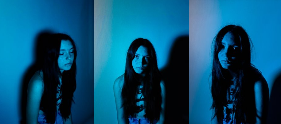
All posts by Caitlin O'Malley

Filters

Author:
Category:

PHOTO-SHOOTS: Planning & Recording

Task

PLANNING: Produce a blog post with a detailed plan of at least 3-4 photoshoots that you intend on doing in response to analysis and interpretation of Artists References above. Make sure photo-shoots relates to the ideas on how you intend to develop your project as set out in your Statement of Intent. Follow these instructions: what, why, when, where?

Shoot One
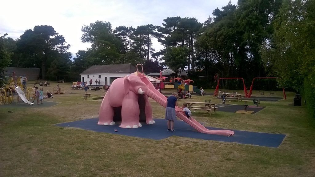
Who – For my third shoot, I intend to photograph locations that bring me a sense of nostalgia and that I visited a lot growing up as well as some locations that I visit a lot currently.

What – When taking these photos, I plan to edit them according to how vivid they are in my memory. If I don’t remember them clearly, I may edit them to be less saturated or perhaps make them appear almost dream like.

Where – These photos will be taken at their locations, such as be the pink elephant park, St. Saviours school, the garden center etc.

Why – While photographing objects will be important for my project, I think the locations of my childhood are also something that should definitely be incorporated. It will also be interesting to see how much these areas have changed, I could also potentially try to replicate some photos from the past at these locations.

Shoot Two

Who – I plan to photograph objects from my childhood that create a sense of nostalgia or a meaningful to me such as toys, books, or sentimental items.

What – Much like the cards, I plan to use gel lighting when taking photographs of my objects too. I also think it would be a good idea to potentially blur some or add a sort of foggy effect to some of the objects that I don’t remember clearly.

Where – Once again, I would likely take these photographs either at school using the studio or at home, where I would set up a small area in my house to take them.

Why – These objects will help to display my memory of what stuck out to me growing up and help me to look back on the things I have forgotten as well at the memories attached to the objects. I feel as though this is important to me since I often don’t reflect on how much different things and people have helped me over the years.

Shoot Three
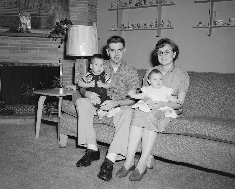
Who – Lastly, I plan to collect old photos of me and my family.

What – My plan for these photos is to create a collage of these images in black and white to symbolise how over different time periods, memories remain through photos and live on.

Where – I will take all these photos from my house and collect some older ones through my parents.

Why – I think its important to include older images to signify how important memory is to photography. However, since I plan on collaging the images I will make sure to use one page.

Shoot Four
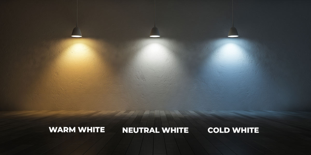
Who – For this shoot, I want to photograph just a blank set up while focusing more on the lighting.

what – I plan to use some kind of blank table as well as a blank background. I will use different colours in my lighting to make the images more eye catching.

where – I will most likely create these images either in the studio at school or set up a makeshift studio at home.

why – I feel as though having blank areas in my photobook will help to depict the loss of a certain memory, however I think that having lighting will help to showcase the general emotion I remember feeling.

Shoot Five
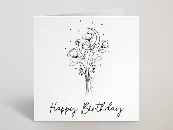
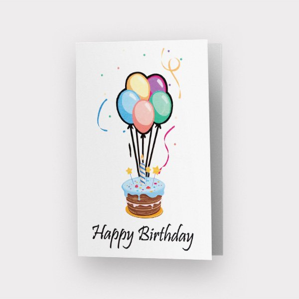
Who – For my first shoot, I plan to photograph birthday cards ranging from when I was younger, to more recent ones.

What – For this shoot, I will use gel lighting in order to make the photos more colourful and eye catching. I plan to use a range of colours and tones to find which ones work best.

Where – In order to take these photos, I will either be using the studio in the school or take them from home.

Why – I am taking the photos of the cards in order to represent my age in my personal study as I will be exploring my memories. Regarding the gel lighting, since we cannot gain many emotions from objects on their own using colours in lighting is a way to display them.

Artist Reference – Philip Toledano

About

Toledano was born in 1968 in London, to a French Moroccan mother and an American father. He grew up in London and Casablanca. He received a BA in English literature from Tufts University in Boston.

Toledano considers himself a conceptual artist, believing that everything starts with an idea, and the idea determines the execution. Consequently, his work varies in medium, ranging from photography to installation, sculpture, painting and video.

Book reference

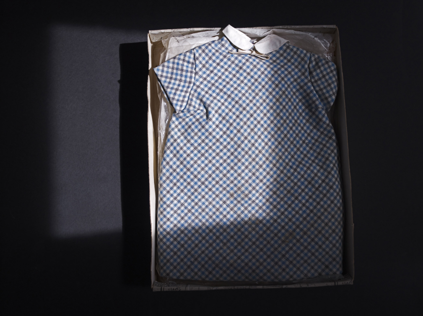
Toledano created the book ‘when I was six’ as a way to honor and remember his sister, Claudia, who passed away in an accident when he was just six years old. After his parents passing, Toledano discovers boxes of Claudia’s belongings that were kept by his parents and so the book is his way of getting to know, not only his sister but his parents relationship with her as well as showcasing some memories he had from the time.

In my opinion, creating a book such as this must take a lot of strength, since exploring something so painful would be difficult for almost anyone. The way Toledano showcases his sisters belongings in the book is symbolic in a way. His use of lighting is done in such a way that it depicts the knowledge he gains of his sister, information that was hidden away finally coming to light after all these years.

Why I chose him

I chose Toledano as one of my artist references due to his link to memory, much like the reason I selected Sternfeld. I also think Toledano’s use of lighting would be a useful technique to replicate in my personal study, since to me it represents something coming to light by just having a small section, or box, brighter than the rest.

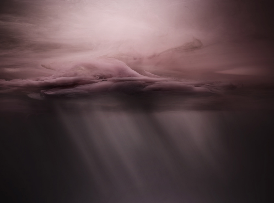
Another approach I would like to try and replicate is with some objects, he makes them appear almost dream like or foggy in a way. I think this would be very interesting to do when I showcase something I don’t remember too well, such as an object or a landscape as it would represent how it’s not a clear memory.

Image analysis

Within this image, we are able to see a dress which seems to be preserved due to the well kept condition it’s in. This tells the viewer that the dress has not been touched in a long time, creating a sense of sadness when looking at the photo.

We are also able to see the lighting in this image, with the majority of the photo cast in a shadow except for one square. This square of light could symbolize the lid of the box being taken off, revealing the dress as well as memories of his sister. The dress is also off center, however, this means that our eyes are drawn to the light overlapping giving off a slightly more positive outlook, maybe suggesting that Toledano is feeling more at peace with his sisters passing.

Lastly, the colouring of the image is important. Majority of the tones in the image are cool, creating a calm outlook for the viewer, once again potentially linking to peace.

Artist Reference – Joel Sternfeld

About

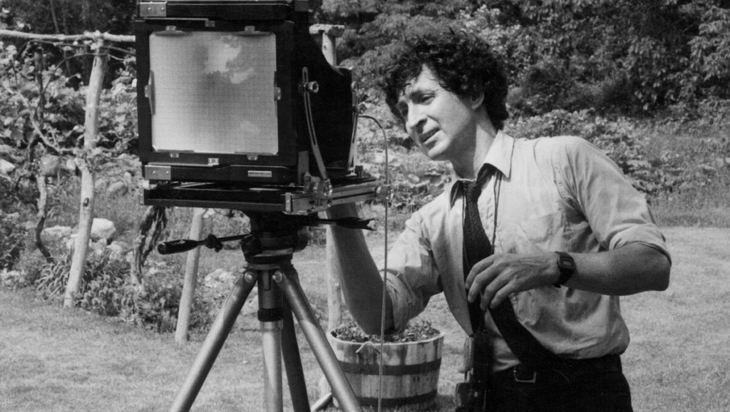
Joel Sternfeld was born on June 30th in 1944 and is an American fine-art photographer. He is best known for his large-format colour pictures of contemporary American life and identity. His work contributed to the establishment of colour photography as a respected artistic medium. He earned a BA from Dartmouth College and began taking colour photographs in 1970 after learning the colour theory of Johannes Itten and Josef Albers. He currently teaches at Sarah Lawrence College, where he holds the Noble Foundation Chair in Art and Cultural History.

Sternfeld documents people and places with unexpected excitement, despair, tenderness, and hope. Ever since the 1987 publication of his landmark “American Prospects,” Sternfeld’s work has interwoven the conceptual and political, while being steeped in history, landscape theory and his passion for the passage of the seasons.

Book reference

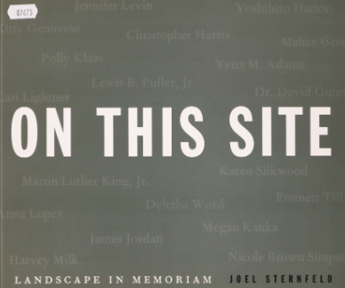
Sternfeld’s book ‘on this site’ was originally published in 2012 and is a collection of photographs that showcase tragedies that have taken place within America as well as short descriptions to inform the viewer of what had once happened. They show the current day locations of incidents, such as the location of Martin Luther kings assassination or the Cuyahoga River which was set on fire after having chemicals dumped into it.

All of these images are used to raise awareness and help to ensure that we do not repeat the same mistakes that lead to such disasters happening as well as helping us to remember the events so that we do not forget the tragedies that occurred.

Why I chose him

I chose Sternfeld as one of my artists references as his work focuses on memory. I plan to also focus my personal study on memory, so taking some inspiration on how he presents the theme in his book may prove useful when creating mine.

I really like how Sternfeld has a small paragraph of information besides the image as it help’s the reader to understand what it exactly it is they are looking at, since many people may not be aware of the tragedy they are looking at.

Image analysis

This image is taken of the stone wall inn, where the patrons of the gay bar were arrested and beaten which caused the village to rebel, creating what is now known as the stonewall rebellion. This photo denotes that there was a change, due to the neon sign in the window which links to a more modern design.

In the photo we are able to see a lot of red ambient lighting, which is often use to either represent danger, warmth or love. In this case, we are able to see that it represents love due to the heart bouquet in the window. Another thing we are able to tell from the image, is that the bar is still up and running due to the more modern appearance it has taken. This tells us that even with the tragedy that occurred here, the bar has survived the attack and is currently thriving.

Artist Reference – Nick Fancher

About.

Nick Fancher is a photographer, author, and educator who specializes in creating in-camera effects, often employing the use of bold colours and dramatic lighting. He is particularly known for his efficient method of working, which is with the use of minimal gear and often in unconventional locations. Nick graduated from Ohio State University with a BFA in photography in 2005 and has authored several books on his techniques including Studio Anywhere 1 & 2 and Chroma. While he is especially known for his editorial portraiture and work in the music industry, his client work includes architectural photography, photojournalism, ecommerce (product, on-figure, and flat-lay), stock and food photography, corporate, lifestyle, fashion, and video. Nick Fancher is based in Columbus and Los Angeles and is available for photo commissions worldwide.

Why I chose him.

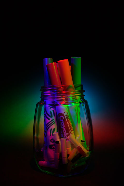
I chose Fancher as my first artist reference as I was inspired by his use of gel photography, which is when a transparent coloured material is used to modify lights by being placed over the light sources to create colourful effects. I think that colour is a very important way to show emotions without having expressions. In my study, I plan to recreate his gel lighting techniques as a way of showcasing emotions when photographing objects or people since it enhances the mood of the images.

Image analysis.

I really like the use of lights and colour displayed in this image. The singular line of colour makes the centre of the image eye catching while also leading the viewers eyes to where the model is facing due to our eyes being drawn to the brightest area of the image. The colours also contrast, perhaps depicting certain emotions through the image.

The models outfit is also important in my opinion as the white makes sure she stands out against the darker background and her necklace catches the light causing it to sparkle, drawing attention to the centre once again.

Lastly, the way that the model is standing puts her hands directly below the light perhaps symbolising that she’s close to achieving something. Her facial expression on the other hand creates a sad, almost longing feel to the photo as if she’s desperate to reach something but is being held back (hence her other hand pulling back)

Nostalgia – Mood board, Mind map

Mood board

This is a mood board of somethings that made up my childhood. Looking back onto them, they bring me a sense of nostalgia in a positive way as it connects me to memories that I had forgotten about over time.

about

The term nostalgia is one that derives from the Greek words nostos (return) and algos (pain). The literal meaning of nostalgia, then, is the suffering evoked by the desire to return to one’s place of origin. However, feeling nostalgic doesn’t always have to be a negative thing, in fact, feeling nostalgic can be viewed as a positive experience since you could be reminded of a happy memory or situation.

mind map

Statement of intent – Personal study

Task

Write a Statement of Intent of 250-500 words that clearly contextualise;

  • What you want to explore?
  • Why it matters to you?
  • How you wish to develop your project?
  • Which form you wish to present your study (photobook, film, prints etc)
  • When and where you intend to begin your study?

Make sure you describe how you interpret the theme of ‘NOSTALGIA’ and any specific subject-matter, topic or issue that you wish to explore, including references to artists, art movement and any other inspiration. Revisit your mind-map and mood-board and hone in one or two ideas. For example, you may wish to consider:

  • How you wish to photograph places, people, objects – carefully selecting your point of view (framing), composition and lighting.
  • Will you be making images outside or inside, shooting on locations or use the studio.
  • Will your images be documentary (observational), or tableaux (staged) in your approach, style and aesthetic look?
  • What will you include?
  • What will you leave out?
  • How will you present these images to the viewer?
  • In a book, a film, or prints on the wall?
  • With or without accompanying text?
  • In a grid, typology study or a linear sequence?
  • Will you be manipulating images using montage/ collage techniques or apply AI technology?
  • Will you be using any specific photographic technique, process of software (Photoshop, Premiere, Audition, Blurb online book making)
  • What difference do these decisions make to the meaning of your images?

PLAN > RECORD > As a creative response to initial ideas set out in your Statement of Intent plan a relevant photoshoot this week that provide you with some visual material to develop your project. There are three photographic genres that you could consider when developing ideas and planning photoshoots, they are:

LANDSCAPE > PLACE > GEOGRAPHY > ENVIRONMENT > GEOLOGY
– familiar vs unfamiliar
– ordinary vs extra-ordinary
– vernacular vs spectacular
PORTRAIT > PEOPLE > IDENTITY > CULTURE > COMMUNITY
– individual vs collective
STILL-LIFE > OBJECT > HISTORY > MEMORY > FAMILY
– private vs public

Produce a blog post from each shoot with careful selection, adjustments and editing of images in Lightroom. Review and evaluate shoot for further development and experimentation. Your first photo-shoot MUST be published on the blog by Wed 13 Dec.

Statement.

I plan to focus my personal study on the theme of memory. I would do this by showcasing my life throughout the years using meaningful objects and places. In order to break up the project into segments I will use birthday cards which will signify my age at that particular point which shows when these objects or places were most relevant in my life. This idea of looking back on memories and nostalgia is important to me since looking back to the past helps us to remember how we have grown, what and who helped to form us into who we are today. Another reason I believe that this study is important as it is also something that will be interesting for me to discover and learn more about myself, especially things that I no longer remember but people, such as my parents, do.

Another option/ idea which would be quite interesting to include would be to missing gaps in the book due to photos from my childhood being lost when we moved house. I could focus for my location images on recreating old photos or places I remember while using toys or sentimental items as my objects to photograph. Also, it would be interesting to slowly introduce colour into my images to represent how my memories become clearer the more recent they are. 

In my opinion, the best way to display my idea would be a mix between prints and a photobook. I think the photobook would be best to display the storyline of my project however having mounted prints for specific photos would also be effective to showcase my best images from the project. When photographing my objects, I would like to have them be the only thing in focus. To do this I would have a blank background with the object in the centre, to make the images more eye catching I think that I would use colour lighting. When photographing my landscapes, I would like to have them fill the page and show how the place made me feel through the use of changing the saturation. The style of my images will also likely be changing to show my emotions growing up, for example, when I’m young it would be more colourful in contrast to current day where it would be darker as a reference to how we lose a lot of our innocence of the world when growing up, similarly to what I plan to do for my landscape photos. 

Review and reflect

This is my review of the topics I have completed throughout the year, including what I currently believe to be my best work from it. These themes have allowed me to gain experience with specific techniques that will help me when completing my personal study.

Themes

Still life

Still life photography is a genre of photography used for the depiction of inanimate subject matter, typically a small group of objects. Similar to still life painting, it is the application of photography to the still life artistic style.

Example photos:

My photos:

Romanticism

Romanticism is the artistic movement of the eighteenth and nineteenth centuries which was concerned with the expression of the individual’s feelings and emotions. Romanticism is attitudes, ideals, and feelings which are romantic rather than realistic.

Example photos:

My photos:

Urban

Urban means belonging to, or relating to, a town or city. Most of the population is an urban population. In photography, it usually relates to images of multiple buildings clustered together.

Urbanization began in ancient Mesopotamia in the Uruk Period (4300-3100 BCE). It is thought that a particularly prosperous and efficient village attracted the attention of other, less prosperous, tribes who then attached themselves to the successful settlement, thus creating an urban environment.

Example photos:

My photos:

Anthropocene

The Anthropocene Project is a multidisciplinary body of work combining fine art photography, film, virtual reality, augmented reality, and scientific research to investigate human influence on the state, dynamic, and future of the Earth.

The group was created in 2016, however, the effects of Anthropocene on the world had been going on long before that, some suspecting as early as 1610 with an unusual drop in atmospheric carbon dioxide.

Example photos:

My photos:

Environmental Portraits

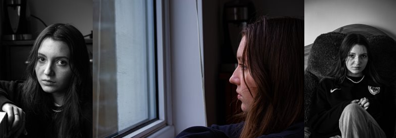
Portrait photography is a very well-known and popular style of photography. The style is all about trying to capture the personality, identity, soul, and emotions of a person by utilizing the background atmosphere, poses, and lighting.

There are many types of portrait styles such as; constructionist, candid, environmental, and creative. Looking more into the environmental portrait style, it usually depicts people in their working environments or environments they are typically found in giving insight to said persons life and surroundings.

Example photos:

My photos:

Femininity vs Masculinity

Photos which aim to show femininity often do so by incorporating nature, youth or innocence while photos aiming to depict masculinity typically show a more rough, assertive side to them. Majority of femininity and masculinity ideals in photography, like nature, become the way they are due to the stereotypes they are bound to in society. For example, women are typically seen as weaker and more emotional while men are shown to be strong and somewhat apathetic.
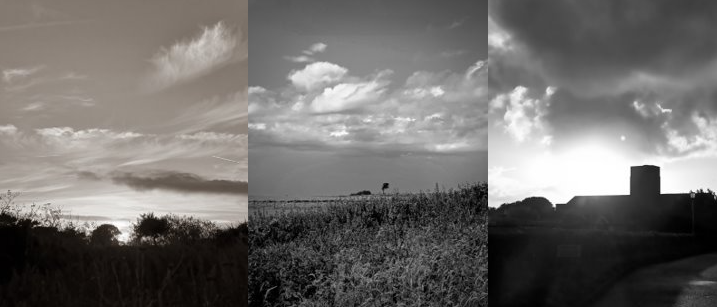
Example photos:

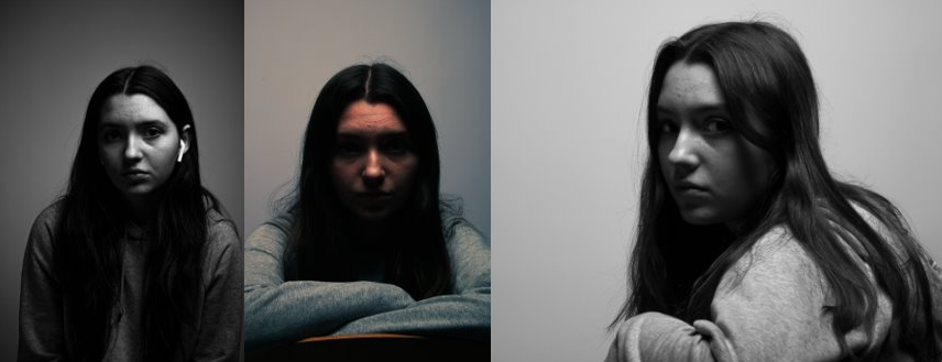
My photos:

Street photography

Street photography is photography conducted for art or inquiry that features unmediated chance encounters and random incidents within public places, usually with the aim of capturing images at a decisive or poignant moment by careful framing and timing. 

Example photos:

My photos:

Artists

Mary Ellen Bartley

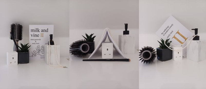
Mary Ellen Bartley is a New York based contemporary still life photographer. Often choosing books as her subject in majority of he work, Bartley is capable of capturing varied textures and colors in her pieces.

Her photos:

My photos:

Ansel Adams

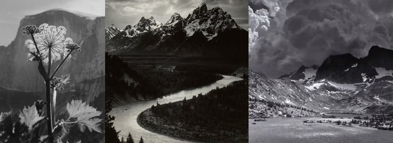
Ansel Easton Adams was an American landscape photographer and environmentalist known for his black-and-white images of the American West. He helped found Group f/64, an association of photographers advocating “pure” photography which favored sharp focus and the use of the full tonal range of a photograph.

His photos:

My photos:

Shannon O’Donnell

O’Donnell is a Jersey born photographer who’s work often consists of showing the way femininity is stereotyped and i tried to replicate this in my image.

Their photos:

My photos:

Photographic Skills

Aperture

Aperture affects the lighting in your picture. The large we make the hole in the lens, the brighter the image will be and vise versa. We can also effect the depth of field using aperture, allowing us to choose the focus point of the image.

My photos:

Lighting Portraits

Rembrandt lighting is a lighting technique used for portrait photography. It is named after Rembrandt Harmenszoon van Rijn, the great Dutch painter and refers to a way of lighting a face so that an upside-down light triangle appears under the eyes of the subject.

Butterfly lighting is a type of portrait lighting technique used primarily in a studio setting. Its name comes from the butterfly-shaped shadow that forms under the nose because the light comes from above the camera. You may also hear it called ‘paramount lighting’ or ‘glamour lighting’.

Chiaroscuro is defined as a bold contrast between light and dark. A certain amount of chiaroscuro is the effect of light modelling in painting where 3-dimensional volume is suggested by highlights and shadows. It first appeared in 15th century painting in Italy and Flanders (Holland), but true chiaroscuro developed during the 16th century, in Mannerism and in Baroque art. Dark subjects were dramatically lighted by a shaft of light from a single constricted and often unseen source was a compositional device seen in the paintings of old masters such as Caravaggio and Rembrandt.

Example photos:

My photos:

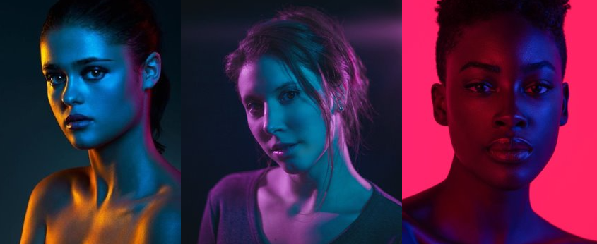
Colour lighting

I experimented with colour by using tinted sheets over my light source, causing the light to change it’s hue.

Example photos:

My photos:

Film: Editing

Audio

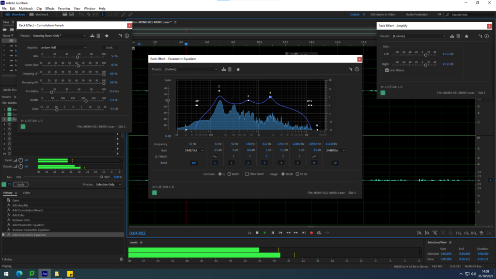
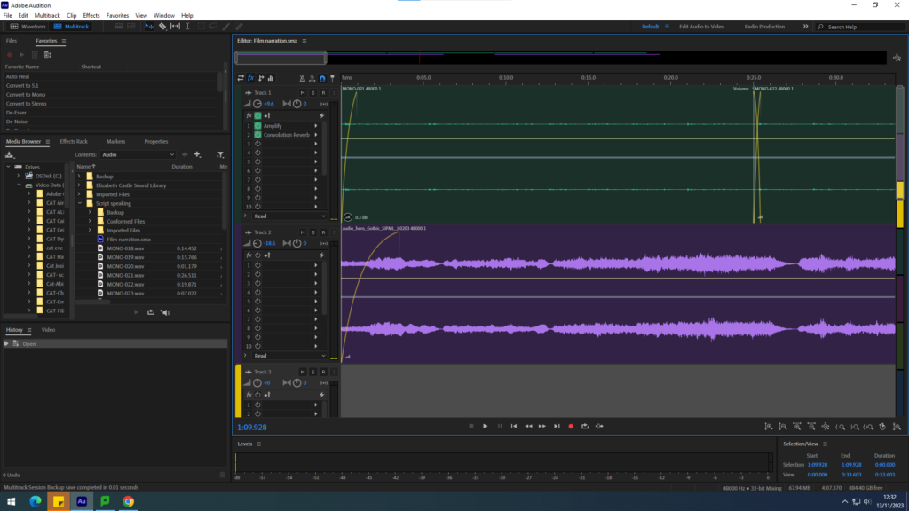
To begin with, we uploaded our recordings of the narrator speaking onto the adobe audition software, putting the audio on the first line to separate it from future sound effects we planned to add. Our next step was to merge the different sections of our recordings together in such a way that they would blend together smoothly, making it seem as though it was all one audio to begin with.

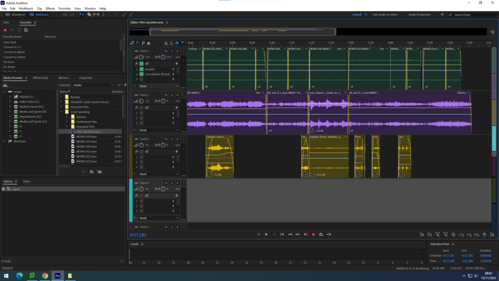
Afterwards, we continued to edit the recordings by adding in effects. Firstly, we amplified the audio to increase the sound quality of the narrators voice before adding the parametric equalizer to adjust the volume and pitch. Lastly, we used the convolution reverb effect to add a slight echo to her voice, adding a slight sense of distance.

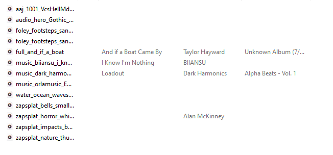
In order to add sound effects and music to our audio, we downloaded them off of the website:

https://www.zapsplat.com

Our next course of action is to input the music. We did this by importing our downloaded music, opting for a dark orchestral style to create a somewhat unsettling atmosphere. The music was placed onto the second line where we then adjusted the volume of it as well as changing the song based on the scene our narrator is talking about to help immerse the viewer.

Lastly, we added in sound effects onto the third line. The sound effects help to create a greater sense of realism, producing another way to immerse the viewer. We made sure to include effects relating to the storyline, in order to help visualise what the narrator is reading out.

video

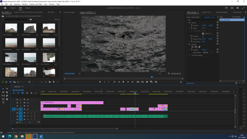
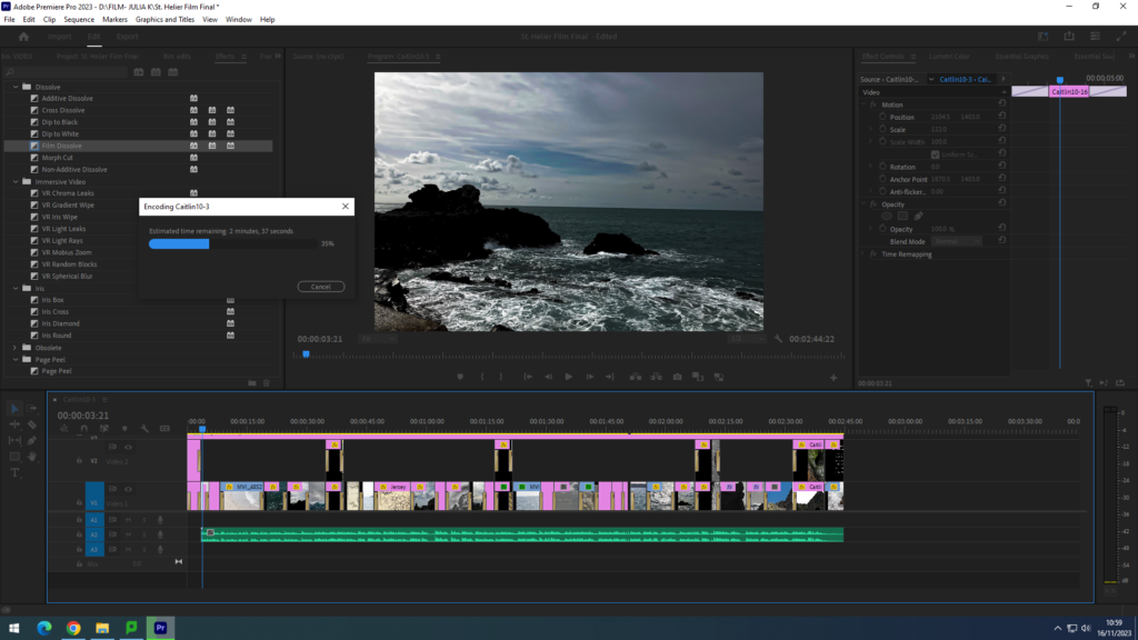
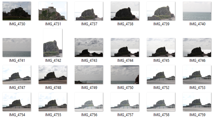
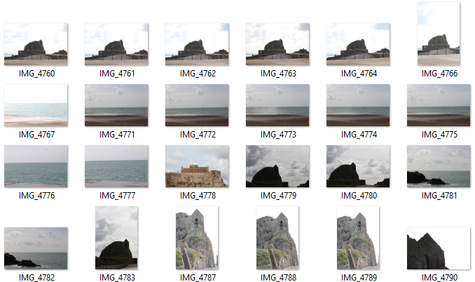
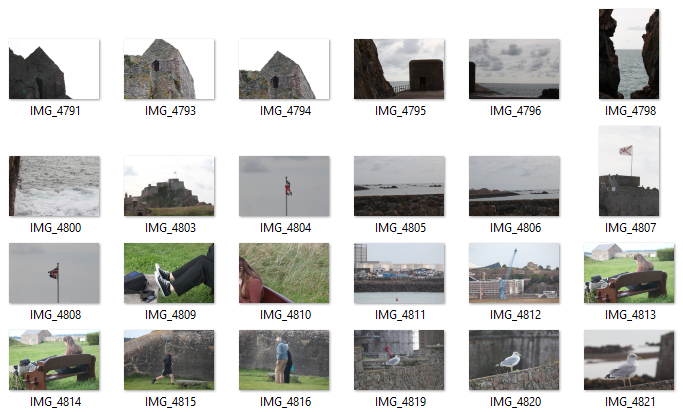
Firstly, we uploaded the photos and videos, creating two bins, from which I could drag in the required media. We firstly put the photos we required in a rough order (taking into consideration the audio that would be added). The pink line is the media we started to put together in our film. After creating a rough sequence, we imported the audio file (the green row).
After importing the audio, we began to match up the media to the audio with accuracy, changing the duration of each part. We decided that the audio was the main aspect of our film, therefore the pictures and videos were simply a visual aim for the narration of St. Helier’s life. Every sound effect (for example: thunder rumbling in the distance as a way of presenting the father’s anger) played a key role in the sequence of the photos, since they had to link up with what was being said in the narration. I also used the ‘Lumetri Colour’ effect tool to enhance the look of the photos, for example changing the contrast and saturation of the colours.

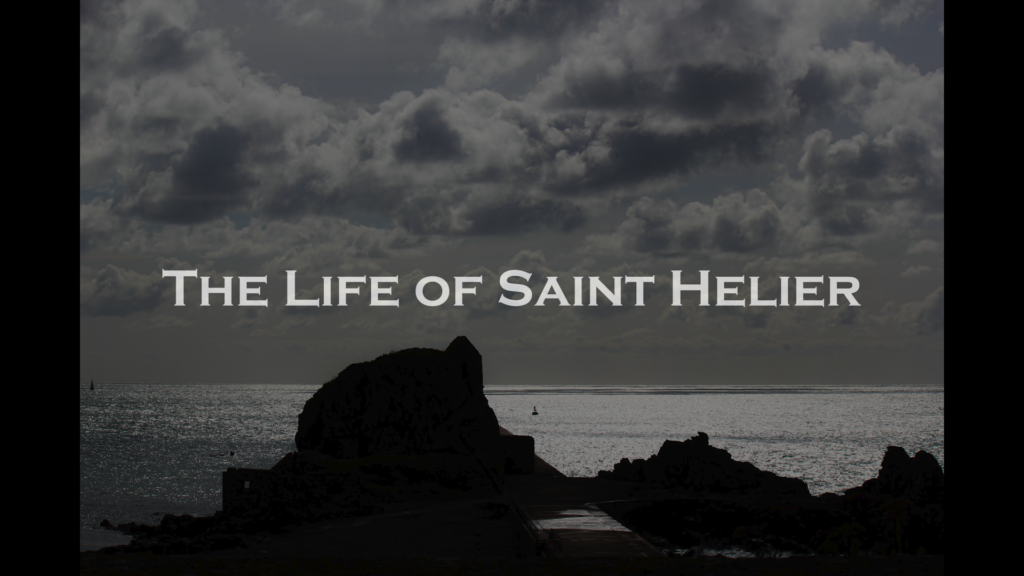
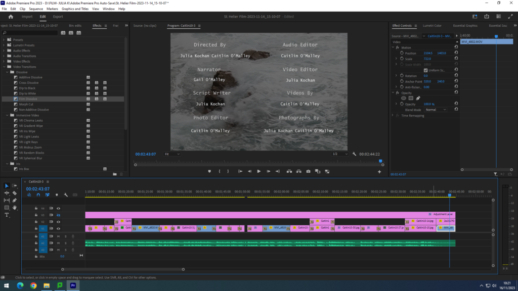
After the layout of the film was finished, we worked on adding text and transitions to further enhance the film. Firstly, we added a title using the text tool, naming our film “The Life of Saint Helier”, choosing a simple title. We also added credits (as seen in the screenshot above) to the end of our film, mentioning the people who worked on the film, once again using the text tool. For the filter, we wanted to keep it simple and used the ‘Film Dissolve” video transition to help the movie flow better. I also added them to the title so that it would appear after a second of the primary frame showing. I added the filters throughout the entire film, causing each frame to merge with the other.

Finally, once everything was in place, I shrunk the overall layout and look a screenshot to show the overall look of the film in Adobe Premiere.