All posts by Charlie Bell

Filters

Author:
Category:

Rembrandt and butterfly lighting photoshoot

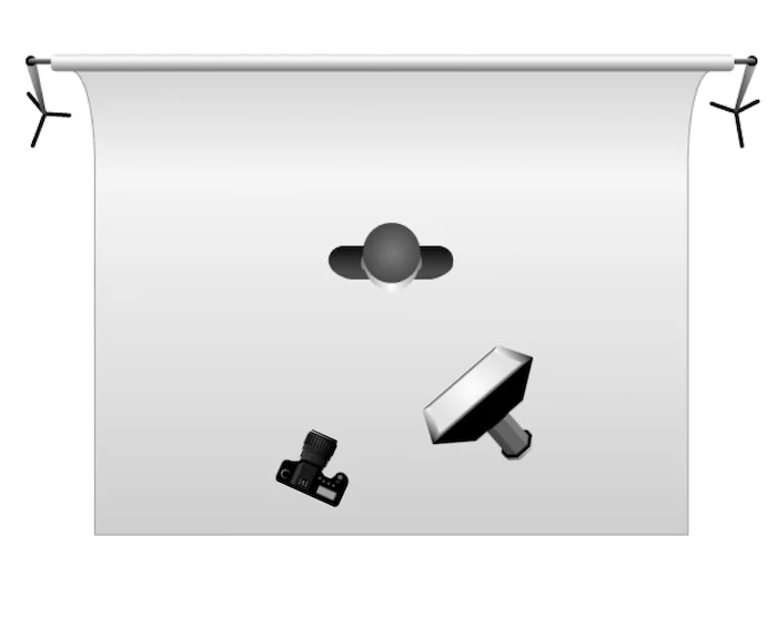
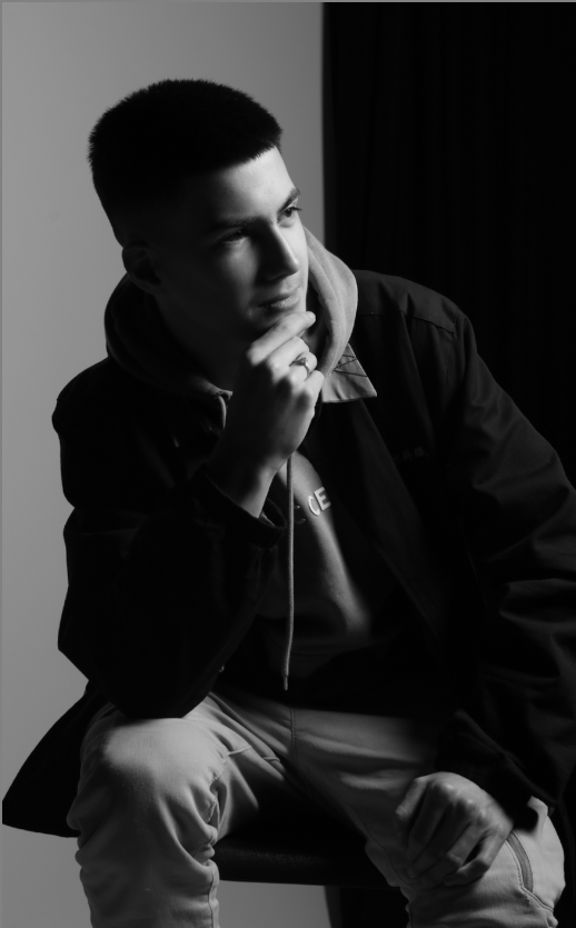
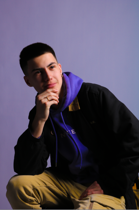
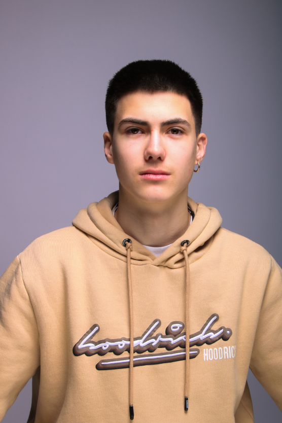
with all of these photos I used this sort of set up its called Rembrandt lighting the point of taking these photos with Rembrandt lighting to experiment and to see how far my photography skills have come along I have done 2 photoshoot doing Rembrandt lighting one. with Rembrandt lighting you want to get a shadow on the side of the face it creates a sort of slimming effect with these photo i cut it off sort of around the knees to make it.
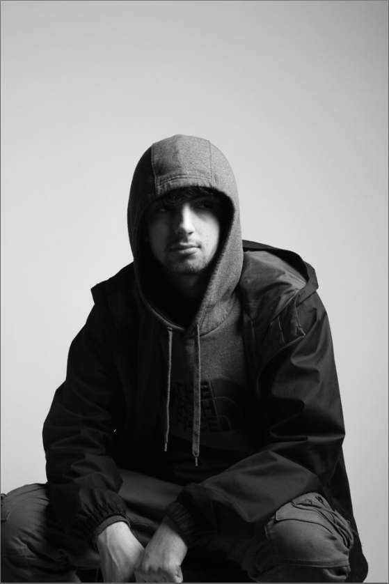
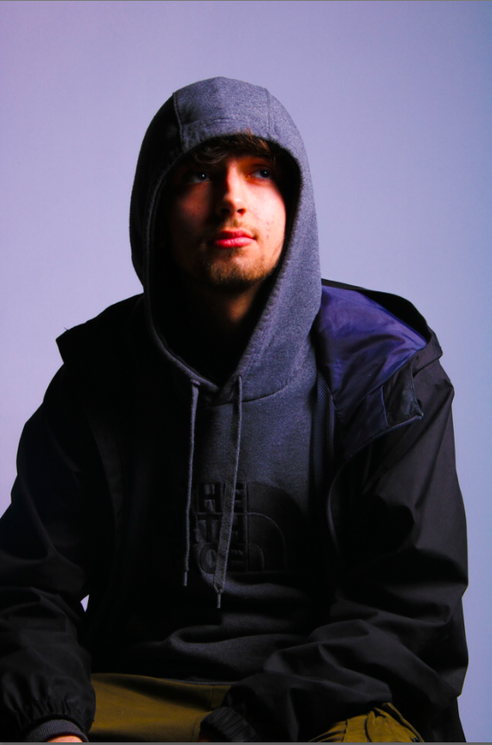
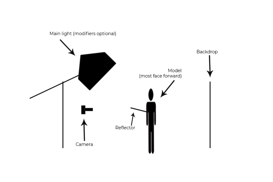
this is the set up for butterfly lighting I used this lighting set up for the photos below when setting up this lighting set up I had to change the angle of the light to get good shadow but not over the top where you cant see the models face I also made the model hold a light reflector to make light hit the models eyes.
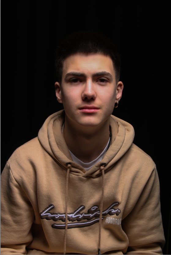
with this there’s a shadow showing the models jaw line and under his neck this is what butterfly lighting you can see with this photo the model has barely any light in the models eyes however other photo I made the model hold a light reflector to get some light to hit his eyes.
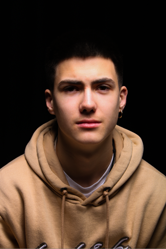
with this photo you can sort of see some light hit his eyes however I turned down the brightness a bit to get warm effect I think the photo turn out alright however if I had to choose between butterfly lighting or Rembrandt lighting I would choose Rembrandt lighting because I like the look of it and it makes nicer looking photos than butterfly lighting in my opinion.

environmental portraits

An environmental portrait is a photographed portrait that captures subjects in their natural surroundings instead of in a studio or other artificial setup.

Alec Soth

Alec Soth is a photographer born in American in 1969  is a photographer who is best known for photographing the Midwestern United States. He lives in Minneapolis, MN, which is also the city of his birth, although he relocated to Bronxville, NY, for his studies at Sarah Lawrence College.

this photo is a photo of Charles. when Alec Soth was driving on a road he saw a house with a glass unit attached to it so he drove up to the house and knocked on the door a lady answered and told him it was her husbands work she also told him to come back later. when he came back Alec Soth spoke to Charles about what he does Charles spoke about how he moved his stair case around 3 times and the glass unit was his cockpit where he builds model aircrafts. Alec Soth took this photo of Charles on one of his roofs he talks about Charles like he’s the type of person that dreams big and starts big project but doesn’t quiet complete them but Soth says these types of people is why keeps doing photography.

Arnold Newman

Arnold Newman was born in March 3rd 1918 and died on June 6th 2006, Arnold Newman was an American photographer, noted for his “environmental portraits” of artists and politicians He was also known for his carefully composed abstract still life images.
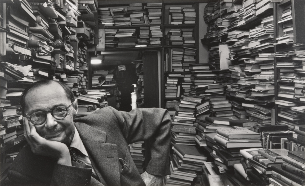
comparing Alec Soth with Arnold Newman

Alec Soth photo are more modern than Arnold Newman this is because when Arnold Newman was taking his photos they where taken on a black and white camera and Alec soth. also with Soth the person in the photo is the main subject.
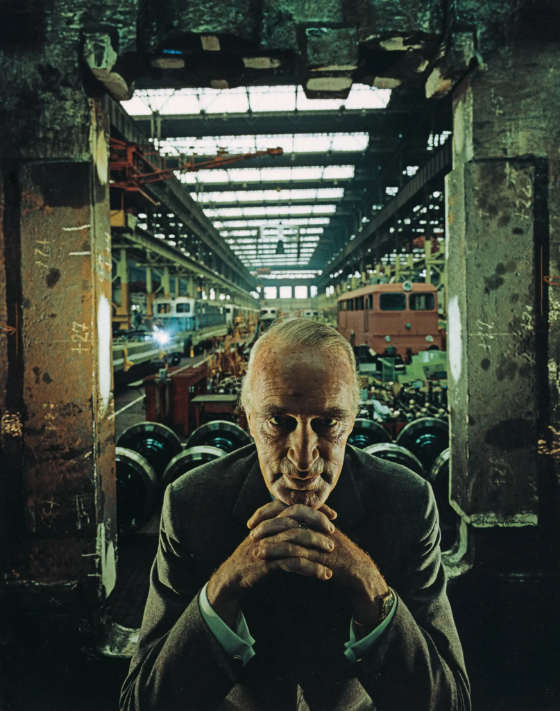
Alfred krupp

my first response to this photo is that the photo is a bit creepy and a lot is going on in the photo, such as it was taken in a car factory so you cane machines working and painting etc.
Technical the photo is using the tunnel effect so on each side there’s something close up and then in middle things get further away.
visual what you can se first is a old man and 2 pillars behind him then there the car factory behind the pillars.
Conceptual the photographer wanted to a picture of the German industrialisation.
Context the photographer anted to a take a picture of the German industrialisation.

final photos and evaluation

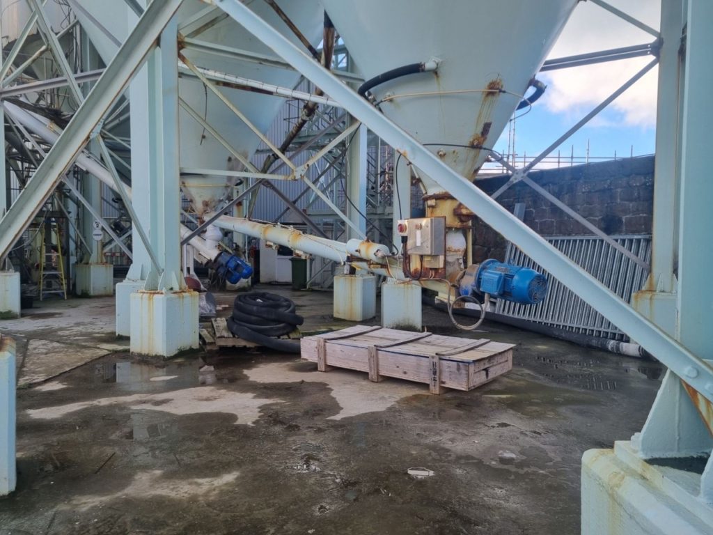
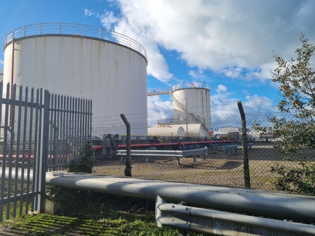
With editing these photos and taking them I had artists in mind Edward Burtynsky, I don’t have drone to take photos on so I to try and get some photos that sort of had the same effect as Edward Burtynsky photos whilst on the ground. I feel like my photos do have the same effect after editing and they make them look even better than the original. for not having a drone to take the photos I believe these are the good photos I could of gotten with the amount of time I had.
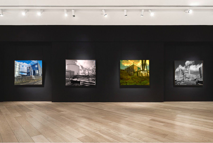
I put my final photos in a picture gallery I explained how I did it on another blog post. but there are 4 images that I have edited and wrote about and there my final pictures. I decided to use these four photo because I think these where the best photo I edited throughout the mock.
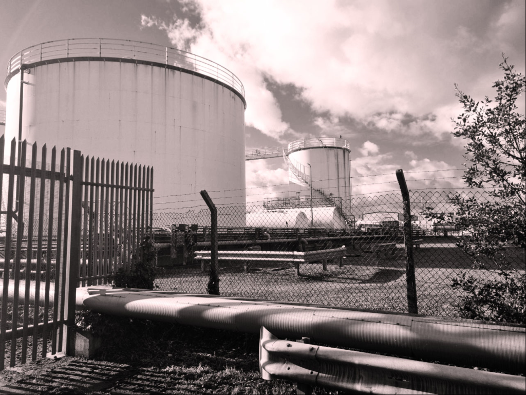
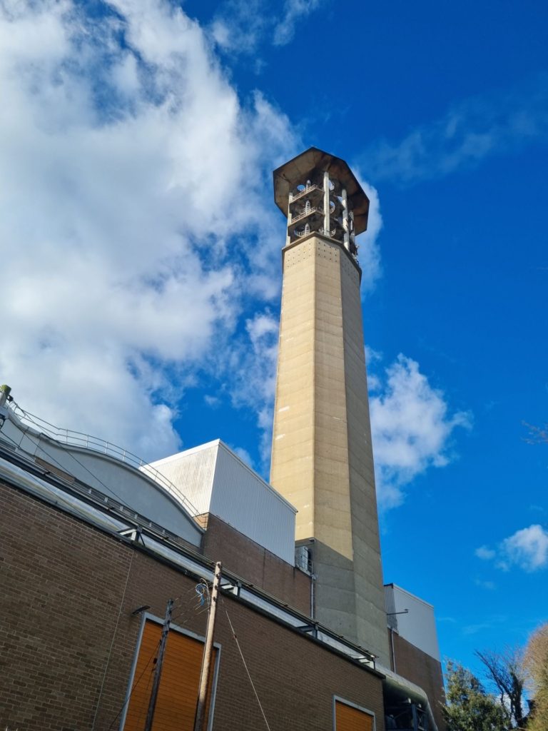
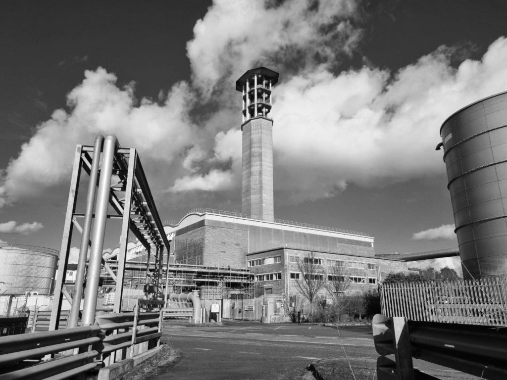
This photo was taken on a landfill site 100 years ago this would of been the sea however today its a important area for jerseys economy. Jersey is known for its stunning views and sights all across the island however where this photo was taken is normally overlooked and ignored by most of the population however in our modern society we need this industrial area for most of the modern day comforts. and that’s why I thought taking a photo of a place where most people over look and try and find beauty in it might be a good challenge. This is known as new topography taking photos of man made landscape instead of natural made landscapes. The reason I went for a black and white edit over this photo is because its doesn’t need any colour in it to make it pop the actual photo has a lot going on in it, I feel if there was colour in the photo it wouldn’t have the same effect. how I took this photo I this photo on my phone and I just used the basic settings I believe it turn out fine maybe next time I should use a proper camera.
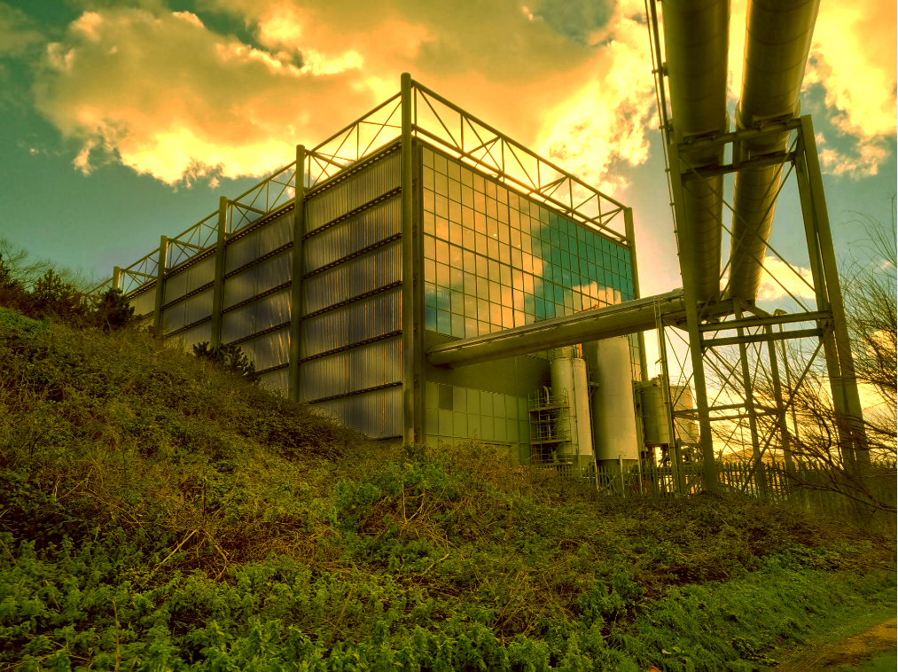
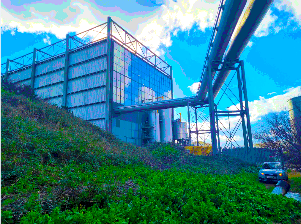
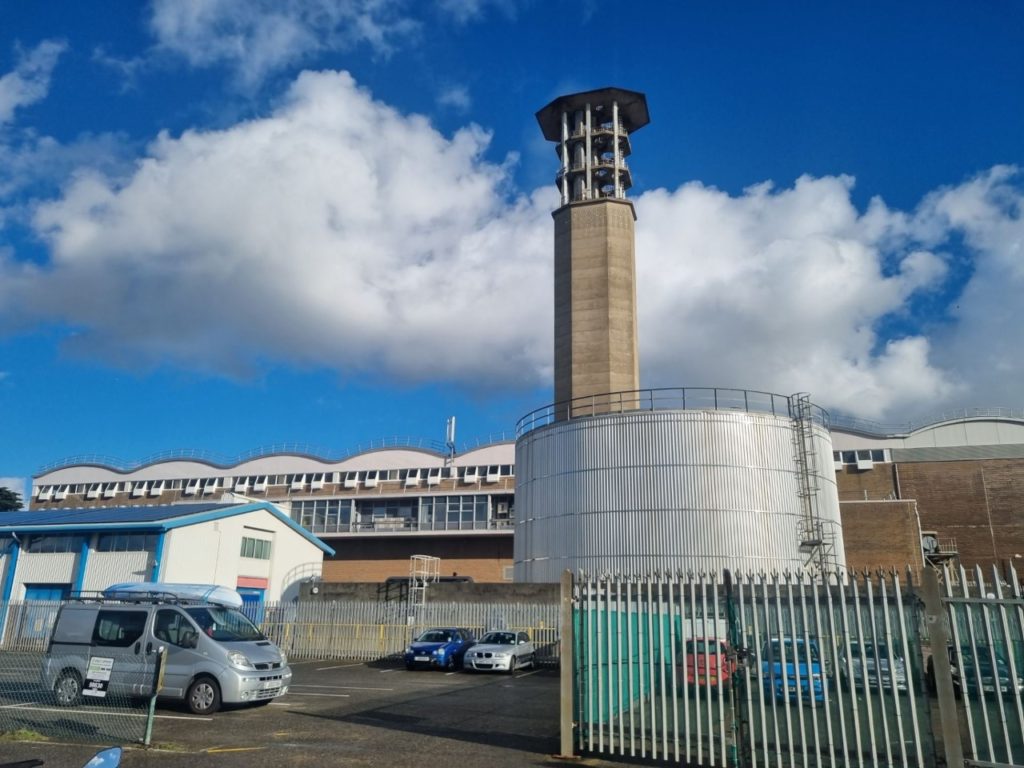
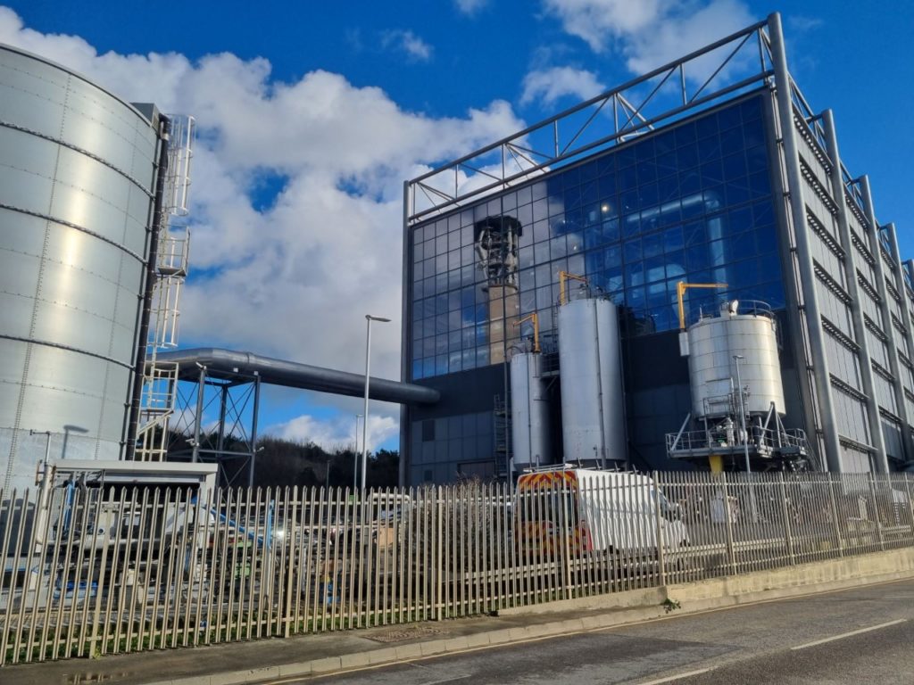
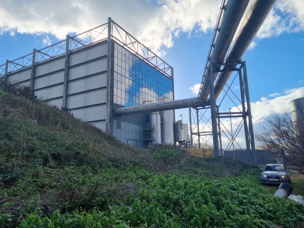
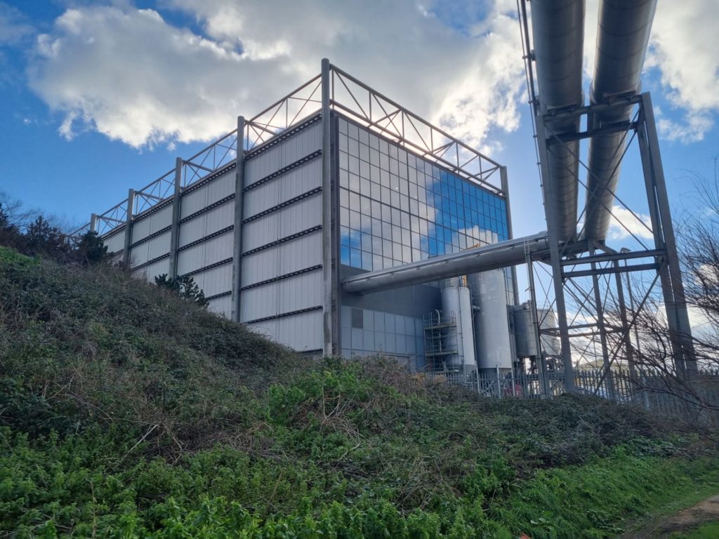
I took this photo on my phone with the basic setting it tuned out alright but next time I will definitely be using a proper camera. Context behind this photo it was taken round back of the incinerator building as I said before where this is built is on landfill so 100 years ago this would of been the sea. I feel like this image is nature and industry living next to each other. however the plants living there are very jagged, overgrown, and has not really been looked after at all. The reason I added a sort of green overlay on this image is to make the air look sort of toxic and kind of post apocalyptic and I went over some of the metal pipes and wall with the burn tool to make it look a bit rusted and warn down. I think it turned out great with the red clouds and the glass reflecting the clouds has really cool effect.
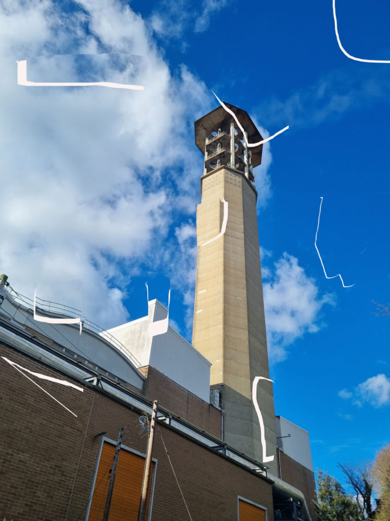
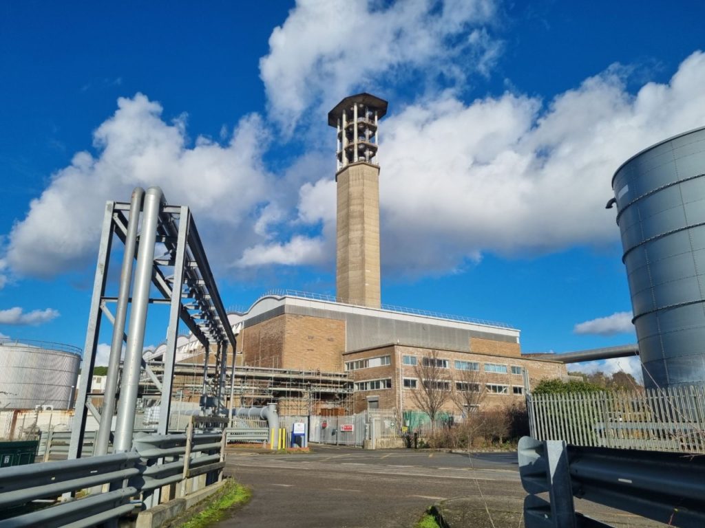
Editing this photo was kind of easy because I already liked the original image with the reflection of the smoke stack so all I really did is add lenses flare to it because I was experimenting around with it and thought it suited this image and going over some of the metal objects with the burn tool to add a worn down effect. this is the same site as before so its a landfill site. What I like about this photo is that there only industrial area, and little bit of grass in the background.
With this photo I tried to make it little bit different because I already have done a black and white photo so with this one its not that noticeable but there’s a slight reddish tint to the photo. I did this because it makes some the details pop a lot more if the reddish tint wasn’t there. I feel like the red adds a hint that this area is not a safe or nice place and that’s the effect I wanted.

These photos are the same not in a literal sense but in a way where they both have the same tunnel effect. Where there are close up thing on each side of the images and then there leading up to something in the middle of the photo. They are also similar because they are both the out come of heavy industry, my one shows what happens to waste in the western world and Edward Burtynsky one shows what happens to waste in poorer country’s it just left there because in poorer country’s they have other things to worry about other than waste like there safety of there people or crime in there country.
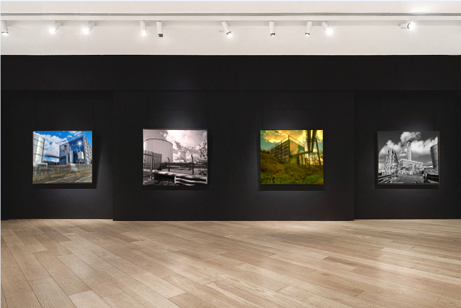
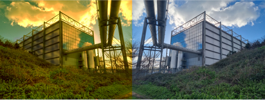
photo gallery

this a photo gallery with my final photo in the picture. I edited them in by shrinking the photo in the picture frame, then I warped it so it fits the actual frame. after doing this I did some finishing touches by getting the lighting right and making sure the pictures are straight

photoshoot edits

The edited photos are on the left and on the right is the original photo. with the one under this text I tried to make it look warn down and sort of toxic I did this because It looks cool and because these industrial places are making the air toxic. when I print this photo it will just be the edited one not the original next to its just so you can see what I have done to the photo.

With this edit I didn’t really do to much to the phot I added a lenses flare I also added a bit of weathering to the image. Also when I print this photo it will just be the edited one not the original next to its just so you can see what I have done to the photo.
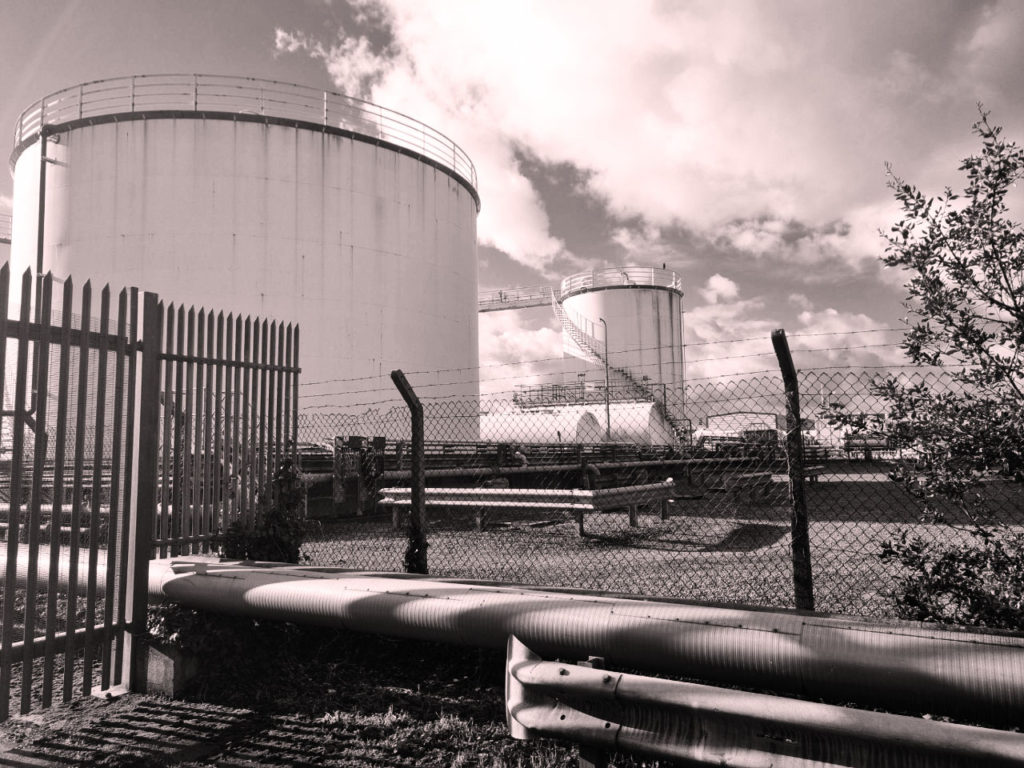
this image is black and white however the reds been turned up so there’s is a light hint of red I liked this photo because its a sort of barren landscape however if you look to the left there’s one small little tree maybe showing there is a bit of natural life in the photo. I didn’t add the original photo next to this one because I think it makes it look rubbish.

With this photo all I did is click on selective colours then gradient map and then invert and it looks very good for something so simple to do. why I took a screenshot of this photo in photoshop is because I wanted to show what I did to the photo in editing.

photo editing experiments

With this edit I tried to add fog to the photo because there’s a chimney I wanted to add smoke coming out the chimney. However I couldn’t find any good photos of smoke and the one that I did find was to small and pixilated so I decide to add fog to the photo. And I believe it looks way better with the foggy effect. How I got the foggy effect, I clicked filter, render, clouds the I just decided how big I wanted it and where it looked best. however the fog doesn’t look realistic enough so thats why I decided to just use it for experimental. Also this photo is the edited one next the original photo.

with this edit I like it, it has a really nice effect however I don’t like its final photos material its a bit grainy and not a hole lot is going on.
with this photo I was just messing around with the lasso tool and making the photo look like its been stuck together the reason that I didn’t put it in the final images is because I dont really like the look of it and probably wont try it again.
with this I just made it black and white and then weathered it a bit with the burn tool I think it turned out ok but as I said before its black and white and its a bit over done but I did it because it looks good.

photoshoot

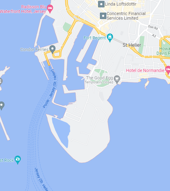
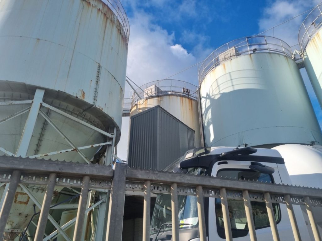
as I said in my photoshoot plan that I would be taking my photos for the mock I took the photos on my phone and I will send them to my computer by email. above this text is the location I took the photos for reference I mostly took photos around the industrial area. under this text are some photos I took around the industrial area.
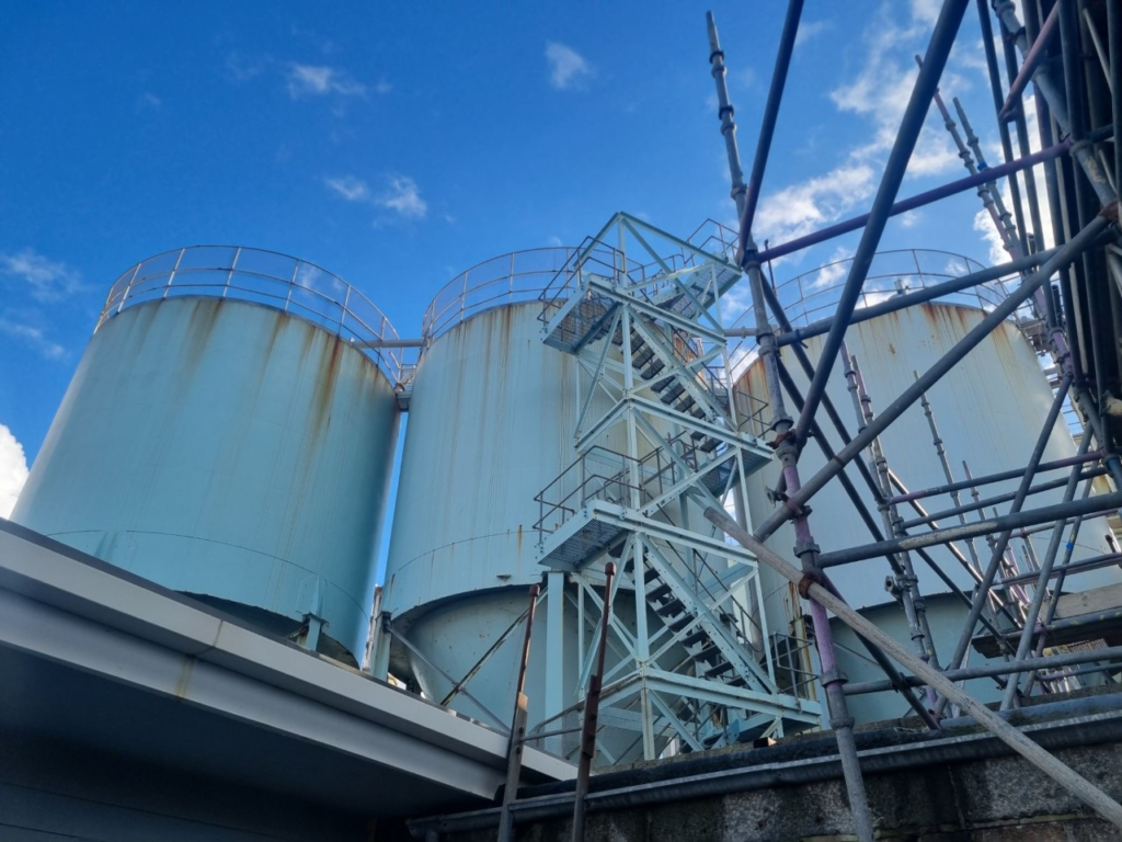
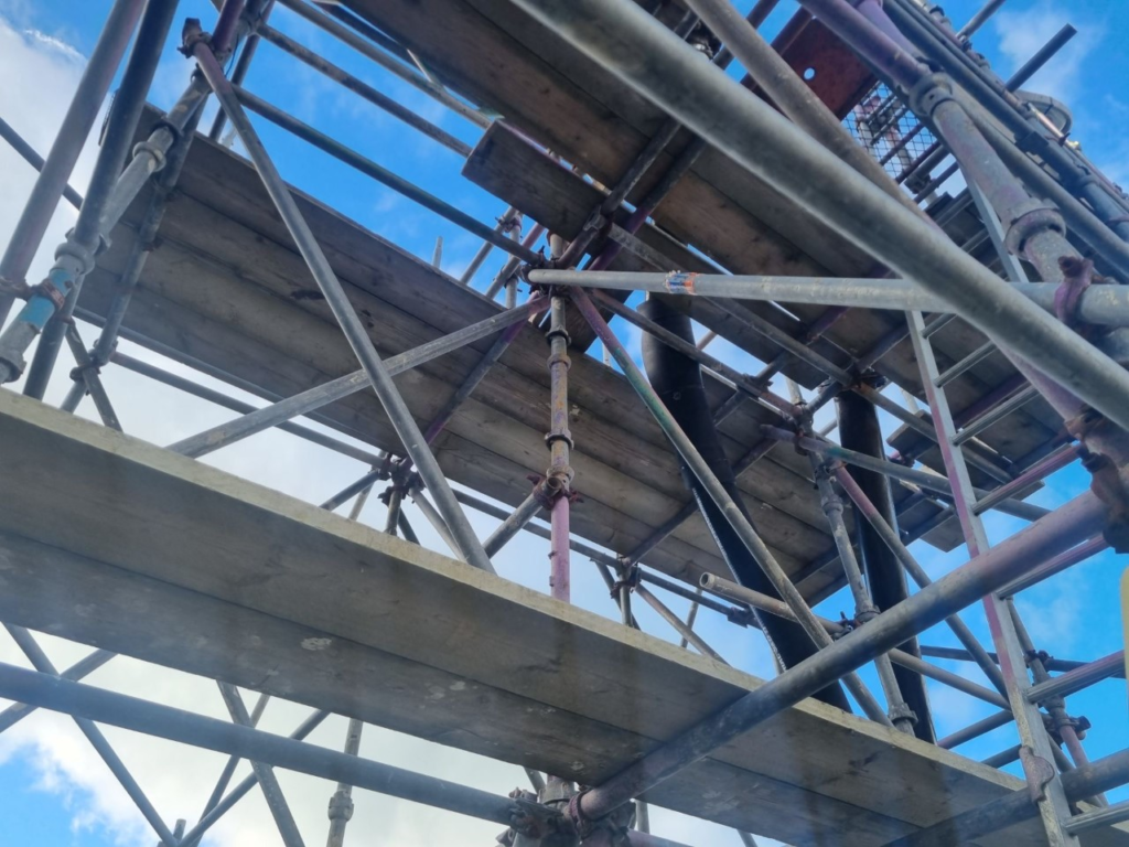
most of these photos I will use in editing and only some for my final images.

Alice Wielinga

Alice Wielinga is a photographer that takes photos in north Korea and edits in painting that is propaganda for north Korea so for example the picture under this shoes a farm with some cows and in the bottom left is the edited in with a strong cow carrying a lot of hay and woman with a rifle the next to this is the real photo where it looks like a small almost kind of weak cow next to man and there no crops and the landscape almost looks like a desert.

Alice wielinga was born in 1981 and lived in Netherlands she finished school as a documentary photographer her most notable work is with north Korea. where she takes photos of north Korean landscape and then adds north Korean propaganda on top of it, its sort of satire its showing what the country promises and then the reality next to it.

kaleidoscope

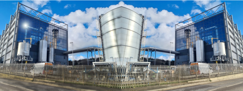
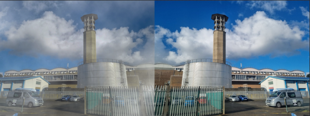
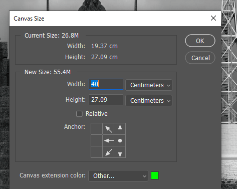
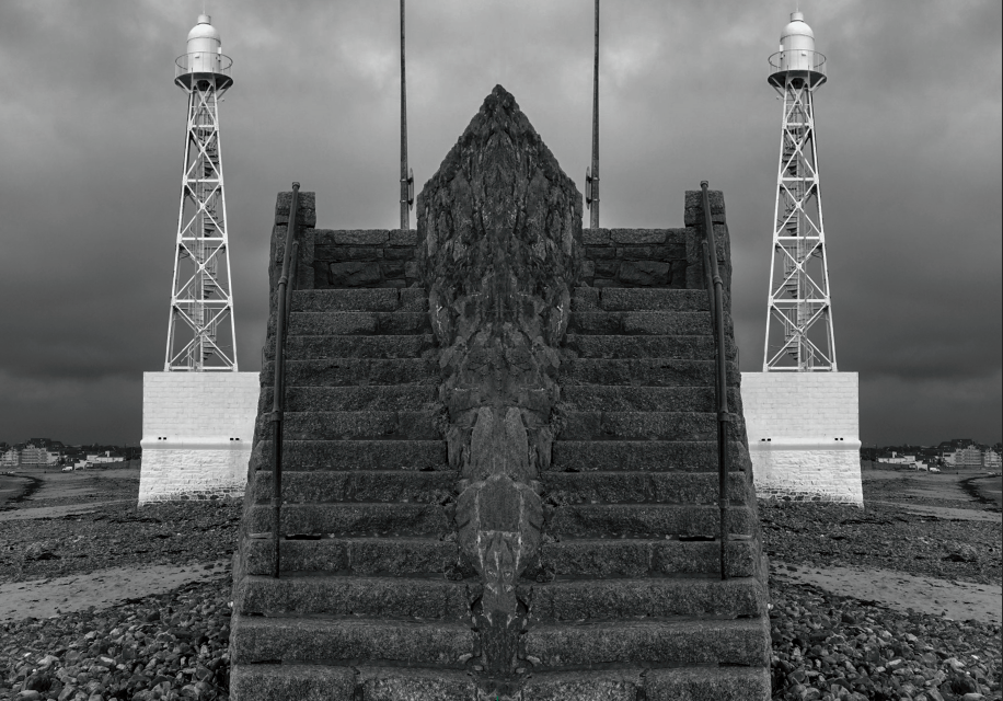
the kaleidoscope effect is where you copy a image and then invert it and put it next to the original image and this is how you do it

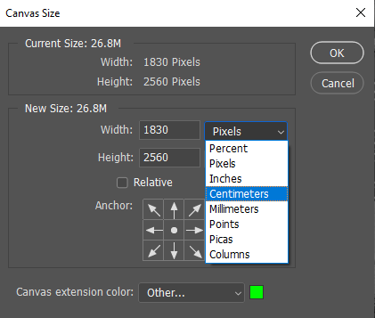
first open up photoshop then select a imagine and then go to the image tab and go down to canvas size.
then click on pixels and then select centimetre
then times the original number by 2
then select the original image and copy it and invert the copy
then do the same as you did with the side one rotate the image down and your finished