All posts by Charlie Barraud

Filters

Author:
Category:

Anthropocene Photographer Comparisons

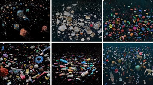
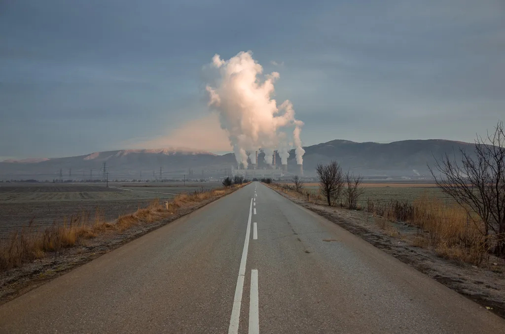
These two images are very contrasting to each other, one having very neutral colours and the other having lots of bright colours. Mandy Barker has used lots of small objects, 350 lighters all together in one image, George Marazakis has used one large object in the background of the image, even though the images are completely different, they both have the same message, which is pollution. Both images have repetition within them, Barker’s being the lighters and Marazakis’ being the lines along the road. In Barker’s the image has been purposefully arranged and edited to look how it is and have the lighters in the positions they are in, Marazakis’ image seems to have been taken by chance, even if it hasn’t, it looks as though he was driving along that road, saw the image in front of him and took it.

Anthropocene Photographer references

George Marazakis

The Anthropocene is an era in which human activity is the dominant influence on both climate and environment.

Human existence, per Marazakis notes, is paradoxically both disease and cure for the earth: “If we assume that humans, and by extension, human civilization, is a product of nature”, he explains, “an external observer could describe it as an autoimmune disease attacking its own body.” Through our greed, we are destroying the earth, but it is such greed that could also save it. “The ecological movement does not aim at the salvation of the planet, but at the salvation of human existence on the planet.”

Mandy Barker

She is an international photographer whose work investigates marine plastic debris, she aims to raise awareness around plastic pollution in the world’s oceans and highlight current research studying the effects this has on marine life and ultimately ourselves.

One of her most famous images “Penalty”, that was made around the 2014 world cup, she got people worldwide to go out and find any footballs that may have been discarded or washed up on the beach. Using her simplistic style she created this image:

Anthropocene

The Anthropocene defines Earth’s most recent geologic time period as being human-influenced based on overwhelming global evidence that atmospheric, geologic, hydrologic, biospheric and other earth system processes are now altered by humans.

The word combines the root “anthropo”, meaning “human” with the root “-cene”, the standard suffix for “epoch” in geologic time.

Moodboard

Constructed Seascape

GUSTAVE LE GRAY – THE GREAT WAVE, 1857

The Great Wave combines Le Gray’s technical skill with grandness. At the horizon, the clouds are cut off where they meet the sea. This indicates the join between two separate negatives. The combination of two negatives allowed Le Gray to achieve tonal balance between sea and sky on the final print.

Contructed Landscapes II

The ongoing body of work consists of staged landscapes made of collaged and montaged colour negatives shot across different locations, merged and transformed through the act of slicing and splicing. The resulting photographs are a conflation, ‘real’ yet virtual and imaginary. The conflation aims to transform a specific place into a space of greater universality.

Both could be described as landscape pictures. What kinds of landscapes do they describe?

Both images show different types of landscapes, one being very simplistic and the other being quite abstract however they both show a seascape

What similarities do you notice about these two pictures?

They both are seascapes.

What differences do you notice?

Dafna Talmor‘s image is very abstract, with images of different seascapes placed together and making a montage idea whereas, even if, Le Grey’s image is made up of two different images, it’s still a lot less abstract that Talmor’s image

What words/phrases best describe each of these landscapes?

Ominous, Cold, Dark. Stormy

In which of these landscapes would you prefer to live? 

Gustav Le Grey’s as the image is more inviting and an actual structure is seen.

Typology

What is Typology:

Typology is a body of photographic work, that shares a high level of consistency that is mostly based on the environment and subjects It was created by Bernd and Hilla Becher in Germany, when they started taking photos of ruined buildings or those that had been abandoned.

Examples of Typology:

As you can see, they appear to have a deadpan style, with the camera facing the subject head-on in black and white. With nothing else in the frame, it’s just the building.

Bernd and Hilla Becher:

Bernd and Hilla Becher were a couple who formed a duo in photography. They were the ones who started Typology:

Photographers like Ed Ruscha, Thomas Ruff and Gillian Wearing were some of these photographers who went out and took photos similar to the Bechers’ work.

Ed Ruscha:

“Every Building on the Sunset Strip”

Ed Ruscha was famous for his paintings and prints but was also well known for his work on Typology in photography. He wanted to capture the same kind of images that the Bechers did. He is well known for his album named “Every Building on the Sunset Strip” which he made in Hollywood.

This 25ft folded album contained photographic views he took in the 1-and-a-half-mile road stretch of sunset. Every two pages would capture both sides of the road to create a panographic view.

“Twenty-six Gasoline Stations”

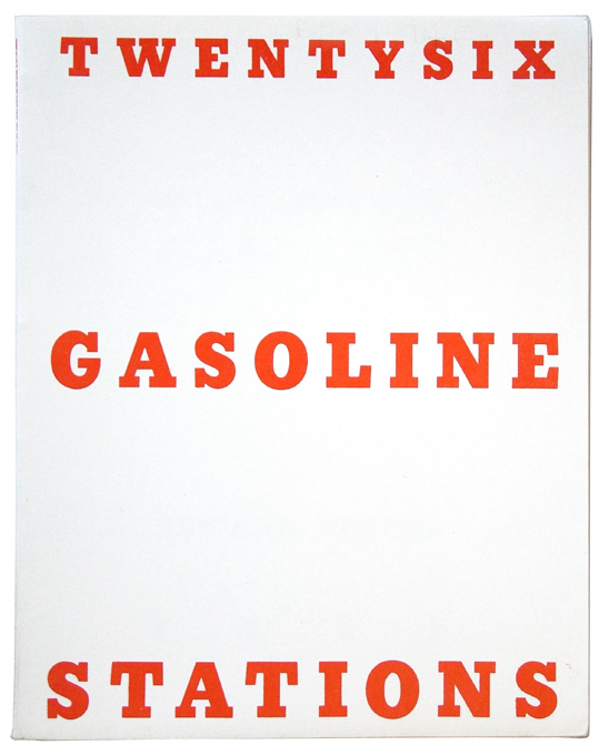
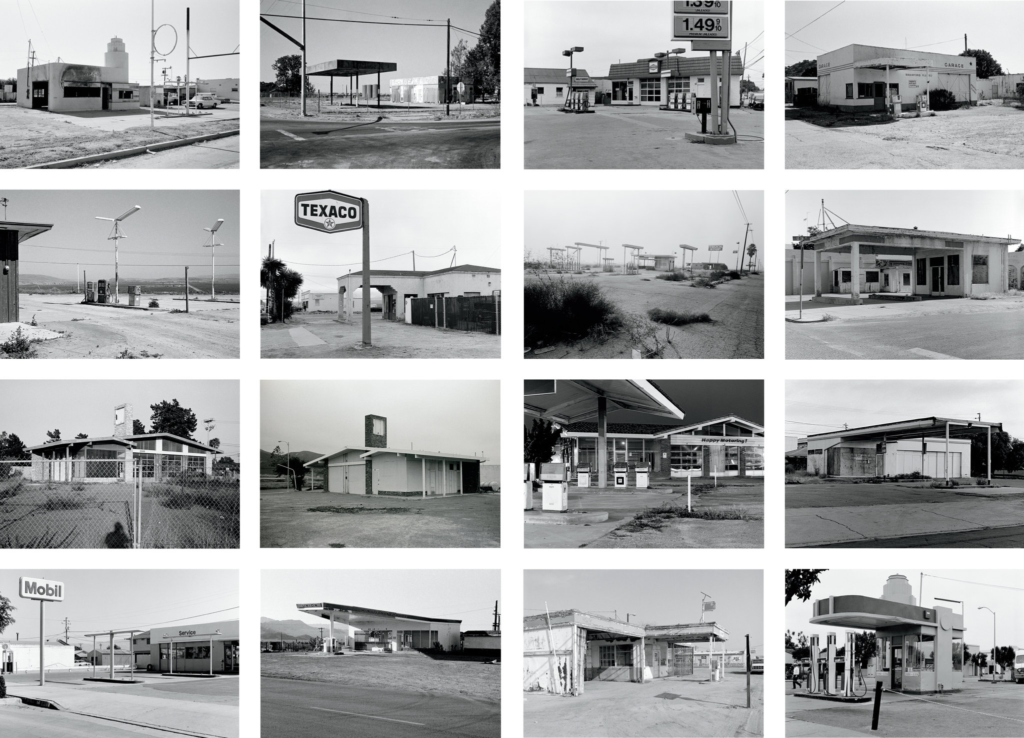
Ed Ruscha made his first book in 1963 and called it “Twenty-six Gasoline Stations”, it contained 26 pictures of gas stations. This is the book:

They fit the deadpan style with no particularly interesting features that the Berchers originally did. His motive was to intentionally make the photos boring to show people that the area had exactly that level of excitement in the actual place.

Havre Des Pas Photoshoot

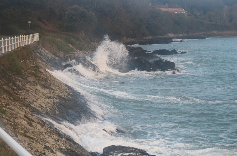
As a class, we went to Havre Des Pas to take images of urban landscapes.

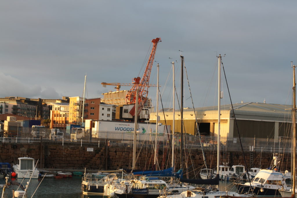
We tried to walk round from Havre Des Pas to the harbour, we ended up stopping near the Jersey Electricity power plant. I managed to take over 200 images during this walk.

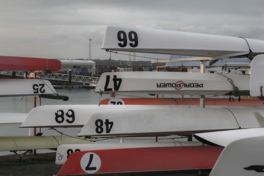
These are some of my favourite images that I took:

I think this image highlights the idea of New Topographics quite well as it shows the industrial world mixed in with the natural world.
This image also shows the industrial world mixed in with the natural world.

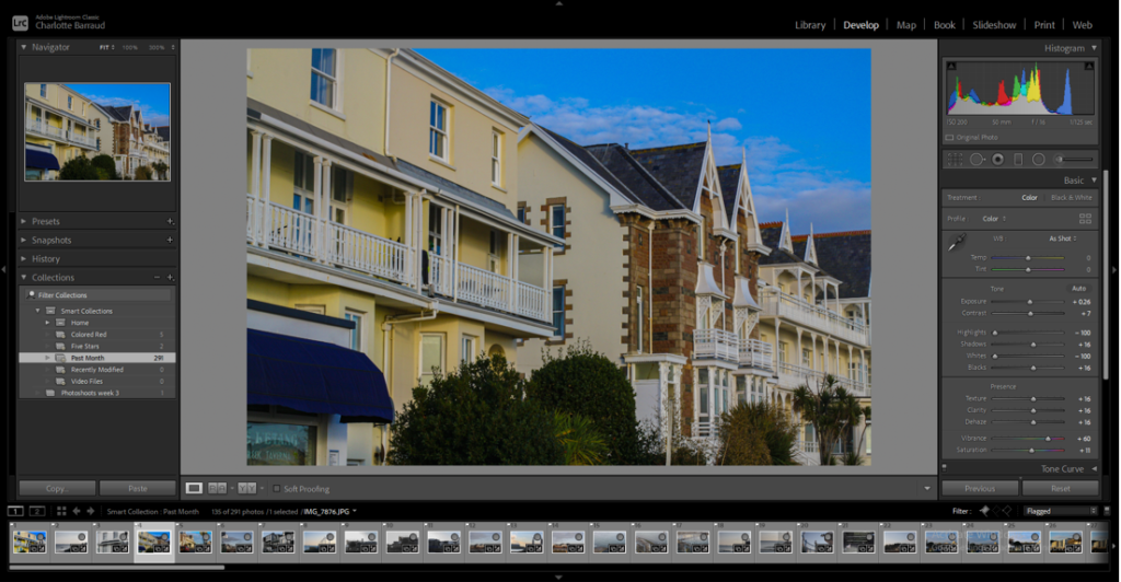
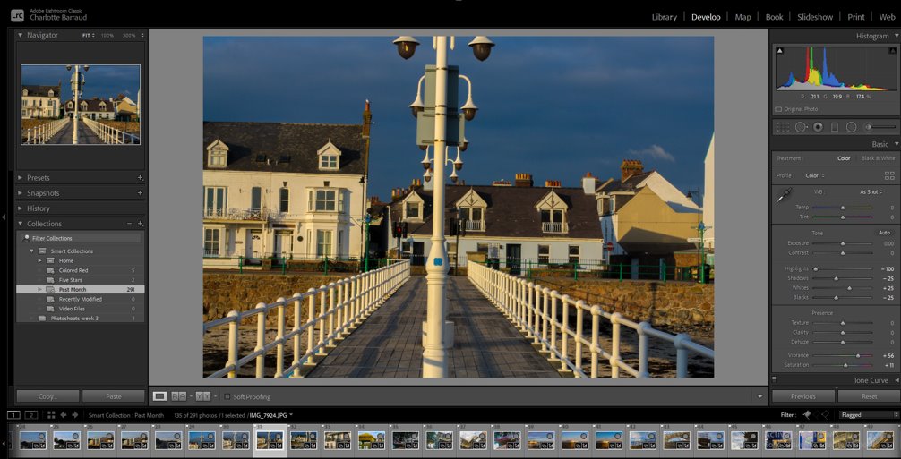
When we got back into class, I used lightroom to sort the images and edit them.

I ended up having 291 images total but not all of them were good so I flagged the good ones, this narrowed it down to 135 images.

Here are some of my favourite edits of my images:

Urban Landscapes

Topography

Topography highlighted the changes in the world, it was a rejection of romanticism and its ideas. Instead of highlighting nature, it highlighted the industrial world and how it has destroyed nature. Topography was both a reflection of the increasingly suburbanised world around them, and a reaction to the tyranny of idealised landscape photography that elevated the natural and the elemental.

New Topographics | Frieze
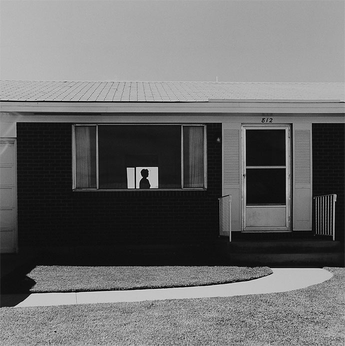
Robert Adams, Mobile Homes, Jefferson County, Colorado, 1973. 
New Topographics (Redux) : The Picture Show : NPR
Landscape, Los Angeles, 1974, Frank Gohlke

These are two very famous images made by Robert Adams and Frank Gohlke.

Robert Adams

Robert Adams was the first person to properly go against Ansel Adams’ (who is completely unrelated to him) ideas of photography and romanticism.

It was said that “his subject has been the American west: its vastness, its sparse beauty and its ecological fragility…What he has photographed constantly – in varying shades of grey – is “what has been lost and what remains” and that “his work’s other great subtext” is silence…”

Analysis of an image

This image has a very dark tone to it, this could suggest the disappointment from Robert Adams about the industrial world, it could also show the loneliness of the woman in the image, she is stood alone in the house, that you could say looks like a jail cell because of how boxy it is. I think the conflict of the natural world and the industrial world is the woman being in the jail-like house as it could be said she is of the natural world, being human. Like I said before, the image is very boxy, apart from the woman, most of the lines are straight lines, quite often making squares, this once again creating a jail-like box around the woman.

Romanticism Photoshoot 1

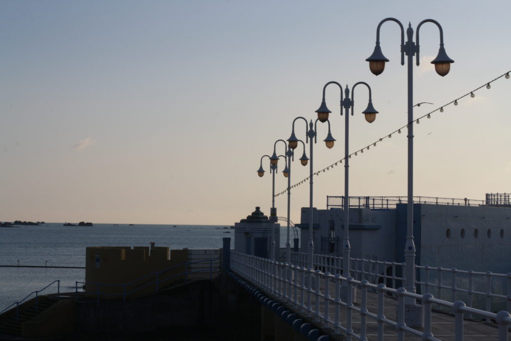
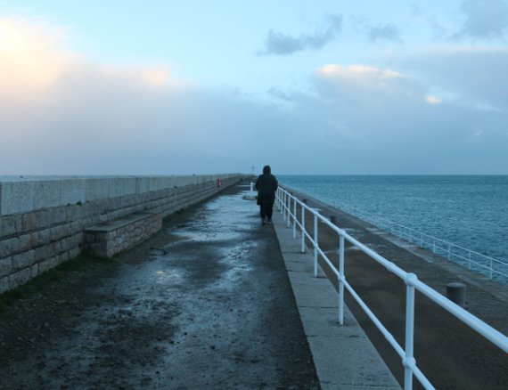
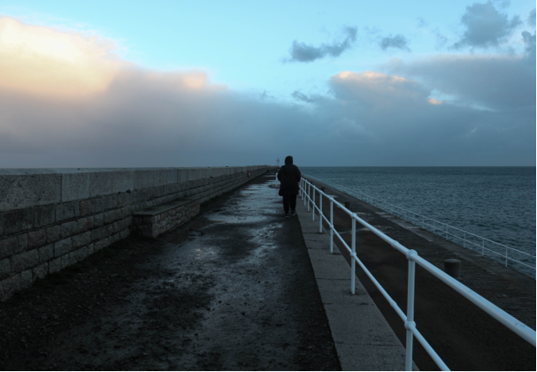
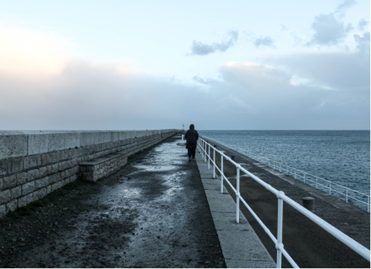
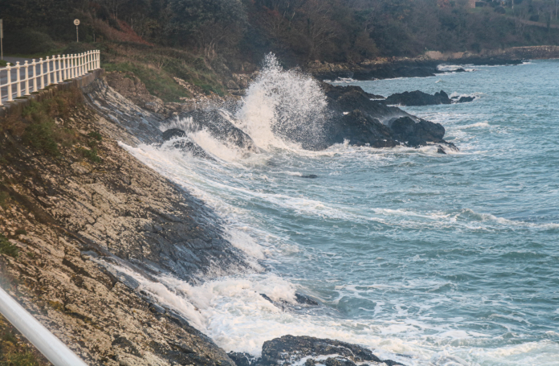
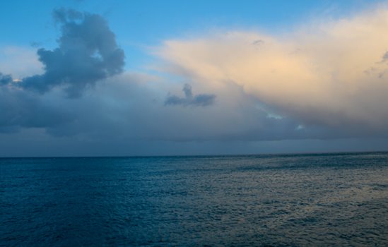
I went out to St Catherine’s breakwater, taking images going out from the breakwater to each side of it.

 These are some of my favourite images:

I then used lightroom to go through and edit them all.

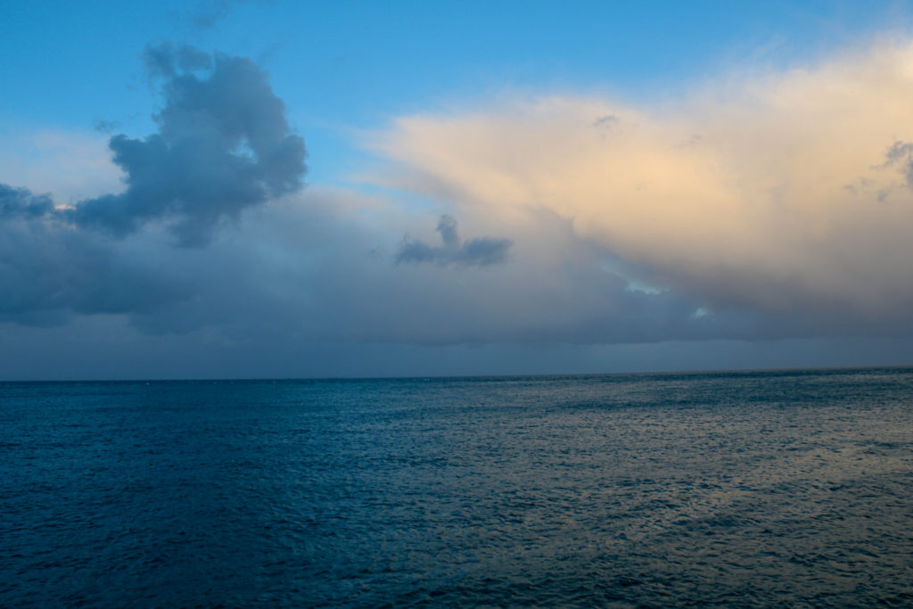
Here are some of my favourite edited images:

These two images are very similar but I have edited them in a way that makes them different, with one of them showing the light and colour and then other being quite dark.

Ansel Adams

You don’t take a photograph, you make it.’ – Ansel Adams

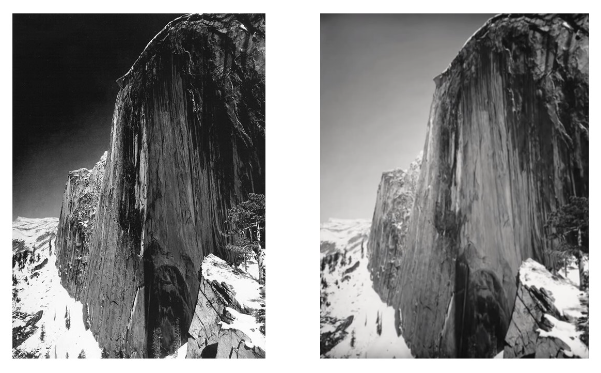
Ansel Adams was a 1940s photographer known for his black-and-white images of the American landscapes. He advocated “pure” photography which favoured sharp focus and the use of the full tonal range of a photograph. He even created a Zonal System to ensure that all tonal values are represented in the images. Zone 0 is pure black, showing no details. Zone 5 is “middle grey”, it would represent the sky in a lot of his images. Zone 10 is pure white, it would show light sources or reflections in an image, in his famous image, Face of Half Dome (1927) it shows the colour of the snow on the side of the half dome.

Monolith, The Face of Half Dome, Ansel Adams; Publisher: Sierra Club | Mia
Face Of Half Dome, 1927
Screen Shot 2016-01-12 at 3.06.26 PM
Ansel Adams’ zonal system

He helped found the group f/64, which was a group of photographers that focused on ‘pure’ photography. This type of photography focuses in on sharp focus and the use of the full tonal range in the image. He was also seen as an advocate of environmental protection, national parks and creating an enduring legacy of responses to the power of nature and sublime conditions.  Other members in Group f/64 included Edward Weston Dorothea Lange, Imogen Cunningham among other female photographers who has been overlooked in the history or photography.

Exhibition poster for An Exhibtion of Photographs by Group f/64, University  of Missouri] | International Center of Photography
Monolith, the face of Half Dome, 1927
Ansel visualised an image and when the first image (the right photo) didn’t look like his visualisation, he changed the filters and took another photo (on the left) which portrayed his visualisation perfectly

This is one of Adams most famous pieces, featuring a cliff face which Adams photographed in 1927. Adams hiked along Yosemite’s LeConte Gully. Once getting to the desired location, Adams set up his camera and snapped a photo, which resulted in the photo on the right. Despite it being an accurate photo, it wasn’t what Adams has previously visualised and he was unsatisfied with it. He decided to add the red filter, and once again snapped a photo. This time, it resulted with the image on the left, a perfect replica of Adams’ visualisation, a darker image with a variety of tones and high contrast.