
BEST SHOTS
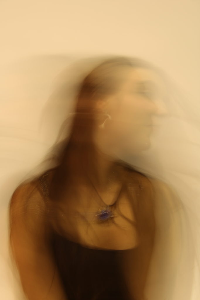
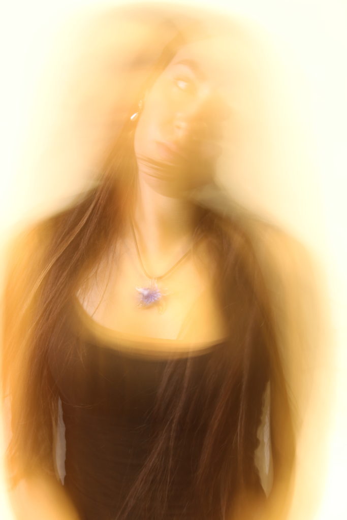
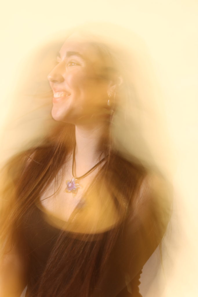
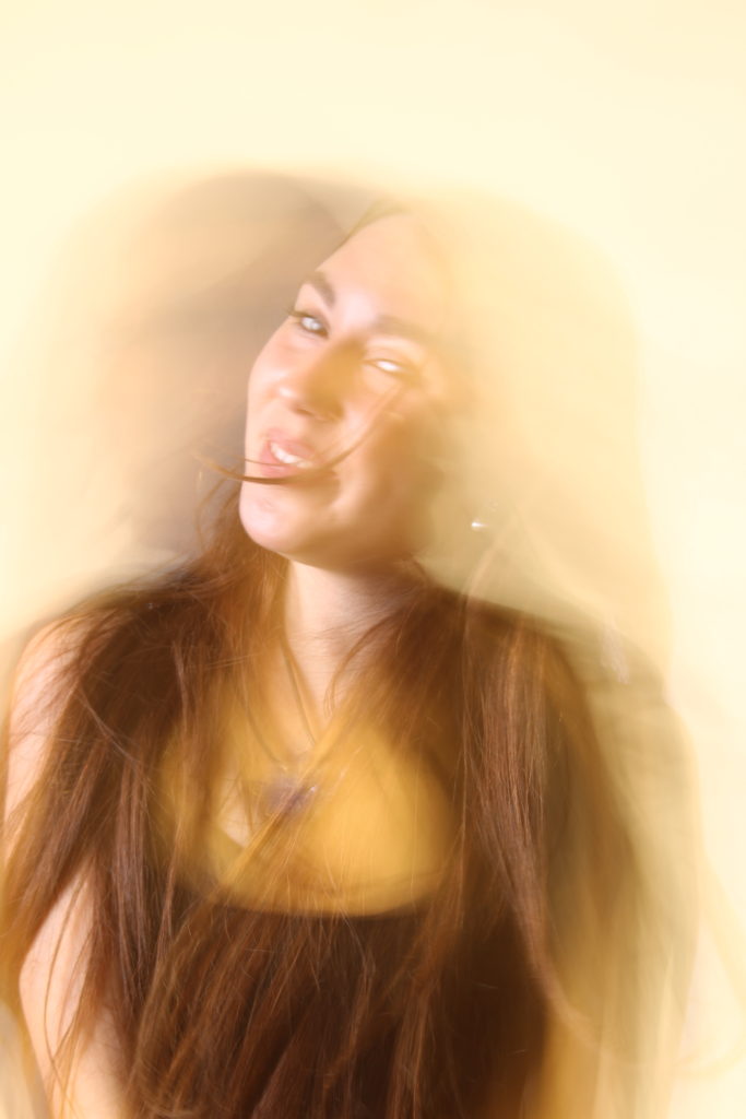
EDITING

FINAL EDITS
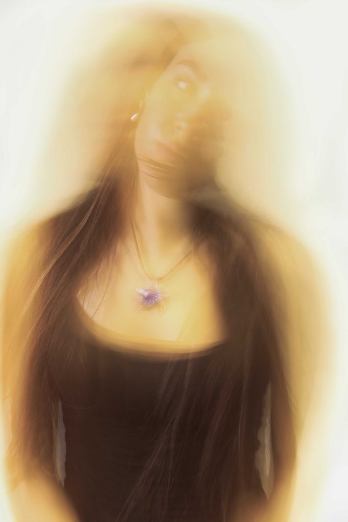
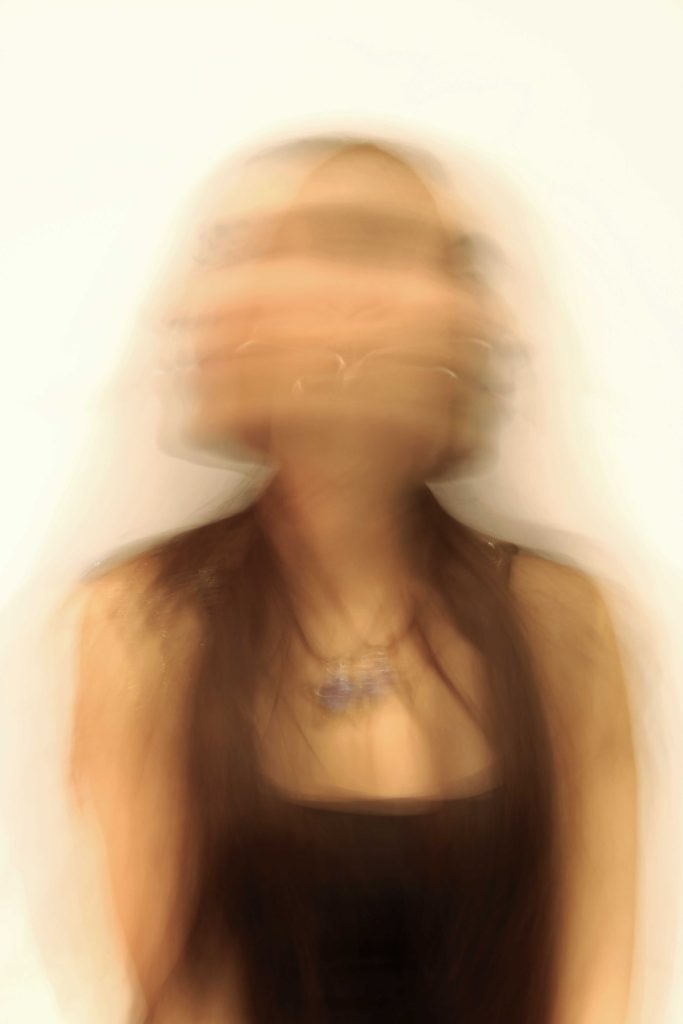
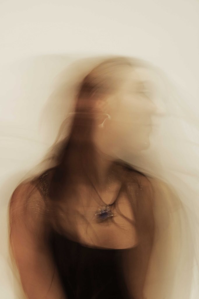
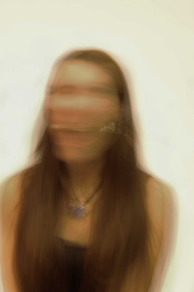

BEST SHOTS


EDITING


FINAL EDITS


WHAT IS IDENTITY?
Identity is the fact of being who or what a person or thing is. Personality traits, abilities, likes and dislikes, your belief system or moral code, and the things that motivate you are what make up your identity. Knowing and understanding your identity gives you a sense of belonging which heavily contributes to your confidence and wellness. It can also help you understand the world around you as well as the challenges we face in the world.
WHAT IS FEMININITY ?
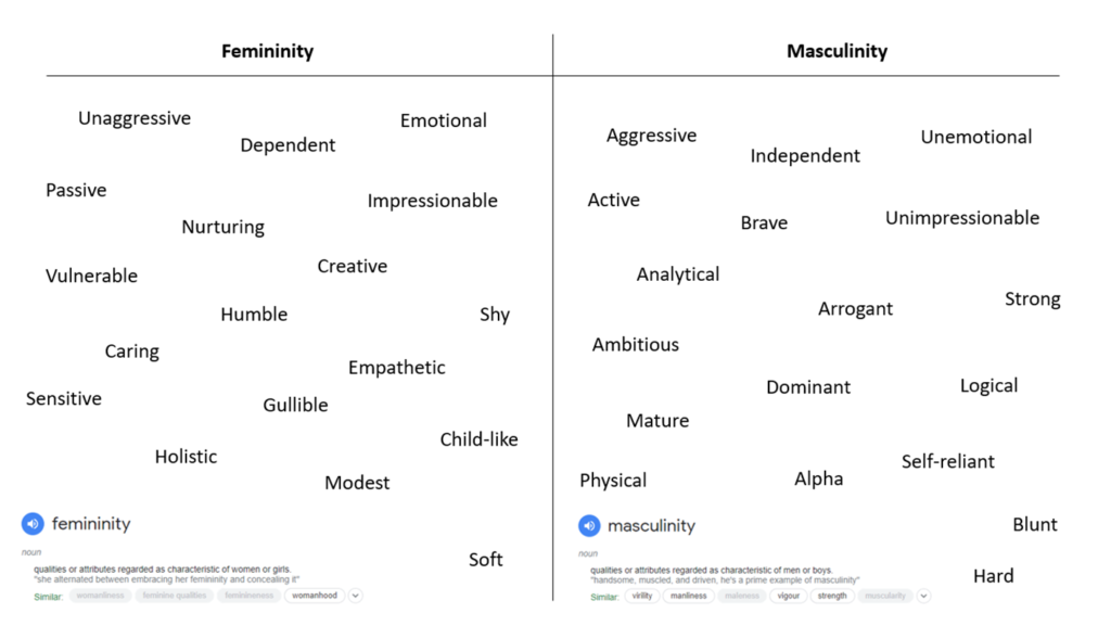
“Femininity is a set of attributes, behaviours, and roles generally associated with women and girls. Femininity can be understood as socially constructed, and there is also some evidence that some behaviours considered feminine are influenced by both cultural factors and biological factors.”
Over history, widely influential cultural systems, such as the religions Judaism, Christianity, and Islam, have explicitly directed that women’s primary social role is to be obedient wives and devoted mothers which is now the very heavy stereotype in the media and in the workplace. Thankfully, in recent years, due to feminist movements, women have been given more space and less expectations on what they can/cannot do.
WHAT IS MASCULINITY?
“Masculinity is a set of attributes, behaviours, and roles associated with men and boys. Masculinity can be theoretically understood as socially constructed, and there is also evidence that some behaviours considered masculine are influenced by both cultural factors and biological factors.”
In many Western cultures, the dominant masculine construct has been created for men by men. It is part of the day-to-day interactions that must be navigated by young boys as they grow into adulthood, and by men throughout their lives.
What all of these traits share is the fact that they are all human traits that are found to different degrees in all people regardless of their gender. Most of us express and experience some combination of traits from both feminine and masculine.

WHO WAS CLAUDE CAHUN?
Born October 25, 1894, Lucy Renee Mathilde Schwob was a French surrealist photographer who explored gender identity and expression through their work. After attending the University of Paris, Sorbonne, she started creating self portraits in 1912 when she was 18 years old. In the early 1920s, she switched to the gender neutral name Claude Cahun after previously changing their name three times. She moved to Jersey in the late 1930s where her and her step-sister/lover disguised as non-Jews while producing anti-Nazi propaganda. Her work was lost and forgotten after World War two but we rediscovered and brought to popularity in the 1990s.
“Under this mask, another mask, I will never be finished removing all these faces.”
– Claude Cahun
She cut her hair very short around 1915 and started taking photos of herself on a neutral background dressed either as a sailor, a sportsman, or in men’s suit, this was the start of her photography of her self identity. Claude Cahun loved repeated patterns and often used doubling and reflection to question and explore gender or identity. She also loved self portraits and being able to show off her different personalities and identities through her photography.
“You could call her transgressive or you could call her a cross dressing Man Ray with surrealist tendencies.”
– David Bowie (2007)
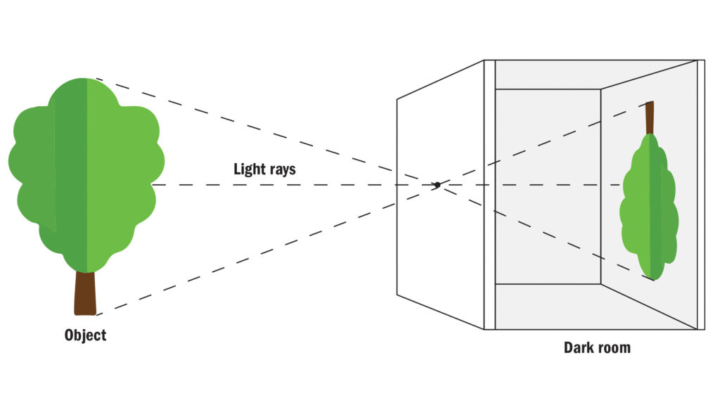
The Camera Obscura (Latin for ‘dark chamber’) is the ancestor of the photographic camera, a blacked-out room with a small hole or lens which allows the outside image to be projected into the room upside down. The earliest known accounts of the Camera Obscura date back to 400BC from Chinese Philosopher Mo-Tzu. After thousands of years, the first scientific outlined description was in 1000AD by Ibn Al-Haytham. It was mostly used for drawing, it allowed the artist to trace the projected image and produce a high quality and accurate work of art. Famous artist such as Leonardo da Vinci and Michelangelo used the camera obscura, da Vinci wrote a detailed account of the it in his 1,286 paged collection of drawings and writing called “Atlantic Codex” in 1490. It was also used for studying eclipses, it reduced the risk of damaging their eyes while looking directly into the sun. This invention has now developed into the modern day “Pinhole Camera” .
“…Here the figures, here the colours, here all the images of every part of the universe are contracted to a point. O what a point is so marvellous!”
– Leonardo da Vinvi, 1490

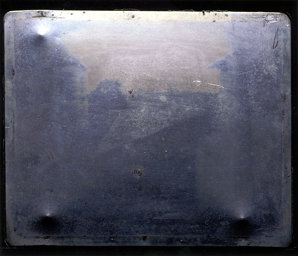
Joseph Nicephore Niepce developed the Heliography in 1927, the world oldest surviving photographic technique. This process created the first and earliest known permanent photograph, taken from a natural scene, Niepce’s iconic photograph “View from the Window at Le Gras” in 1826. This picture is often acclaimed the most important and famous photographs of all time. The image and Niepce’s research was effectively lost in the 19th century despite all his efforts to get his work publicised and sell his invention. His iconic first photo was then rediscovered by photography historian Helmut Gernsheim in 1952 along with many of his writings.
For the time, Heliography was a ground-breaking process. The procedure worked by Niepce dissolving light-sensitive bitumen in oil of lavender and applied a thin coating over a polished pewter plate. He then inserted the plate into a camera obscura and positioned it near the area that he wanted to photograph.
Louis-Jacques-Mandé Daguerre was a French painter and physicist that invented the first practical process of photography, the Daguerreotype, in 1839. It is a direct-positive process which creates an intensely detailed image on a sheet of copper lined with a thin coat of silver without the use of a negative. The copper plate will then need to be cleaned, polished and refined until it looks like a mirror. The polished plate is then taken to a dark room and sterilised with chemicals before then being left in the open to be exposed to what the photographer wants to be photographed. The copper plate is then returned to the darkroom where the image is “brought out” with the fumes of heated mercury before then being “fixed on” with hyposulphite of soda and then washed in water and dried. These images were very delicate and easily damaged so they often came with protective cases

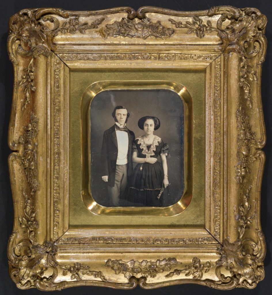
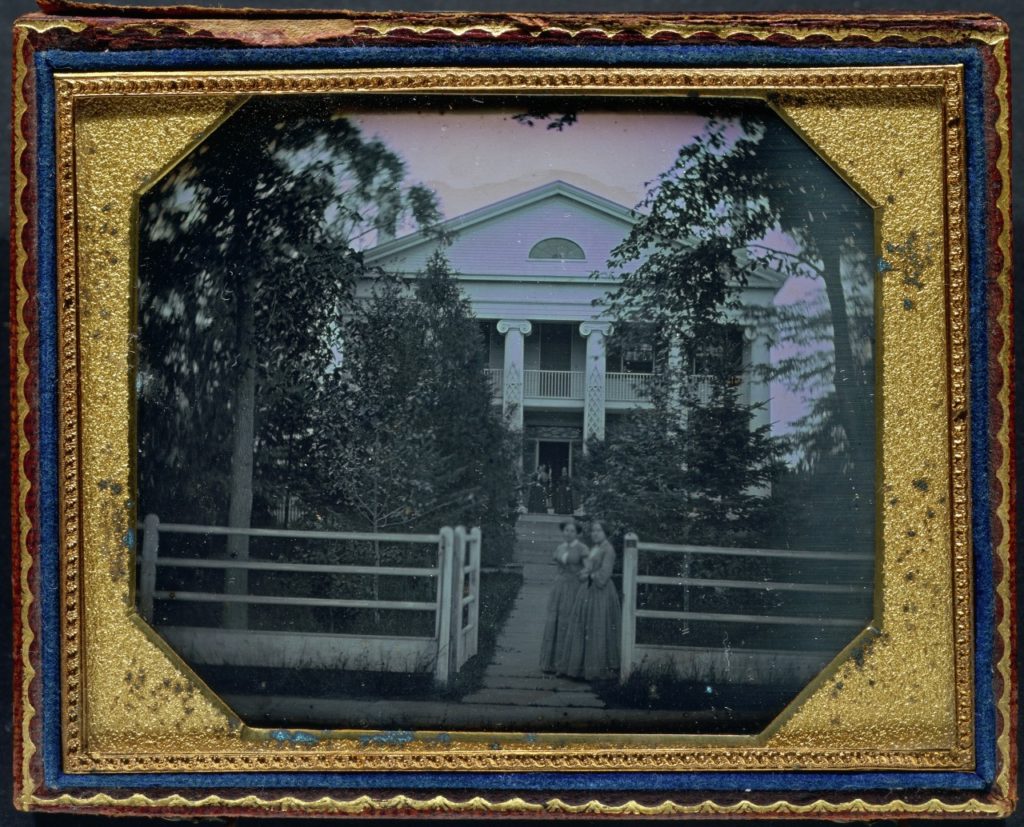
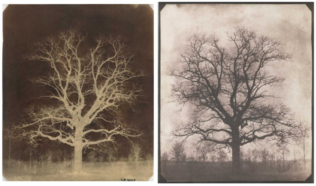
William Henry Fox Talbot invented the Calotype, also known as the talbotype, in the 1830s. The name calotype comes from the Ancient Greek καλός (kalos), “beautiful”, and τύπος (tupos), “impression”. It was the first ever negative-to-positive image process and famous for the soft texture and lack of detail A piece of paper would be bathed in chemicals (silver chloride) to become light sensitive which was then placed inside the Camera obscura and would record a negative image as it is exposed to light. These images were then printed in positive on salted paper and fixed using sodium hyposulfite.

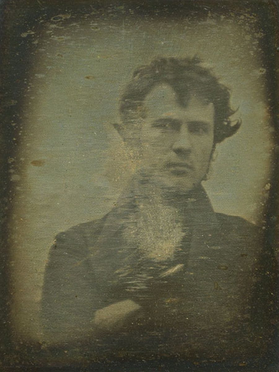
Robert Cornelius was an American photographer who took the first self portrait in 1839 in Philadelphia, USA using the Daguerreotype. He set up the camera in the back of his family store by removing the lens cap and then sitting in front of it for a minute before then covering the lens again. On the back of the image, it said “The first light Picture was ever taken. 1839.”
“Catching a shadow is a thing no more to be laughed at. Mr Cornelius, in one matter, has outstripped the great master of the art.”
–GODEY’S LADY’S BOOK, APRIL 1840
Born in the 1860s, pictorialism flourished for several decades after and was a photographic approach that looks to emphasis beauty rather than documentary. Pictorialism creators took photography and reinvented it as an art form, placing beauty, expression, and composition above creating an accurate visual record. Pictorial photographs often had a soft focus and was printed on one or two colours rather than black and white, also often including brushstrokes or other similar visible manipulation to the surface.
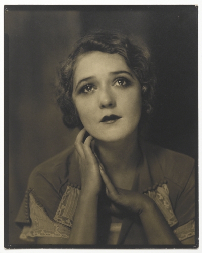
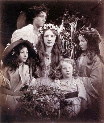
Julia Margaret Cameron was a British photographer who was considered one of the most important Pictorial photographers in the 19th century. Born in 1815, her famous portraits of Victorian men and women established herself herself first among Calcutta’s Anglo-Indian upper-class. She picked up photography late after getting a camera from one of her children at 48 years old, she went on to take over 1200 photographs over 14 years.

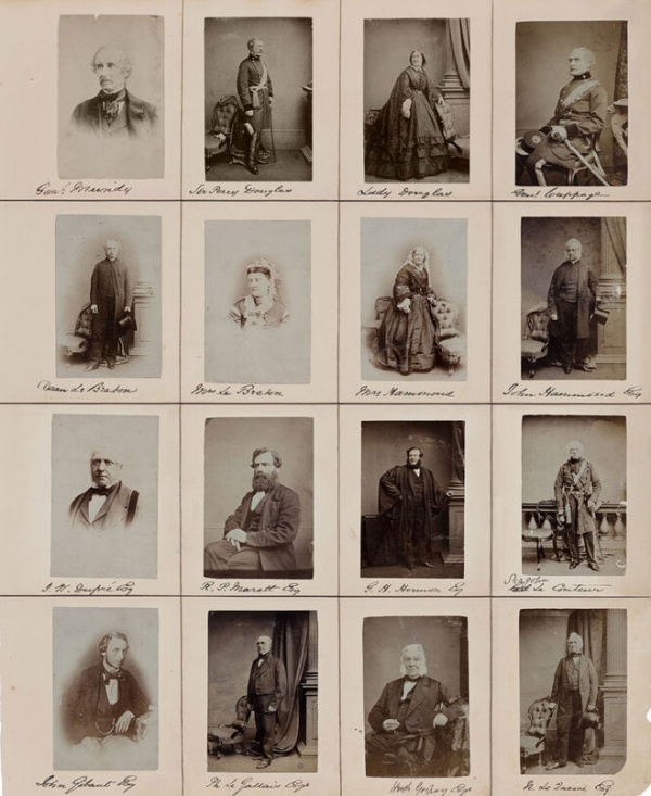
Henry Mullins was a photographer working at the Royal Saloon, at 7 Royal Square in Jersey during the 2840s. He would photograph singular, duos and grouped portraits of islanders which led to almost 10,000 photographs in the Jersey Photographic Achieve, this was known as cartes-de-visite. During this time, the cost of a portrait was very high so only the upper-class and more wealthy people of Jersey got photographed. Mullins was popular with many high up officials and politicians so often photographed them, their wives and children.
Bibliography
Camera obscura: https://www.hsm.ox.ac.uk/camera-obscura
Camera obscura: http://www.photographyhistoryfacts.com/photography-development-history/camera-obscura-history/
Daguerreotype: https://www.metmuseum.org/toah/hd/dagu/hd_dagu.htm
Daguerreotype: https://www.photohistory-sussex.co.uk/dagprocess.htm
Calotype: https://www.metmuseum.org/toah/hd/tlbt/hd_tlbt.htm
Calotype: https://www.britannica.com/technology/calotype
Self-portrait: http://www.betterphotography.in/perspectives/great-masters/robert-cornelius/216722/
Pictorialism: https://www.britannica.com/technology/Pictorialism
Julia Margaret Cameron: https://www.vam.ac.uk/articles/julia-margaret-camerons-working-methods
Julia Margaret Cameron: https://www.theartstory.org/artist/cameron-julia-margaret/
Henry Mullins: https://www.theislandwiki.org/index.php/Henry_Mullins
NATURAL LIGHT
Natural light is the use of the sun to illuminate the area for the photographer. There are many different types of natural light: shade/overcast, backlighting, direct light, side light, and golden hour which is argued to be the best time to take photos.
GOLDEN HOUR

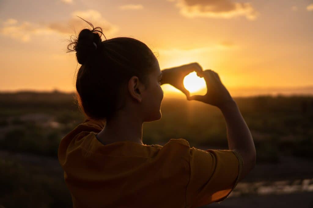
What is the golden hour?
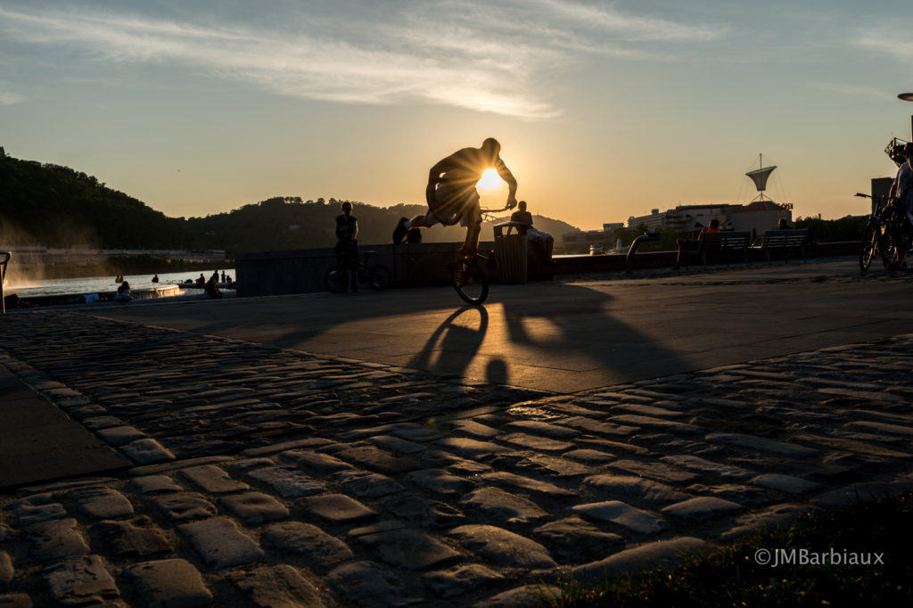
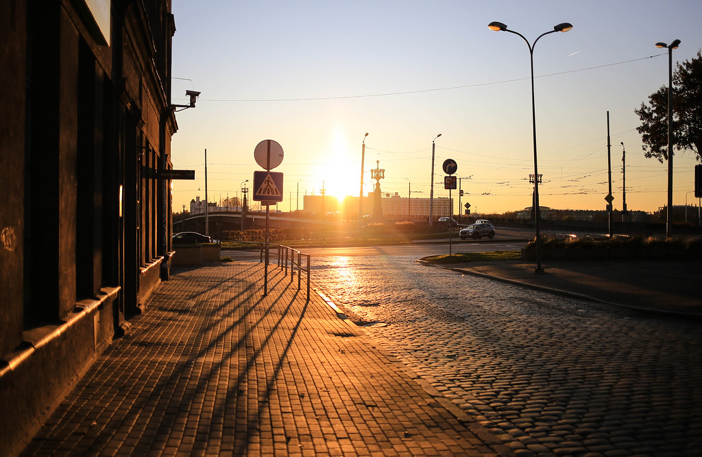
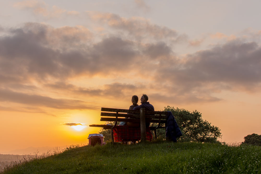
The “golden” or “magic” hour is the hour after a sunrise or the hour before a sunset, the sky is often a soft golden yellow colour as the sun leaves or enters our hemisphere. Photographers and cinematographers often deem this as ‘perfect lighting’ as the brightness of the sky matches the brightness of the streetlights, lit windows, and car lights which creates an overall blend and calmness. However, this lighting can be used to the photographers advantage by placing the subject/camera in a way that elevates the whole picture (either having the sun light come from behind the camera or in the background) and the use of shadows can be used creatively.
Light is softer – unlike the harsh rays at the other times of day, the sun is not shinning directly down, the sun rays have to travel a longer distance which reduces the intensity of the direct light. Skin tones get washed away in direct or artificial light but the golden hues enhances the subjects natural skin.
ARTIFICAL LIGHT
BUTTERFLY LIGHTING
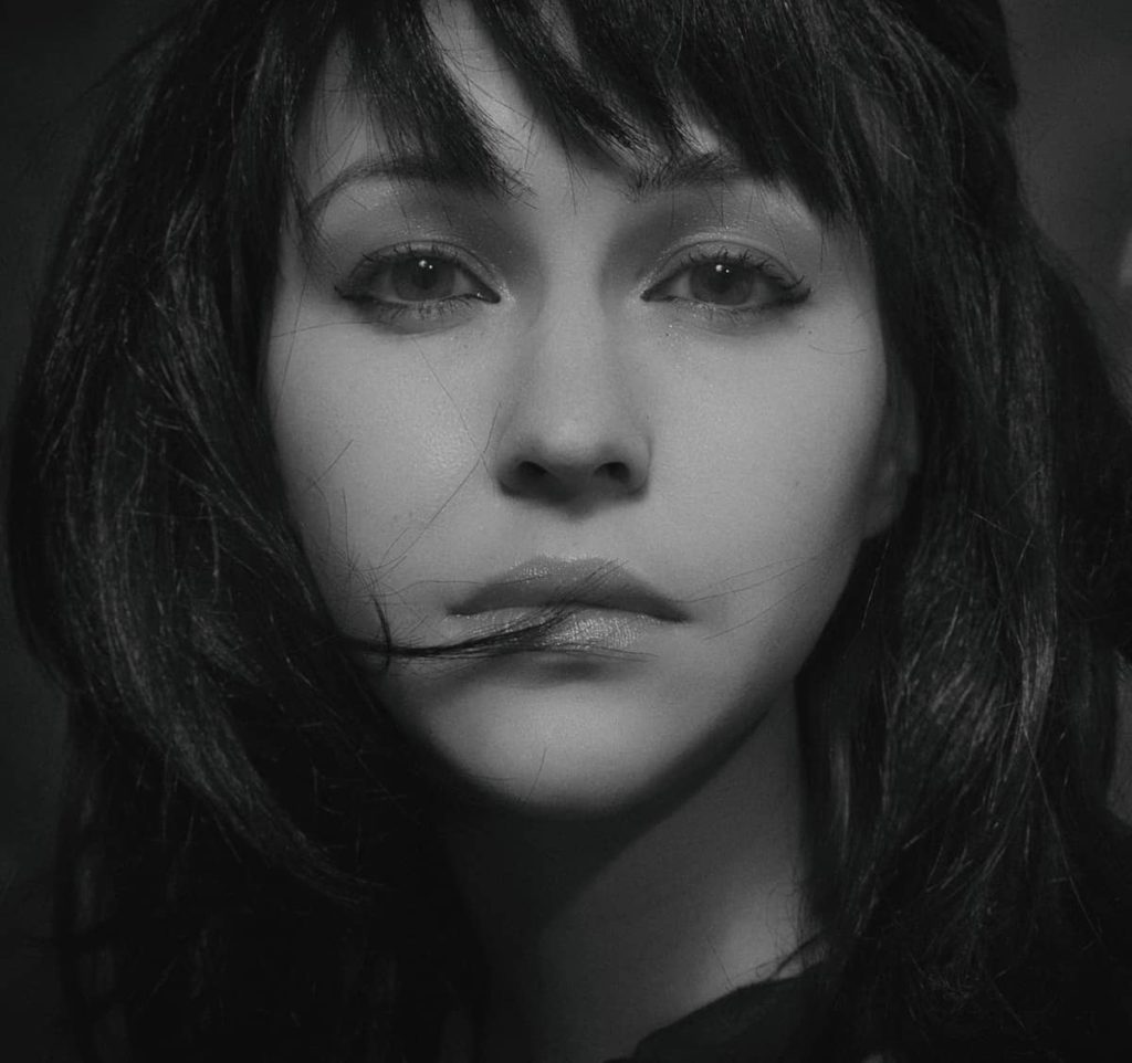
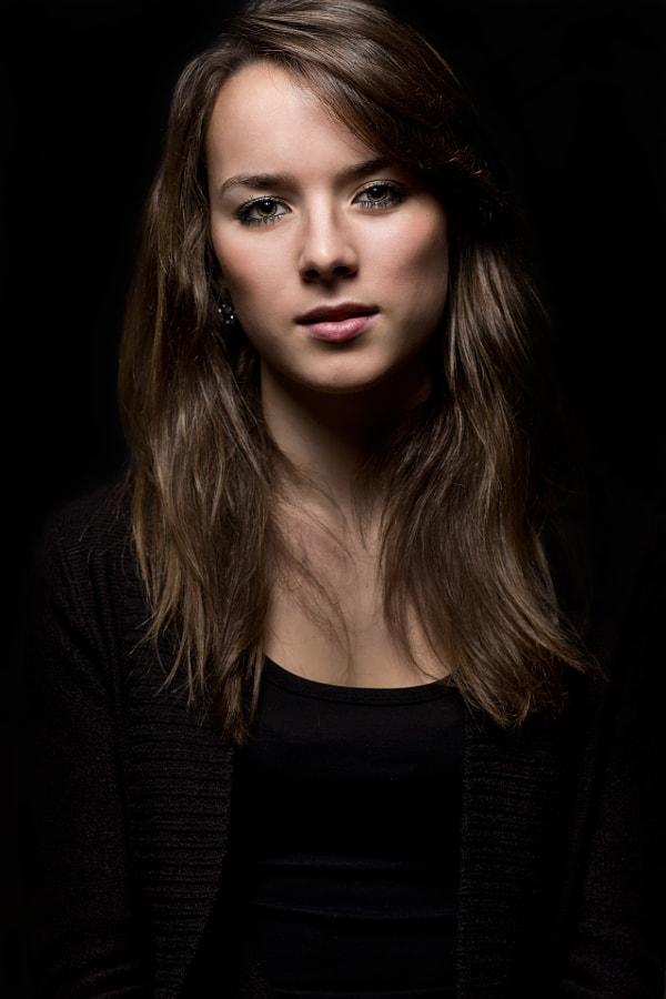
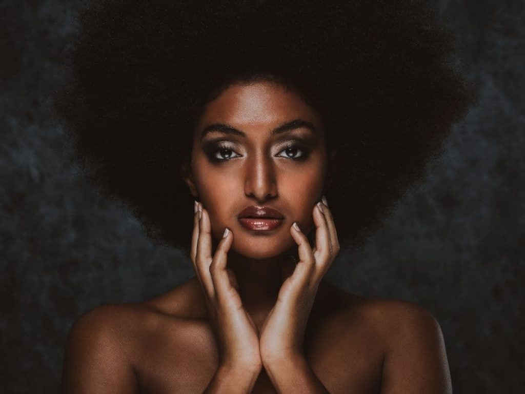

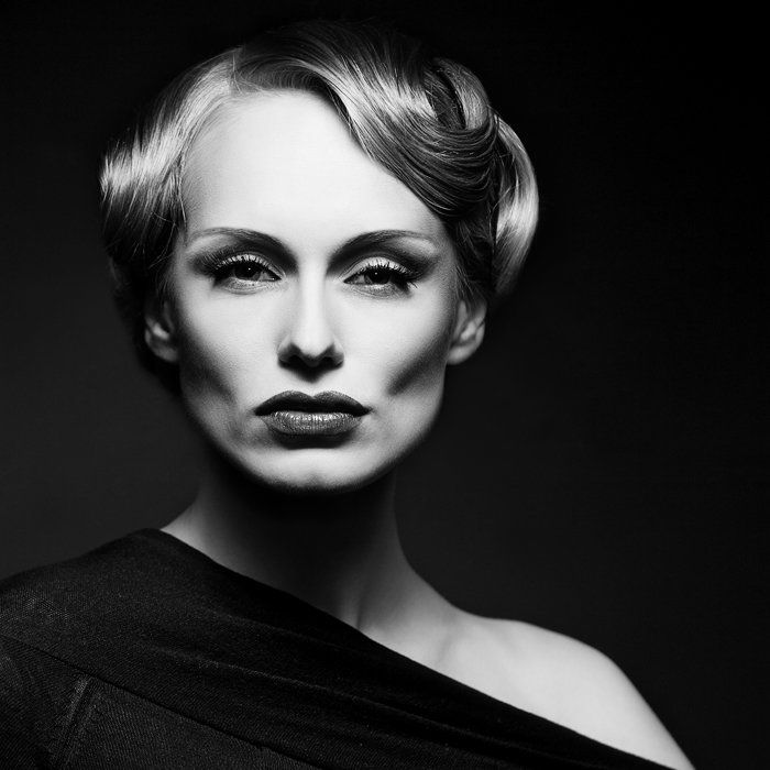
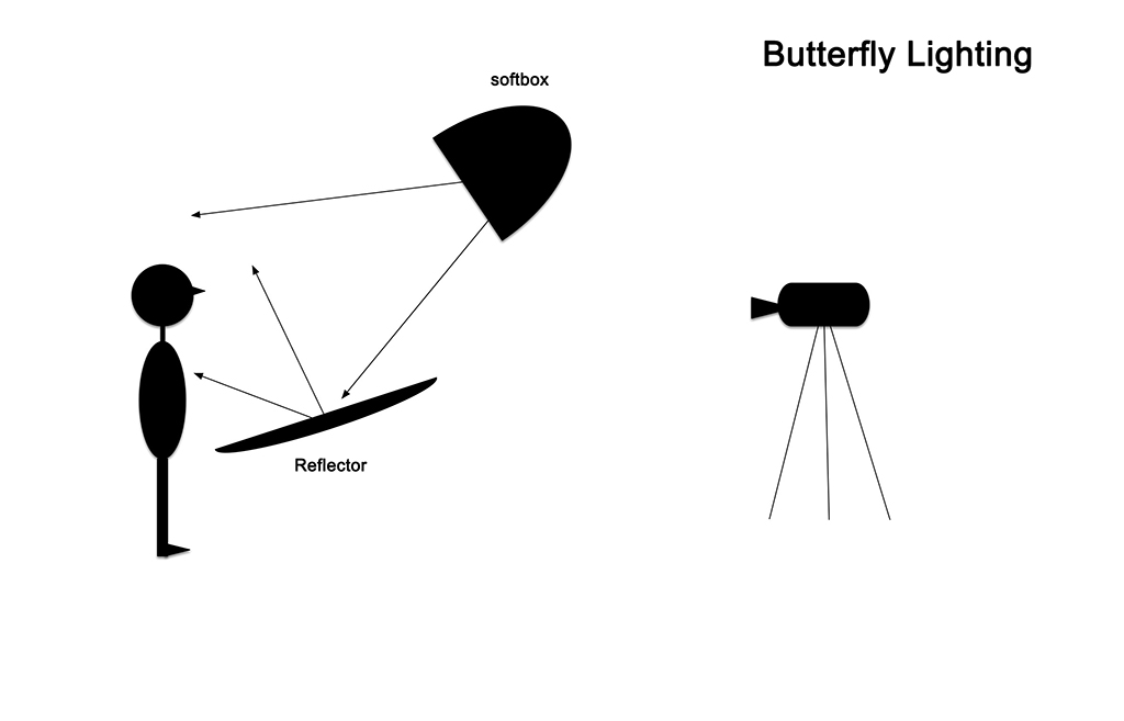
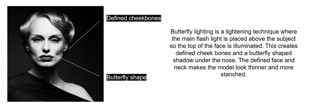
Butterfly lighting, also known as ‘paramount lighting’ or ‘glamour lighting’. The name comes from the butterfly shape shadow created under the subjects nose. A reflector is often used under the model to ensure that the light reflects back up onto the subjects face, adding more definition and highlights their features. A soft box is also used so that the light is not too harsh and doesn’t wash out the subject too much. This is the lighting set up which is used:
REMBRANDT LIGHTING
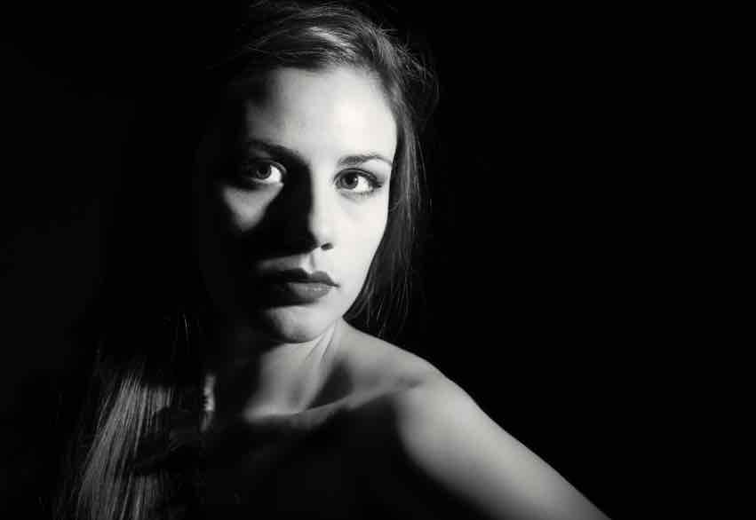

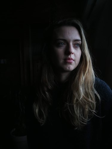

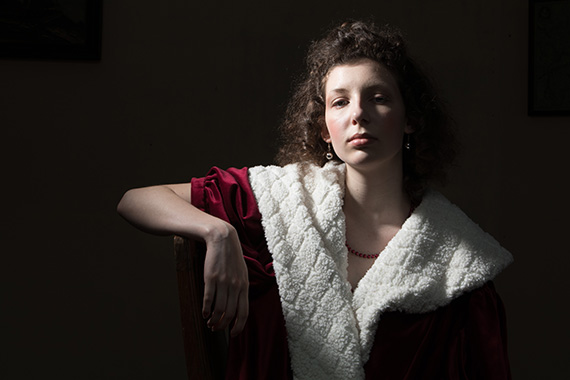
Rembrandt lightning is when the light source, often a soft box, is around 5 feet away from the model at a 45 degree angle, looking down onto the subject. This casts a shadow on one side of the models face and highlights the other side, this is also called “Rembrandt patch”. A reflector is then used so as much light is being utilised as possible.
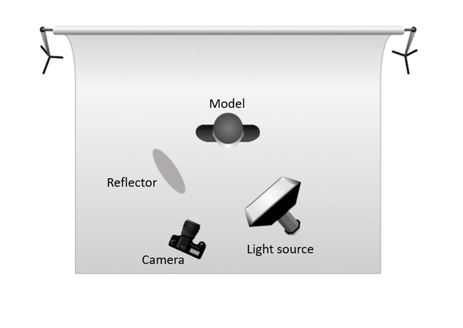
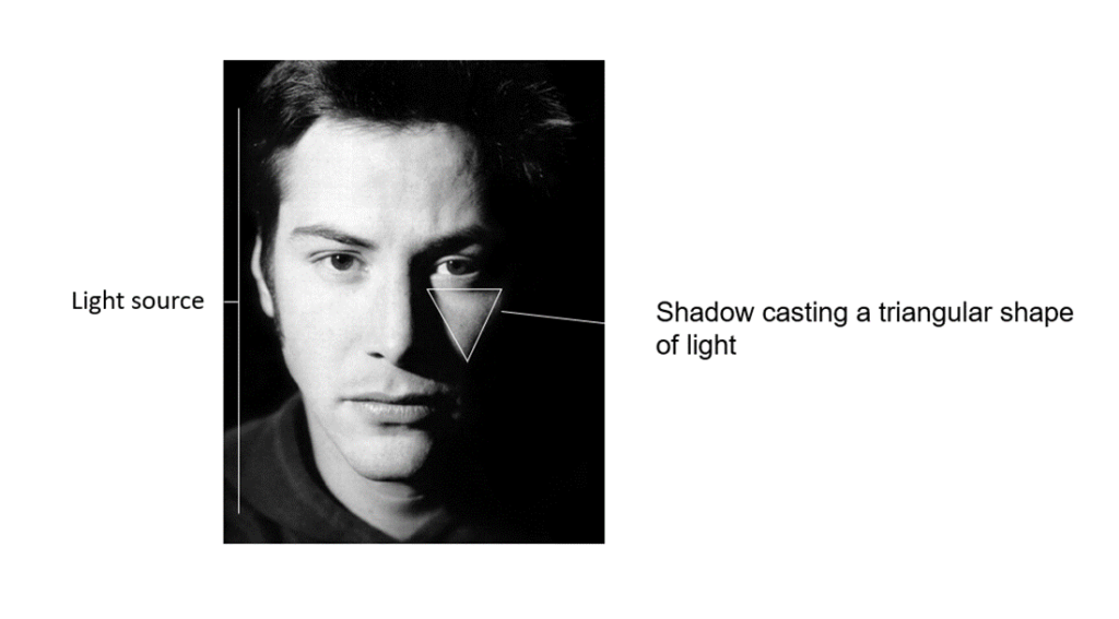
This lighting technique originated through Rembrandt’s famous paintings where he would often using different lighting techniques, but this one in particular, to elevate and add another artistic element to his paintings. The famous Dutch painter ‘coined’ the term in the 17th century
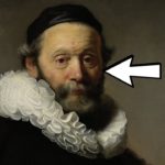
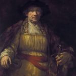
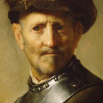
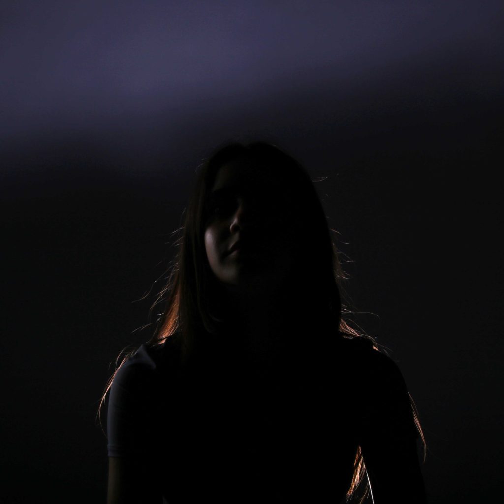
In this photoshoot, I experimented with Rembrandt, butterfly and back lighting
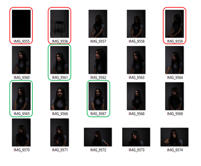
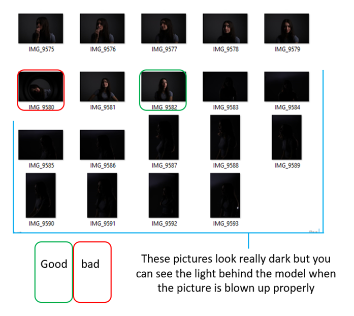
BEST SHOTS (unedited)
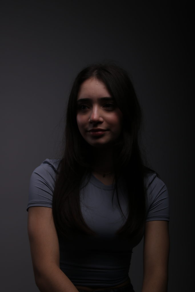
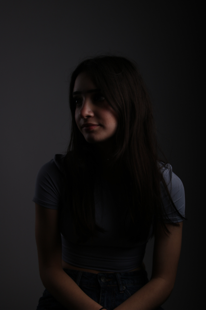


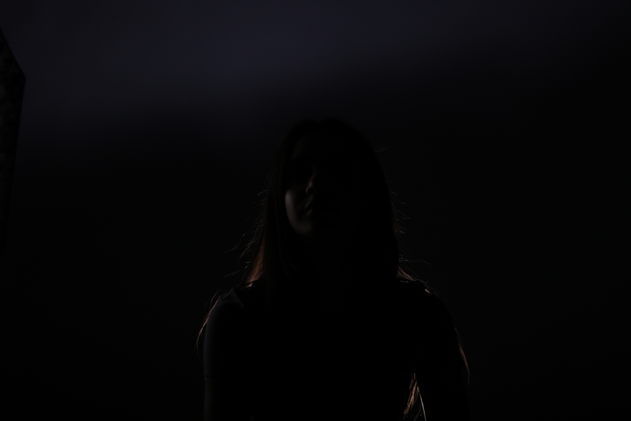
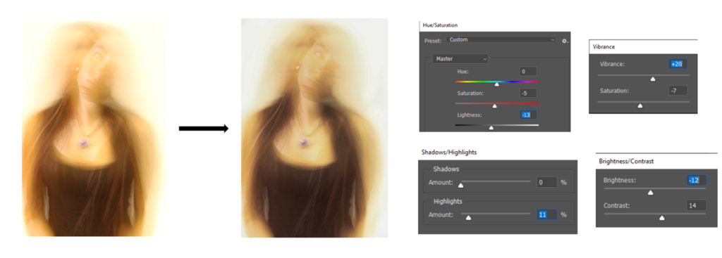
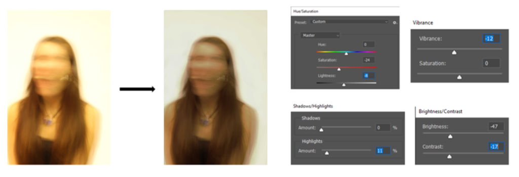
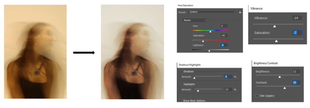
EDITING
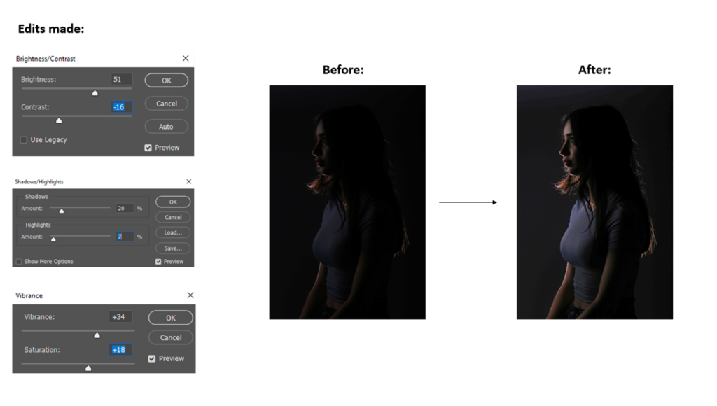
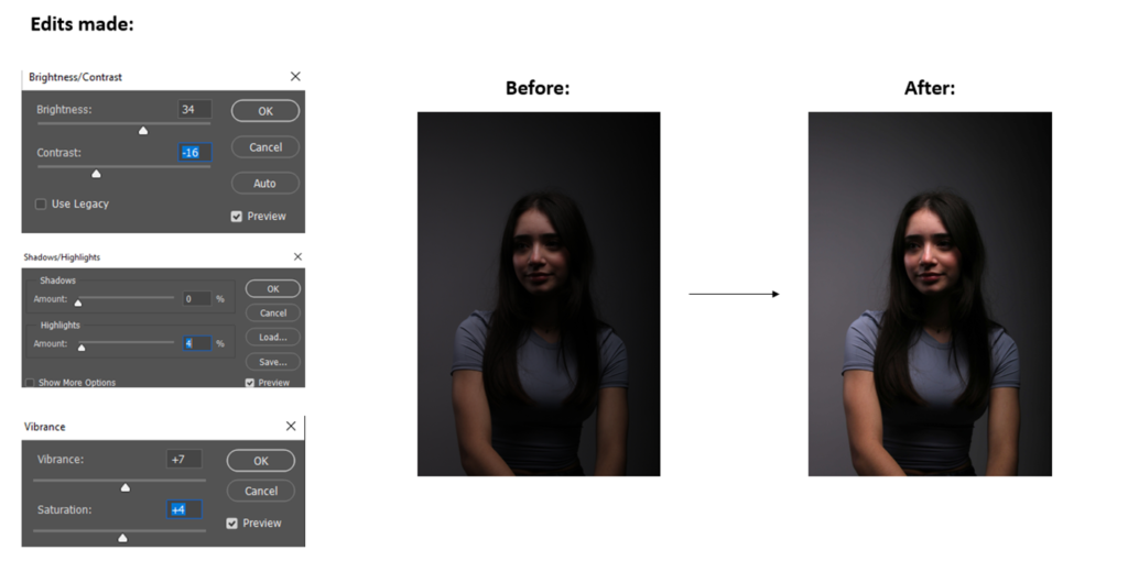
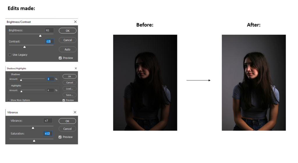
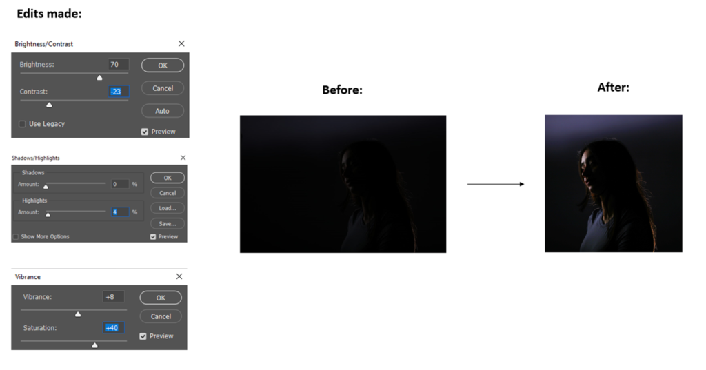
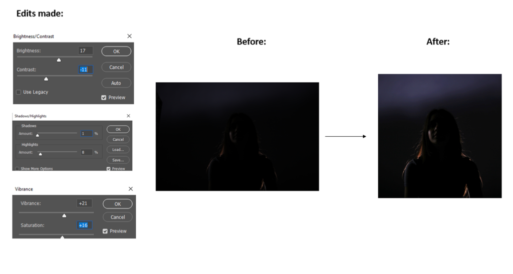
BEST SHOTS (edited)
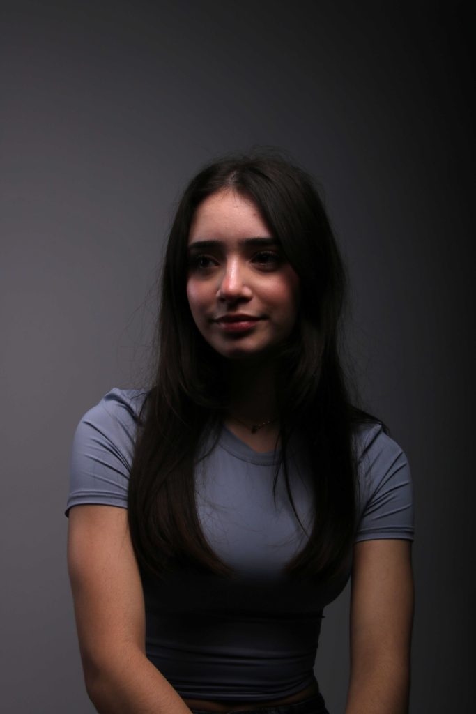
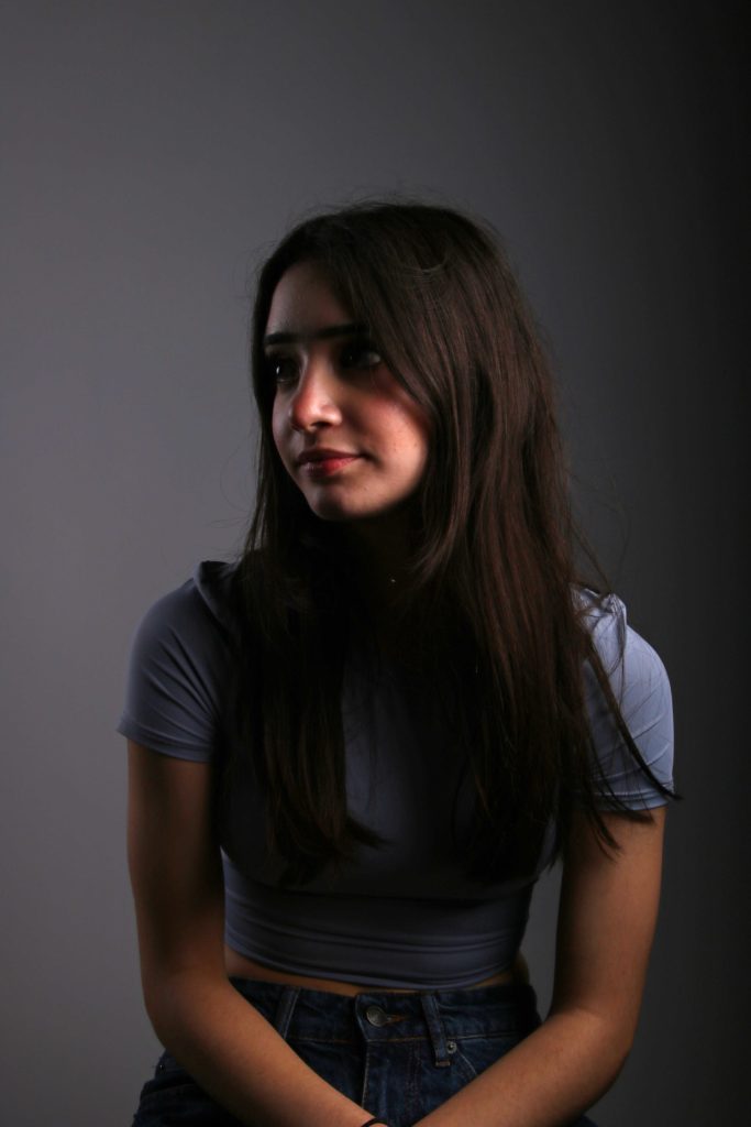
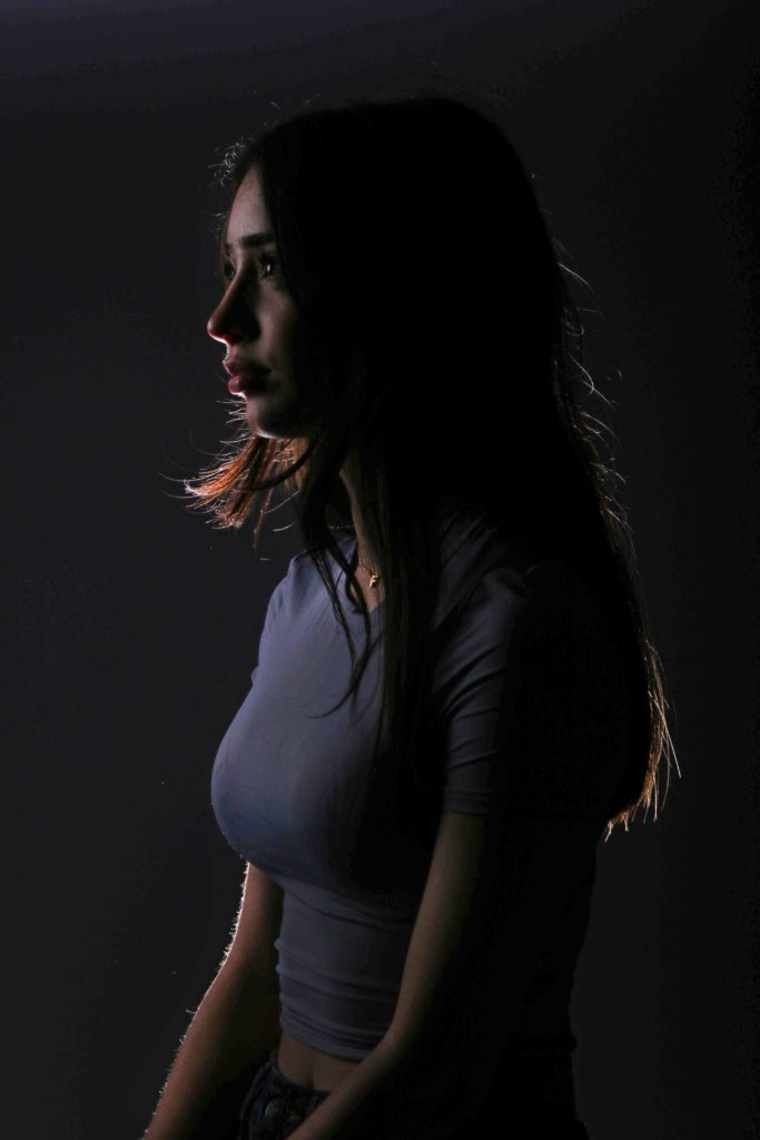

EVALUATION
What I really like about these pictures is how they all work together and how the light is used in multiple different ways while still looking simplistic and elegant. I especially like the last two with how the light hits the back of the model to we can only see her silhouette. I think I have effectively been able to show off all the different types of lighting and my standard portraiture skills. For my next photoshoot, I will make sure the photos are not as dark so I don’t need to edit them as much later on.
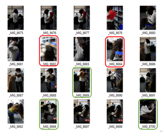
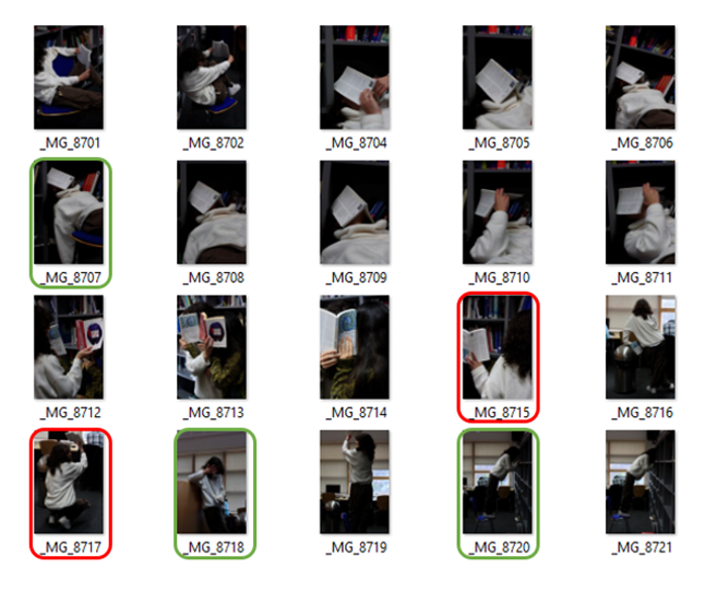

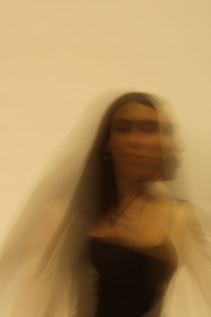
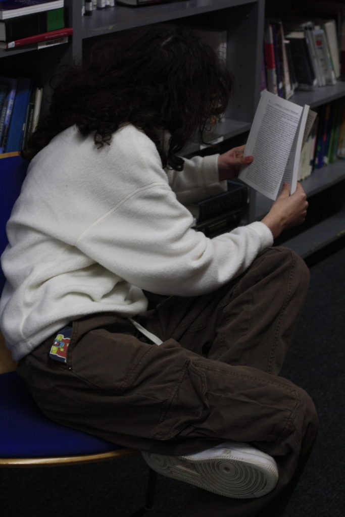
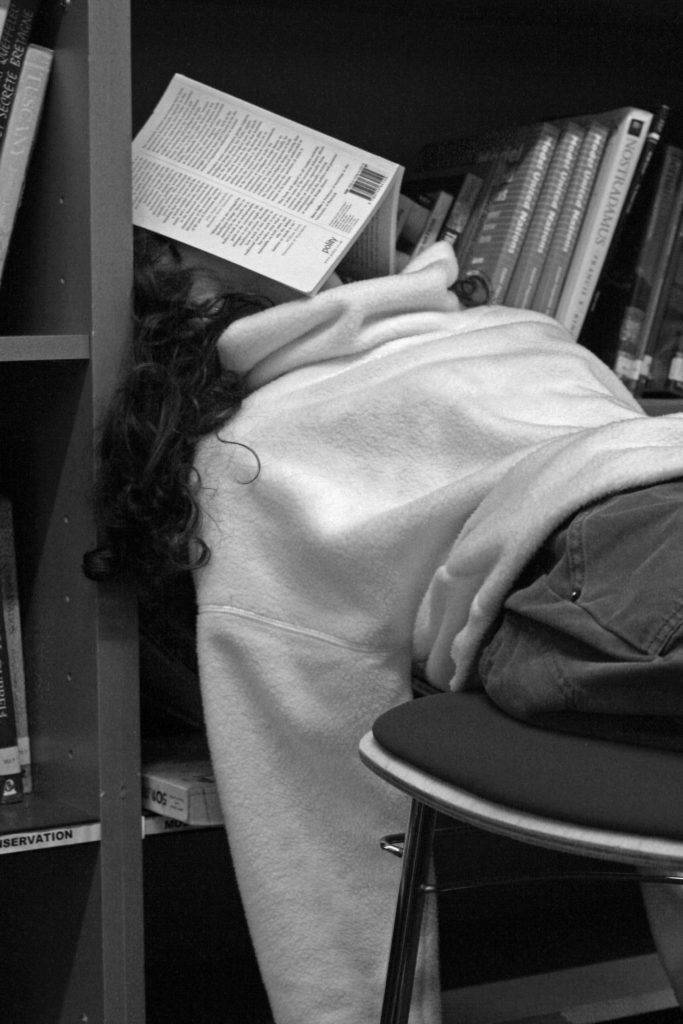
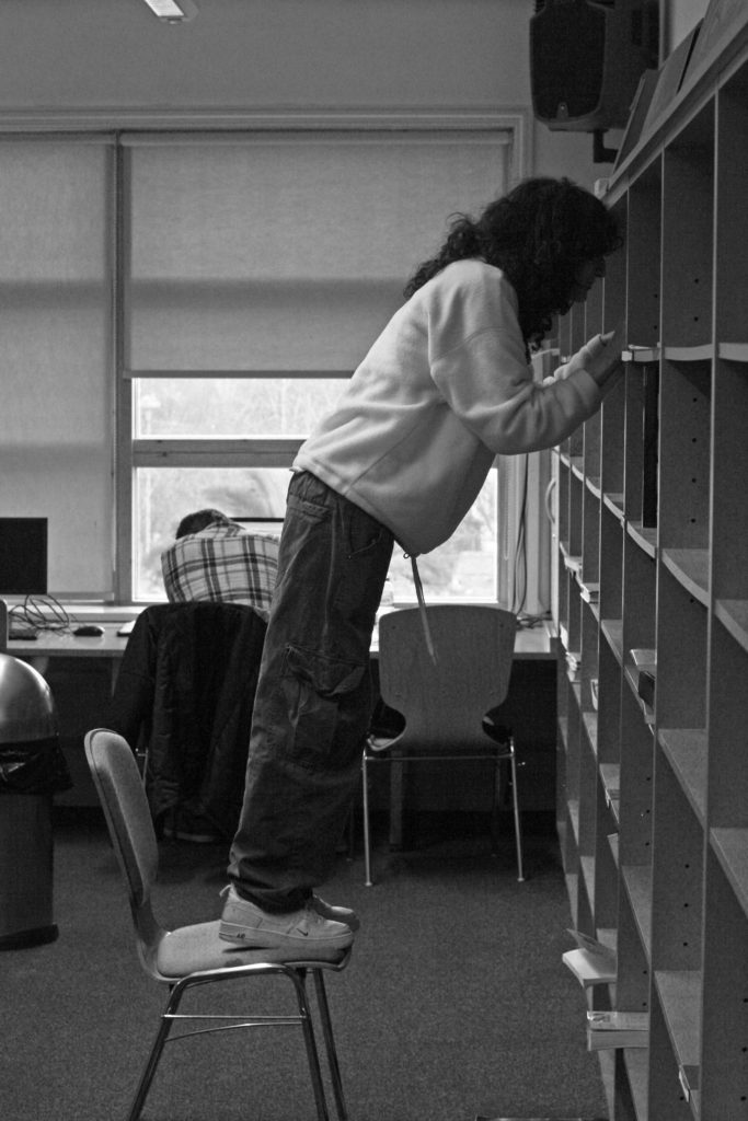
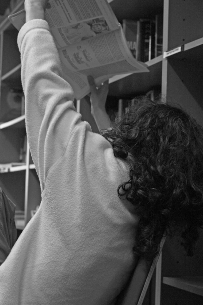
Here I have selected what I believe to be my best and worst photographs from our photoshoot in school. I had my friend pose in our library as this is where she spends a lot of time. I got her to pose in multiple different places and positions
BEST SHOTS
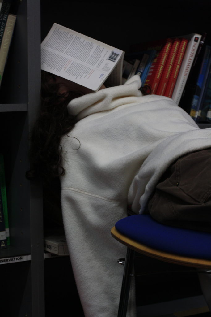

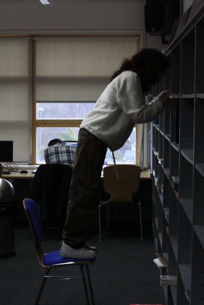

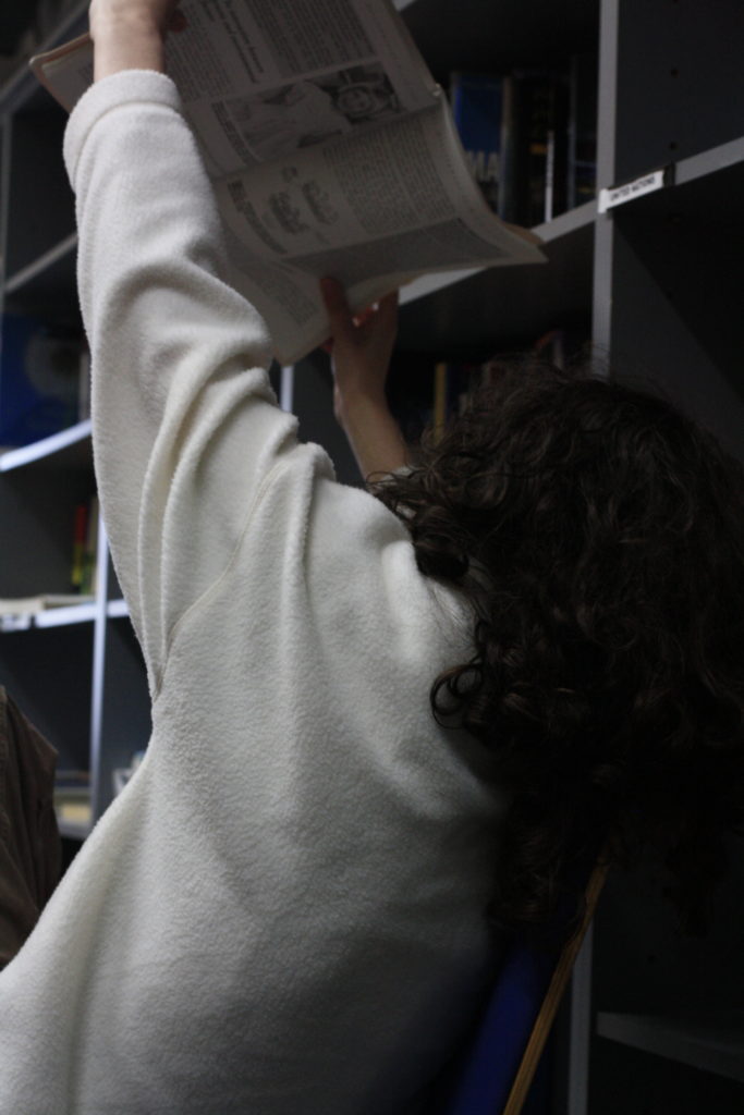
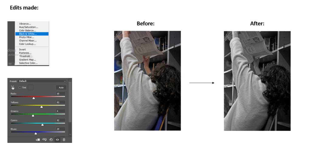
EDITING BEST SHOTS

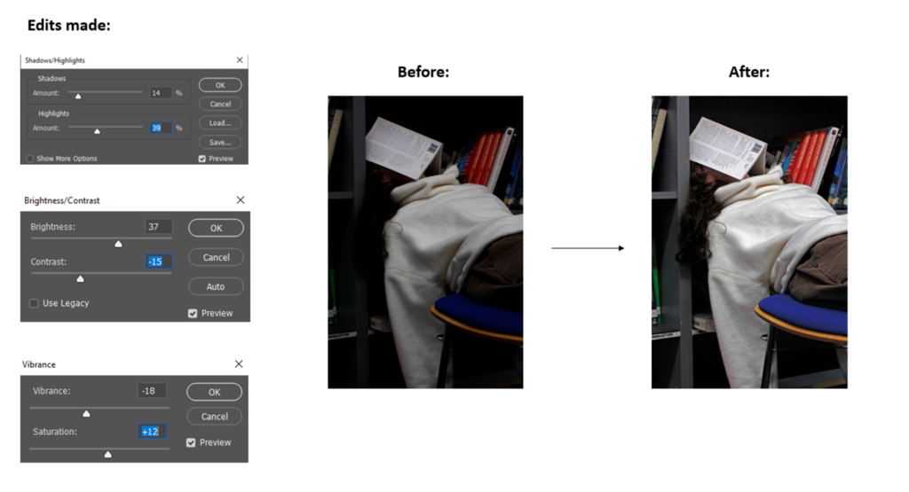

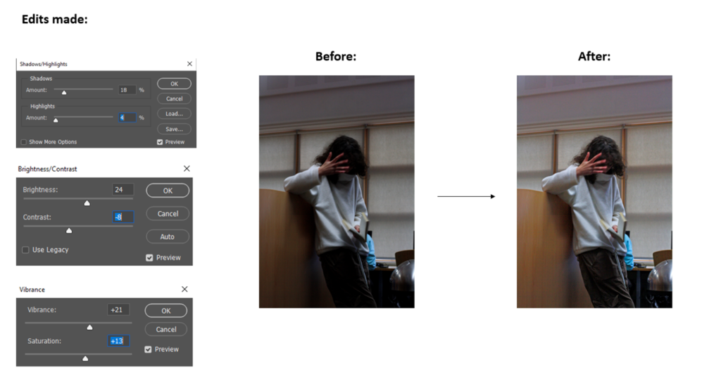
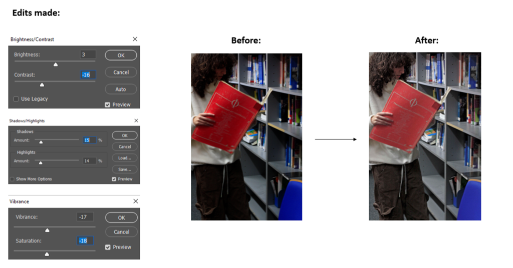
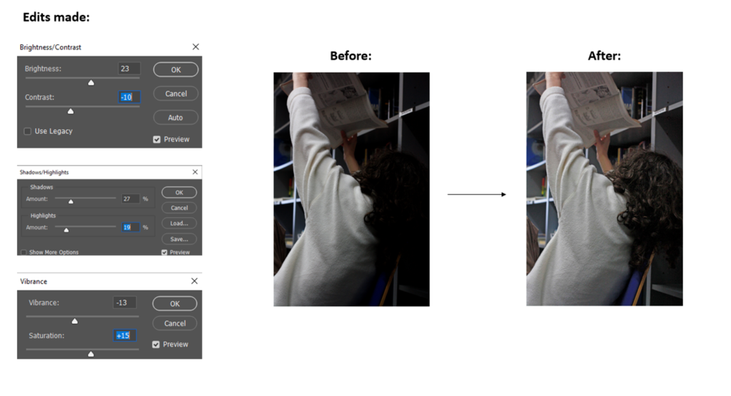
EDITED BEST SHOTS
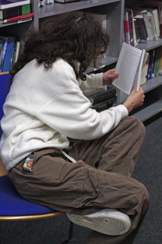
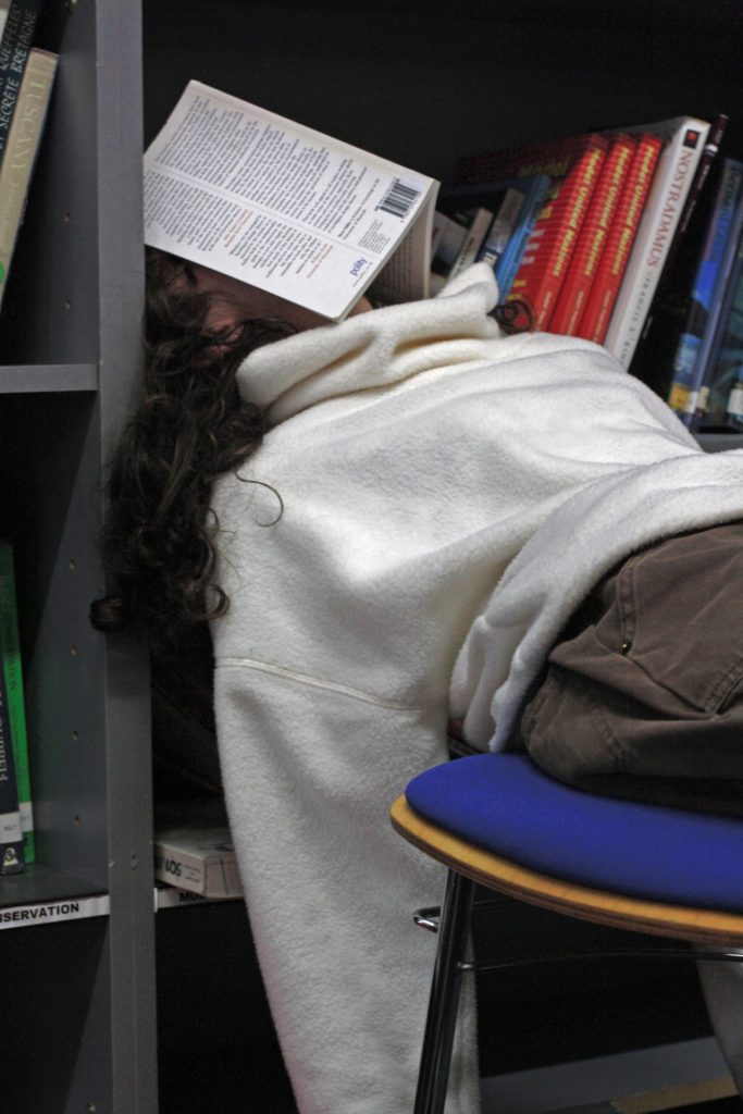


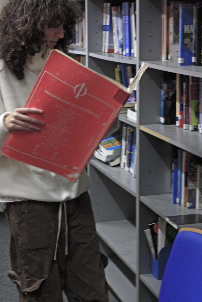

EDITING INTO BLACK & WHITE

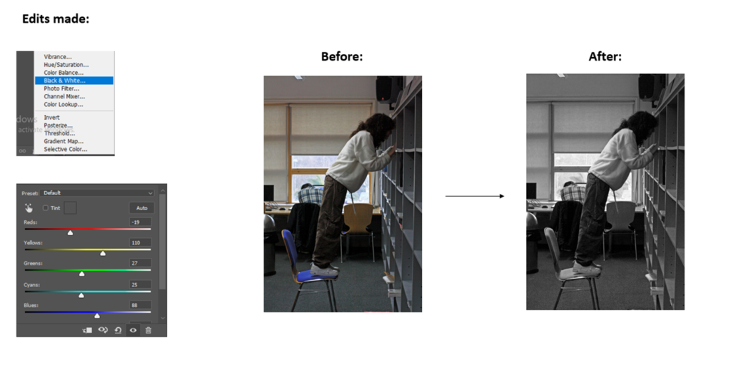
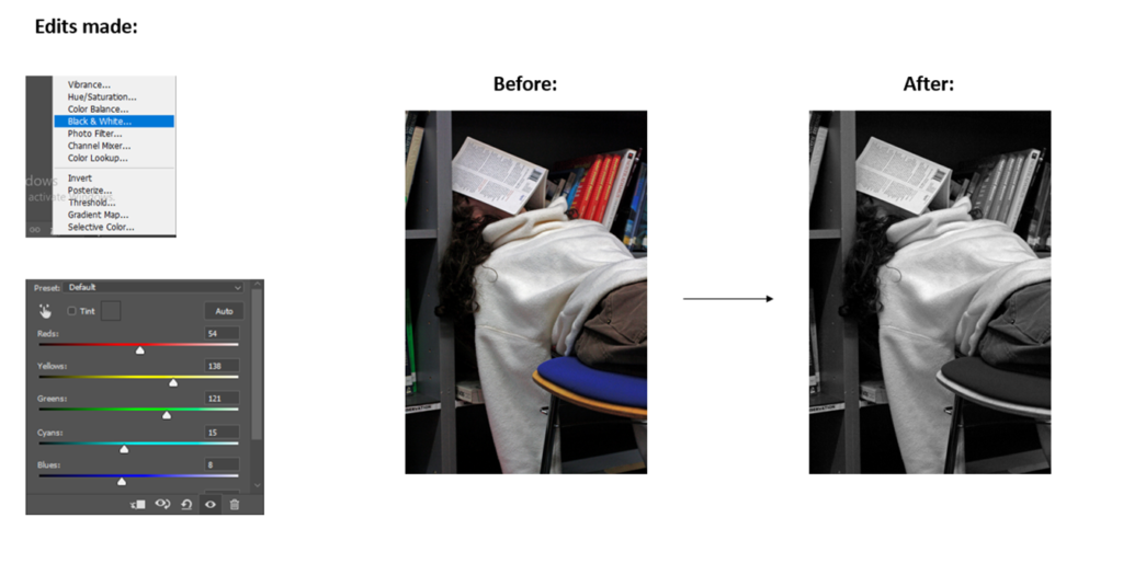


FINAL IMAGES IN BLACK & WHITE




The photo has been taken centre on, looking directly at the main subject (the man). There are two light sources, the natural light at the back which helps create the depth and intensity of the photo, the other light source is the artificial light behind the camera which is being used to amplify and enlighten the sides of his face while his nose and eyes are left dark, adding to the intimidating effect.
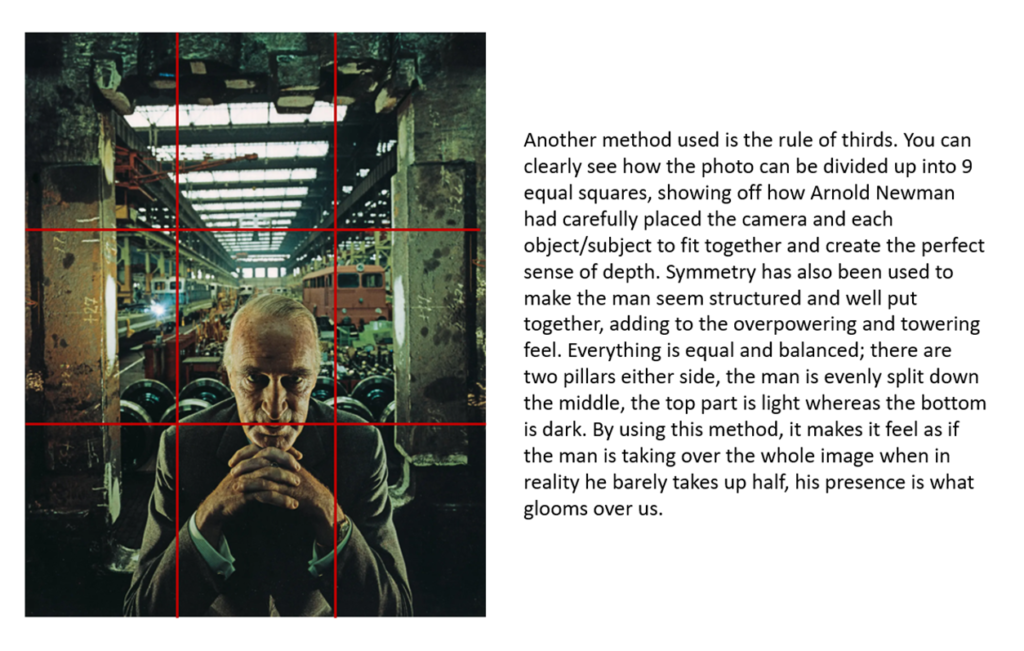
In the foreground there is a very intimidating man that appears to be in his 60s, dressed in a smart suit while looking directly into the camera. His hands are resting under his chin, adding to his striking pose. In the background, there seems to be one of the subjects industrial factories that he owned. I assume that it is a train factory as we can see multiple different tracks and trains. There are windows that line the ceiling and large pillars that surround the man.
In 1963, Newsweek magazine commissioned Jewish man, Arnold Newman to photograph industrialist Alfred Krupp, a convicted but later pardoned Nazi. Newman wanted Krupp to appear as the sinister-looking man that he was. Krupp came from a prominent 400-year-old industrial German dynasty worth around £1.33 billion.
“As a Jew, it’s my own little moment of revenge. It was my impression of a Nazi who managed to survive yet killed millions of people”
– Arnold Newman

GUSTAVE LE GRAY
Jean-Baptiste Gustave Le Gray was born 30 August 1820 was a French painter and photographer who was often referred to the “the most important French photographer of the nineteenth century” because of his innovate and famous techniques. He began by studying painting in Switzerland and lived in Italy between 1843-1846 and painted portraits and scenes of the countryside. He then crossed into photography in the early years of photography’s development.
DAFNA TALMOR
Based in London, Dafna Talmor is a artist, photographer and lecturer. She creates her work by cutting up two negatives before merging them back together while being developed in the darkroom.
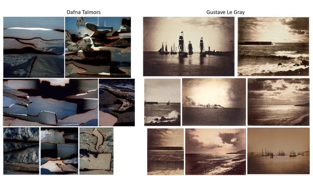
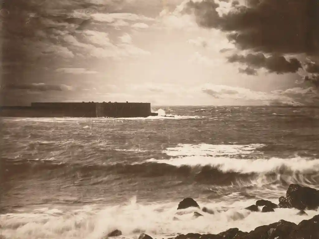
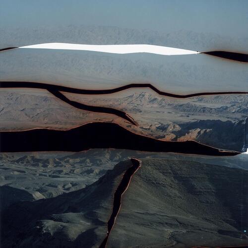
Both could be described as landscape pictures. What kinds of landscapes do they describe?
Both describe seascapes.
What similarities do you notice about these two pictures?
They both have film cut ups, Dafna Talmors may be more obvious but Gustave Le Gray also cut and stuck his photos back together to create collages of the pictures. They both used a similar technique of cutting up the image into multiple pieces before taking them back to the darkroom to reconstruct together. I have highlighted the areas in these two photos:
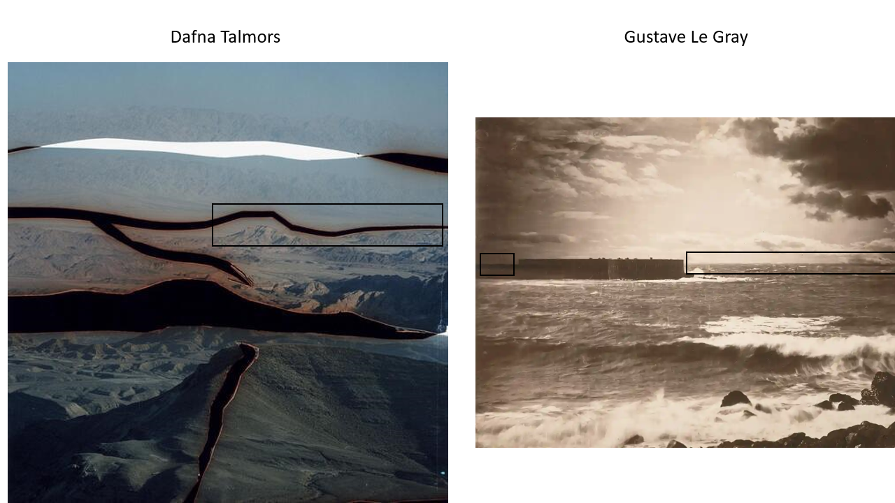
What differences do you notice?
Gustave Le Gray focused more on more on seascapes whereas Dafna Talmor pictured everything from mountain landscapes to seascapes. Gustave Le Gray also used to images of the same place (each with different exposures) and put them together whereas Dafna Talmor cut up the same images and put them all back together instead of two individual pictures.
What words/phrases best describe each of these landscapes?
Gustave Le Gray: classic, simple, moving, exciting
Dafna Talmor: artistic, different, abnormal, mysterious
FINAL IMAGES

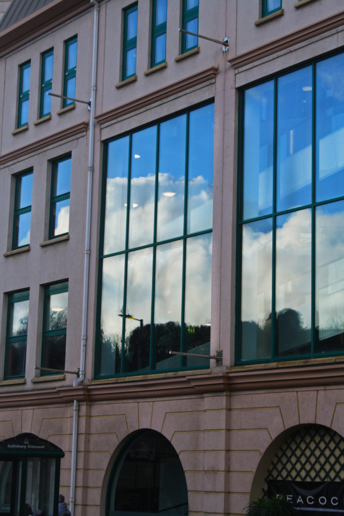

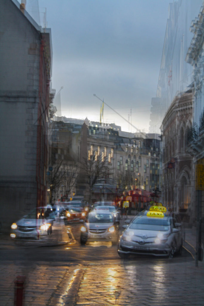
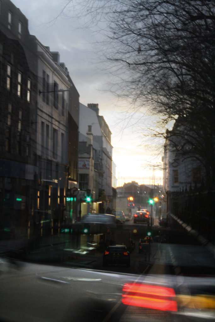
WHY DID I CHOSE THIS IDEA?
The reason I want to focus on this area (overpopulation/overcrowding) is because I believe it is a real problem for Jersey. Not only is this negatively affecting the environment but the limited space and housing crisis is detrimental for the people living on the Island.

I think these style of photographs shows just how Anthropocene is effecting us without it being obvious or boring. I love the use of repition in Michael Wolfes work, it suggests that humans are only repeating what they are already doing instead of fixing the problem they have caused. Whereas Stephanie Jung’s work how the busy lives of the city and crowded areas while it still being creative and effective.
WHAT DID I DO?
I started by walking around the busiest areas of St. Helier to try photograph big crowds after work hours before then focusing on buildings and architecture. I wanted a variety of different types of buildings in various places, time, angles, etc. as I think this was a great way of showing off exactly what Jersey has to offer while still linking it to Anthropocene and my area of overcrowding/overpopulation. To link back to Stephanie Jung for some of my photos, I messed around and lowered the f/ stop to create movement which I think adds to the depth and the message of the images. This works best with cars moving as the lights create a path to follow.
WHAT COULD’VE BEEN BETTER?
To make my work better, I could’ve done another photoshoot to create better images and spent more time on making a series of images to layer on top of each other – inspired by Stephanie Jung. In the extra photoshoot I could’ve also focused more on apartment blocks and offices as this would link to Michael Wolf and his repition of buildings. I think having more images to work from would elevate my work even more and not limit to quite similar pictures like I have.
OVERALL ANALYSIS OF PROJECT
Overall, I am really proud of how this project came out but I do think I could’ve made it a lot better if I had spent more time on them. I think I was able to find a mix between Stephanie Jung and Michael Wolfs work while it still being original and different.