All posts by Anna Schaffrath

Filters

Author:
Category:

photoshoot 1 landscapes:

My first photoshoot for landscapes was at Plemont, the original pictures are on the right and then the edited black and white are on the left:

FIRST IMAGE

ANALYSIS ON IMAGE:

This is one of my favourites I took as it shows a clear view of the cliff, the rocks, sea and some plants. I also like the angle it’s taken at and how the light shines down onto the ocean which you can clearly see the in the black and white edit.

SECOND IMAGE:

ANALYSIS ON IMAGE:

This shows more detail and texture in the rocks and the sea, I like the texture it presents, showing depth. Although, I do prefer the image coloured to show more detail and it makes the picture more interesting.

THIRD IMAGE:

ANALYSIS ON IMAGE:

Shows a better view of the waves and looks more interesting in black and white as I adjusted exposure and highlighted the whites:
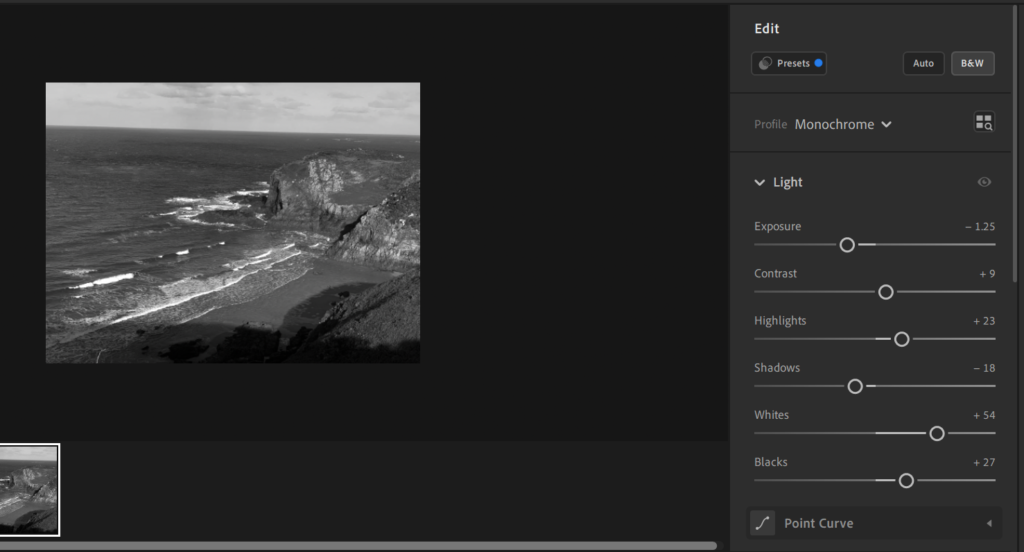
More highlights, and stronger in white than black.

FOURTH IMAGE:

ANALYSIS ON IMAGE:

When editing this image in black and white i also liked how this edit looked:
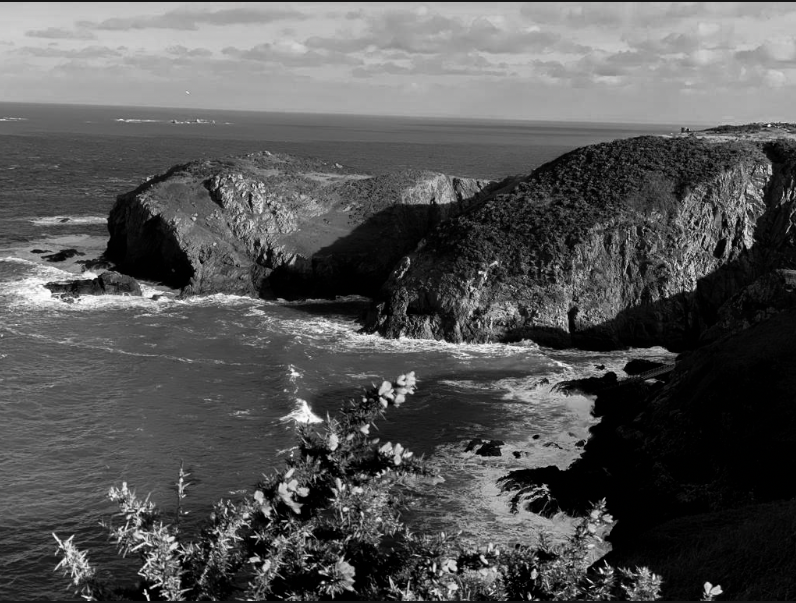
My reasoning being that I darkened the shadows, so they are almost black, I like this as its more similar to Ansel’s pictures. The other black and white image being:
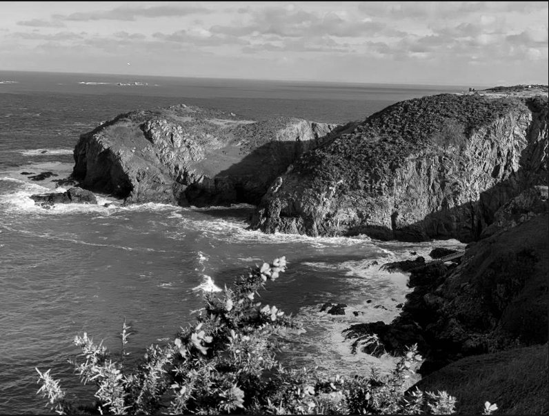
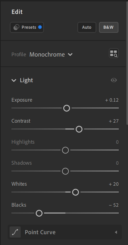
There are more details in the shadows compared to other image.

EVAULATION

Overall, I enjoyed doing this photoshoot as I could focus and explore on different areas of the cliff paths. In my plan I wasn’t aiming to go to Plemont originally but found it suited the ‘rural landscapes’ topic. Each image shows a different perspective and allows me to practice editing different aspects of each image whether it being the shadows, highlights, exposure or tone. My favourite image is the fourth as I like the angle and how much I could experiment with editing it, I’d say it’s the most similar to Ansel’s pictures as it shows depth, and the cliffs resemble as mountains to create different levels and height in my image; the shadows are sharp and effective with black and white.

Exposure bracketing

What is exposure bracketing?

Exposure bracketing is when a photographer creates pictures with different exposure settings. The purpose of this is to cover more of the dynamic range. Bracketed photos are used later to create an HDR (high dynamic range) photo.

Why do photographers use bracketing?

Bracketing is a technique where a photographer takes shots of the same image using different camera settings. This gives the photographer multiple variations of the same image to choose from or combine to ensure that they get the perfect shot.

Getting exposure right can be a complex subject. There are lots of things you have to balance: how your camera is metering the scene, your camera’s dynamic range, and of course, what settings you’re using. You might also be trying to deliberately overexpose your photos a little to get more data in the RAW file without going too far and blowing your highlights.

Exposure bracketing only works well in certain situations. It’s really a landscape or architecture photography technique. If you’re photographing people, pets, or anything else that moves a lot, you won’t be able to shoot bracketed exposures; instead, you’ll just be taking different photographs with different exposure values.

new topogaphics

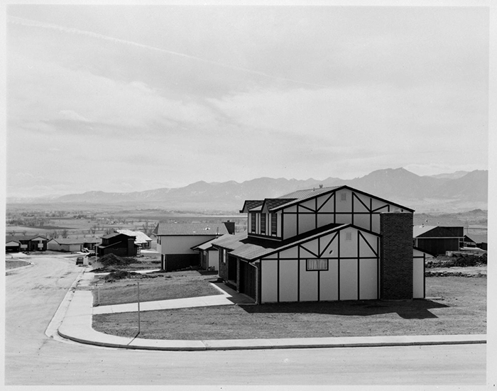
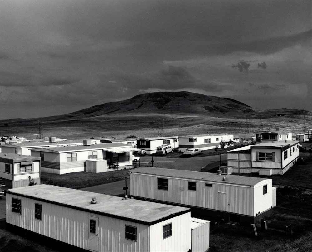
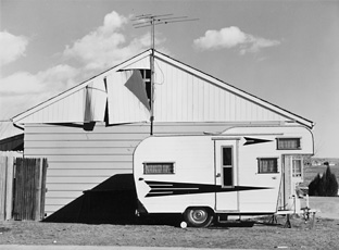
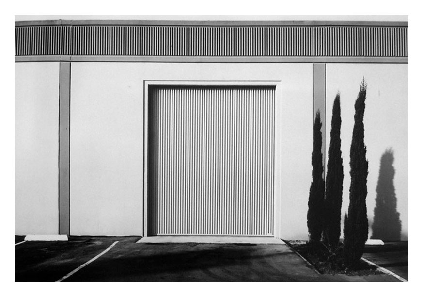
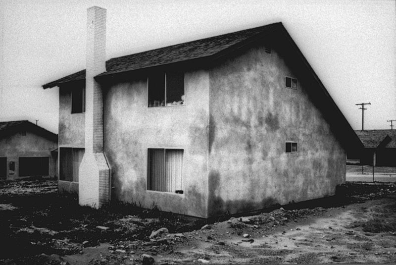
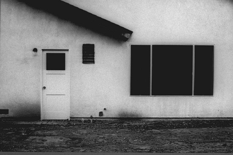
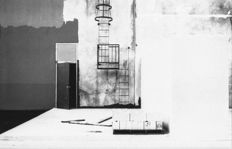
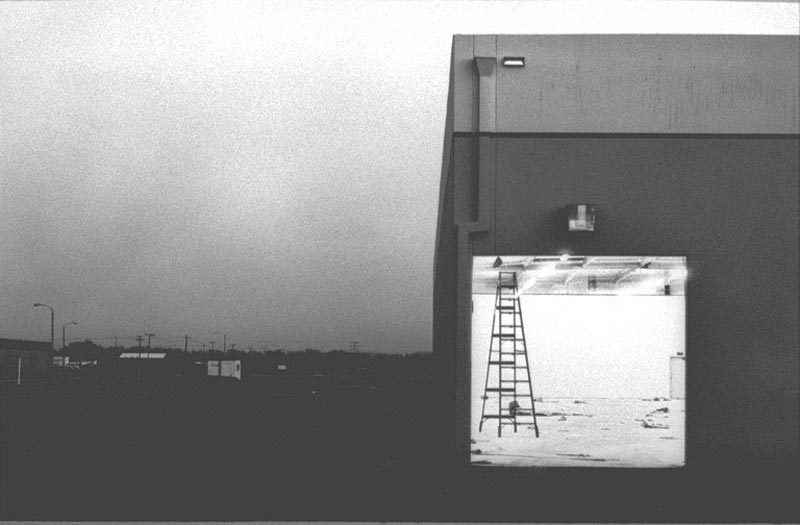
New topographics was a term coined by William Jenkins in 1975 to describe a group of American photographers (such as Robert Adams and Lewis Baltz) whose pictures had a similar banal aesthetic, in that they were formal, mostly black and white prints of the urban landscape.

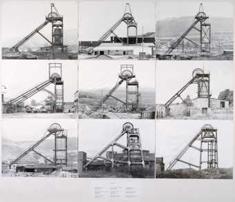
Many of the photographers associated with new topographics including Robert Adams, Lewis Baltz, Nicholas Nixon and Berdand Hiller Becher, were inspired by the man-made, selecting subject matter that was matter-of-fact. Parking lots, suburban housing and warehouses were all depicted with a beautiful stark austerity, almost in the way early photographers documented the natural landscape. An exhibition at the International Museum of Photography in Rochester, New York featuring these photographers also revealed the growing unease about how the natural landscape was being eroded by industrial development.

What was the new topographics a reaction to?

Their stark, beautifully printed images of this mundane but oddly fascinating topography was both a reflection of the increasingly suburbanised world around them, and a reaction to the tyranny of idealised landscape photography that elevated the natural and the elemental.

Robert adams:

“I think if you placed me almost anywhere and gave me a camera you could return the next day to find me photographing. It helps me, more than anything I know, to find home.”

-ROBERT ADAMS

He is a photographer who has documented the extent and the limits of our damage to the American West, recording there, in over fifty books of pictures, both reasons to despair and to hope.

Lewis Baltz:

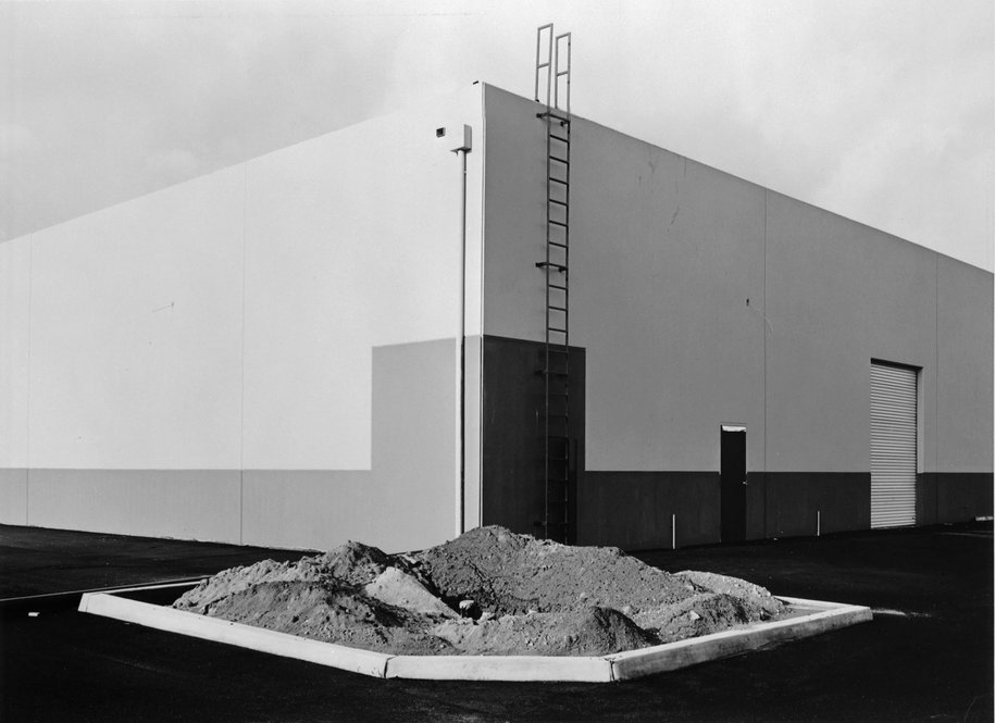
Lewis Baltz produces photographs in series focused on a particular theme or geographic area and usually publishes them in book form, as in The New Industrial Parks Near Irvine, California (1975), Nevada (1978) and Park City (1981). His work, like that of others associated with the New Topographics, challenges the nineteenth century tradition of western landscape photography represented by Timothy O’Sullivan, Carleton Watkins, and William Henry Jackson by presenting a less innocent view of the landscape. Baltz’s perception of the landscape necessarily reveals the effects of twentieth-century culture and suburban development on the nation’s topography. 

Nicholas Nixon:

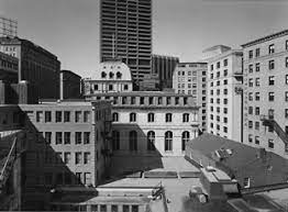
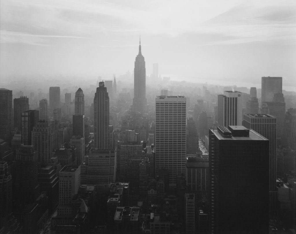
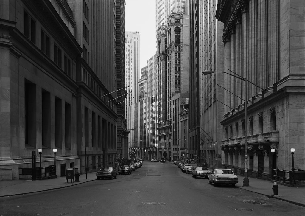
Nixon’s career began in the 1970s when he was a student of photography. Following his first photos of Alburquerque, he shot his first major series, City views. These photographs, taken in Boston and New York, formed part of one of the most influential exhibitions in the history of photography, organized in 1975 by George Eastman House entitled New Topographics: Photographs of a Man-Altered Landscape. This is one of the main themes dealt with by Nixon throughout the whole of his career. From the very start he has worked on series that touch on fundamental aspects of human life.

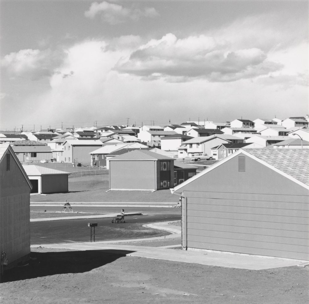
This image interests me the most:

The low angle to give a realistic perspective and view of the ‘man made’ world we are living in. With the buildings towering over and almost enclosing us, its intimidating.

Bernd and Hiller Becher:

New Topographics | Exhibitions | MutualArt

MOODBOARD

What is a mood board?

A mood board is a collection of images gathered together into collage form. People use it extensively in design and photography to help define the visual direction of a project. Sometimes you may want to create a physical board from magazines and other print media. But these days mood boards are usually virtual.

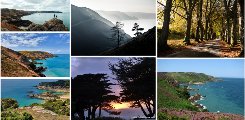
My photoshoot for landscape romanticism and the sublime has me inspired to focus on doing coastline areas around Bouley Bay and also autumnal/ wintery settings in the lanes of jersey. I think these locations are good for this topic as they are very rural areas and show off the peacefulness of nature.

My mood board:

ansel adams

You don’t take a photograph, you make it.’ – Ansel Adams

Ansel Easton Adams was an American landscape photographer and environmentalist known for his black-and-white images of the American West. He helped found Group f/64, an association of photographers advocating “pure” photography which favoured sharp focus and the use of the full tonal range of a photograph.

What is group f/64, and what does it mean?

Formed in 1932, Group f/64 was a San Francisco Bay Area-based informal association of 11 American photographers, including Ansel AdamsImogen Cunningham, and Edward Weston. Like many postwar documentary photographers, this group of so-called ‘straight’ photographers focused on the clarity and sharp definition of the un-manipulated photographic image. Committed to a practice of “pure photography”, Group f/64 encouraged the use of a large-format view camera in order to produce grain-free, sharply-detailed, high value contrast photographs. The name of the group is taken from the smallest camera lens aperture possible—which yields the sharpest depth of field.

About Ansels photography:

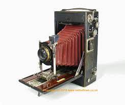
Ansel’s pictures would never turn out how he imagined them to. This was due to exposure and tones, and that the pictures he took were in black and white. The camera ansel would use is a kodak A4 speed camera:
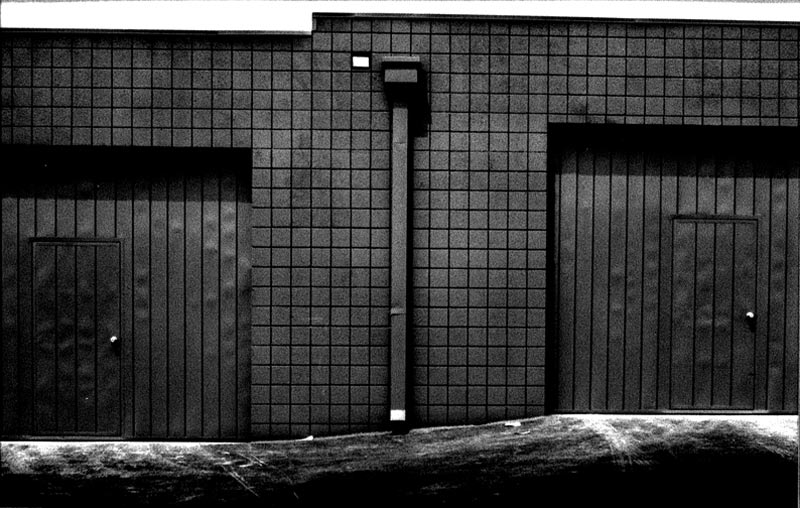
No 4A Speed Kodak

Ansel couldn’t take several photos at once instead he had to use glass plates each time he took a photo, this is why it was essential for him to be able to make sure that he wasn’t wasting any chances. To enable him to understand and estimate his outcomes for his pictures he created the ‘zone system’.

The zone system

The zone system was designed to provide a framework for determining exposure, ensuring that the photographer could create properly exposed images each and every time. Despite it being almost ninety years old, the zone system in photography is still relevant today, in both film and colour photography. it is a scale of eleven tone values. The darkest being pure black, the lightest being pure white. Black is Zone 0, white is Zone X. Each grey value between these two extremes is exactly one photographic stop different than the grey tone on either side of it.
How to Use the Ansel Adams Zone System in the Digital World | Fstoppers
ANSEL ADAMS AND VISUALIZATION VERSUS VISION – WHY VISION COMES FIRST -  Julia Anna Gospodarou Fine Art Photography | Workshops | Architecture |  Landscape
Here you can see the difference in the background (sky). The left shows before Ansel changing the camera exposure and then the right showing pure black (zone 10). Clearly the right image looks more interesting with more sharp tones and definition. This is why it was important for Ansel to recognise how much exposure was having an effect on his photography.

EVALUATION OF PROJECT

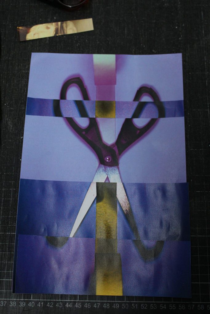
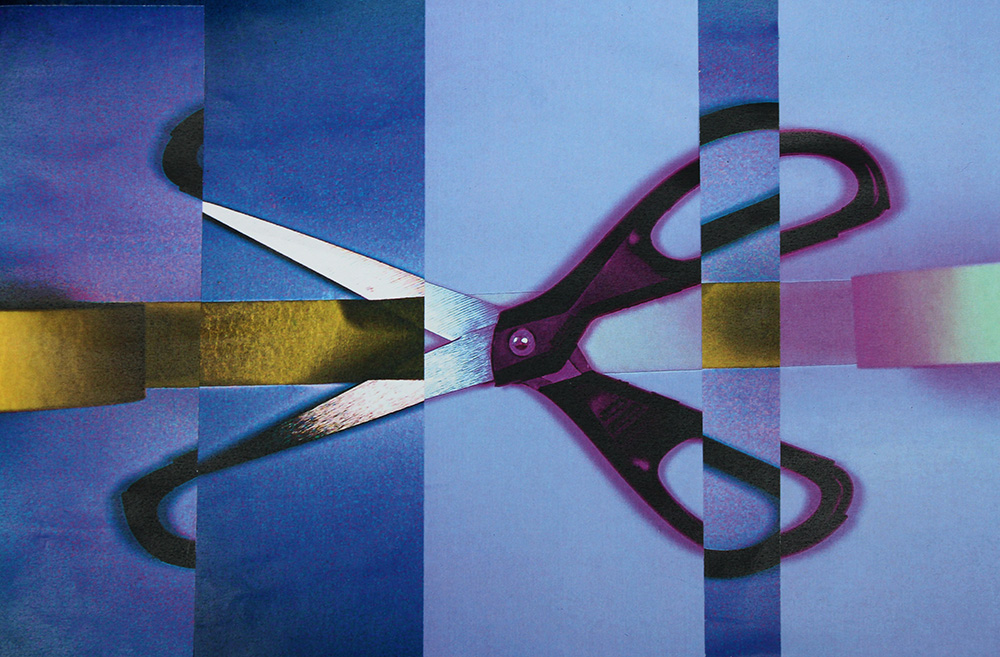
ANALOUGE FINAL IMAGE

Development of final piece:

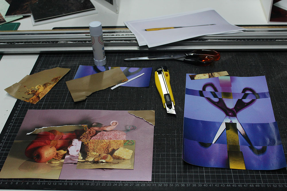
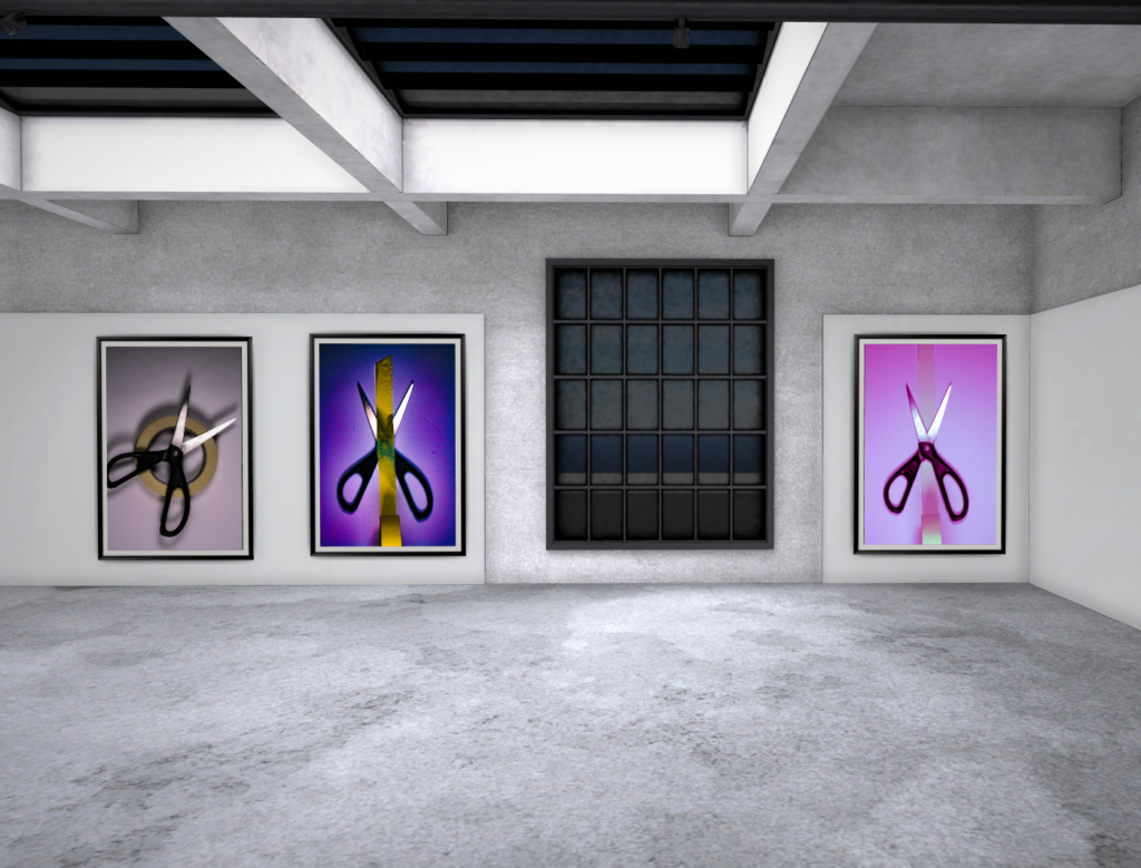
Firstly i started off by editing my image on photoshop, for example edited the saturation and colour to more purple/blue. i continued to print the same two images out of the scissors and tape the difference being different tones of colour but similar. Then used the trimmer to precisely trim out sections of the picture to then use superimposition and stick the sections in line as much as possible on top.
I decided I wanted this in an A3 so went back onto Lightroom and photoshop and made sure it was smooth and sharp ready to be put into the print folder. Now I have framed it and is on display.

EVALUATION

Overall the project ‘home’, was very new to me at the start getting used to photography and how to effectively use a camera. I’ve learnt useful things such as how to use photoshop and organise my photoshoots on Lightroom. However, I need to be more creative with my photography whilst also focusing on the technique and quality of my images. I’ve enjoyed doing research into artists and exploring different styles of photography. This project has been an informative introduction to photography and has helped me understand what photography is and how it can be portrayed as ‘home’.

romantacism and the sublime

What is romanticism in photography?

According to the article titled “Romanticism and Its Relation to Landscape Photography & Painting”, romanticism was an art form that rejected classicalism and focused on nature, imagination and emotion. Therefore, this started a new way of thinking and created a new type of art.

History of romanticism:

Romanticism, first defined as an aesthetic in literary criticism around 1800, gained momentum as an artistic movement in France and Britain in the early decades of the nineteenth century and flourished until mid-century. With its emphasis on the imagination and emotion, Romanticism emerged as a response to the disillusionment with the Enlightenment values of reason and order in the aftermath of the French Revolution of 1789.

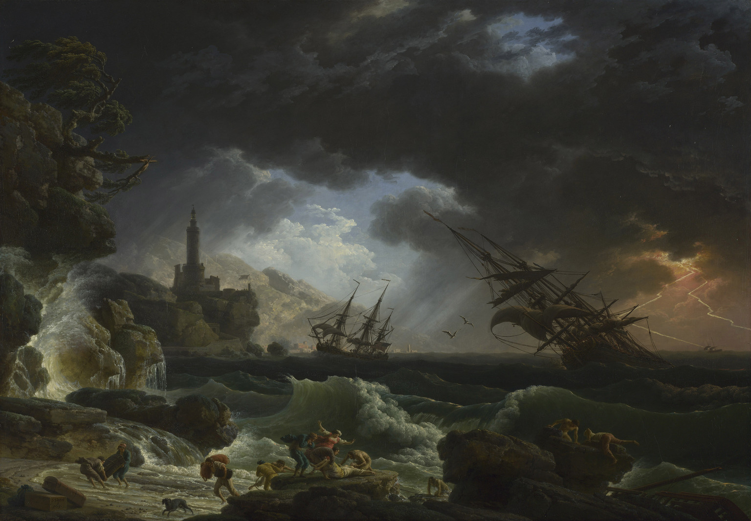
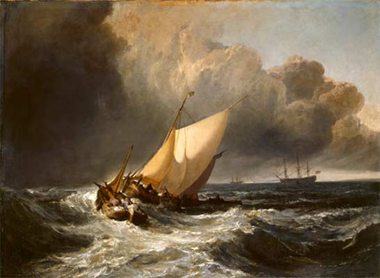
 In French and British painting of the late eighteenth and early nineteenth centuries, the recurrence of images of shipwrecks and other representations of man’s struggle against the awesome power of nature manifest this sensibility. For example:

Christine Riding, 'Shipwreck, Self-preservation and the Sublime' (The Art  of the Sublime) | Tate

Artist references for romanticism:

Roger Fenton, despite him working in a number of genres, Fenton remained consistent in his love of the British landscape and the history it enfolded. Each summer he photographed in locations revered for their ruined abbeys, cathedrals, castles, romantic associations and literary connotations. These are now considered to be among the finest architectural and topographical studies of the 19th century. Examples of his photography:

Roger Fenton (1819–1869) | Essay | The Metropolitan Museum of Art |  Heilbrunn Timeline of Art History

JMW Turner, throughout the first half of the 19th century, Turner was unstoppable. He dominated British landscape painting in a thoroughly Romantic style which was driven by the immediacy of personal experience, emotion, and the boundless power of imagination. Examples of is art:

History of Art: Romanticism - Joseph Mallord William Turner
JMW Turner Paintings, Bio, Ideas | TheArtStory

The five elements of romanticism:

  • Interest in the common man and childhood.
  • Strong senses, emotions, and feelings.
  • Awe of nature.
  • Celebration of the individual.
  • Importance of imagination.

The sublime:

The Sublime is a western aesthetic concept of ‘the exalted’ of ‘beauty that is grand and dangerous’. The Sublime refers to the wild, unbounded grandeur of nature. The Sublime is related to threat and agony, to spaces where calamities happen or things run beyond human control.

still life edits

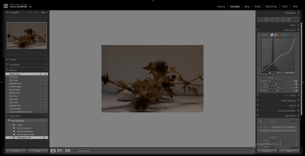
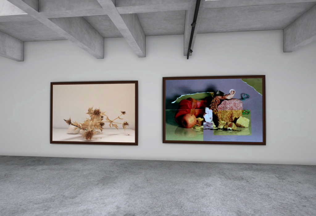
This was my final still life edit I chose:

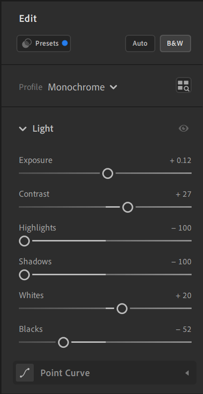
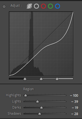
By using Lightroom I could edit the shadows to make them look darker and stand out more. I lowered the highlights and colours.

Here I also cropped the image and adjusted the size ready to upload to my blog.

No highlights, to emphasise the dullness and more darks and shadows.

artist refernces

Walker Evans

What inspired Walker Evans and why was his photography different from the rest?

Walker was inspired by his ‘French cultural heroes’, Evans set out to document the authentic, ordinary, and transitory details that he now saw in his homeland. While Evans’s realism was clearly at odds with the aestheticized images of contemporaries like Alfred Stieglitz, he was quick to deny his role as a documentarian.

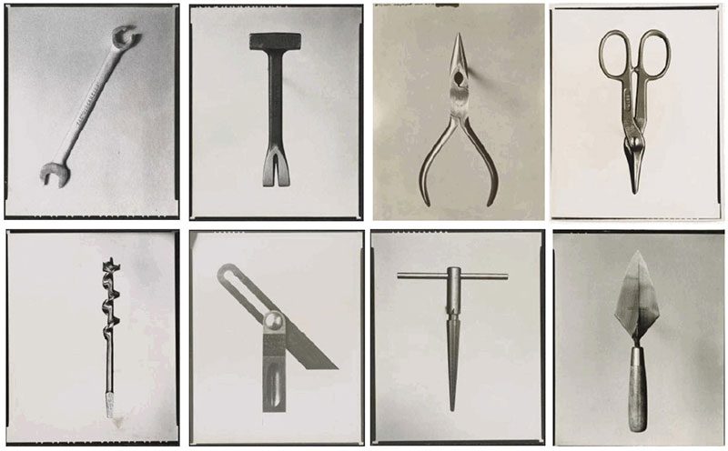
Boring things

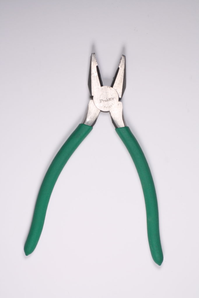
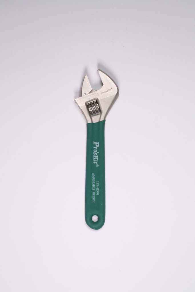
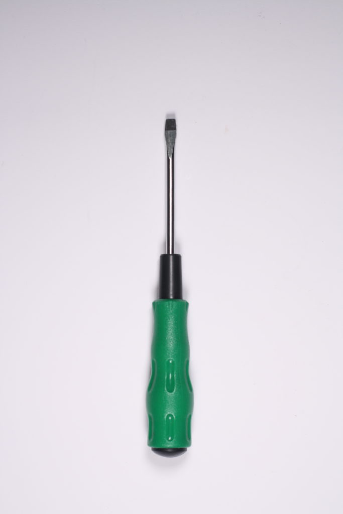
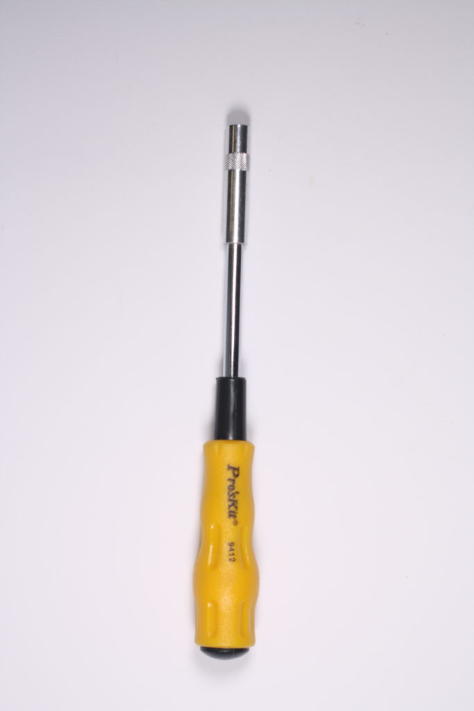
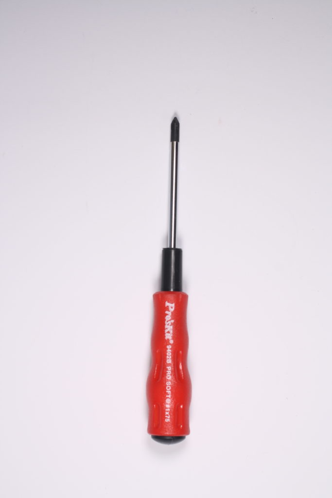
Walker has proven that the best photography isn’t always images such as views, nature and ‘beautiful things’ instead he has picked objects which people can almost relate to as they have seen or own it themselves. Using these everyday objects, he has managed to make them look interesting and meaningful, it shows the details and the way the tools have been made to help up build things ourselves. I think it’s a really interesting aspect/type of photography as it’s so simple but still interesting.

Object studio edits

By editing the colour of these to black and white it would look similar to walker evans images. I was experimenting the camera position/view when taking taking this pictures from above.