All posts by Anna Schaffrath

Filters

Author:
Category:

Selecting Final images/Mock-up

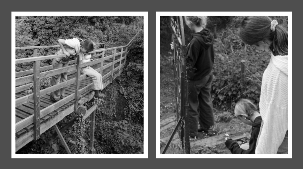
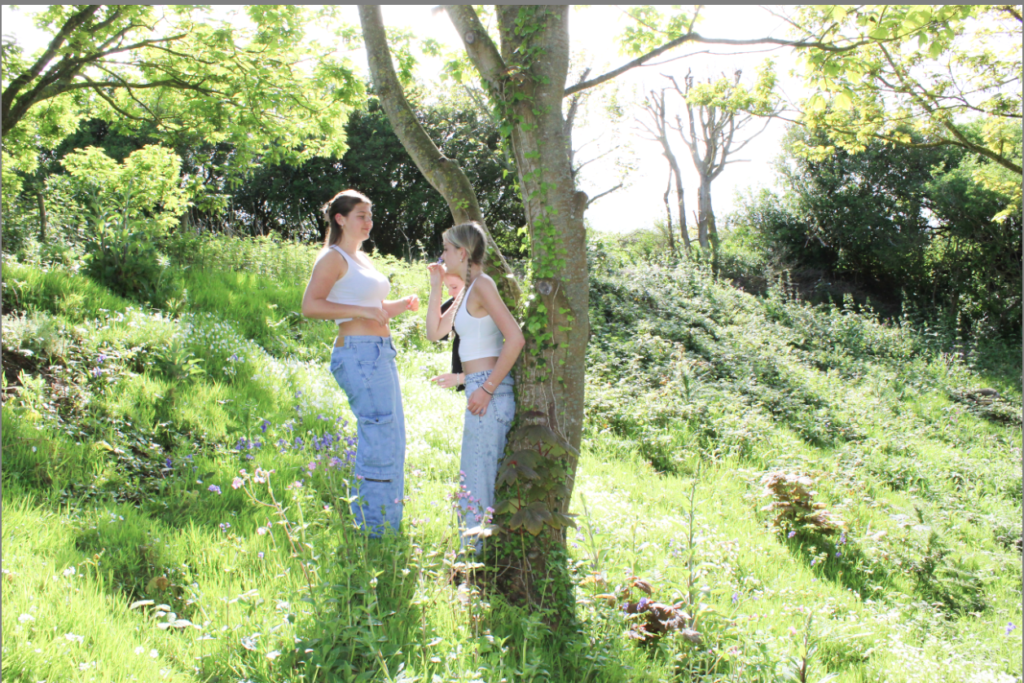
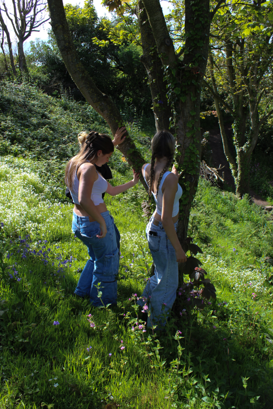
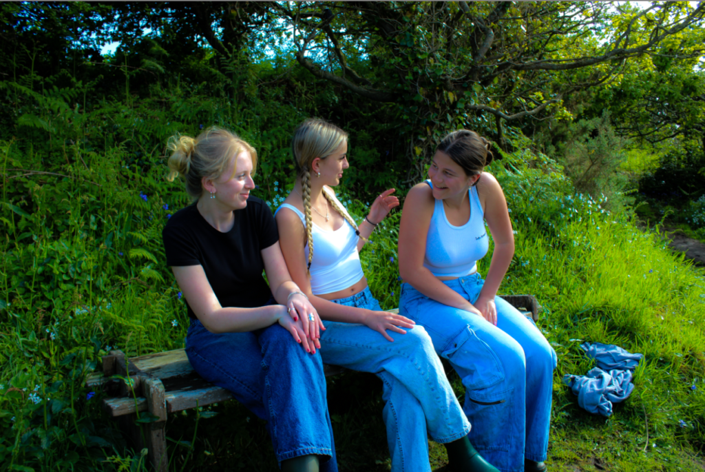
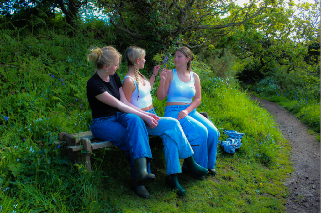
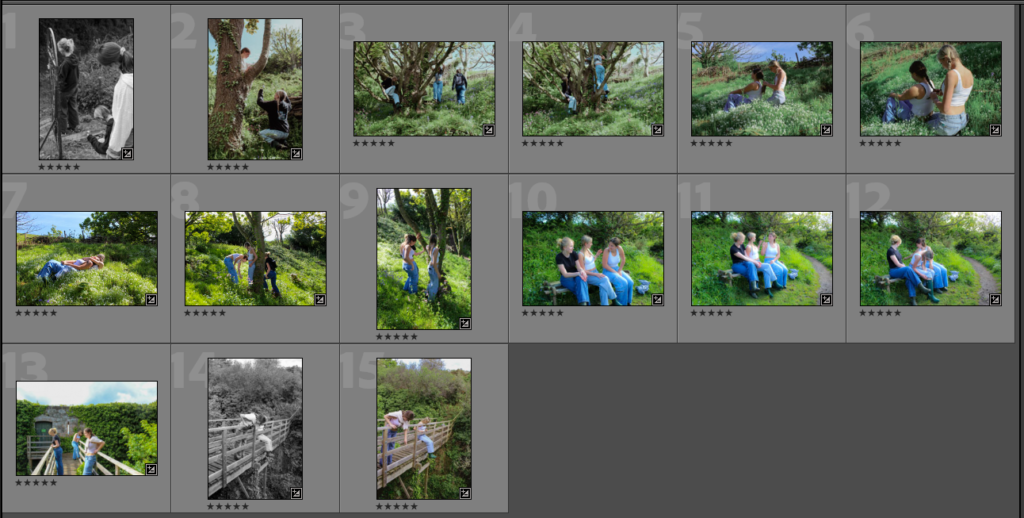
I started off by selecting my favourite images id like to put into the print folder. To do this I rated and categorised my images on Lightroom so it was easier to asses each of them. I had 15 I liked, however, still needed to narrow them down:

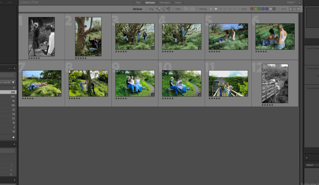
After narrowing down to 12 final images I had these:

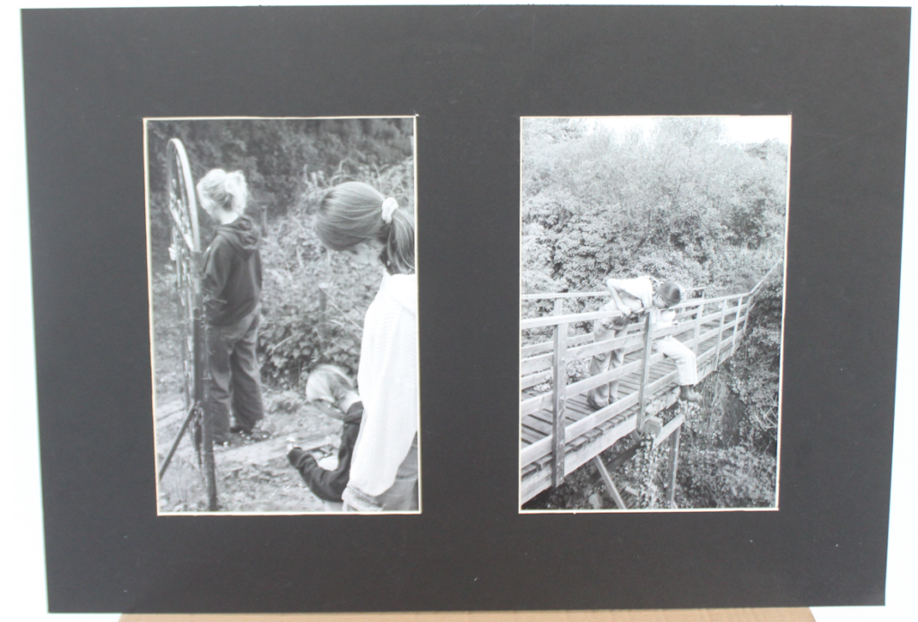
Initially I had my mock – ups presented on this post but then went back into it to show my recreations and how my final images were presented in comparison to my initial plan:

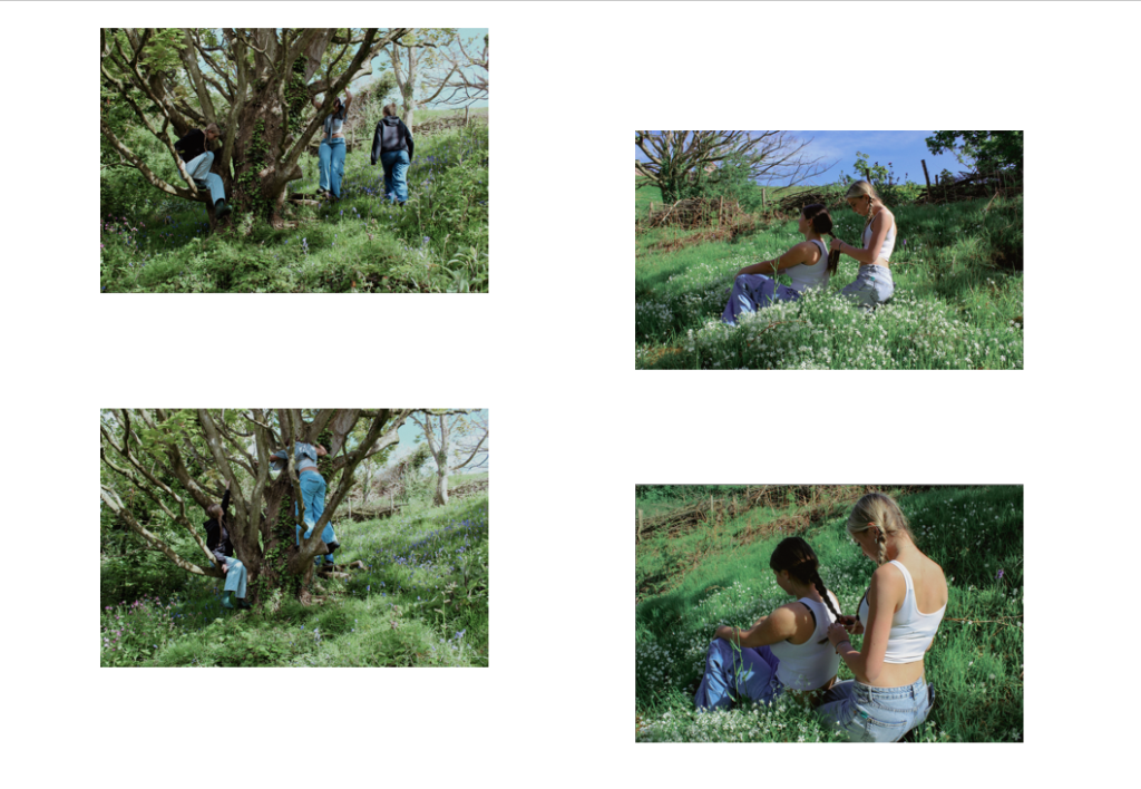
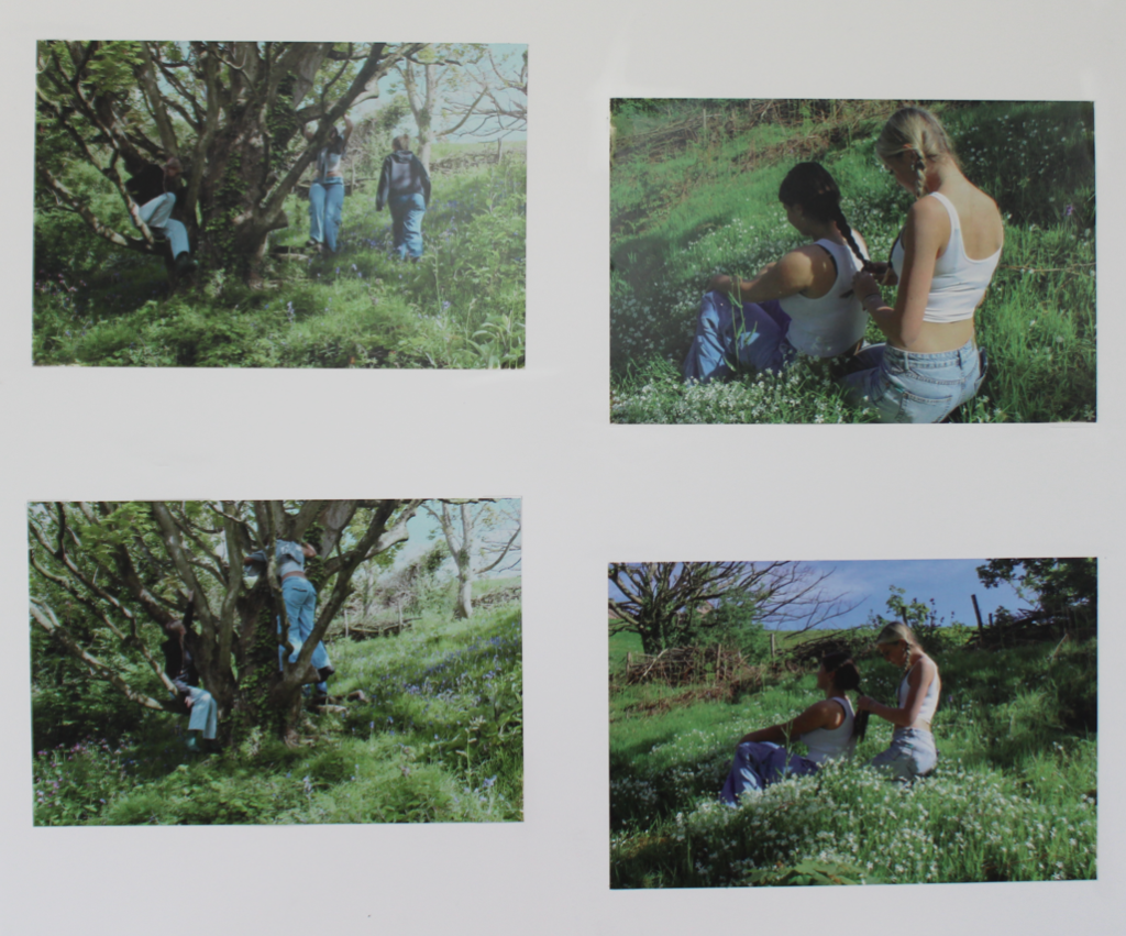
First mock-up/recreation:

After going back into the blog post and editing it I can show my recreation and how I exactly did this whilst framing my images:

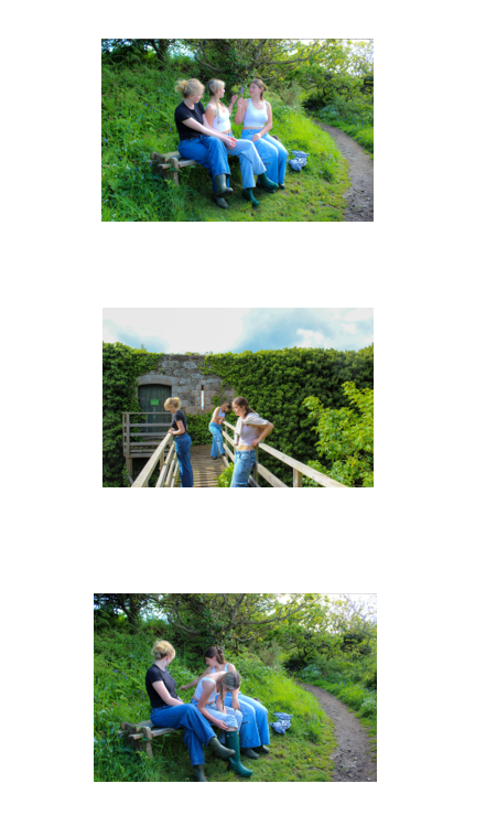
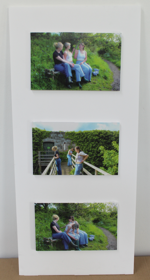
Second mock up/ recreation:

Third mock – up/ recreation:

Remaining images were window mounted individually.

PHOTOSHOOT PLAN

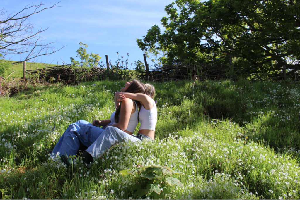
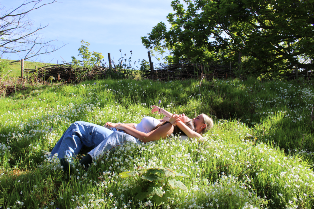
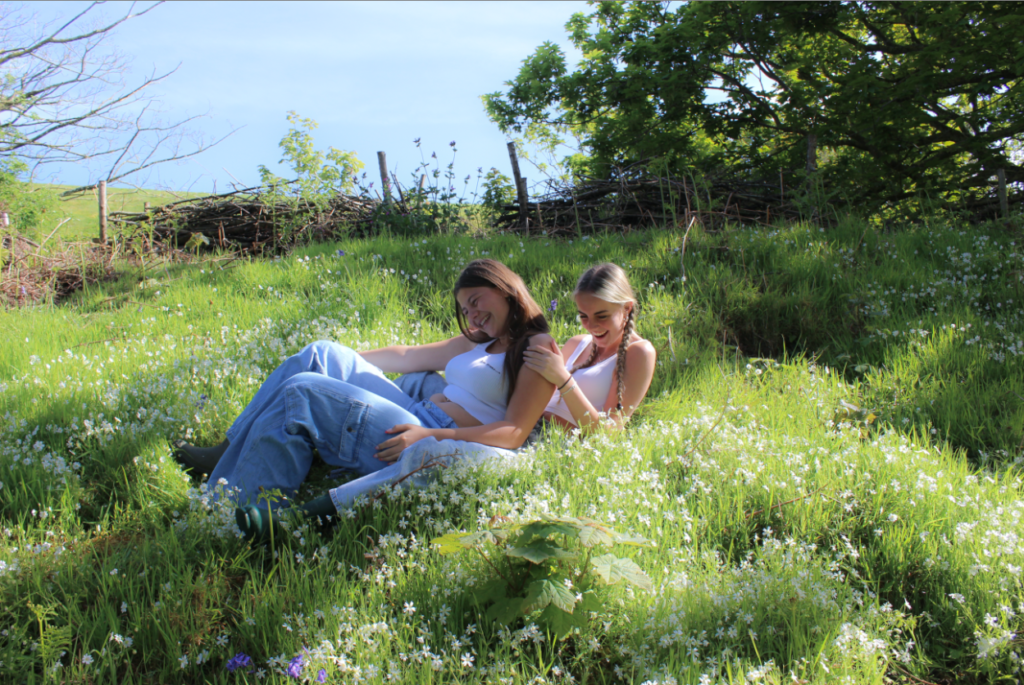
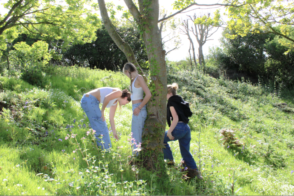
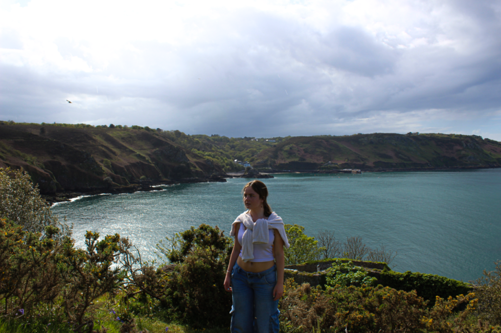
Overall, i aim to take around highest 100 images for each location to give me a wide range of photos to select from.

WHERE?

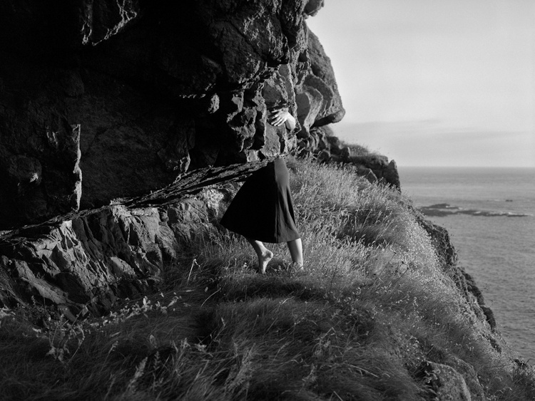
  • Cliff paths
  • The woods
  • Fields
  • Rural areas
  • Surrounded by trees, flowers and grass
  • Studio – close ups
  • Bath – b&w

Why these specific places?

I have chosen these mainly ‘rural’ locations as they are surrounded with nature, my aim is to create the idea of being in the ‘middle of nowhere’. In the studio I plan to do close ups… and also ‘milk bath photography’ however still relating it to being surrounded by nature: Milk bath photography is a type of portrait photography that places subjects in a tub full of milky water, often with floating props like flowers, fruit, or greenery.

WHEN?

Whilst its sunny but not midday; more so late afternoon. The photoshoots not involving the environment can be whenever is suitable.

HOW? (EXPLANATION)

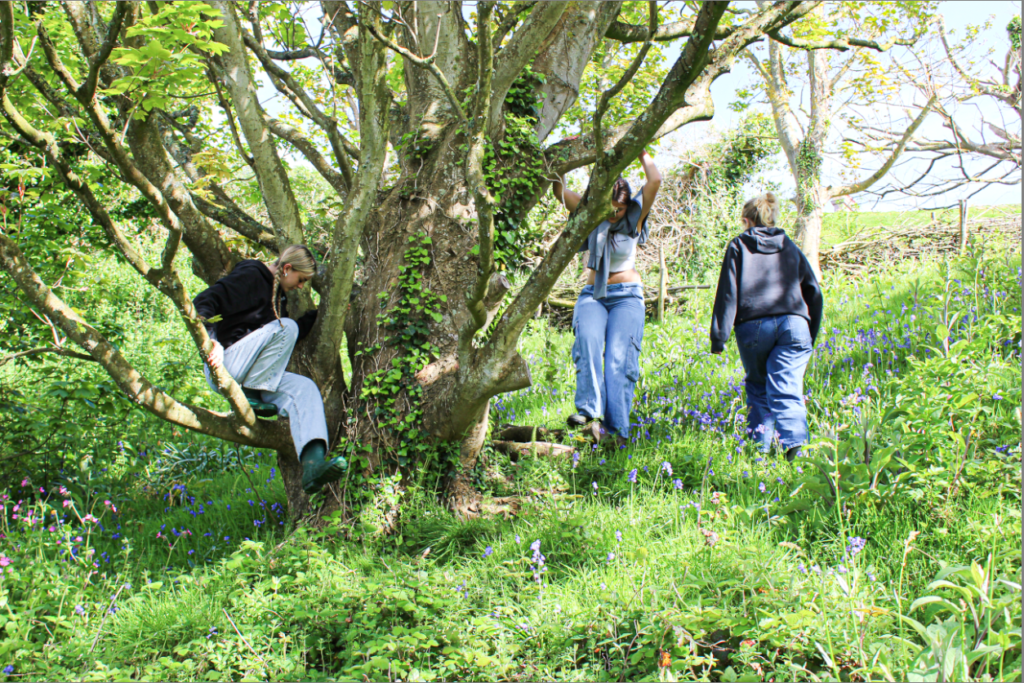
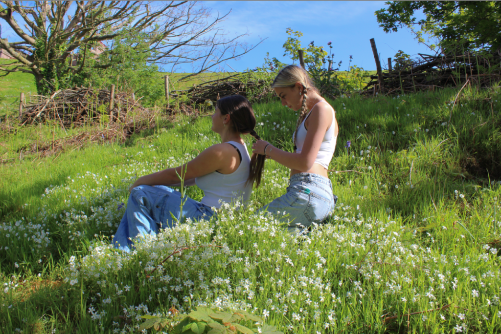
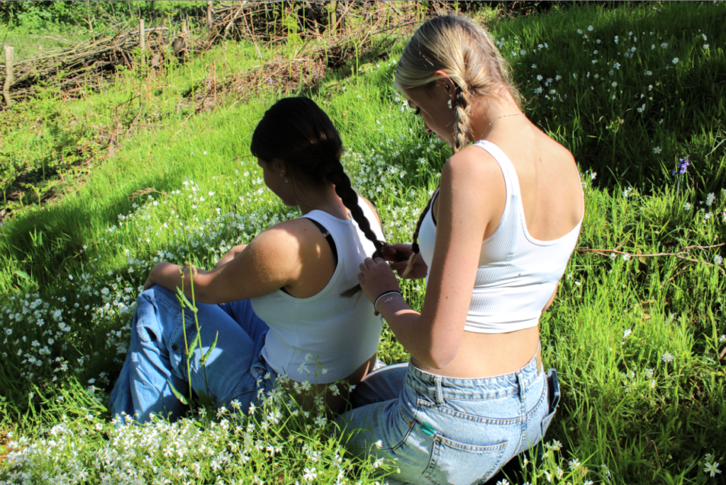
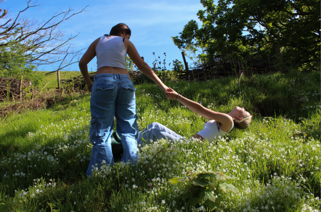
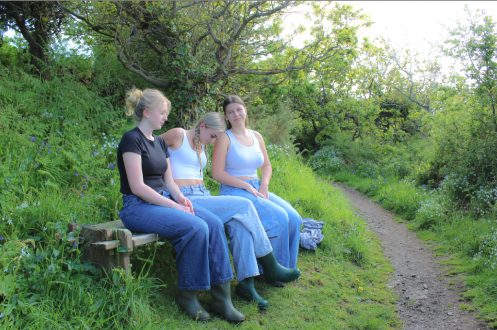
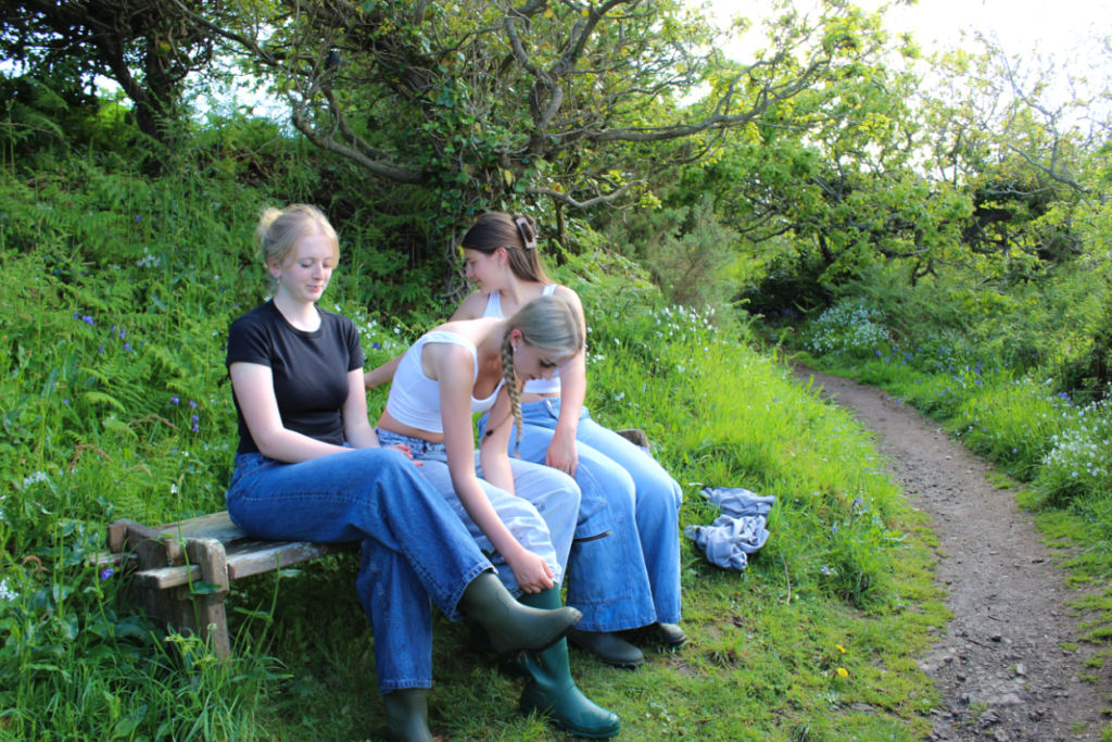
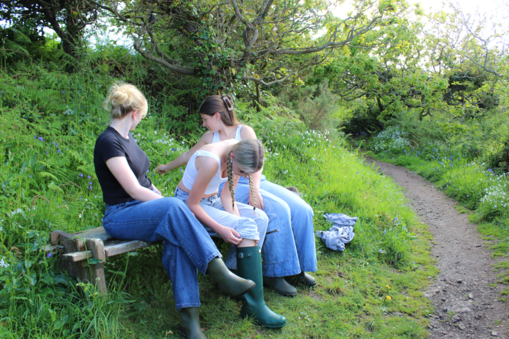
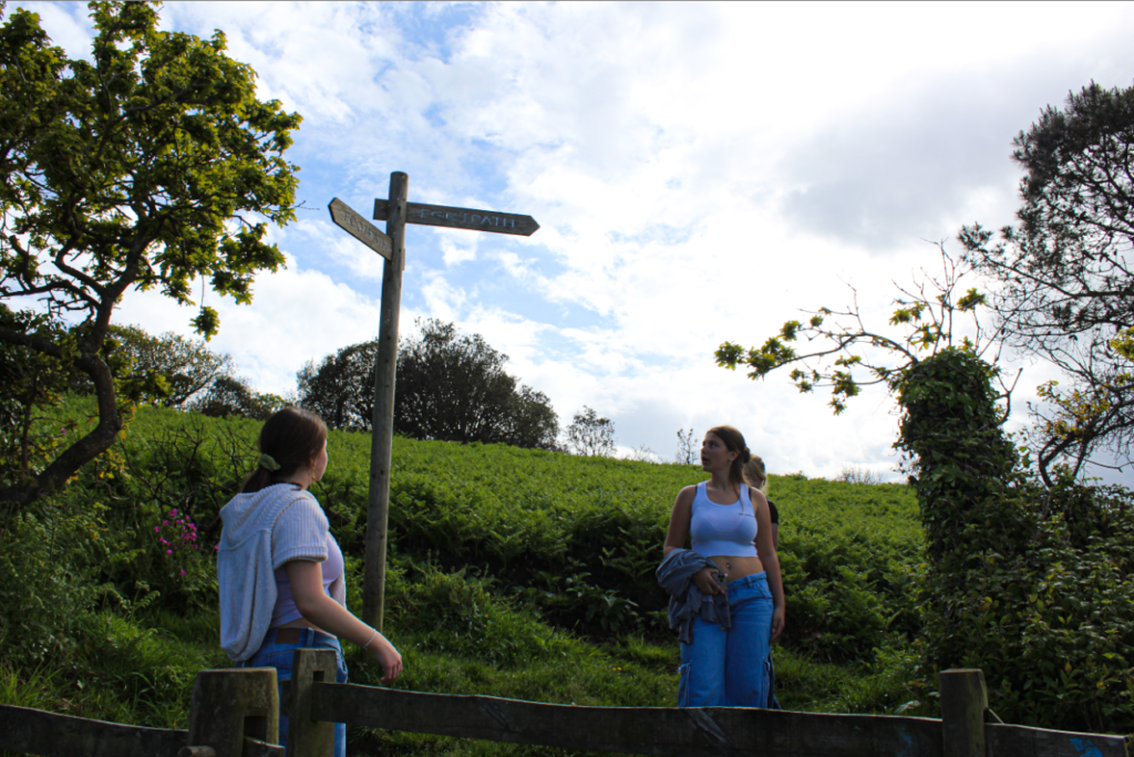
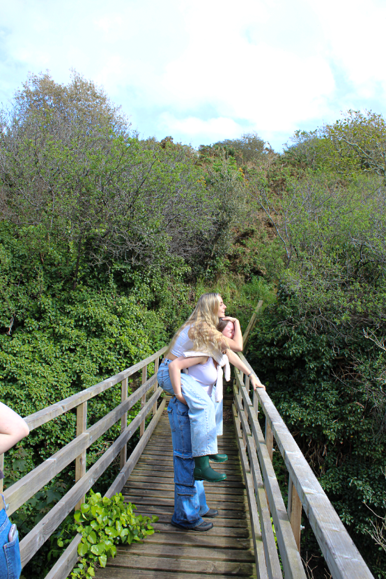
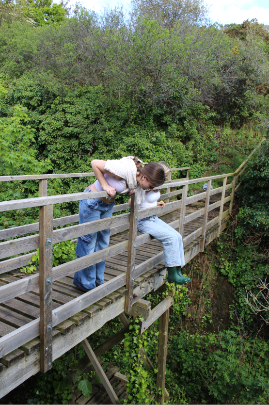
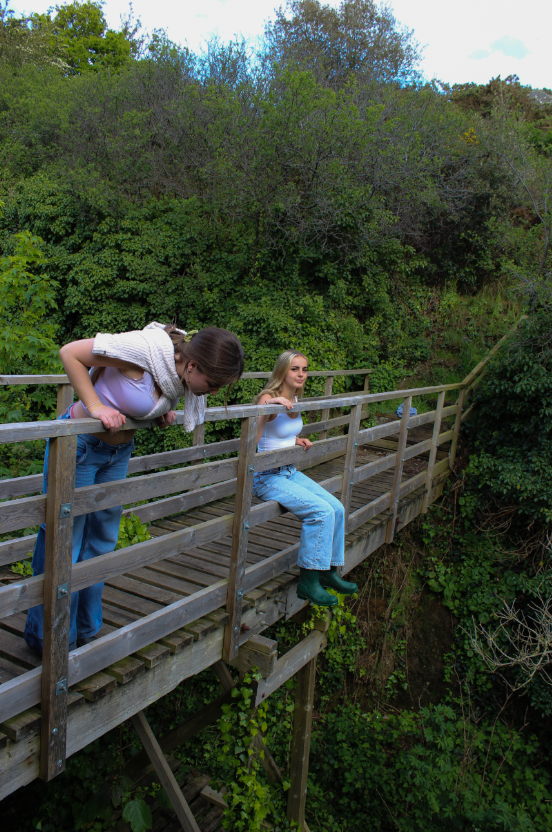
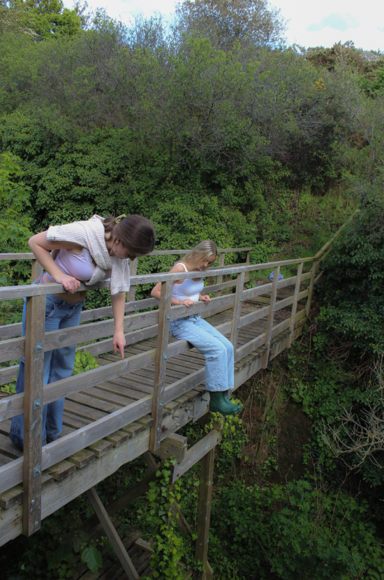
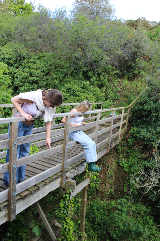
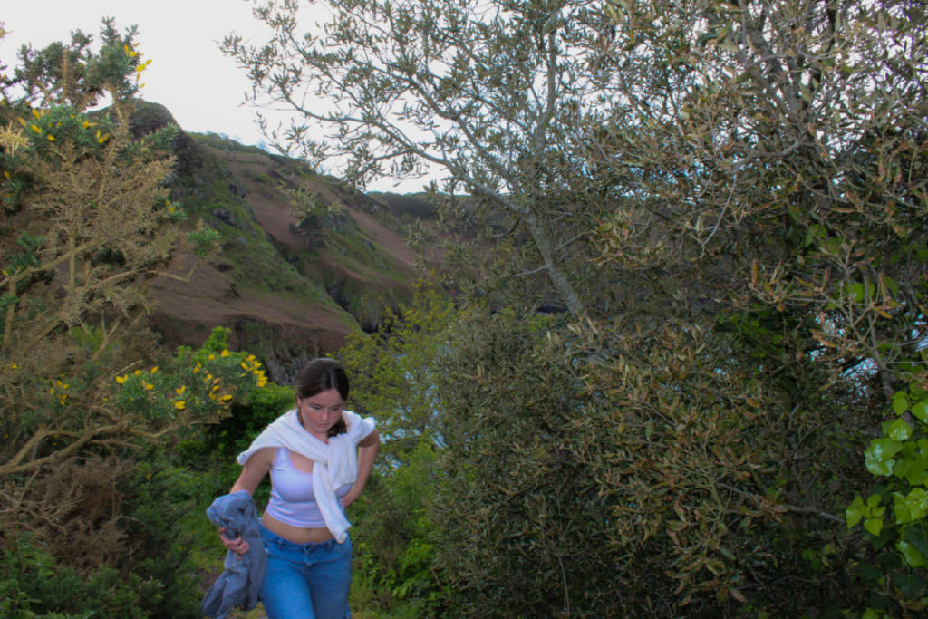
Using my artist reference Justine Kurland, I will recreate her images in the book ‘Girl Pictures’ in my previous blog posts it displays examples of her photography, and shows that the locations are mainly: cliff paths, the woods, fields and generally rural areas. By doing more research and also having my own idea of what id like to incorporate into this project of ‘femininity vs masculinity’ I’ve decided to do close up portraits in the studio using smudged makeup or ‘post crying makeup’ to challenge the ideology that when girls cry its seen sometimes as ‘pretty or aesthetic’. Referring to the bath photoshoot id like to create a similar message and meaning to the studio pictures i plan on doing. Having flowers in the milk bath, positioning the model to look as if she’s basically fully submerged in the water giving the message that she feels ‘weighed down’ and has no freedom yet still surrounded with beautiful things such as flowers to represent ‘purity’. I like this idea as the message/meaning can be perceived in several different ways making the image intriguing, giving it a deeper emotional meaning. However, the milk bath and studio shoots are more of an individual idea leaving out the artist reference.

Artist Reference-1 Justine Kurland

Justine Kurland – ‘female utopia’

My main inspiration is from her book called ‘girl pictures’ its exactly what I wanted to base my photoshoot on and how id like to represent femininity. It shows girls coming together and the simplistic caring traits that are shown.

About Justine’s book/photography:

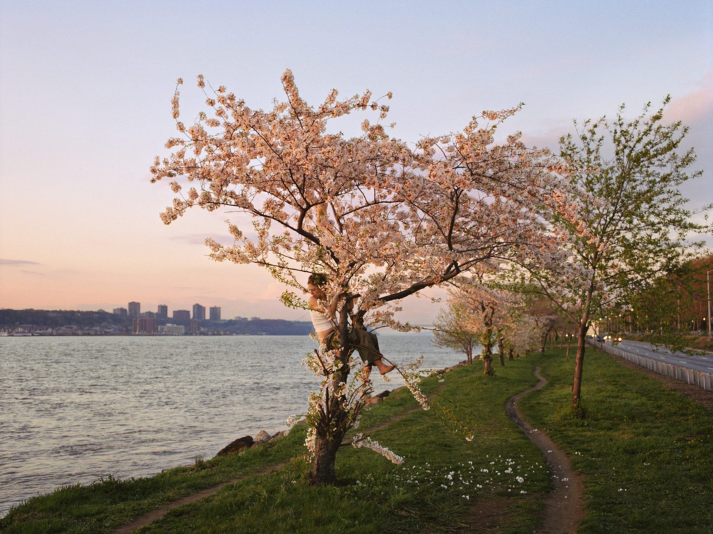
Kurland started this project in 1997 when she was a graduate student at Yale. In an essay at the back of the book, she crowns Alyssum as “the first girl” to be photographed. It started as a kind of make-believe. At fifteen Alyssum had been sent to live with her dad, whom Kurland was dating at the time. While he was at work, the two women bonded and began a collaboration, merging imaginations to plot out a narrative of a teenage runaway. Kurland went on to find more make-believe runaways, but one of the images from this time seems to hold a special importance; a portrait of Alyssum takes up a full spread towards the end of the book. Perched in a cherry tree between the Hudson river and a highway, Alyssum looks back over her shoulder. The river seems to flow away, while the headlights of cars on the road seem to be approaching. With her body in profile, Alyssum doesn’t seem to follow either direction.

Analysing some of Justine’s images:

Adventure stories were a source of inspiration for this project. The girls in Girl Pictures plagiarize these myths until they become their own, until the original myth is hardly relevant anymore. What’s left after all this repetition of runaway legends and costumes are the common themes: rebellion, self-sufficiency, confidence. A kind of inverse of the American Dream, but with the same carrot on a string: freedom. Perhaps this is why we love runaways so much.

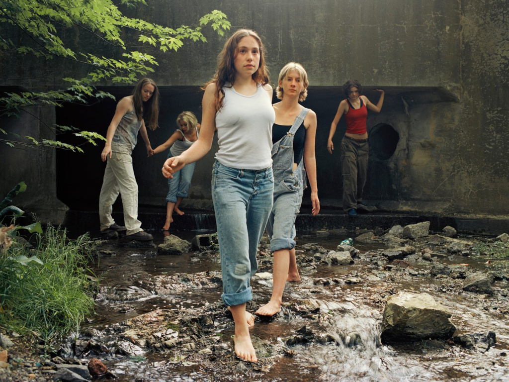
We see worn out overalls holding onto a girl’s body by one strap. The girl at the centre of this image guides the others, looking past the camera as if it doesn’t even matter, as if the thing worth examining is actually behind us.

But of course with freedom comes the threat of danger. So many of the images in Girl Pictures were taken outside in locations that feel desolate or easy to overlook. They are often staged under bridges or beyond fences or on the sides of highways; places that feel synonymous with warnings.

The focal point of the image is the back of a young girl who is raising her shirt. Instead of her face, we see the eyes of all the girls surrounding her, watching the big reveal. There’s one boy in the group, but his eyes are covered. A girl has wrapped her arms around him from behind and places her fingers over each of his eyes. It’s funny to see such an obvious removal of the male gaze, especially as it’s still present – and yet the delicate hands of a teenage girl prove capable of obstructing it. As viewers we look from his covered eyes to her watchful ones.

Yet it feels beside the point to spend too much time considering a male perspective when looking at this project. The subjects move on, and do more interesting things. They collapse in the snow in ‘Snow Angels, 2000’, and roast marshmallows over a garbage fire in ‘Puppy Love, Fire, 1999’. It starts to feel as if they exist in their own reality, just removed enough. This is especially strong in the photographs that appear to capture two parallel worlds.

There are other things uniting all the girls in these photographs. The deeper you get into the book, the more difficult it becomes to see each girl as a distinct character. The camera stays just far enough away to keep the subjects slightly anonymous. Or perhaps it’s because they are mostly long haired, or wearing similar clothing, or belonging to that vague age range that captures adolescence. Whatever it is, they begin to blend together into one visually unified group of girls. 

Kurland’s focus is less on individual girls, and more on what happens when they band together.

I found this text on a website and i agree with how i perceive the book and the idea of how girls specifically teenage girls are represented:

‘I don’t know any of the girls in Justine Kurland’s Girl Pictures, but it really feels like I do. Or at least, I must have seen them. Maybe they were there on the side of the highway, or in some public restroom, or just standing on a sidewalk as I passed by. The girls in their baggy jeans and bare feet. The girls in their leather boots and used sweaters. There’s something about them that feels like so many teenage girls. The images in this book weigh me down with a sense of nostalgia, and it’s not just the late nineties fashion. It’s the fact that the girls seem to be disappearing. Like catching a wild animal in a trap, it feels like by the time you look at each image of these girls you’ve already missed them. They’ve run off to someplace better or just some place that isn’t here.’

Using this book as a reference I’ve found that it creates an emotional connection and deeper meaning.
Artist Reference-2 Clare Ray

“the way children negotiate their surroundings and respond with an unharnessed spatial awareness, which I find really interesting when applied to the adult body.”

 “… each living body is space and has space: it produces itself in space and it also produces that space.”

https://clarerae.com/

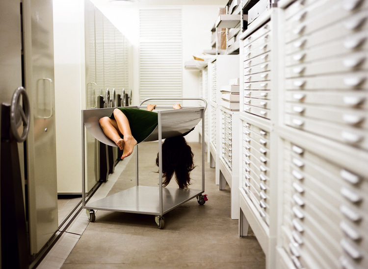
These photographs form part of an ongoing series of engagements with institutional space and architecture. Through my photographic performances I investigate specific gestures and movements undertaken within public and private spaces, considering the impacts on the body by educational and institutional authority. The photographic process of recording the body in space depicts my physical and experiential memory of these sites, which is often absurd or uncomfortable.
My practice at large is informed by feminist theory and considers the implications of representing a woman’s body (my own) in an inherently fetishizing medium. My aim with all my photographs is to subvert the dominant ways we depict women’s subjectivity.

This series was captured in various spaces at RMIT University (life drawing studio, court room, design archive), an institution I have engaged with as a photography student and now lecturer. It is also where my late father studied architecture in the 1950s, which prompted my thinking when making this work about our personal connections to these educational spaces over time. -Clare Ray.

The common theme shown in these specific images are that only her legs and body are visible, her face is hidden and mainly focals the legs which is representing how women’s bodies get fetishized.

In these photographs action is opposed with stillness, danger opposed with suspension; the boundaries of space, both of the body and the environment, the interior and the exterior, memory and dream, are changed.

Femininity vs Masculinity

Femininity – qualities or attributes regarded as characteristic of women or girls.

Masculinity – qualities and attributes regarded as characteristic of men. 

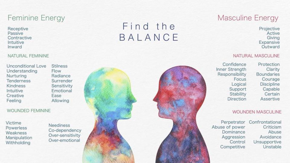
When we talk about masculinity and femininity, we’re talking about a person’s gender. Gender is a social construct, and is one of many ways we as humans make meaning and create social structures.

Feminine traits include being emotional, collaborative, nurturing, vulnerable, caring and humble. Comparing to masculine traits which are considered as dominant, strong, independent, assertive, brave and innovative.

When looking at both these traits I don’t see gender. Traditionally feminine traits are considered bad or unwanted, I believe that is why women and men have taken to more masculine traits. In the workplace, I found it better to be dominant, assertive, and strong than it is to be caring, humble and emotional. Now, why is this? Why have we taken these traits and immediately started labeling them? All of the feminine traits are associated with women, whereas the masculine traits are associated with men. If a woman is seen being dominant or assertive she is bossy, but if a man is dominant or assertive he’s a boss and is taking control. We can say the same thing about a man who is seen crying or being caring, he can be considered weak,  but if a woman is emotional or caring it is considered good or the way she is supposed to act.

It is time that society realizes that masculinity and femininity are not traits we associate with depending on gender, but instead depending on the character. To be balanced and better people, I believe we need to have both masculine traits and feminine traits. 

How can identity be influenced?

The geography and cultures of our town influence our productivity, creativity and happiness. Our contentment with our identity has a lot to do with the opportunities our location affords us. If we feel isolated, out of place or unaccepted in the collective identity, we may come into conflict with our personal identity.

Identity can be influenced by upbringing, as people may have been pressured since being young to act/be a certain way, or what is deemed ‘appropriate’ and ‘fitting’… either that being towards their religion, gender, personality or beliefs. Your upbringing can be the biggest influence on the person you will turn out as, to be moulded into the person you are.

Diamond cameo

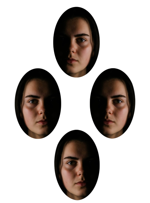
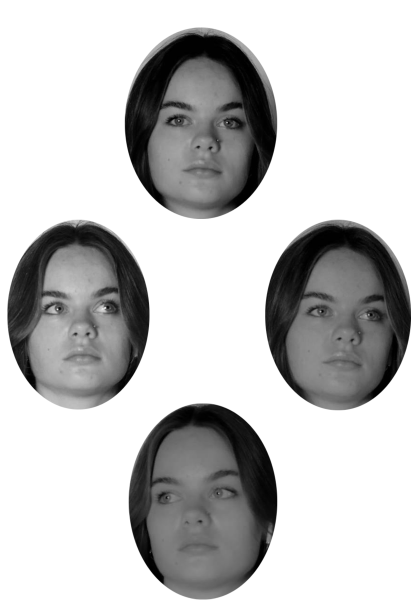
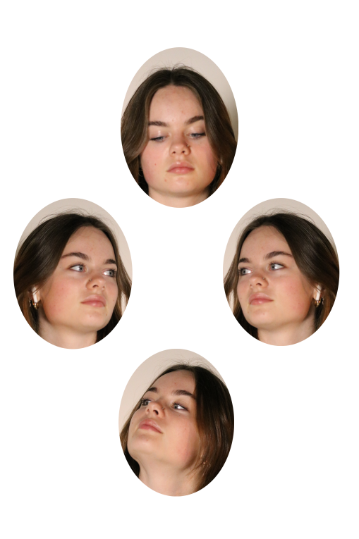
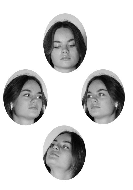
I chose to experiment and to diamond cameo as I wanted to practice and expand my knowledge on photoshop. Its also very different do any other styles of photography/portraiture I had seen, therefore, I wanted to research and explore.

Background on diamond cameo/ Henry Mullins:

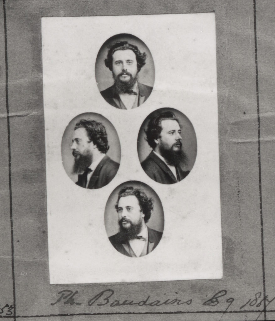
Henry Mullins is one of the most prolific photographers represented in the Societe Jersiase Photo-Archive, producing over 9,000 portraits of islanders from 1852 to 1873 at a time when the population was around 55.000. The record we have of his work comes through his albums, in which he placed his clients in a social hierarchy. The arrangement of Mullins’ portraits of ‘who’s who’ in 19th century Jersey are highly politicised.

A photo zine was created by Société Jersiaise Photographic Archive that presents a selection of images from its historical collection. This link shows some spreads from ED.EM (photo zine):  ED.EM.03 Henry Mullins / Michelle Sank – on the social matrix

My take on diamond cameos:

By using the elliptical marquee tool on photoshop I could create the diamond shape onto my portraits, I experimented by firstly using a singular portrait and duplicating the shapes to allow me to flip/ rotate the other duplicates to create an almost symmetrical outcome. I then went on to choose four separate portraits and create a diamond cameo, I struggled slightly to make the shapes the same size for each portrait however to overcome that problem I figured a way to use the first shape as a template to ensure all diamonds were identical size.

Edit one: (using one portrait, continuing to flip and rotate)

Edit two: (using four different portraits)

Edit three: ( using three portraits however flipping one)

Edit four: (Black and white duplicate of edit three)