








Stephanie Jung:
My Work:


Jung’s Work:

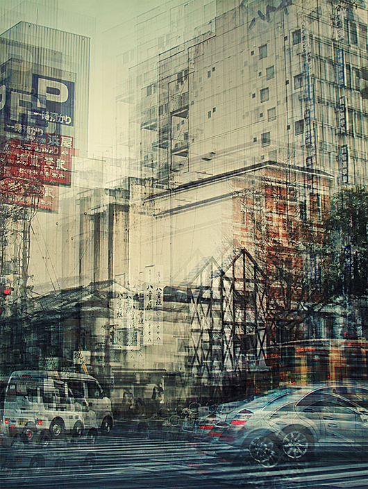

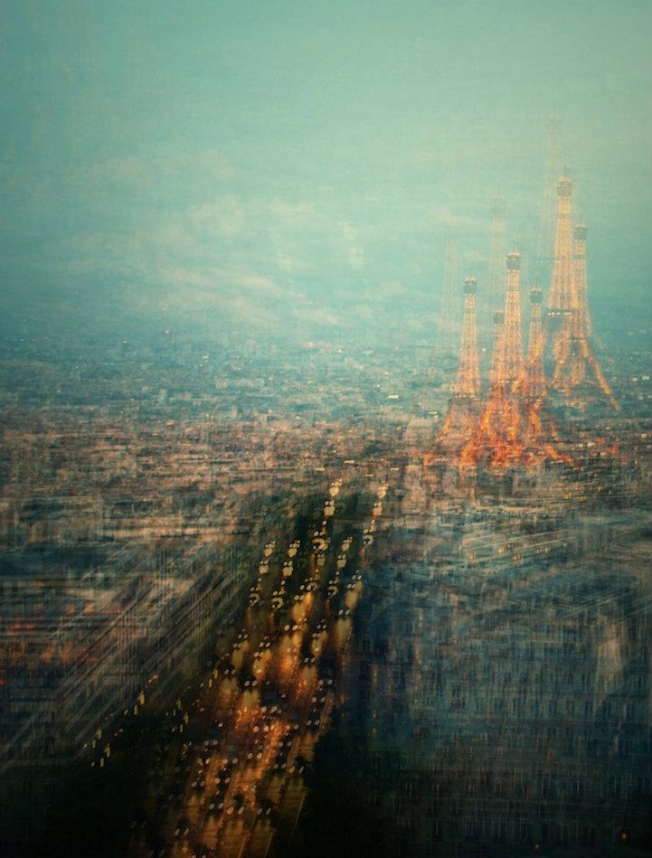
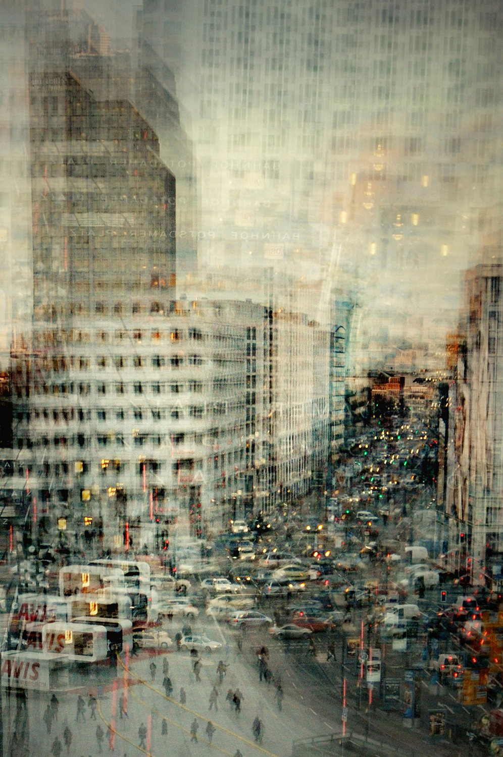
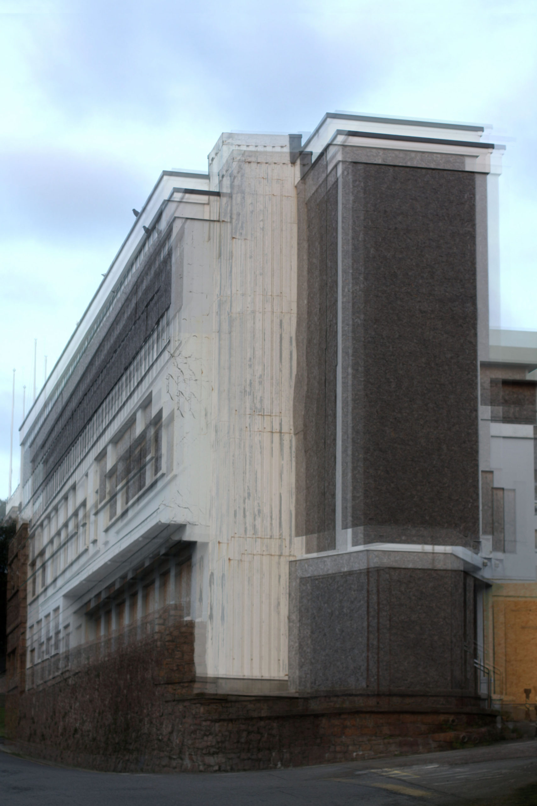
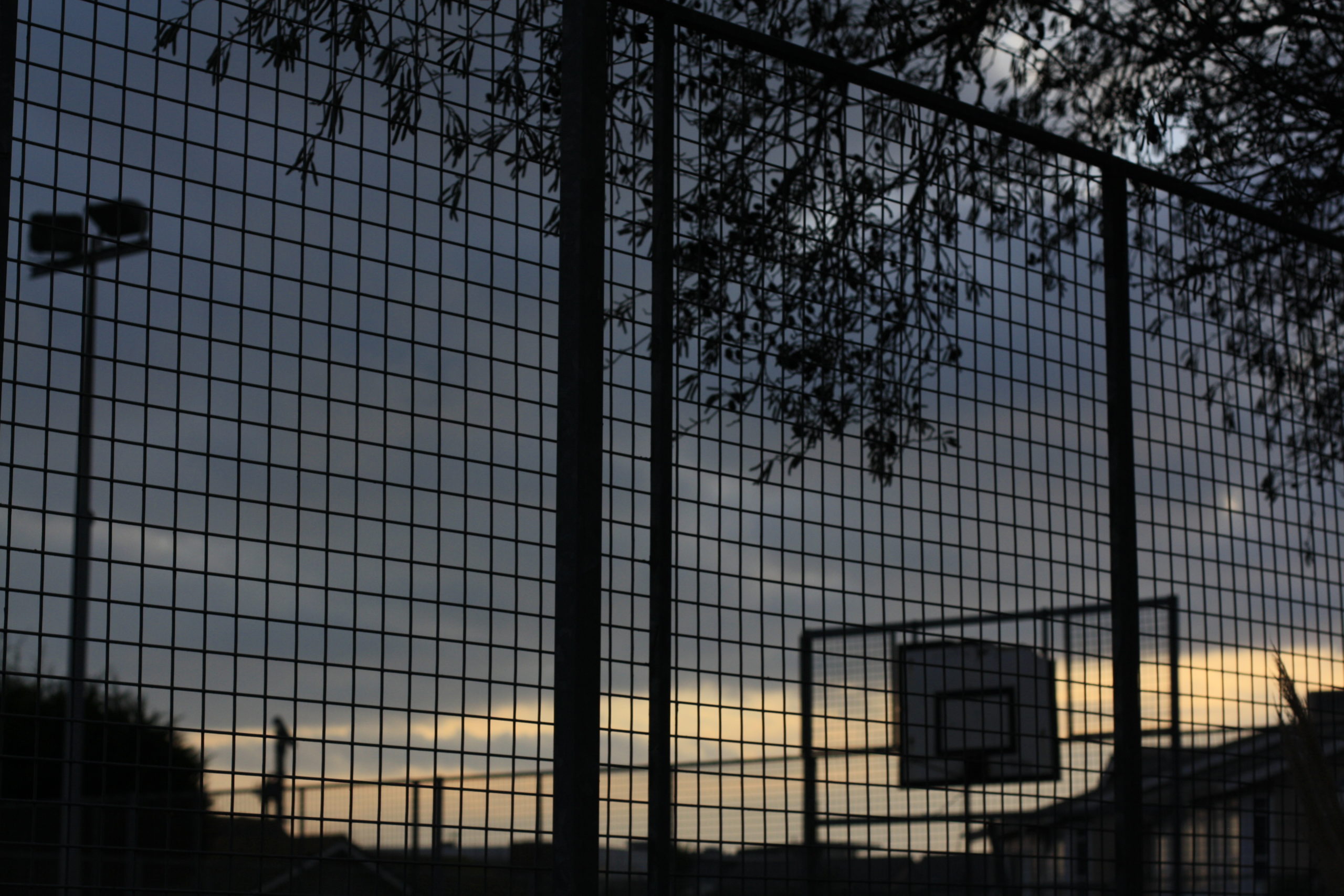
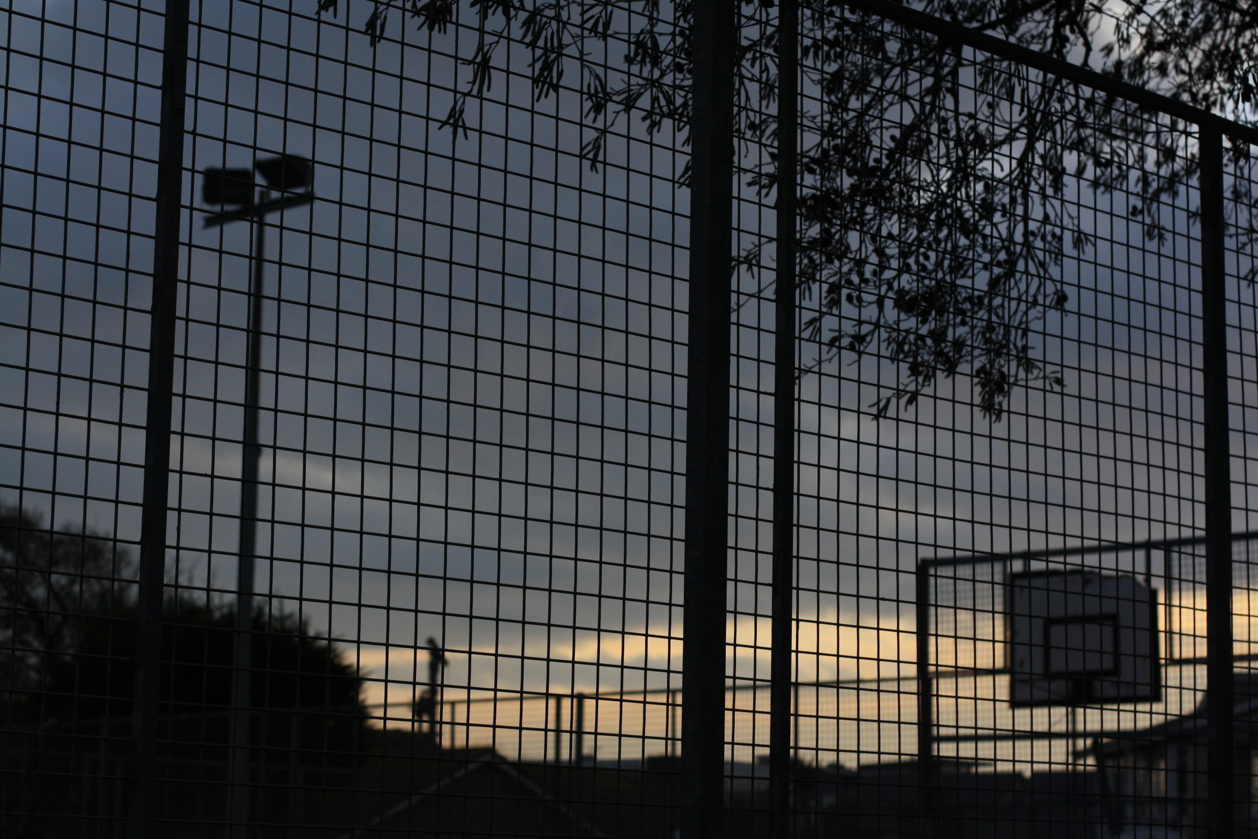
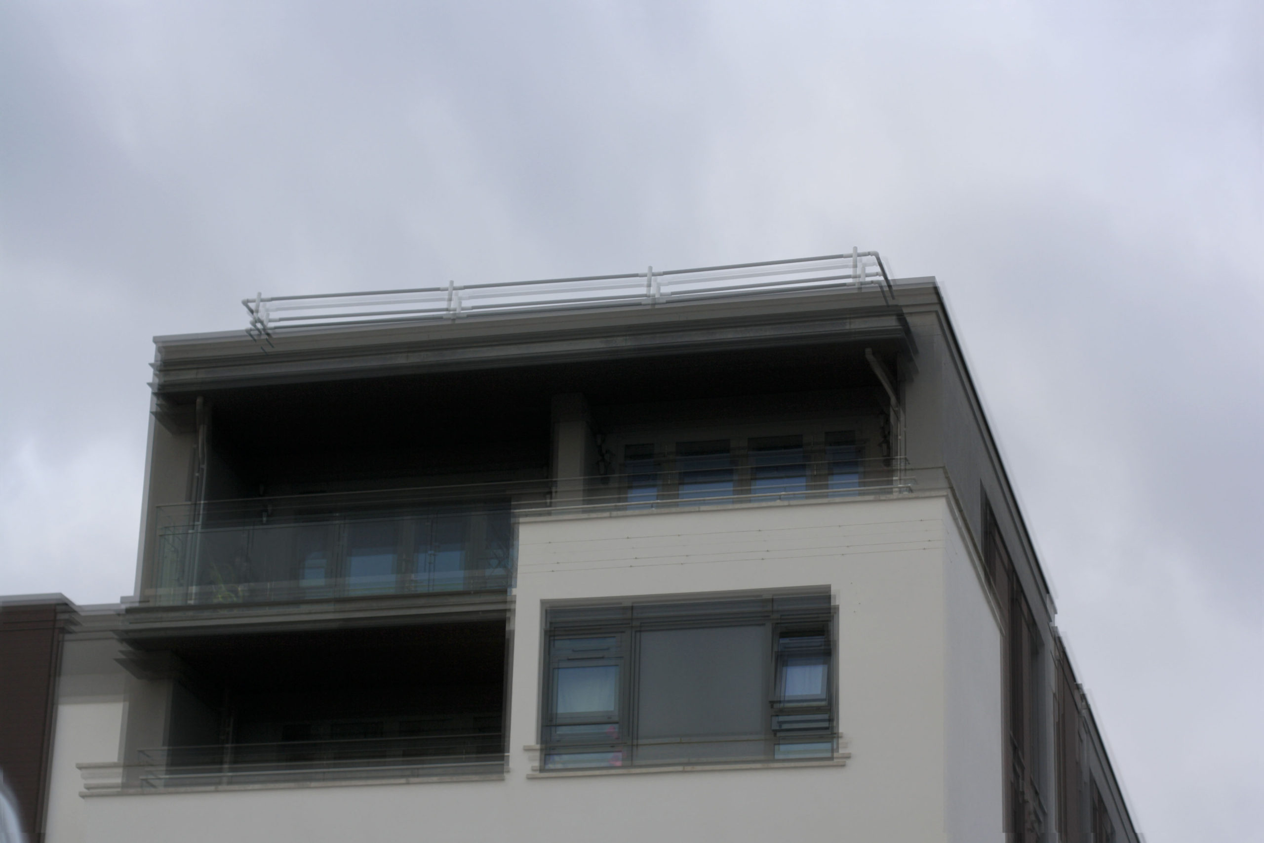
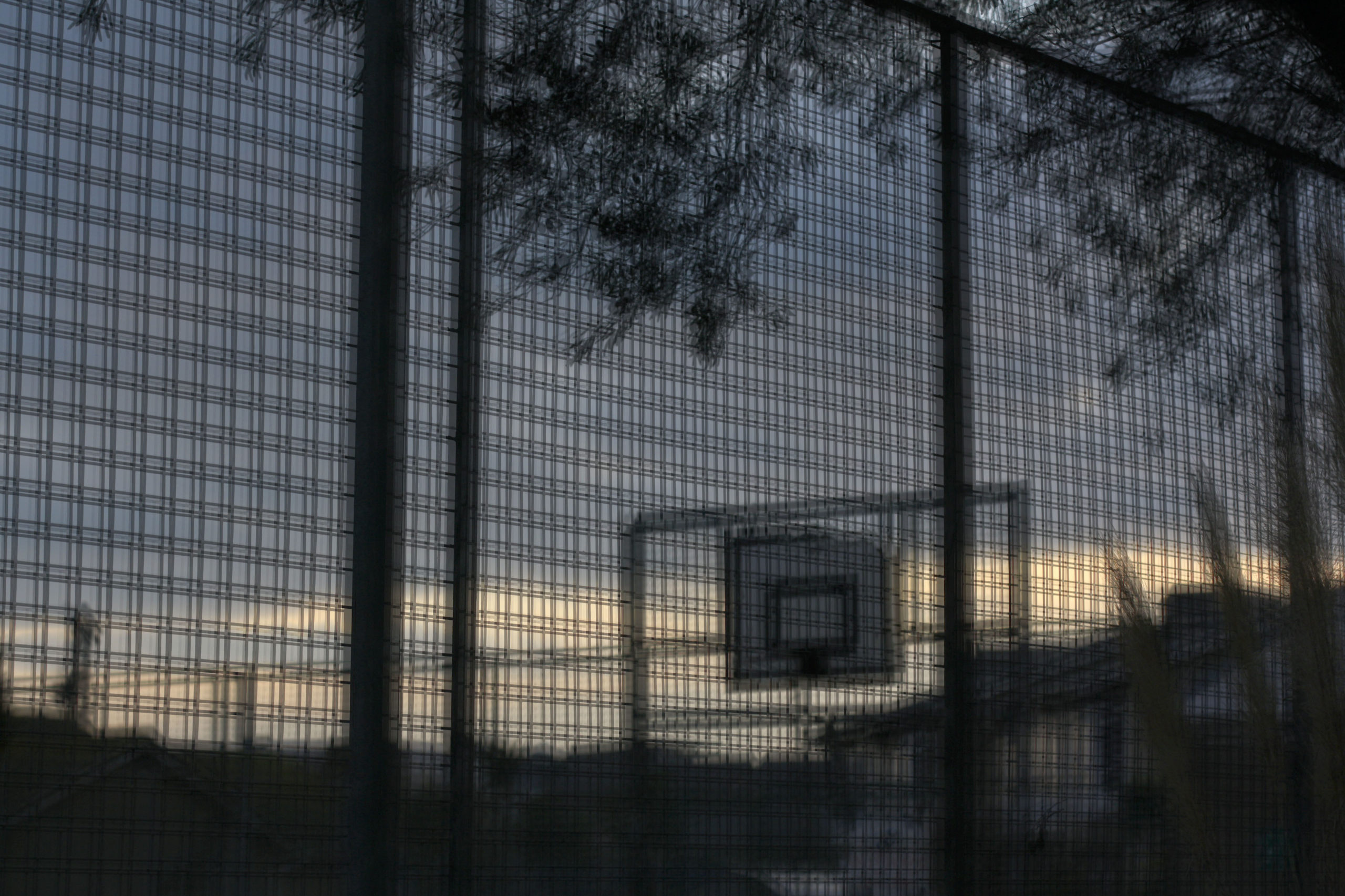
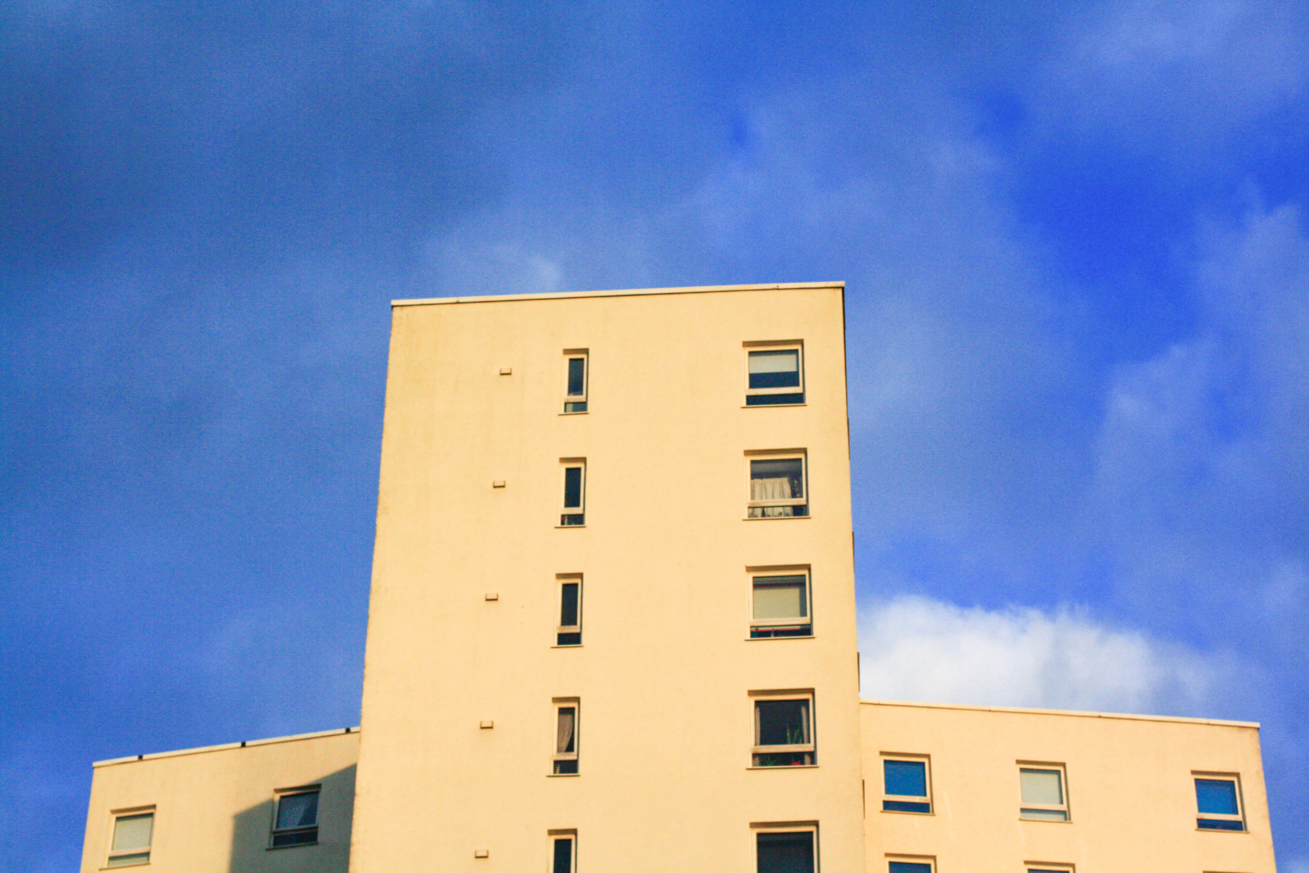
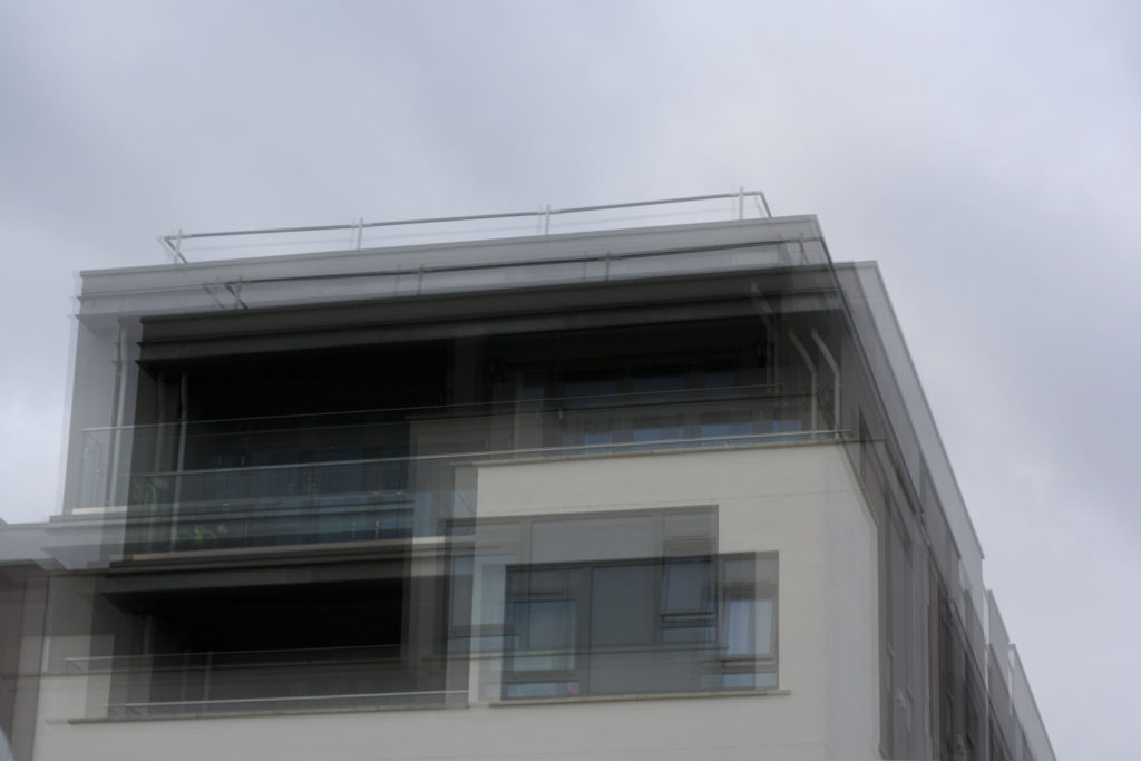
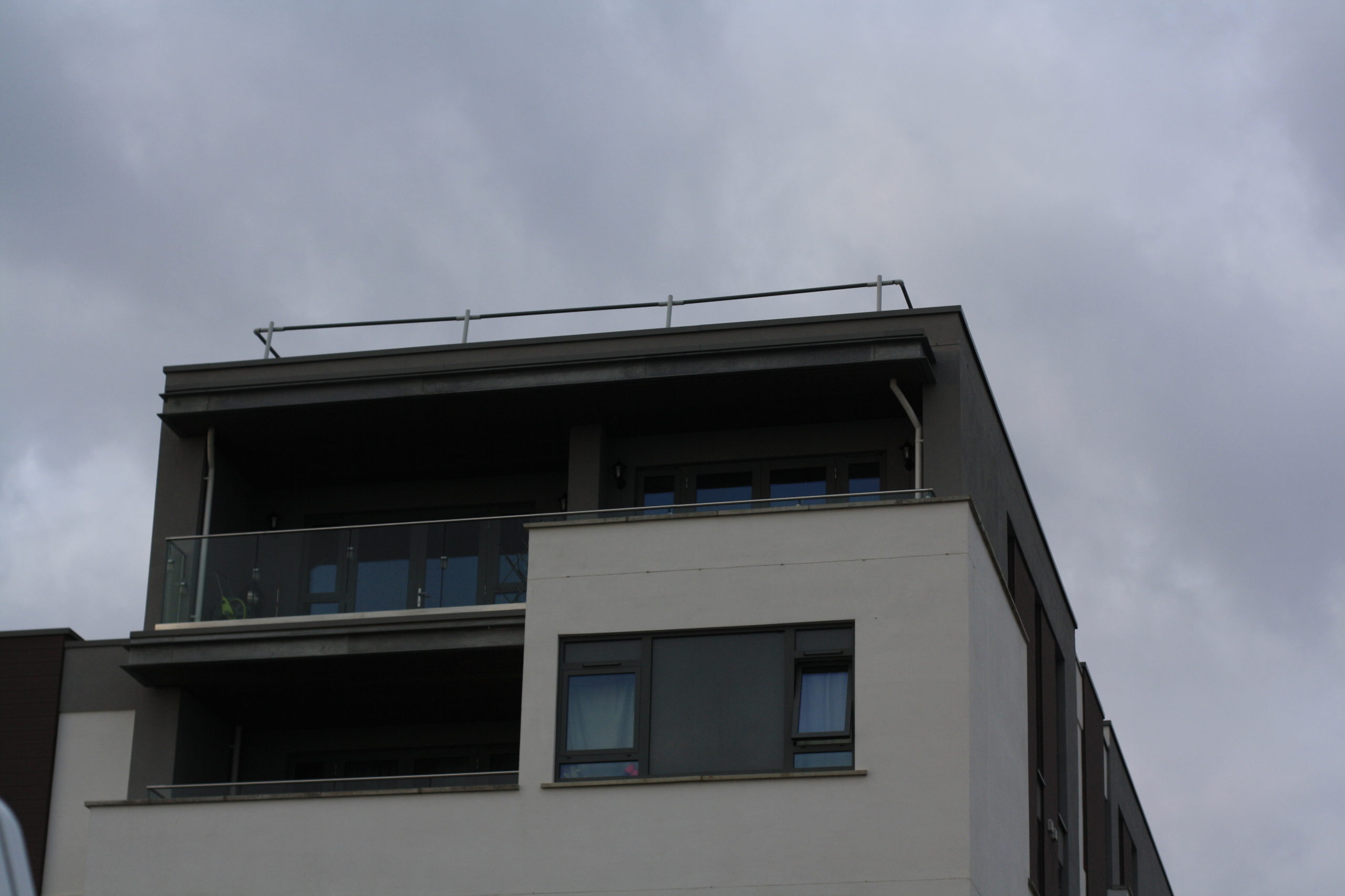
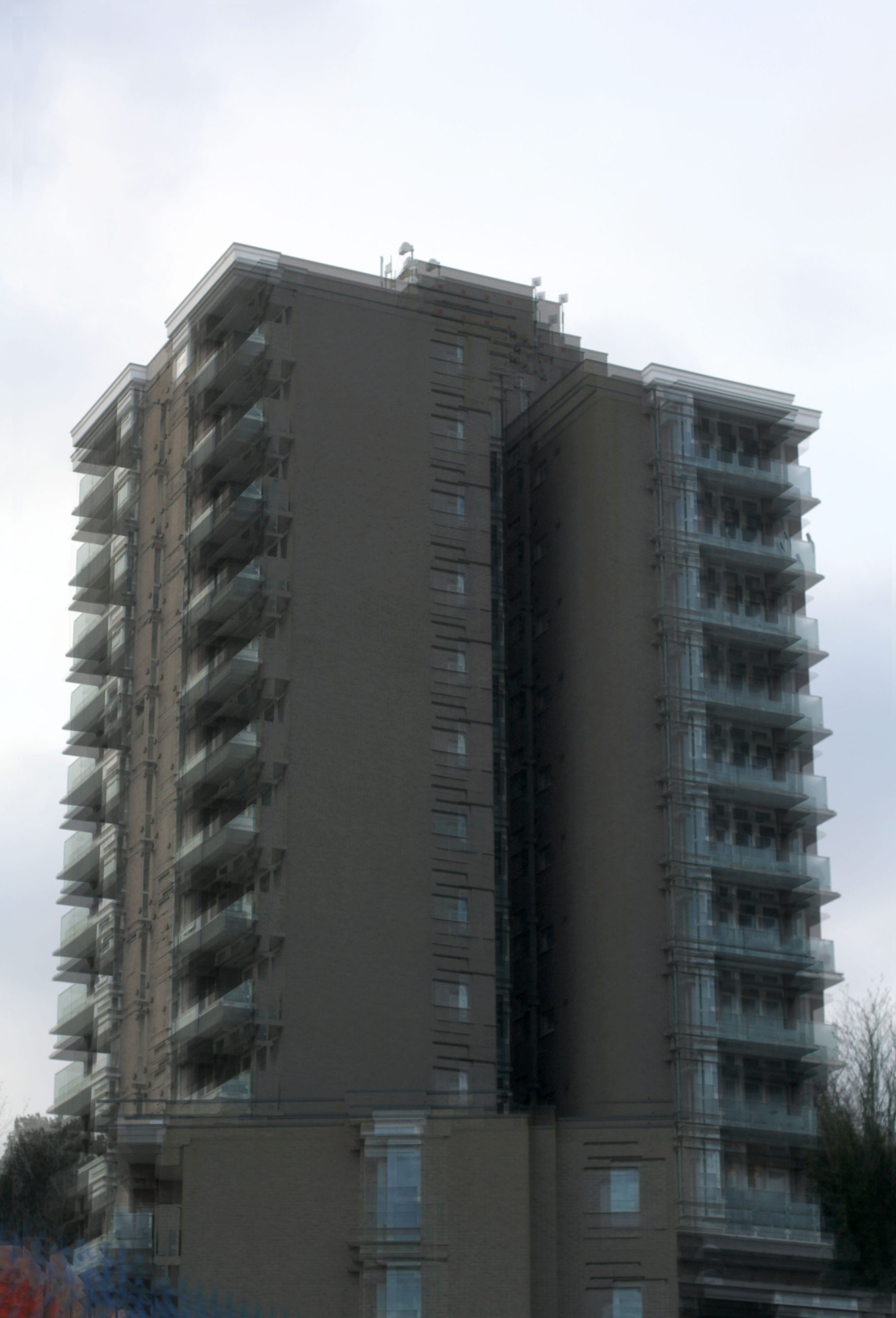
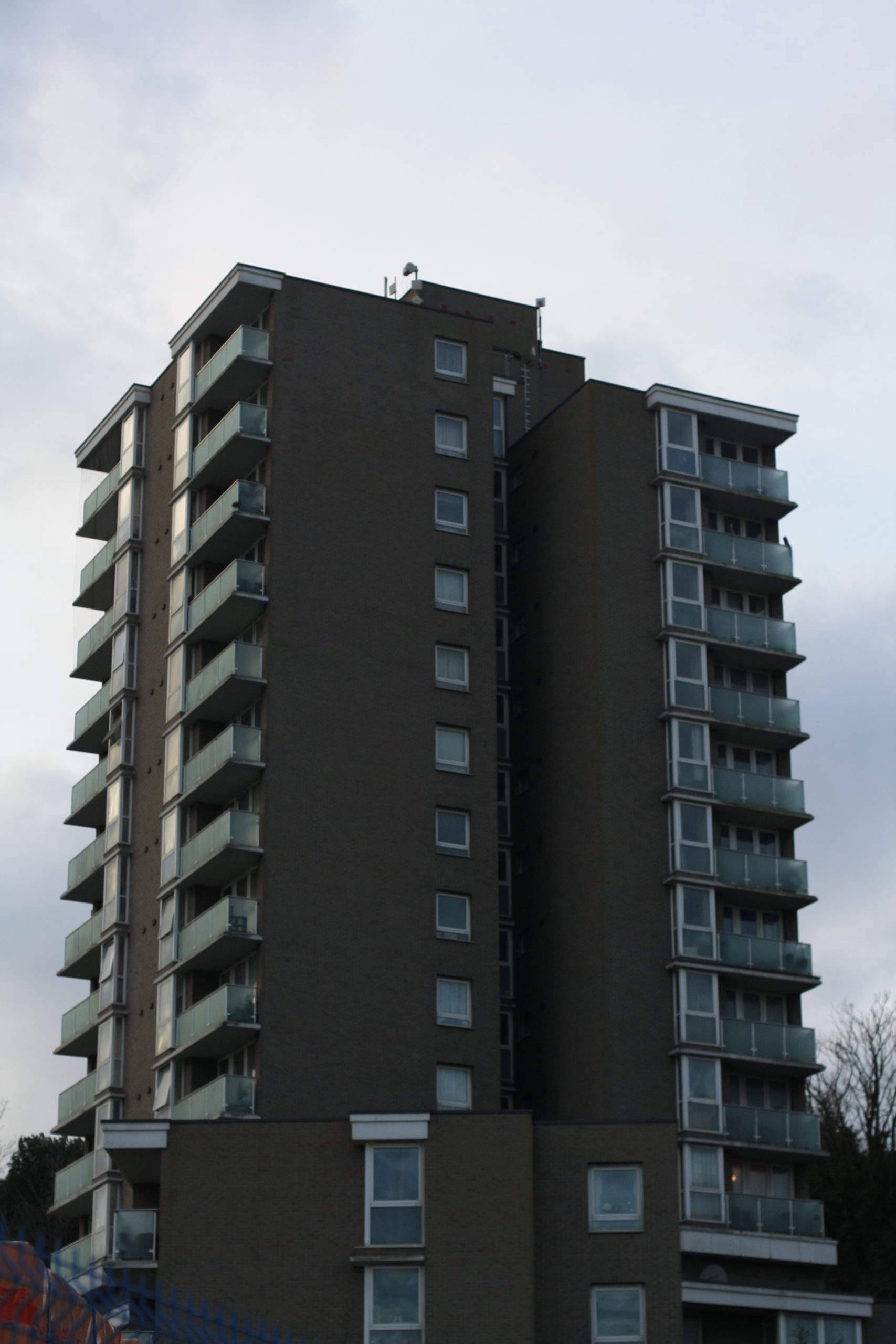
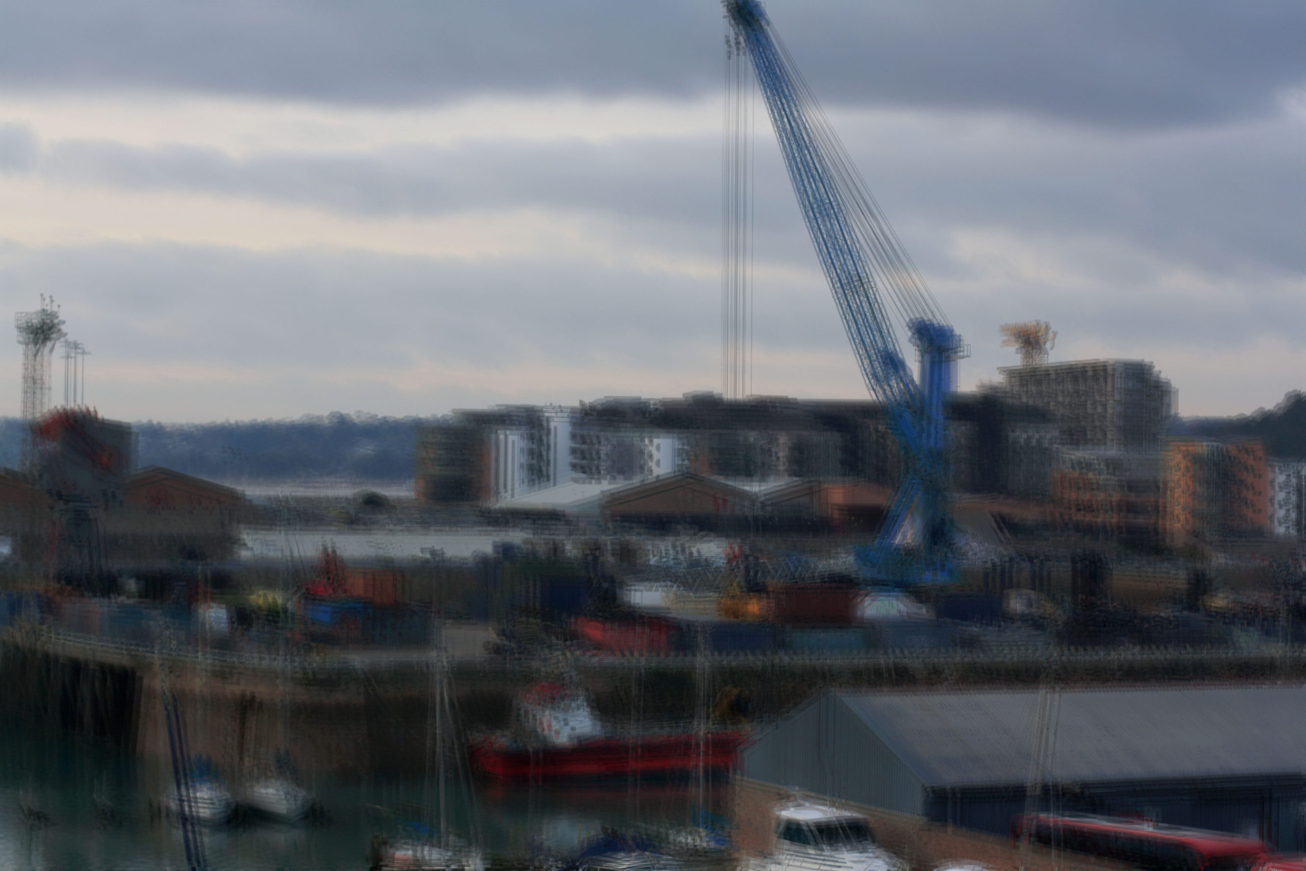
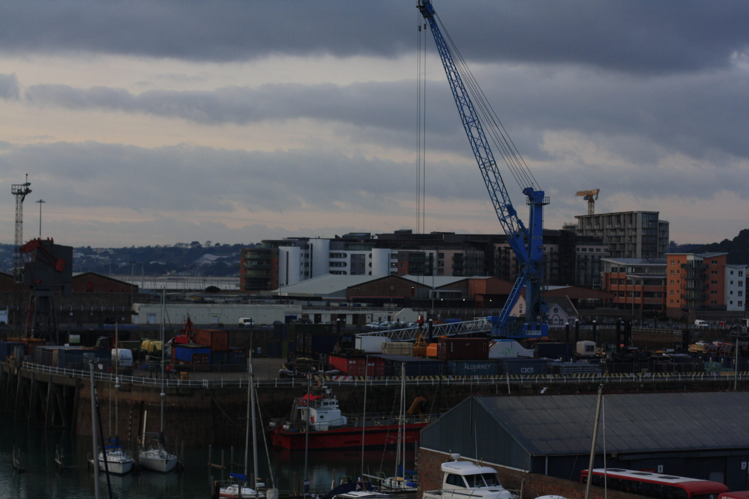
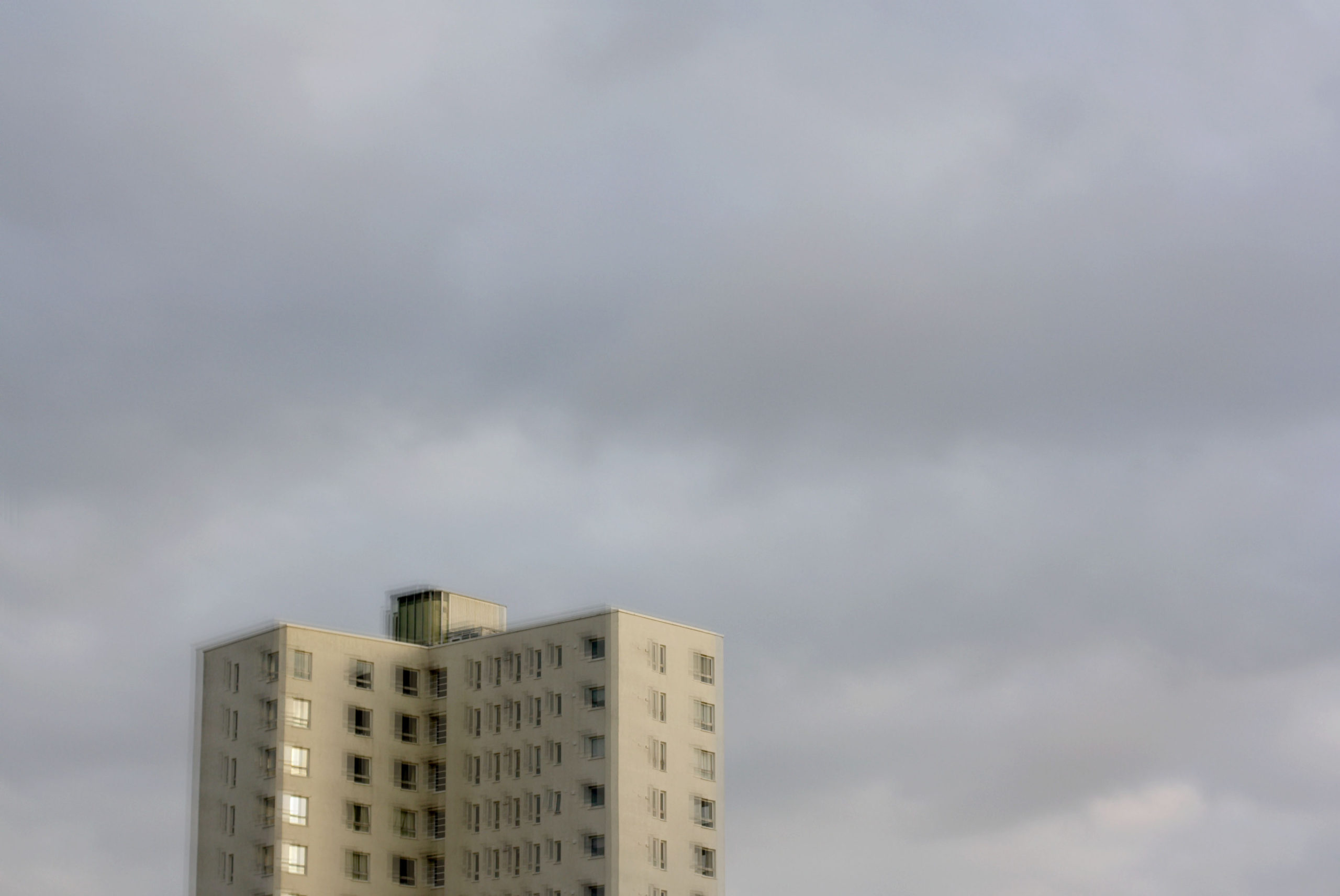
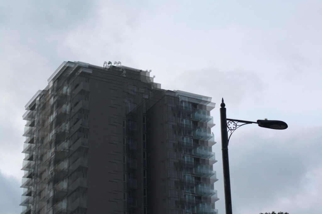
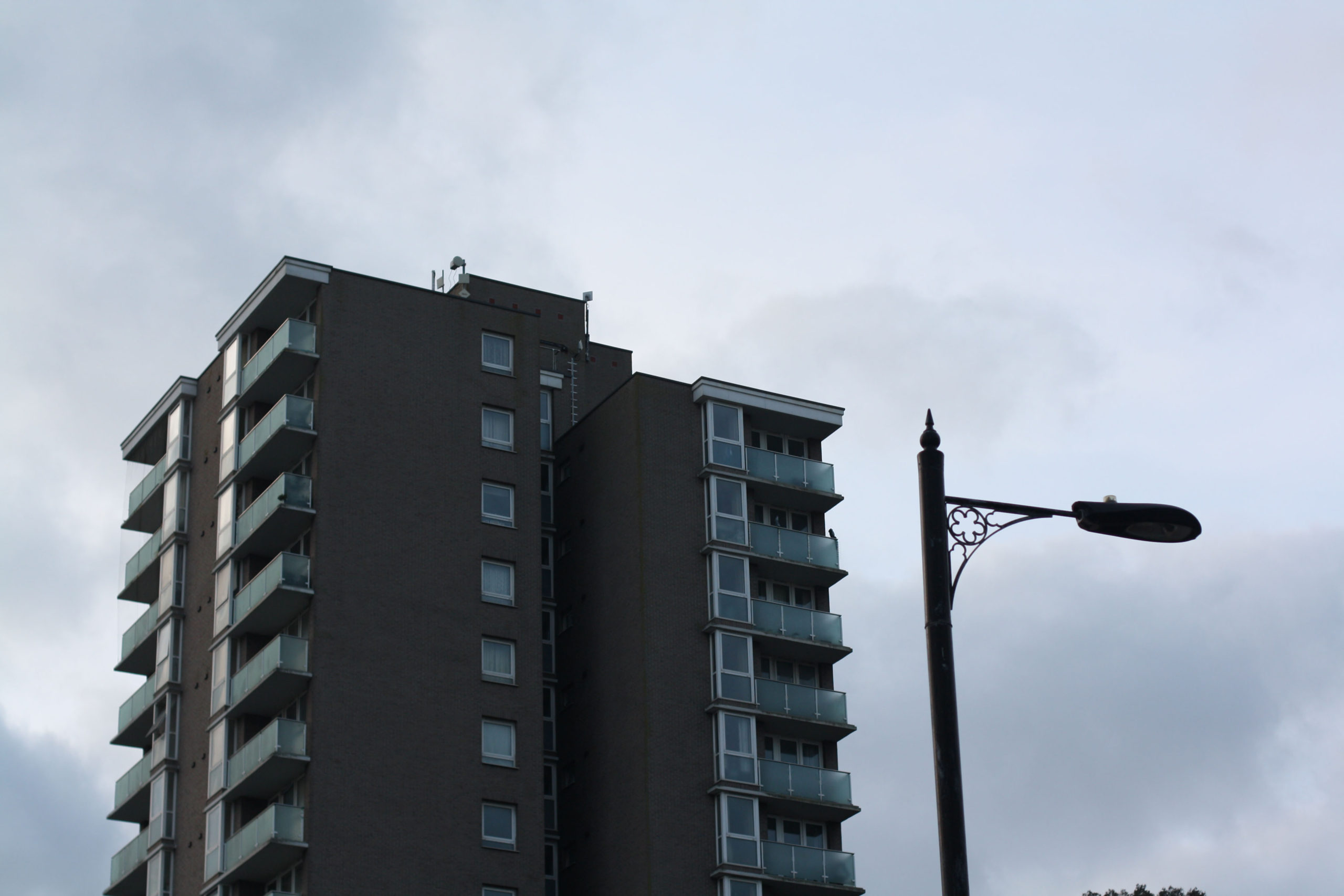
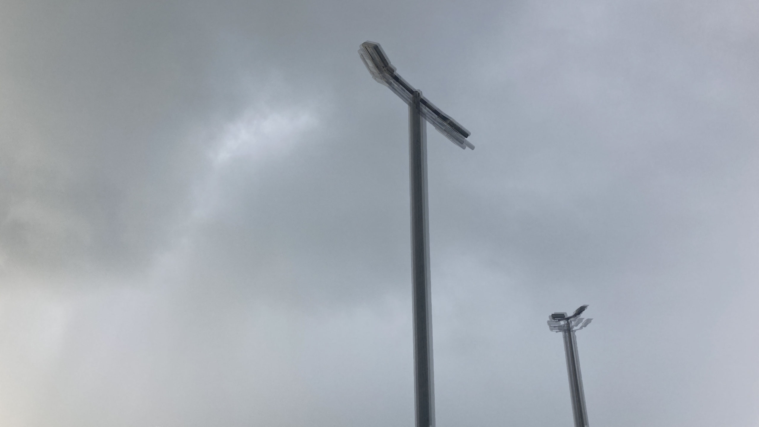
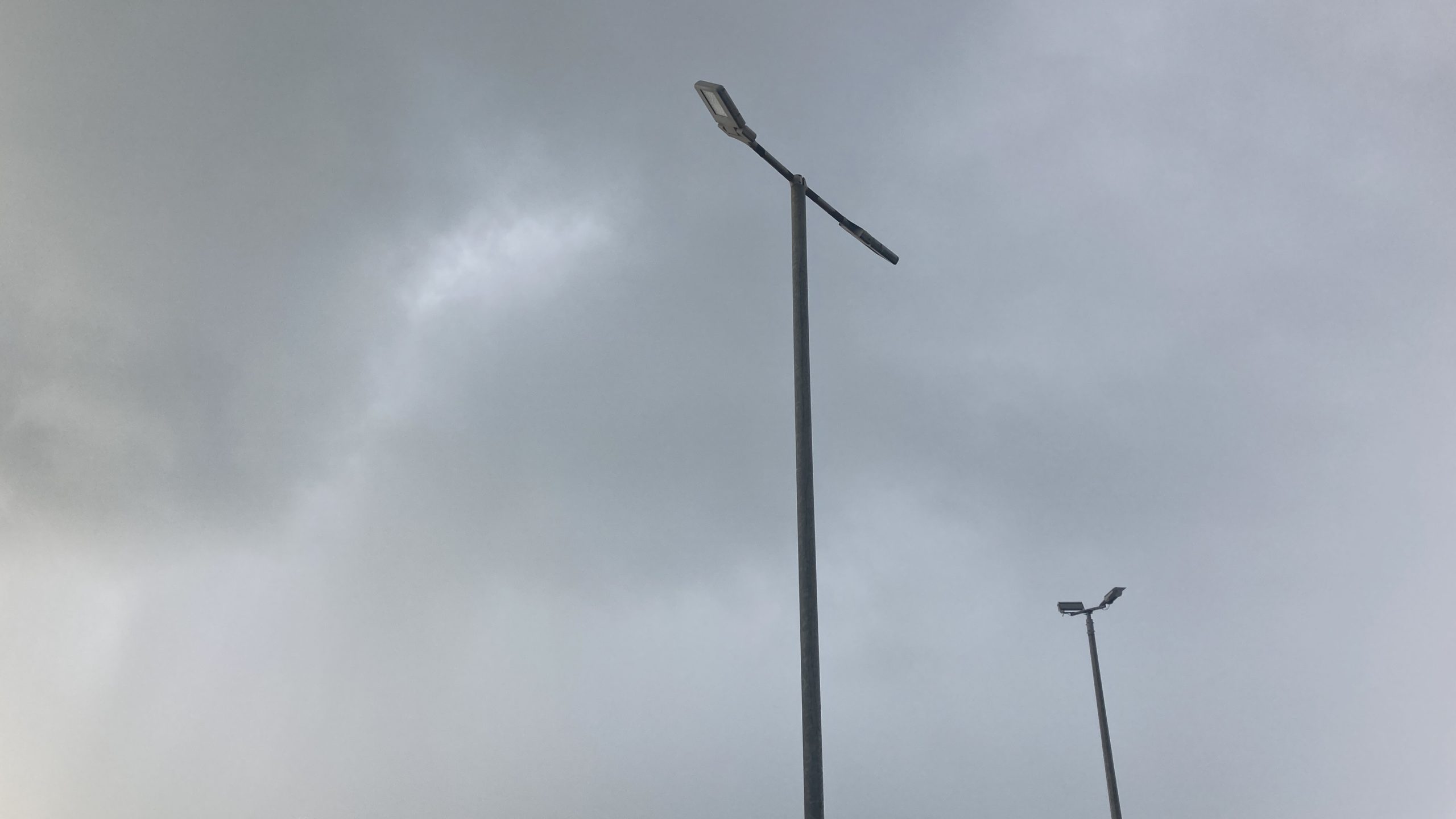
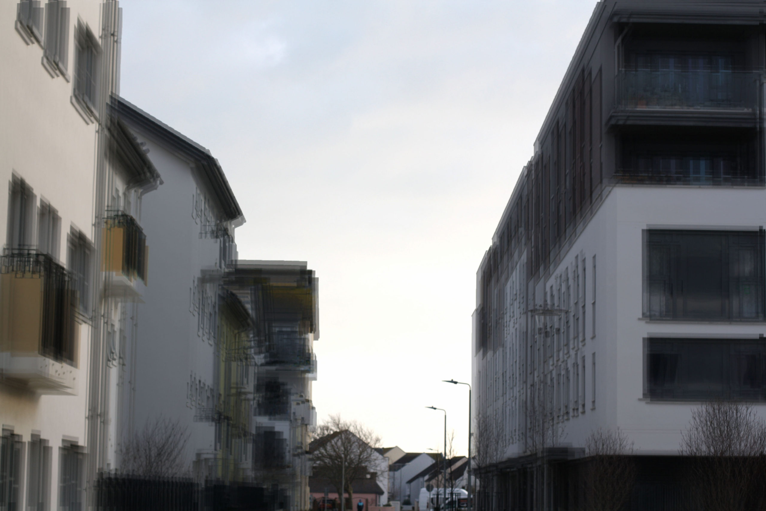
Very similar themes here and I think mine are just as good as hers, although you can definitely tell who made what as Jung’s pictures have a much stronger blur and probably involved a different camera technique. Some of mine don’t have a lot of visual blurring and I made my ones from the same single photo. Something else is that Jung’s photos have better views of cities and streets and mine are single objects where not much is going on nearby. I wish I had ventured more into town to take pictures of the streets along with the many more buildings. I also wish that when I was editing mine, I had one of Jung’s photos open so I could quickly compare them for the best accuracy. All together these photos aren’t actually that bad, but compared to Stephanie’s ones they are quite weak.
Robert Clayton:
My Work:



Clayton’s Work:
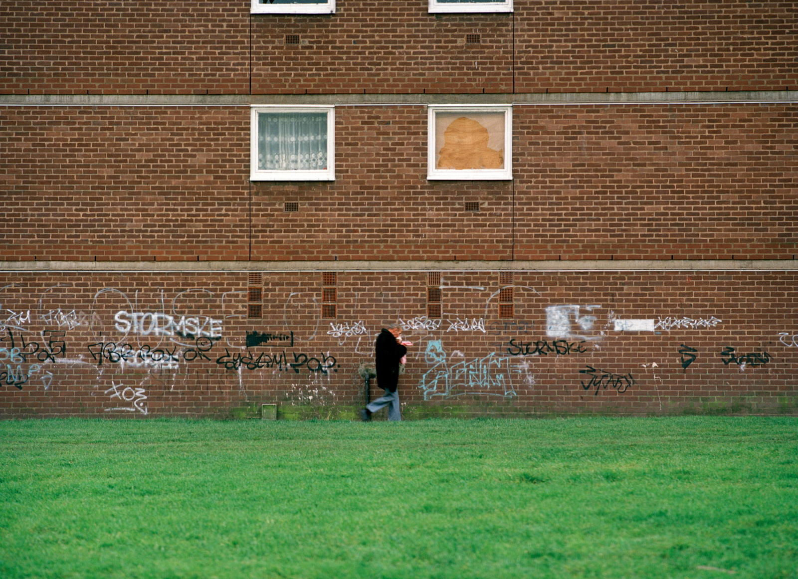
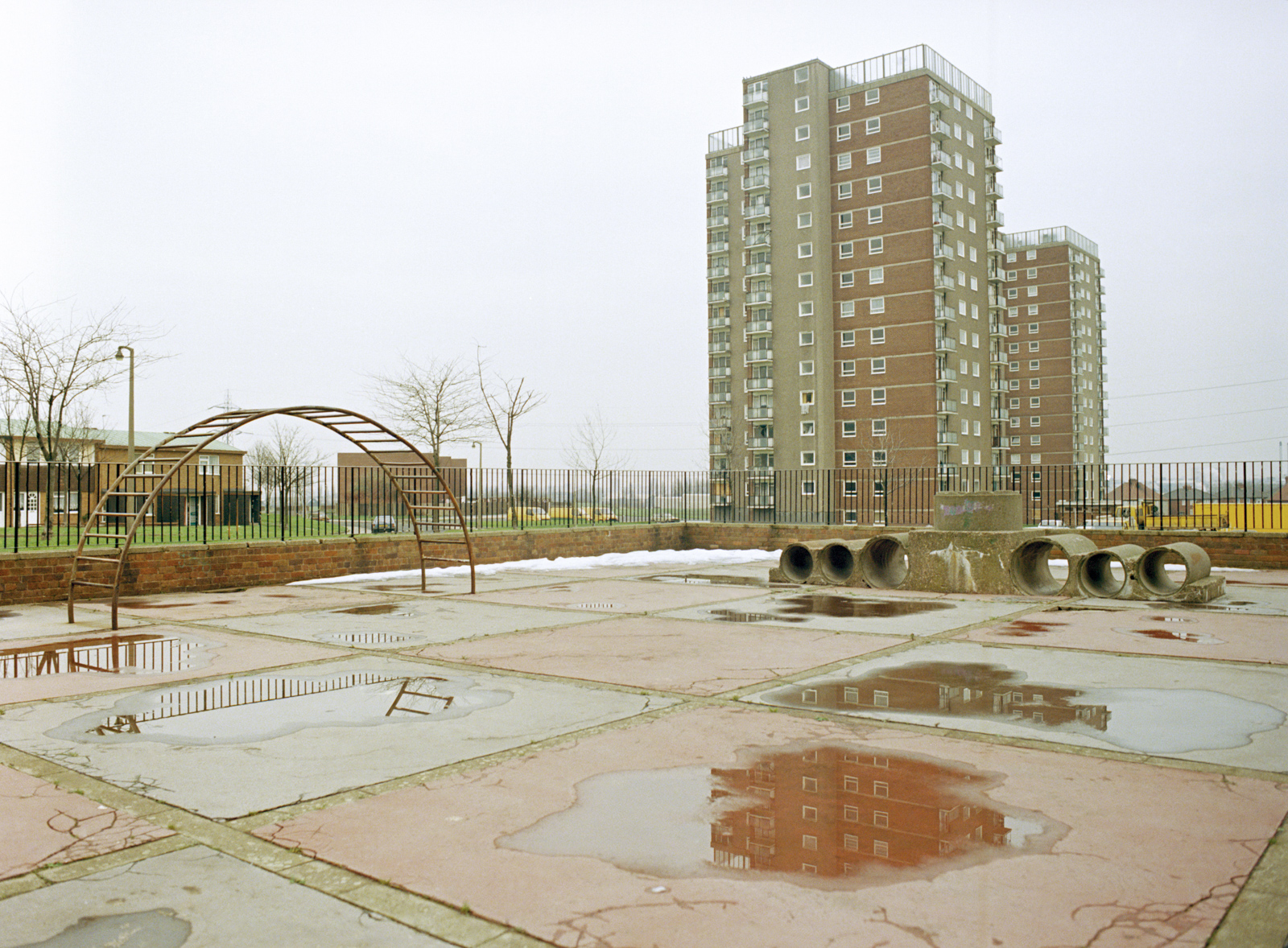
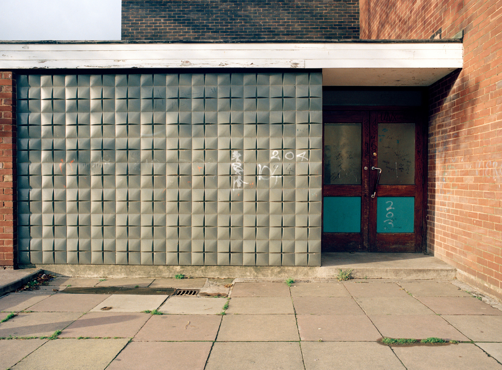
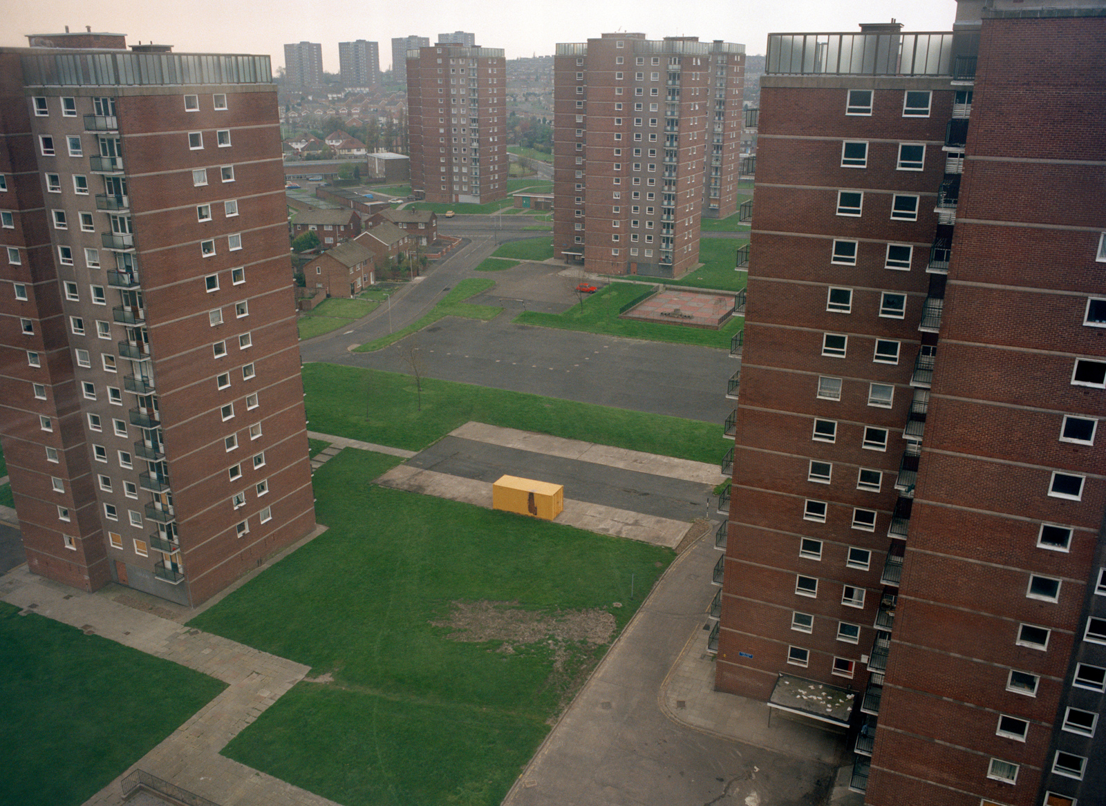
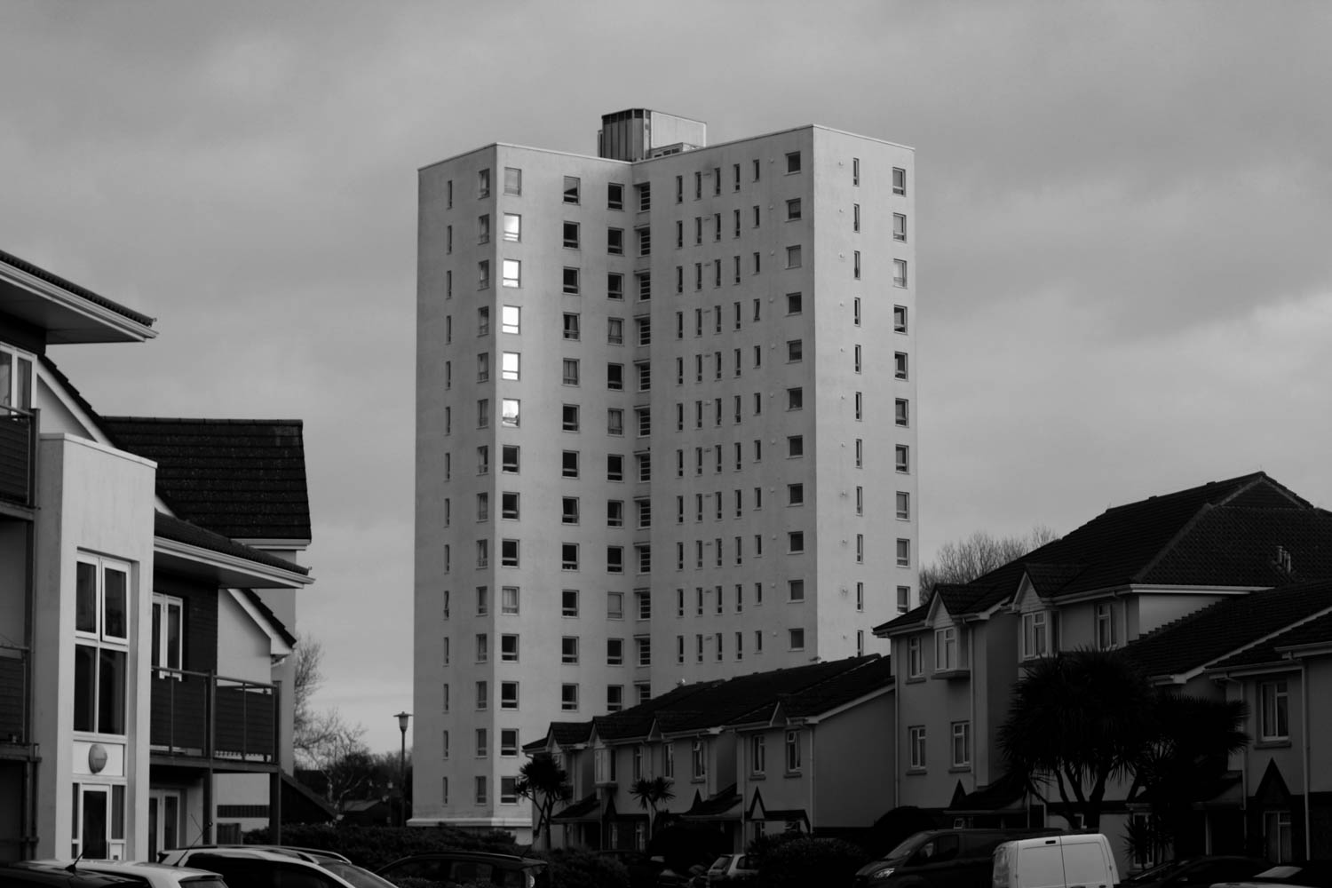
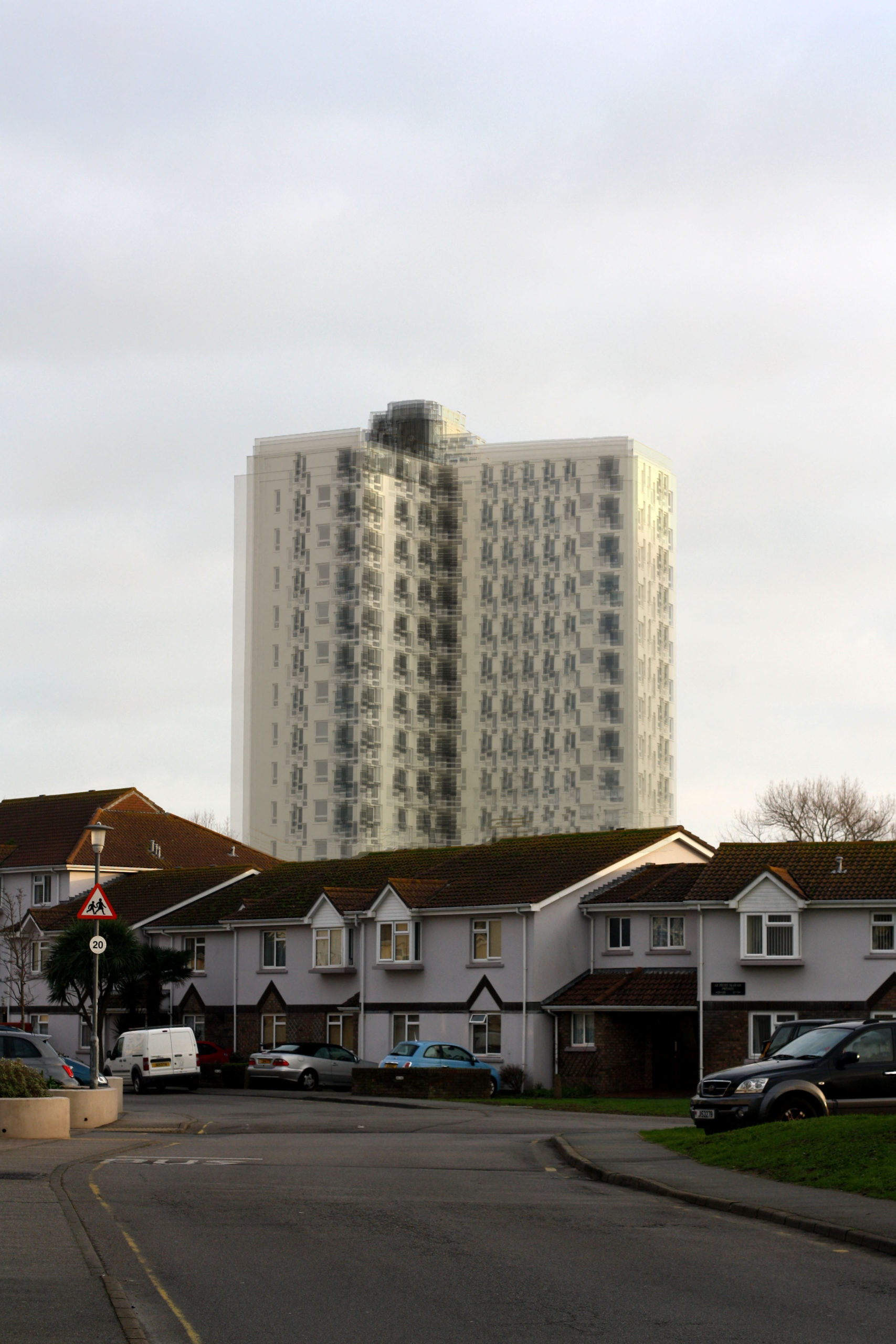
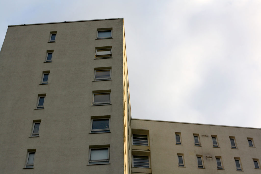
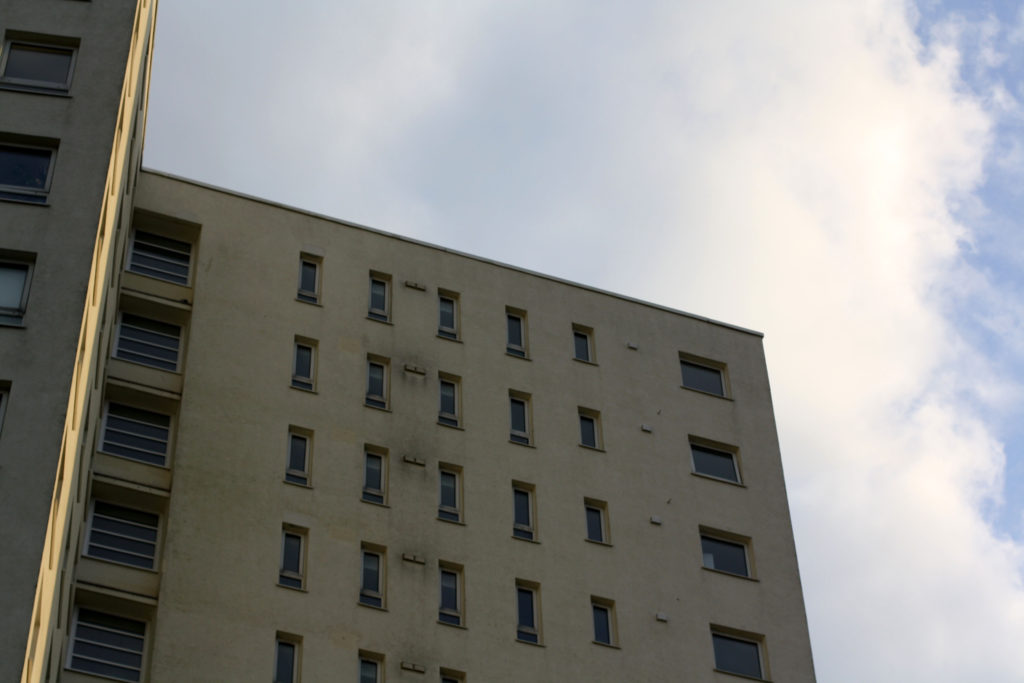
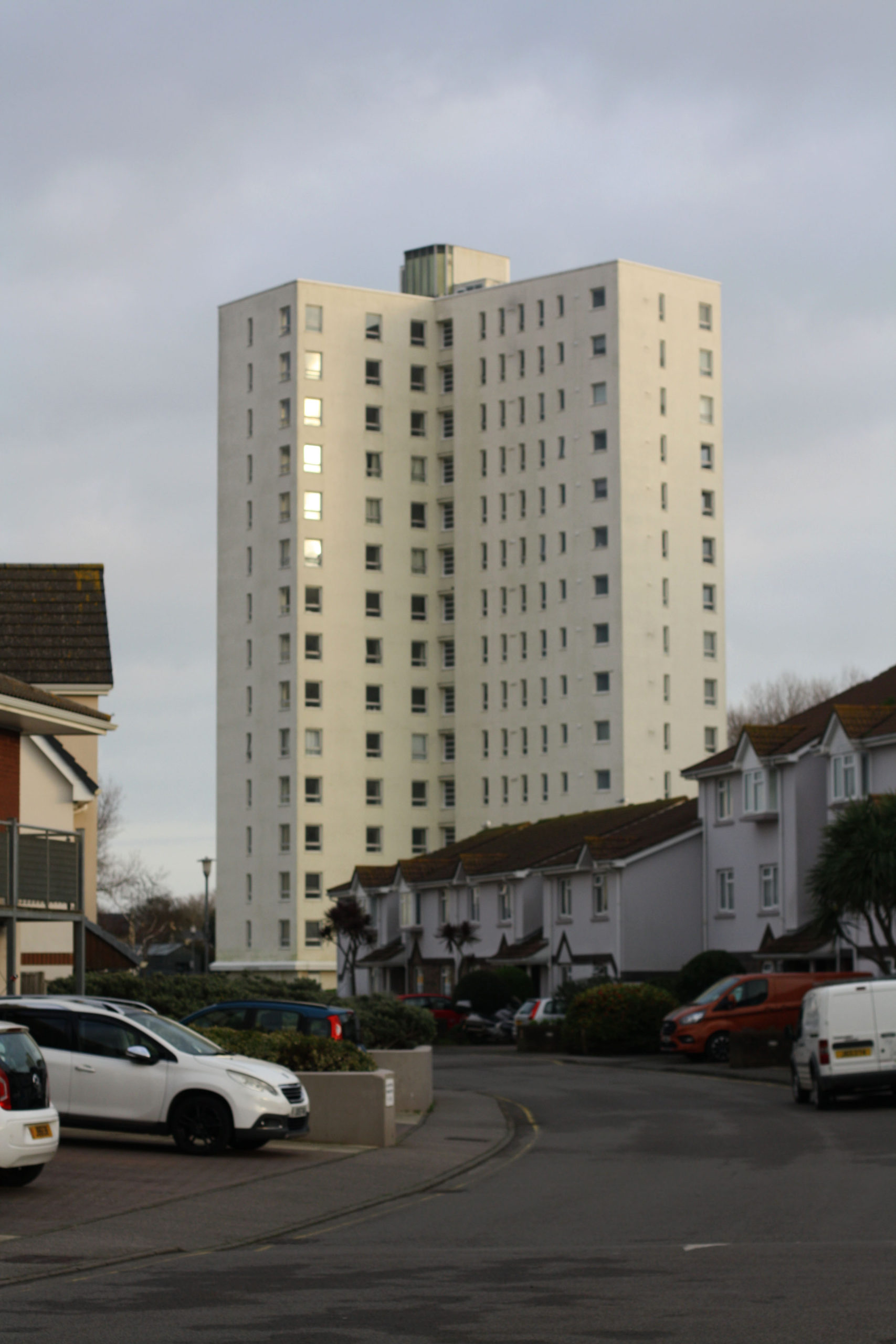
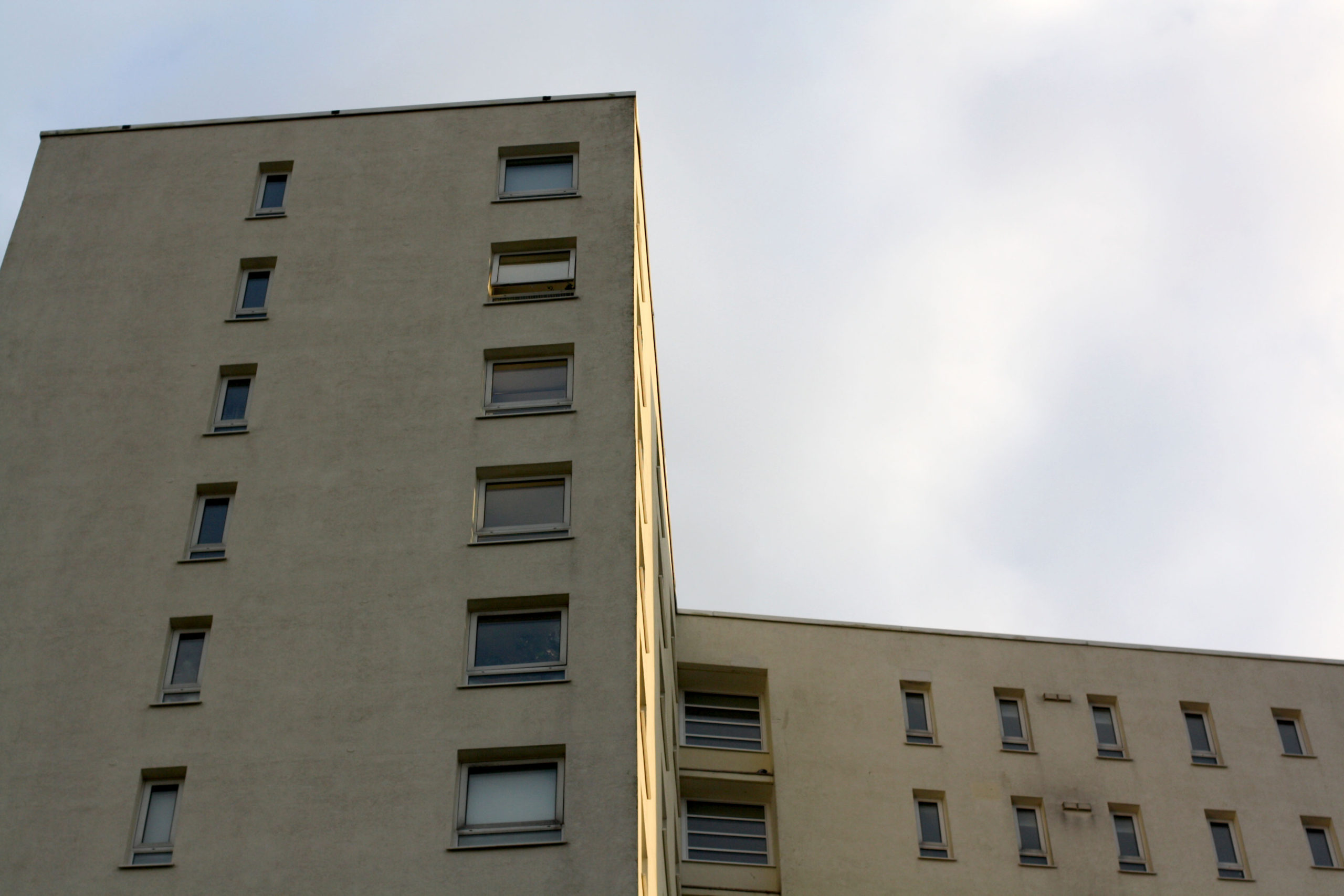
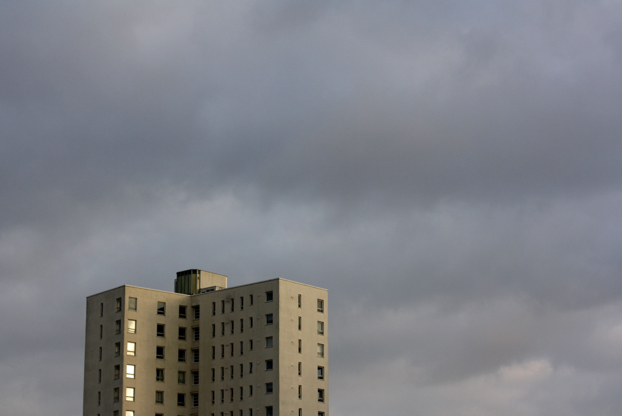
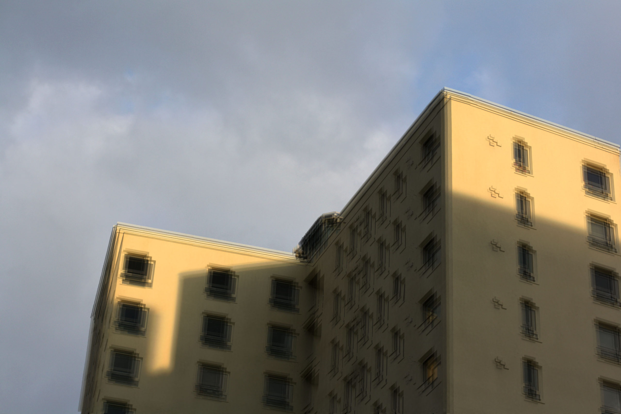
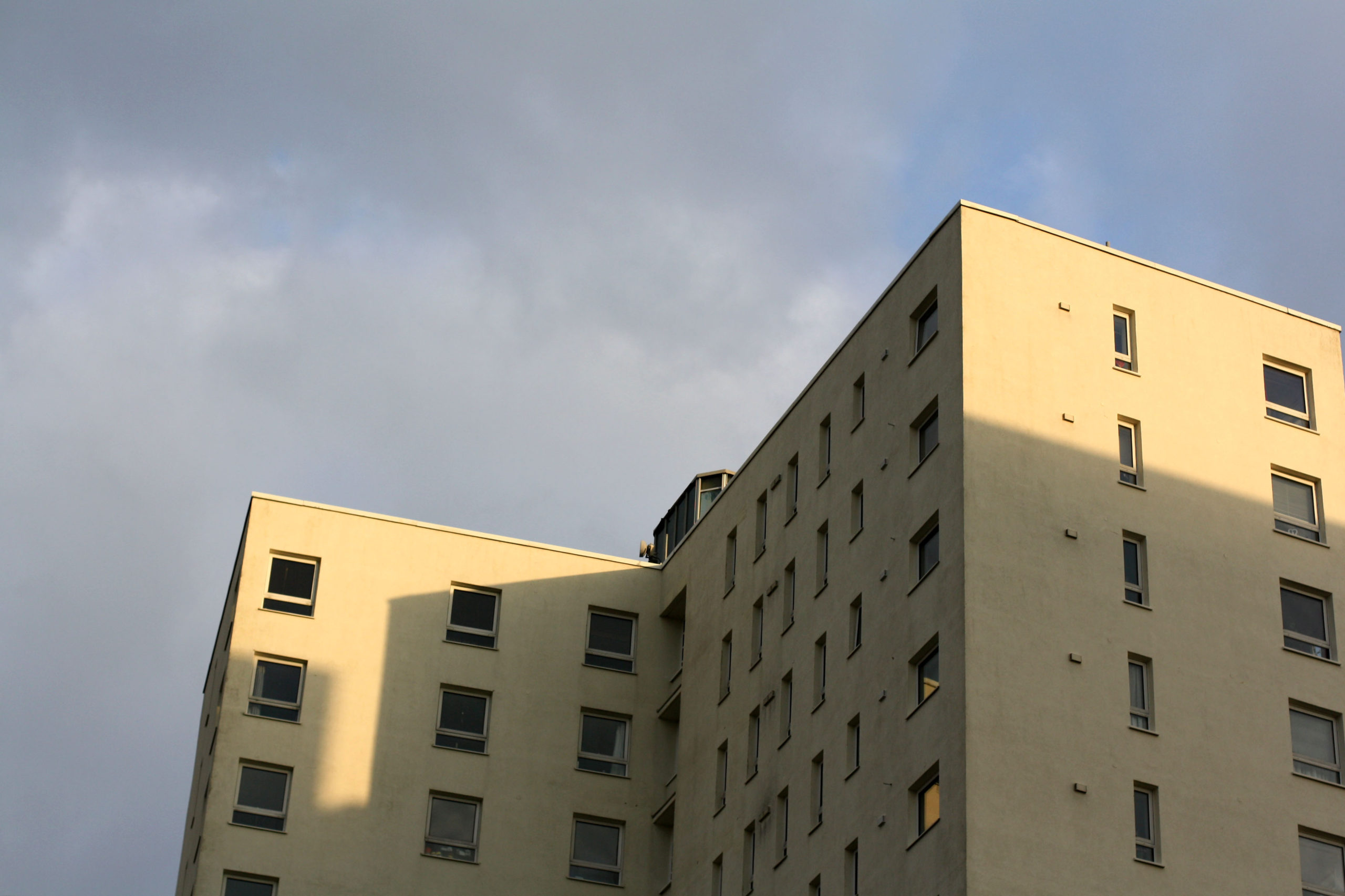
I don’t think, compared to Robert, that my pictures are that bad. I think they might even be better on a scale of colours and sharpness. When I said I was going to mimic Clayton’s work I instantly knew I was going to go down to Le Marais and take pictures of the tall buildings and they turned out just how I expected them to. Nothing I don’t think I could have improved on in these photos, but I should have gone to other areas to take pictures of different buildings. That would have most likely improved the variation and made the photos more interesting.
I took a handful of some of the best photos from my Anthropocene photoshoot and edited them. I did all sorts of edits to these photos to make them look more interesting and better and I like the finished products.
Stephanie Jung:
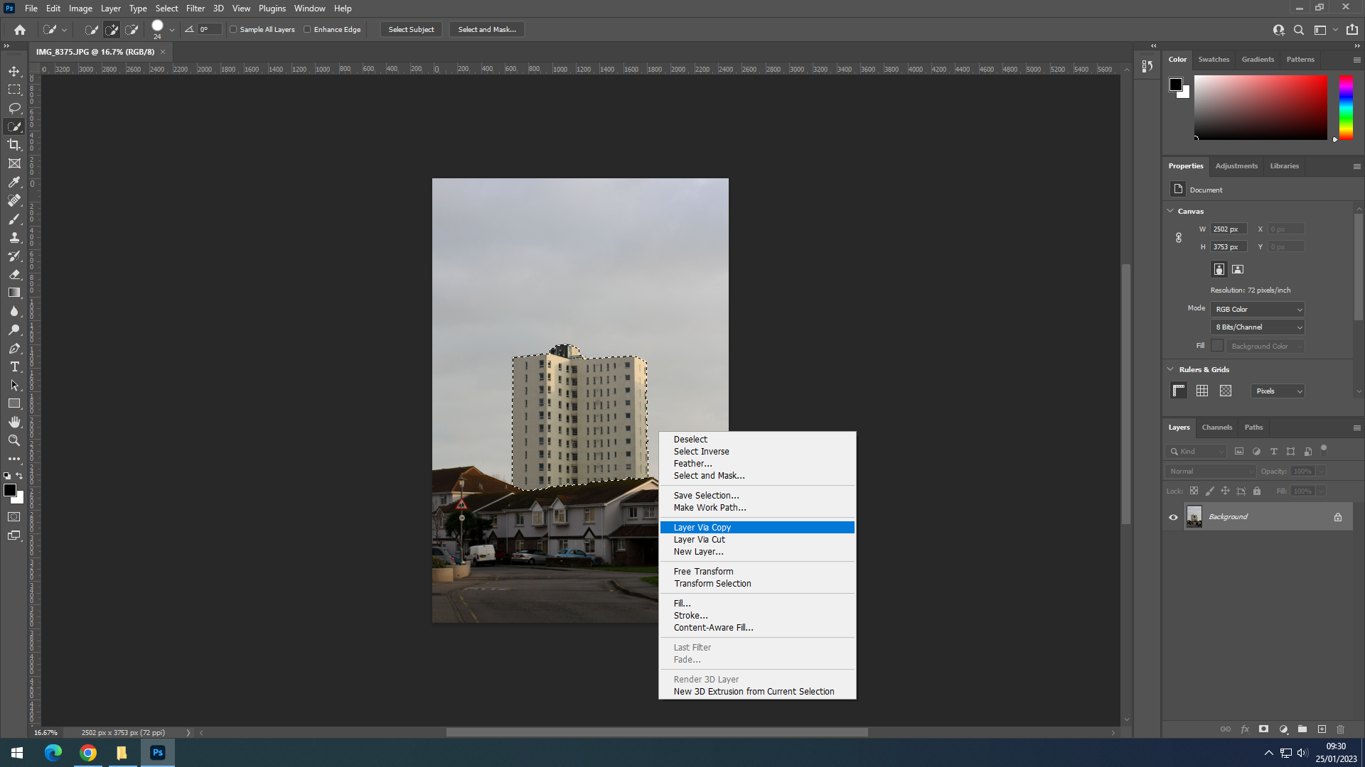
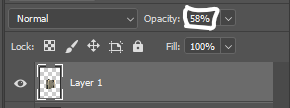
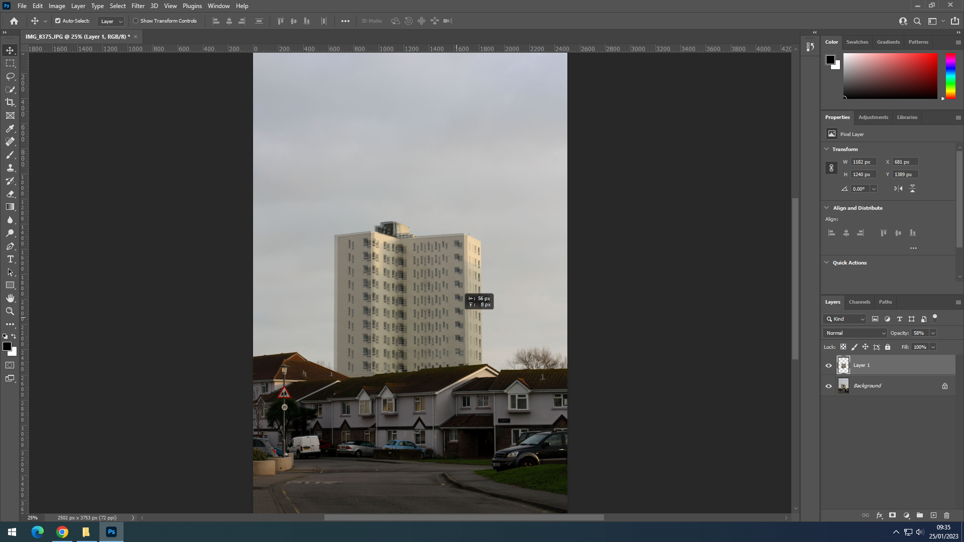
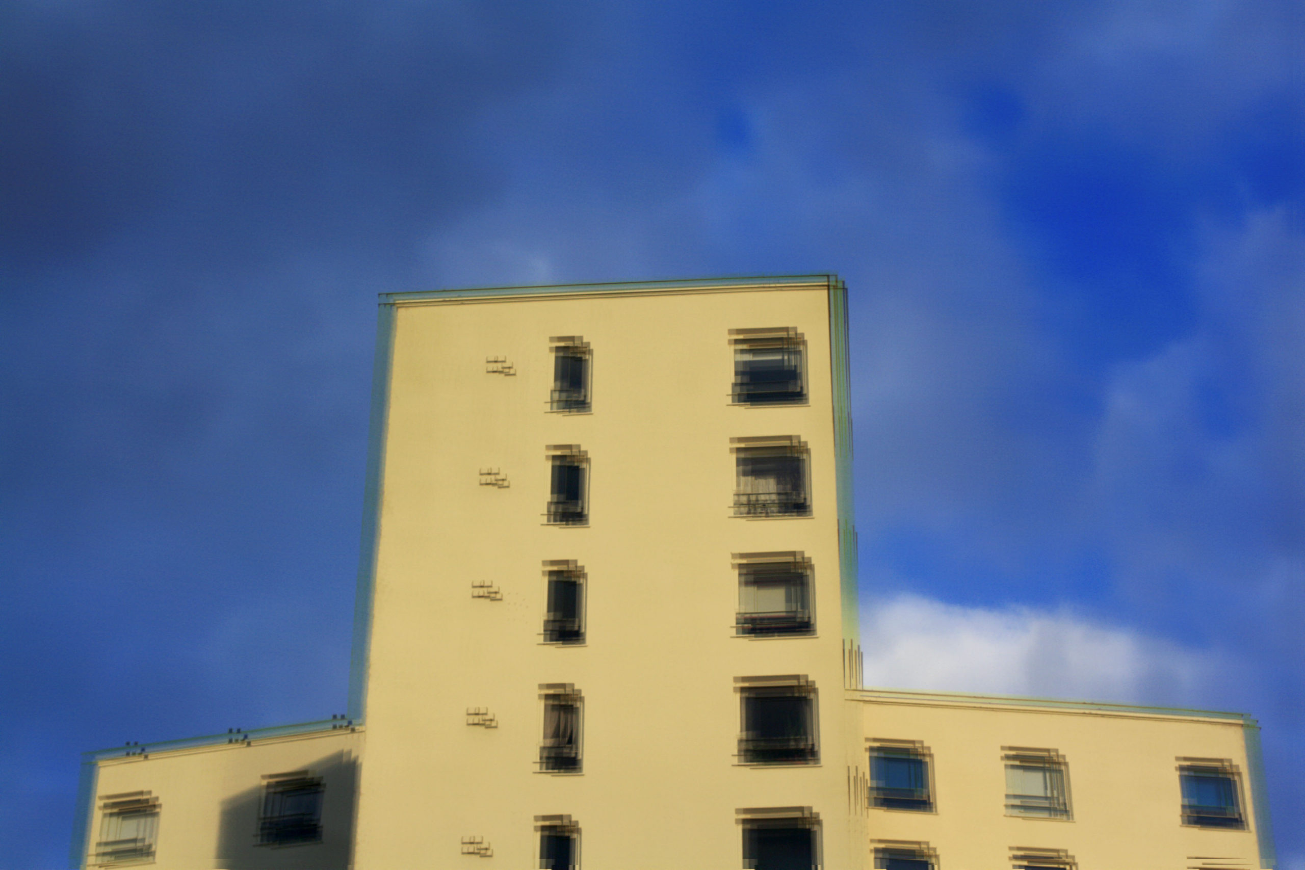
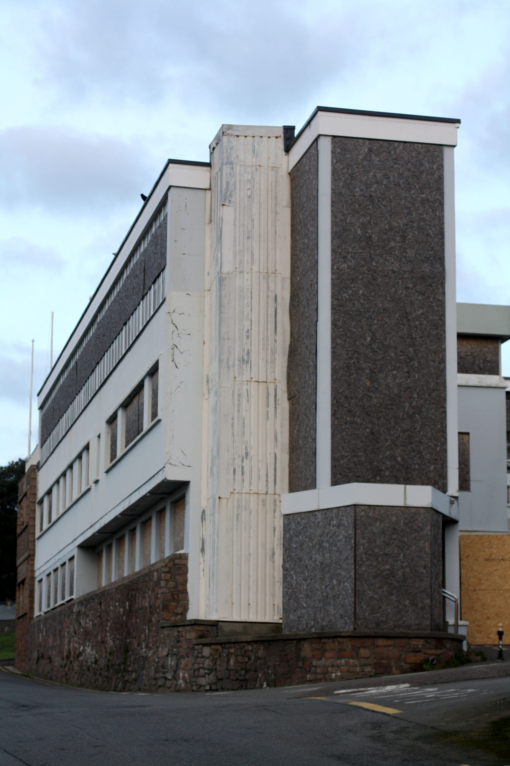
I edited some of my photos to mimic Stephanie Jung’s editing style. I took one image and lowered the opacity, then I duplicated the layer multiple times and moved each one slightly to make the distorted effect. Each edited photo will be compared to the original.
Method used:
Results:







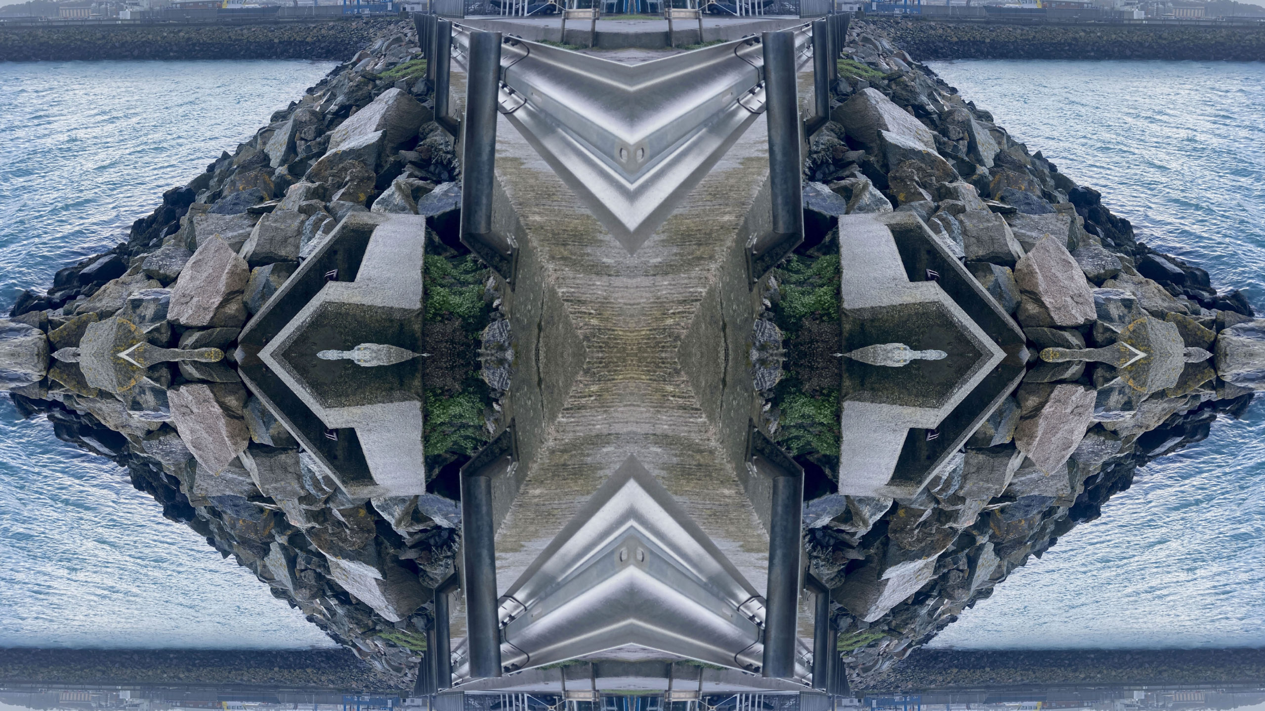
Kaleidoscope:
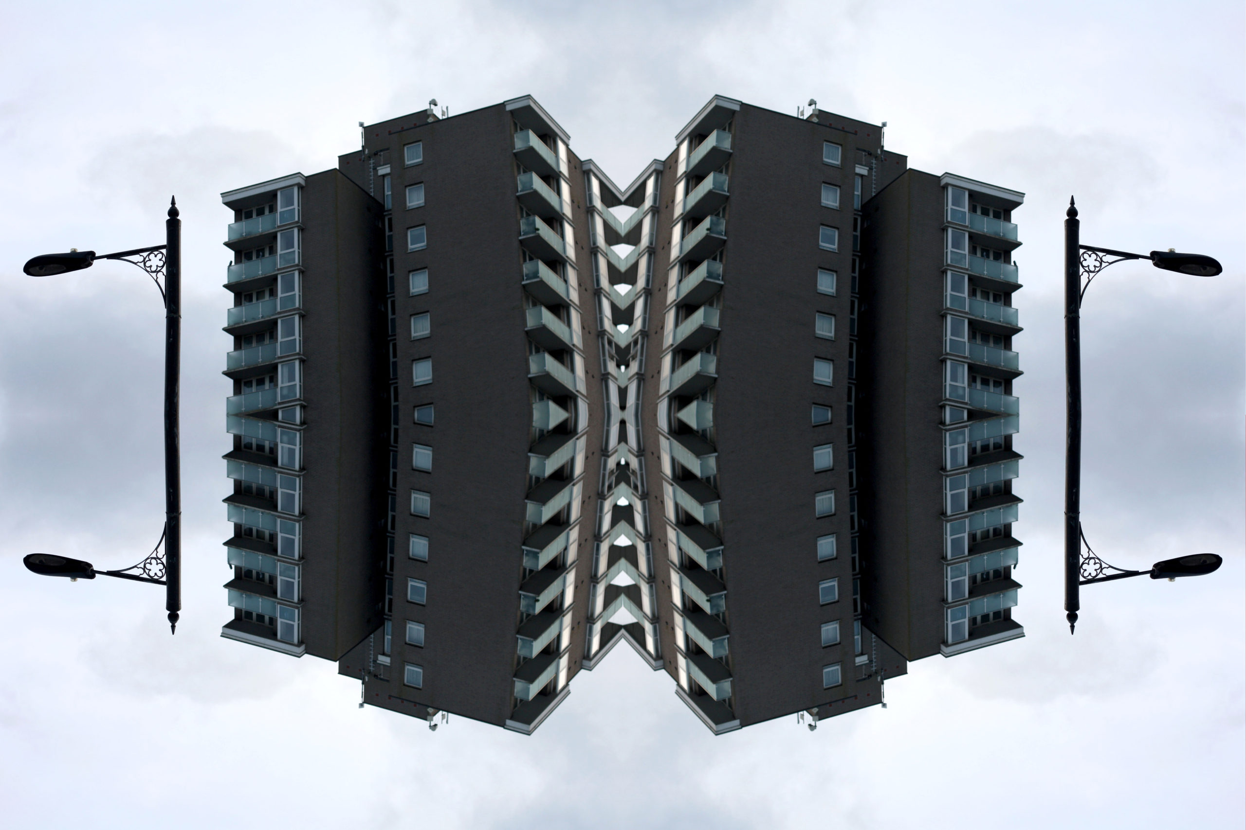
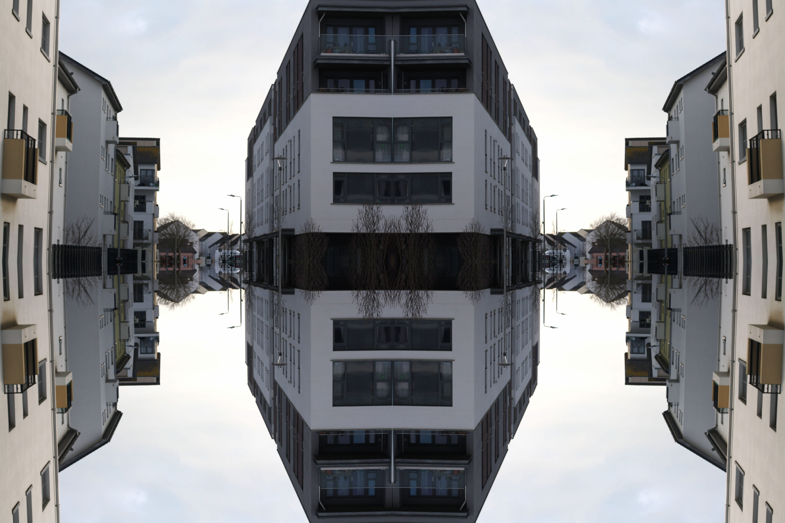
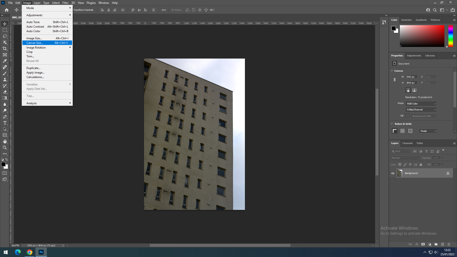
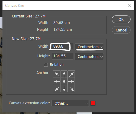
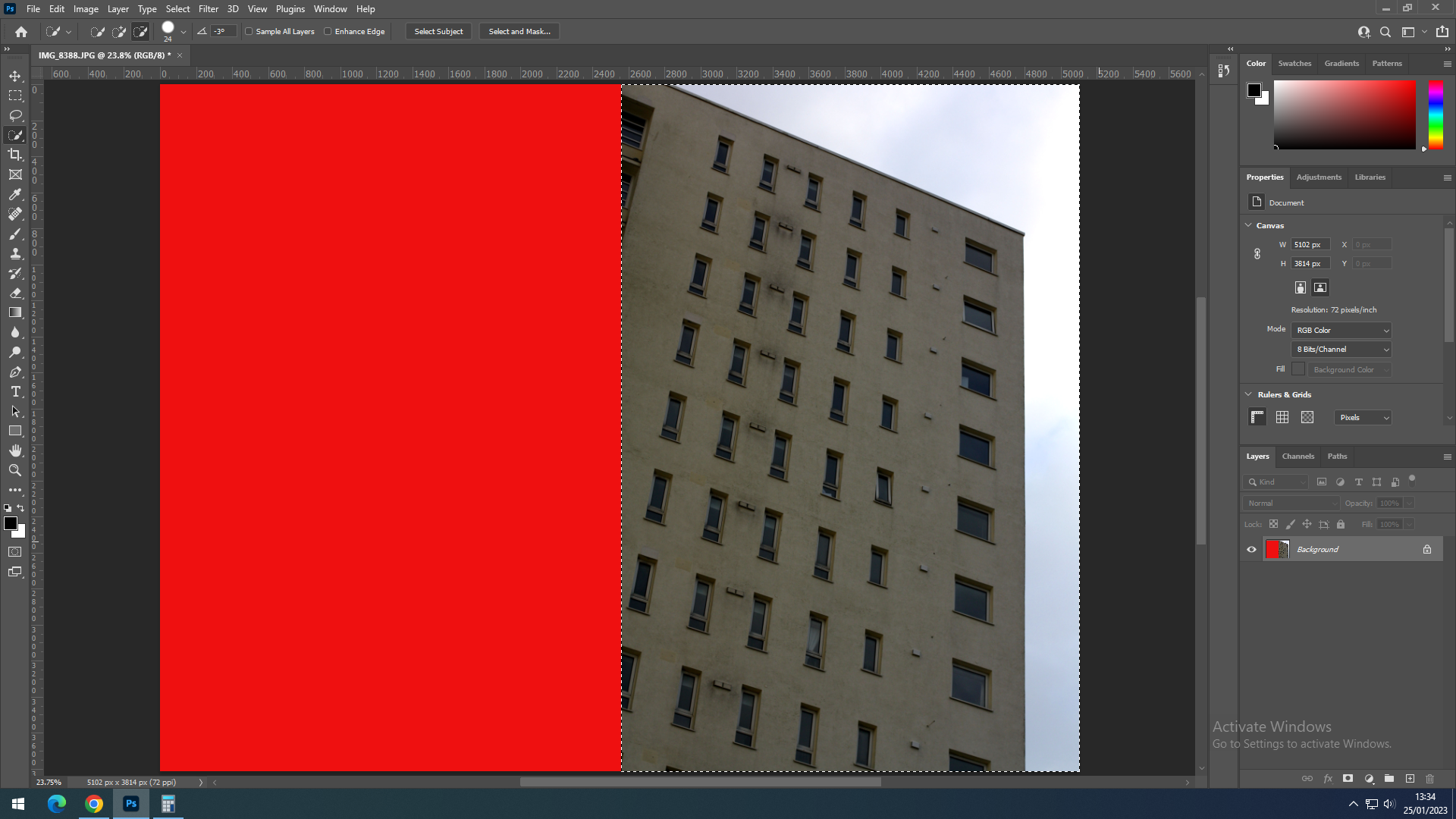
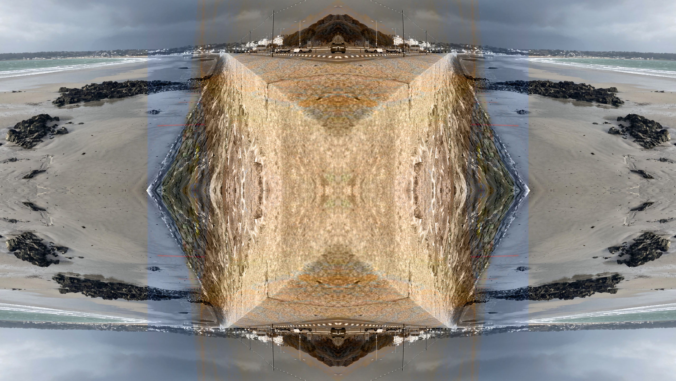
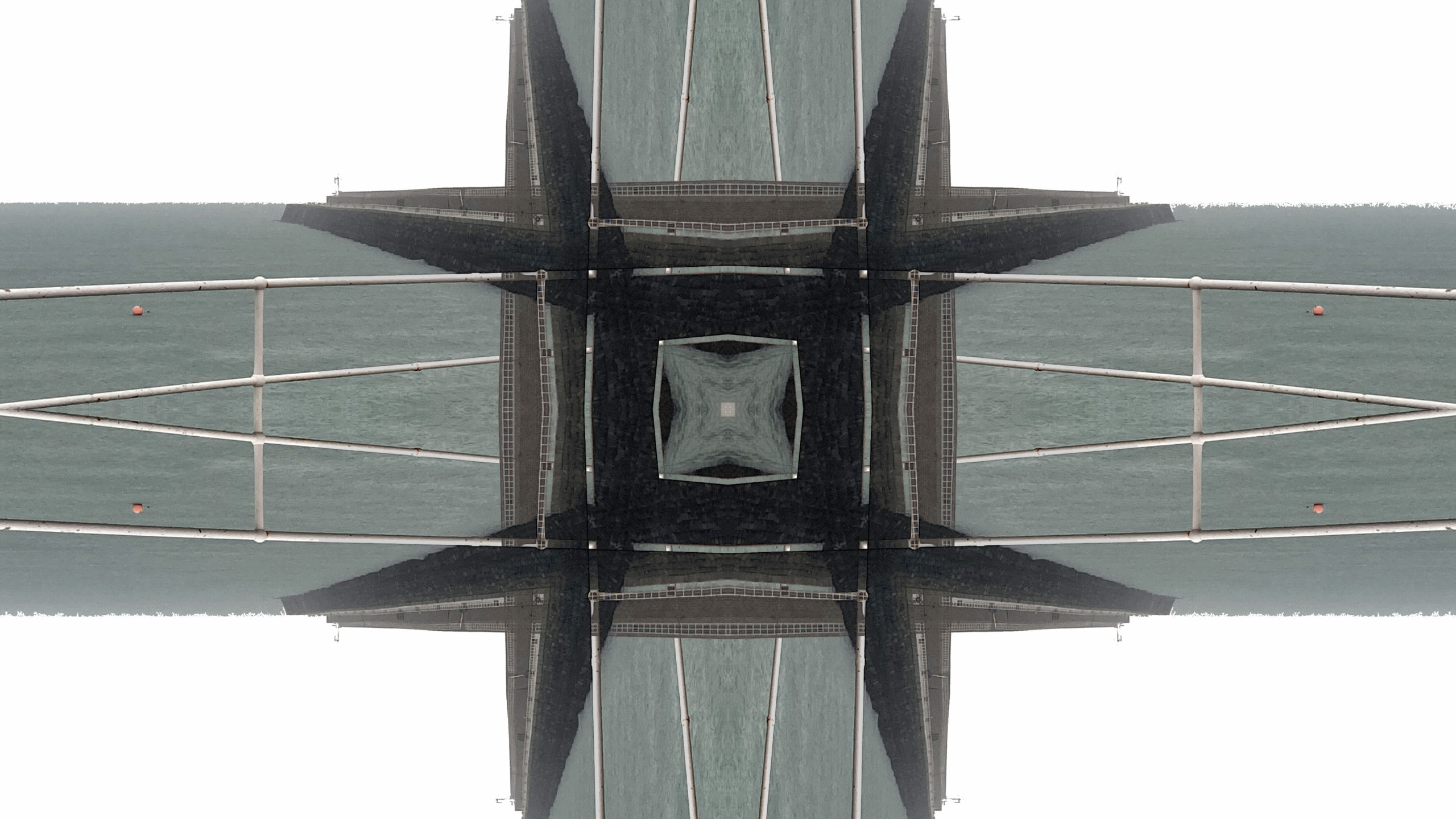
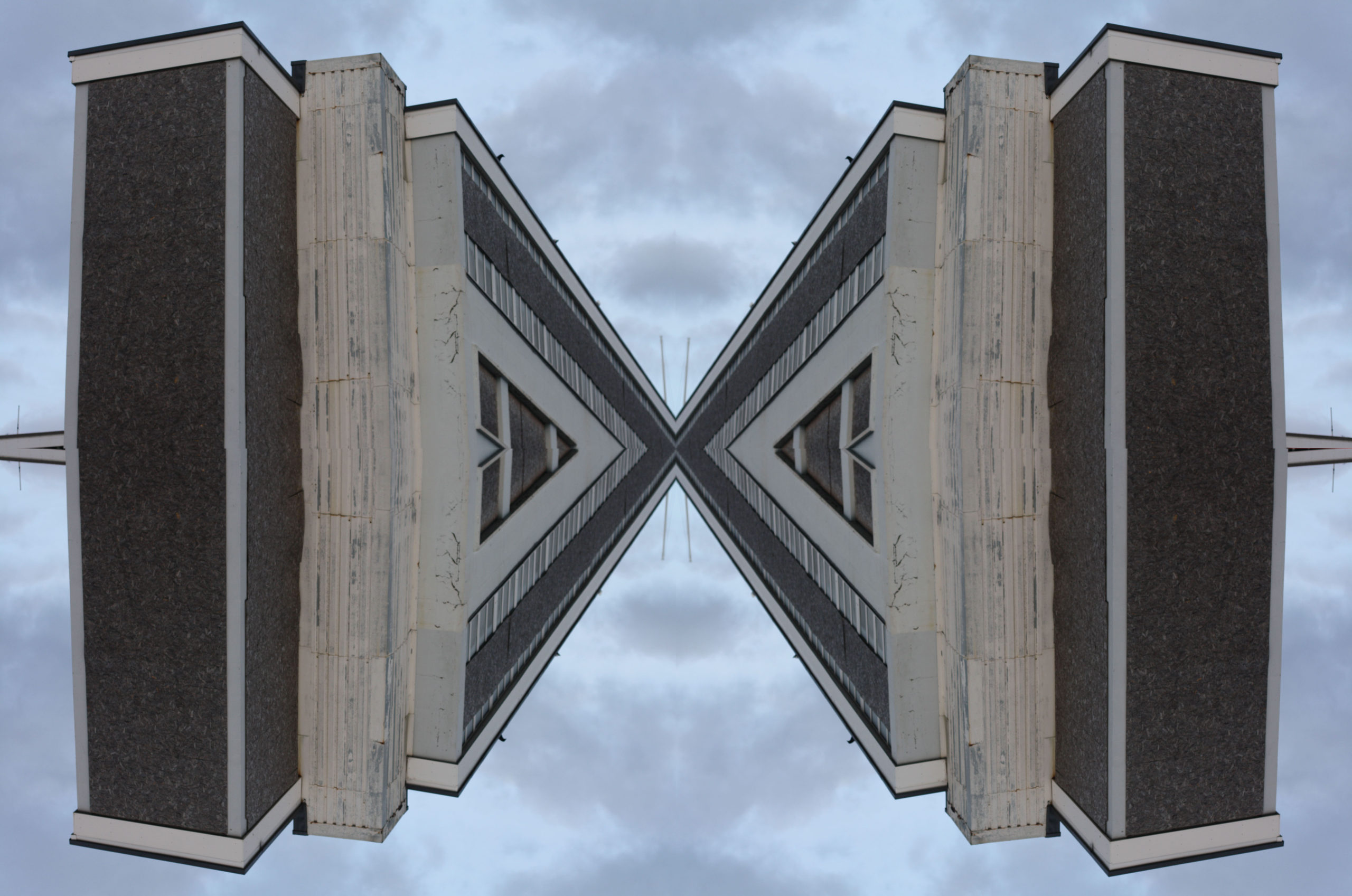
I decided to play with the mirroring function on Photoshop and made a weird but interesting amalgamation of a single photo, I think they look pretty cool.
Method Used:
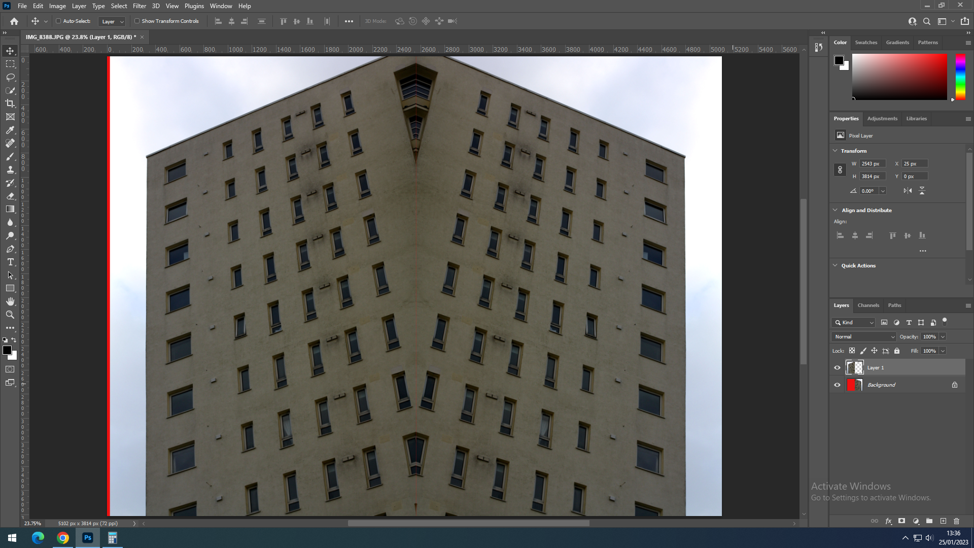
Results:


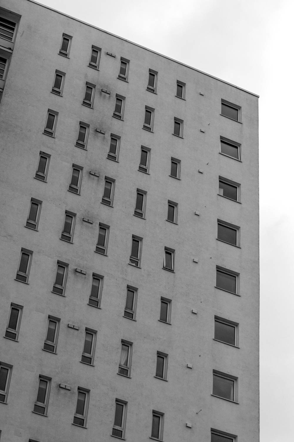
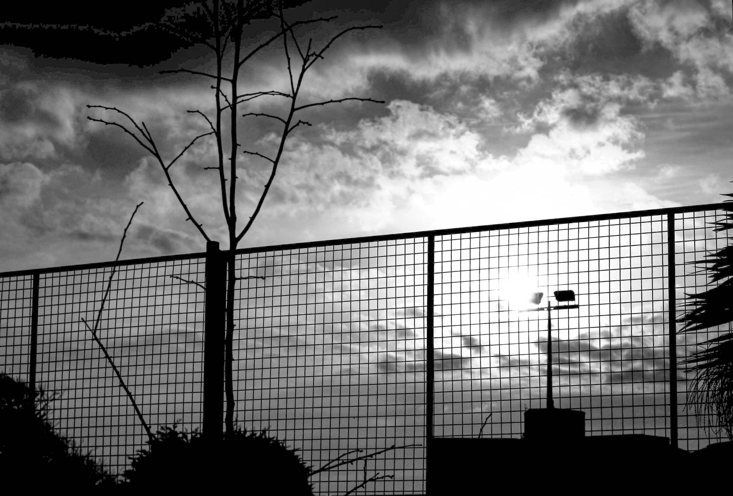
Black and White:
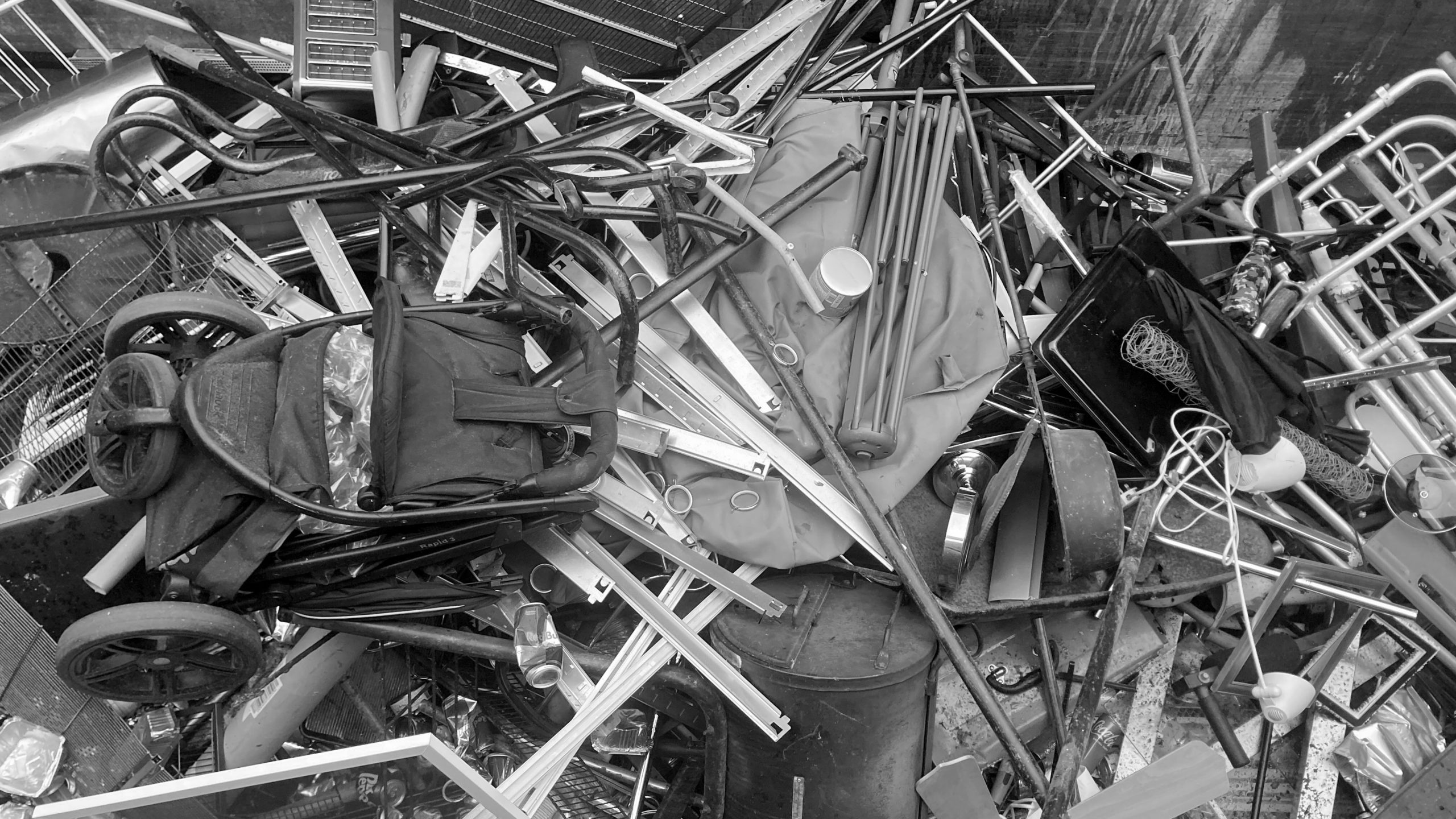
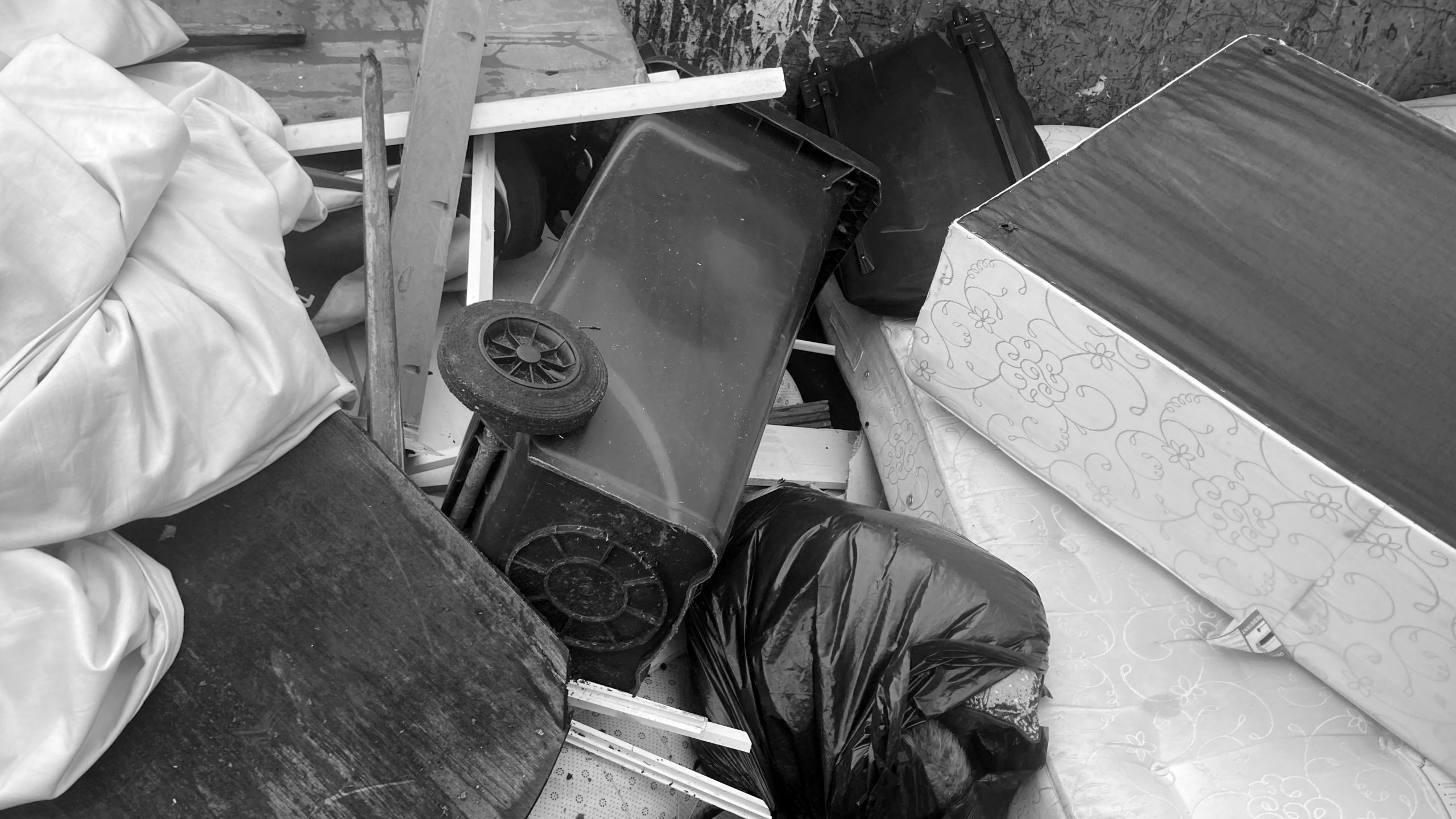
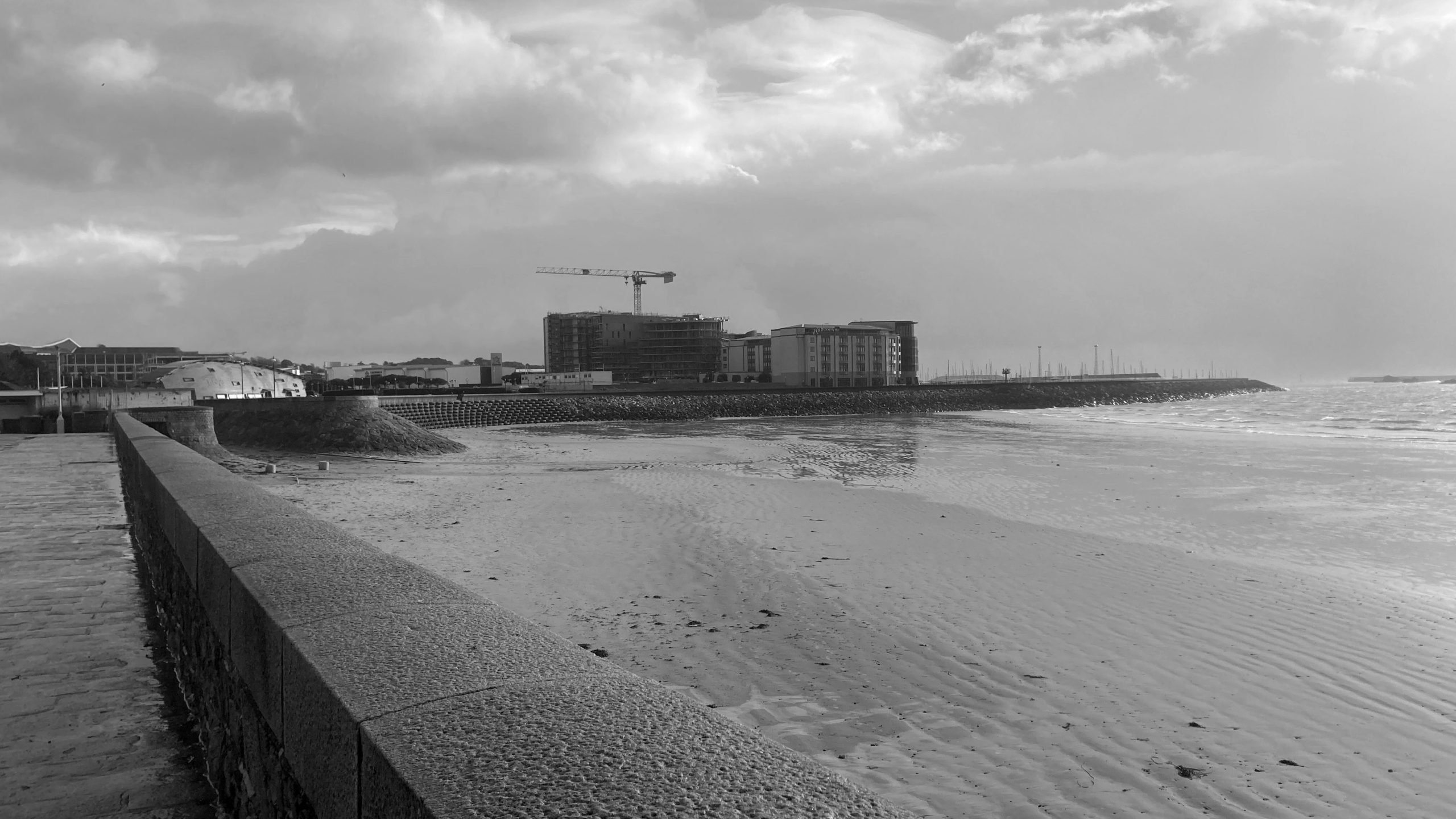
I turned some of the photos black and white and they look pretty nice.

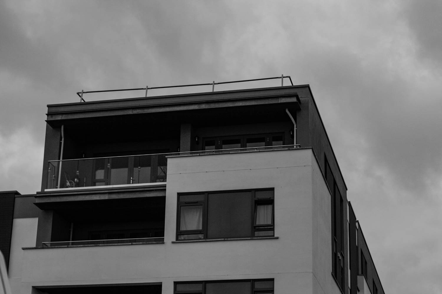
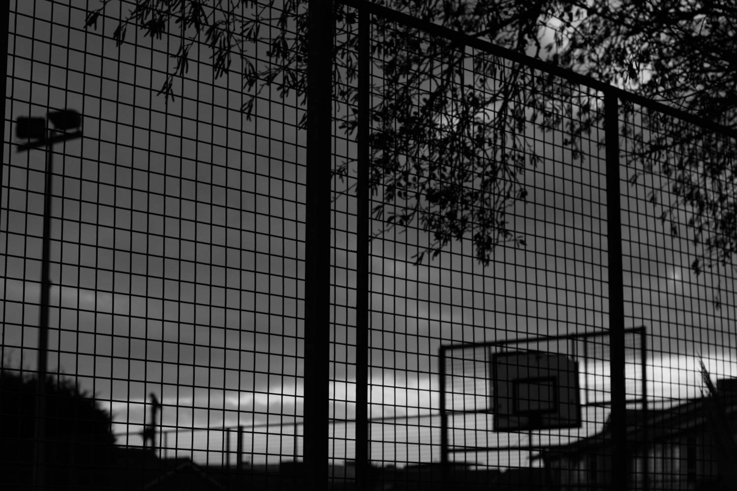
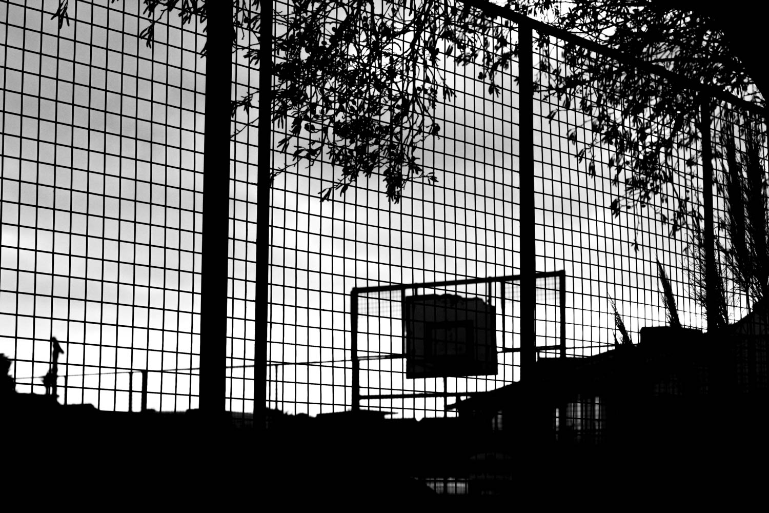
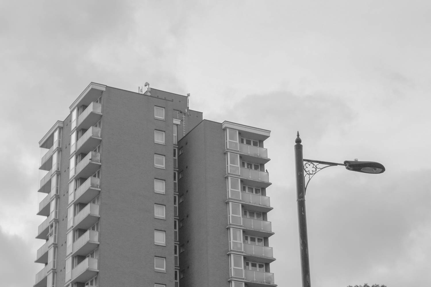
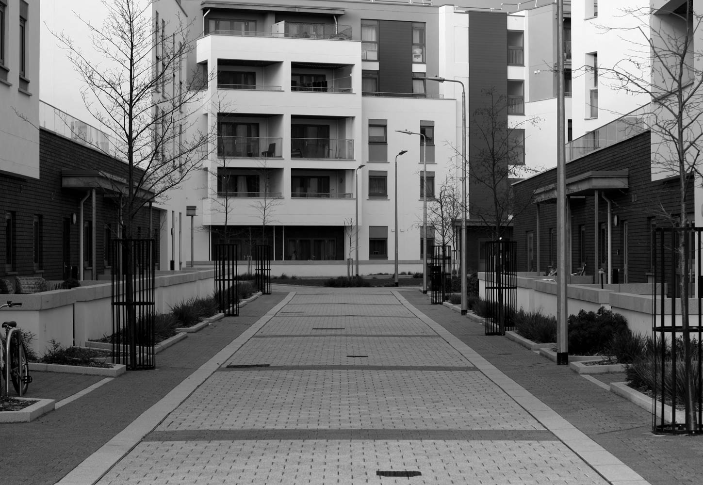
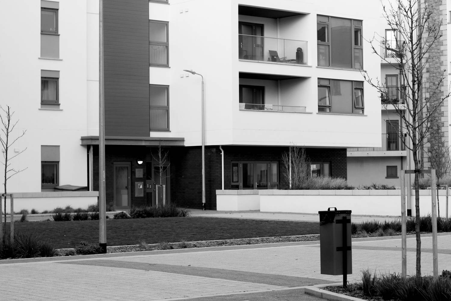
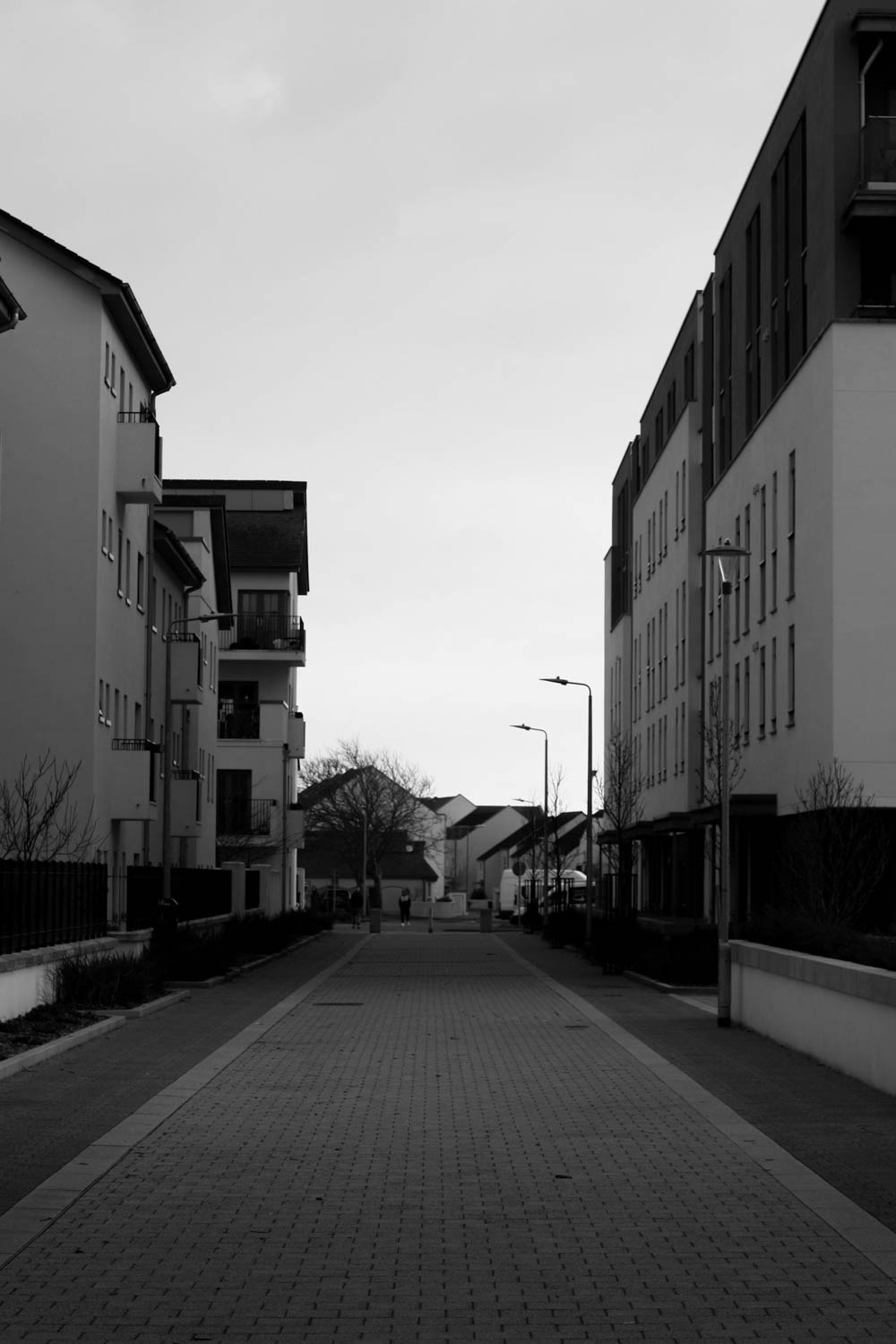

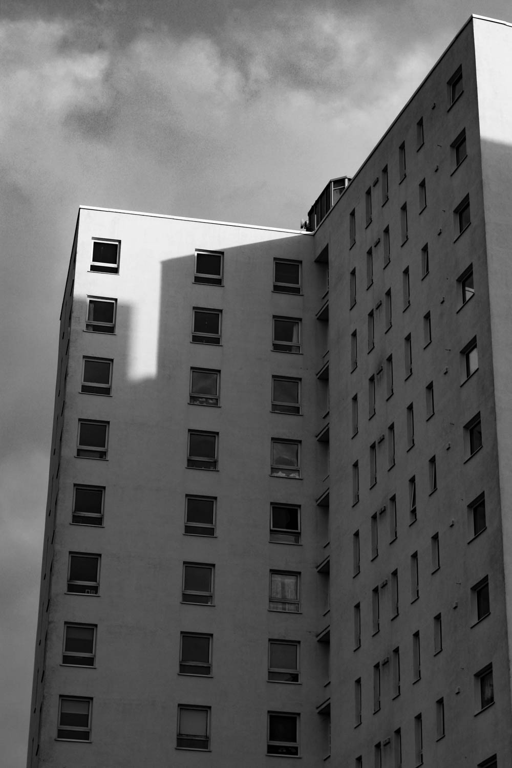
Random Edits:
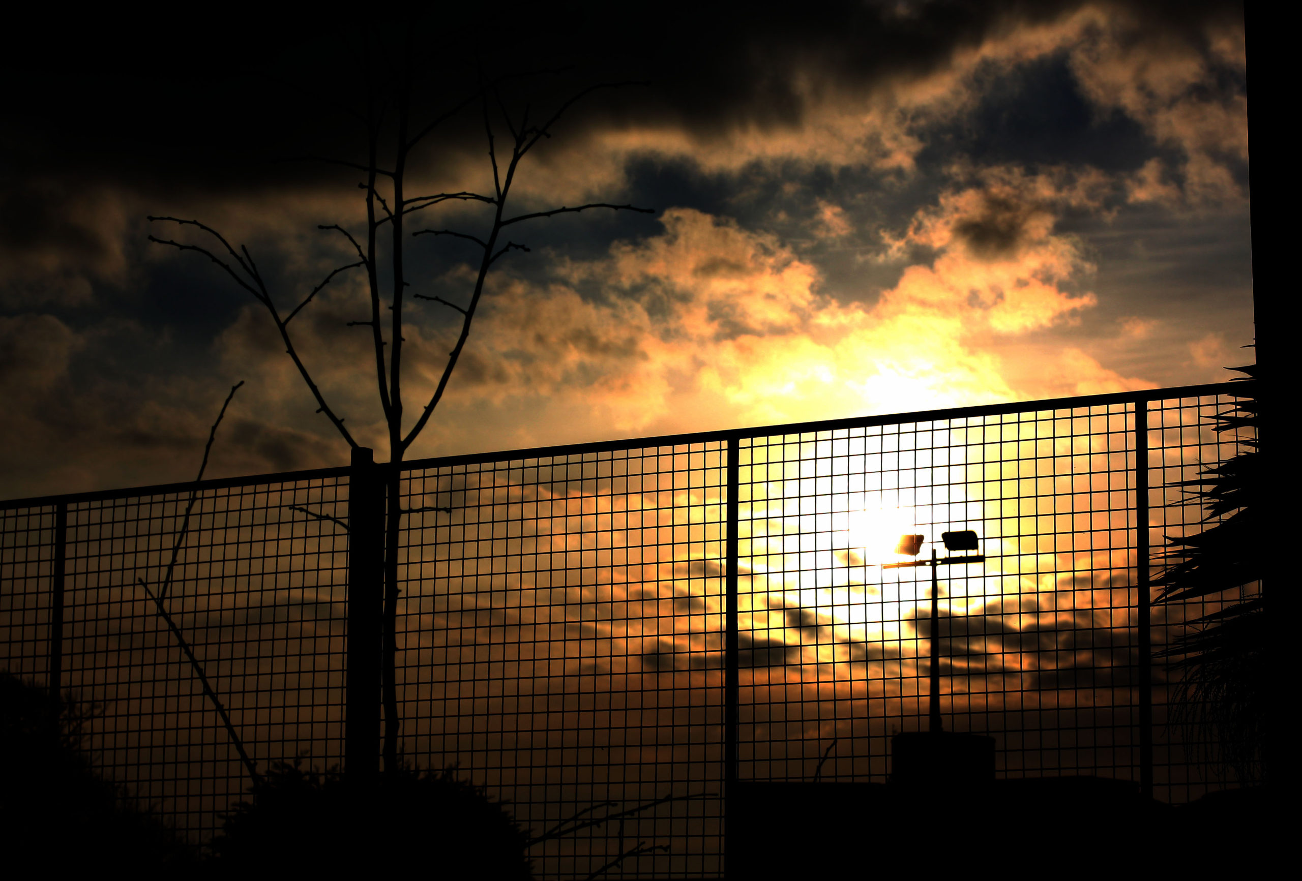
As the title implies, I was editing these images with no exact plan in my head and I was just making things up, and some of these actually turned out alright.
Dumps:
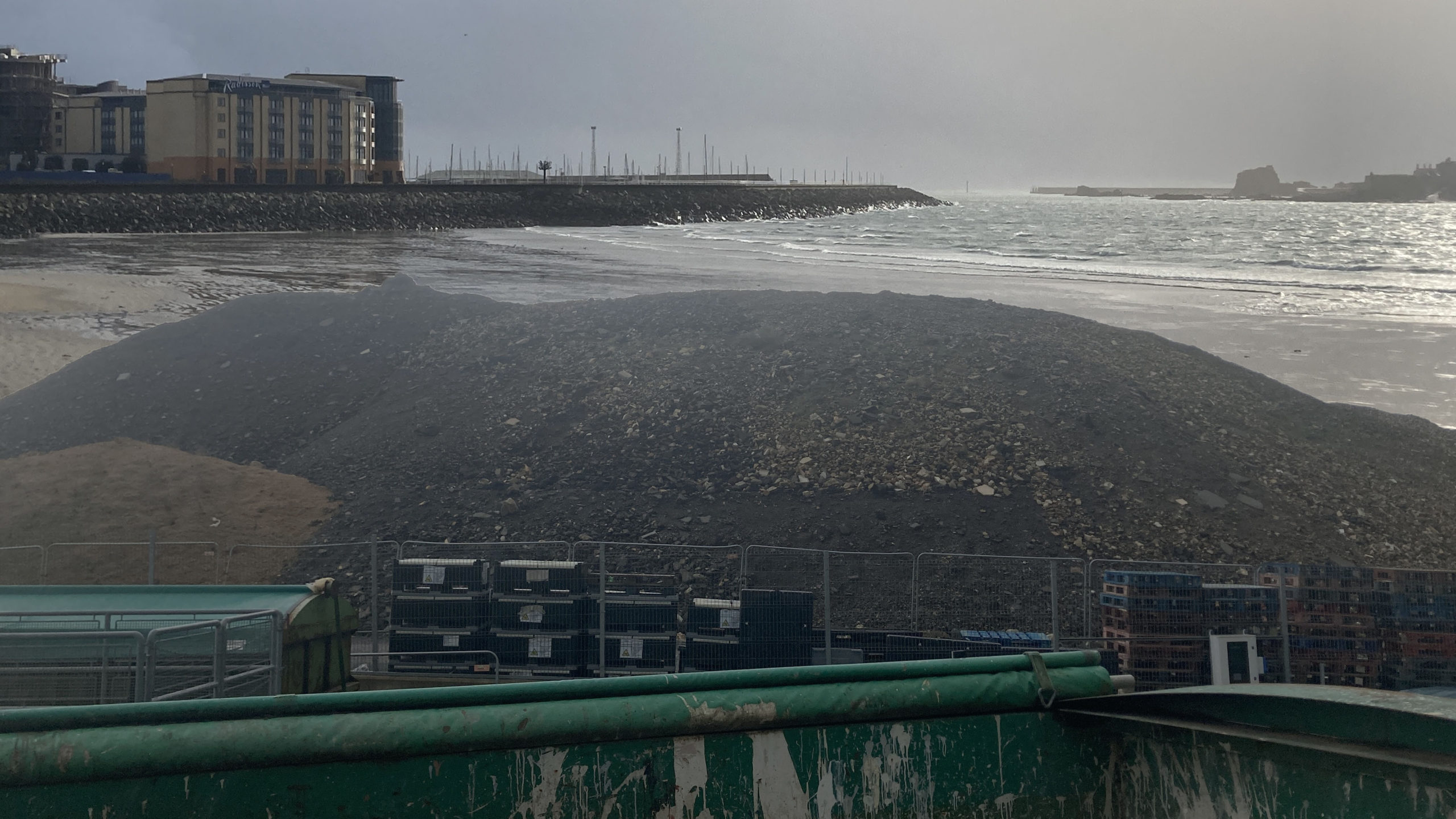
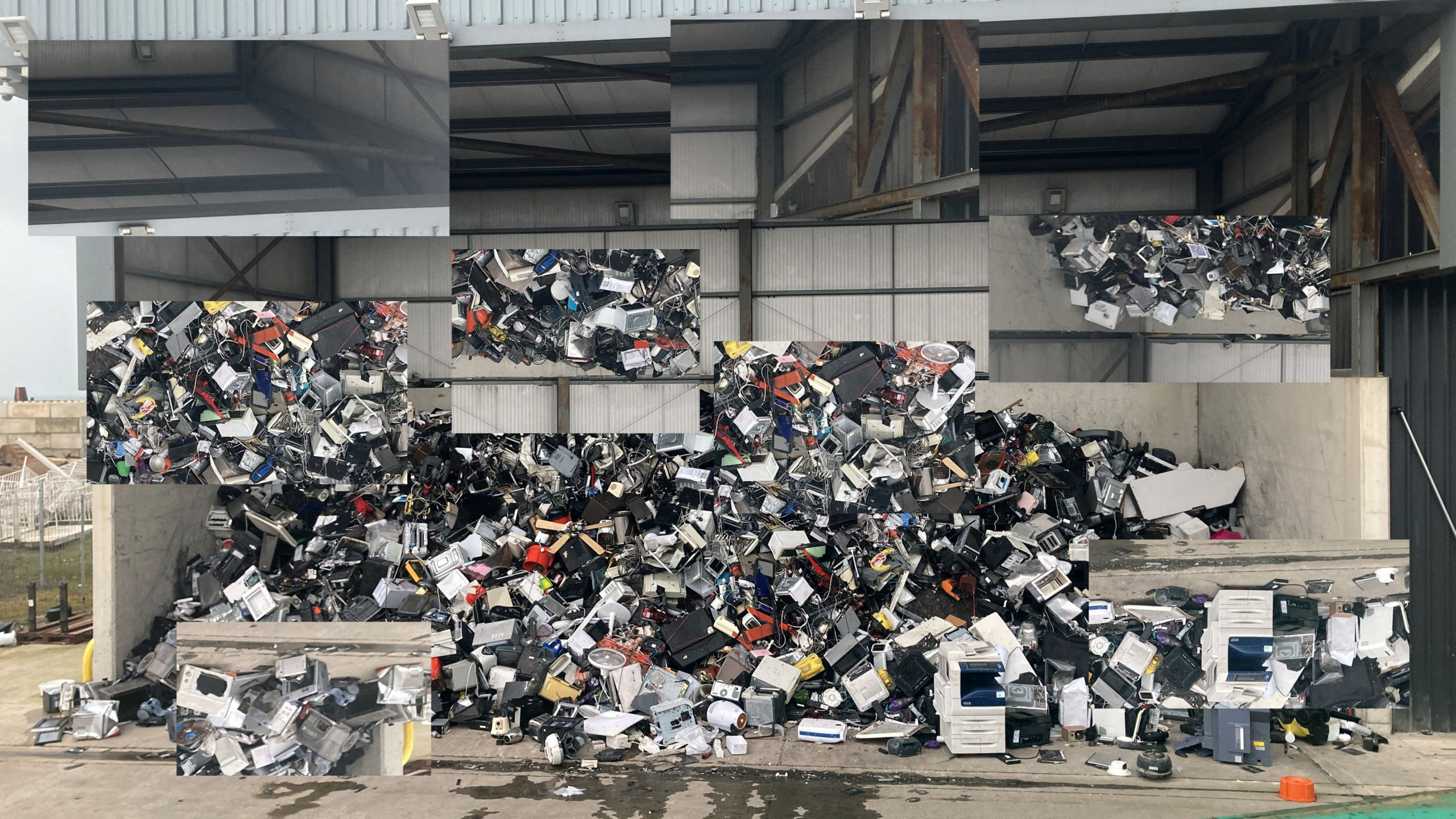
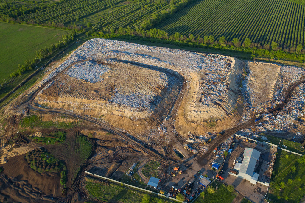
I went to the dump at La Collette and took pictures of the big metal bins filled with all kinds of rubbish. Along with the huge mountains of rubbish that have been there for years now.
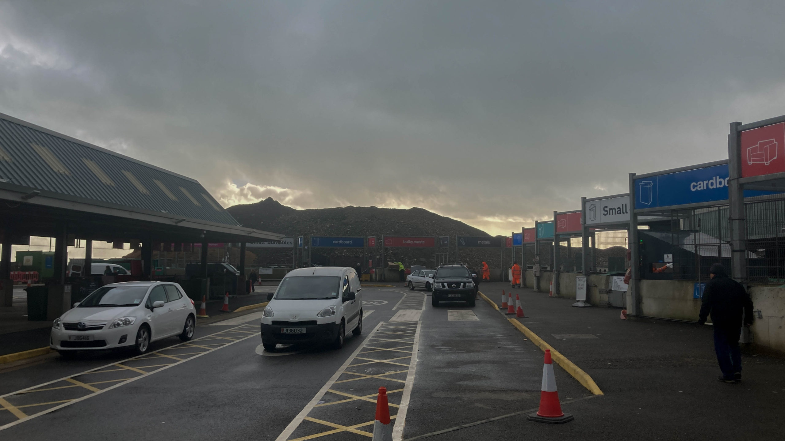
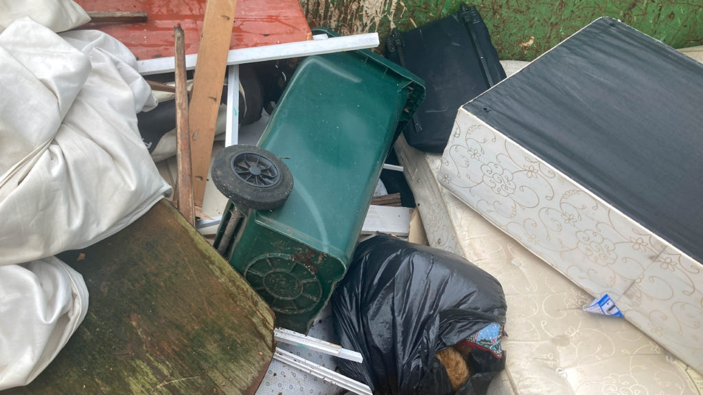
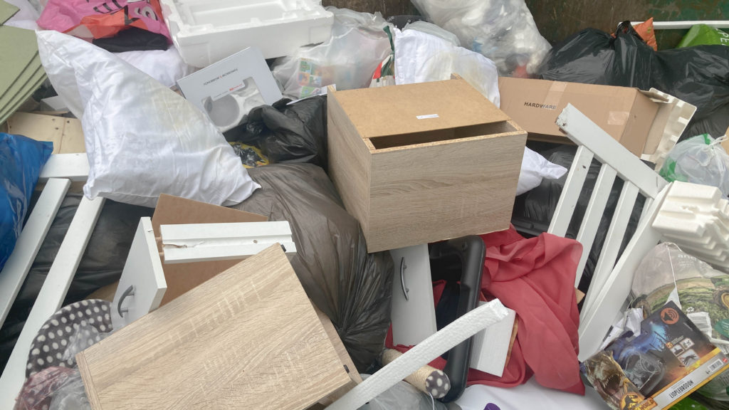
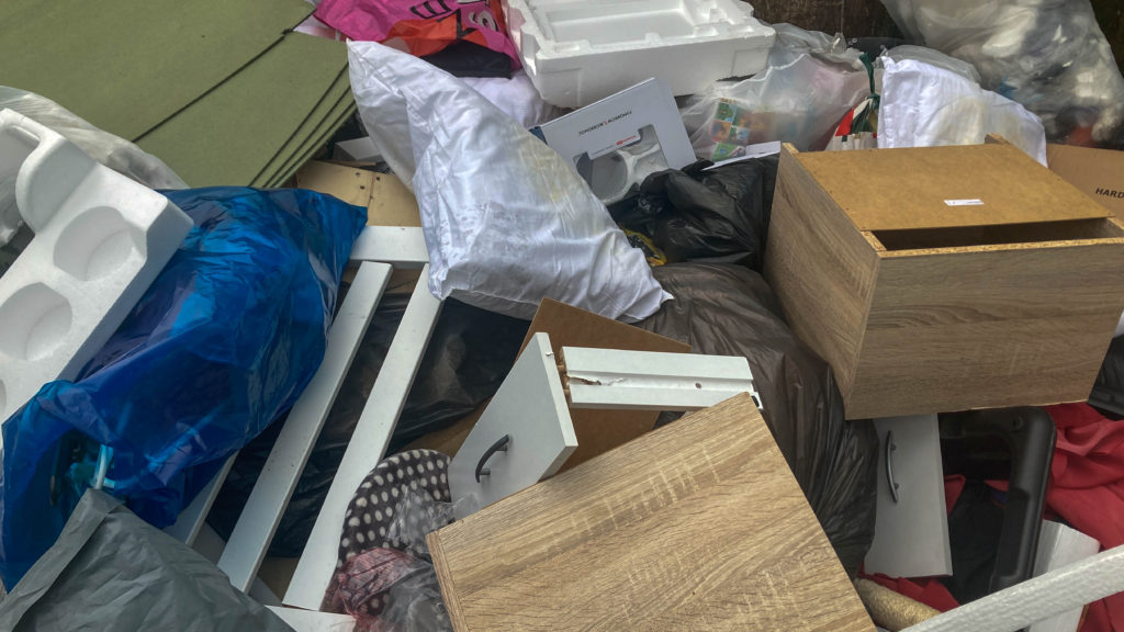
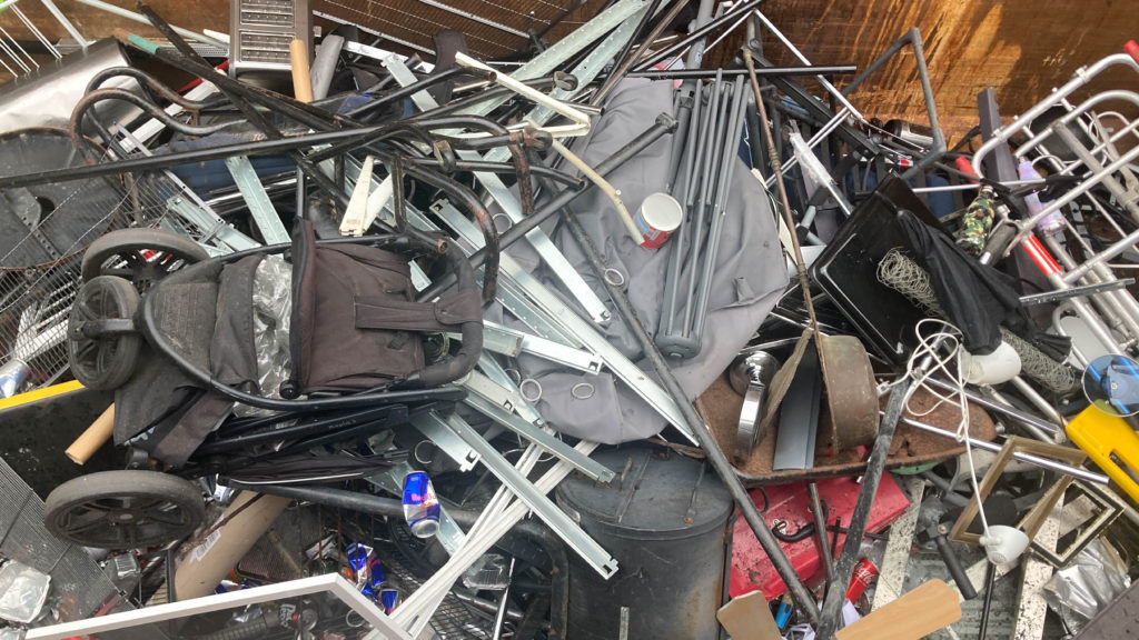
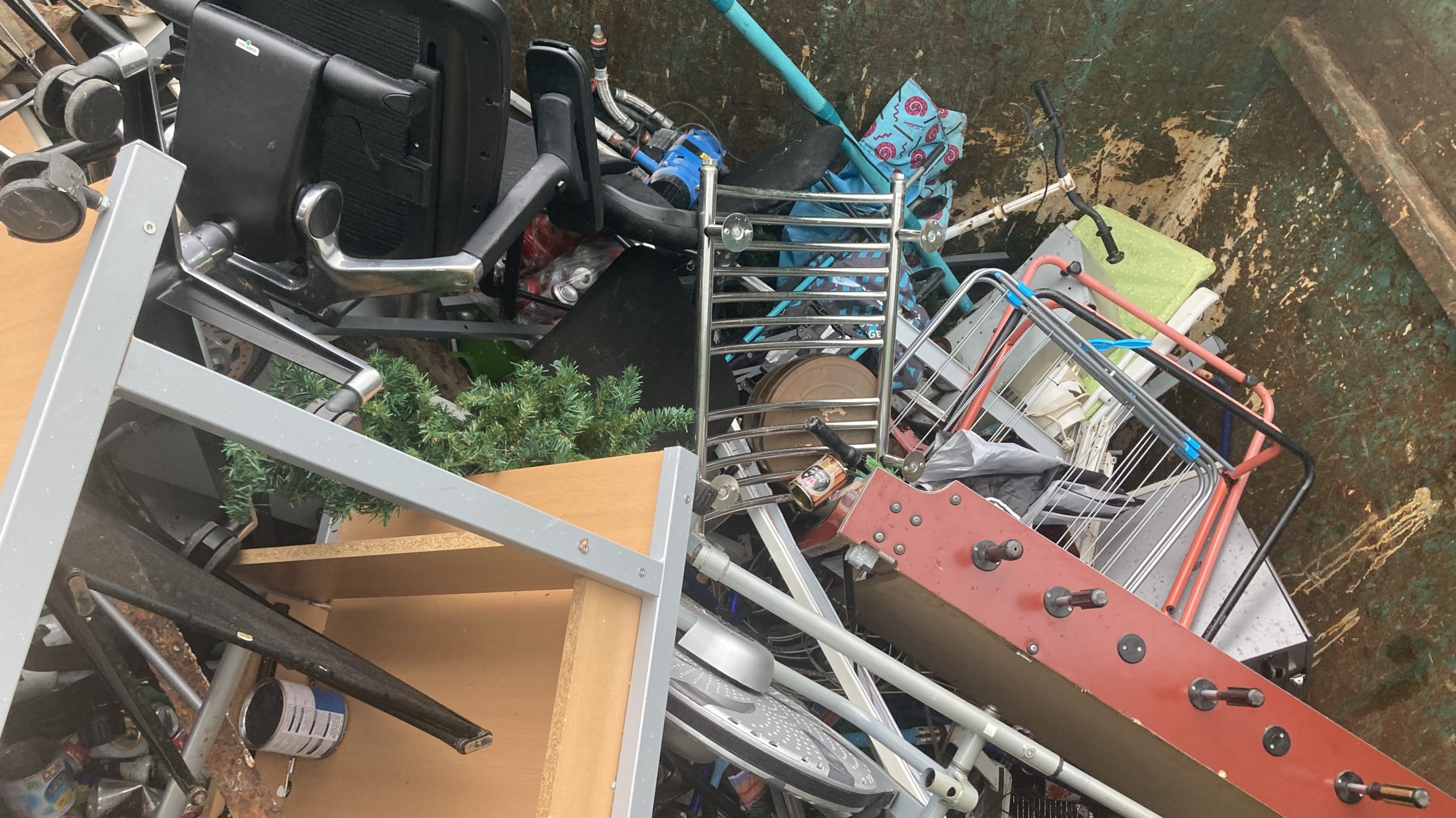
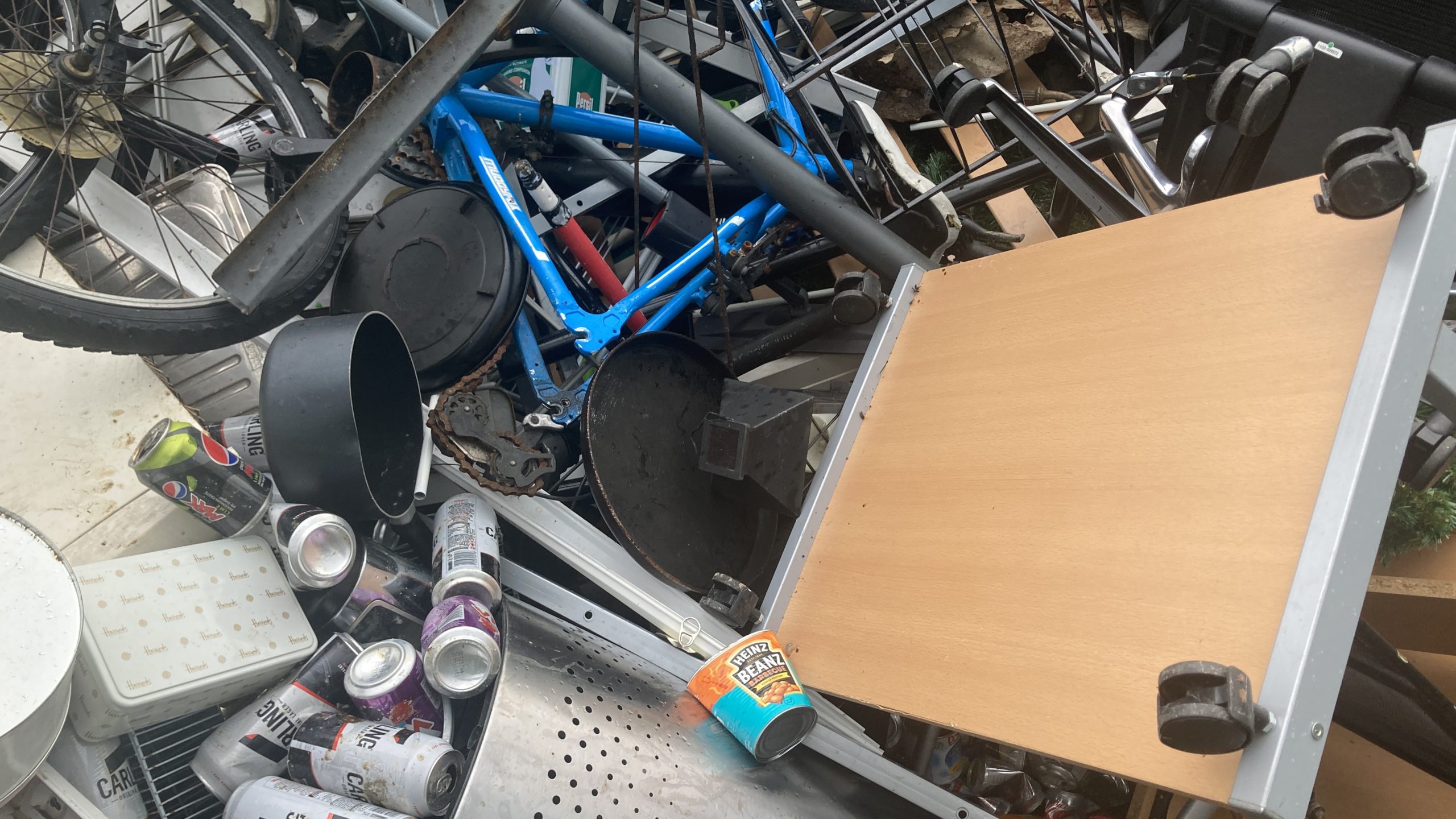
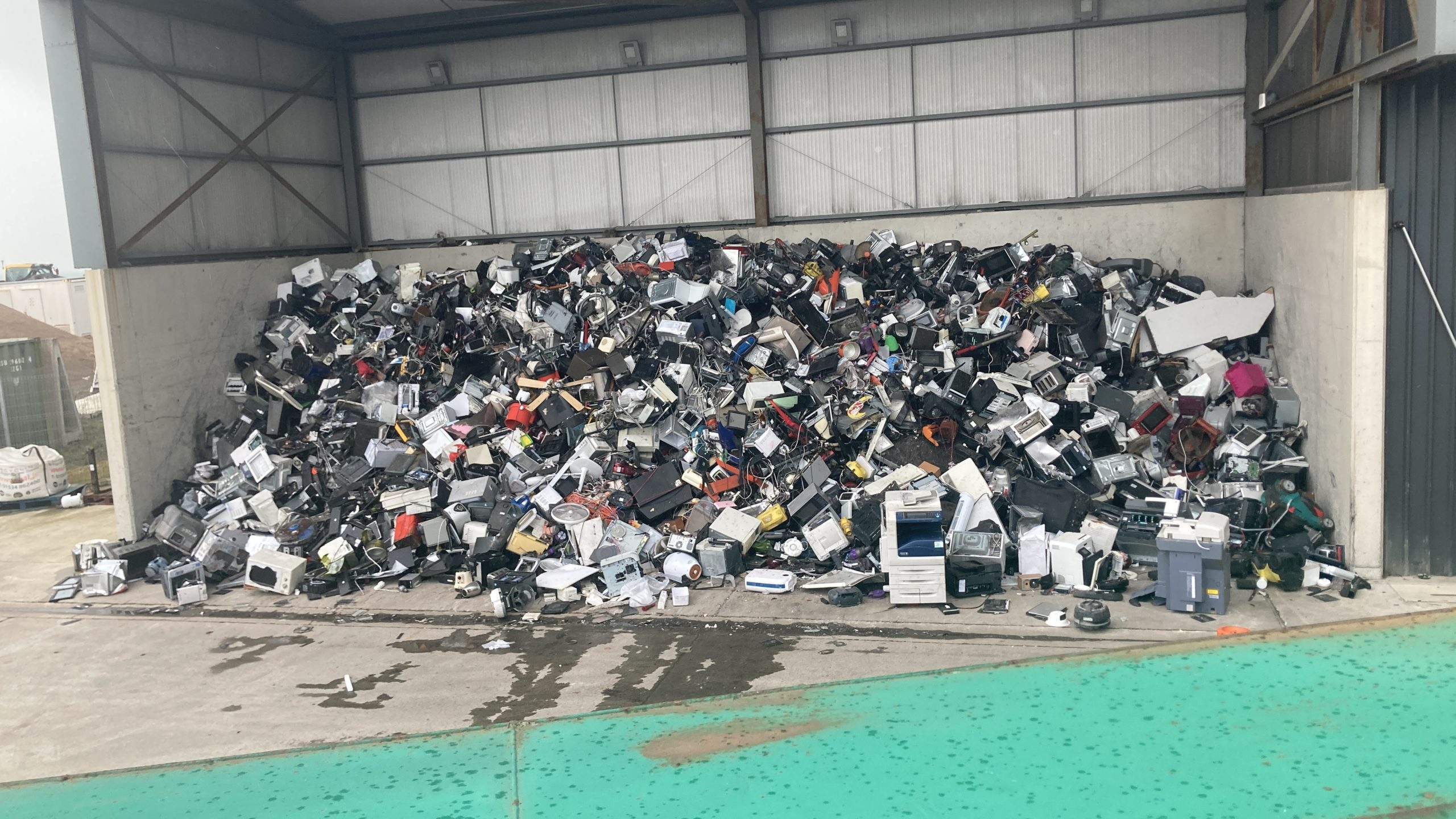
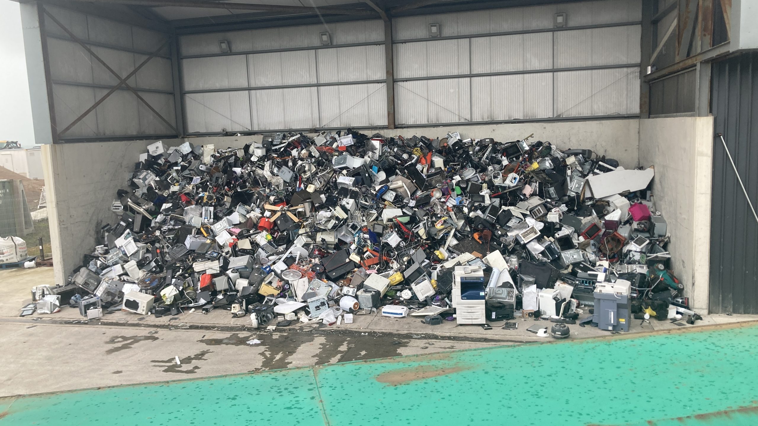
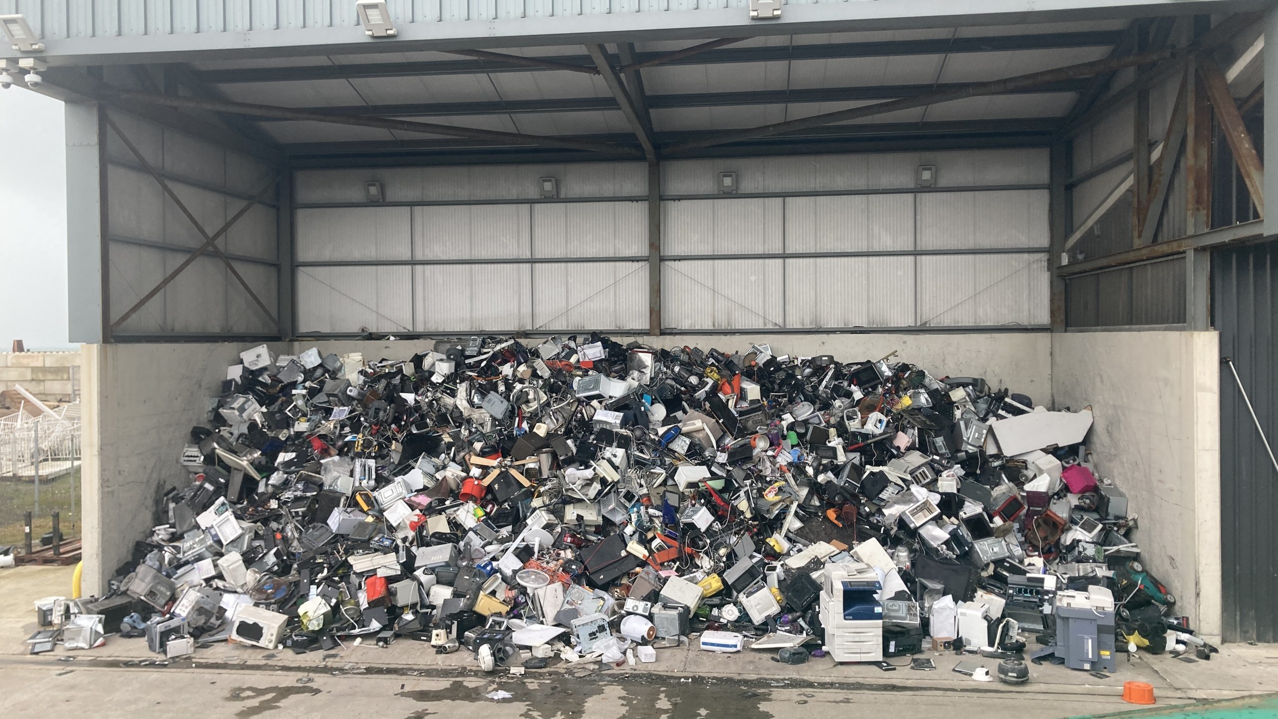
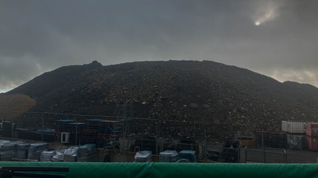
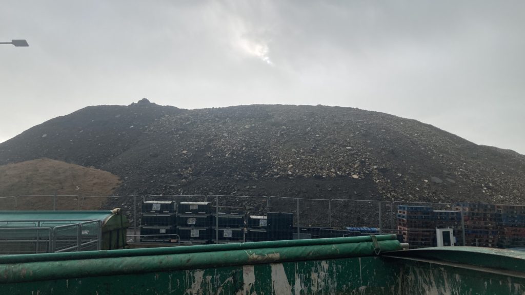
I like the bin shots as they look very full and crowded, showing us that we produce and throw away too many things. And the mountains show us where it goes, it just gets dumped here because we don’t know what to do with it. I like the weather seen in the background in some of these too, the clouds are very dark and sad which I’d like to think reflect the feelings of the world currently because of what we are doing to it.
Seawalls:
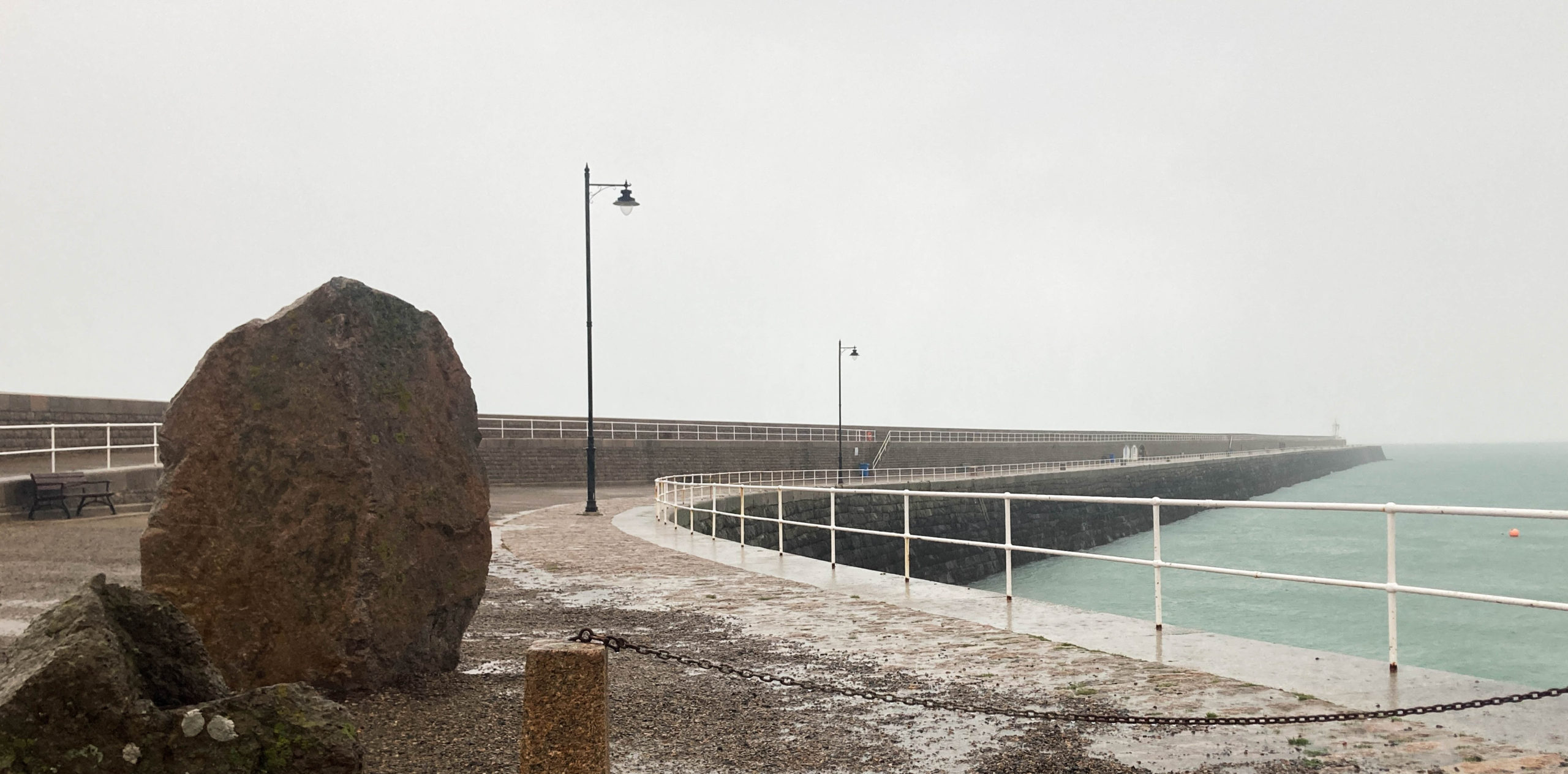
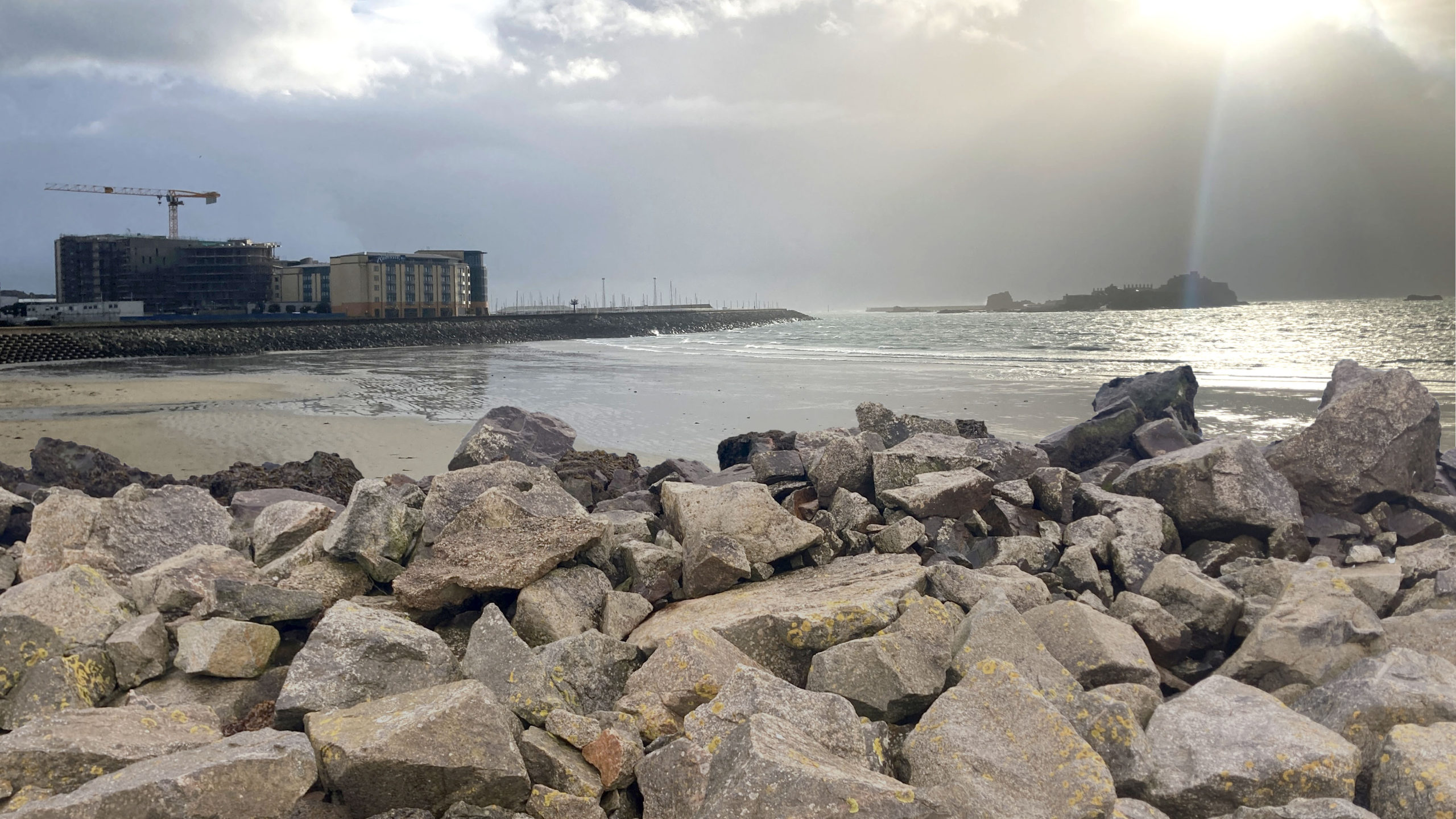
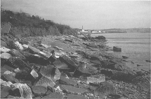
I visited a few places near the sea that had seawalls preventing the water from going any further into the land.
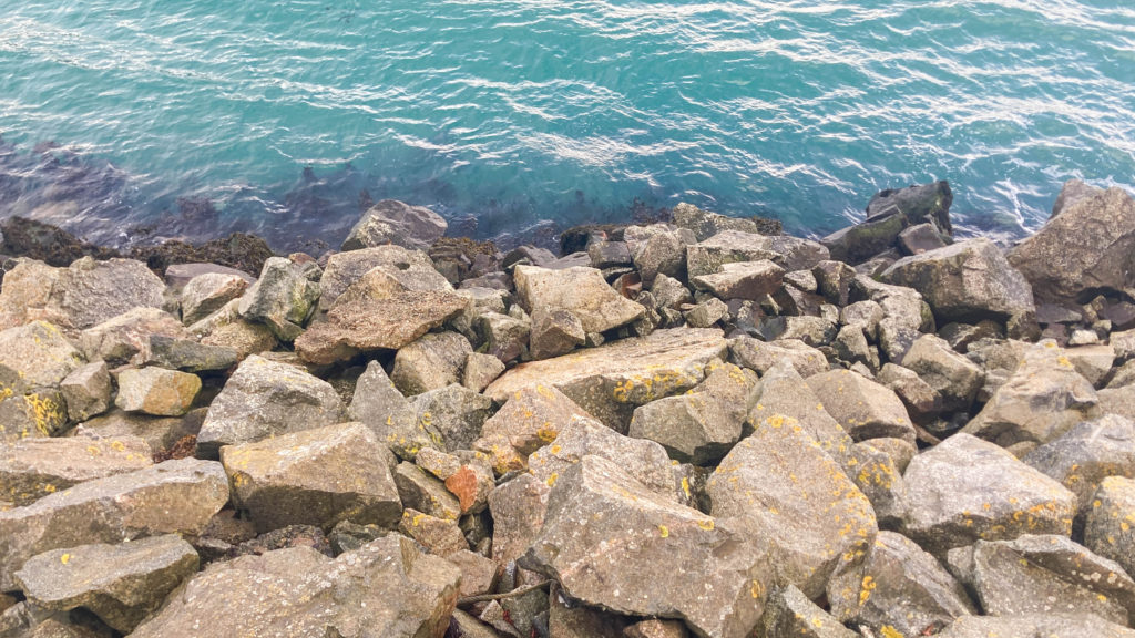
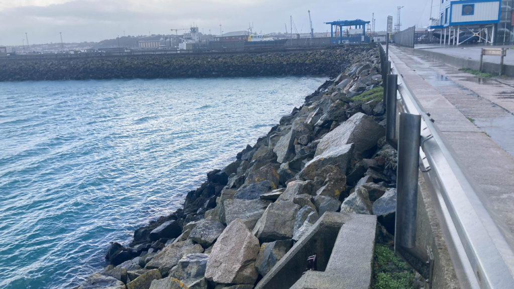
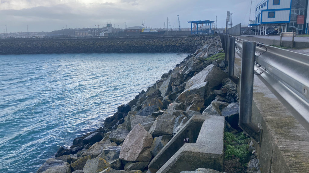
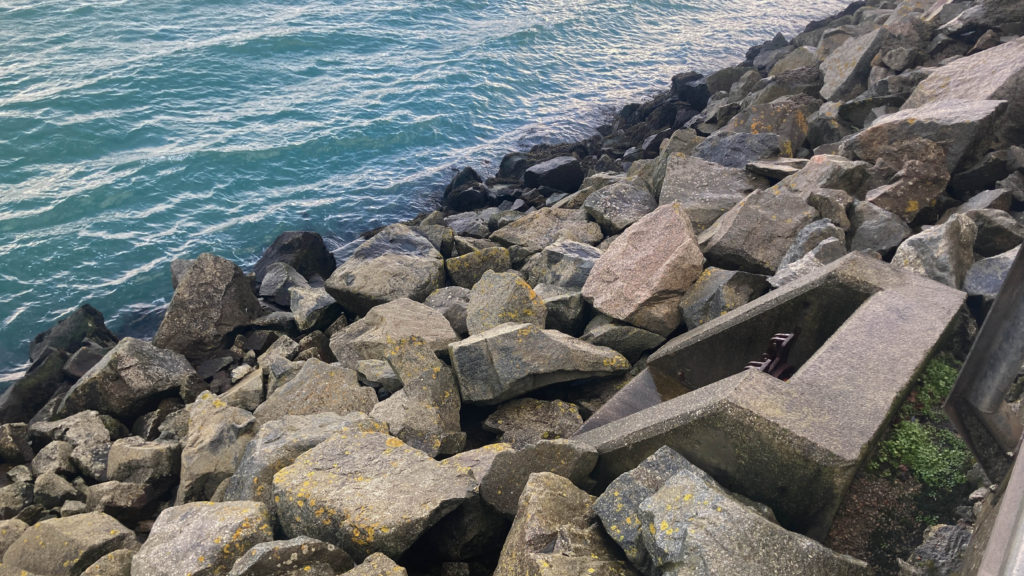
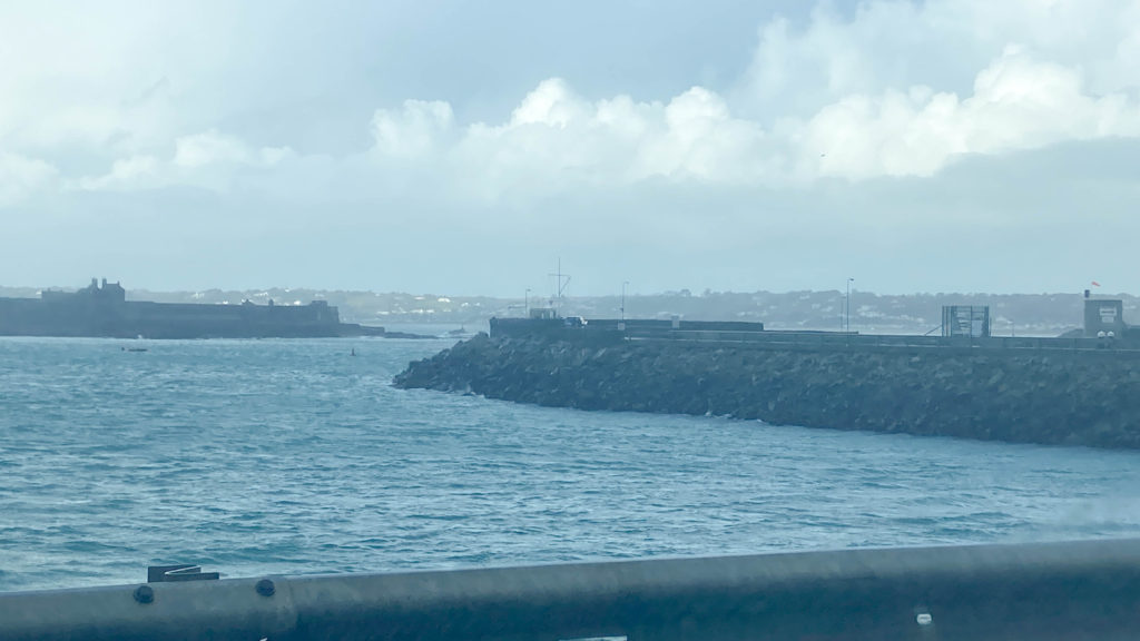
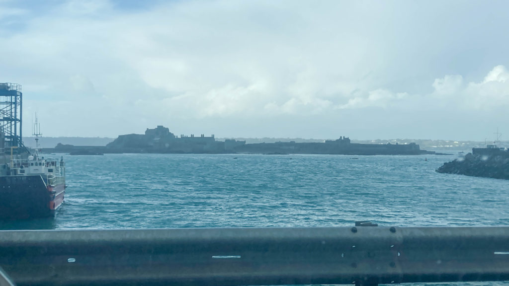
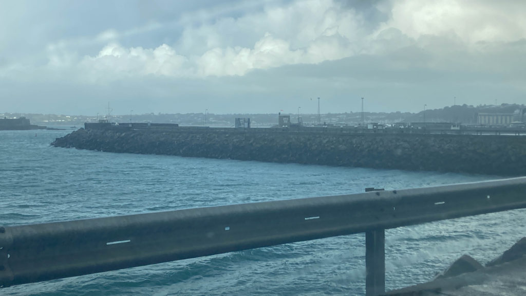

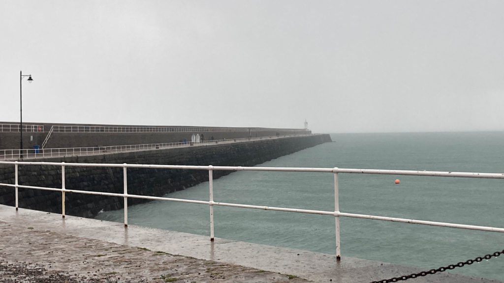
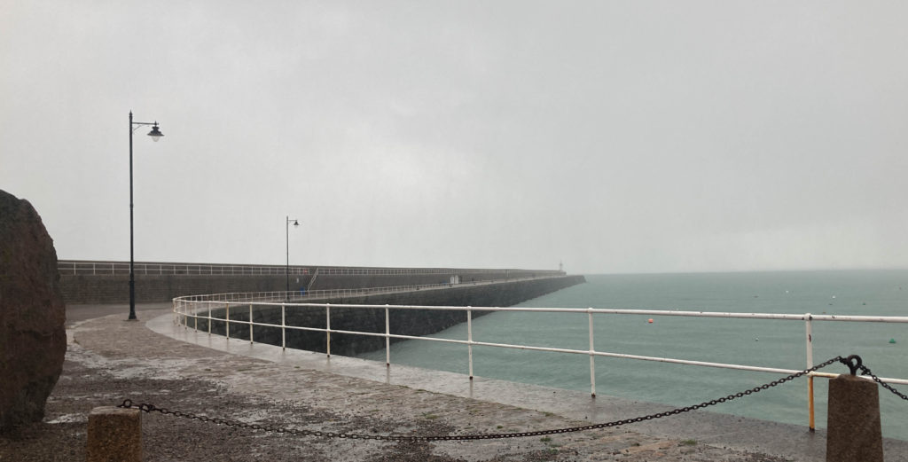
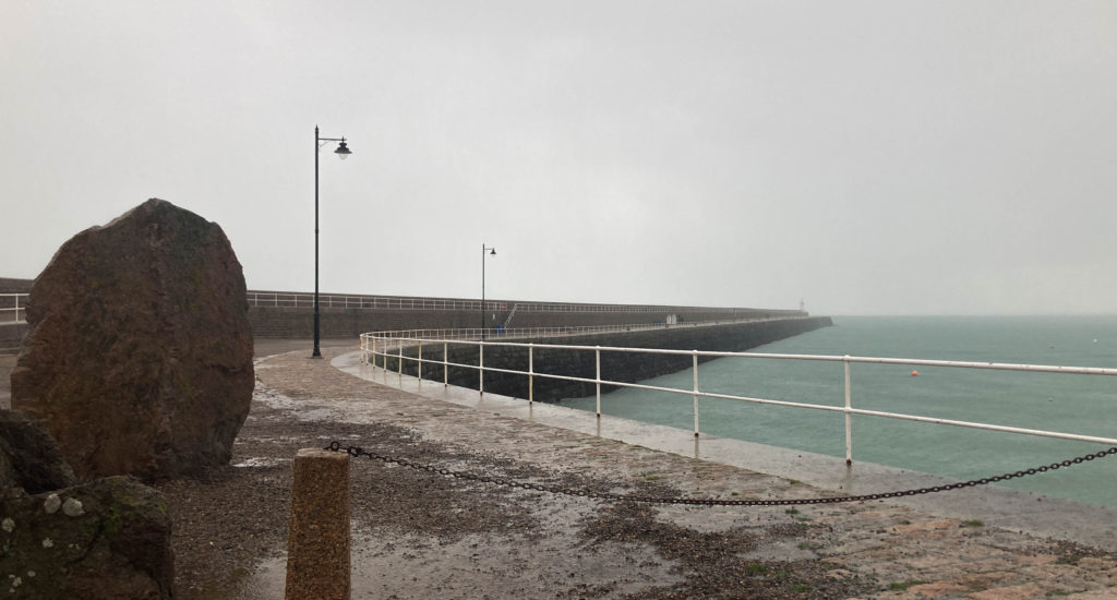
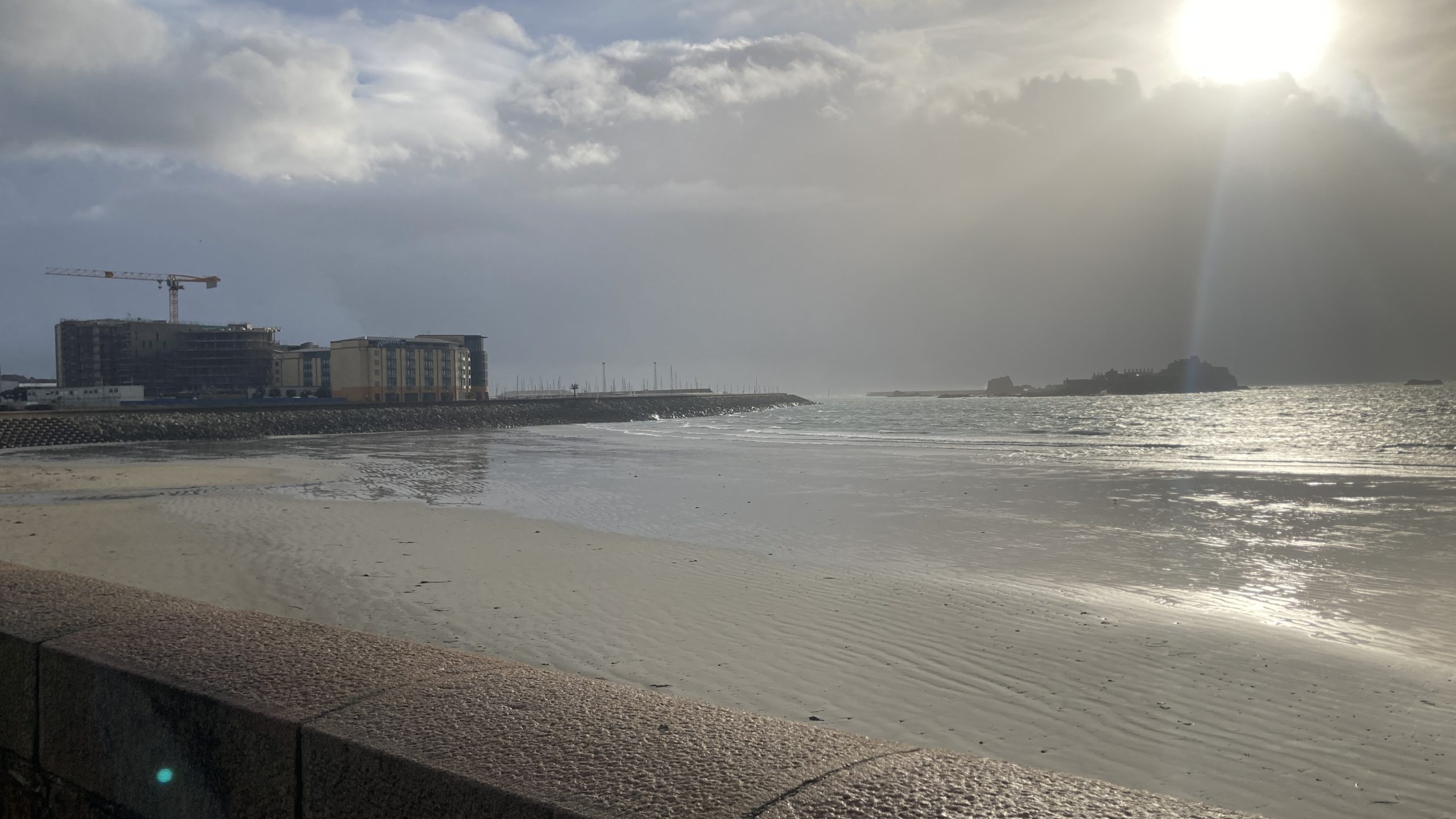
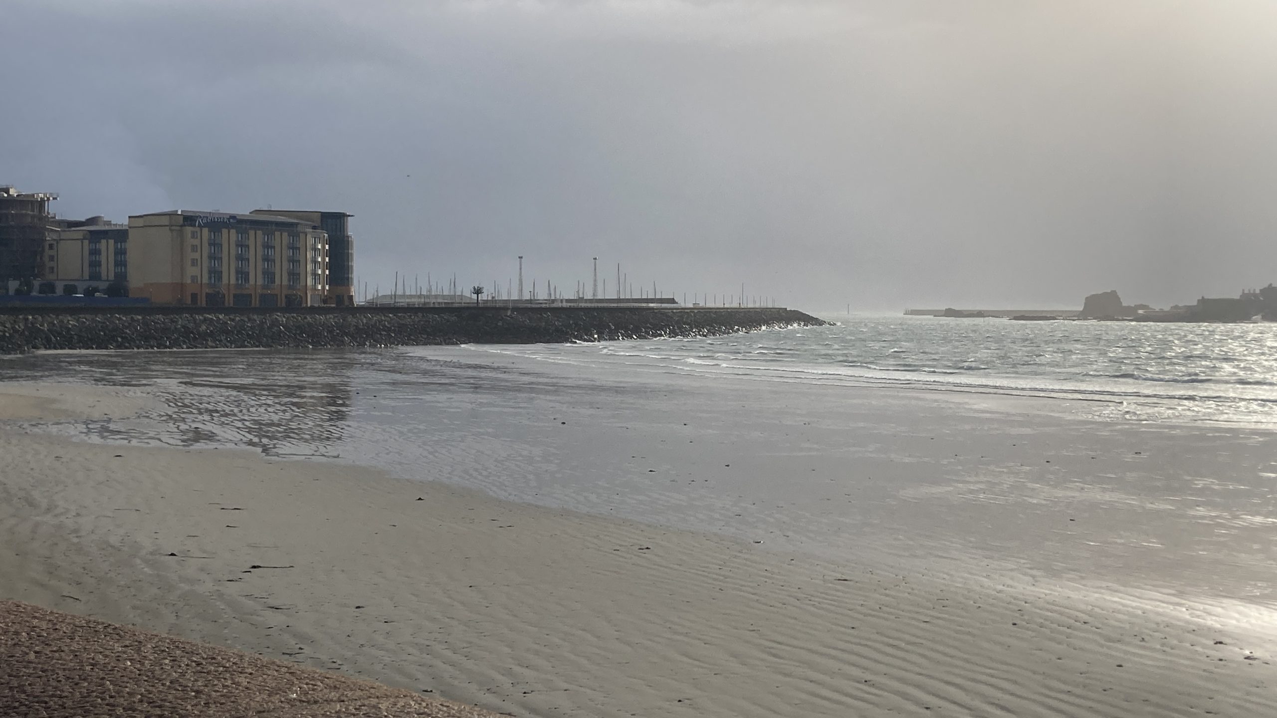
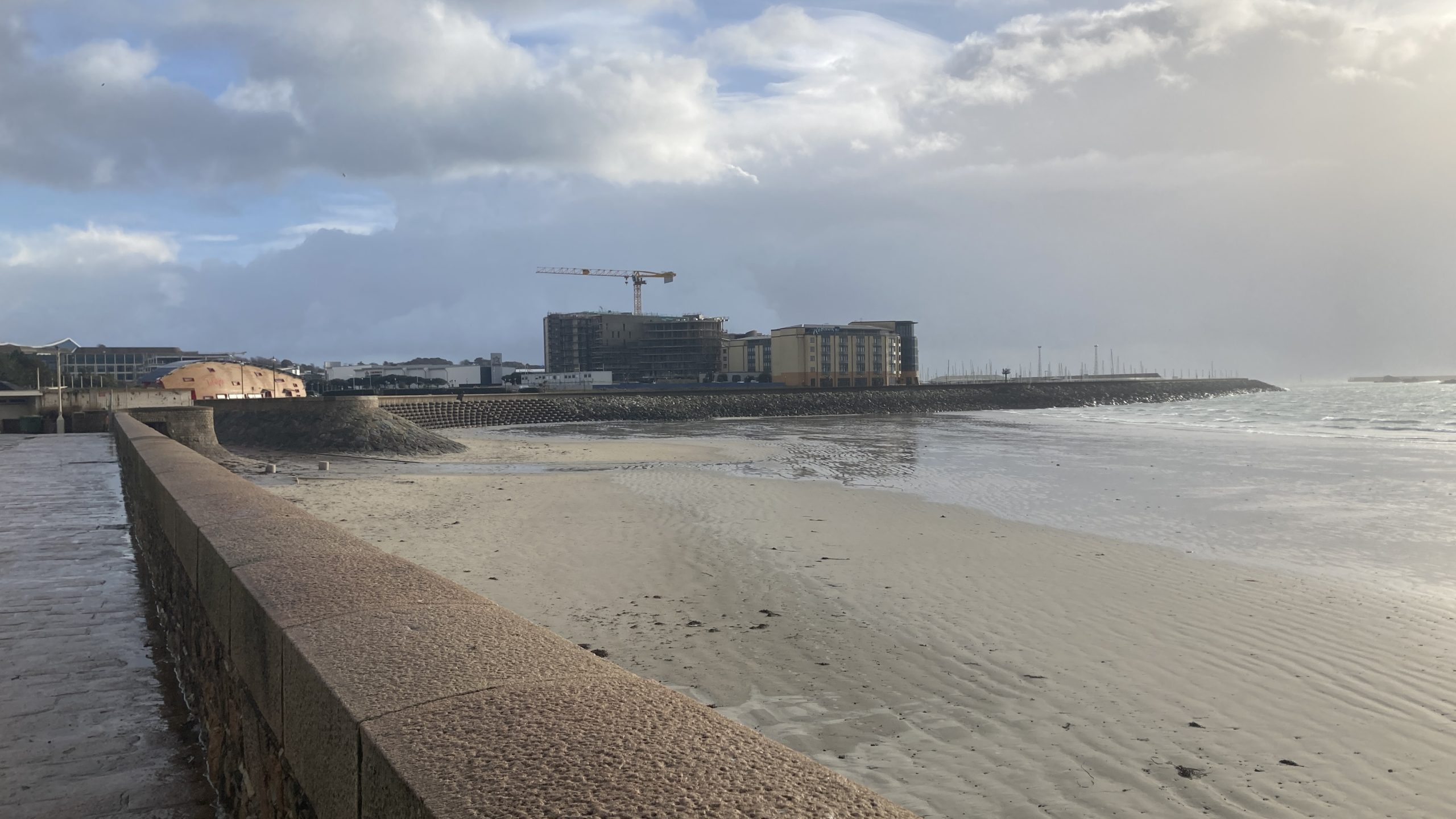
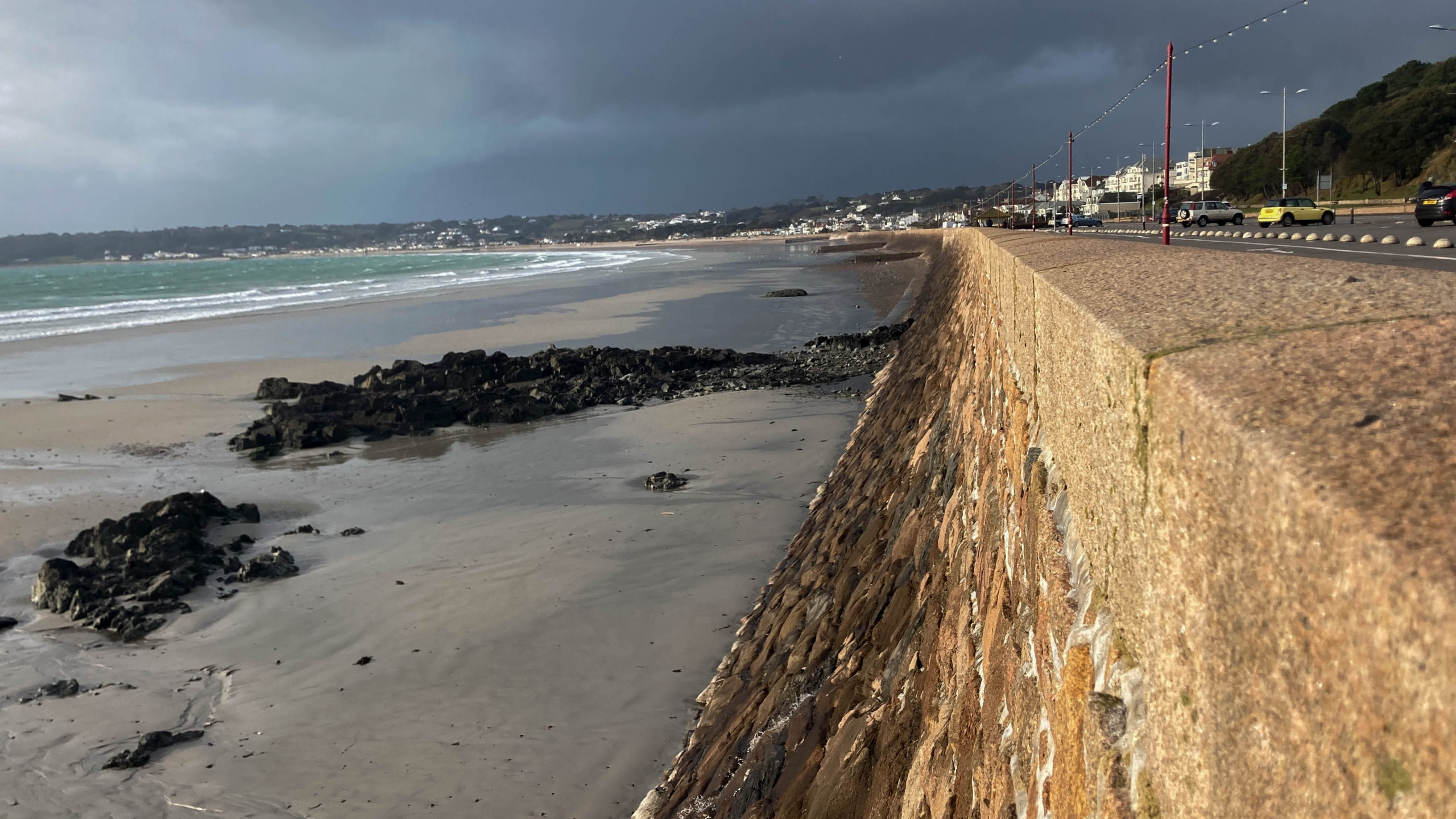
Once again, very happy with these shots as they show mankind intercepting with the ocean. Especially so with the pictures that include the Waterfront as that area is on top of reclaimed land and landfill. I like that the photos also show the side perspectives, showing the seawalls stretch all the way out.
Estates:
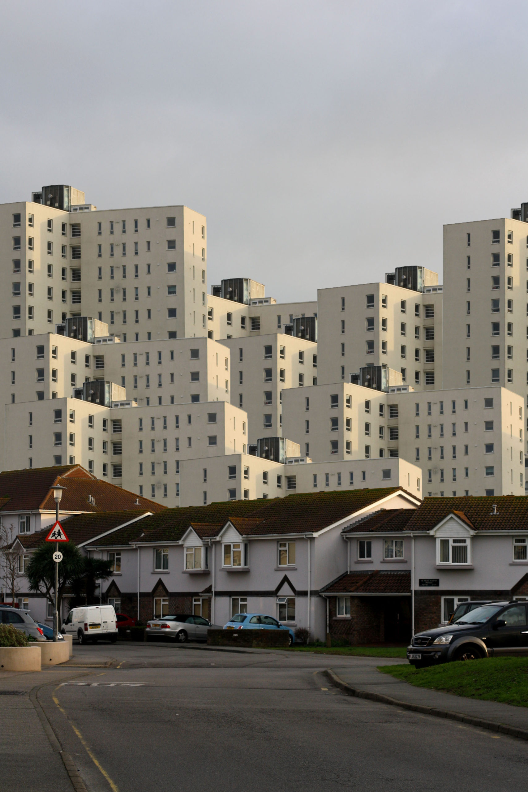
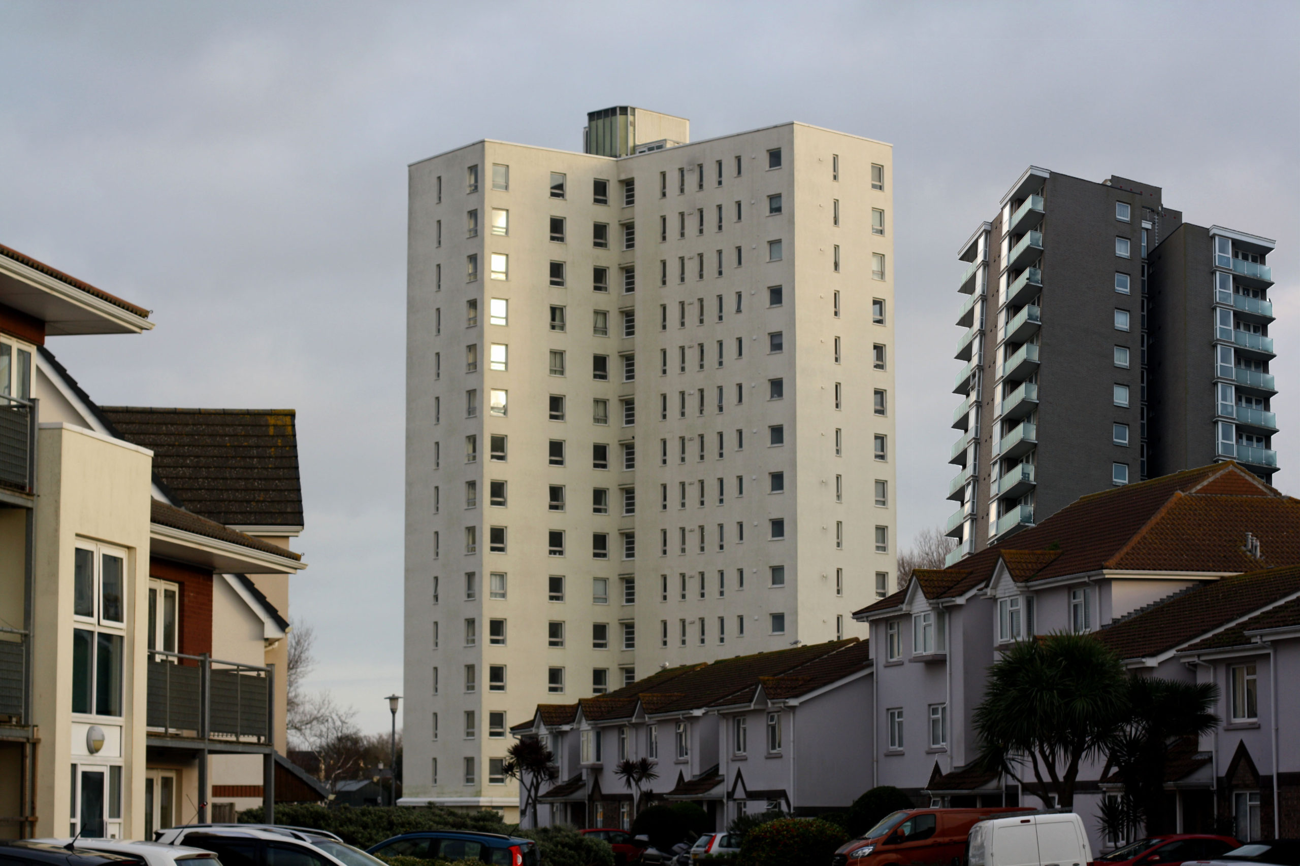
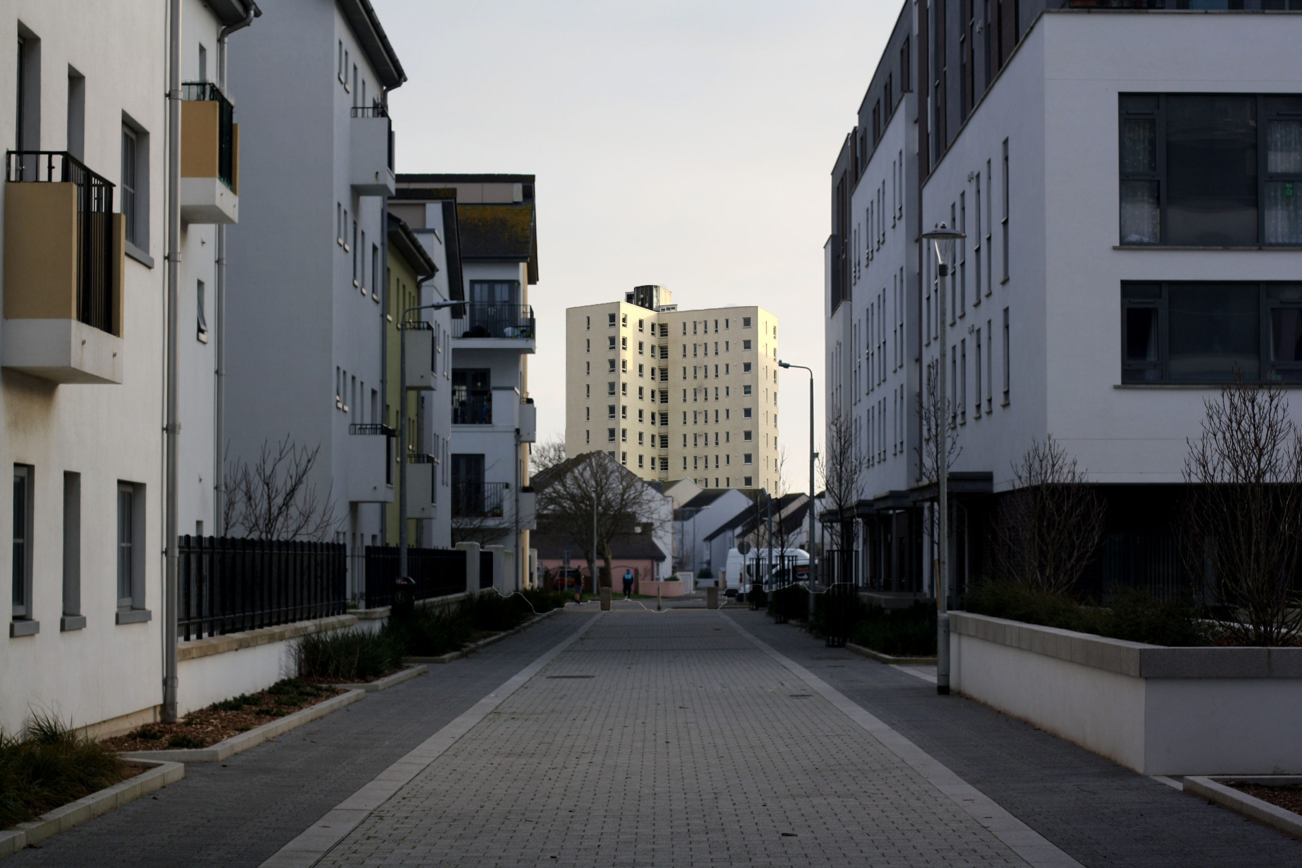
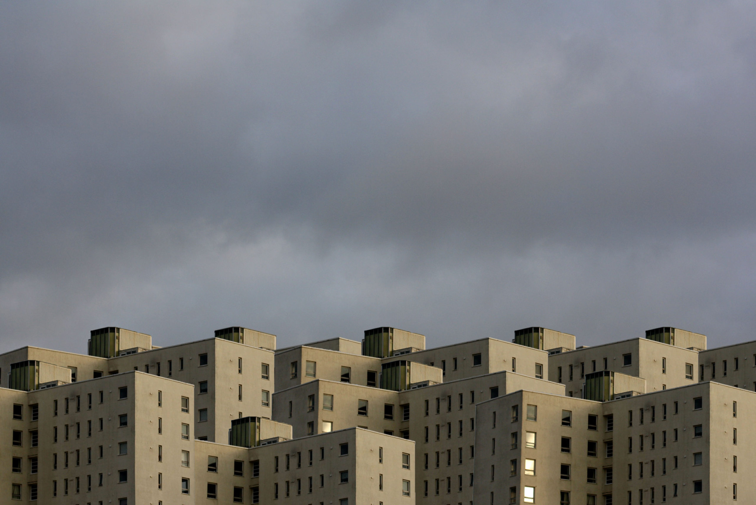
I went to Le Marais and other areas nearby to take pictures of some of the buildings that people live in. Some of these turned out great. These photos are also my Robert Clayton photoshoot.
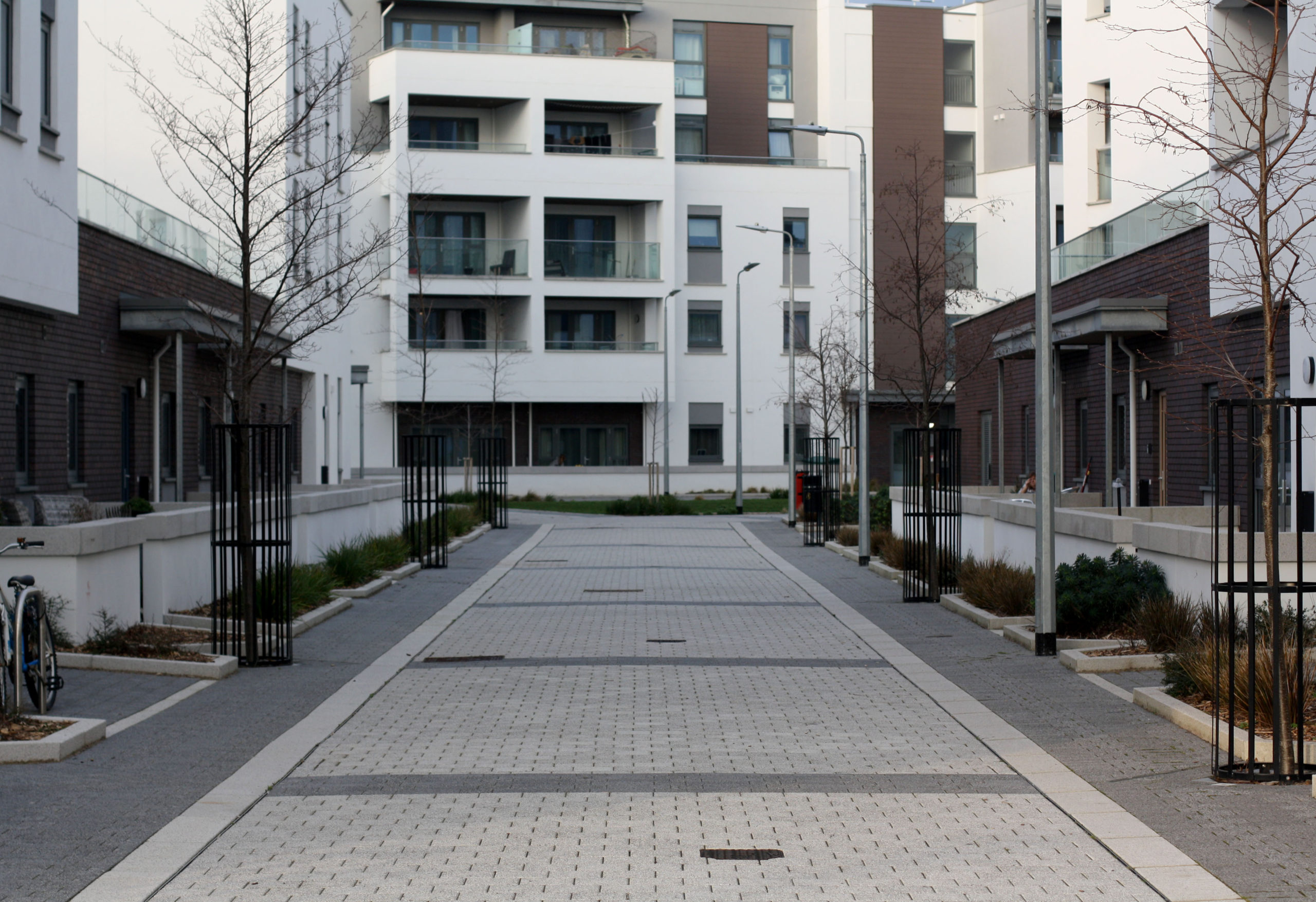
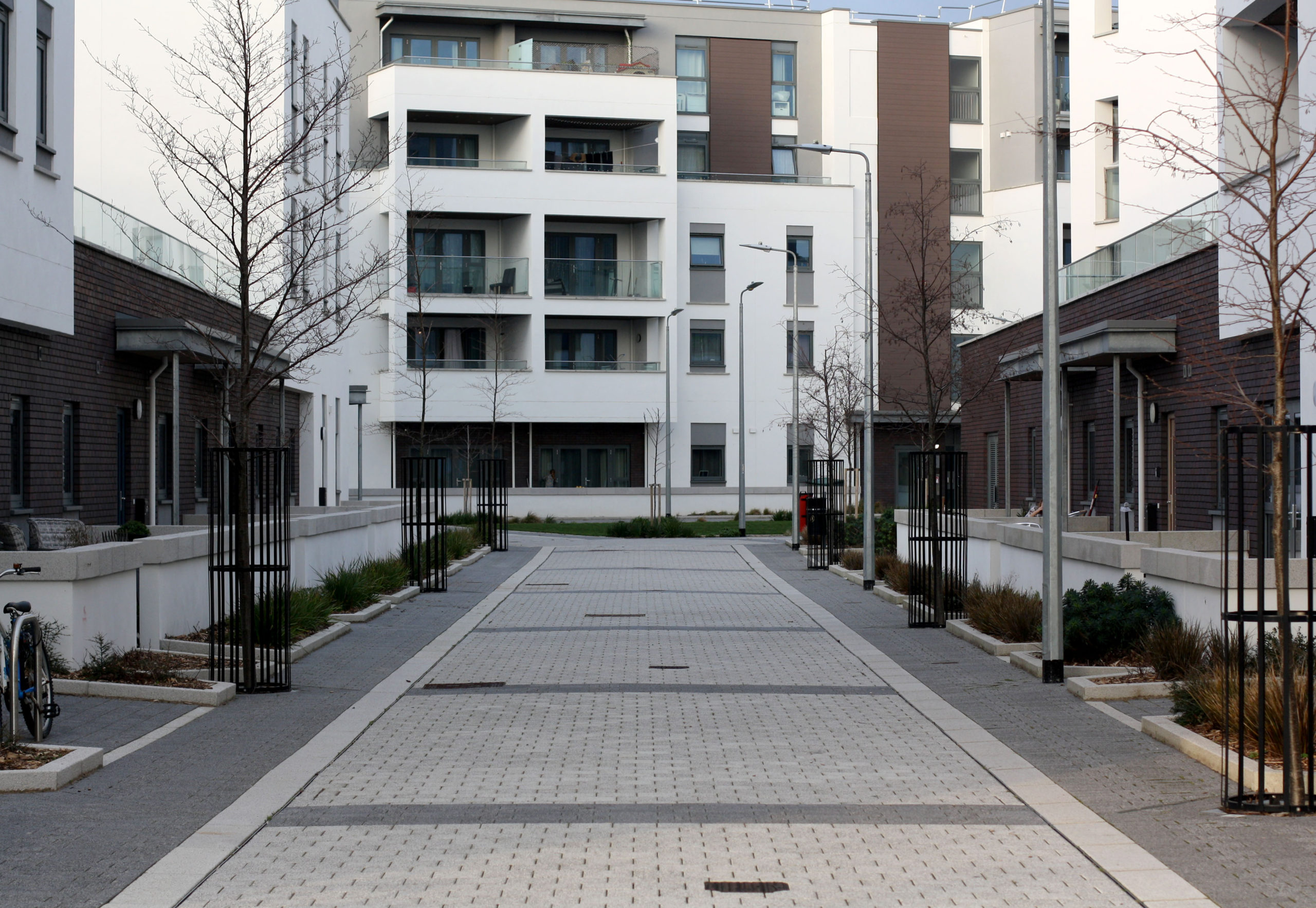
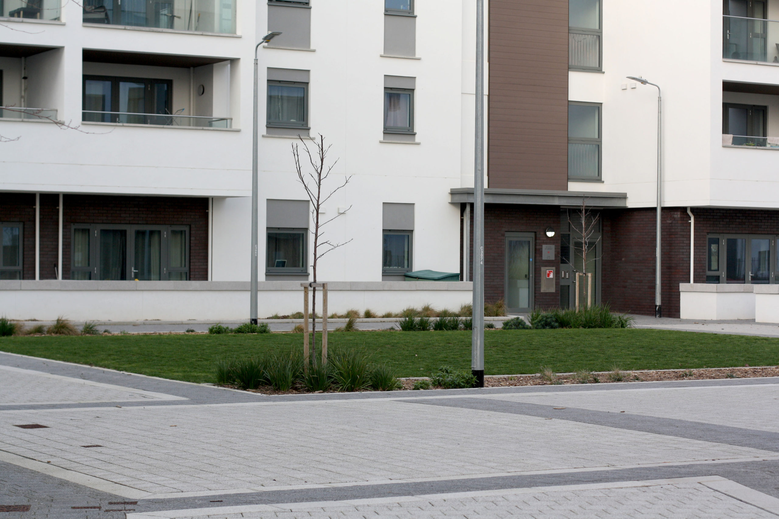
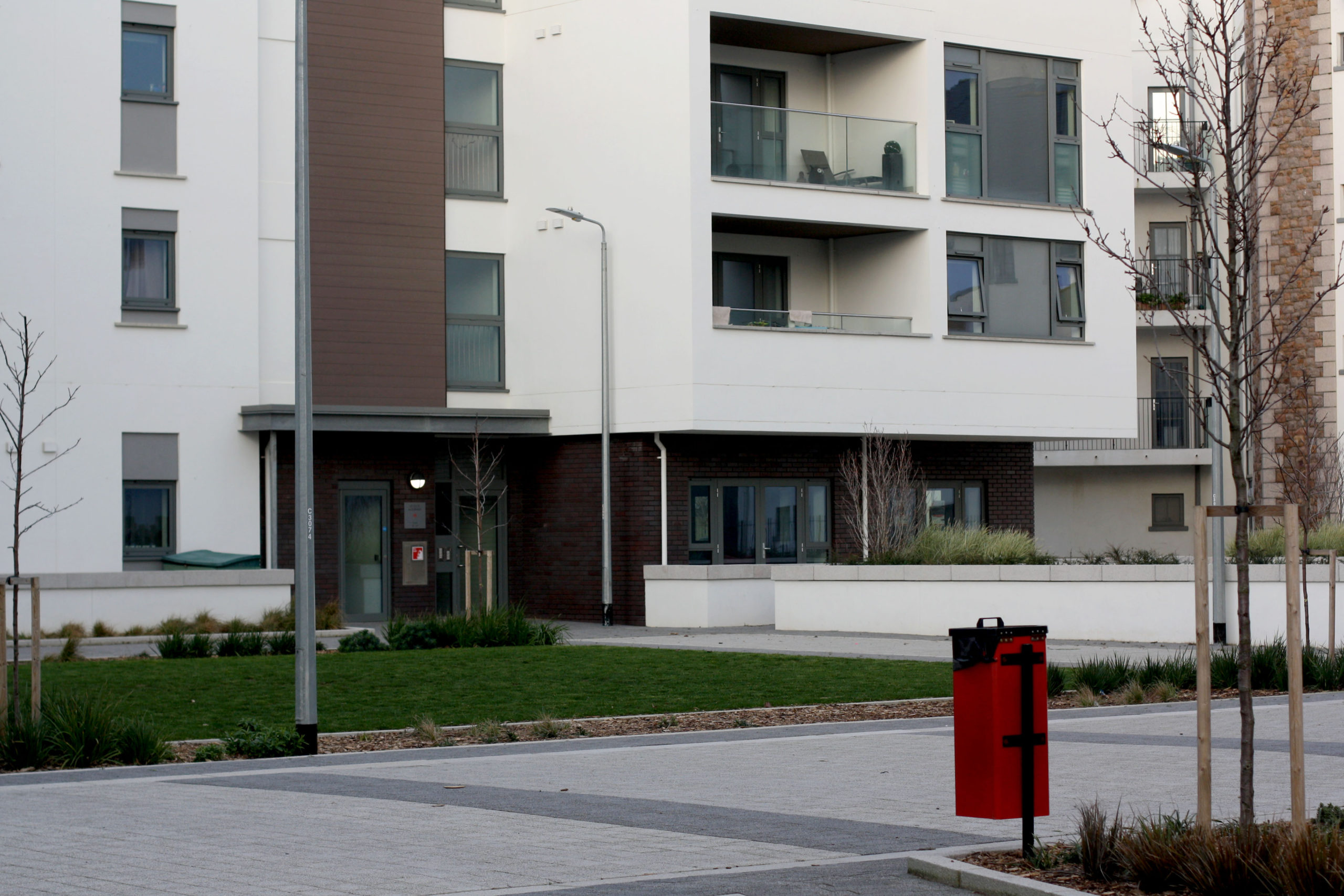
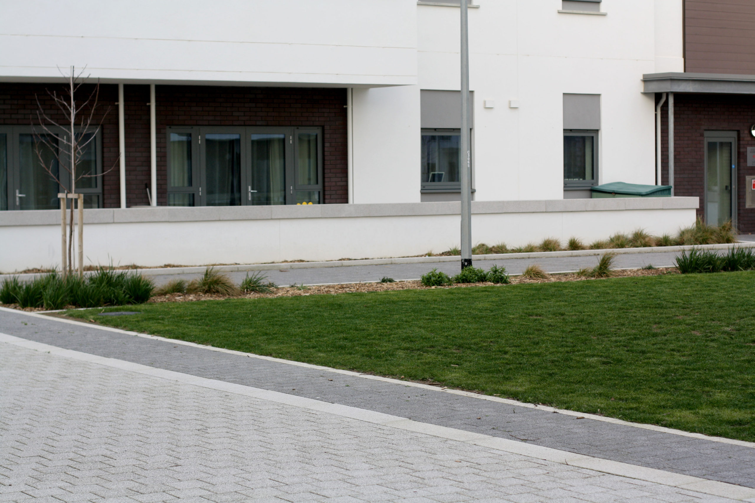
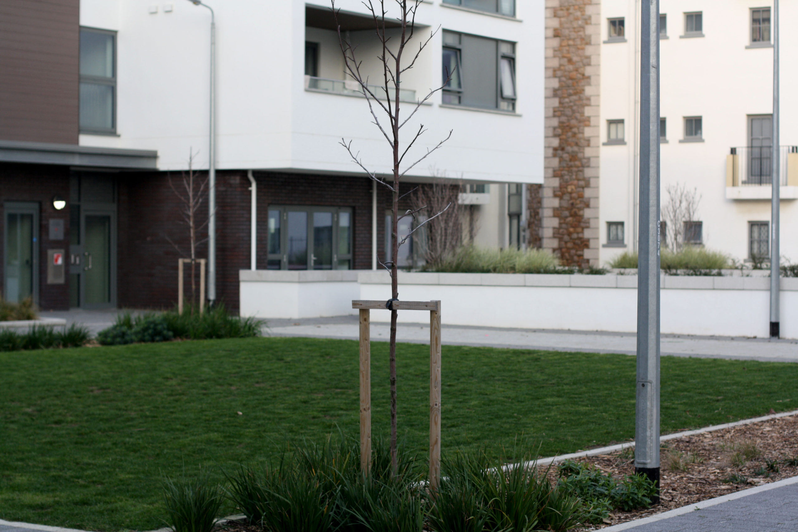
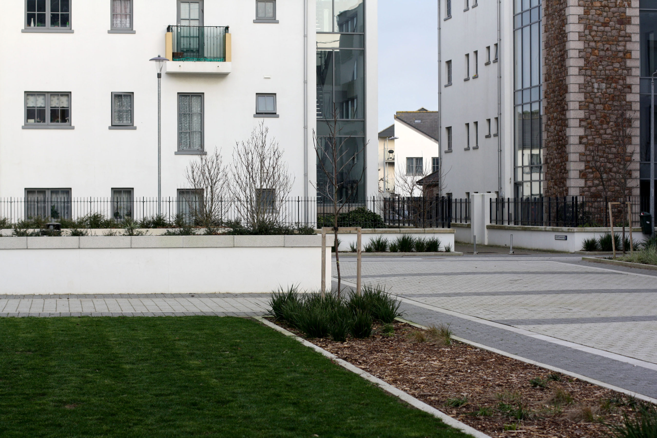
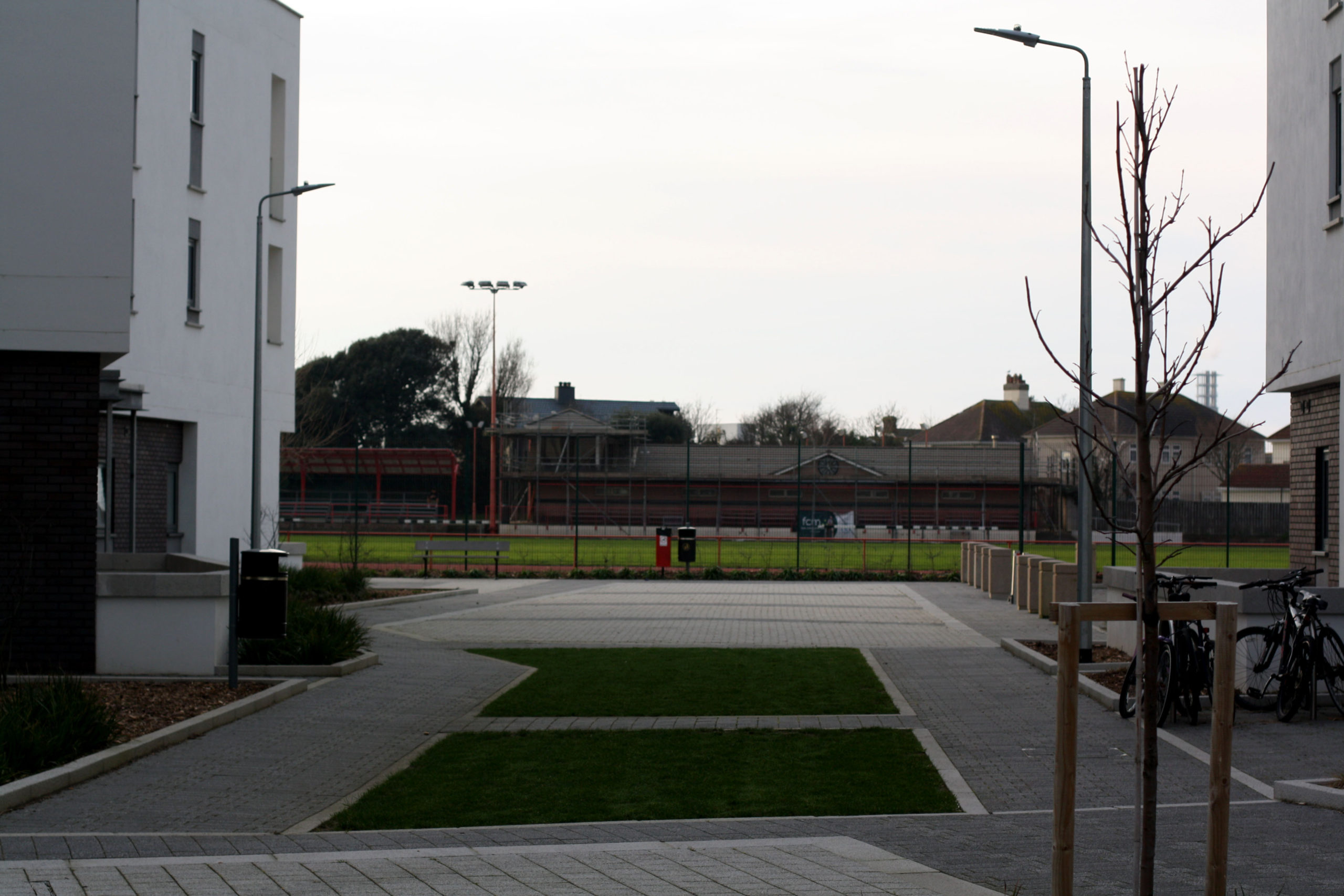
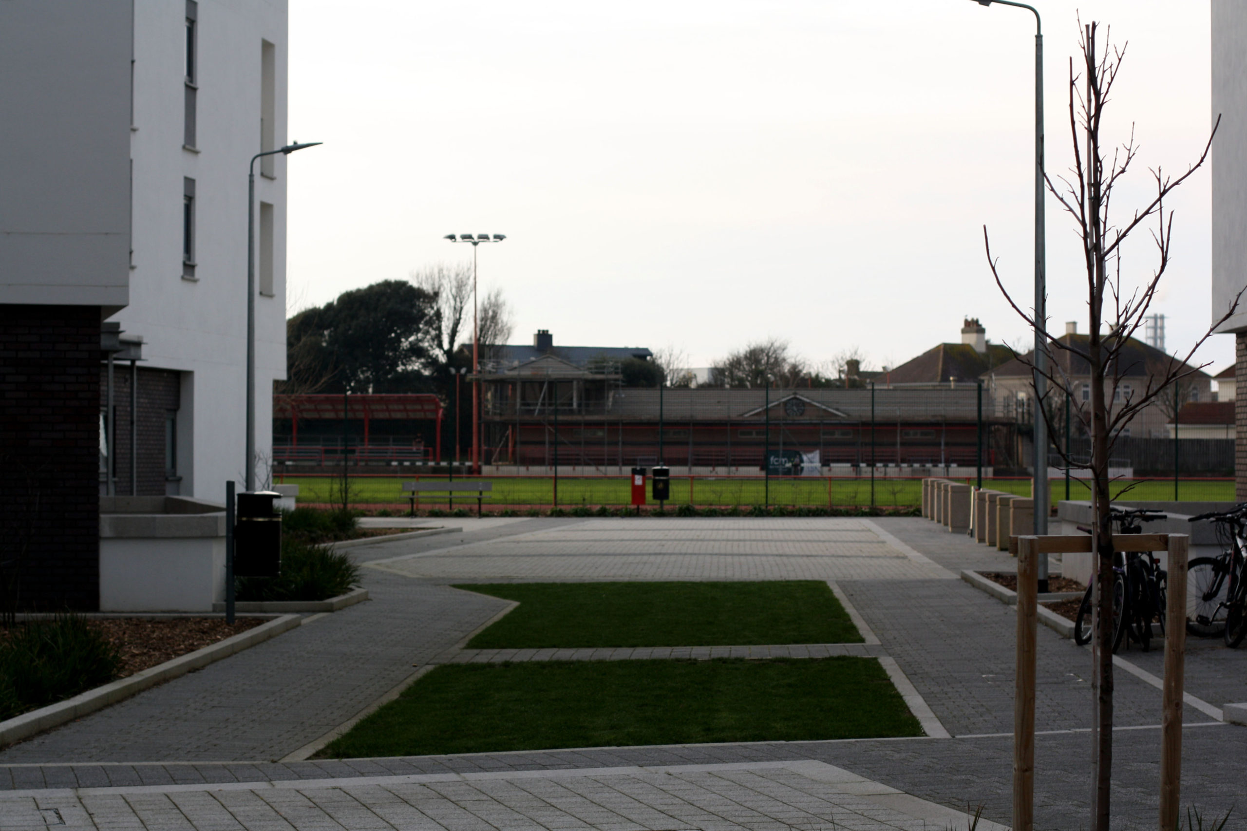
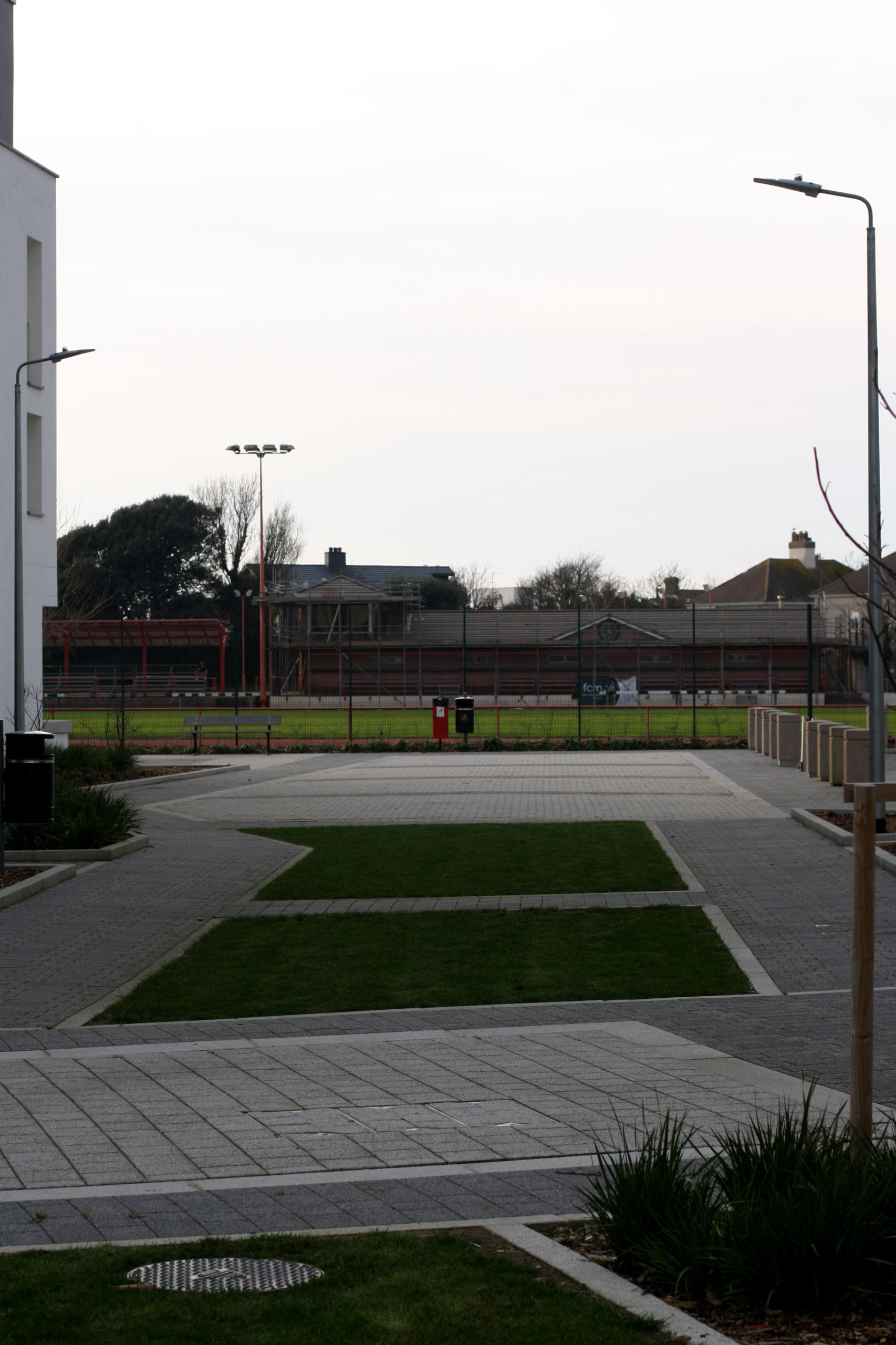
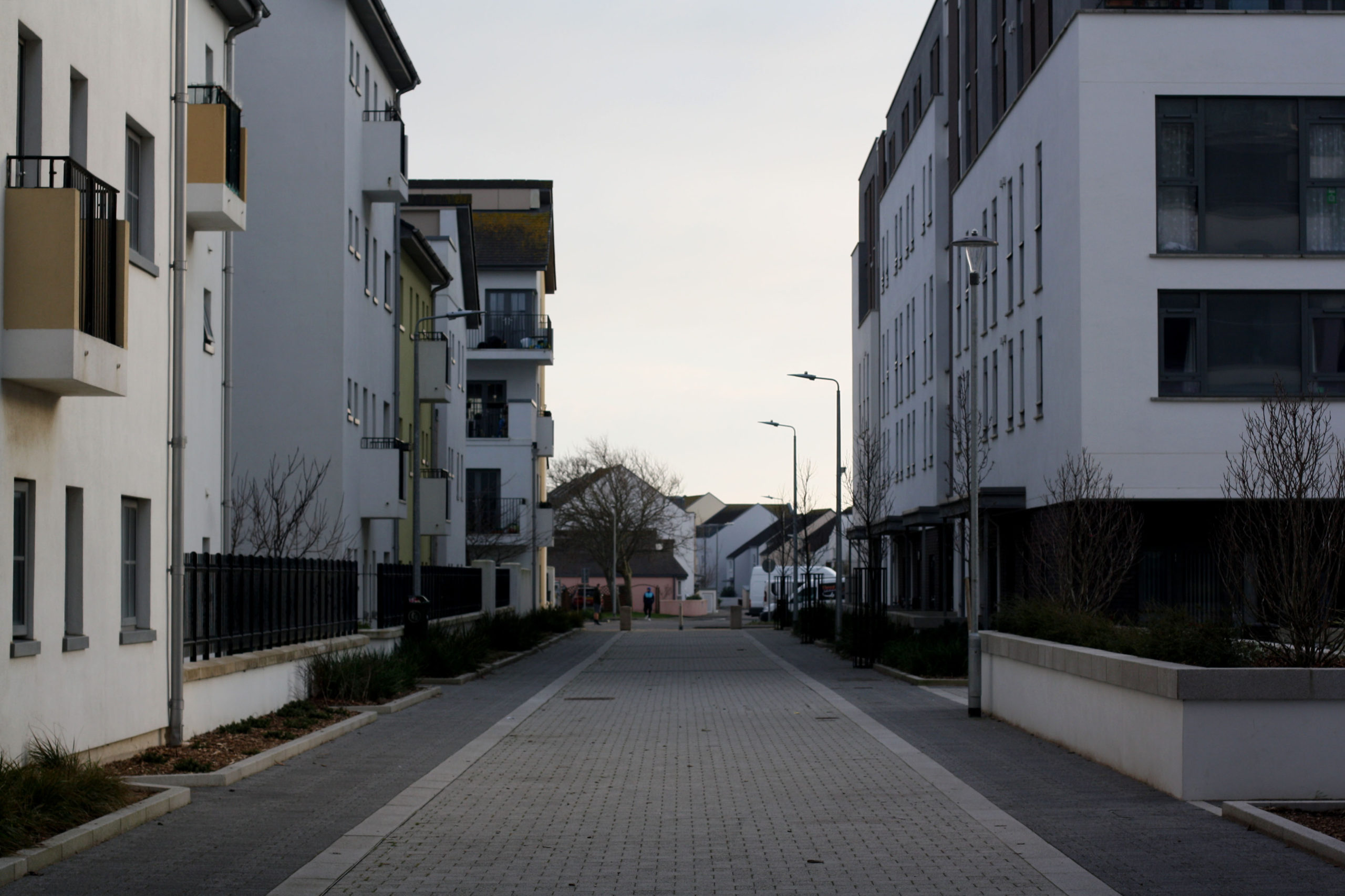
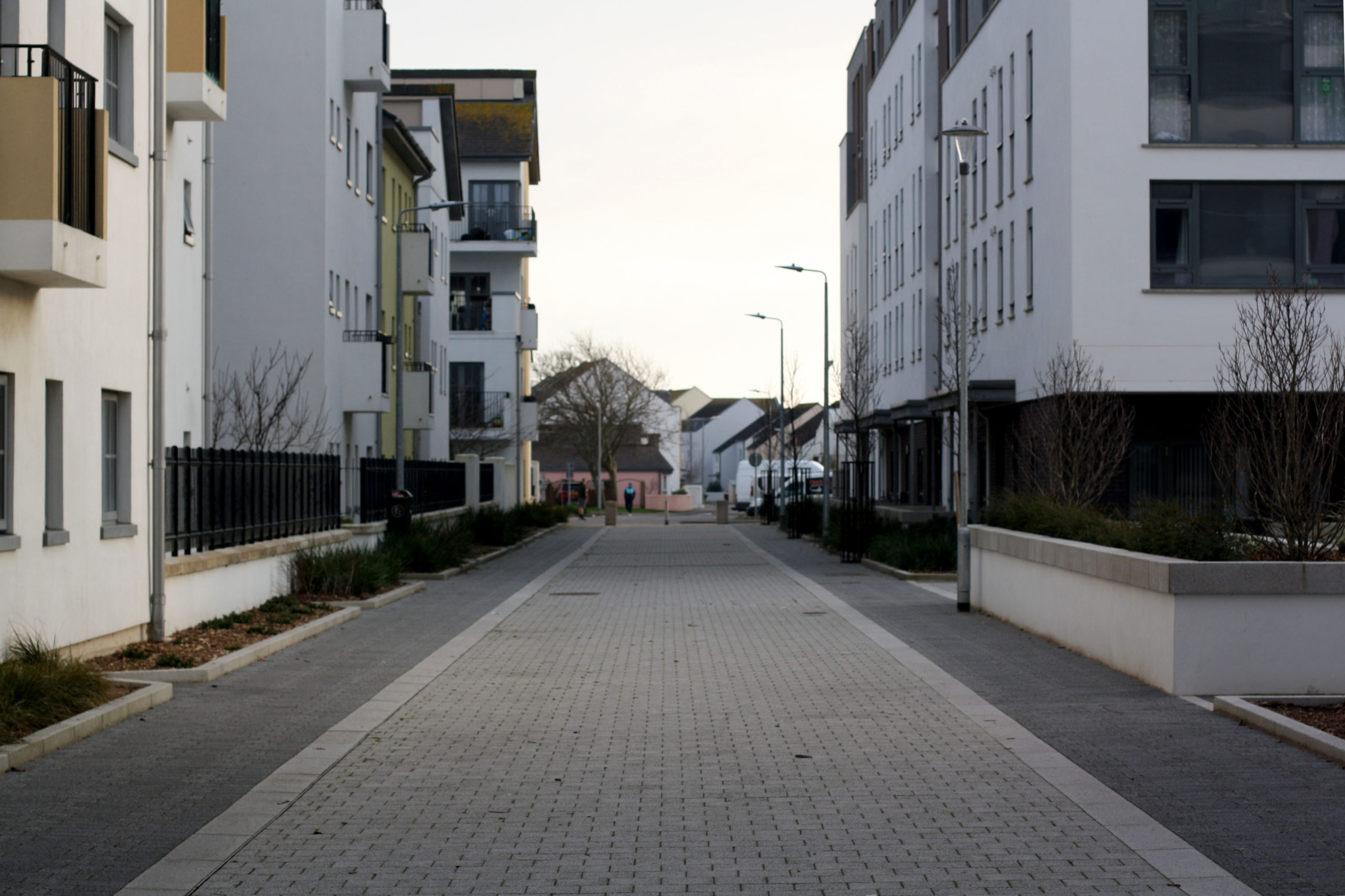
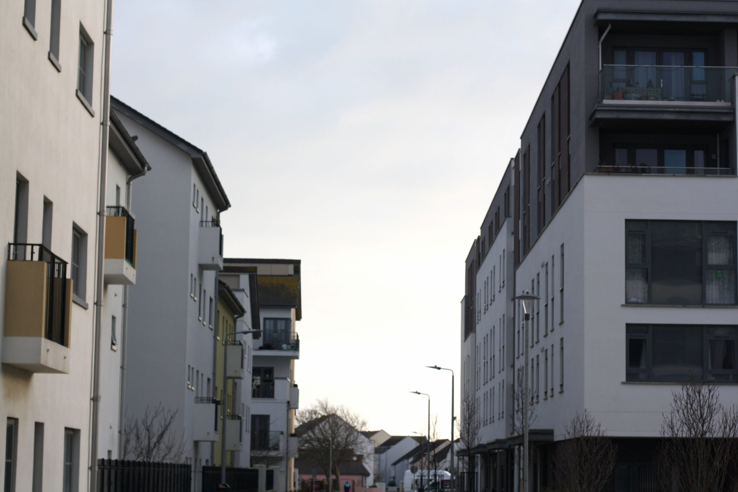
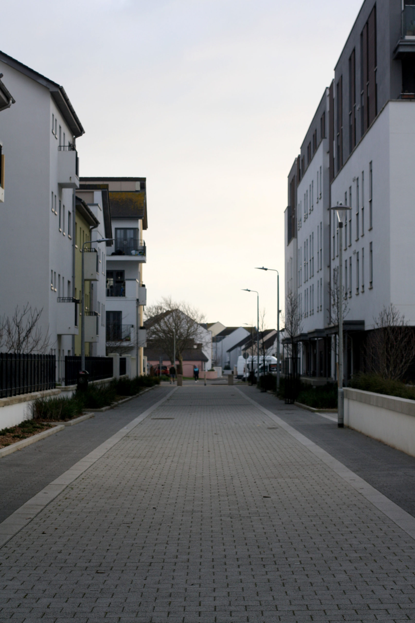
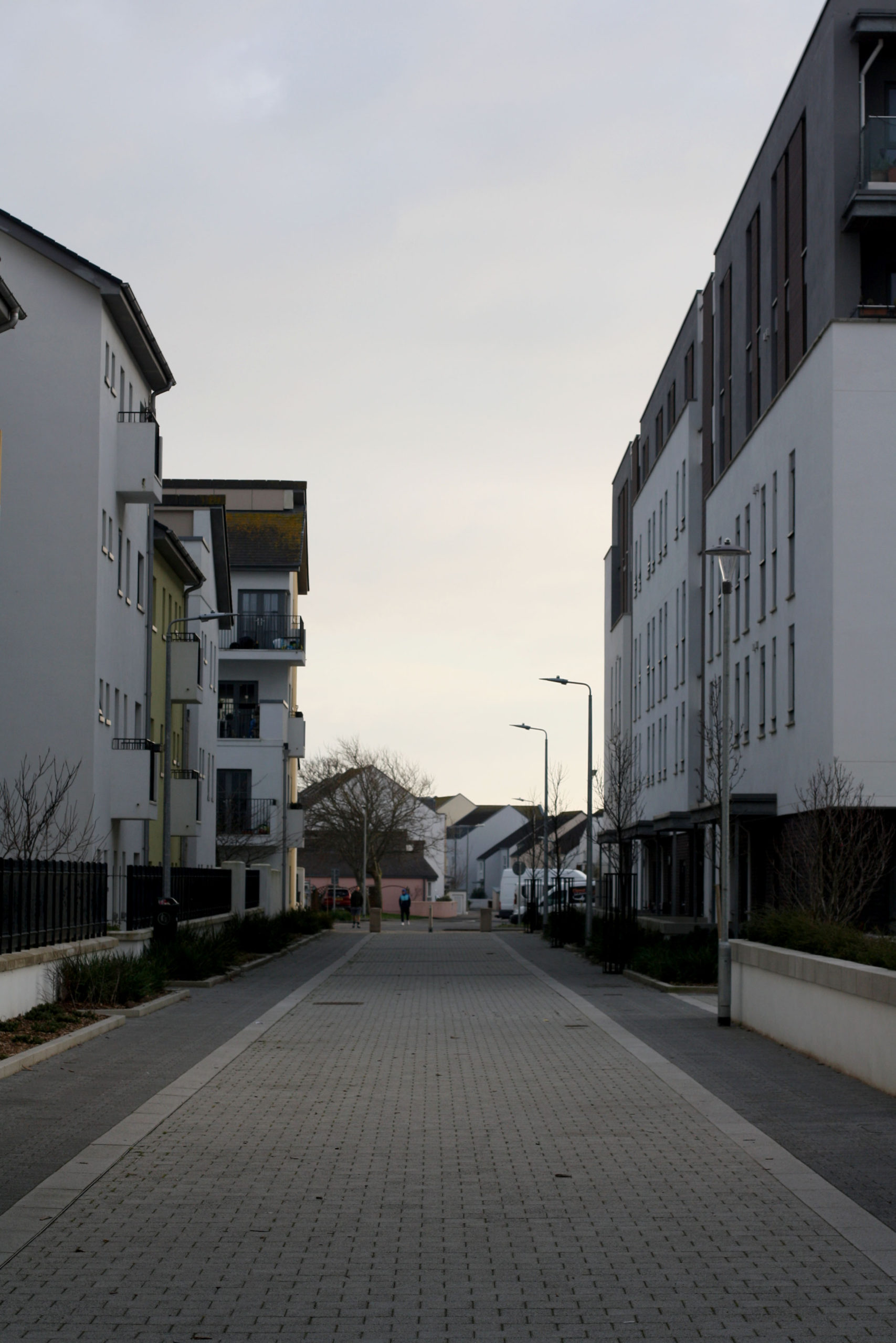

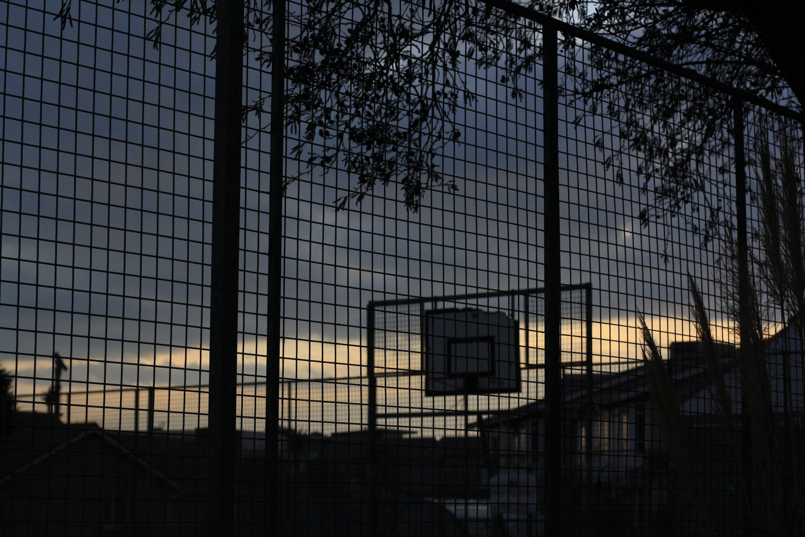


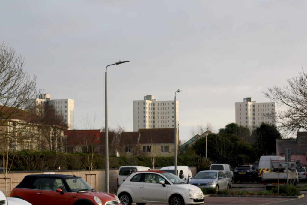
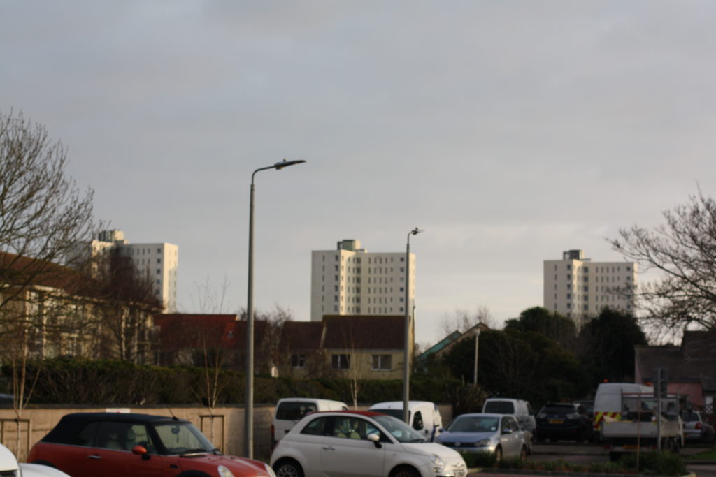
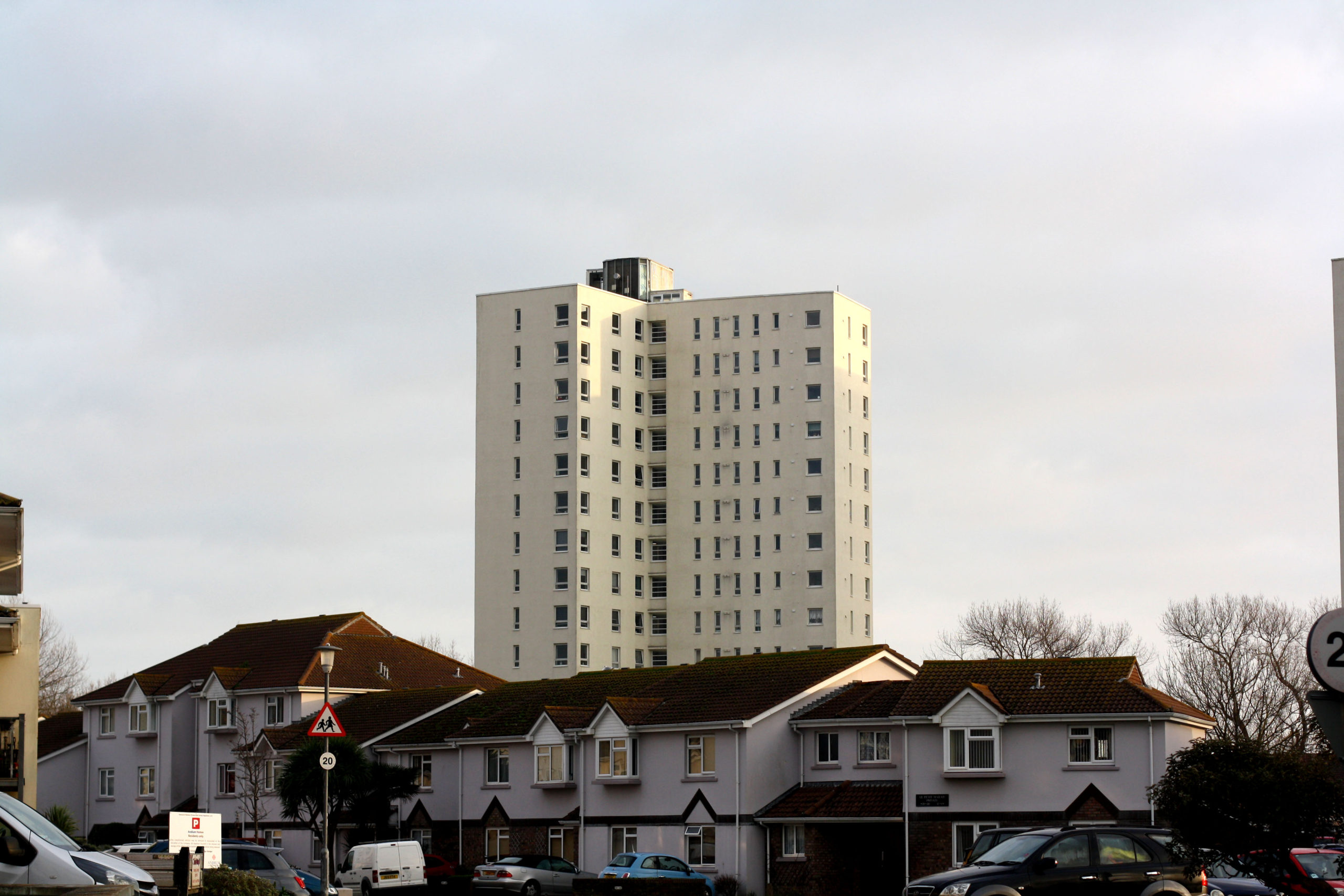
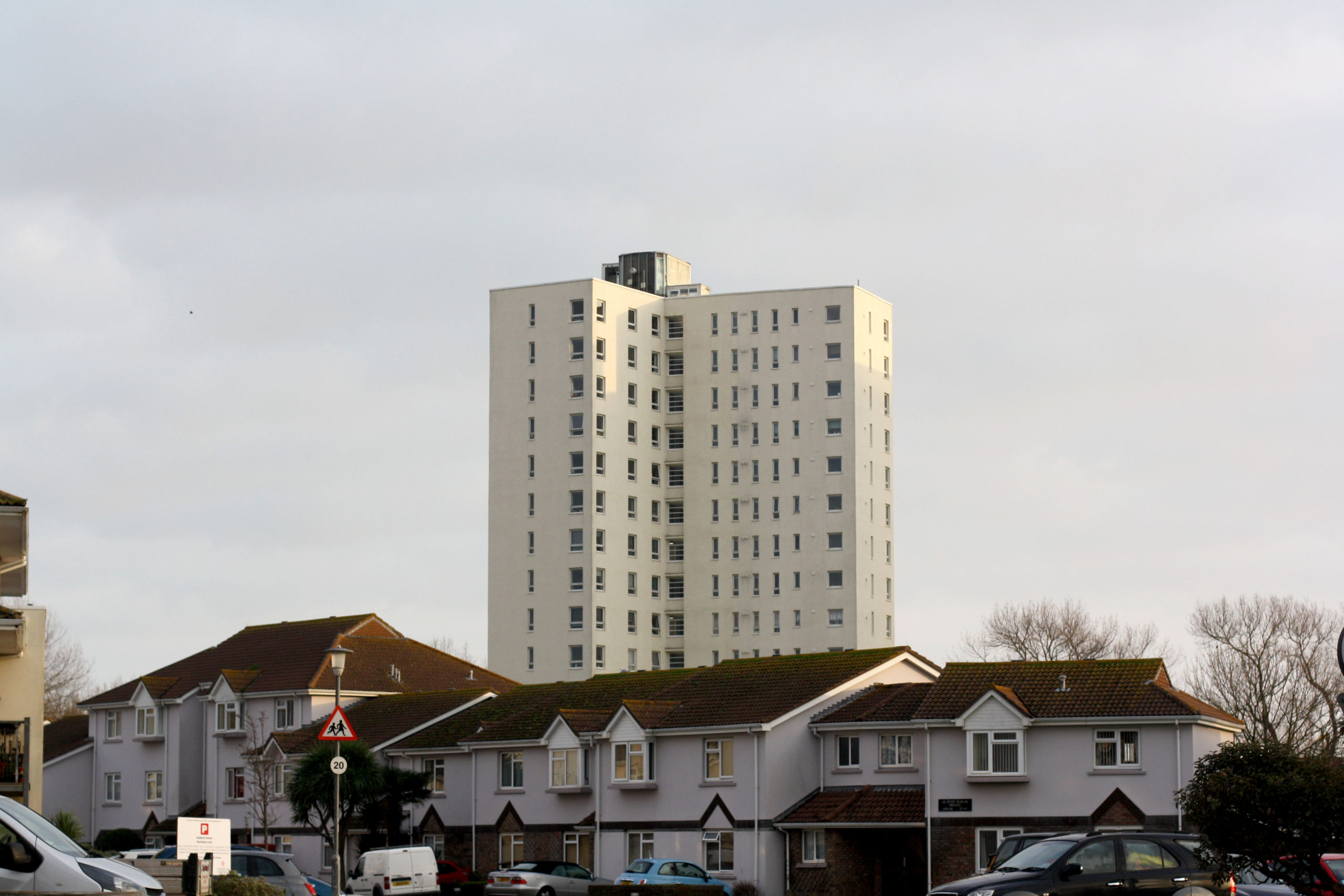
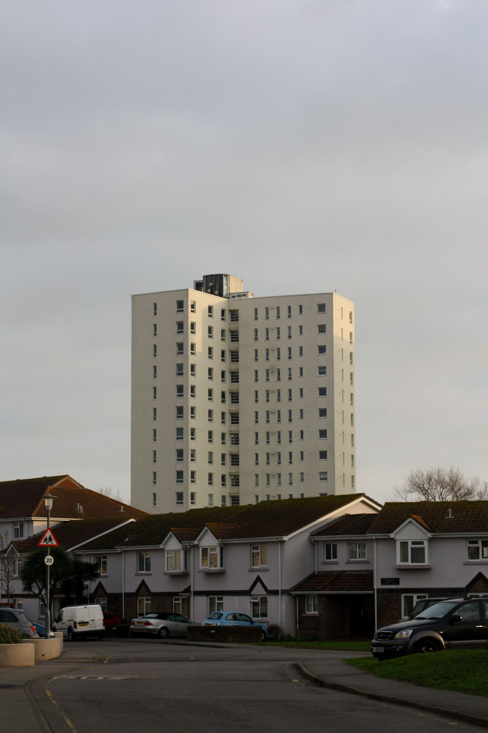
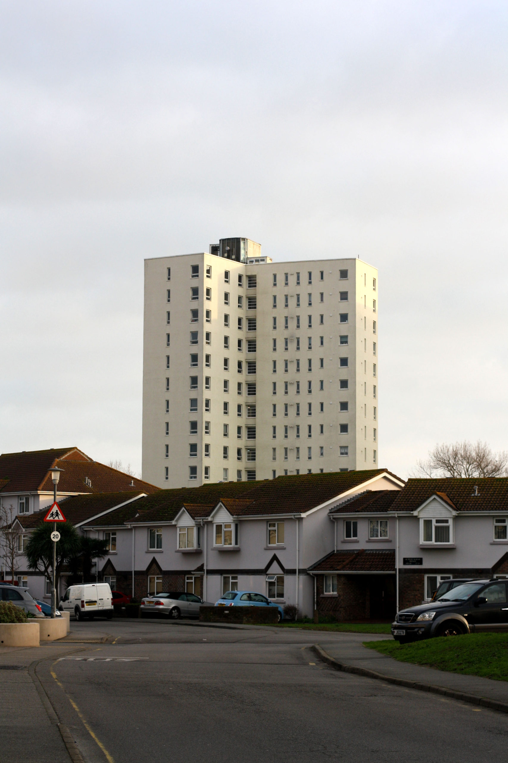
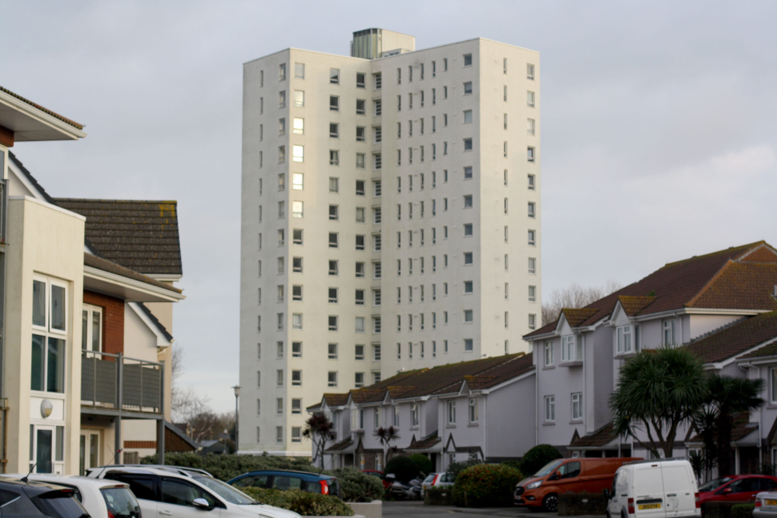
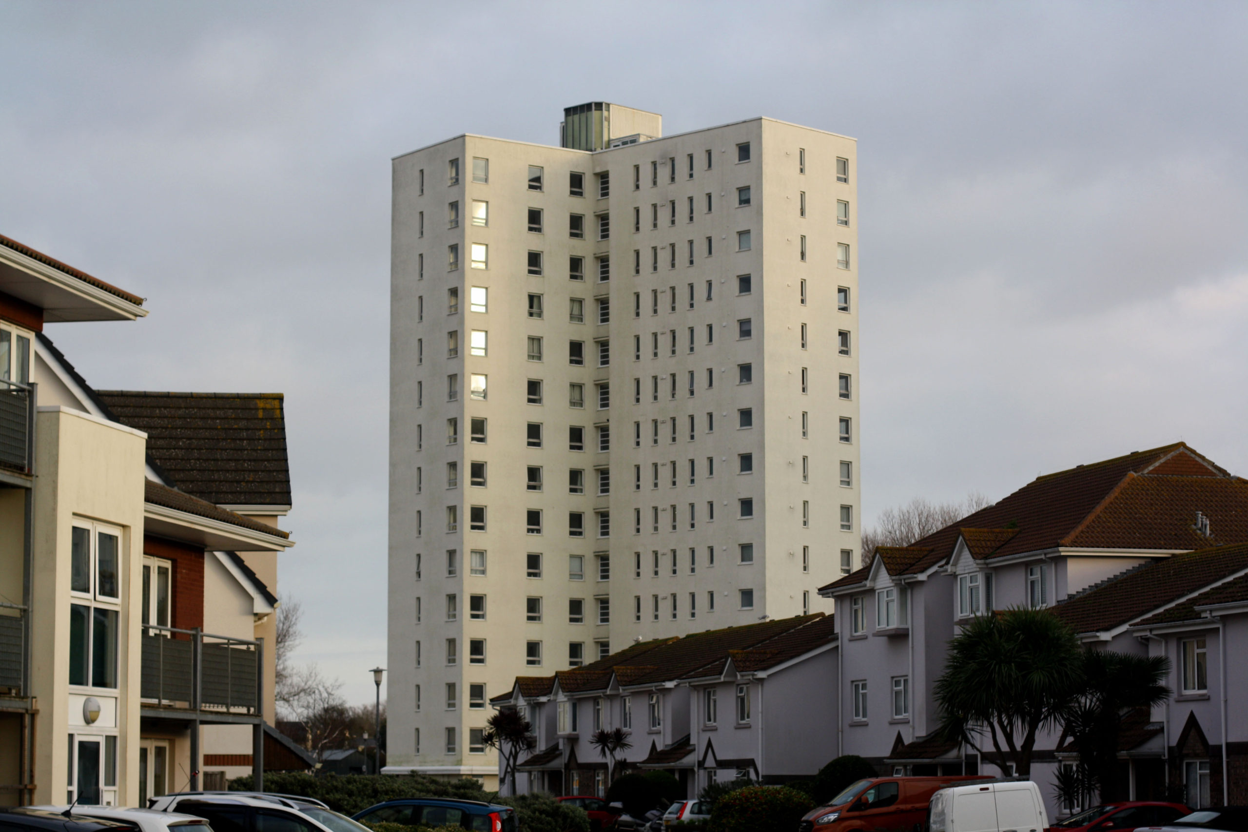

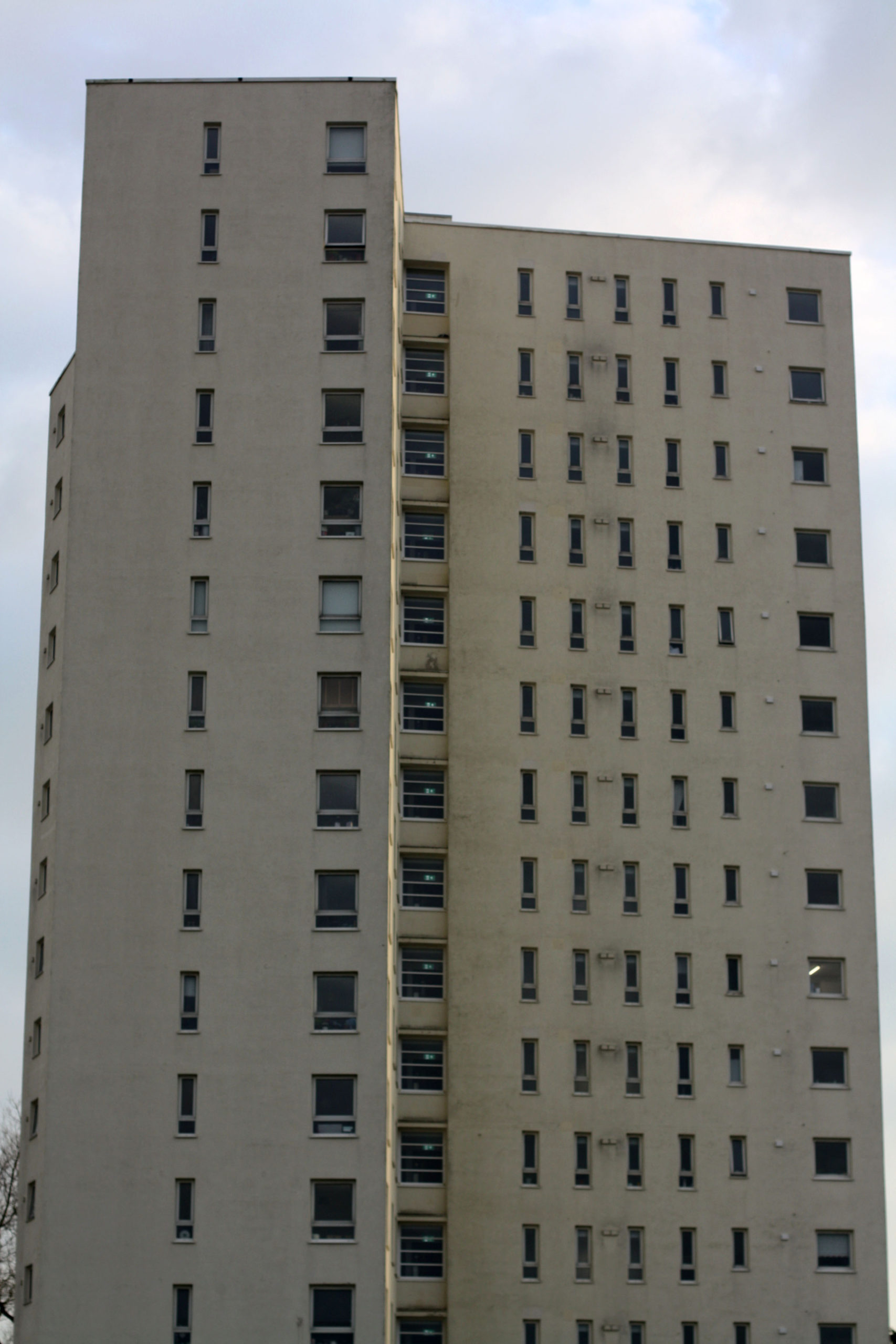
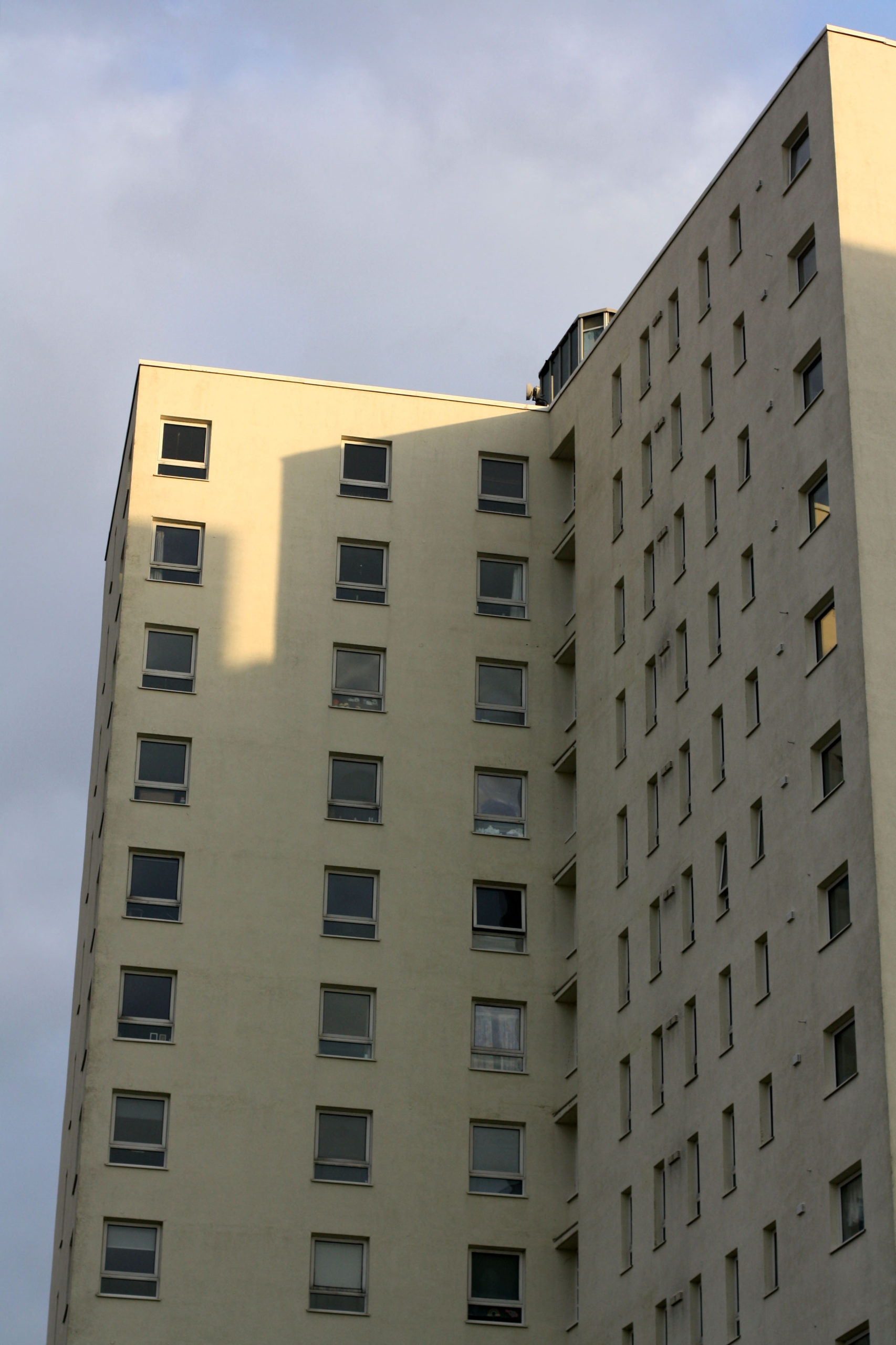
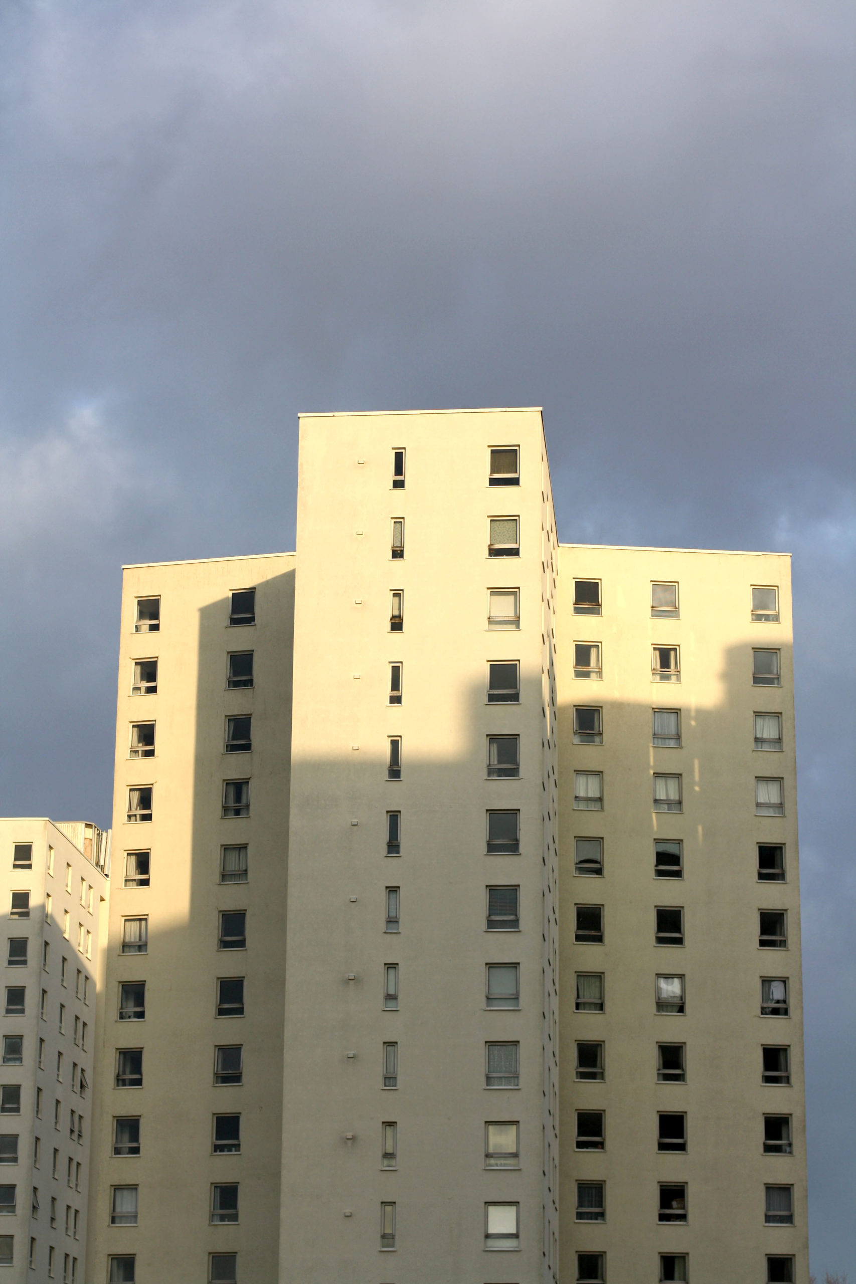
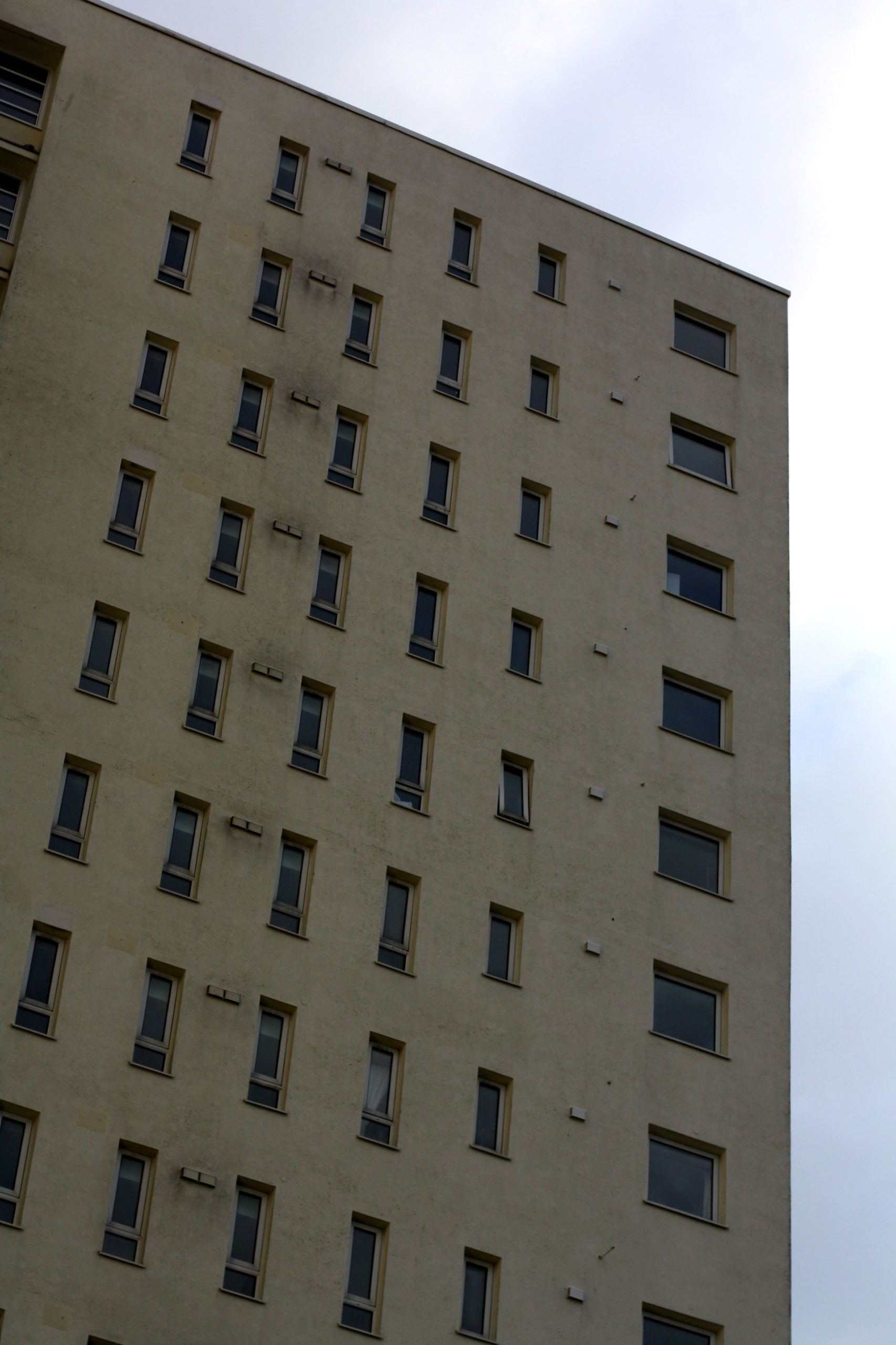
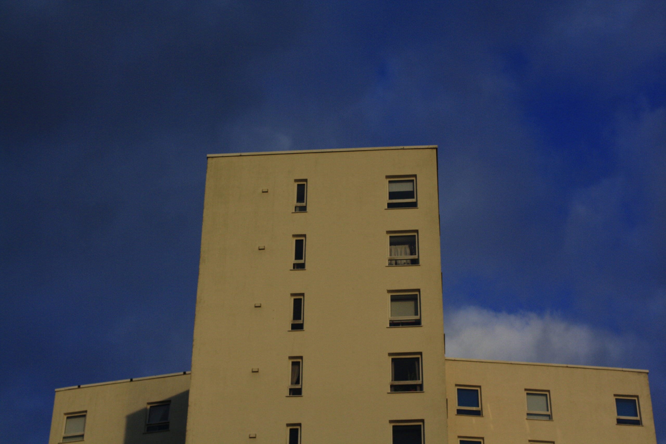
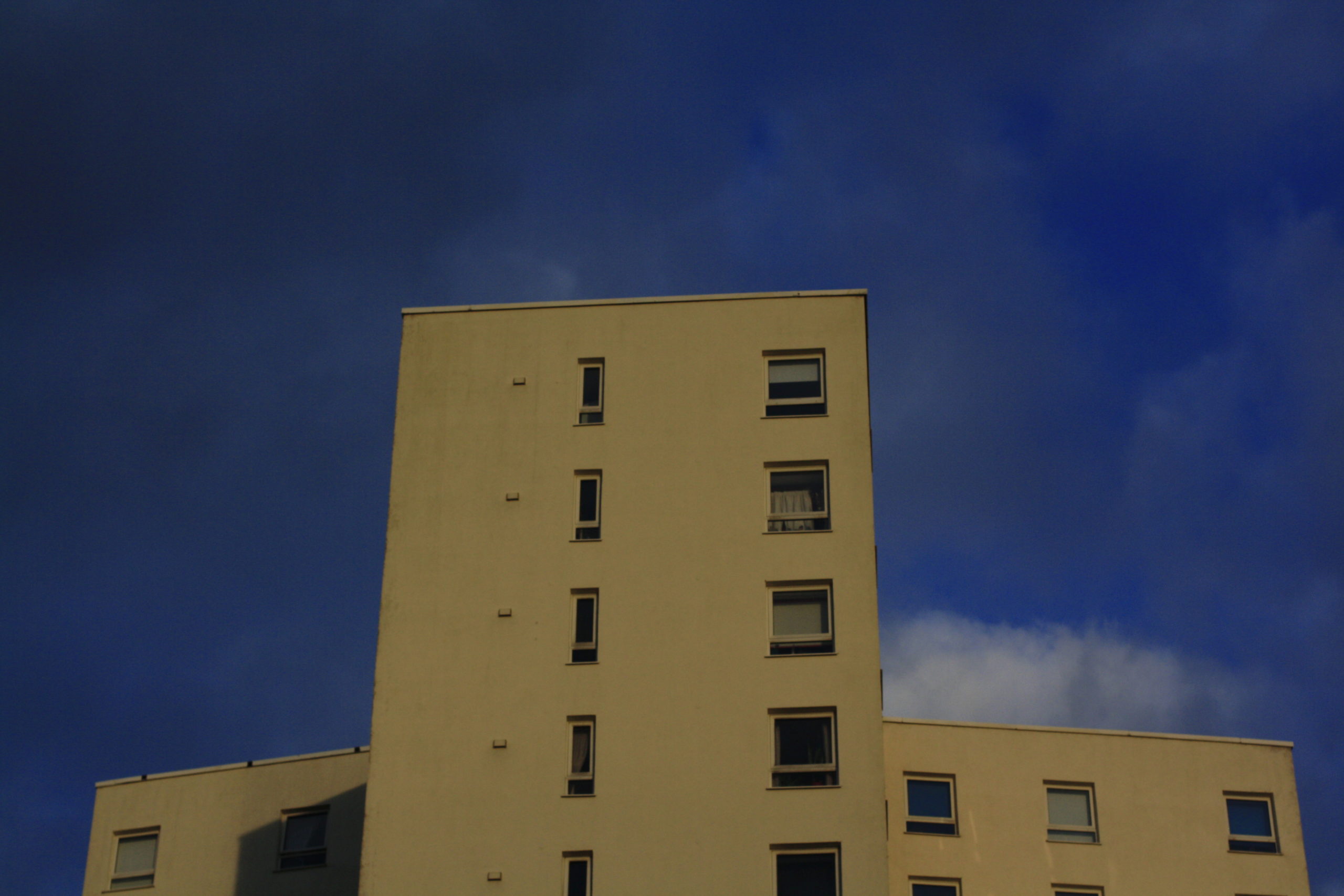
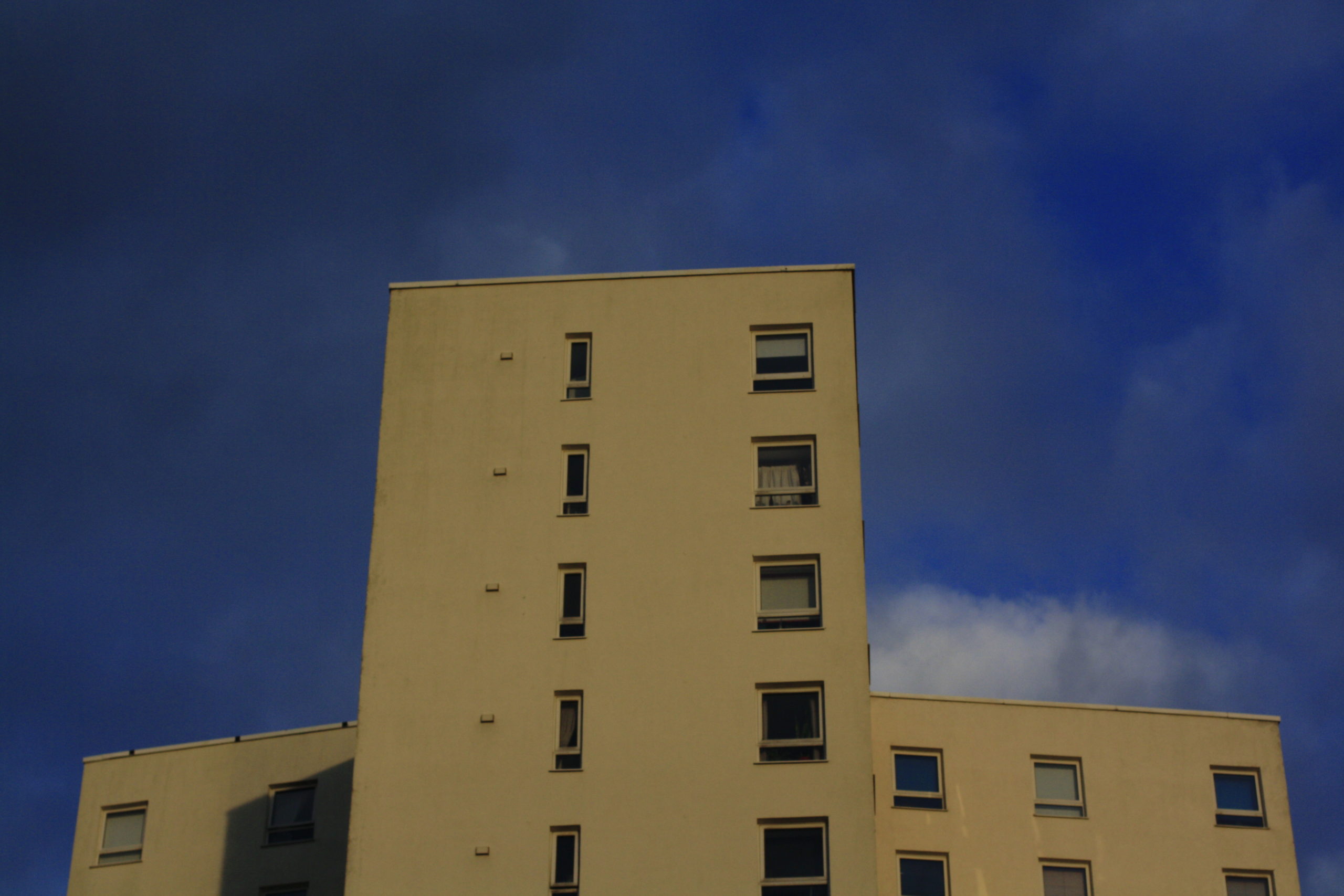
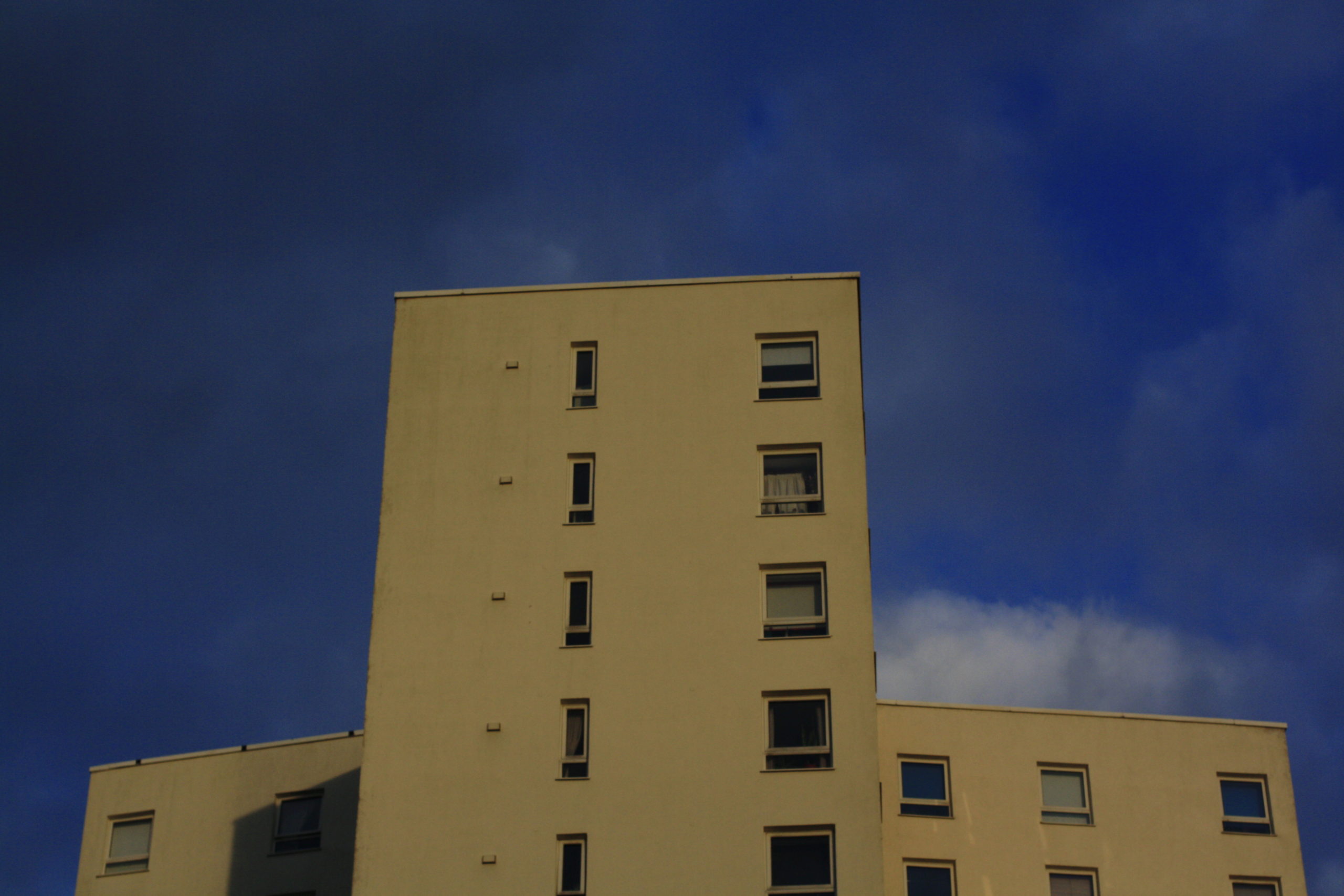
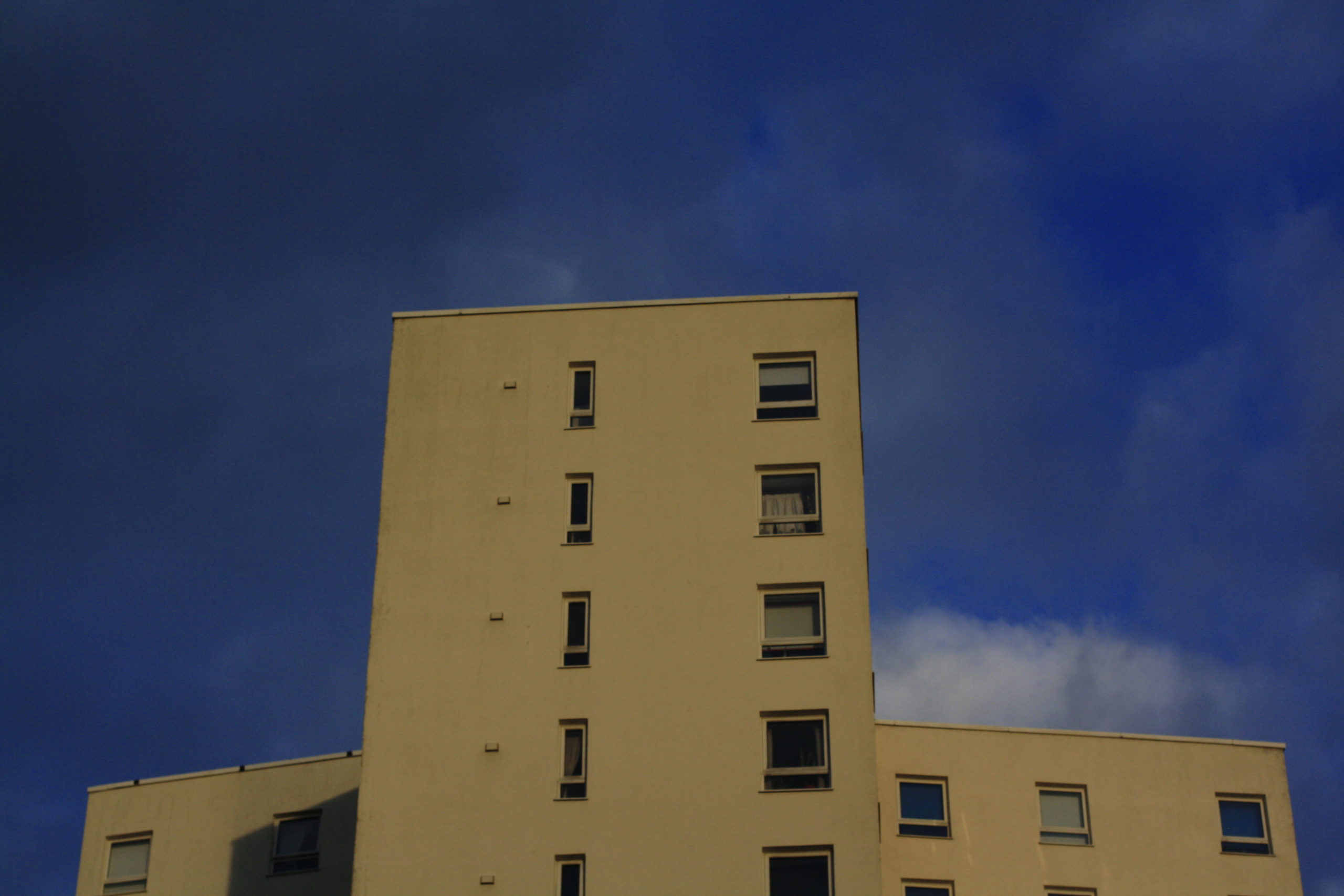
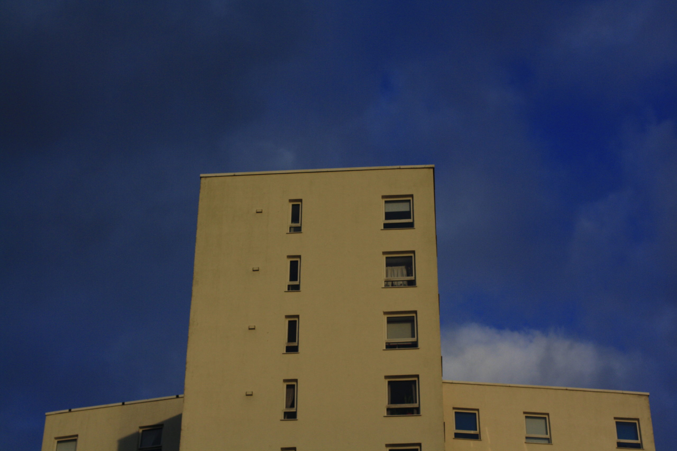
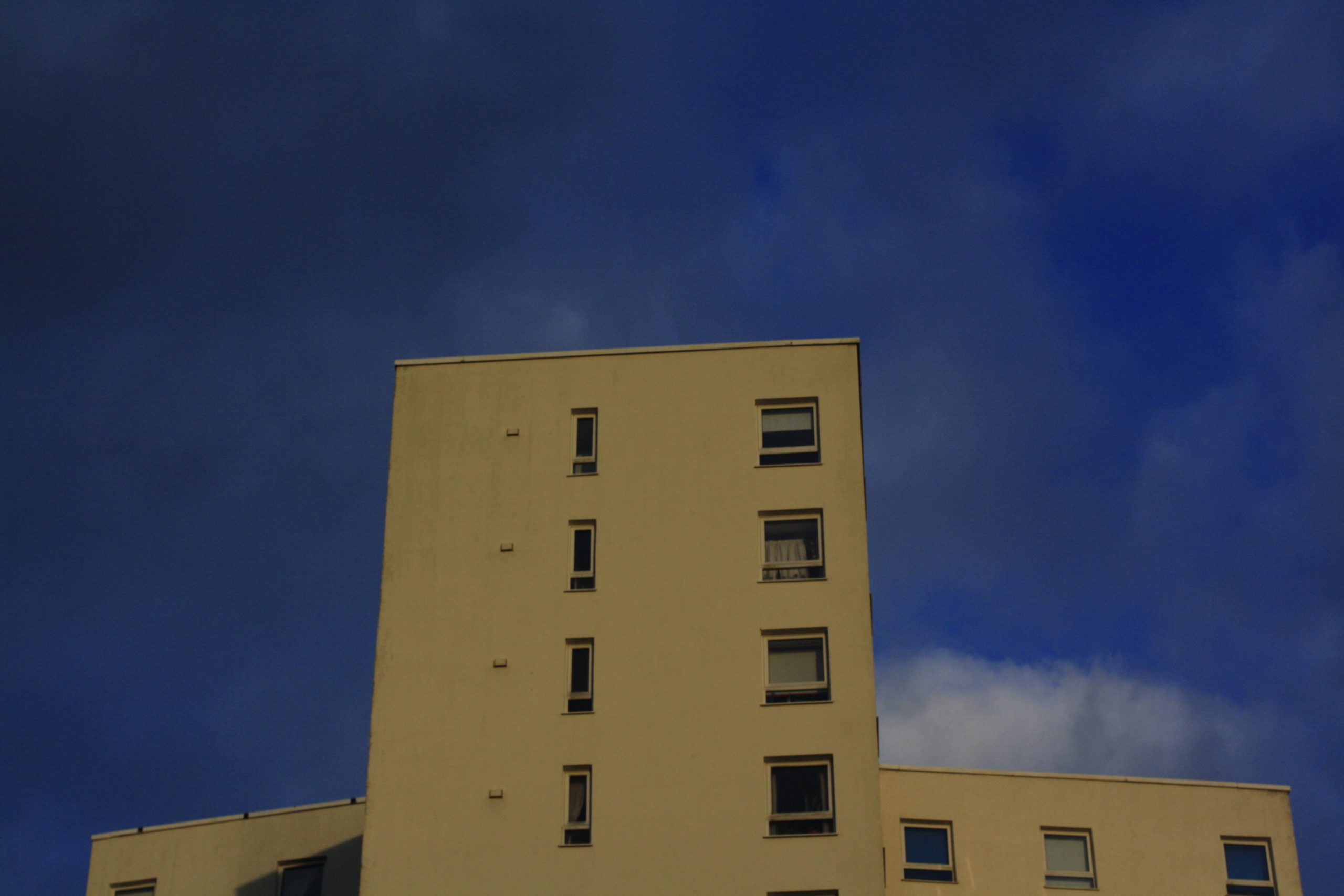
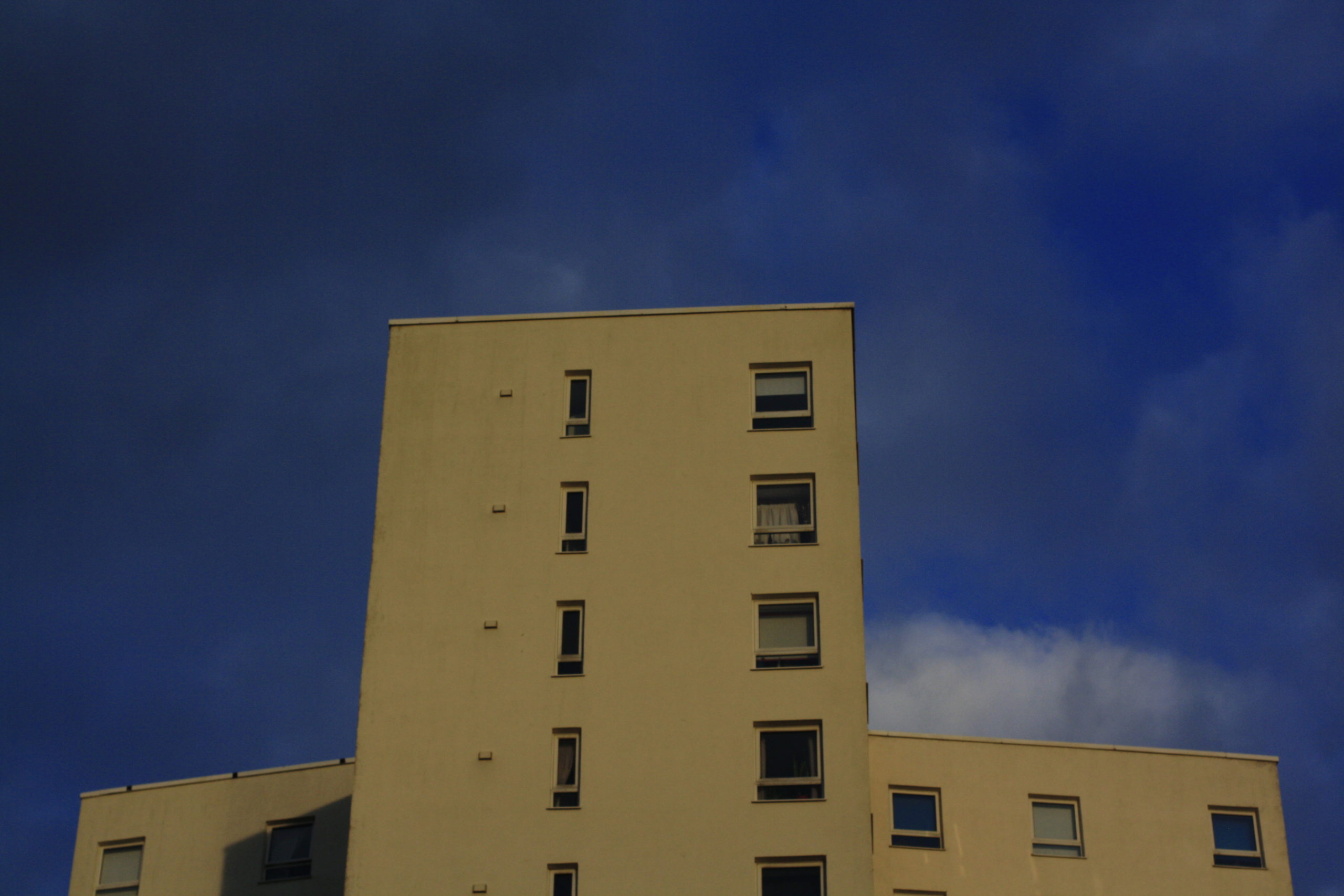
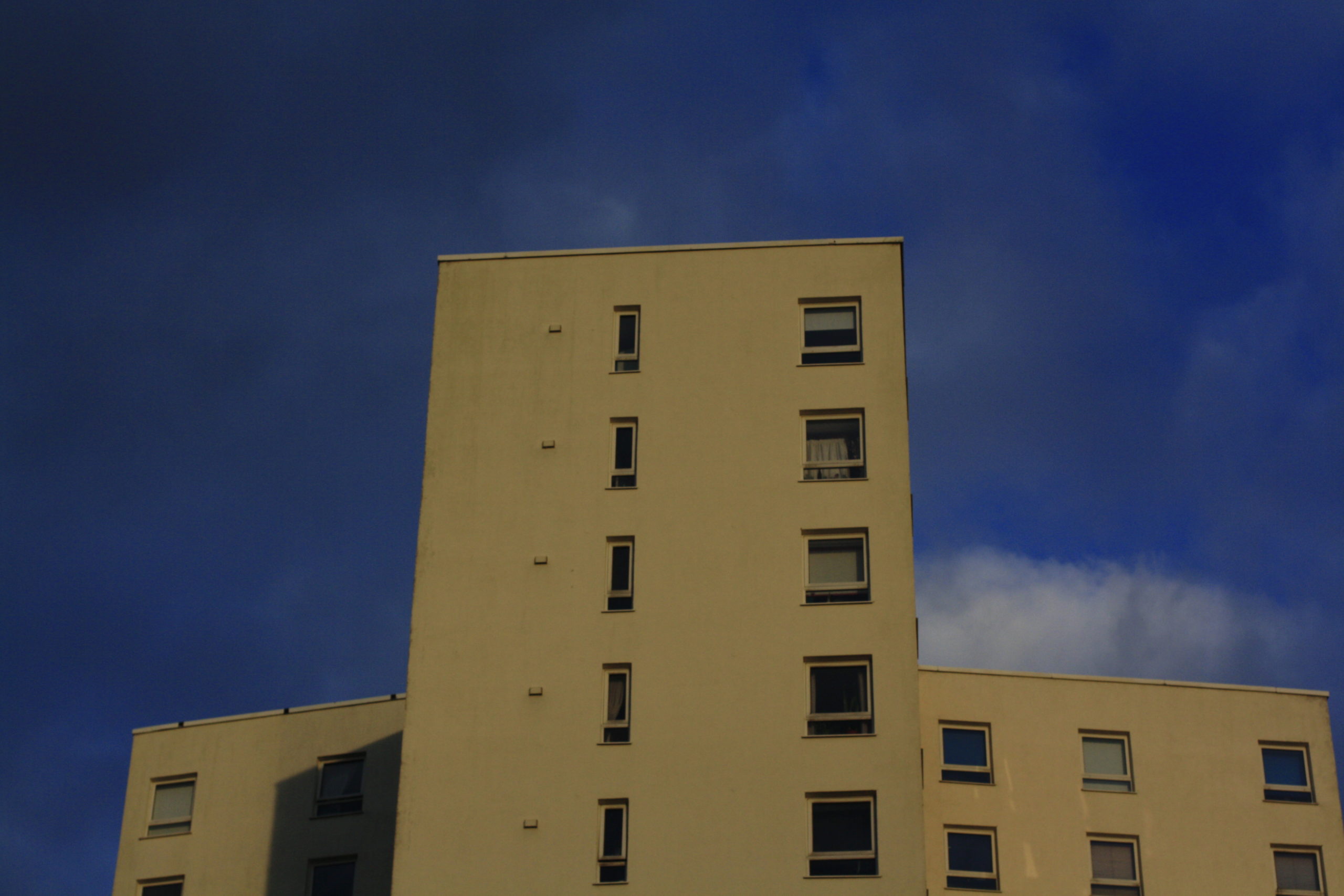

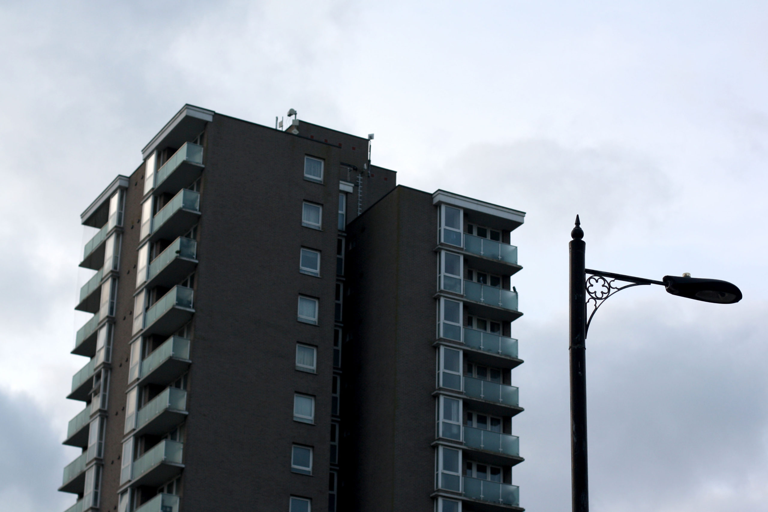
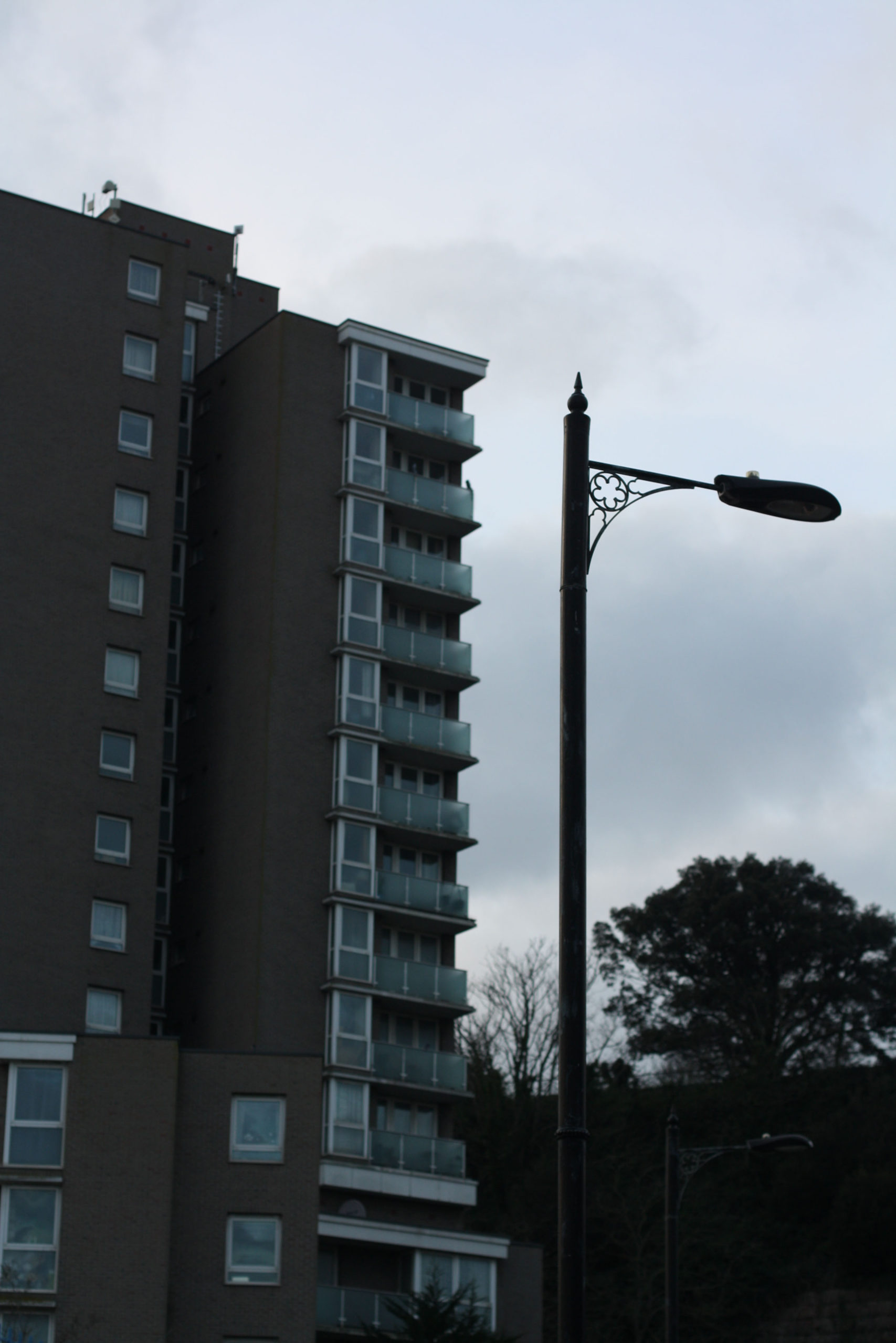
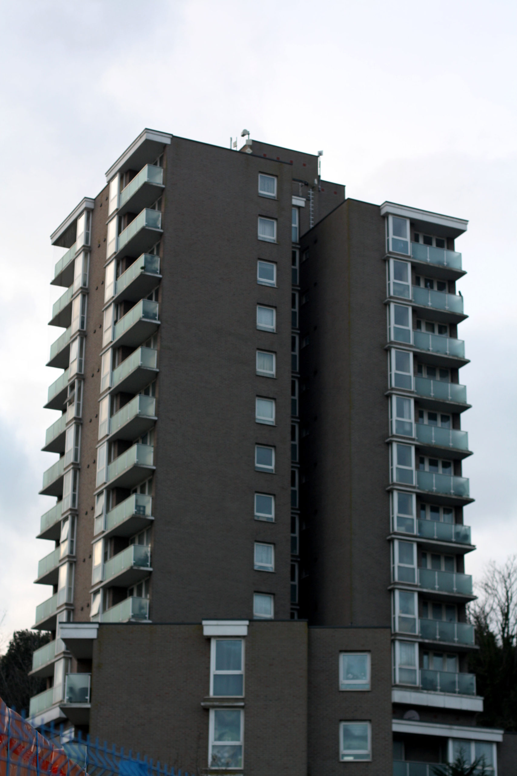
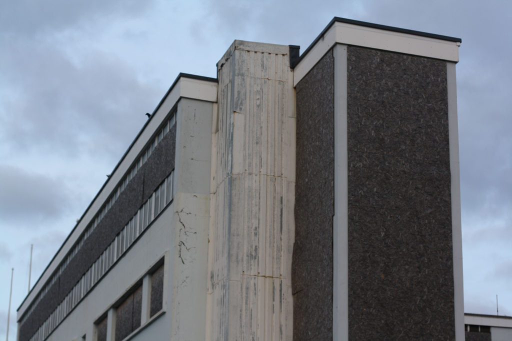
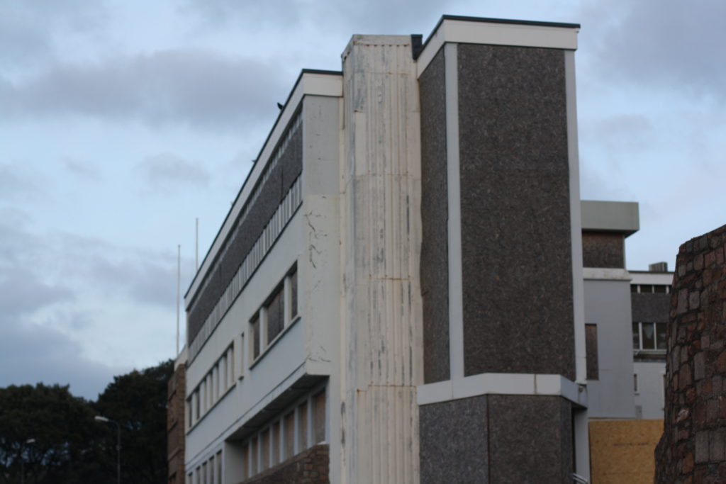

VERY proud of these images, I enjoyed taking these images and knew they were going to look great in my blog post, I love the perspectives of some of these, from vertical shots down a street between adjacent buildings to wide angle views showing houses in the foreground and tall buildings in the background standing high. I think these relate to Anthropocene very well as, for example, the pictures involving the small patch of grass in the middle of the surrounding man-made environment, I think it can show nature sort of being trapped and compressed by us with no way out. Another example could be the pictures with the tall building and the lamp post in the frame, it could be showing us how long we have been damaging the planet as the lamp post looks kind of old and classic and the building is more new. Indicating we have been around for quite a long time.
Gustave Le Gray
Le Gray was a French Photographer who is very well known for his work in Photography and his technical innovations like the waxed paper negative, which he made to make photos look sharper and better. He is also known as “The most important French Photographer of the nineteenth century”.
“The Great Wave”
“The Great Wave” was one of his many famous photos, it features a shot taken in Sète, France, 1856 at a shoreline:
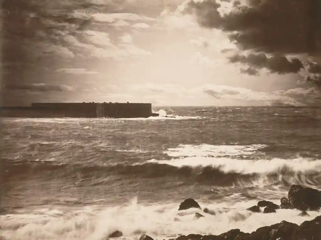
The photo appears very eerie in a sort of way, with the bright sky combined with the dark sea and black rocks, it creates a powerful contrast in the picture and it makes it feel more dramatic and extreme. You can see the choppy waves crashing on the sea wall which adds to the photos harshness in addition to the very opaque, black clouds in the sky. The darkness overall makes a very closed in and claustrophobic environment for the viewer, especially around the edges of the frame where it looks almost like a sort of faint vignette. This image is quite compelling given the points I just made and creates a unique feeling to the viewer which is why I like it.
I think this photo relates to Anthropocene quite well as it shows the sea wall, being a man-made structure, and the ocean clashing together which could be trying to visualize man intercepting with nature and nature trying to fight back. I think the weather may be important here along with the colour too. The colour palette in this photo doesn’t create a happy feeling, it’s more sad and depressing. The harsh weather in addition can relate to themes of anger and rage, all of these emotions could be symbolising God being angry at humans and what we are doing to the world he created.
Dafna Talmor
Dafna Talmor is another Photographer who takes landscape photos. He composed an album which consisted of all the photos he took that are under his Constructed Landscape Photography project:
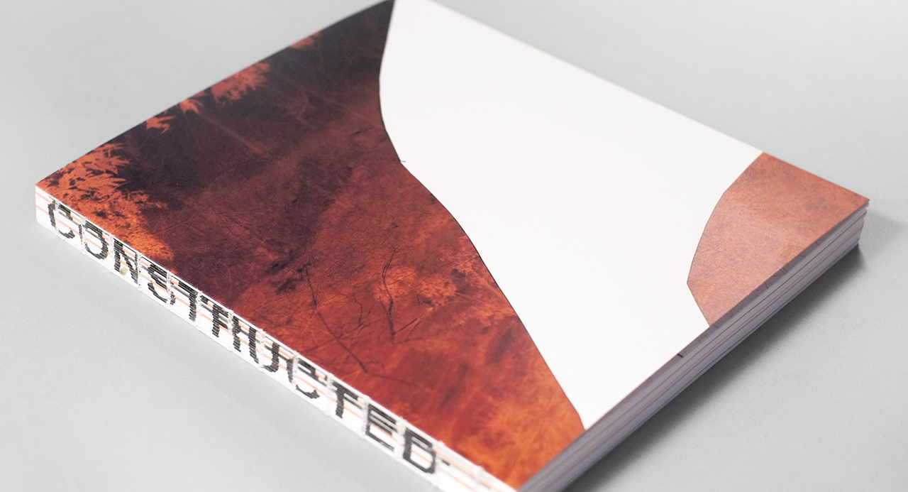
The photos within would contain edits that would involve stitched and spliced methods to “remove the negatives of the image”. Almost to “fix” the image by replacing removed areas with the colour black:
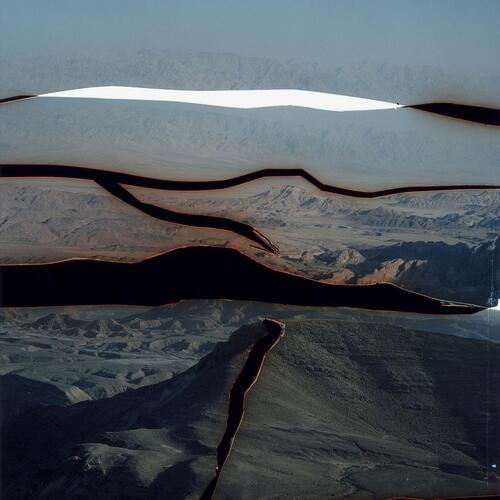
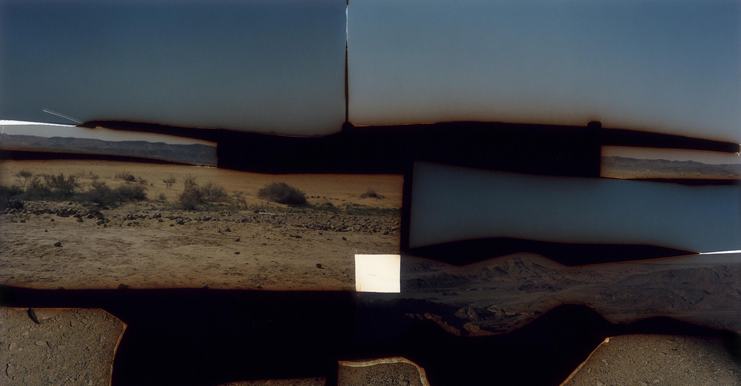
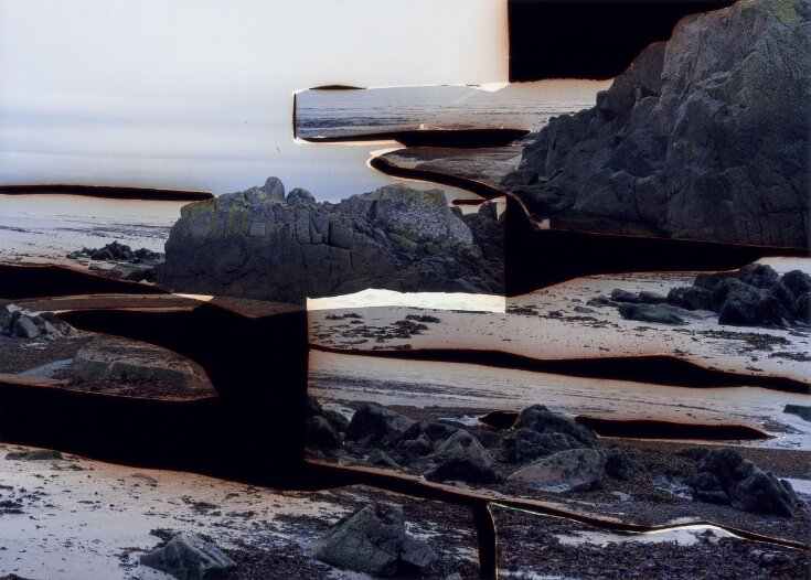
Talmor has also taken other images and put them together. They have been labelled as “aims to transform a specific place initially loaded with personal meaning, memories and connotations – into a space of greater universality.”.
I like the mysterious nature behind these photos, it fractures the photo to alter reality and distorts our view on the world through the frame. It may be trying to tell us the fact that we have done so much damage to the planet for so long, that trying to fix the world at this point will not restore it to 100% and will be forever different, hence the black spaces in the photos that indicate gaps and breakages.
Another thing it could be attempting to show us is mostly based on the photos combined together. They could be trying to show us different parts of the planet as one, to show us how what we are doing is affecting everywhere else, even if we don’t think we are.
Robert Clayton
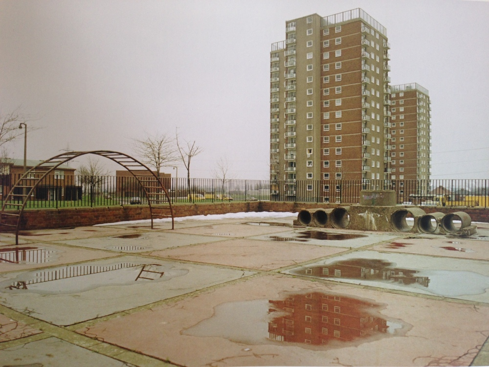
Robert Clayton is known for his work in urban photography, particularly in neighbourhoods and estates.
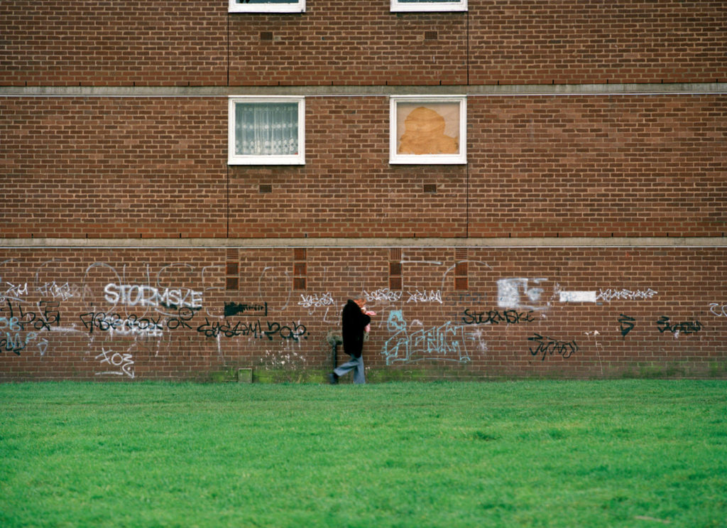
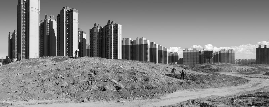
Intentional or not, it appears that he wants to show the dullness and depressing neighbourhoods, full or lacking in crowdedness. Some of these feel as if they were taken in a deserted and abandoned area which gives quite a chilling feeling. Here are some of his photos:


Analysis
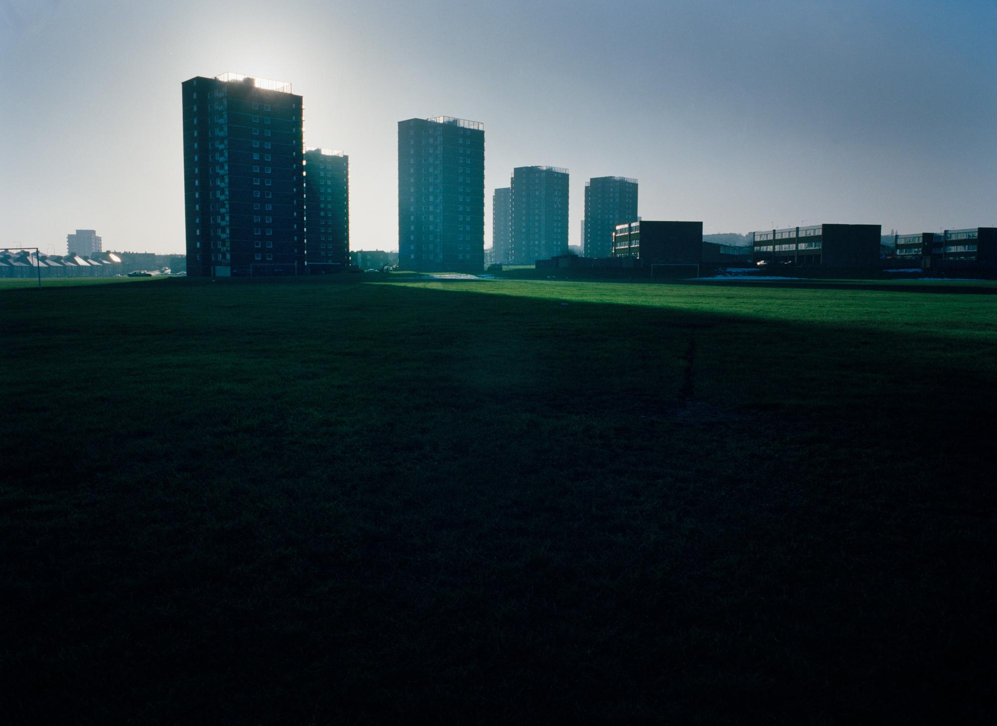
You can see here, a wide view angled landscape photo showing some apartment buildings standing tall along with other buildings in the fore and background in a very flat grass area, the buildings indicate human life, but the environment and natural life is scarse, this could be indicating that the way humans live is not supposed to be mixed in with the way animals live.
Another thing is some of the buildings obstructing the sun, casting a long shadow across the flat land. This may be representing the intrusion of man made structures being built in our world, we’re not supposed to live the way we do and we definitely shouldn’t be shunning nature out as we do so.
I can go to places like La Collette, Le Marias, Samarès, Le Quennevais Le Squez and Grouville Arsenal to take pictures like these.
Stephanie Jung
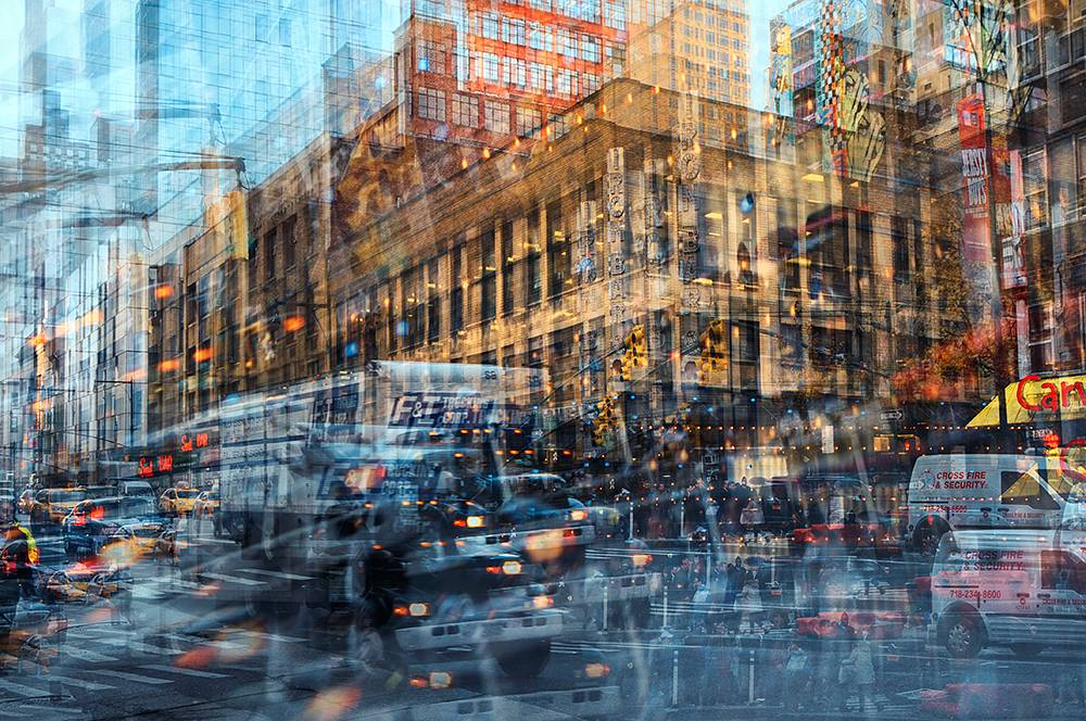
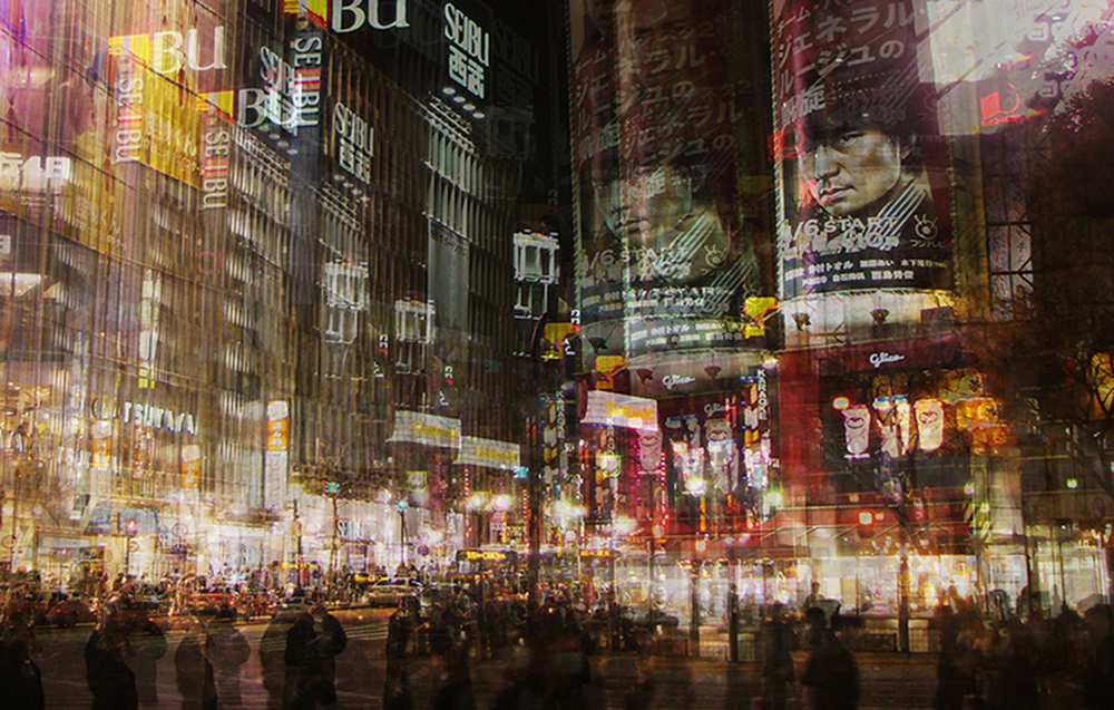
Stephanie Jung is another photographer who is also involved with urban like photography. She takes lots of pictures of mostly buildings and cities in, what seems to be, a sort of burst technique and puts them together to create a distorted effect. I think these photos are very interesting as I’m not sure what the meaning is behind them.
Here are some samples:


Analysis

Jung’s work captures the everyday life in the city. She takes these photos at the right time of day to capture different moods. This one for instance has a very gloomy look, especially with the dark green appearance. It creates a sort of sad and lonely environment. And it’s distorted to show perhaps everything that is going on at the same time the photo was took, there is lots of different activity the people are doing in this city whether that be working, talking, eating or anything else that could be potentially happening. Because of this, I think these photos overall are made to show us that were are overpopulating the planet, it will continue to happen and increase and we can’t do anything about it. As of now, there are just over 8 Billion people on planet earth. Which will not mean any good for the environment as now there are more people taking up more space and causing more pollution etc. Humans only make the world worse.
Some places I have in mind to take pictures at are The Waterfront, Fort Regent, Car Parks, The Big Chimney, Harbours and High Rises.
I will try other things during my photoshoot however, like trash washed up on the beach, litter scattered around places, buildings and places that are overgrown with leaves, vines, trees etc.
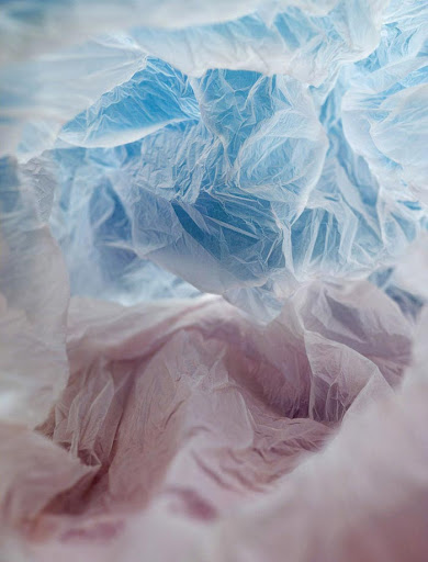
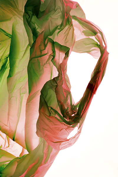
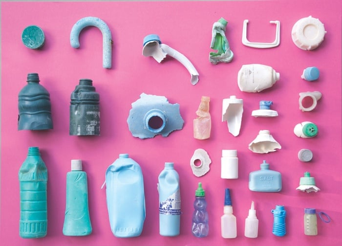
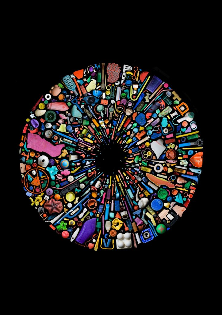
Here are some extra ideas:
What Is Anthropocene?
Anthropocene is an epoch about the most recent state Planet Earth is in and how humans have altered it and are impacting the planet.
I am tasked with taking several photoshoots involving this topic for my mock exam. Here are some examples of photos and locations I can use:
Locations:
La Collette, St. Ouen, St. Helier, Harbours, Ocean, Airport.
Subjects:
Bins, Cars, Rubbish, Smoke, Pollution, Plastic in sea, Any sign of Man intercepting with nature.
Mood Board:

What is Typology:
Typology is a single photograph or more commonly a body of photographic work, that shares a high level of consistency that is mostly based on the environment, subjects and photographic process. It was created by Bernd and Hilla Becher in Germany, 1959. When they started taking photos of buildings that had gone to ruin and had been abandoned.
Examples of Typology:
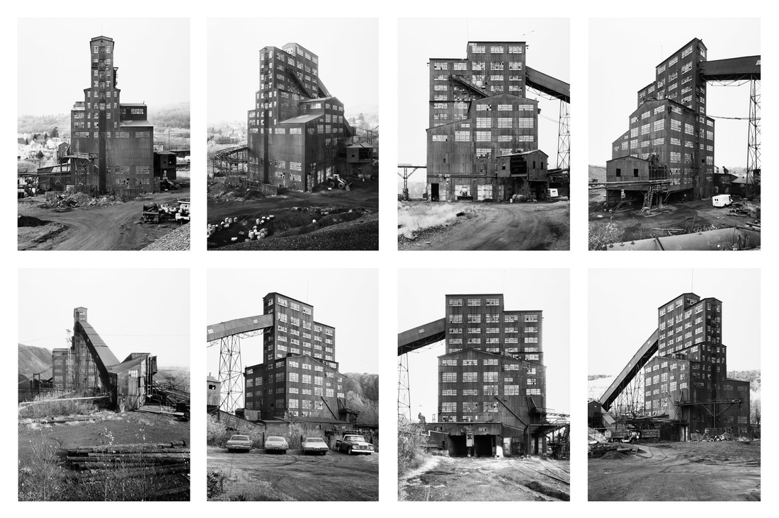
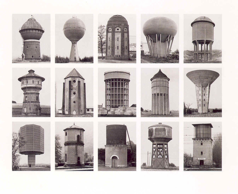
As you can see, they appear to have a deadpan style, with the camera facing the subject head on in black and white. With nothing else in the frame, it’s just the building. Sometimes other sides of the building were also taken to show more perspectives.
Bernd and Hilla Becher:
Bernd and Hilla Becher were a couple who formed a duo in photography. And also, as said earlier, were the ones who started Typology:
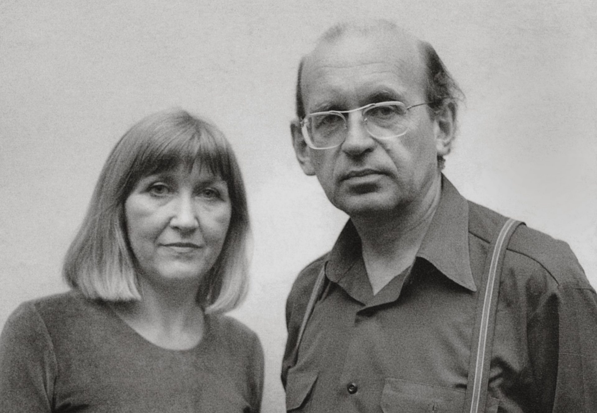
They described their work to be “buildings where anonymity is accepted to be the style” and their motive was to “capture a record of a landscape they saw changing and disappearing before their eyes”.
Their work inspired other photographers and was passed down to photographers who were from the next generation. Photographers like Ed Ruscha, Thomas Ruff and Gillian Wearing were some of these photographers who went out and took photos in relation to the Becher’s work.
Ed Ruscha:
“Every Building on the Sunset Strip”
Ed Ruscha was famous for his paintings and prints but was also well known for his work on Typology in photography. He used the deadpan style very well and wanted to capture the same theme the Bechers did. He is well known for his album named “Every Building on the Sunset Strip” which he made in Hollywood, 1966:
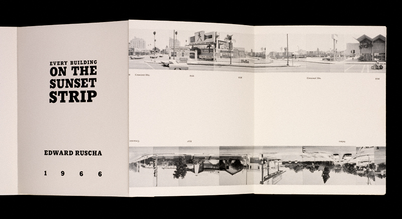
This 25ft folded album contained photographic views he took in the 1 and a half mile road stretch of sunset. Every two pages would capture both sides of the road to create a sort of panographic type of view.
“Twenty-six Gasoline Stations”
Ed Ruscha made his first book in 1963 and called it “Twenty-six Gasoline Stations”. As implied by the title, it contained 26 pictures of gas stations. The book is also considered to be the first modern artists book ever made and it became a precursor to modern artist book culture:
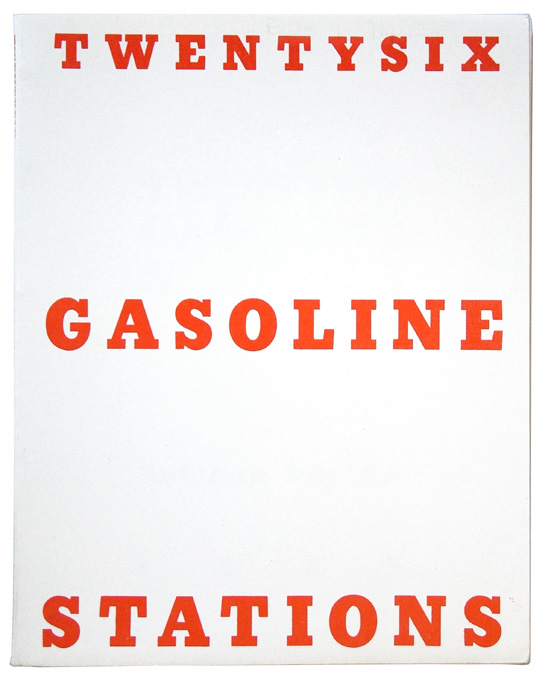
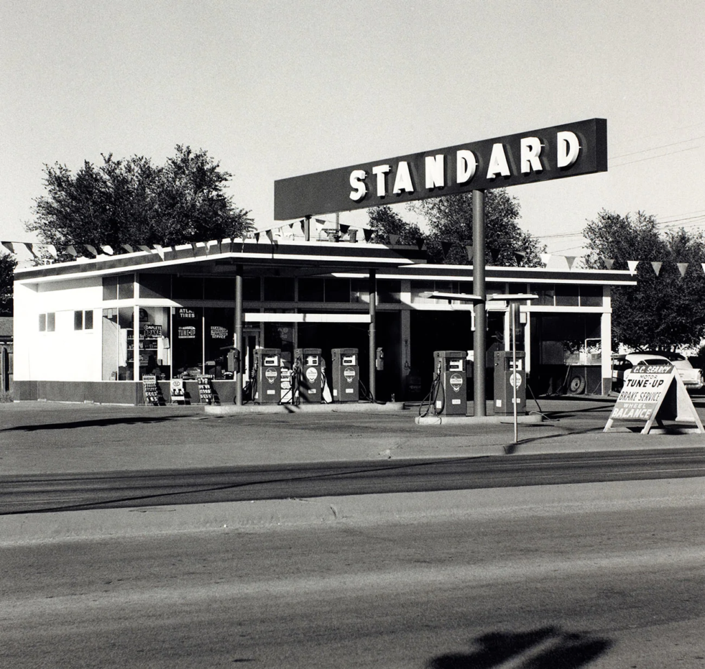
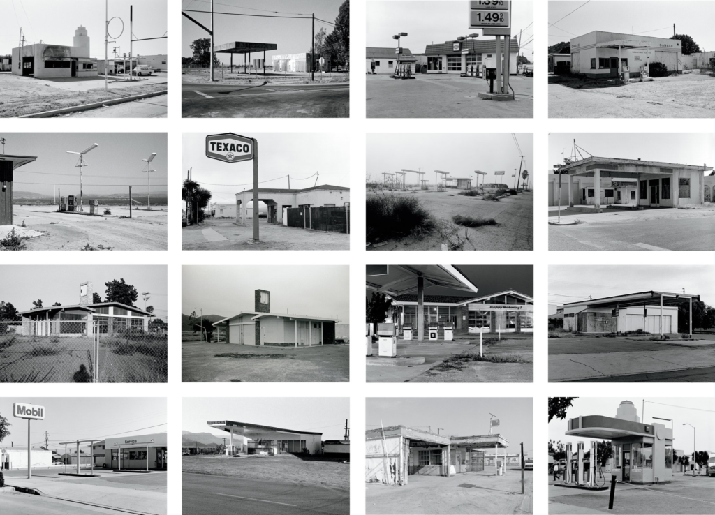
As you can see, they also fit the deadpan style with no particularly interesting features. Ed Ruscha himself said:
“I had this vision that I was being a great reporter when I did the gas stations. I drove back to Oklahoma all the time, five or six times a year. And I felt there was so much wasteland between L.A. and Oklahoma City that somebody had to bring in the news to the city…I think it’s one of the best ways of just laying down facts of what is out there. I didn’t want to be allegorical or mystical or anything like that.”
So his motive was to intentionally make the photos boring to show people that the area had exactly that level of excitement in the actual place at that time.
“Twenty-six Abandoned Gasoline Stations”
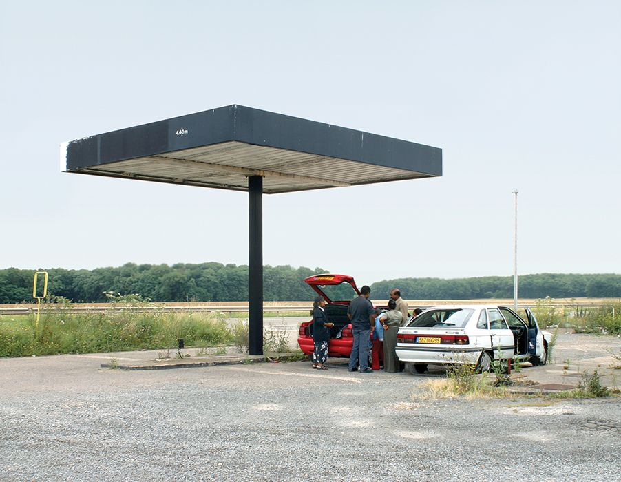
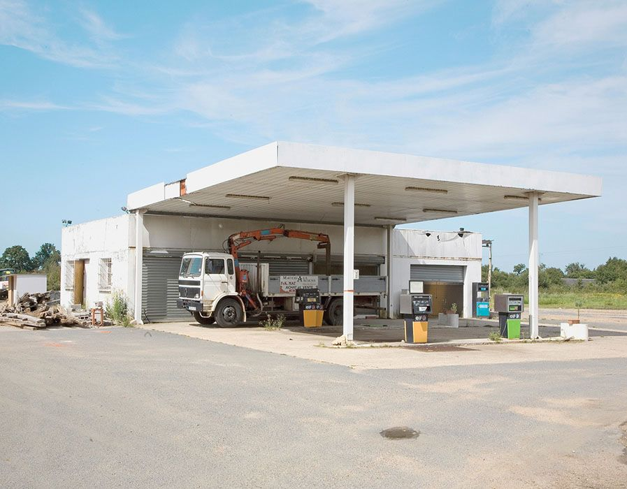
A photographer named Jeffrey Brouws made a replica of Ed Ruscha’s work in 2013, taking 26 photos of gas stations but instead being abandoned this time. the idea was to show how times have changed and that many gas stations were beginning to be abandoned, whether this was due to newer technology being made or rises in cost in order to maintain businesses wasn’t confirmed. But it also captures the same deadpan approach that Ruscha also had:
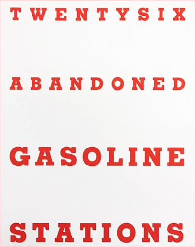
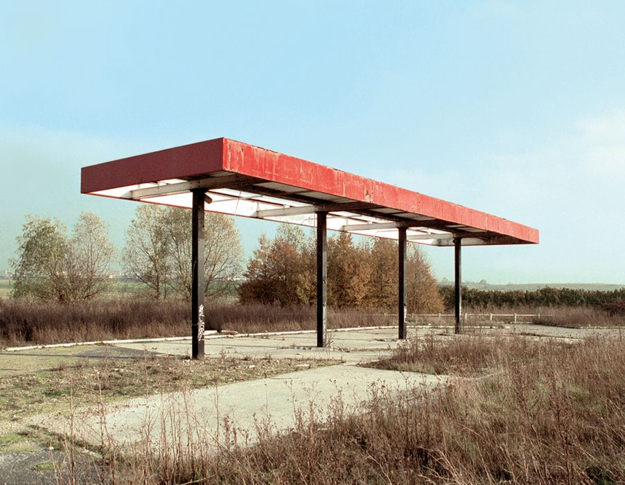
Who Is Robert Adams:
Robert Adams was an American Photographer, best known for his published book in 1974 called The New West, his landscape photos of the changing west and his affiliation with the exhibition called The New Topographics.

His Photography was influenced by the changes happening in America at the time, with the addition of man altered areas and suburban houses.
His Work:
His work featuring New Topographics was black and white photos of the changing west. The idea of his work in relation to New Topographics would feature elements from the man-made parts of our world with what was remaining of the natural parts, typically in the background to symbolise that man-made things were replacing the natural world.
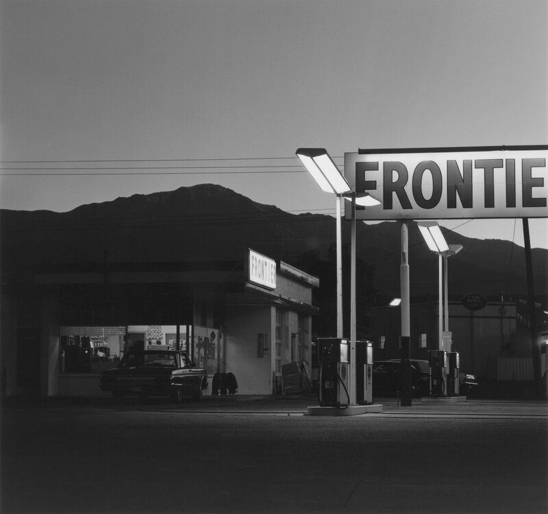
This image for example, involves a gas station as the main subject. You can see elements of man-made objects being present in things like the lines and shapes, things like the big sign, poles and the building’s corners have very sharp edges and straight lines. They are manufactured and perfect. However, the mountain seen in the background appears to have a more rocky, rough-like look. It is uneven and messy. It is not manufactured and is natural.
Other elements that can be labelled and compared are:
The lighting that involves the street lights and the sky, the overall tone, the patterns in the shapes and/or the composition with the organisation of the visual elements, layout, contrast or viewpoints.
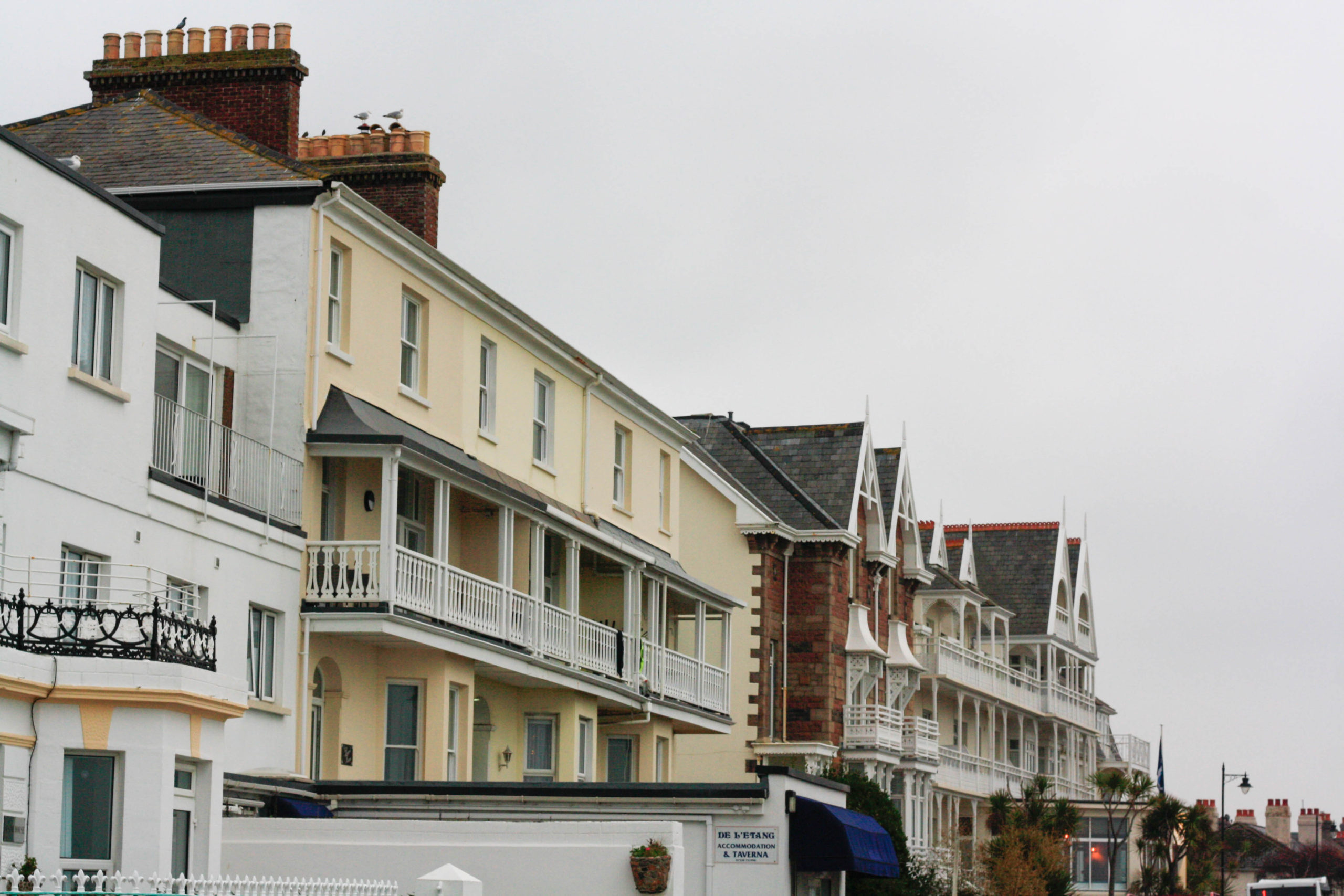
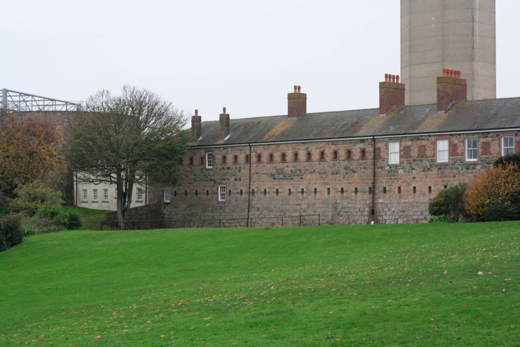
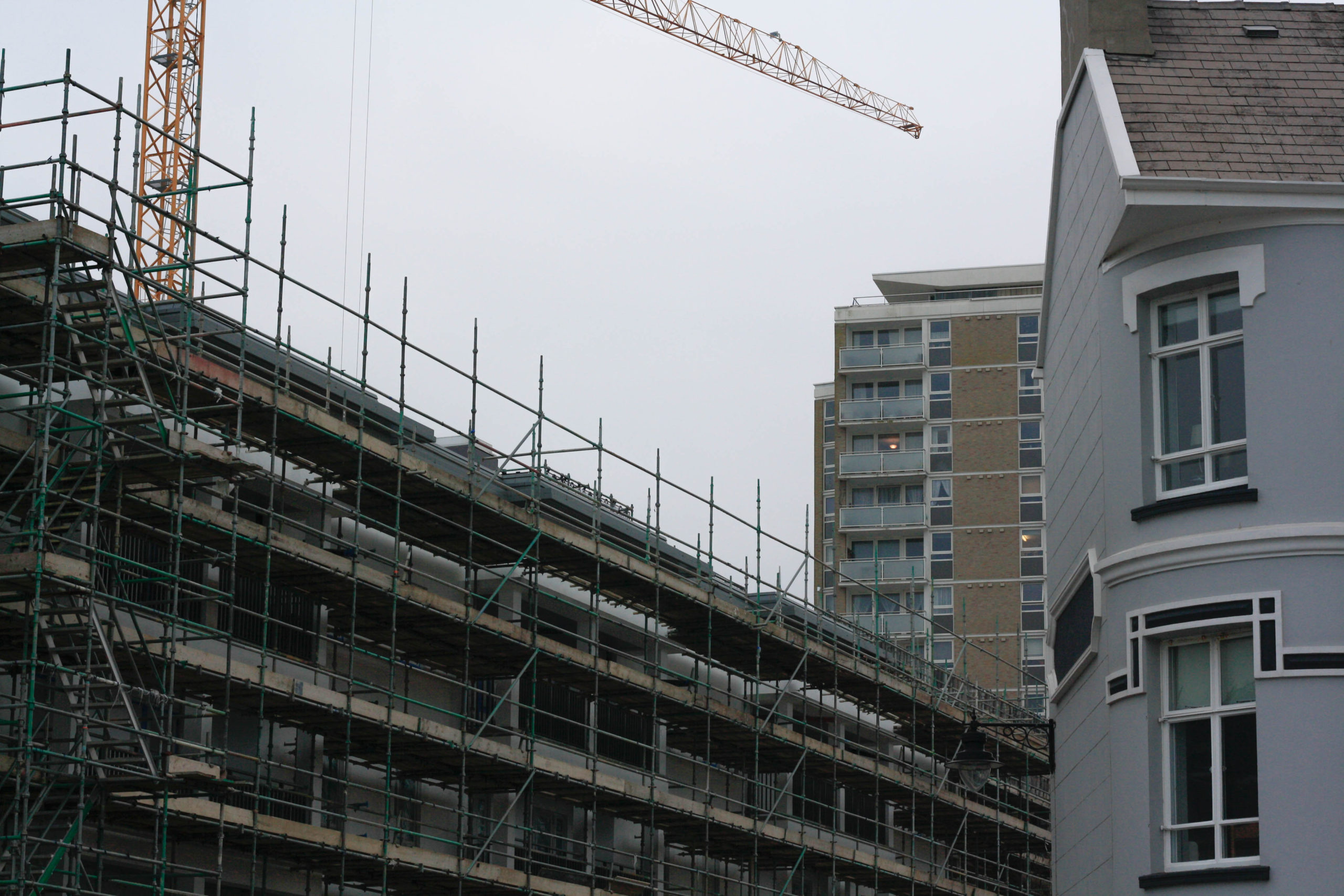
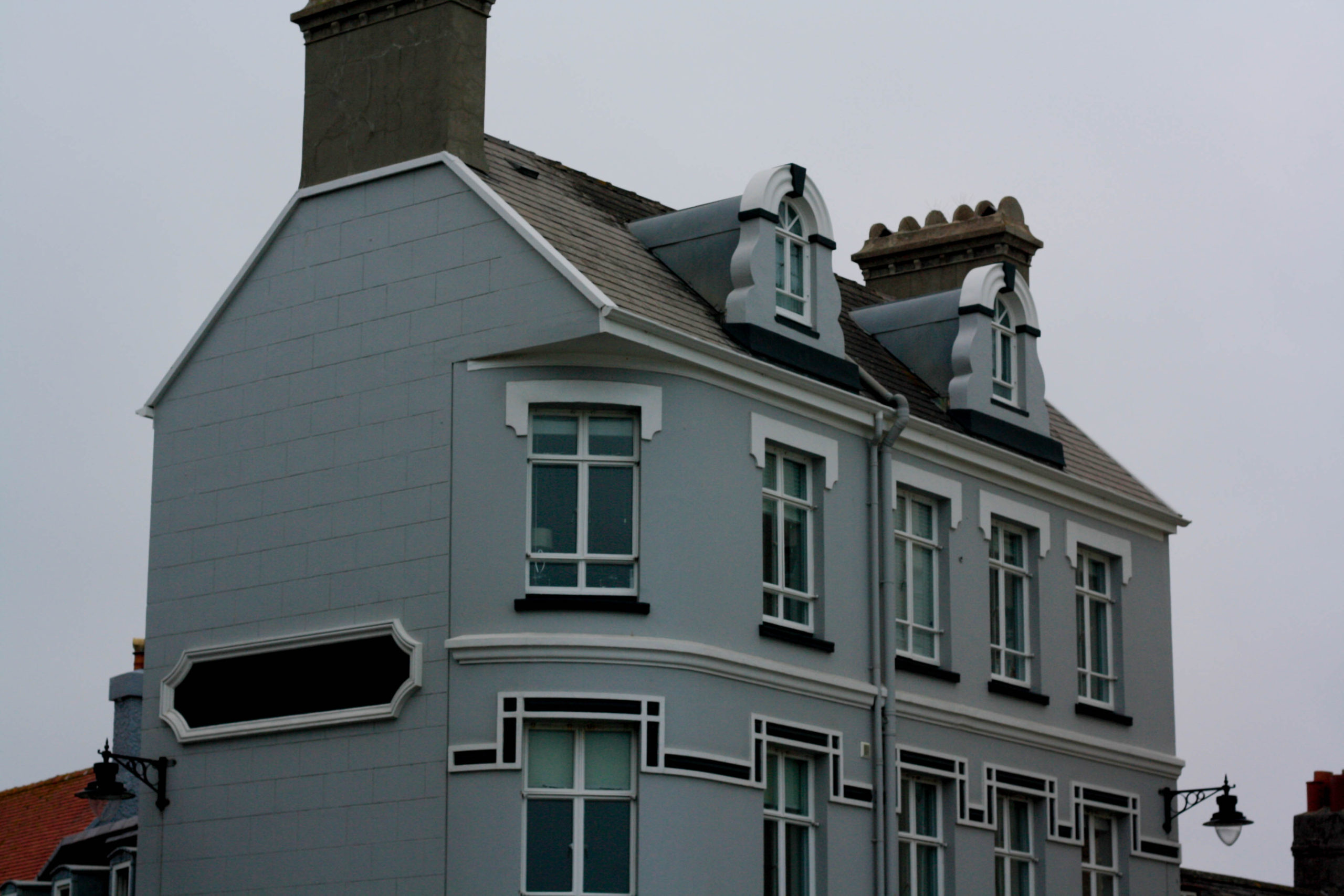
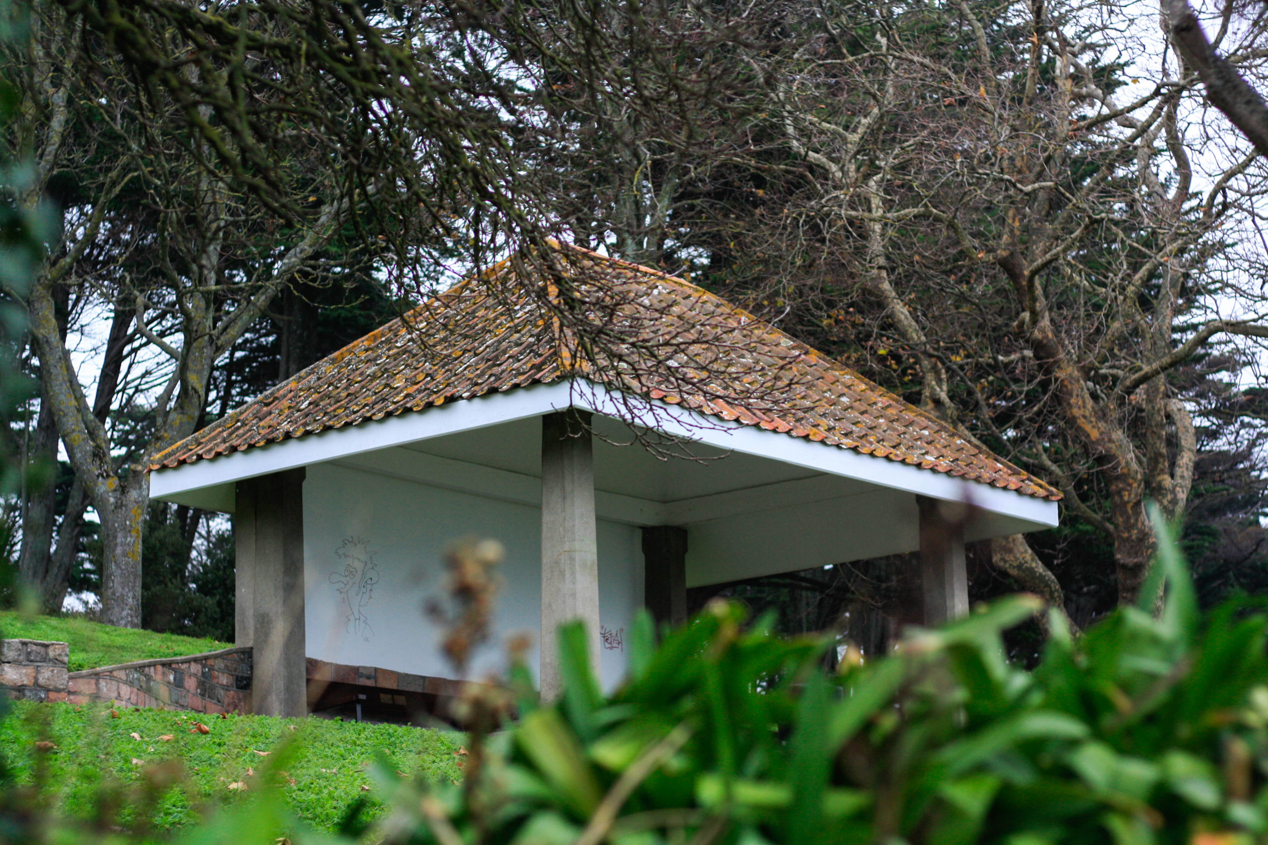
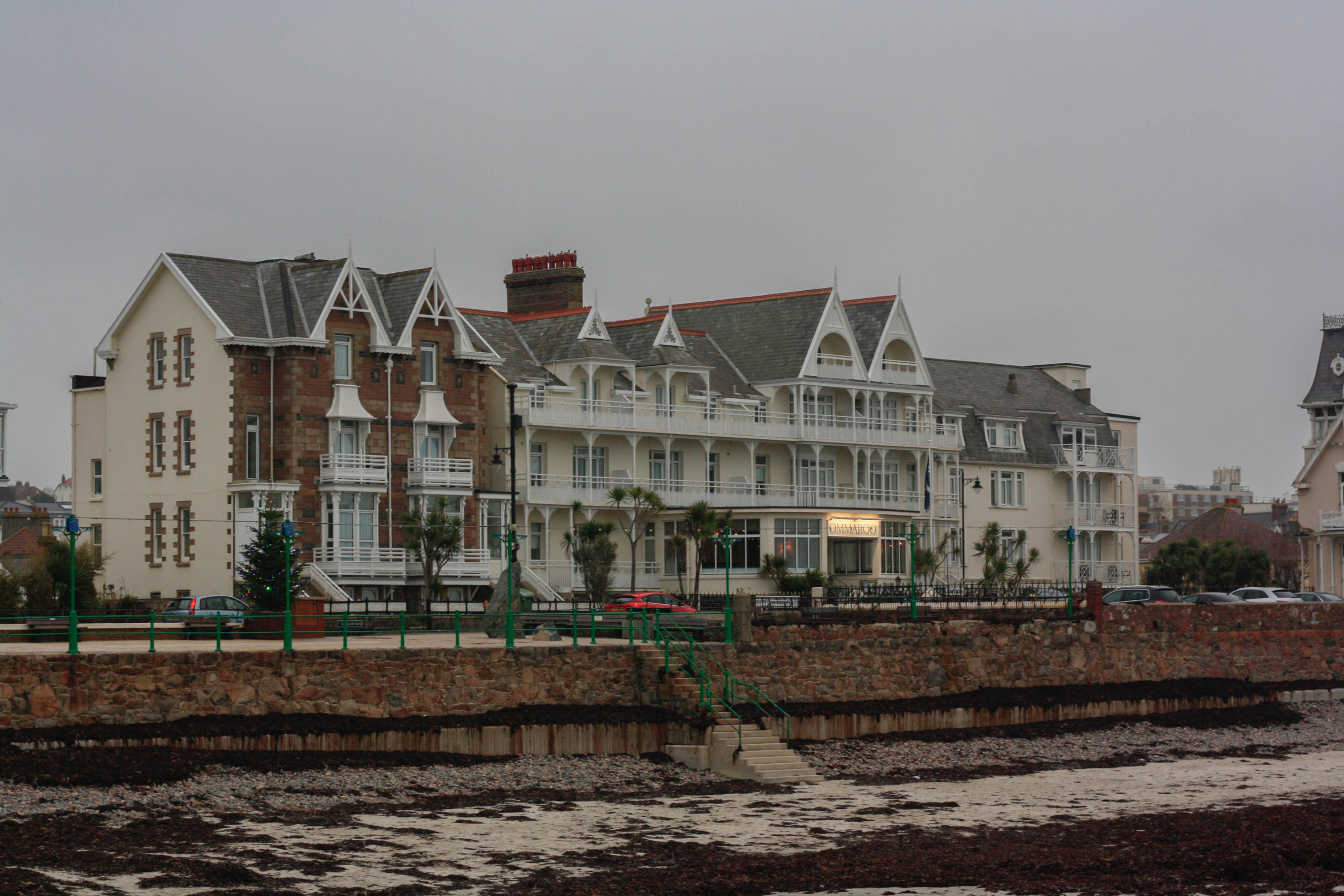
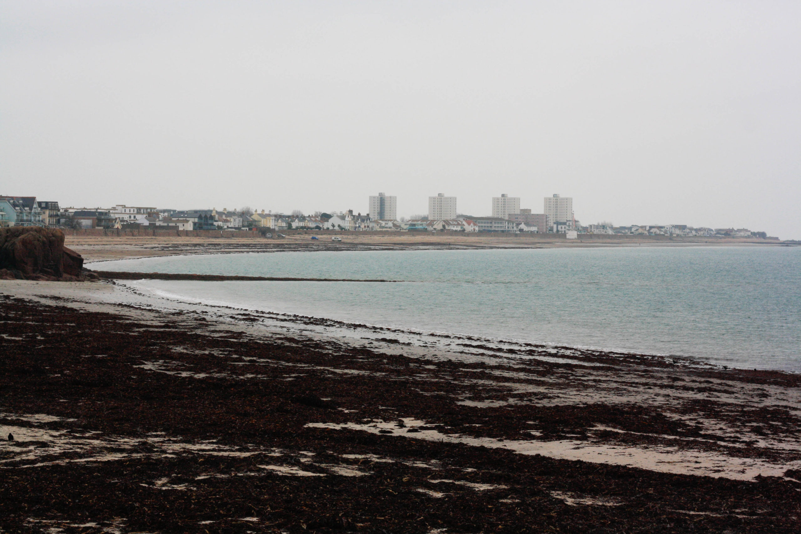
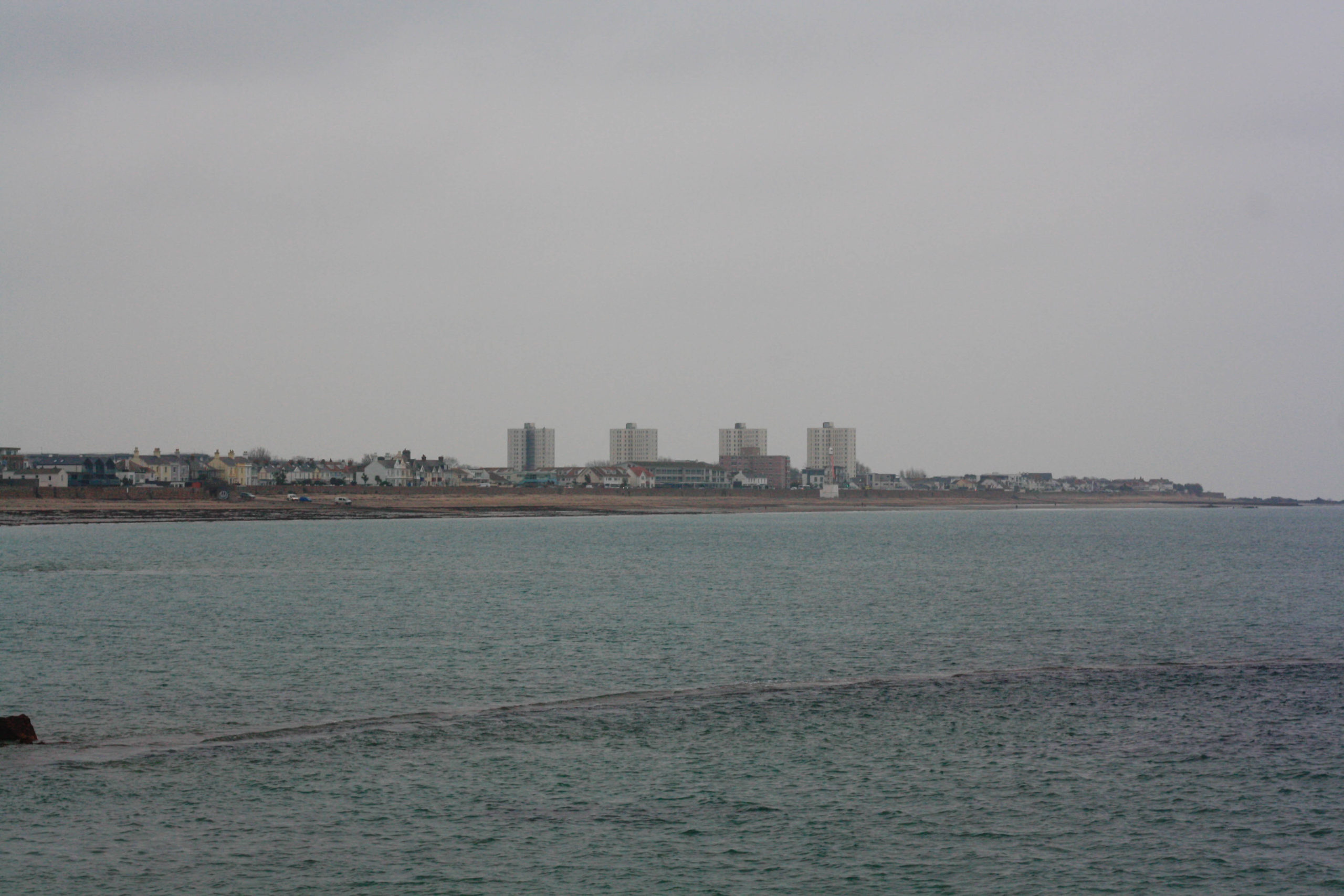
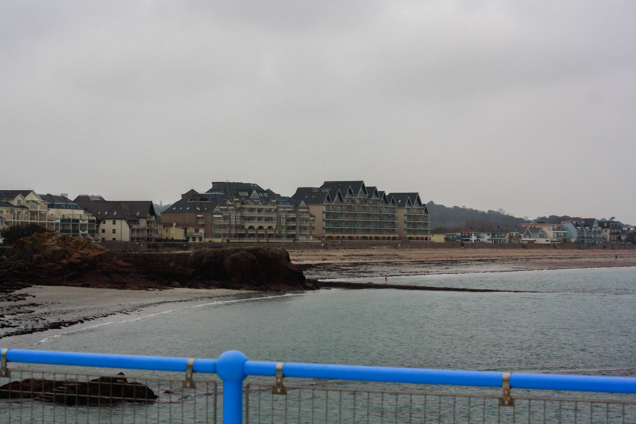
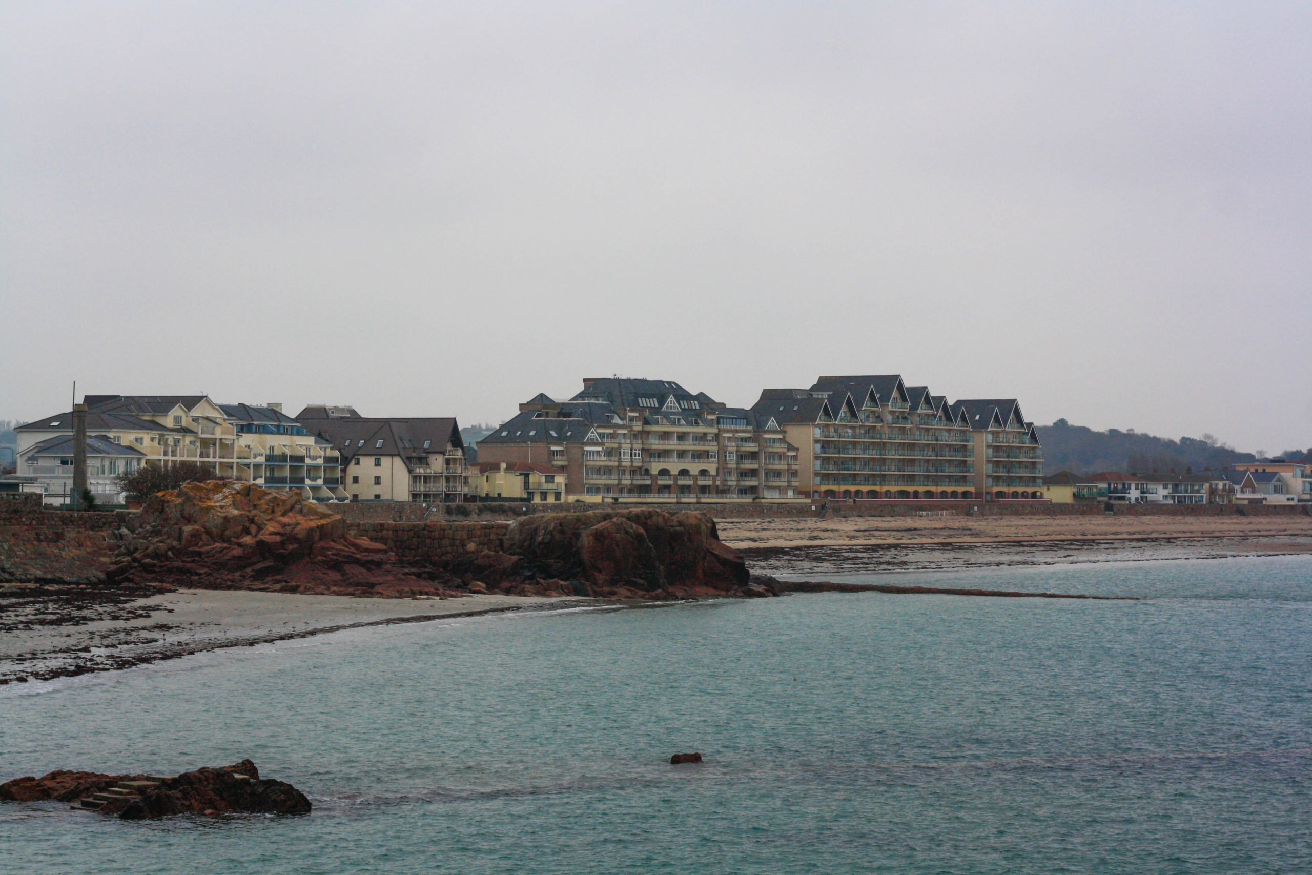
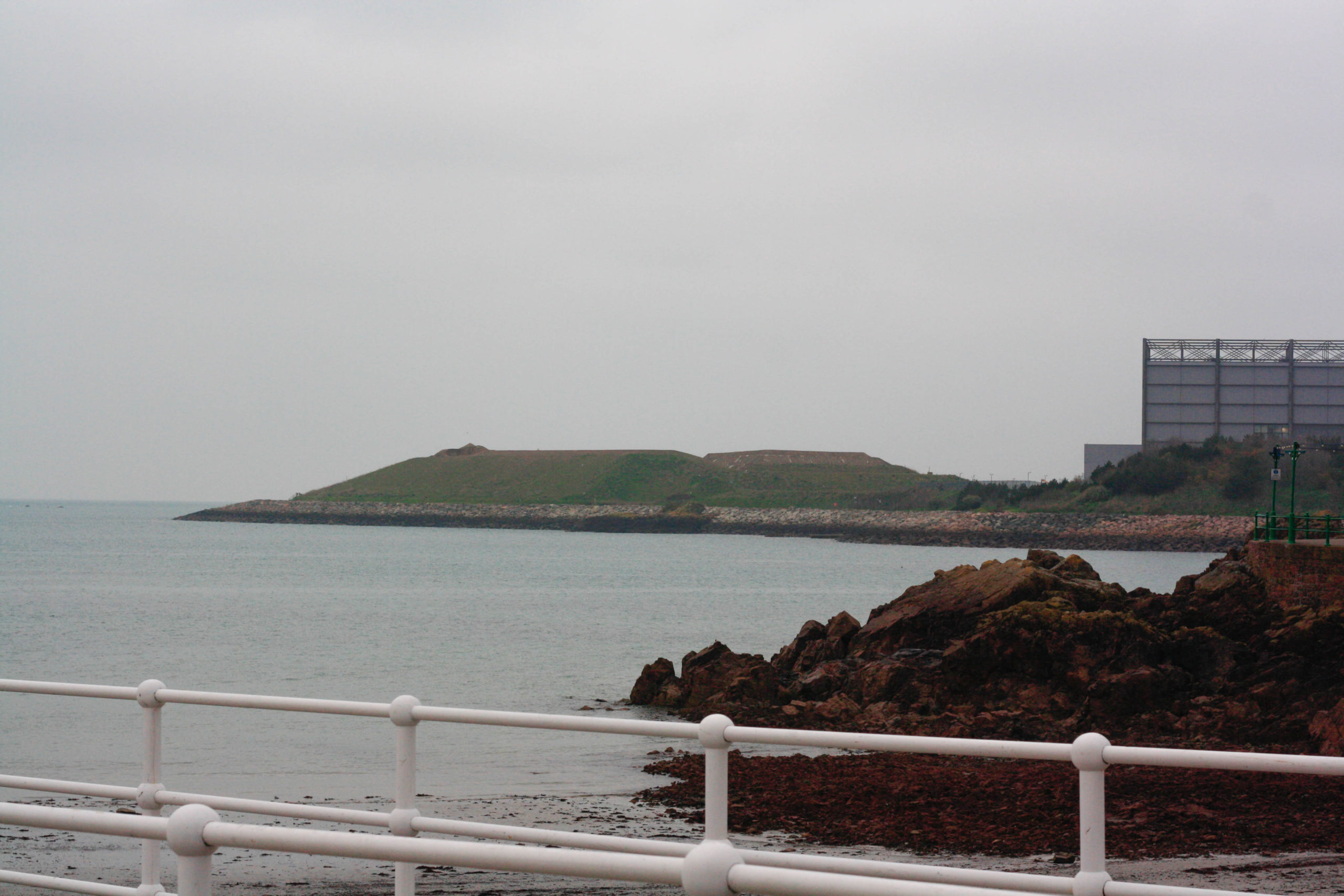
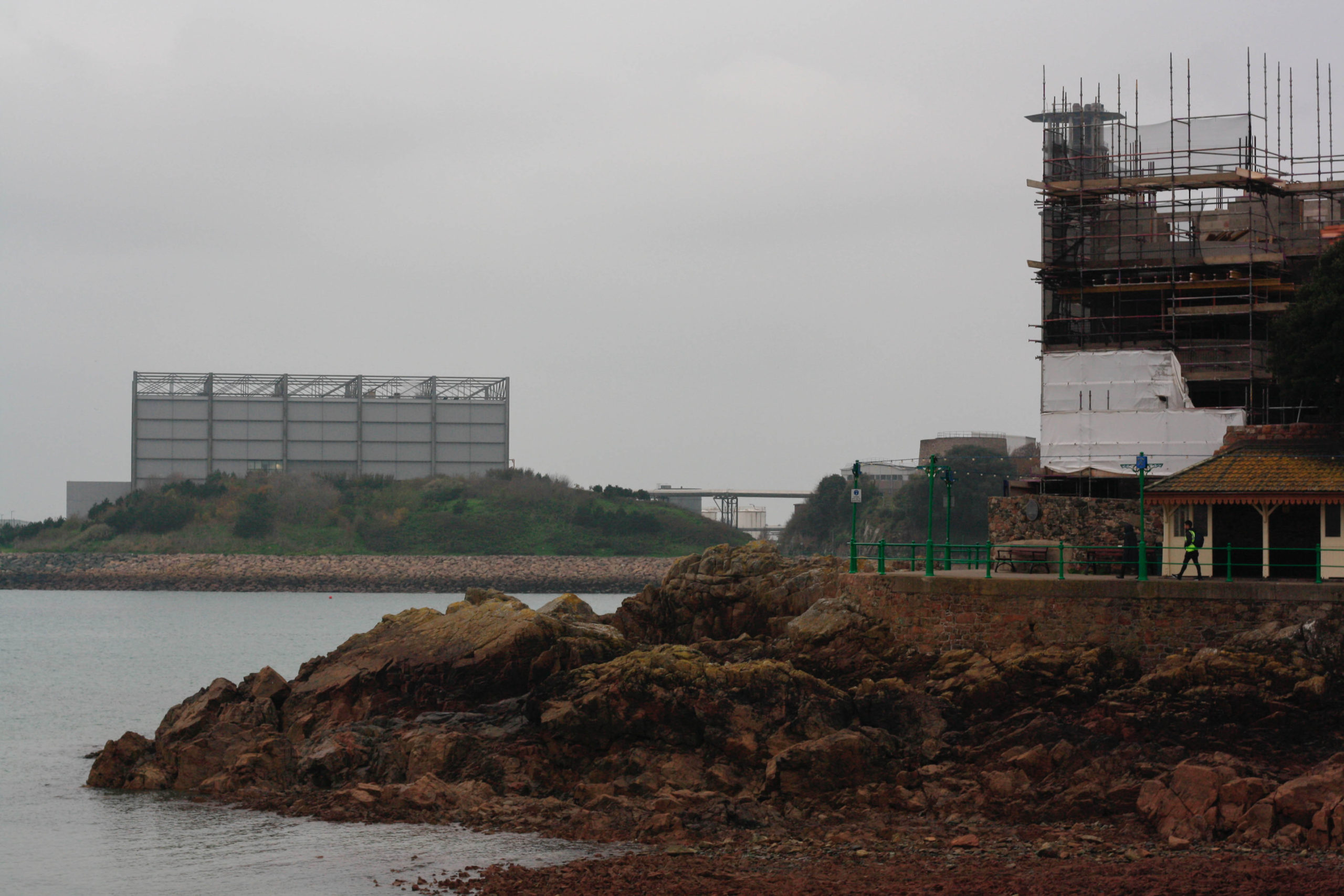
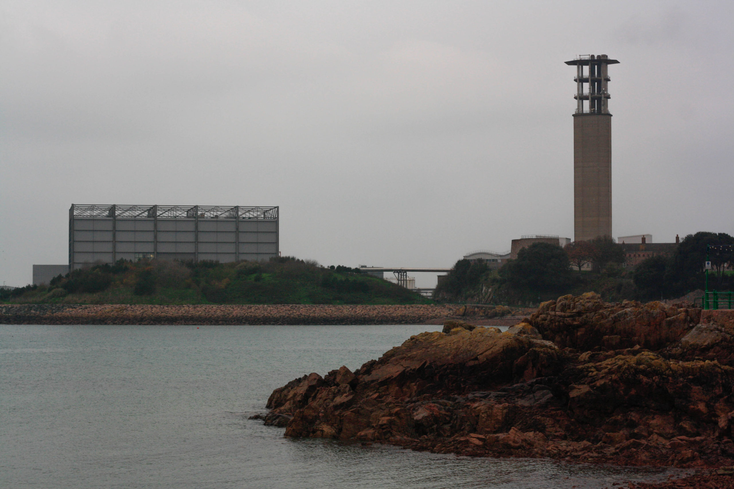
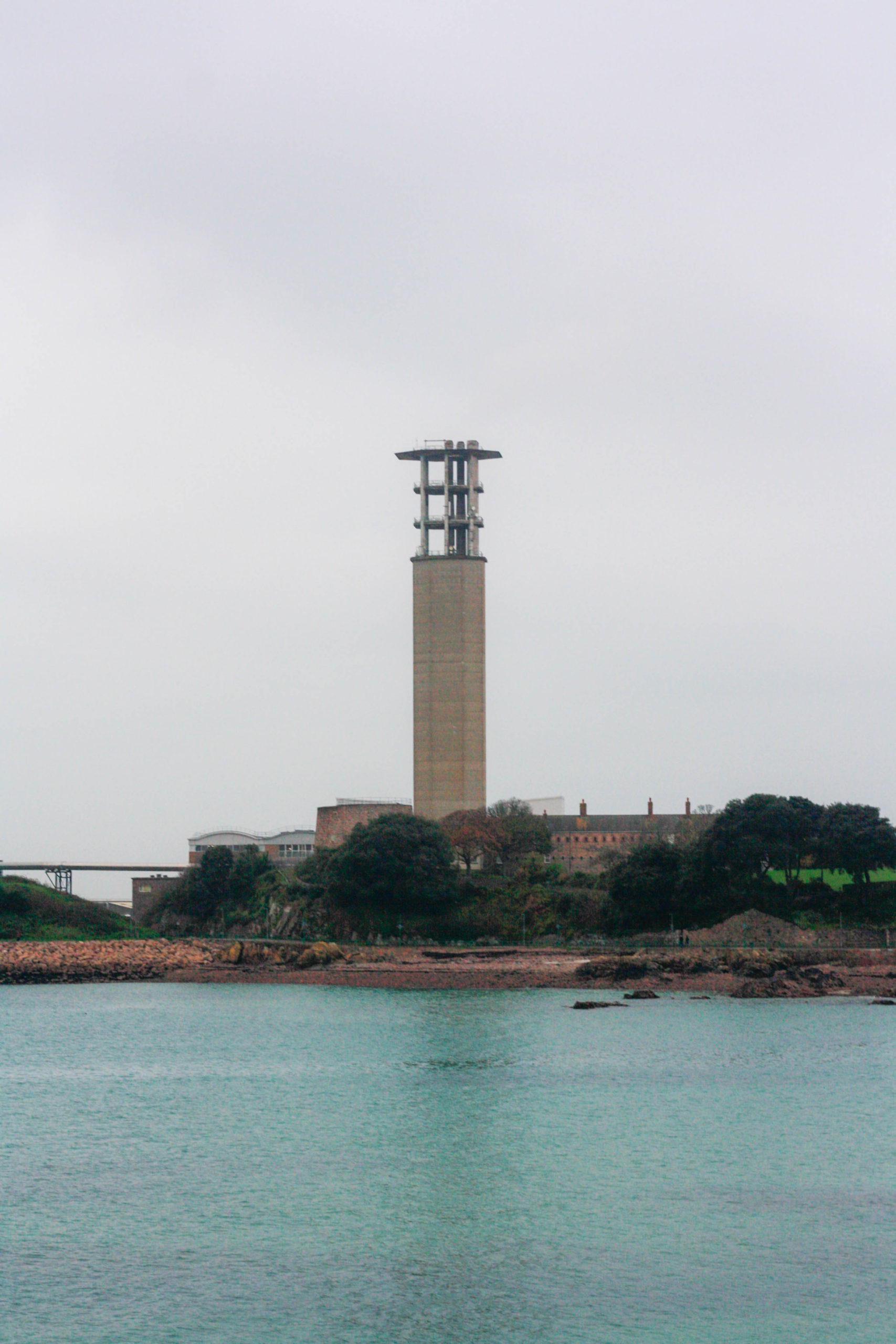
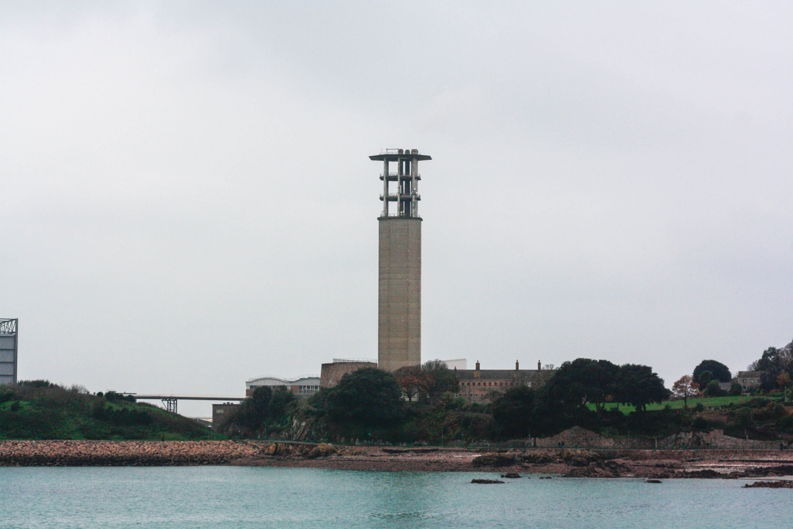
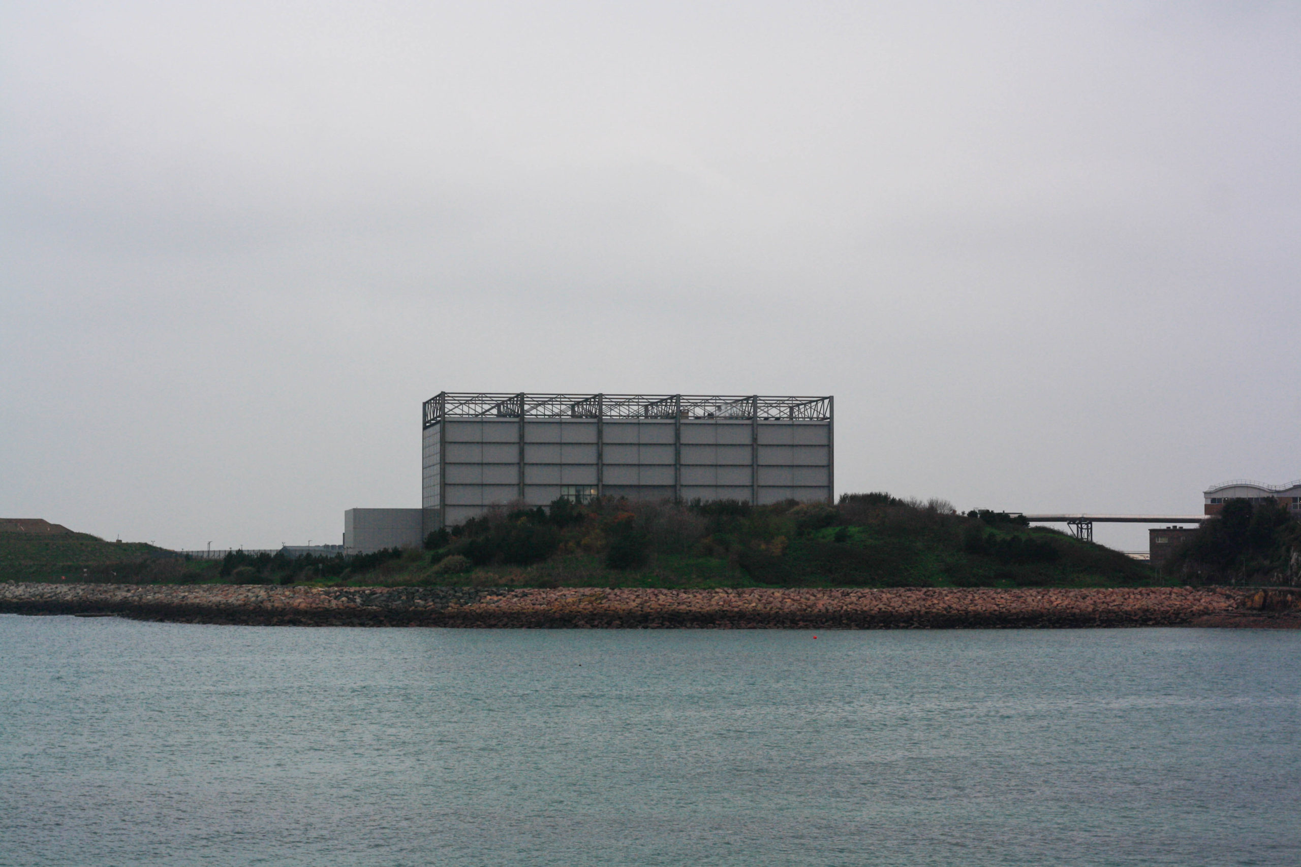
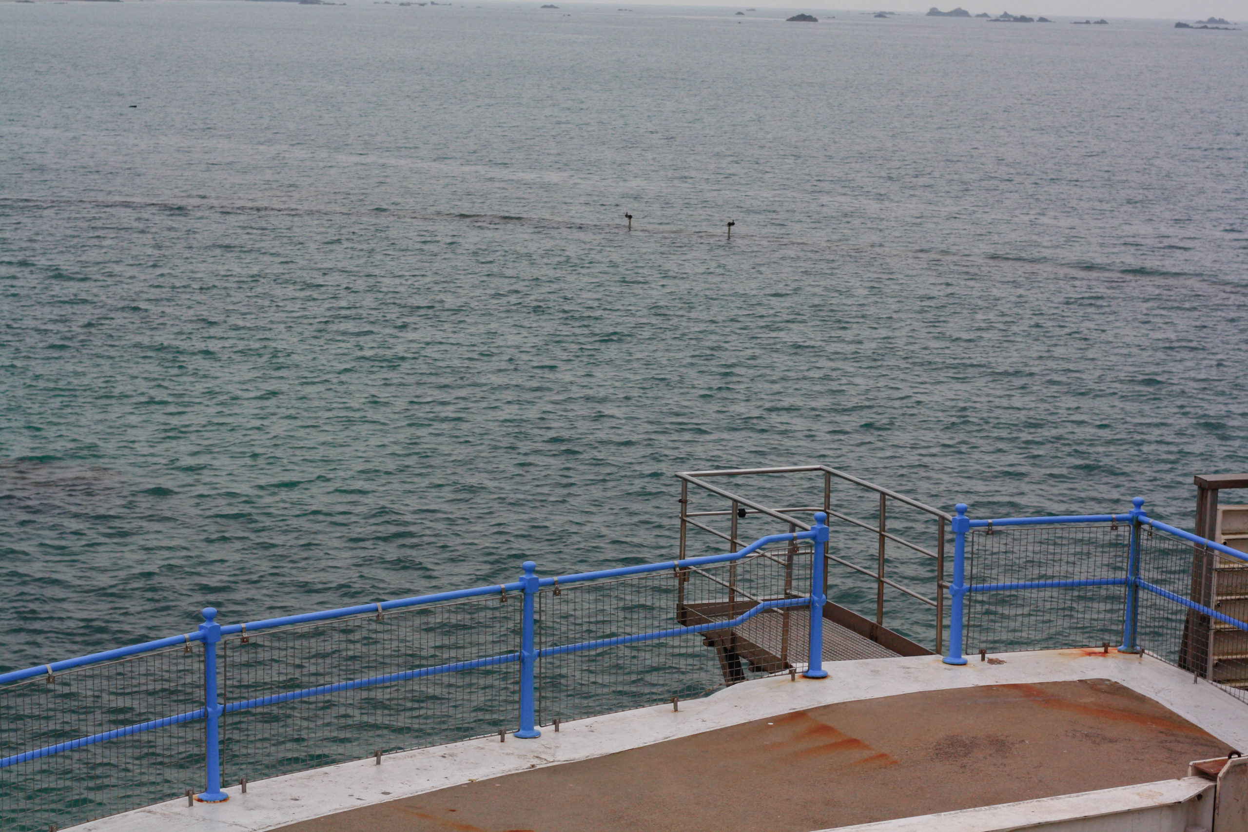
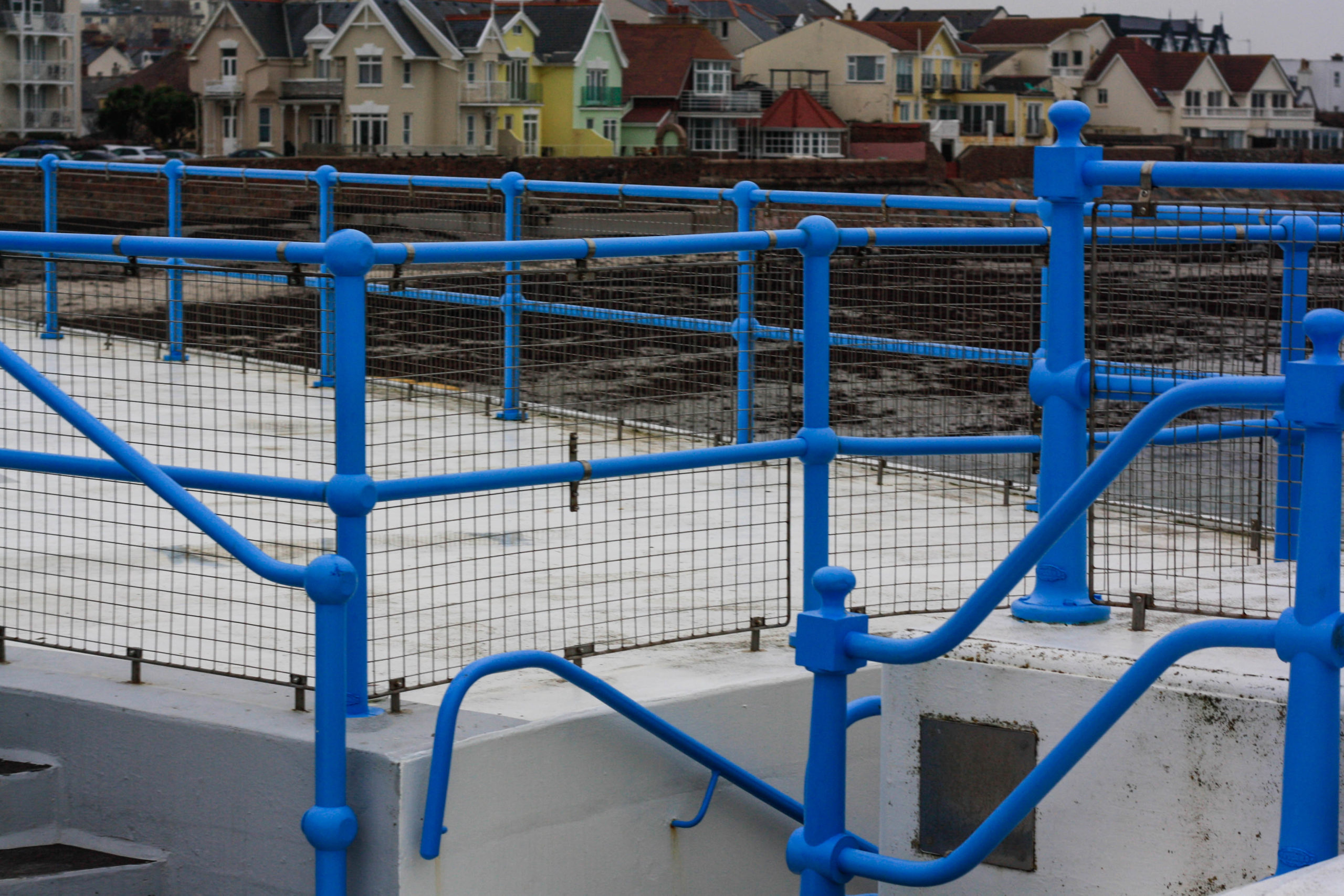
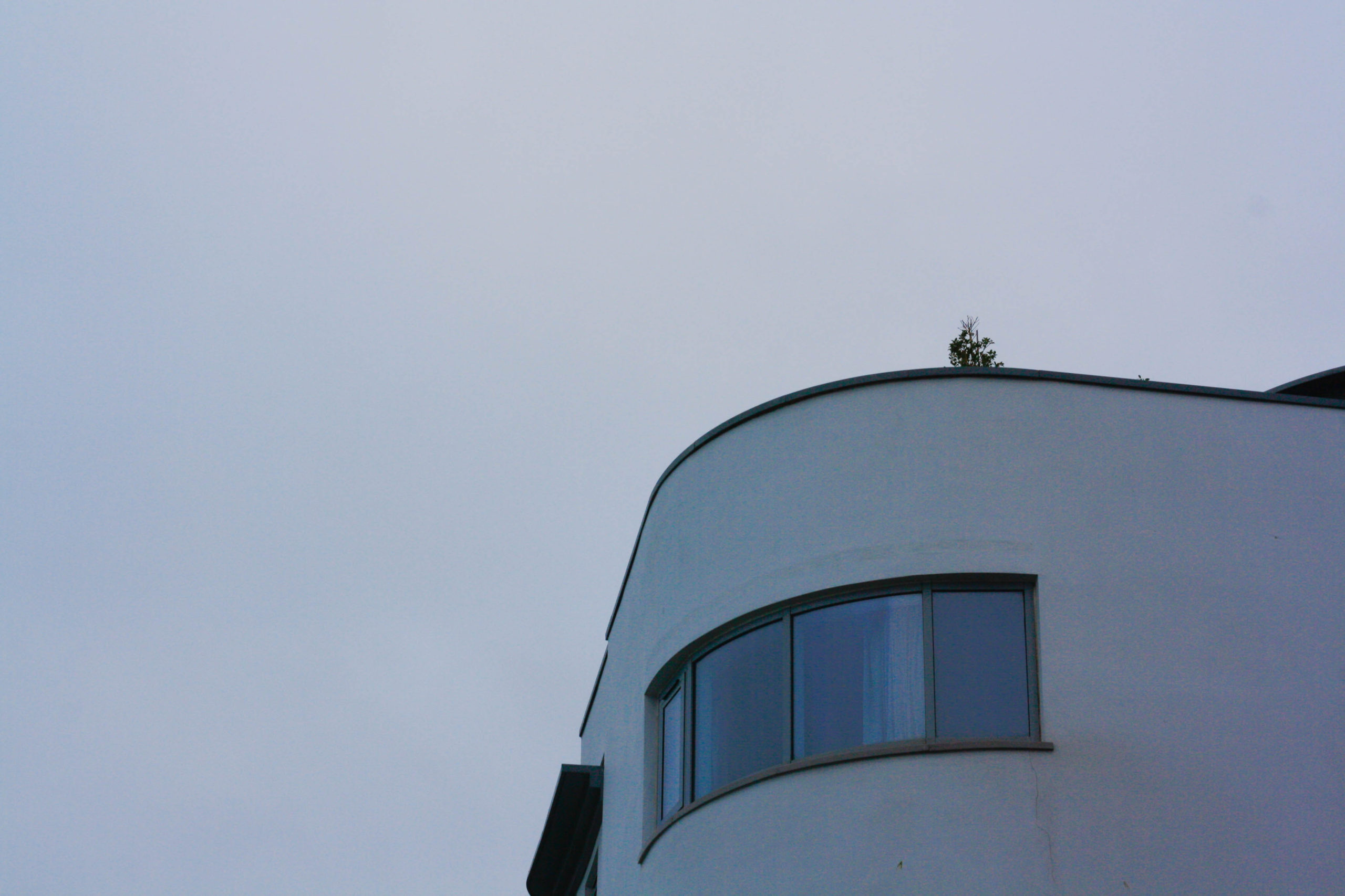
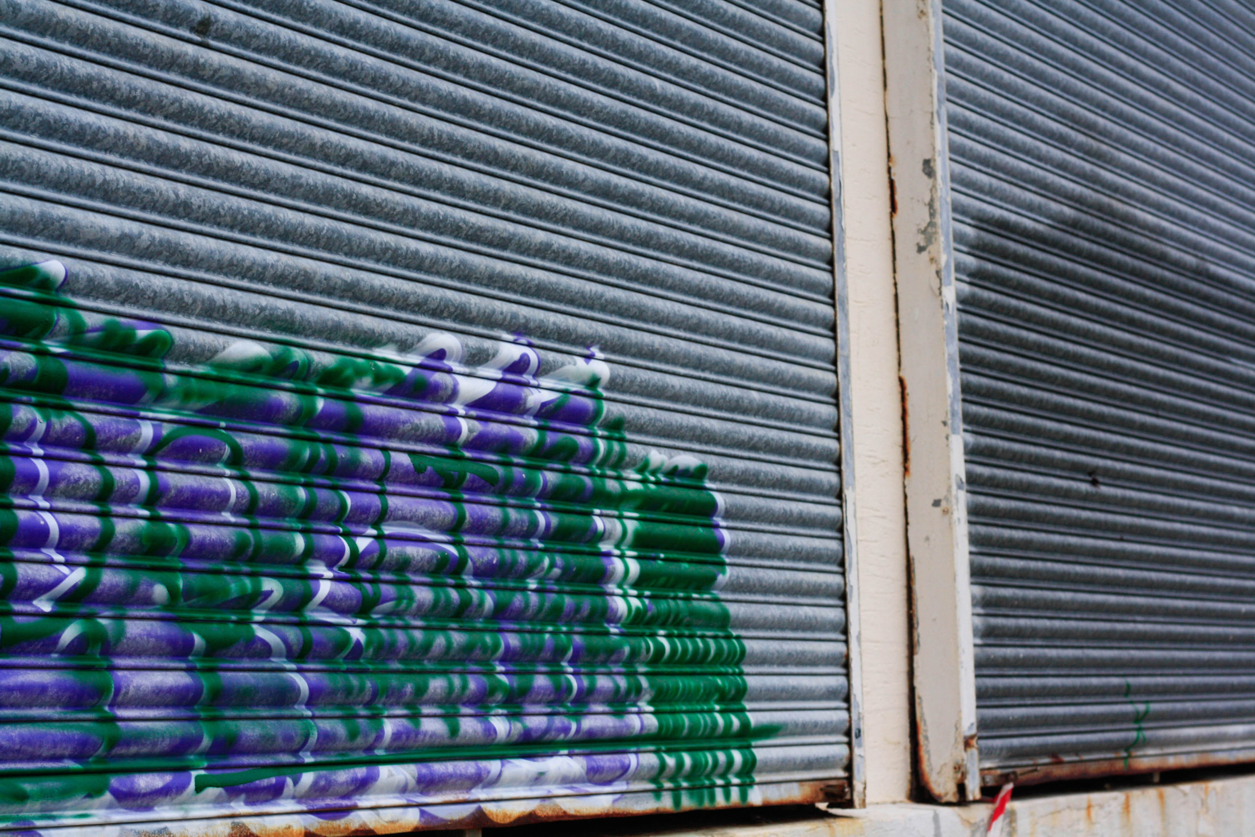
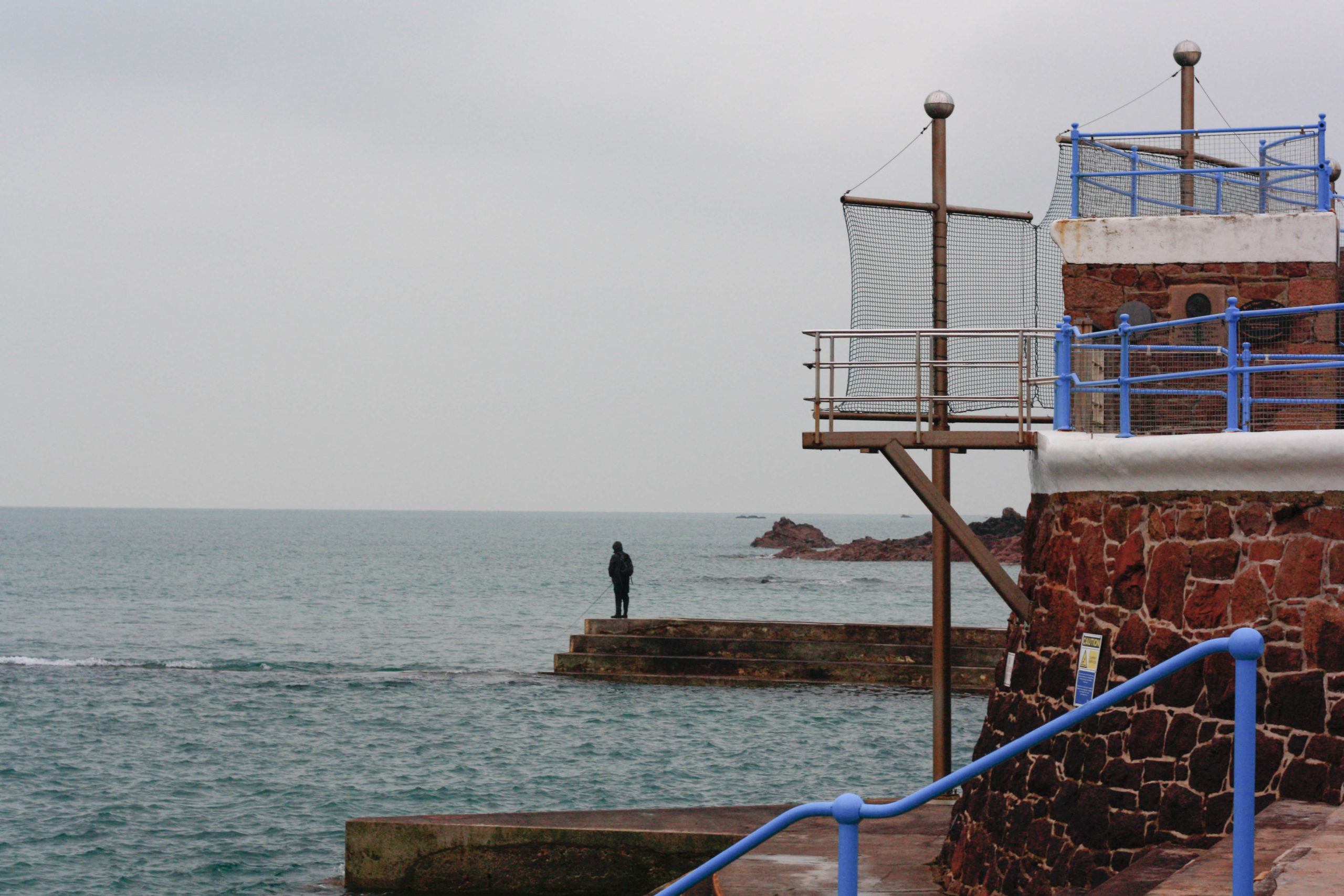
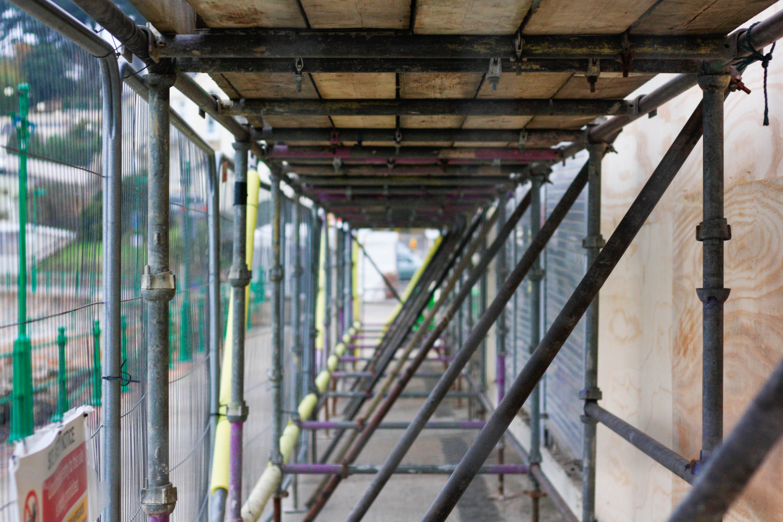
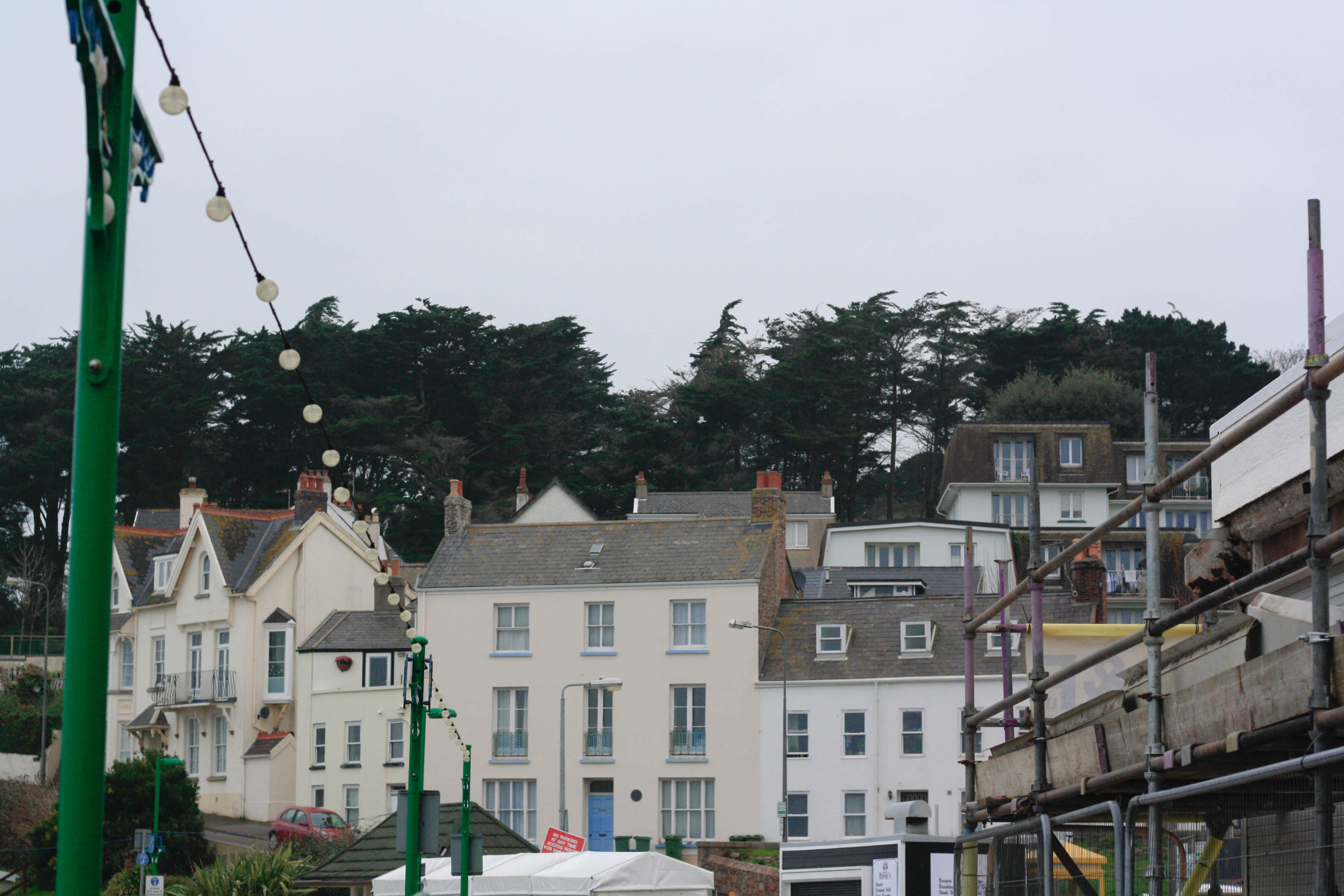
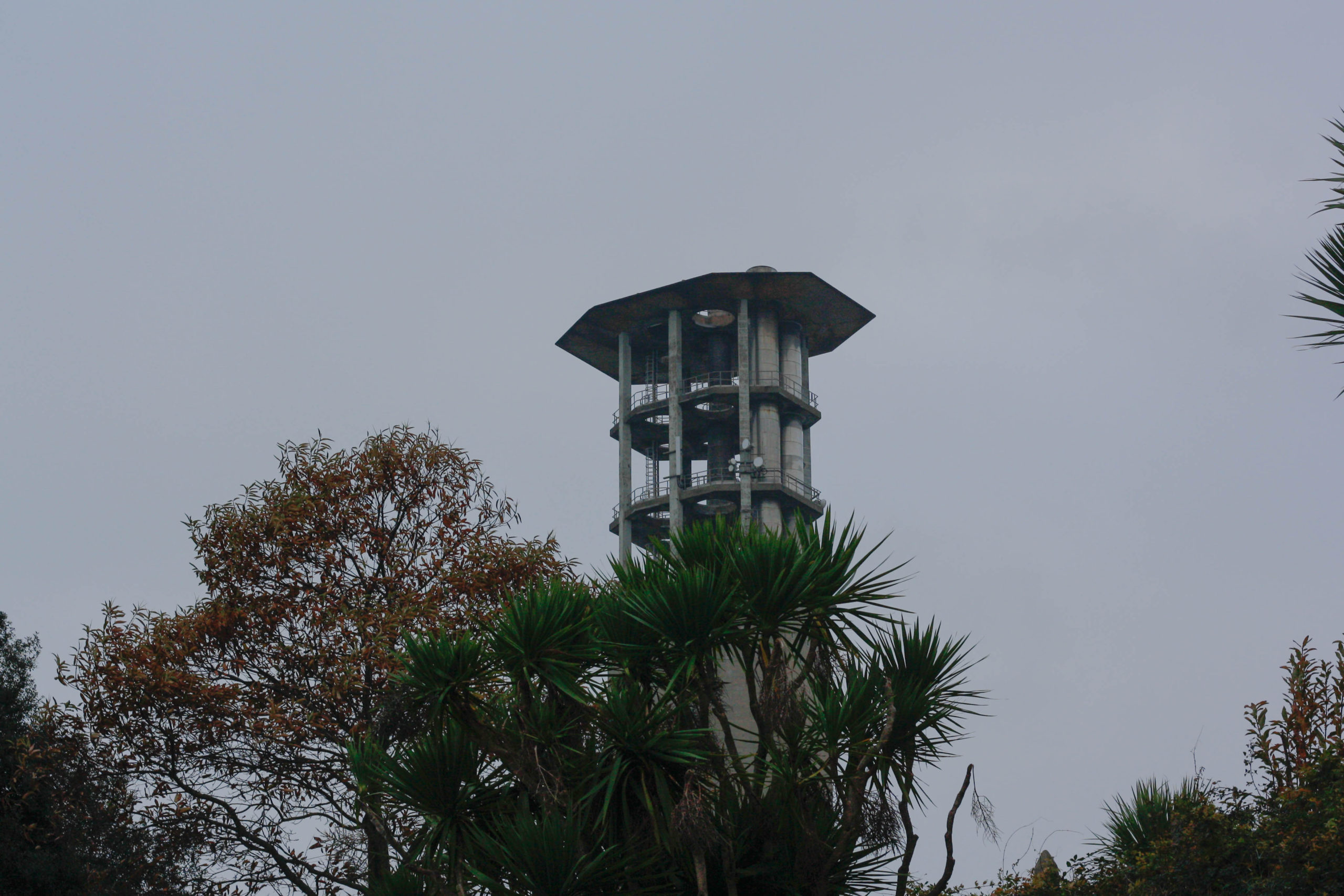
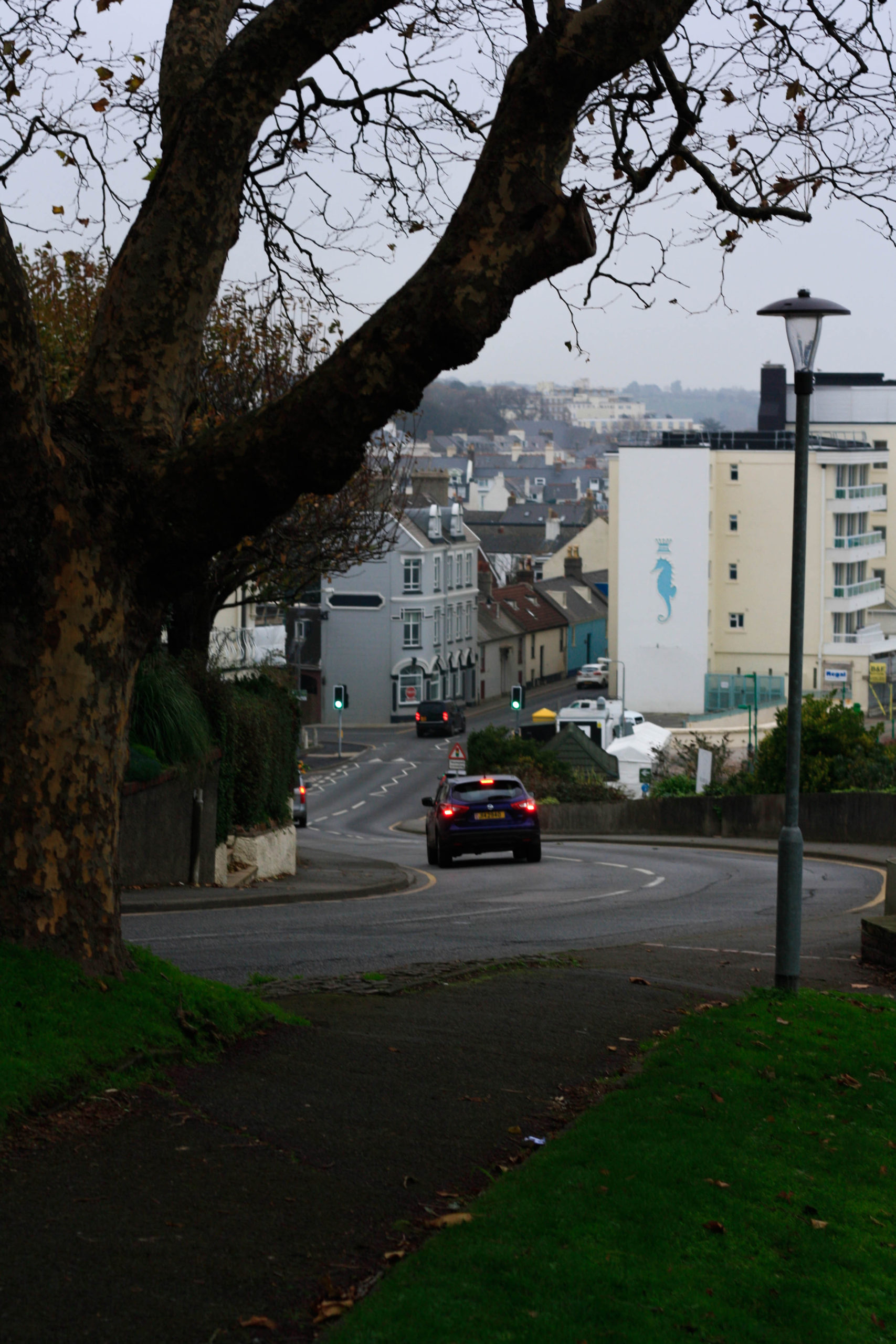
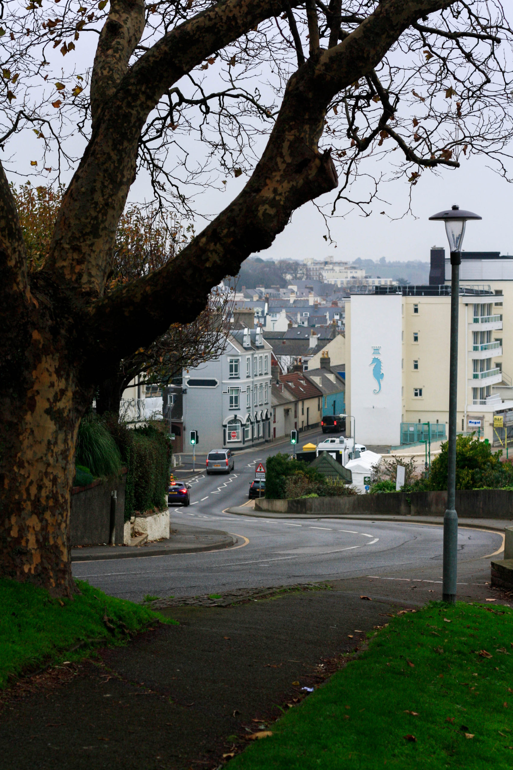
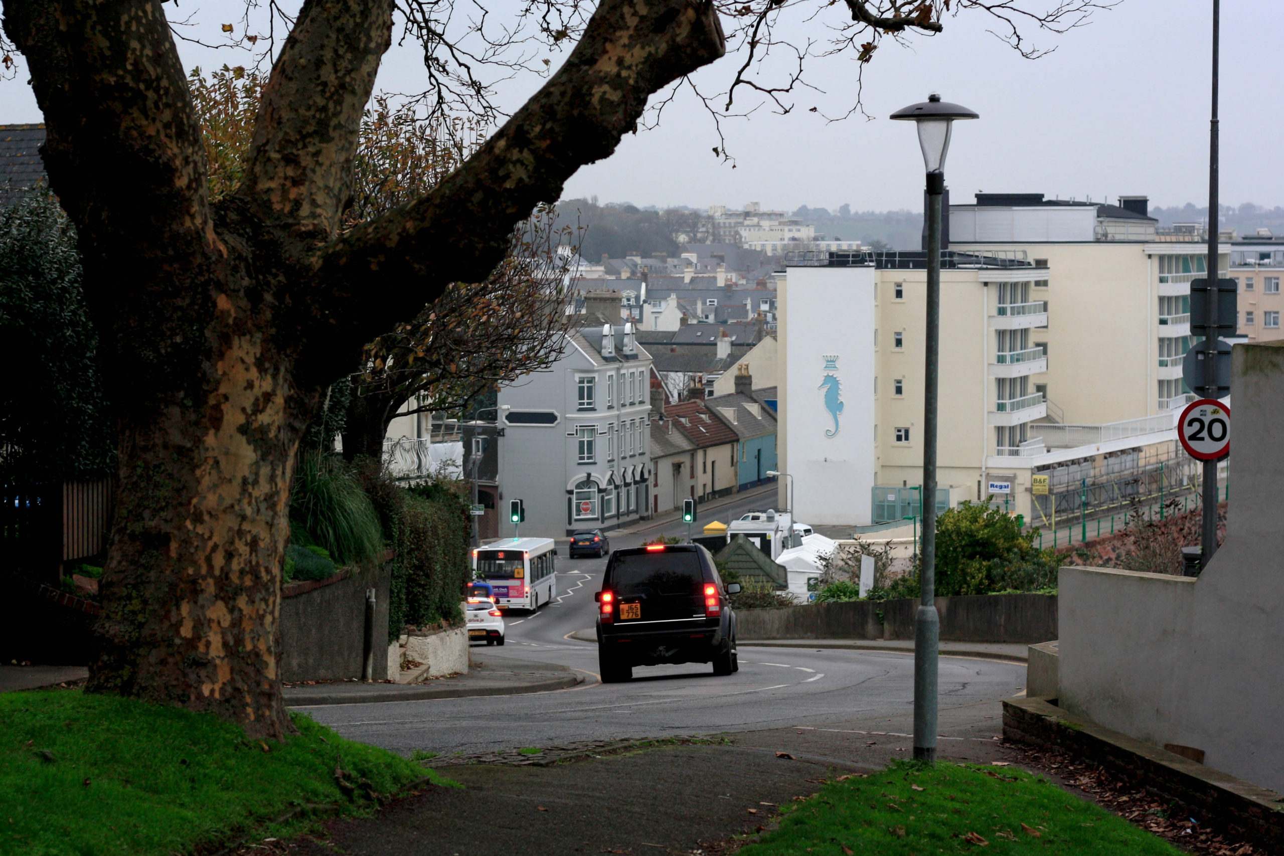
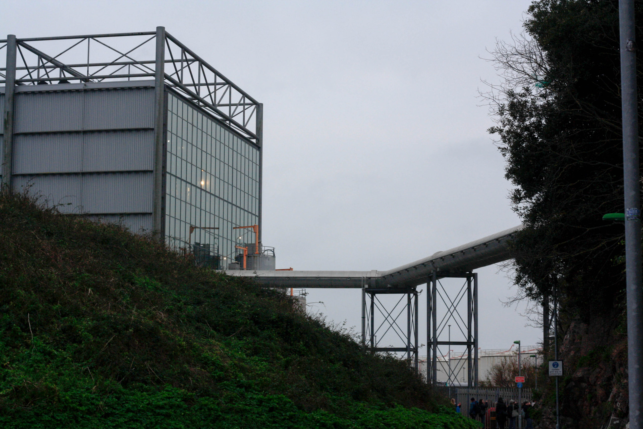
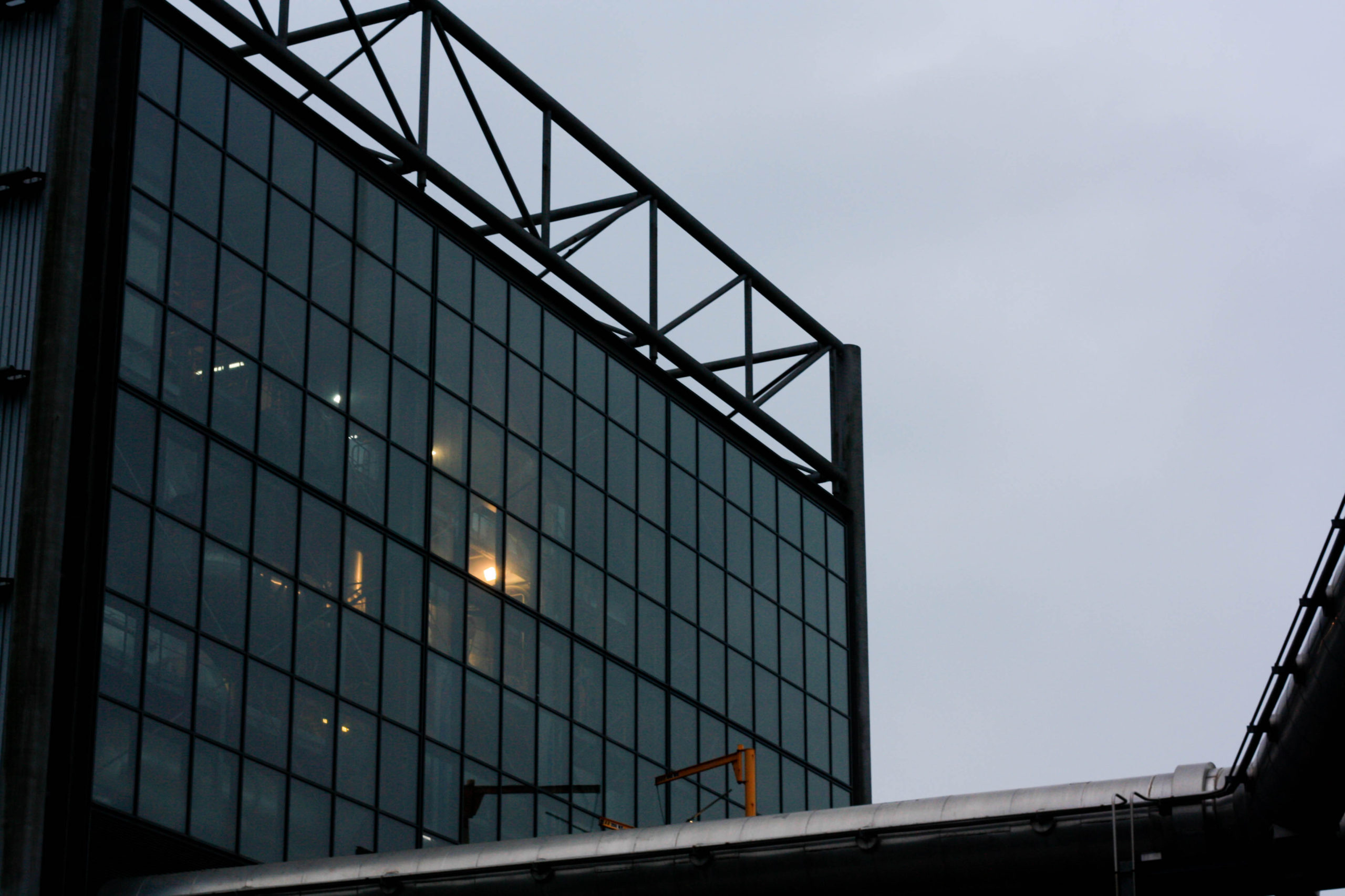
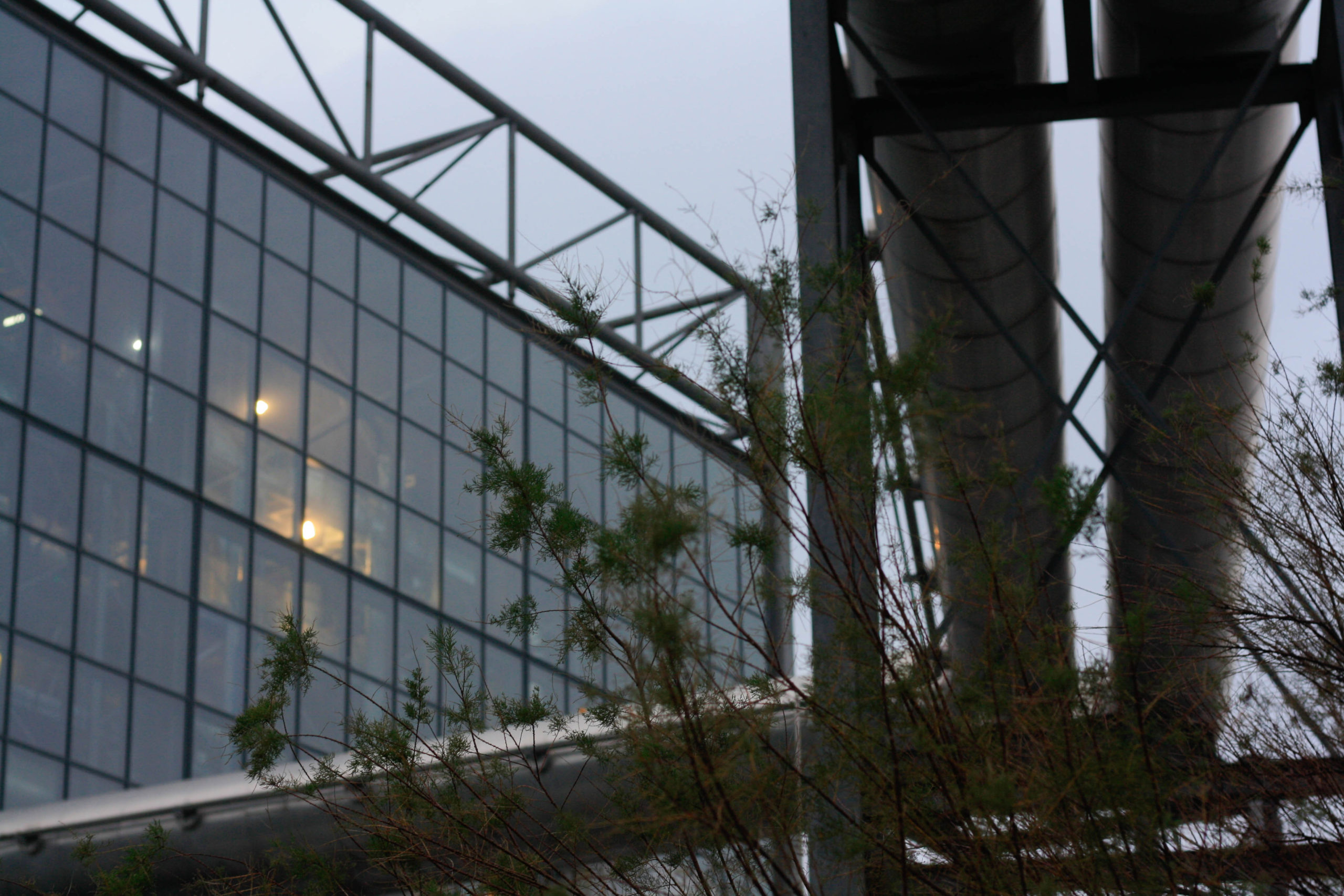
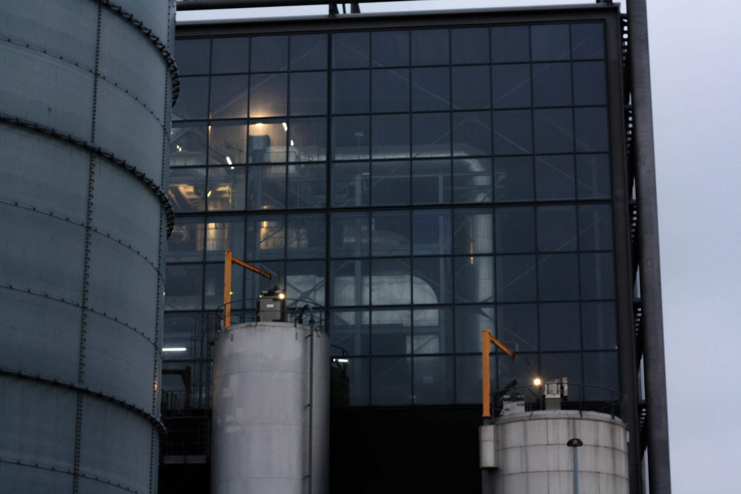
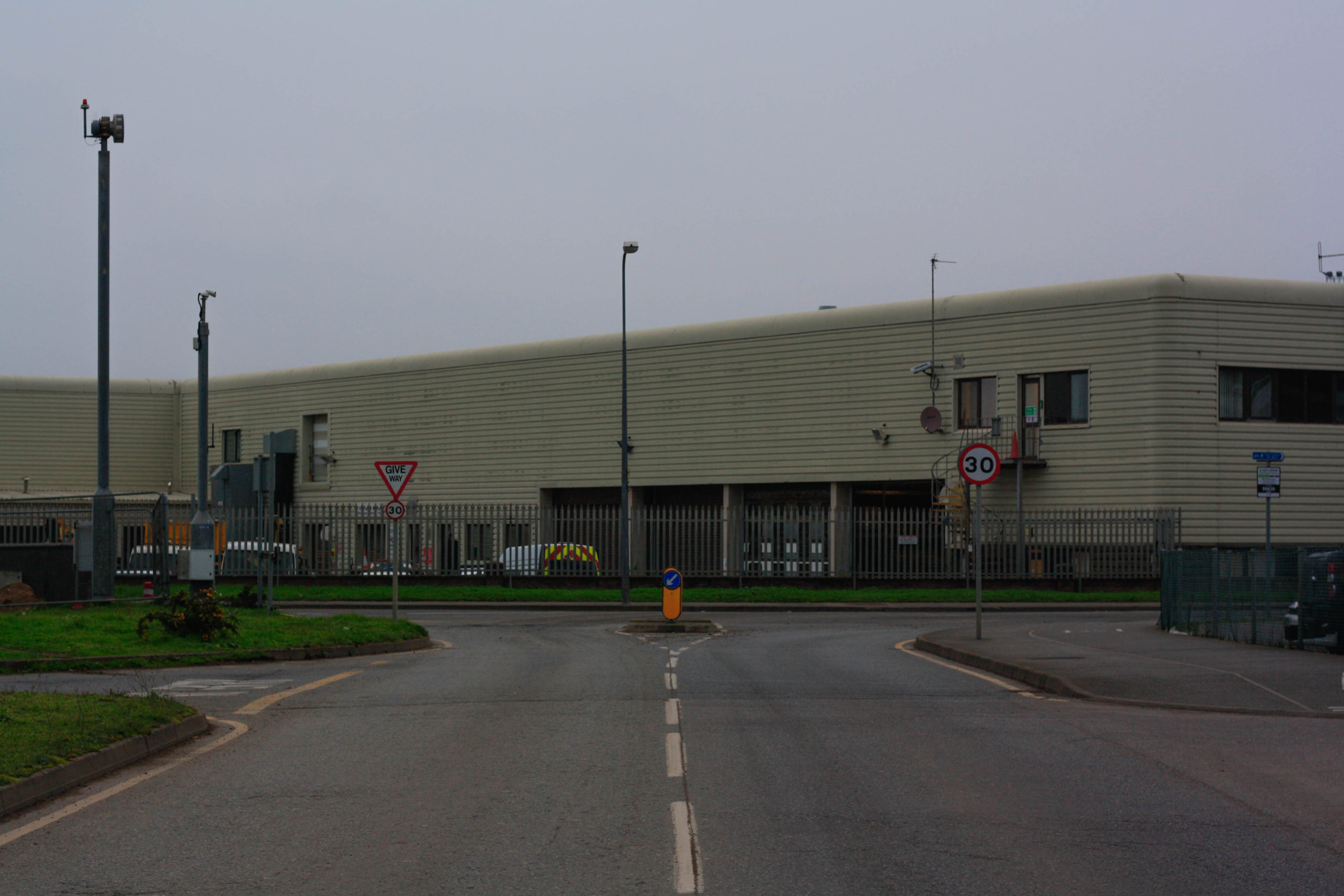
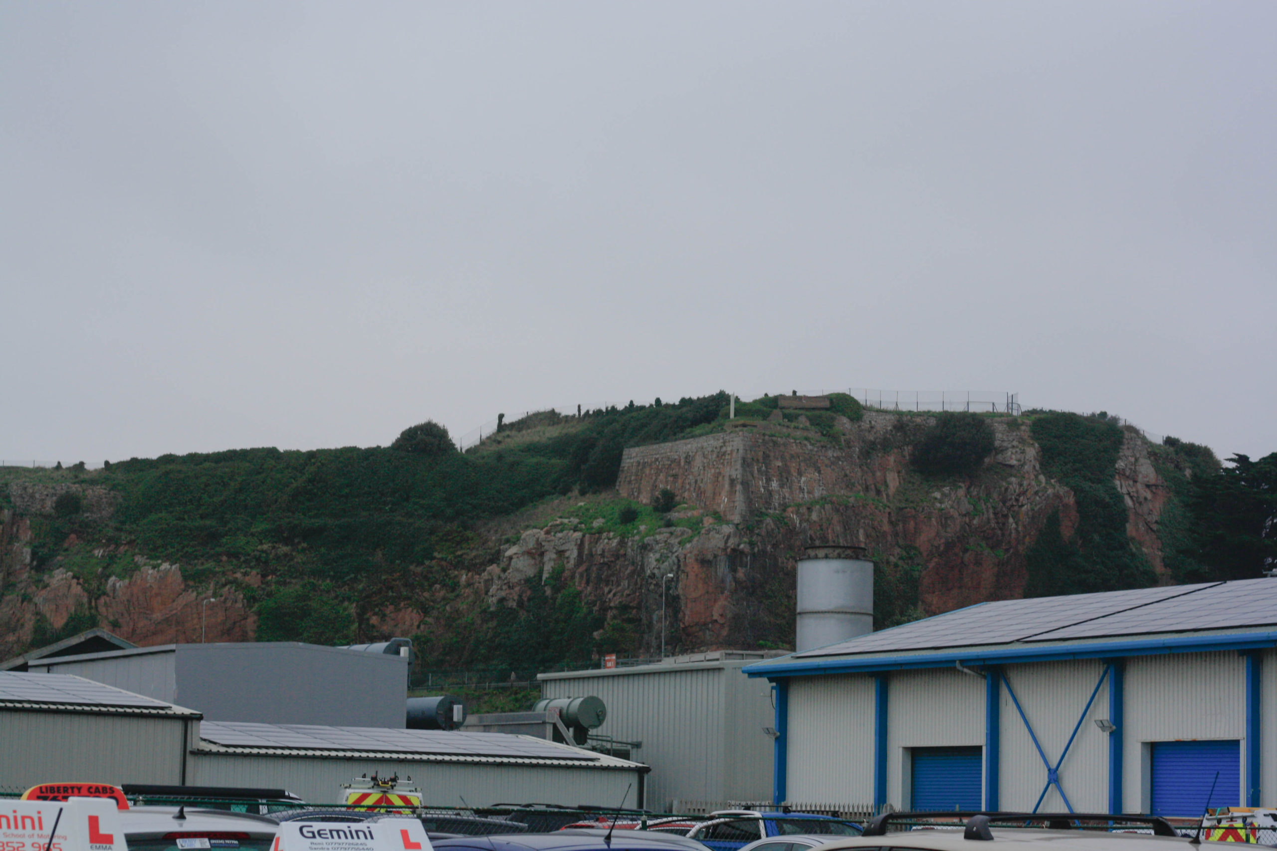
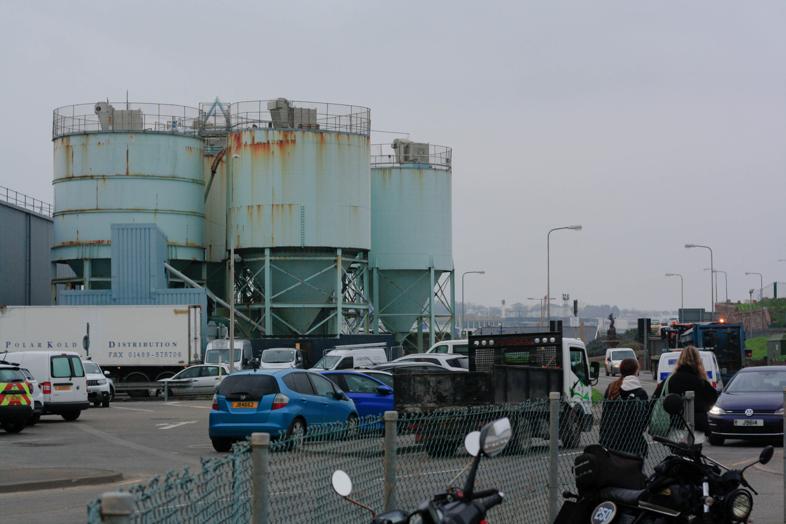
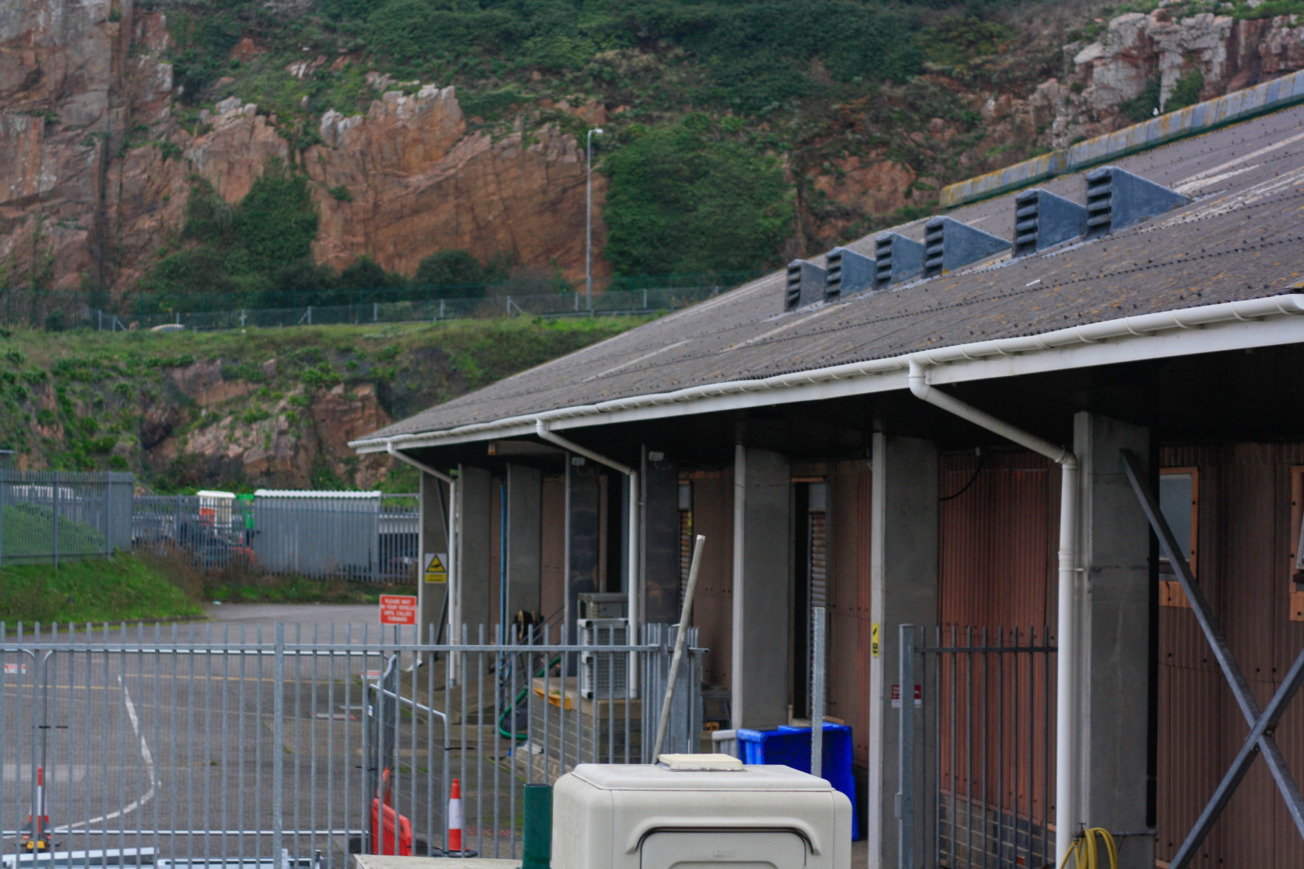
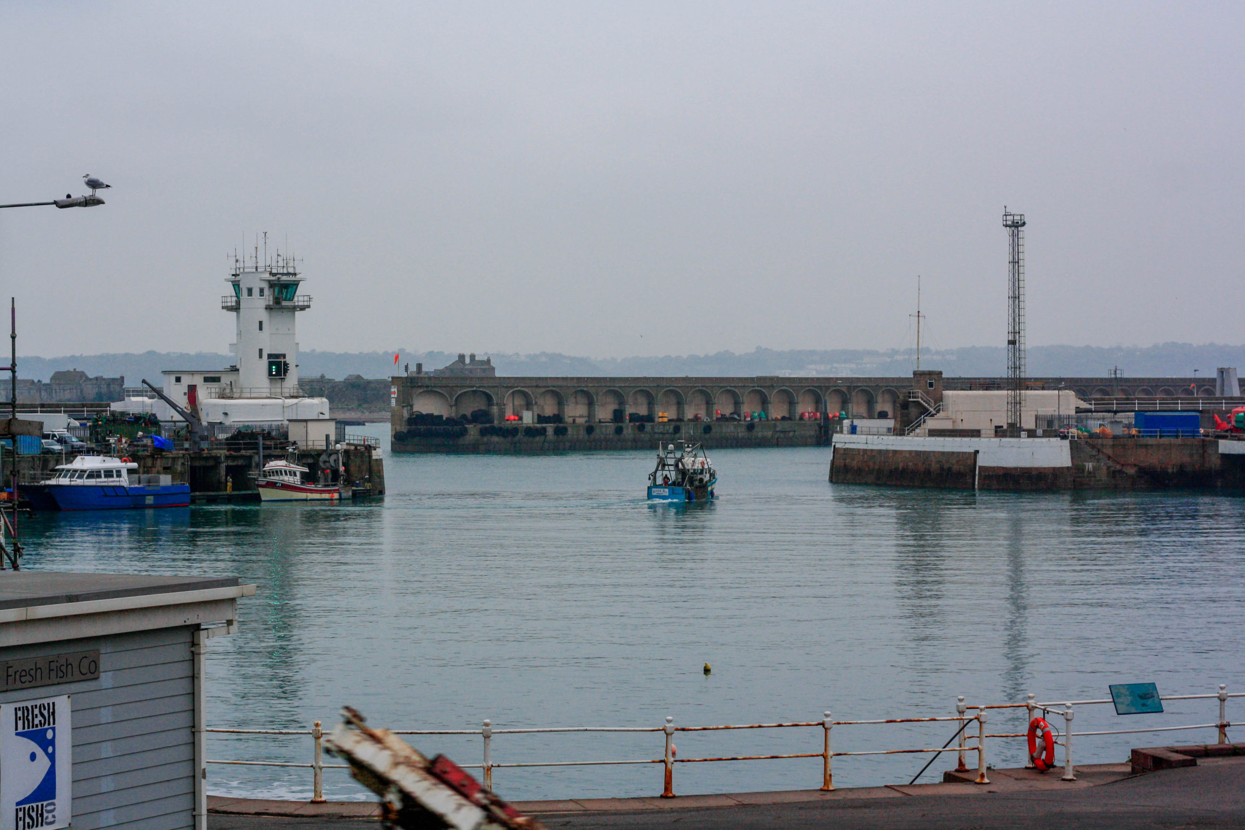
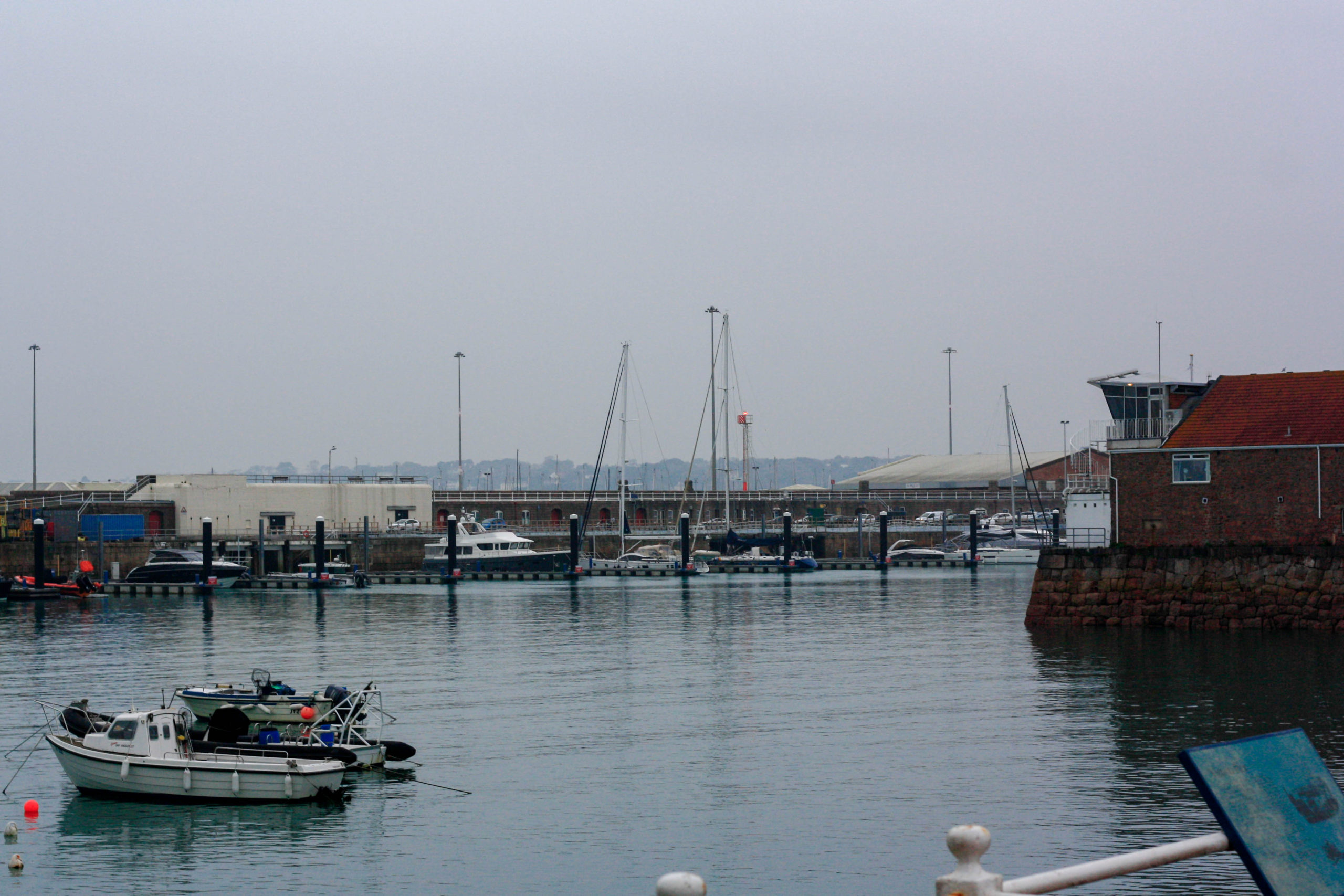
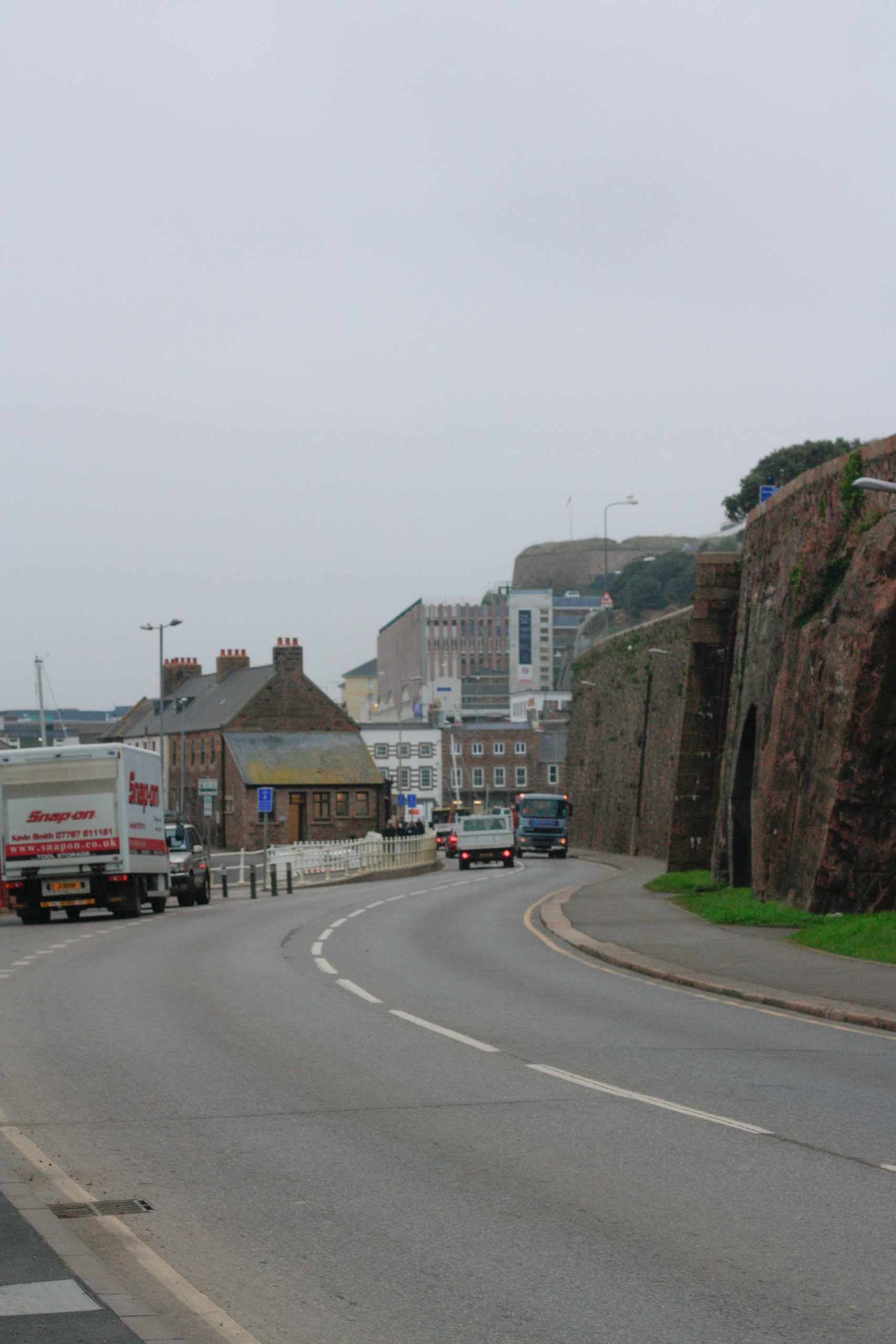
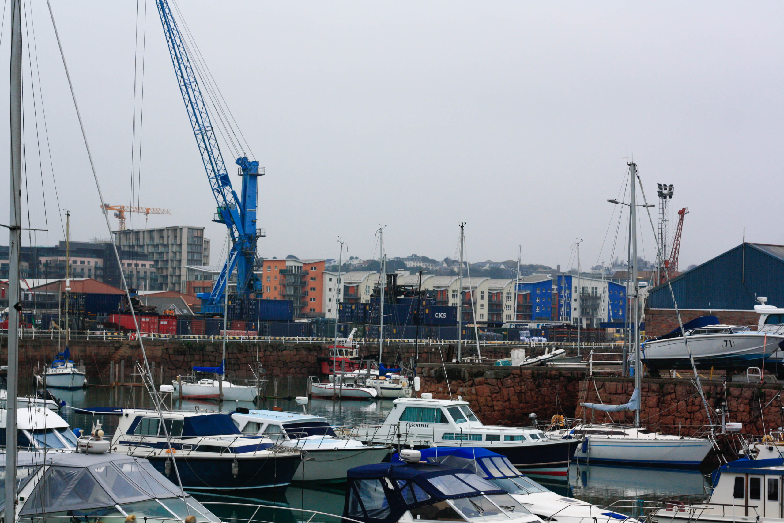
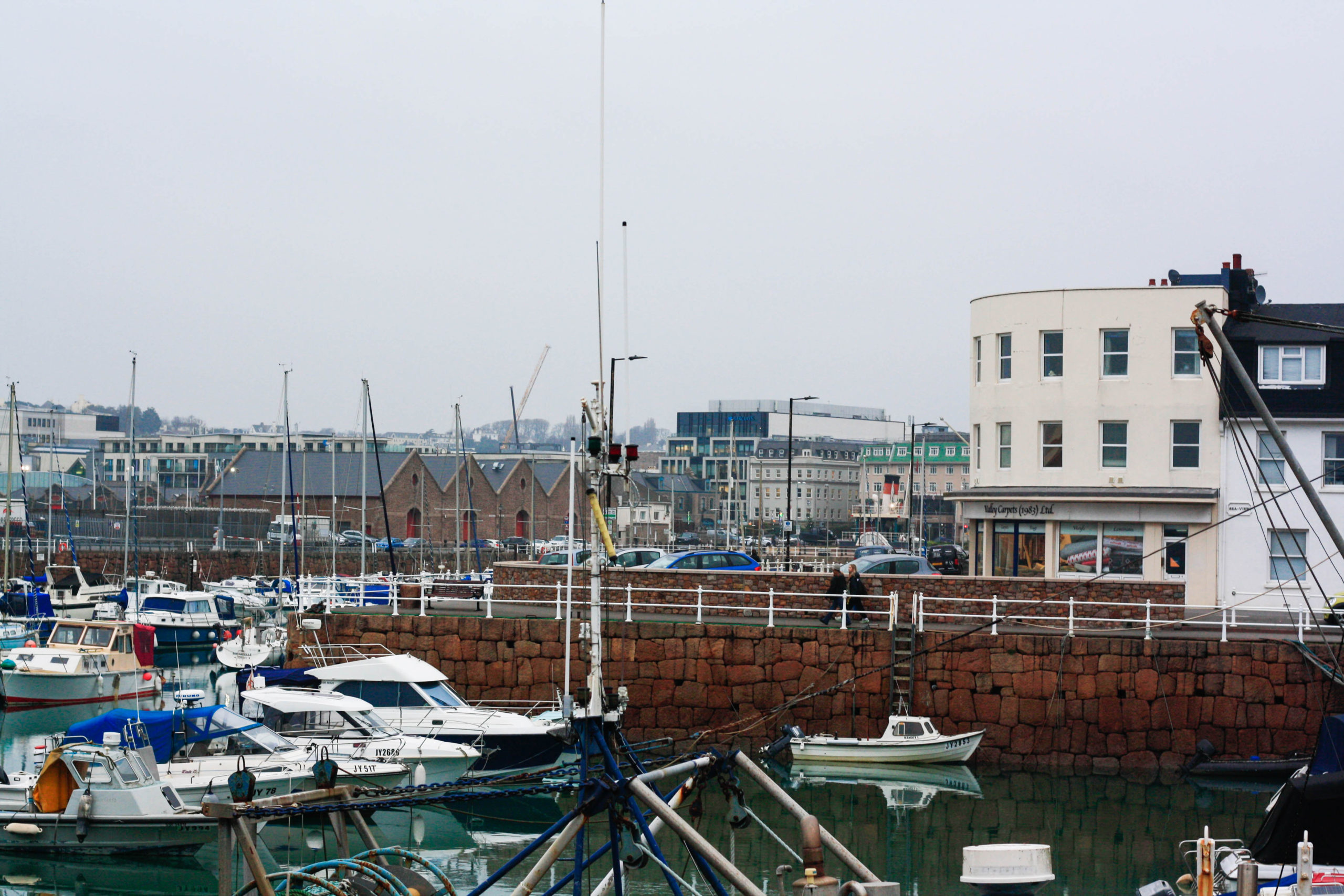
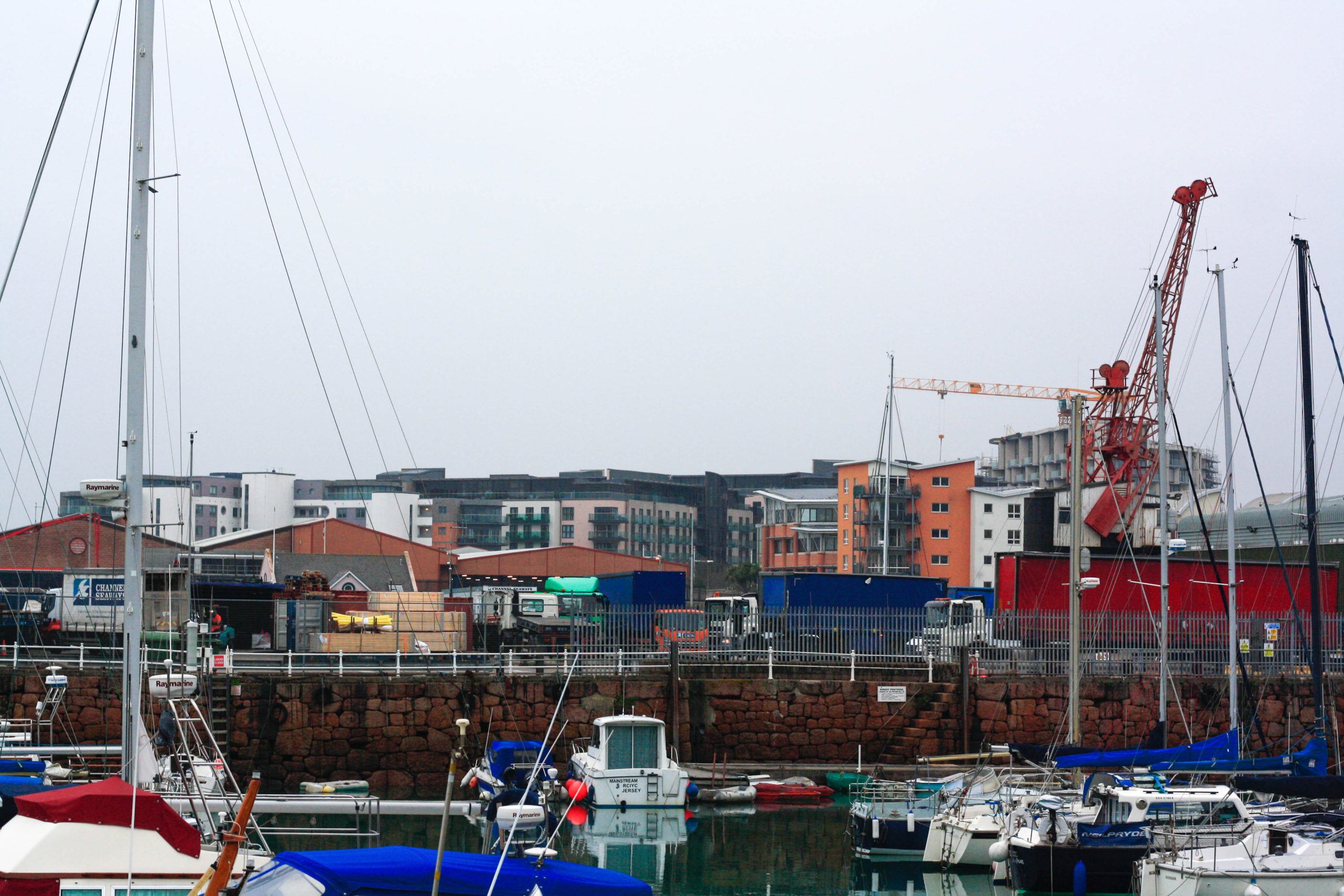
I went outside to take some Urban Landscape photos that featured buildings and the seaside. These ones feature Havre Des Pas and other areas around it. The contact sheet seen below is the photos taken. And the ones under “Photoshoot” are the final images chosen and edited.
Contact Sheet:

Photoshoot:

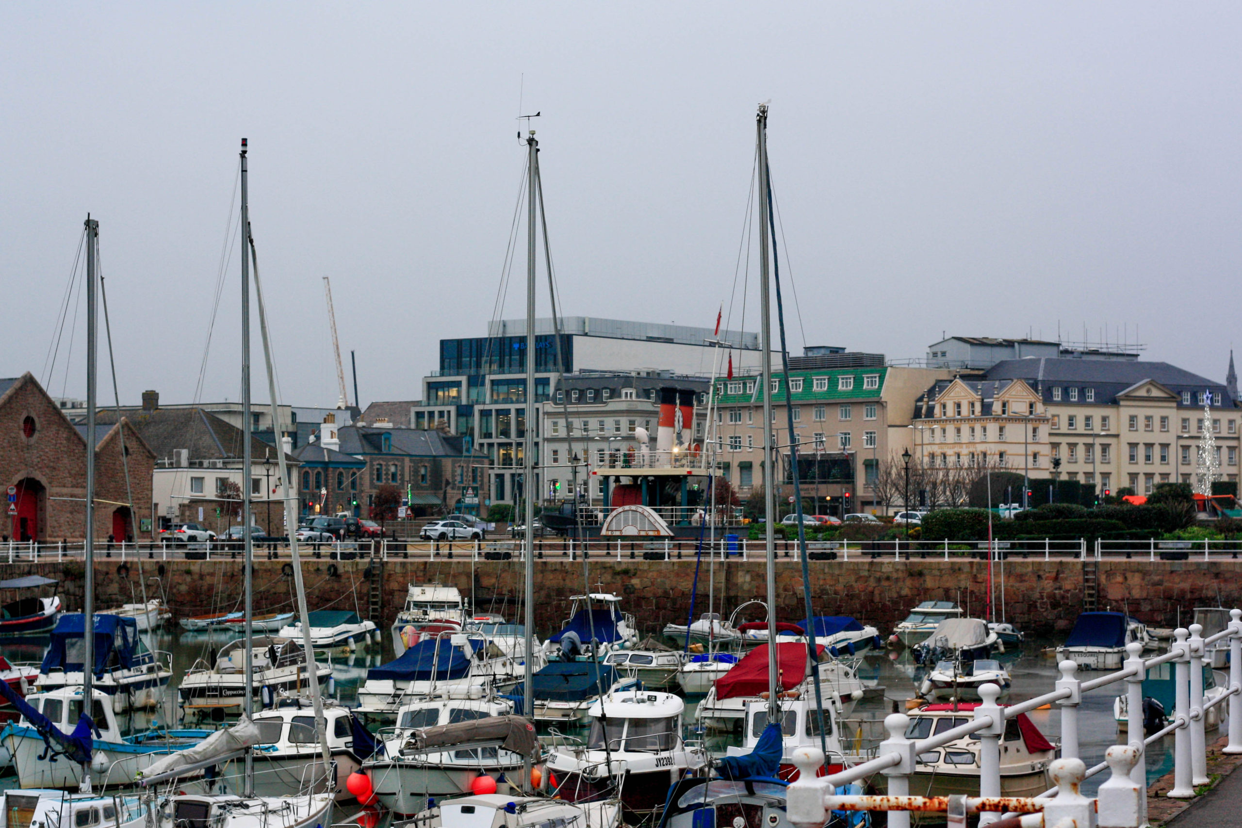
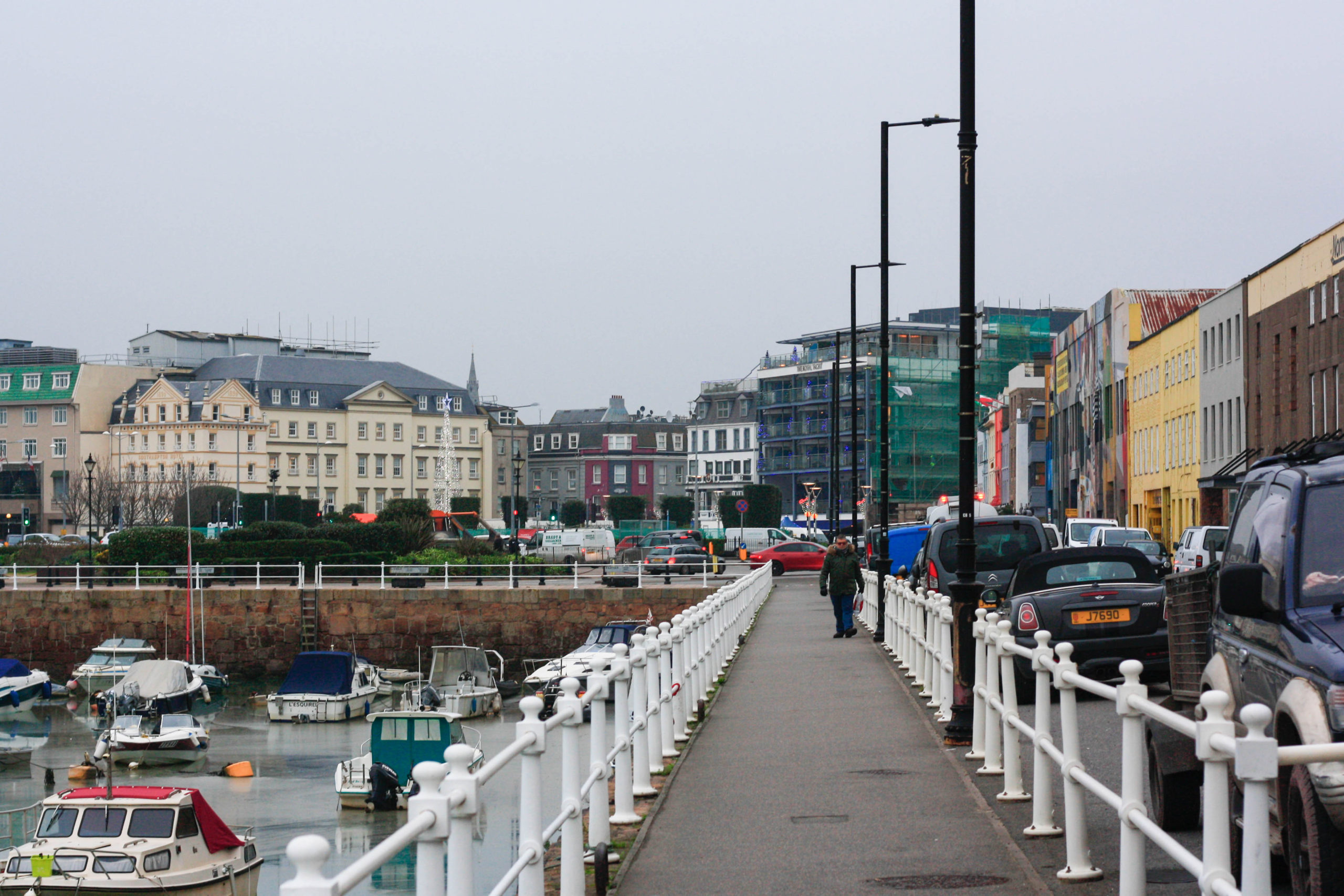
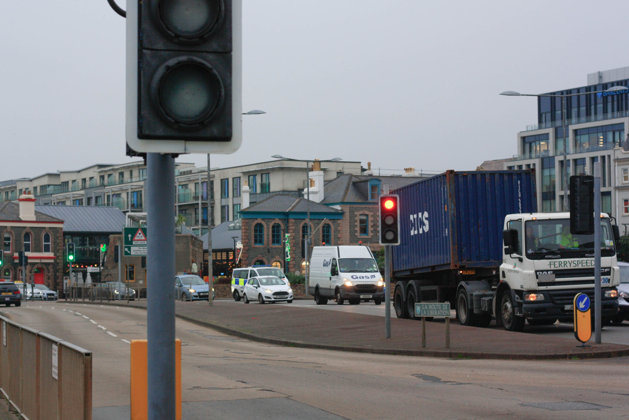
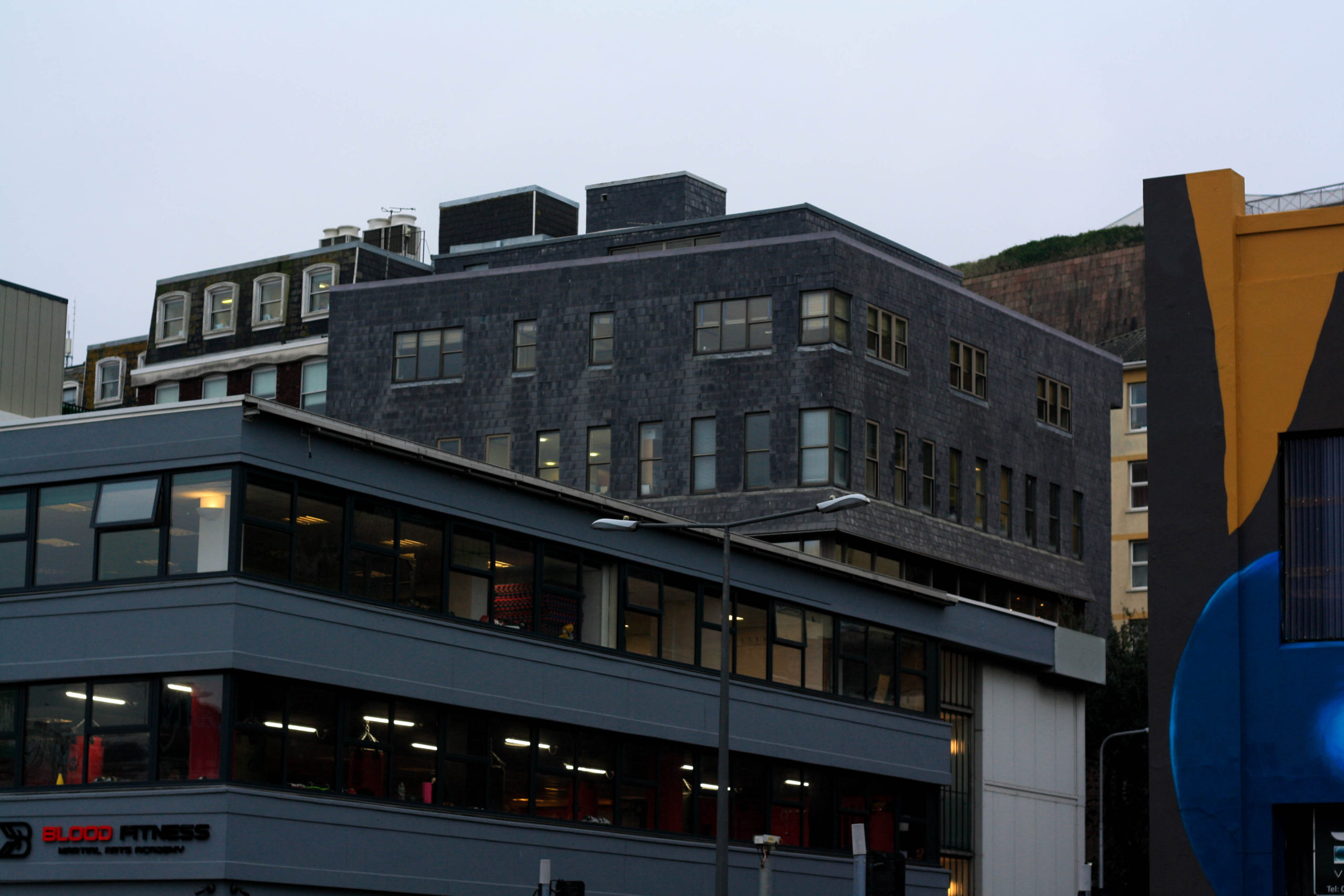
Black and White Edits:
I selected a handful of photos from this collection and made them black and white:
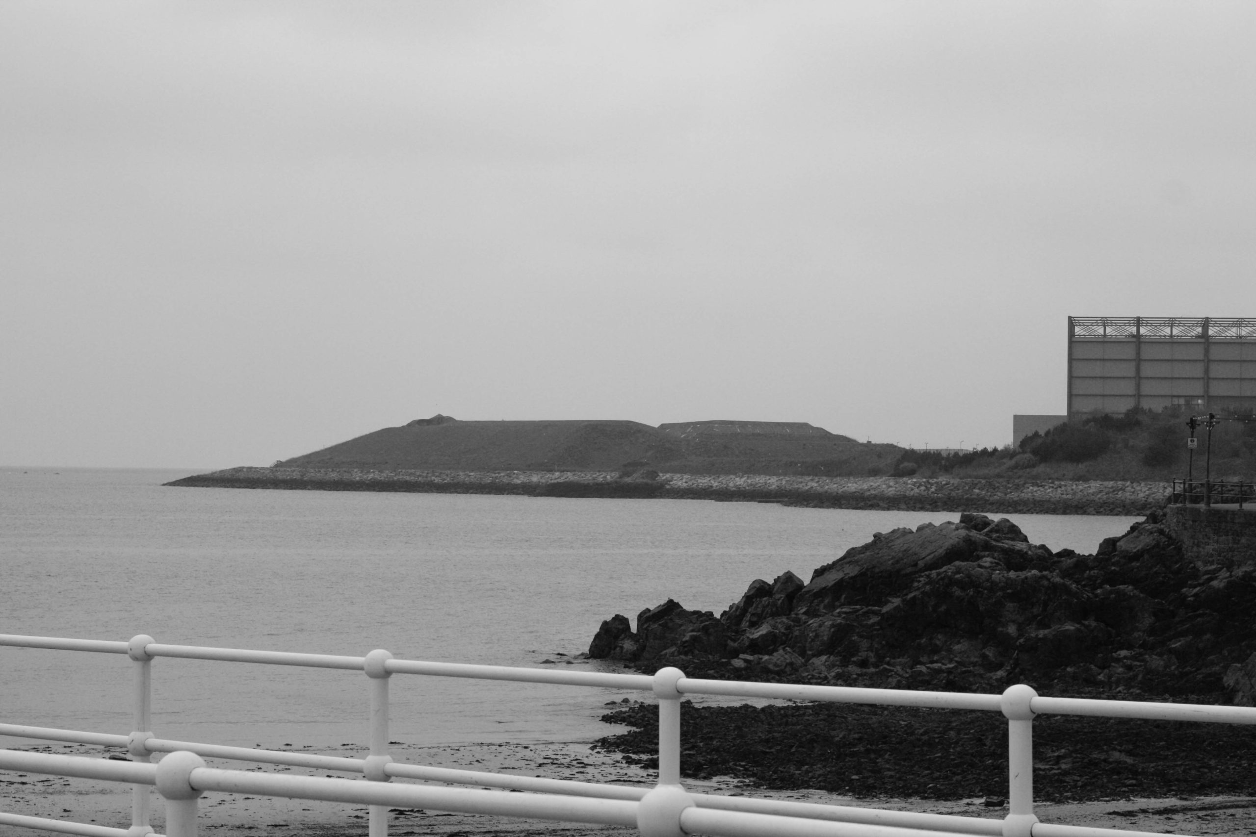
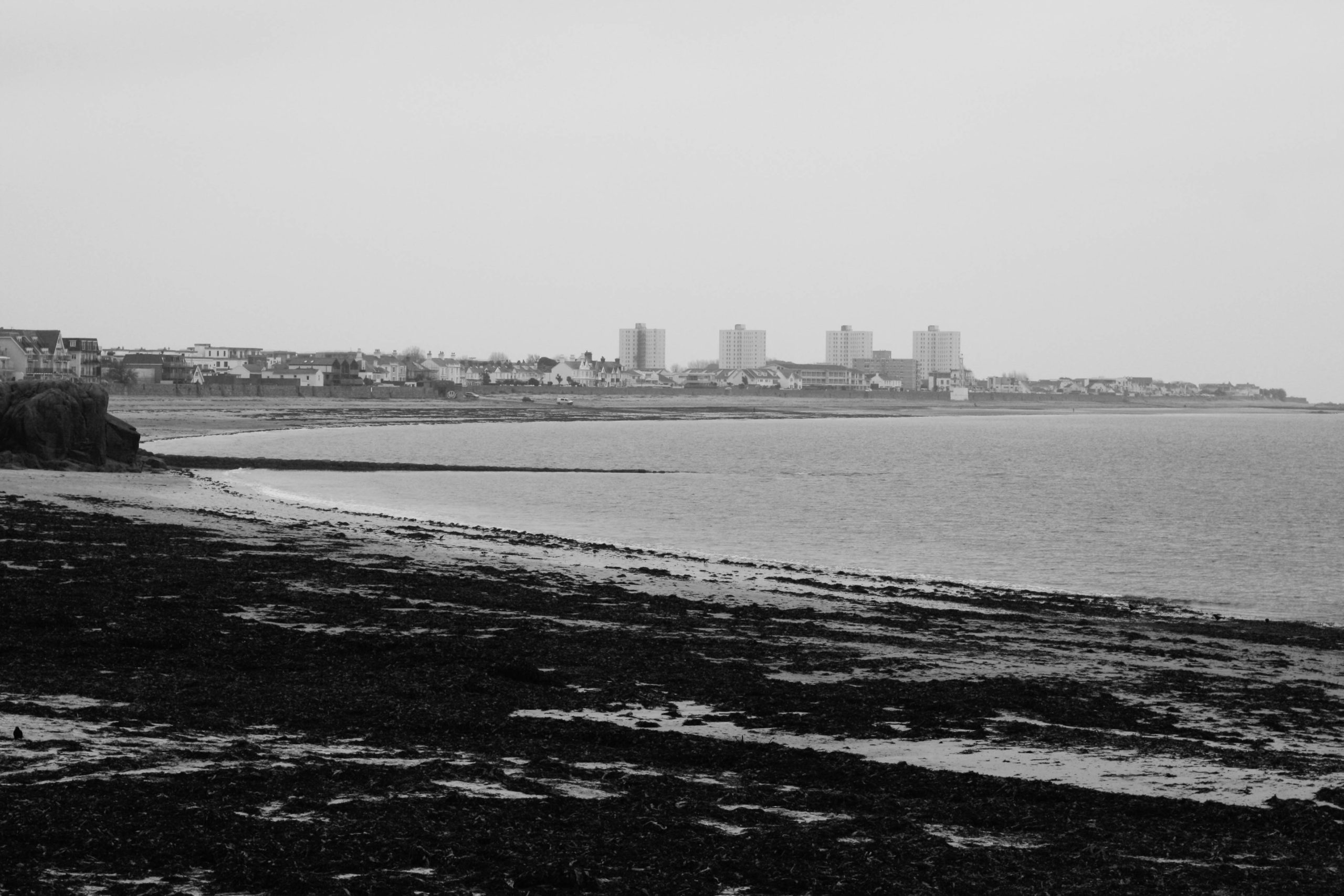
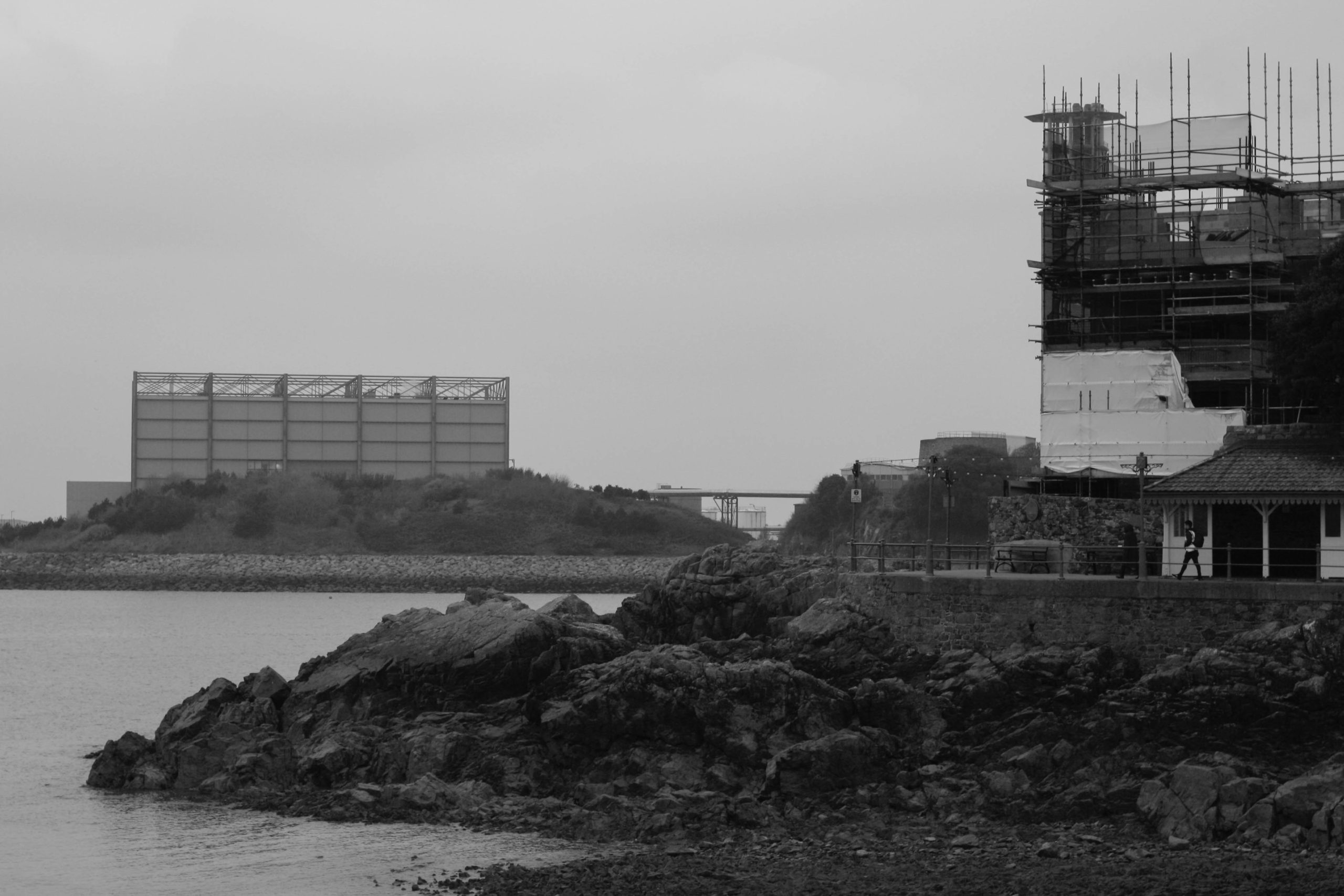
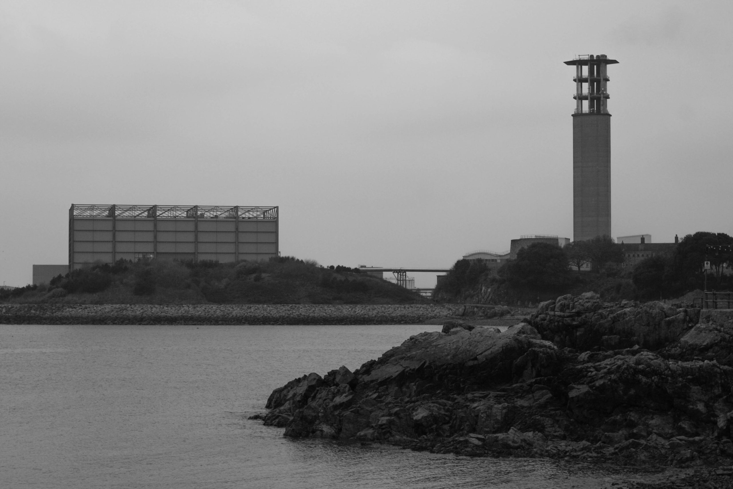
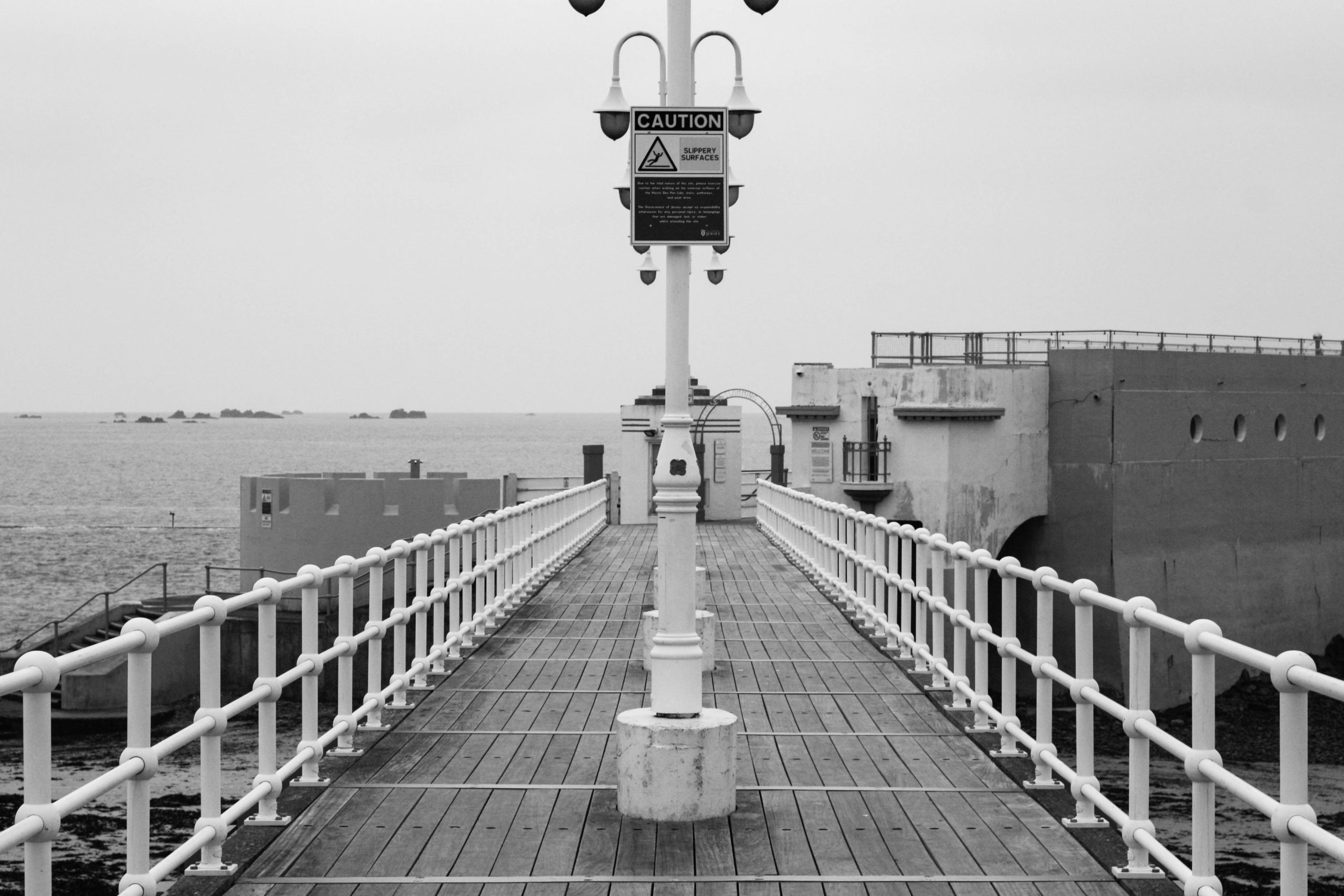
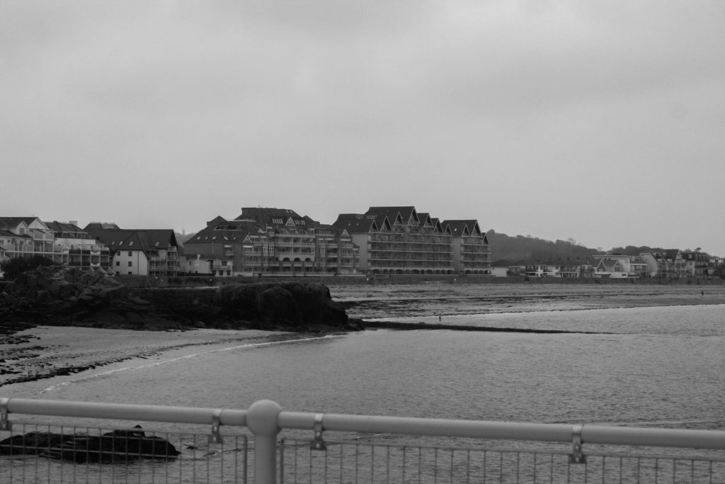
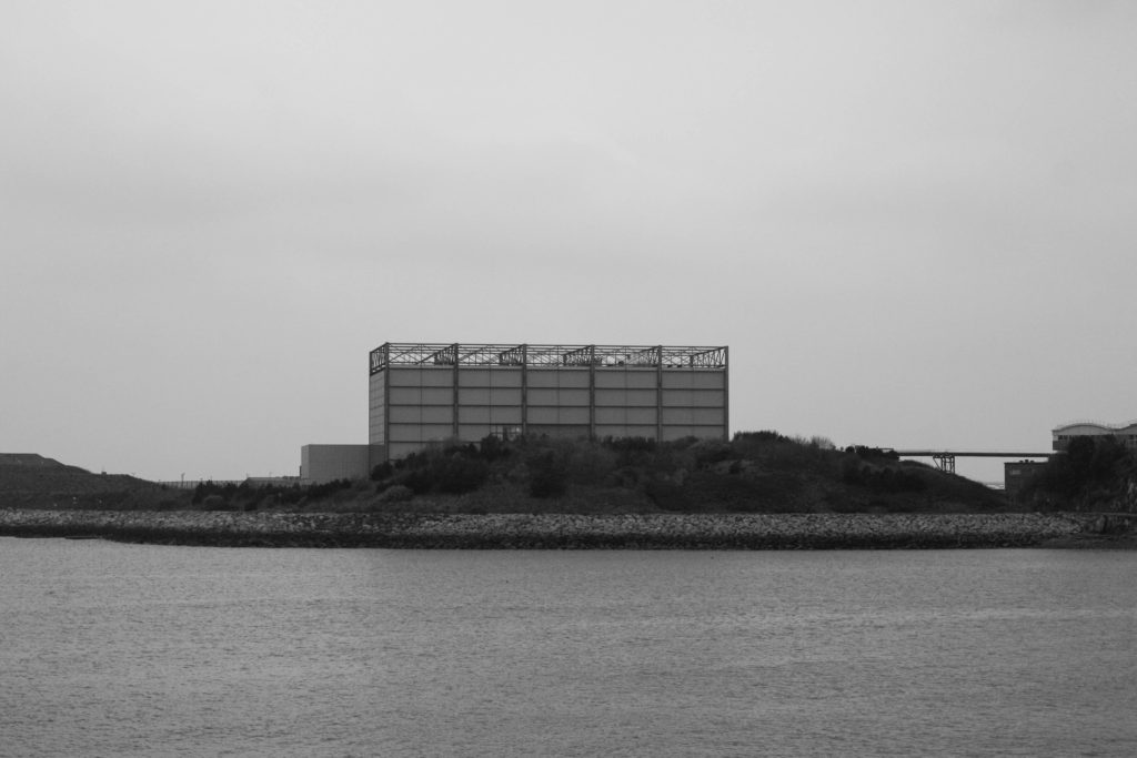
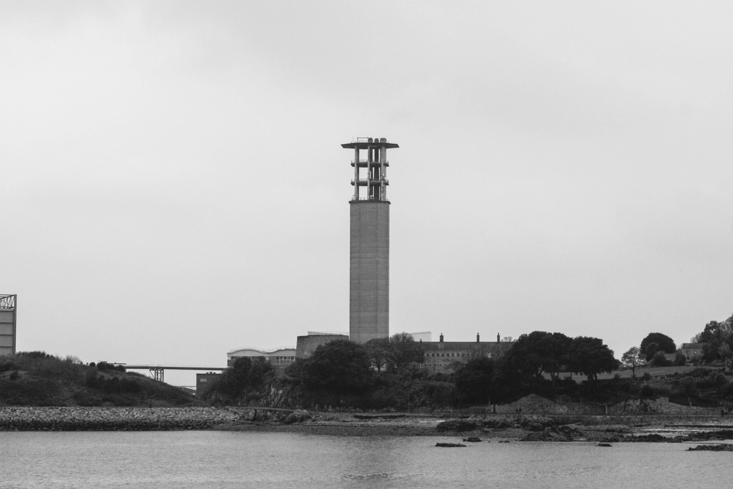
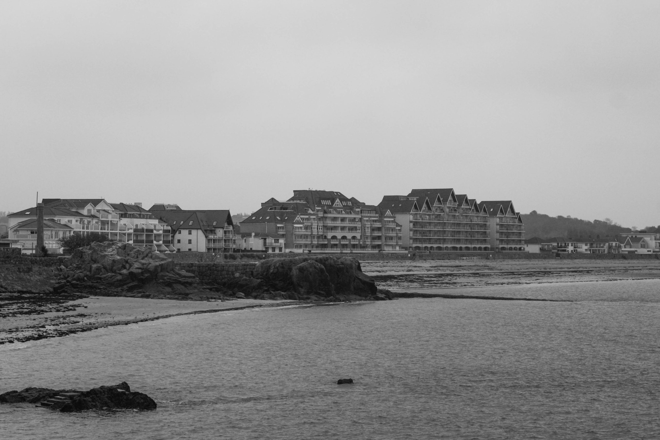
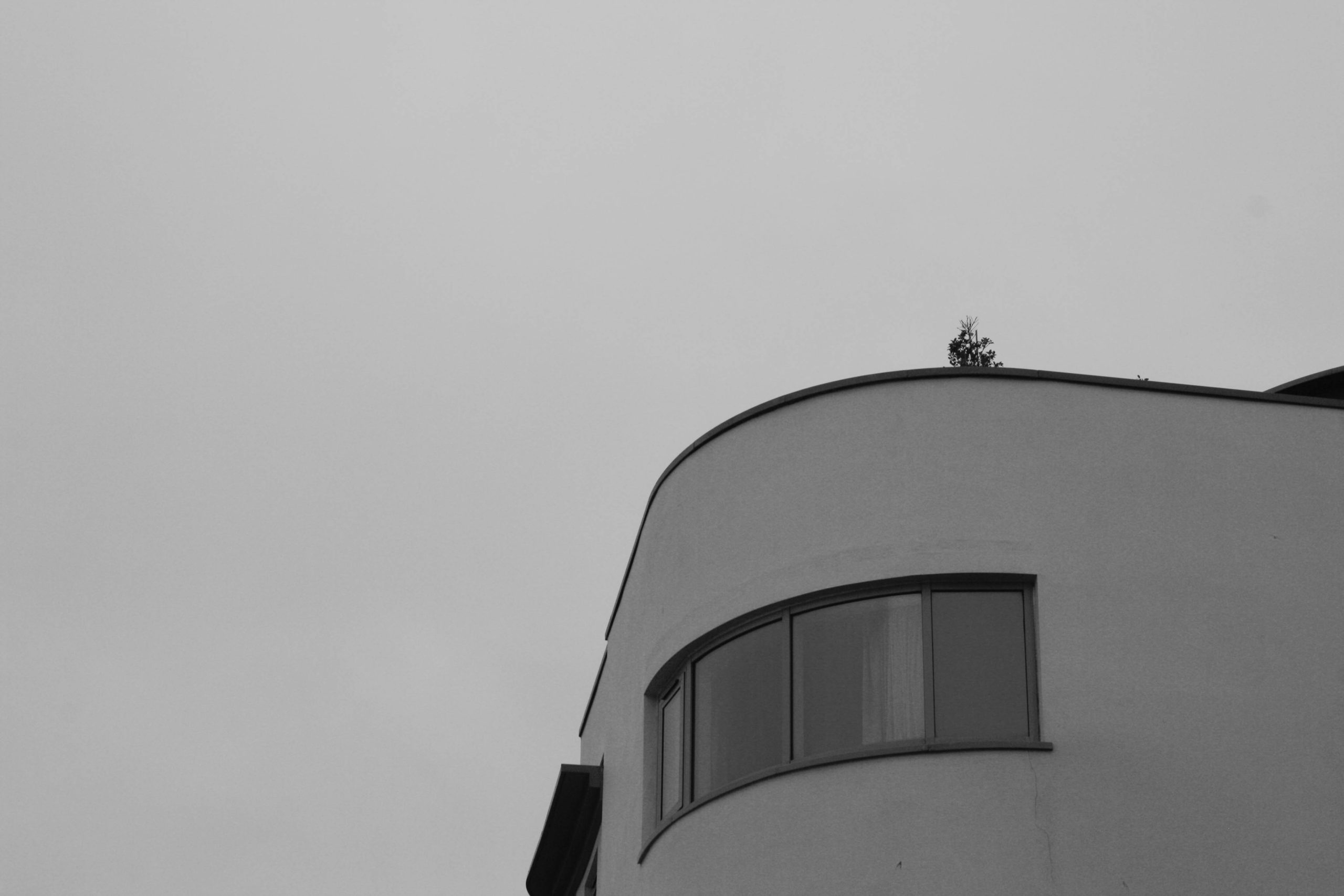
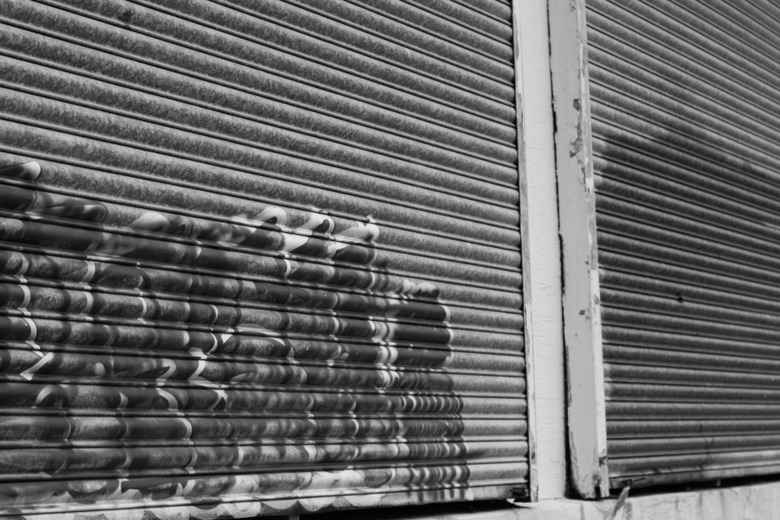
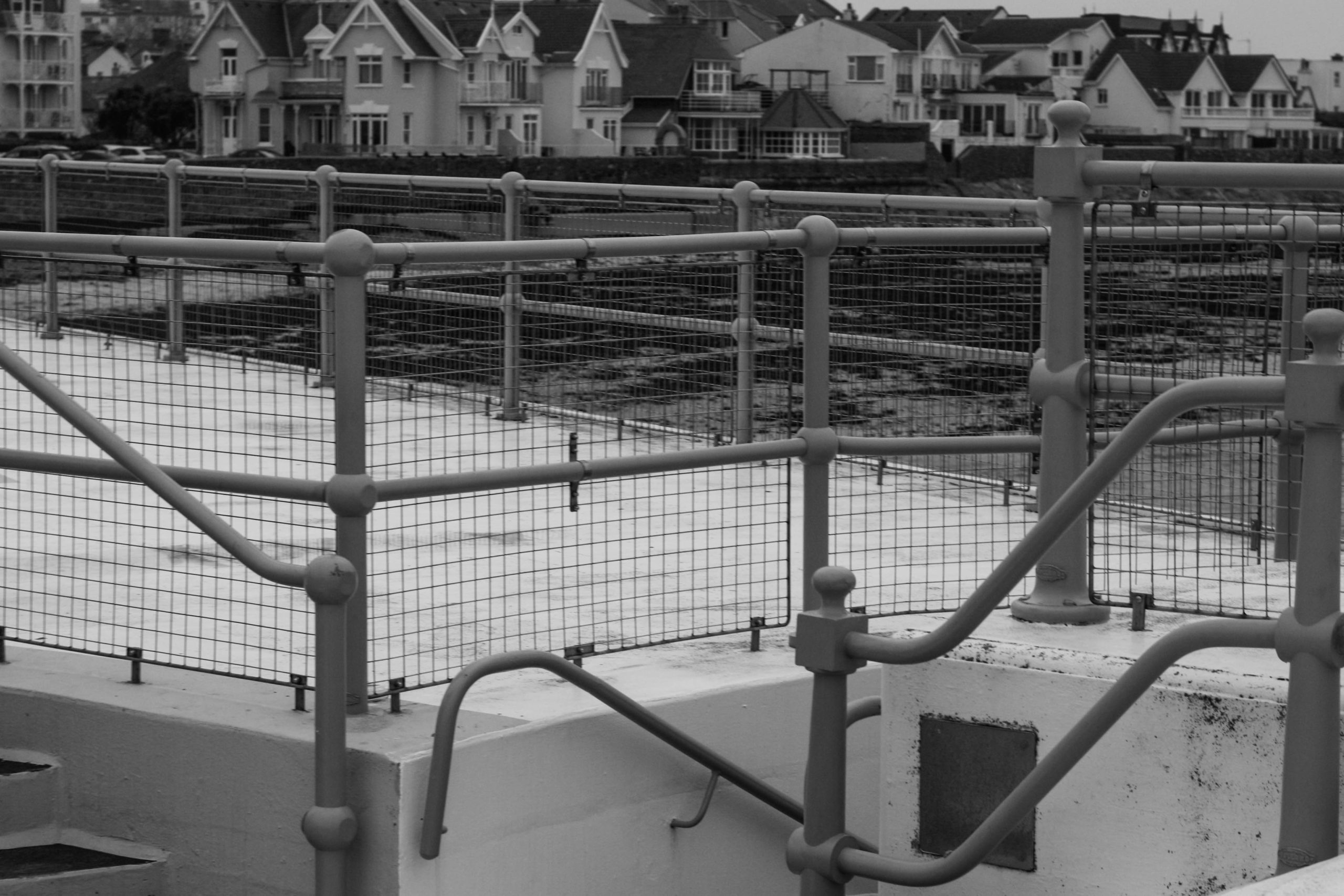
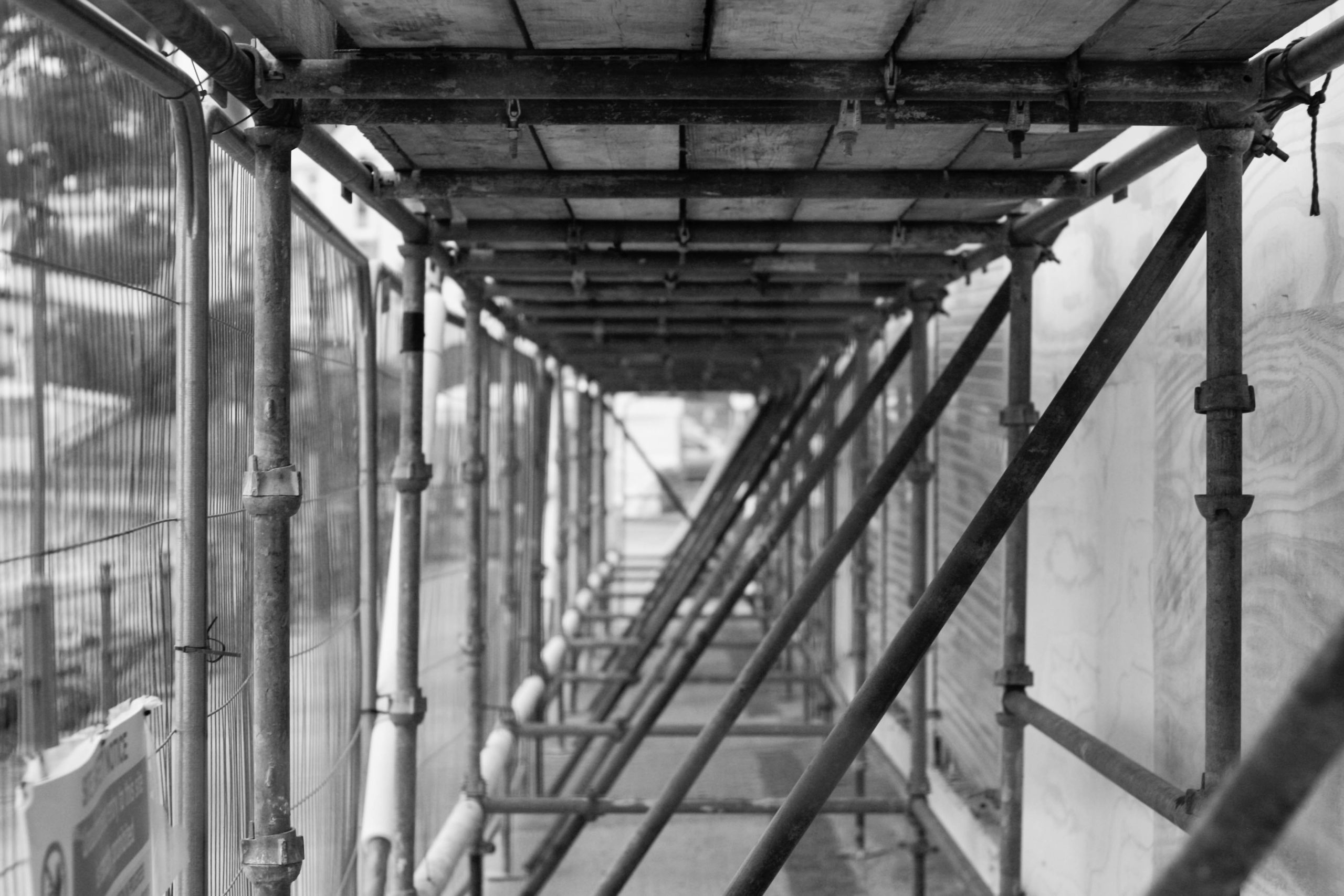
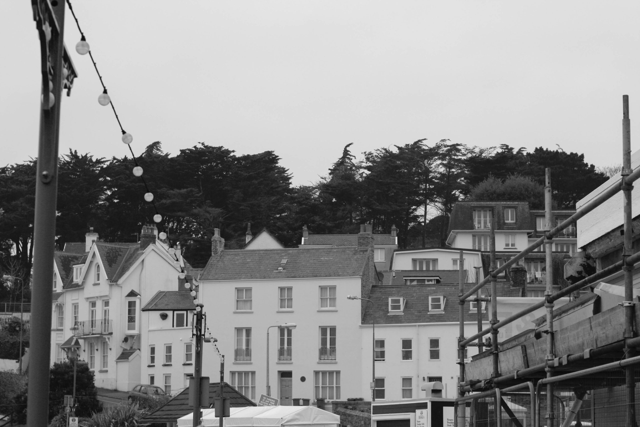
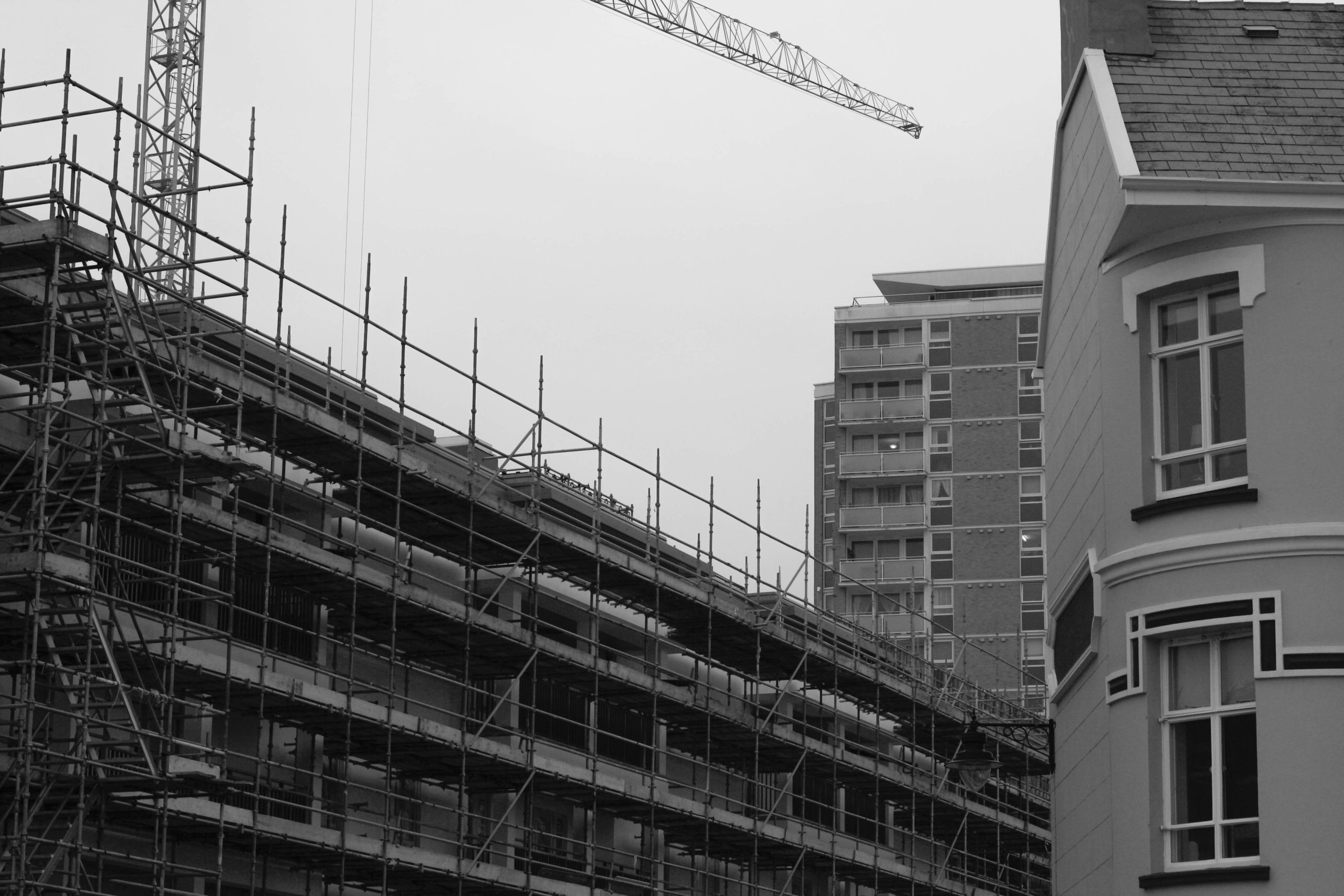
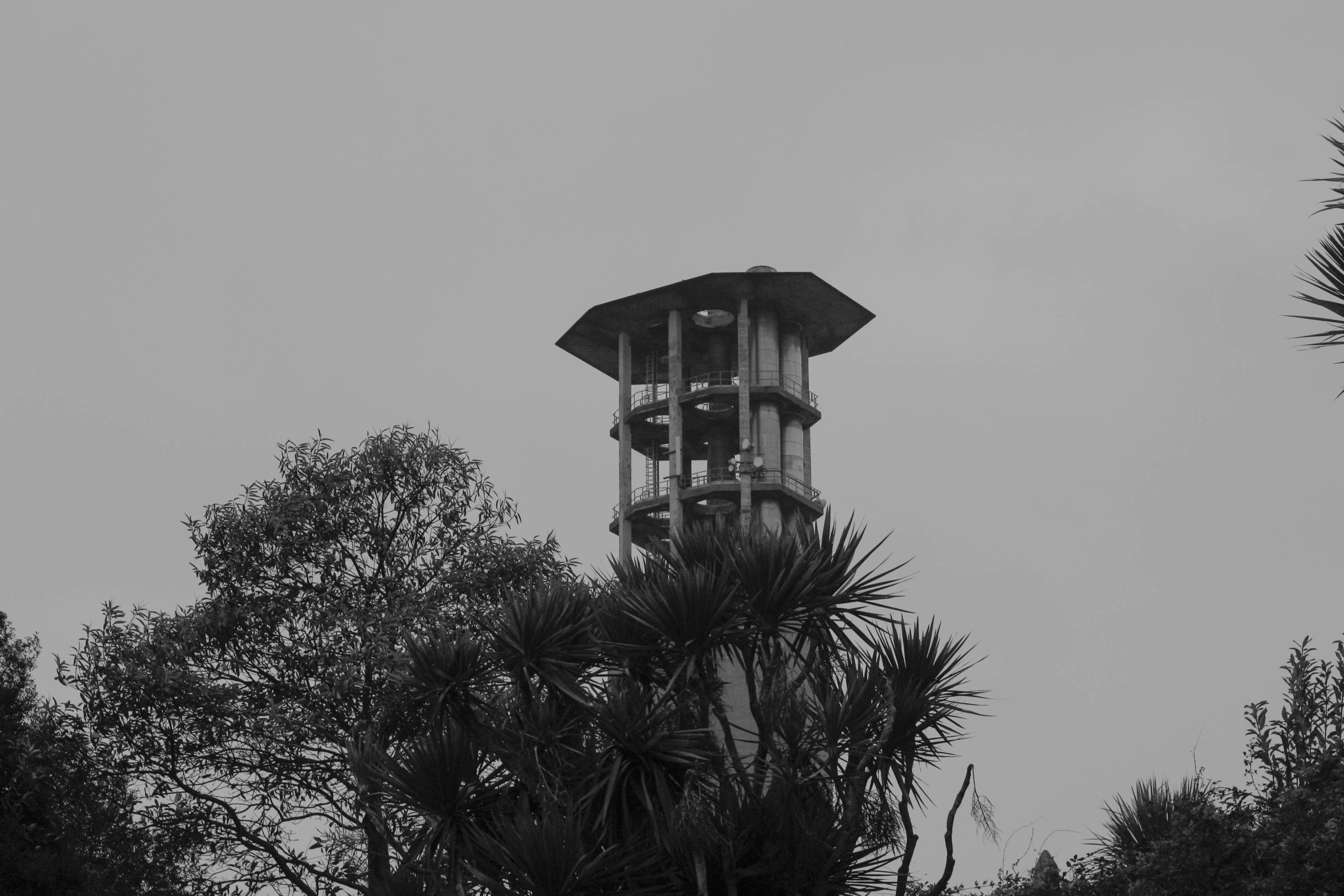
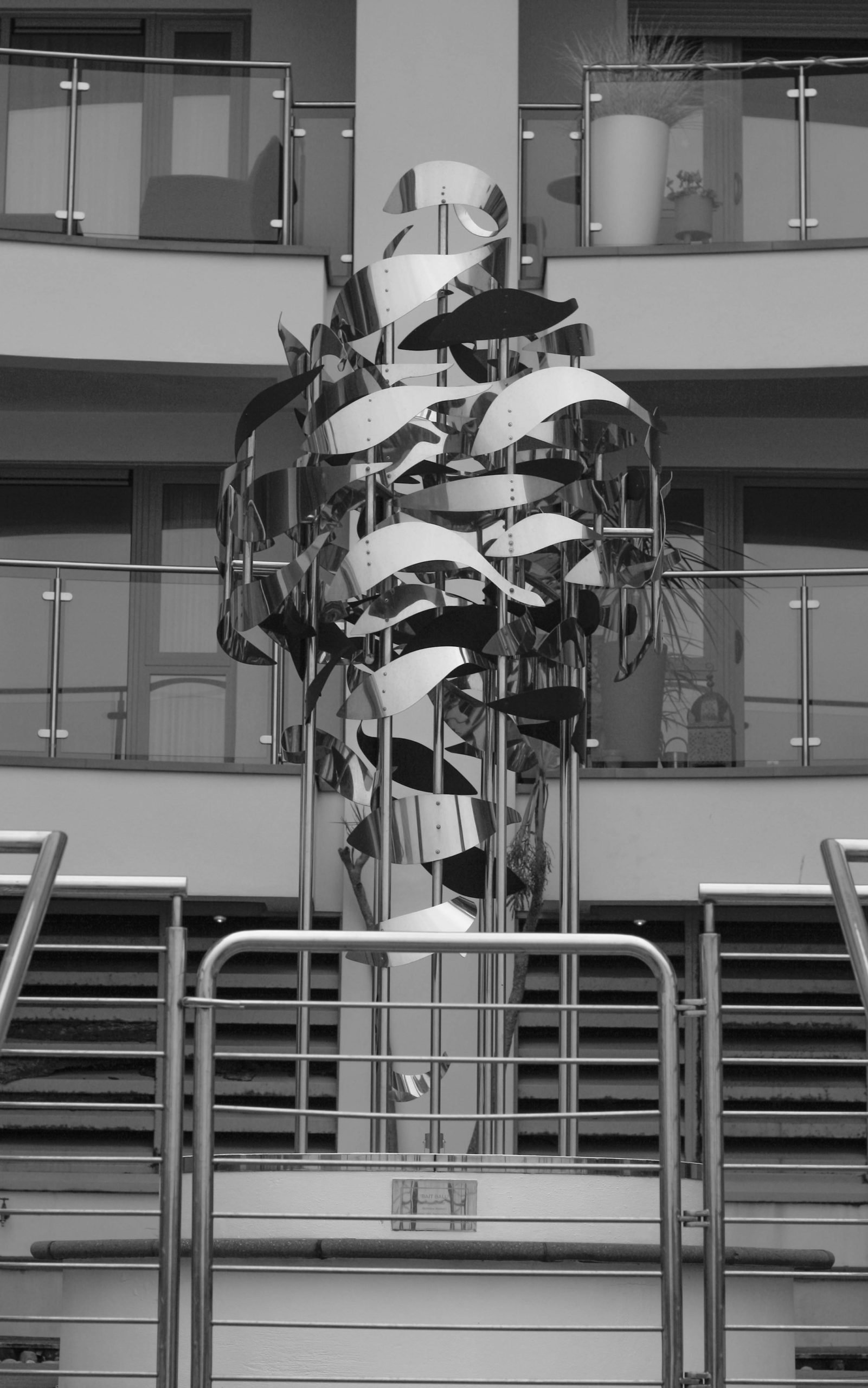
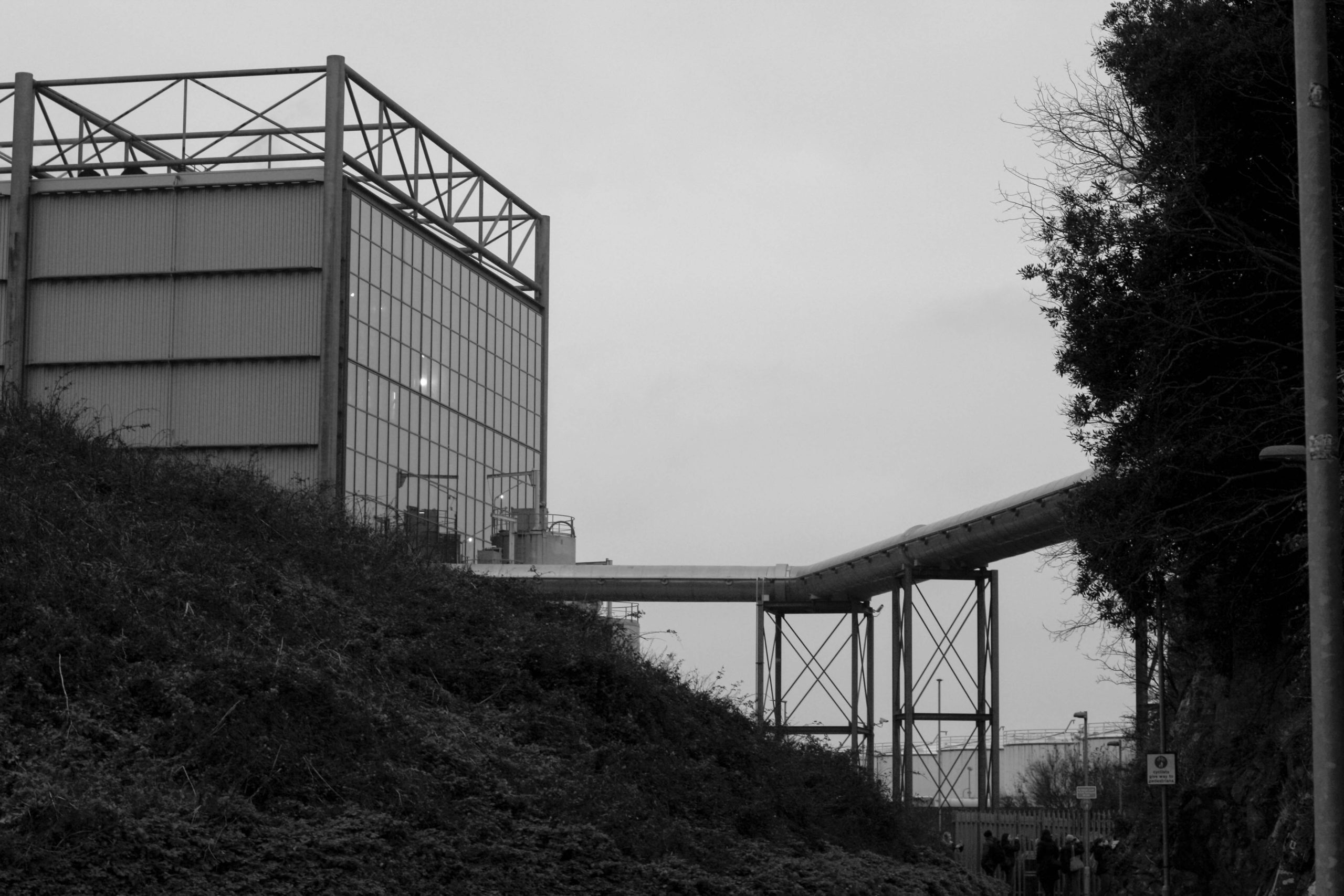
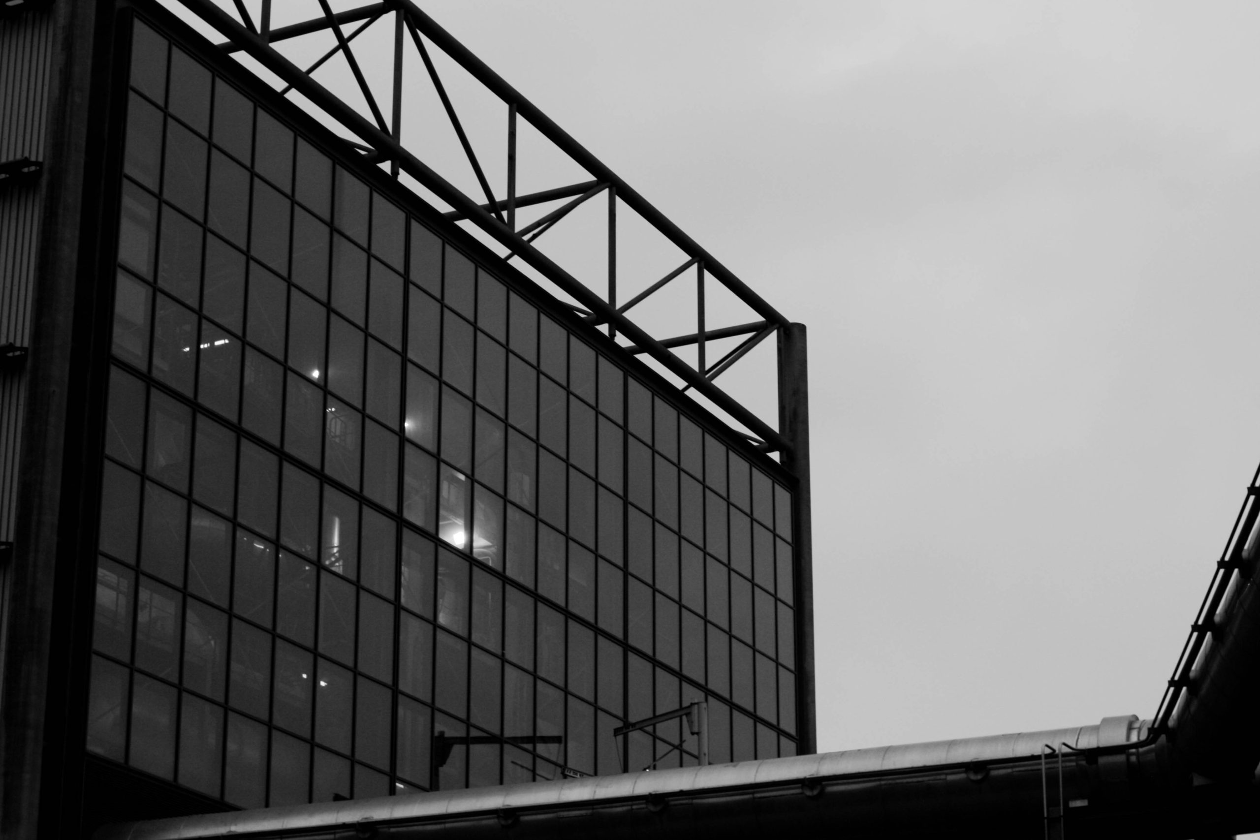
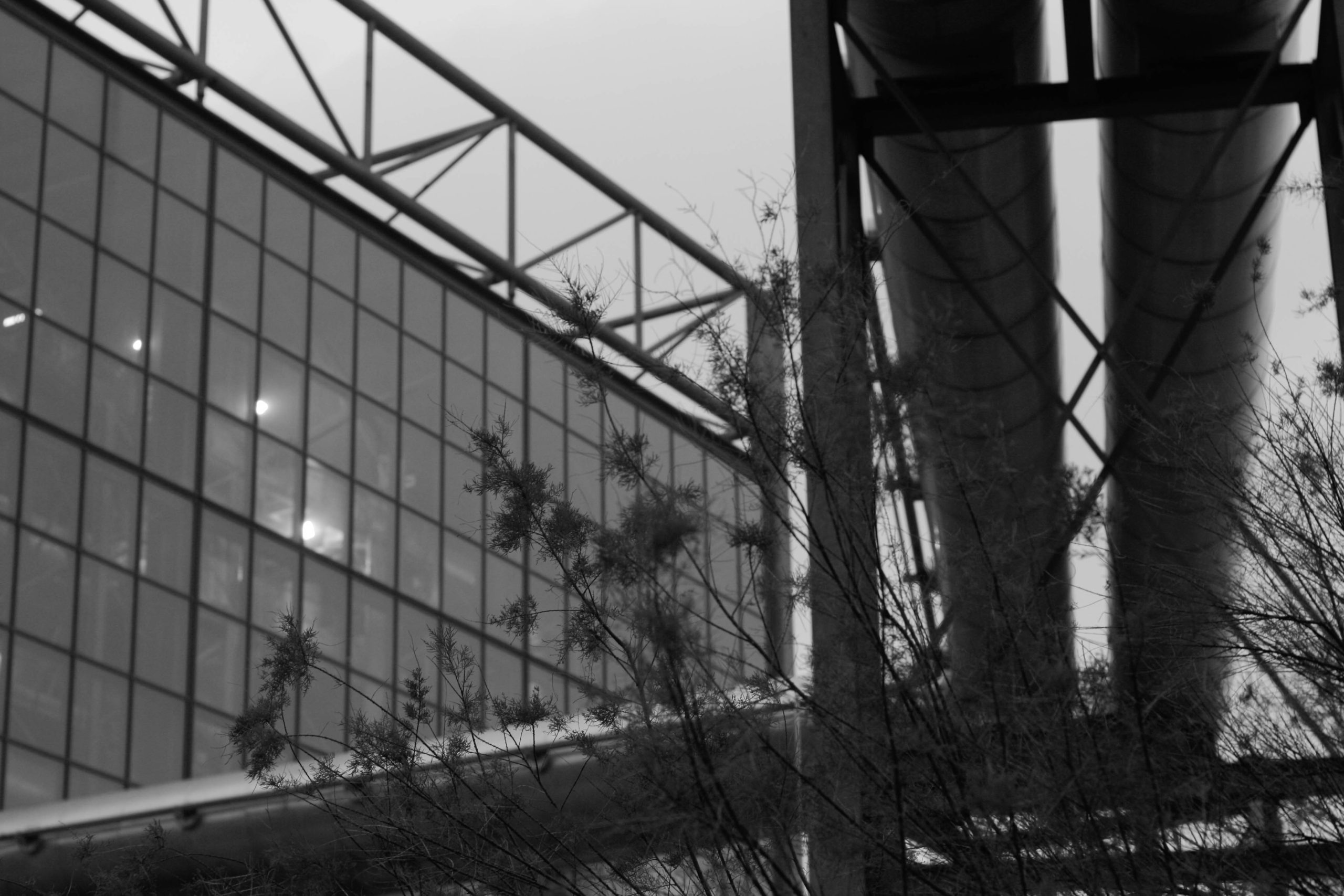
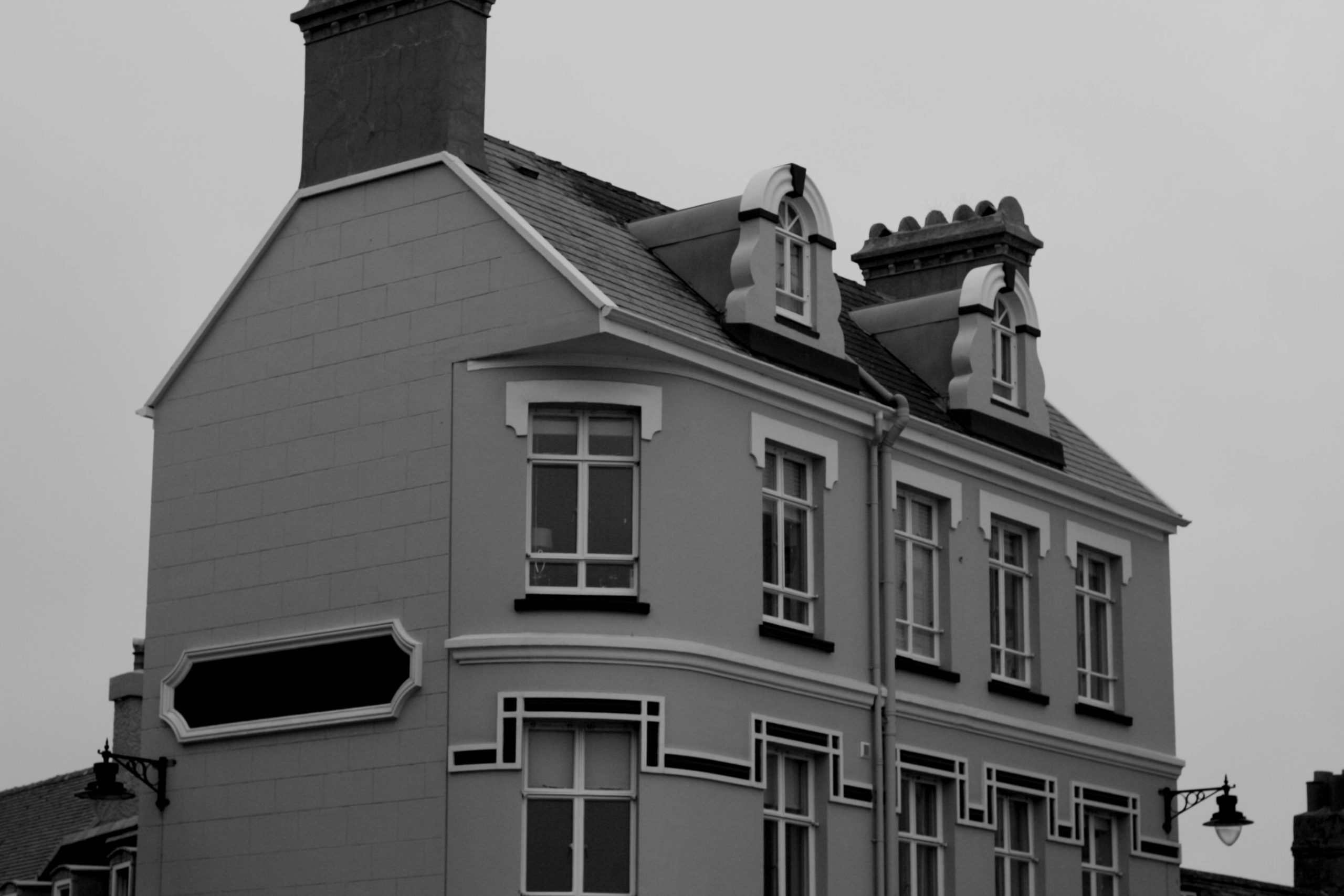
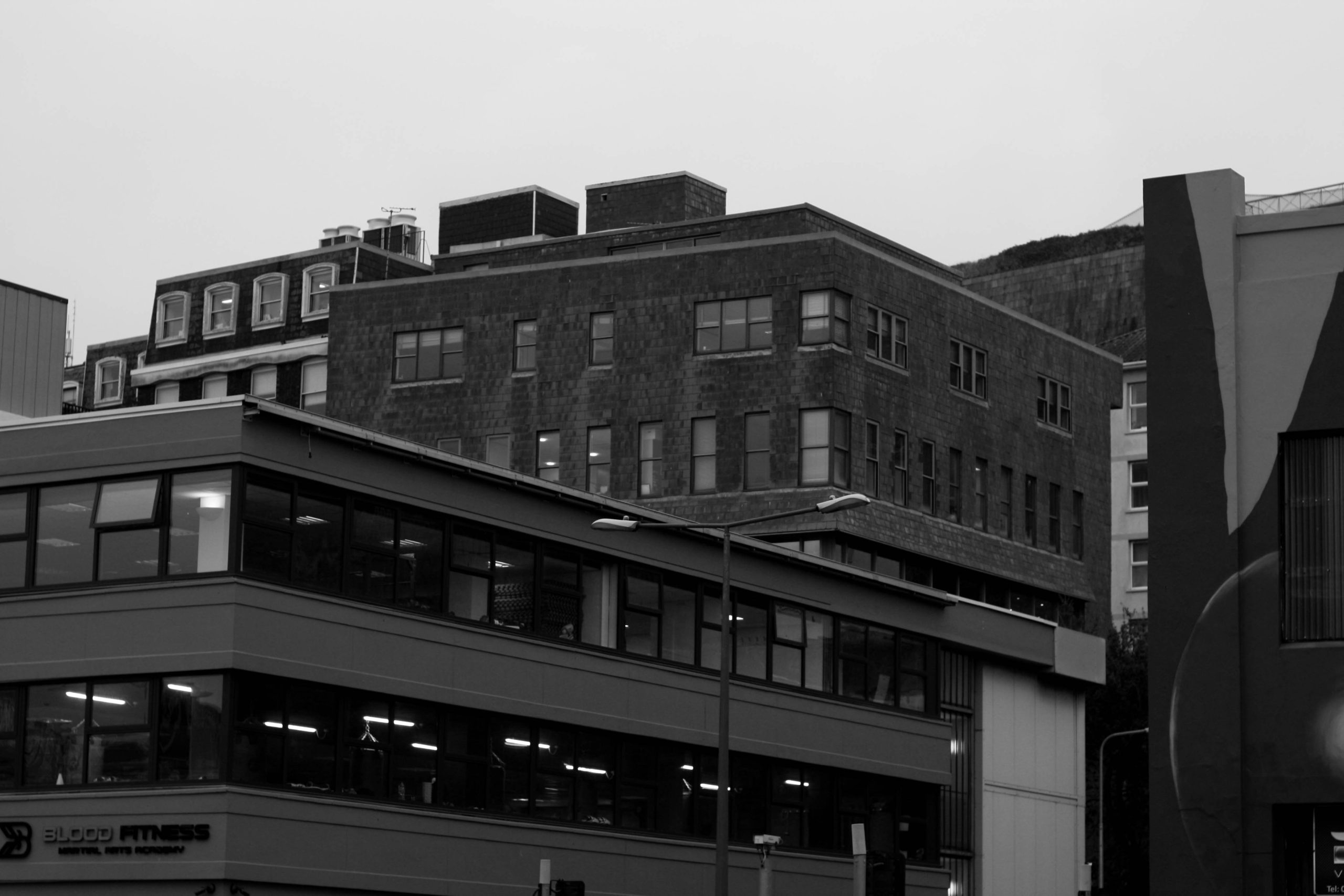
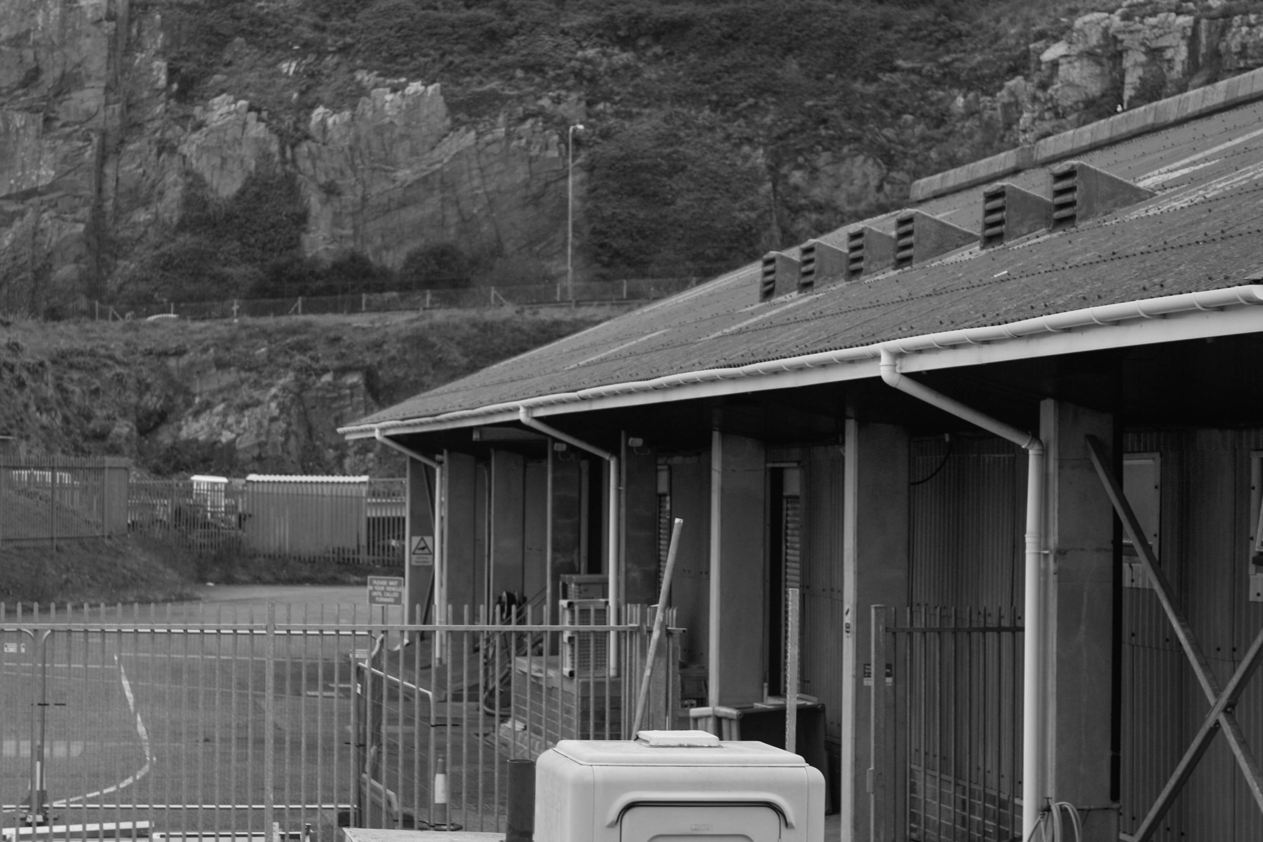
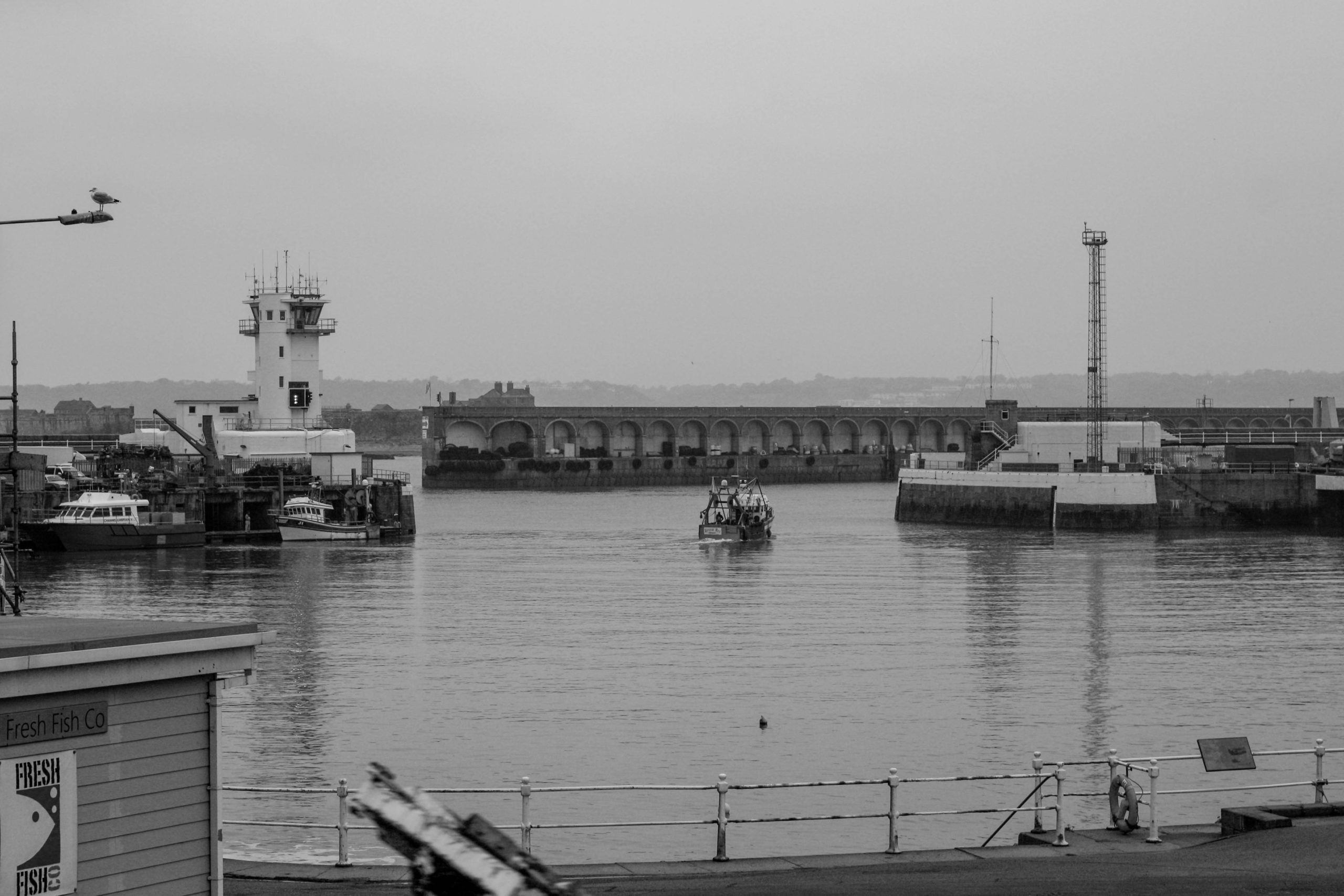
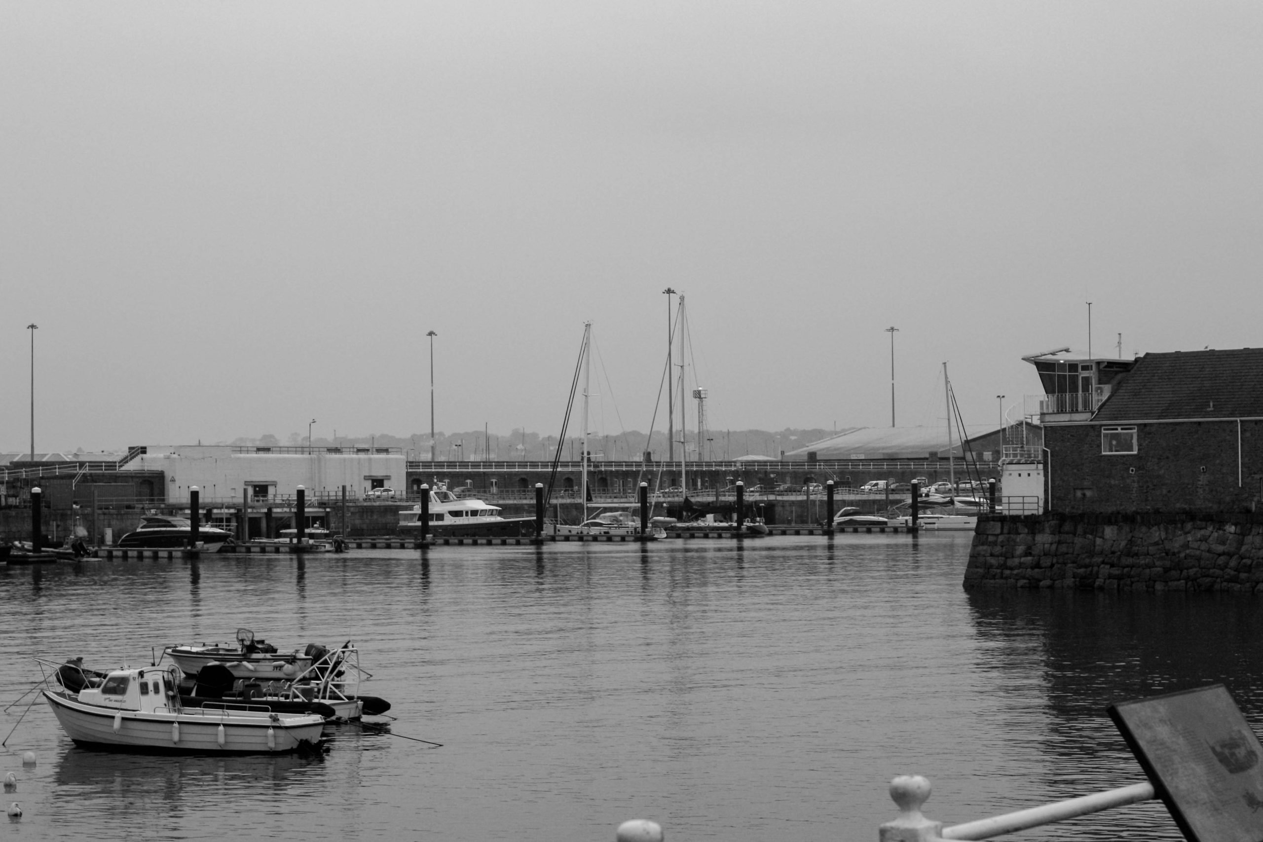
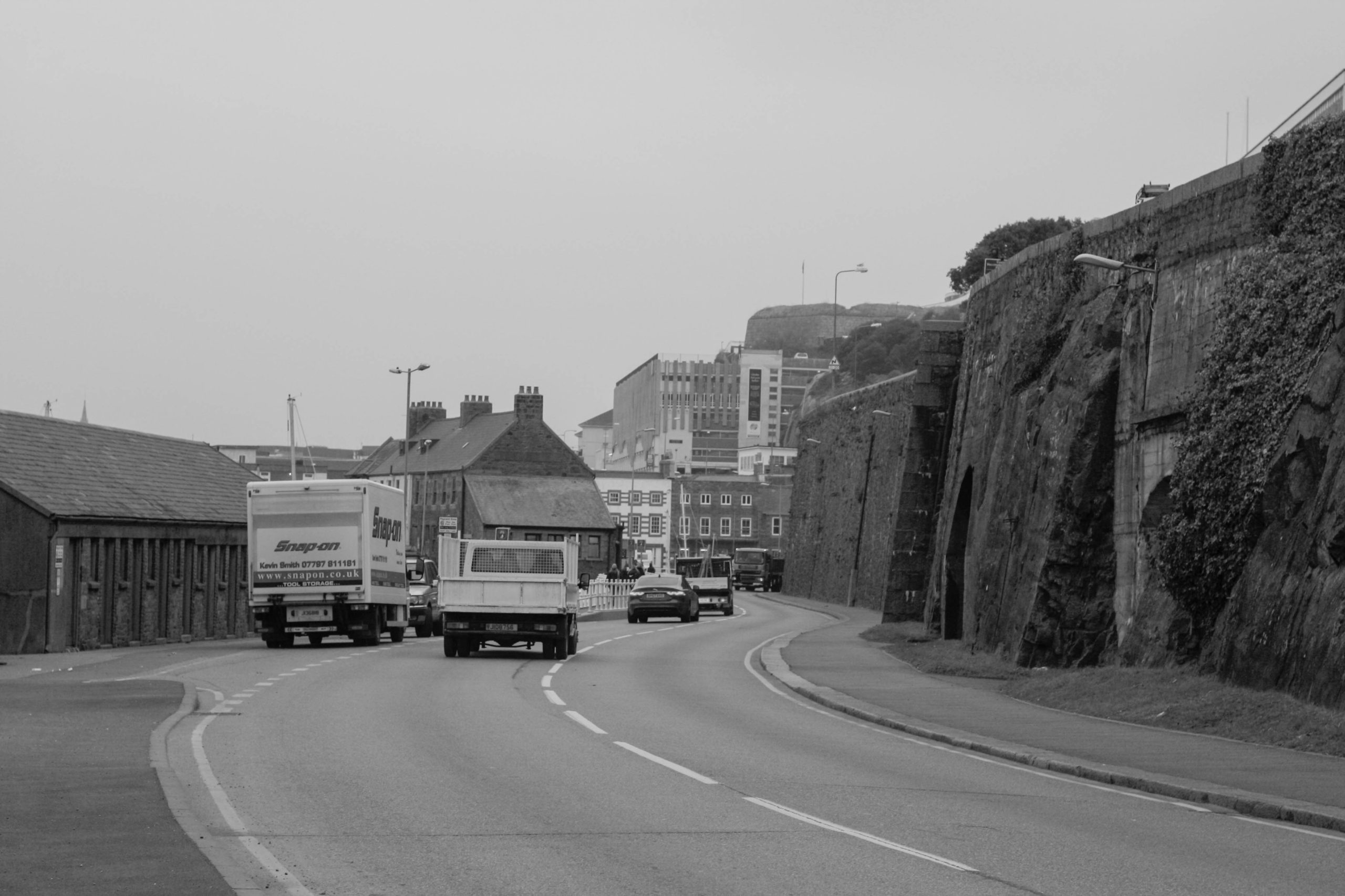
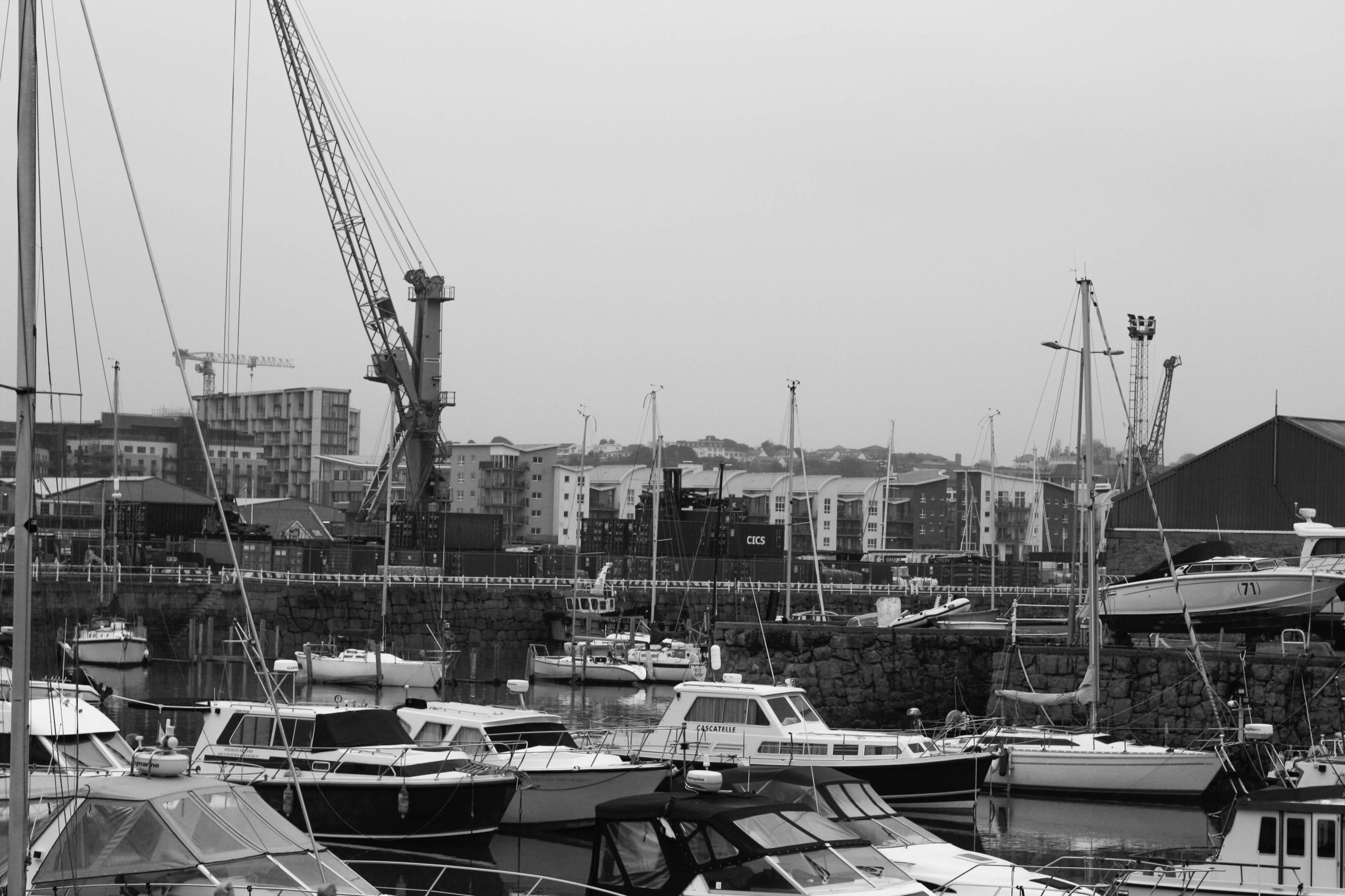
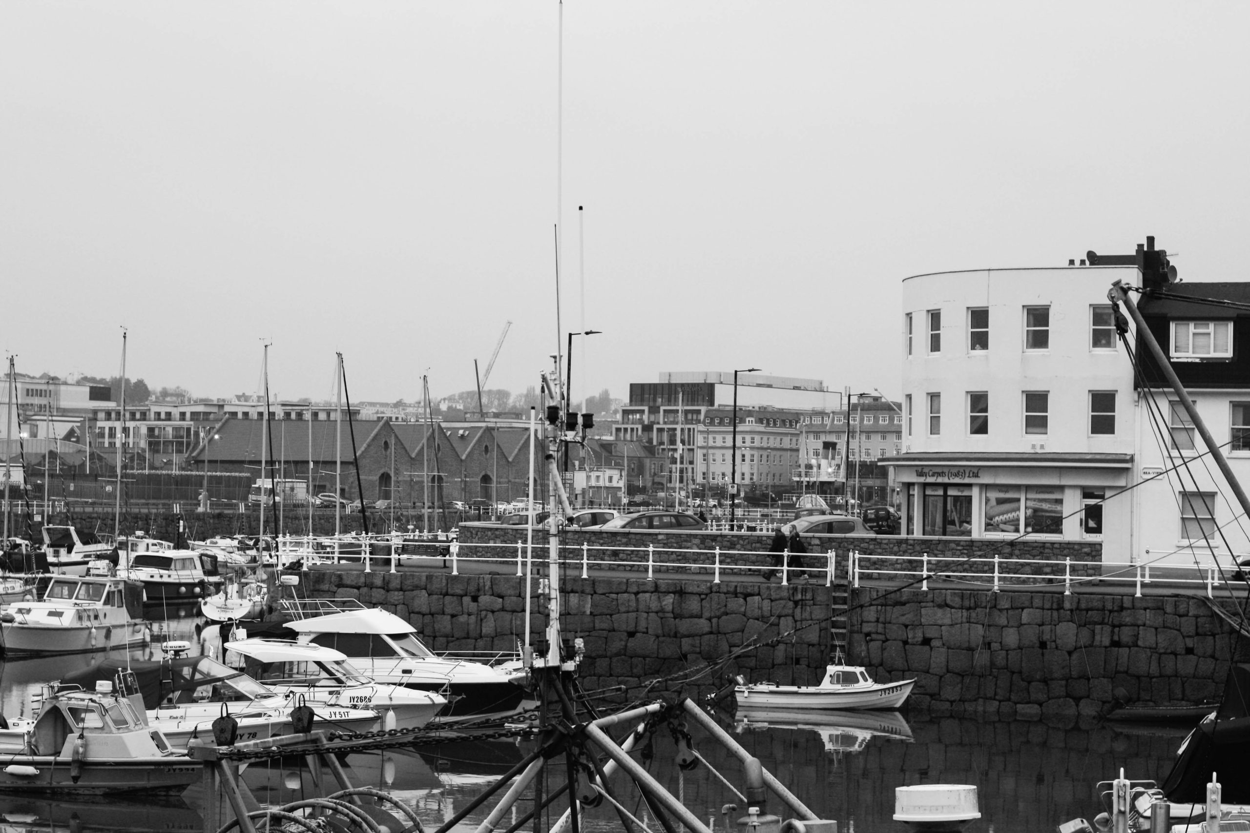
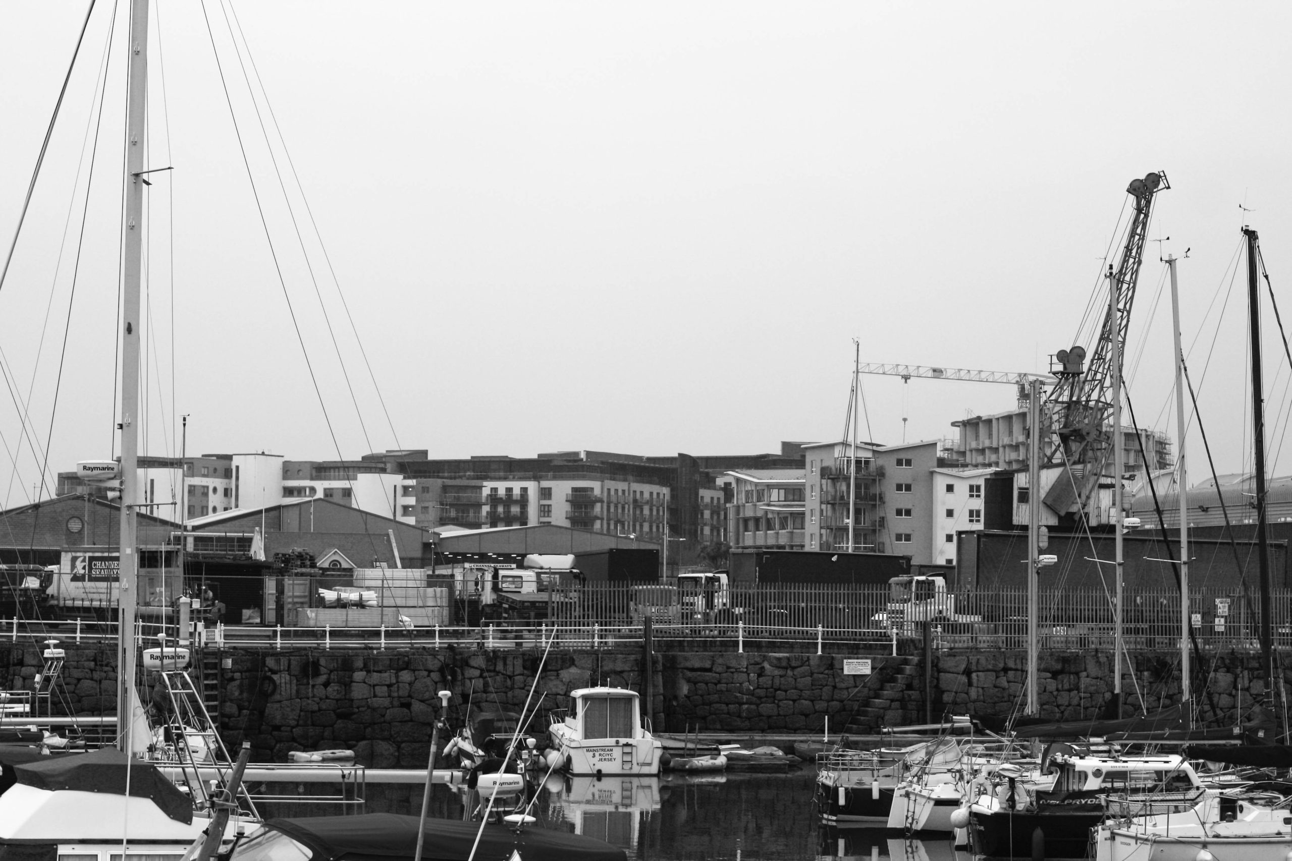
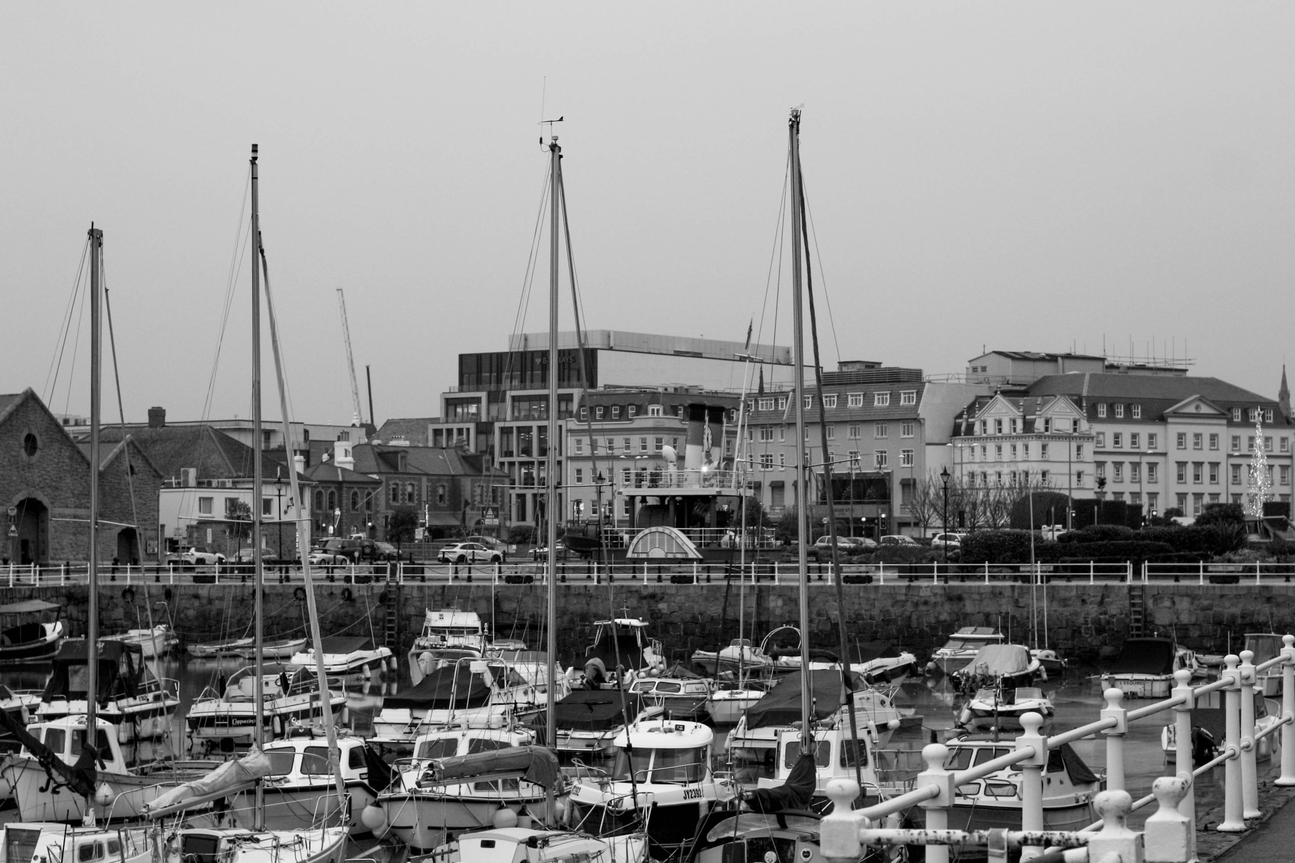
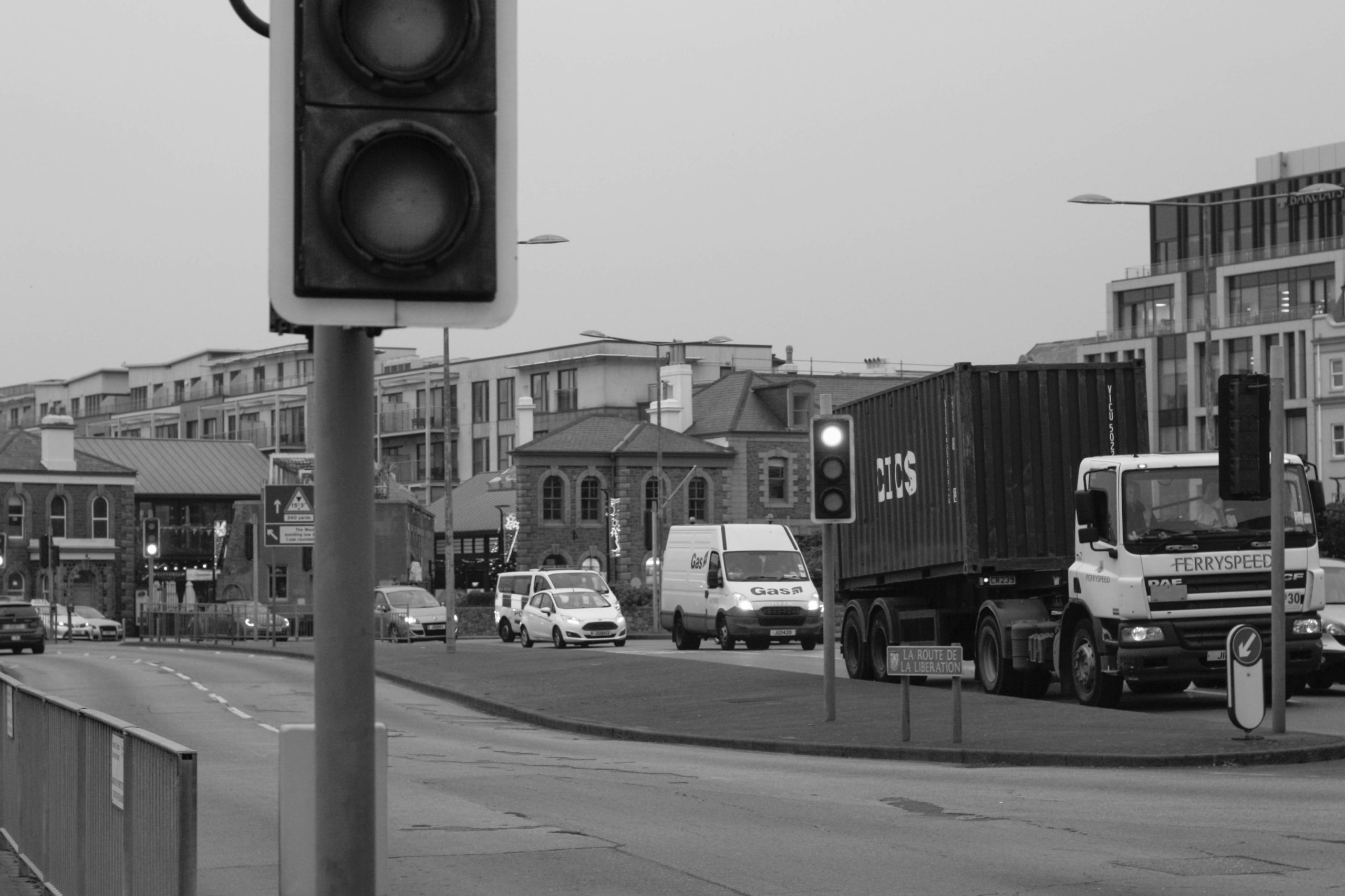
I personally think that all of these photos turned out great and that they featured lots of things to look at. both good in Quality and Quantity. I think the editing has also made them much better and enhanced. I enjoyed editing these as much as I did taking them and this has probably been one of my best photoshoots so far. My favourite ones are the ones that were taken at the top of the hill with the road going down it, showing the view of the buildings going off into the distance. I also love the ones that feature the big chimney alone and ones that show the electricity station as well. Showing the height of the chimney and the station next to it, in addition to the nice green/blue water below.