Here is a link to my photobook, Left Behind.
Final Layout –
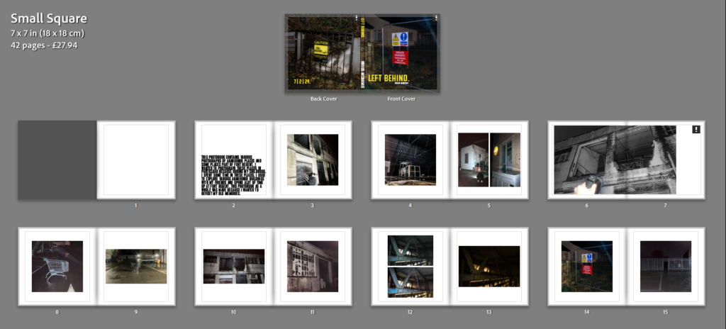


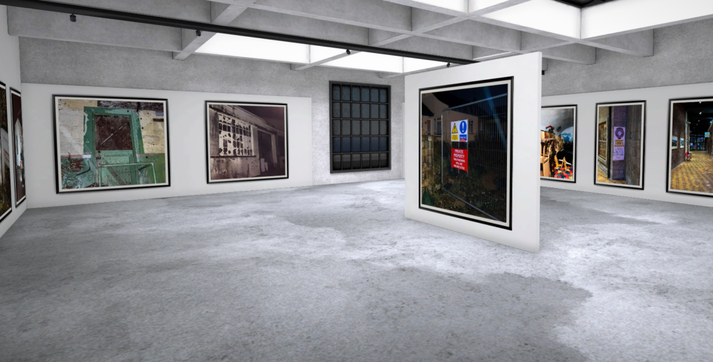


The photobook overall is set to the small square size (7×7 inches) and has a total of 42 pages, a lot more pages I was expecting. The front cover, I wanted the title to be simplistic and nominal, of course I also chose a text colour to stand out from the dark image. I also put the date of publication on the back. I liked the font because it looks bold and serious, similar to the text you’d see on a sign telling you to stay out.
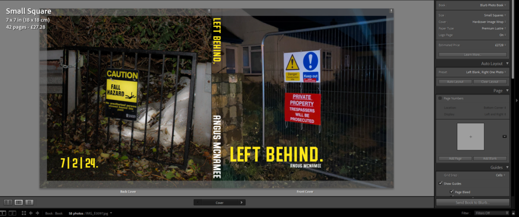
For the photobook, I wanted to feature mostly square photos placed in the middle of the page. I feel this makes the pages feel more professional and nicer to look at, it also makes the images print out at a higher quality. I selected these two images because they both feature a fence and some form of un-welcomeness, with the signs and the dark doorway.

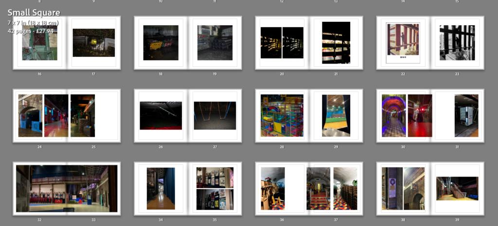
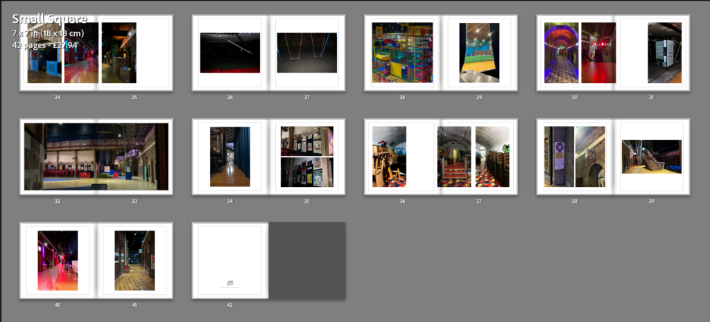
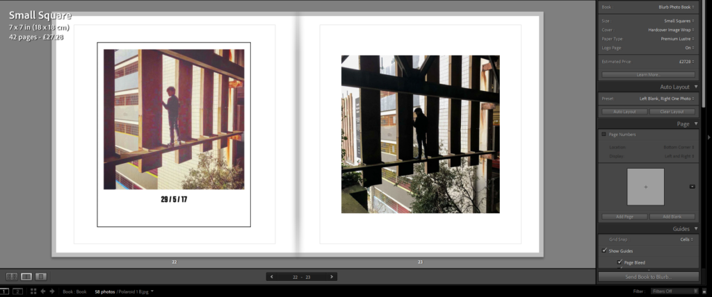
For this page, I wanted to put the images of the same thing but with different colours, I felt it made sense and made the order of the images tidier. I also did this for the page with the polaroid too.
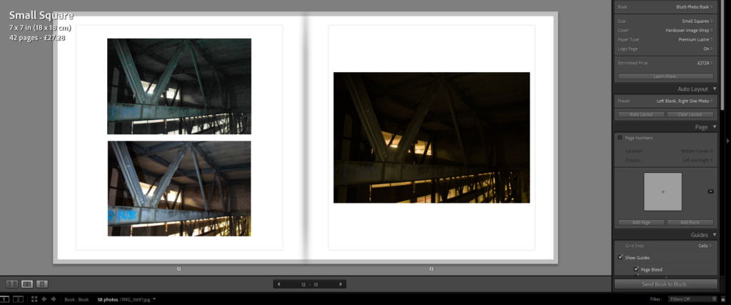
For these pages, I wanted to mix the layout a bit to cause less repetition. They also matched the same sizes too so It made them fit better together. The image that goes through the gutter makes the photo more interesting to look at while not differentiating too far from the general style of the book.
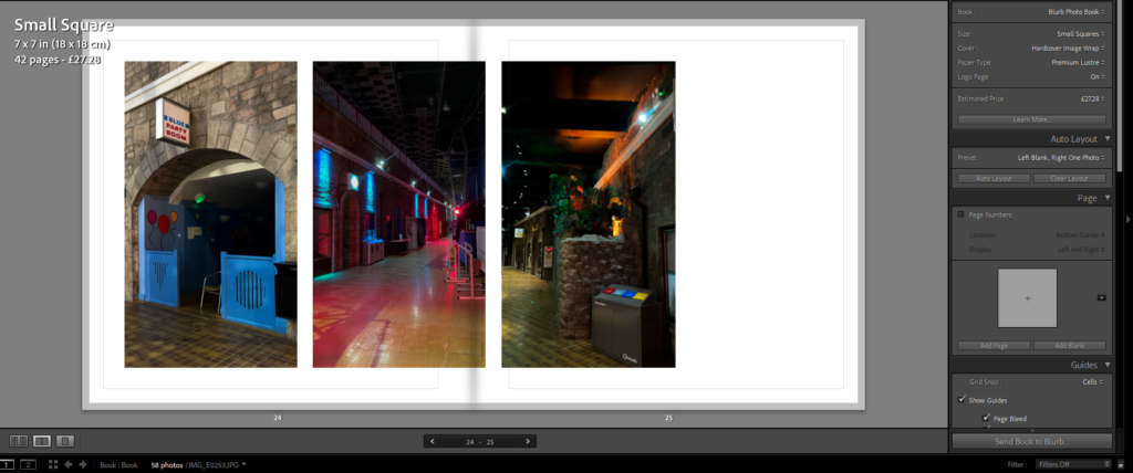


These pages, because they feature landscape photos, have the photo stretch over the middle too. To emphasise that of the long subject in the photo.


Abandoned –
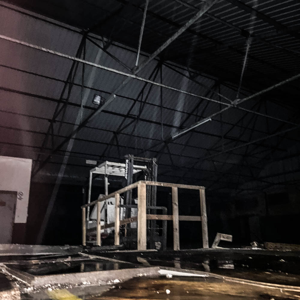
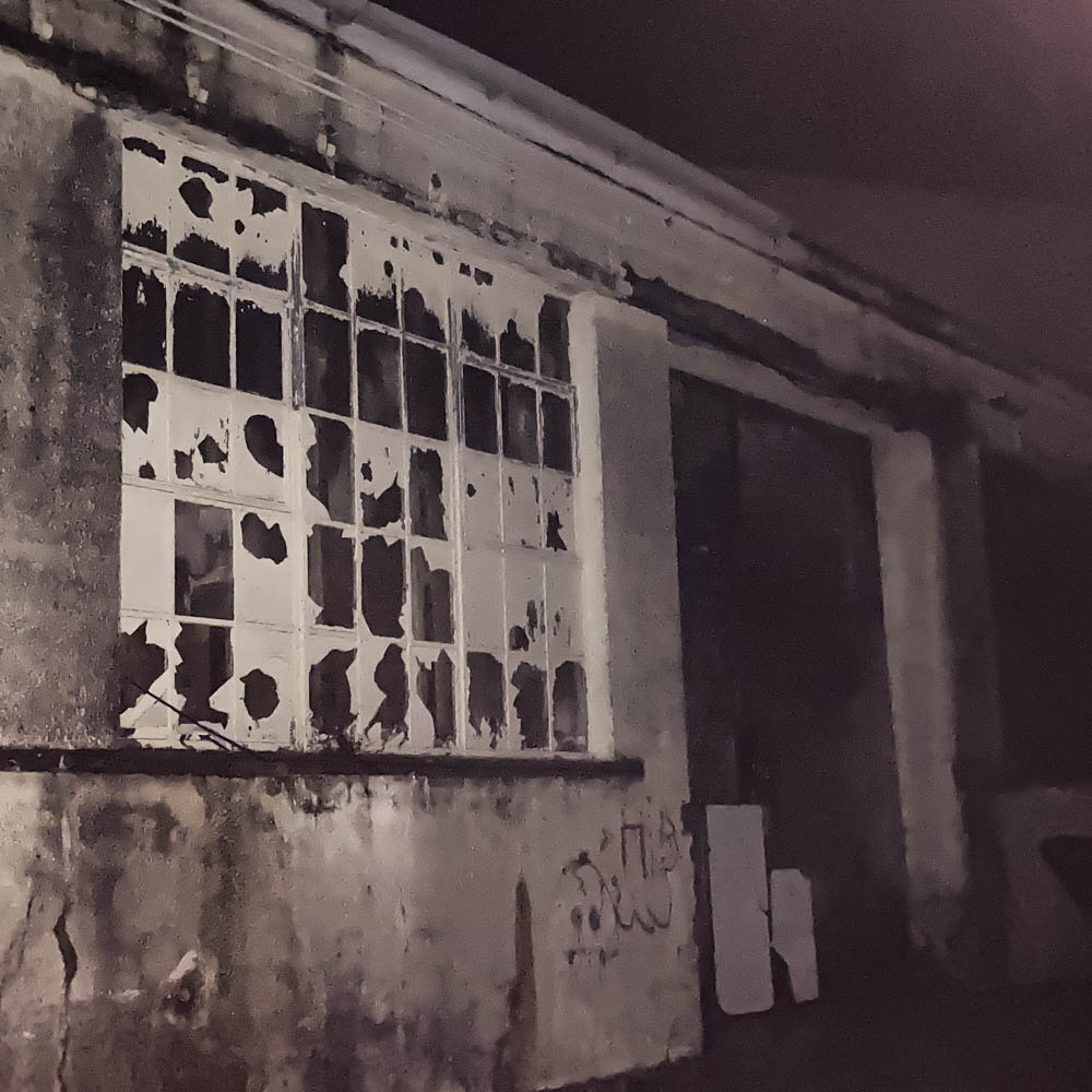
I wanted to capture the overall gloominess and decay of these buildings, I think I did an excellent job on portraying that. The photos, however, didn’t come out as good as I wanted them too. Lots didn’t have great clarity or quality, but that’s mostly because those ones I took on my iPhone. Next time I will strictly use my camera.


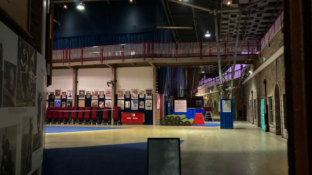
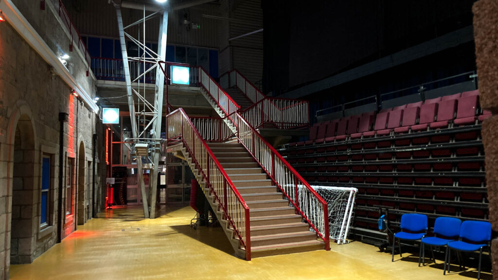
Fort Regent –
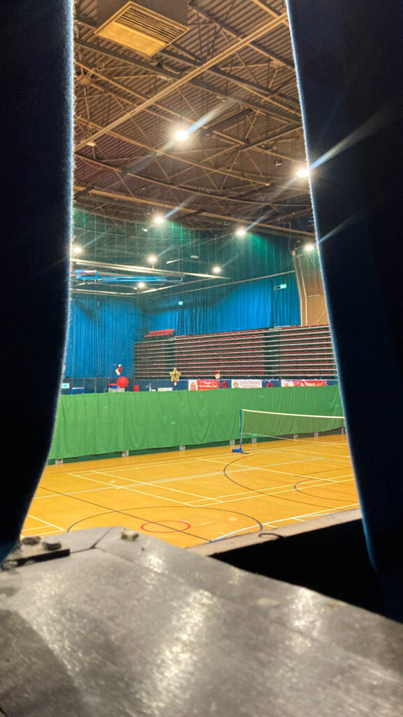
I like the luminous, spacious and overall empty and quiet these images appear to be. Something I made sure to feature in these images, to reflect how the fort really is these days. I like the lighting, angles and rule of thirds I used when taking photos of the empty corridors.


Overall I think I did an okay job. I wasn’t too satisfied with my final outcome because I never even started on the other photoshoots I said I would do. The main reason was because I was never really engaged or interested in these things, which is a terrible starting mindset, especially for me. As said earlier, most photos were taken on my phone because I just couldn’t work with my camera and get it to work the way I wanted it too. Next time I will have a fresh minded approach and stick to one device for taking photos, as it makes it much easier to do and produces much higher quality photos.

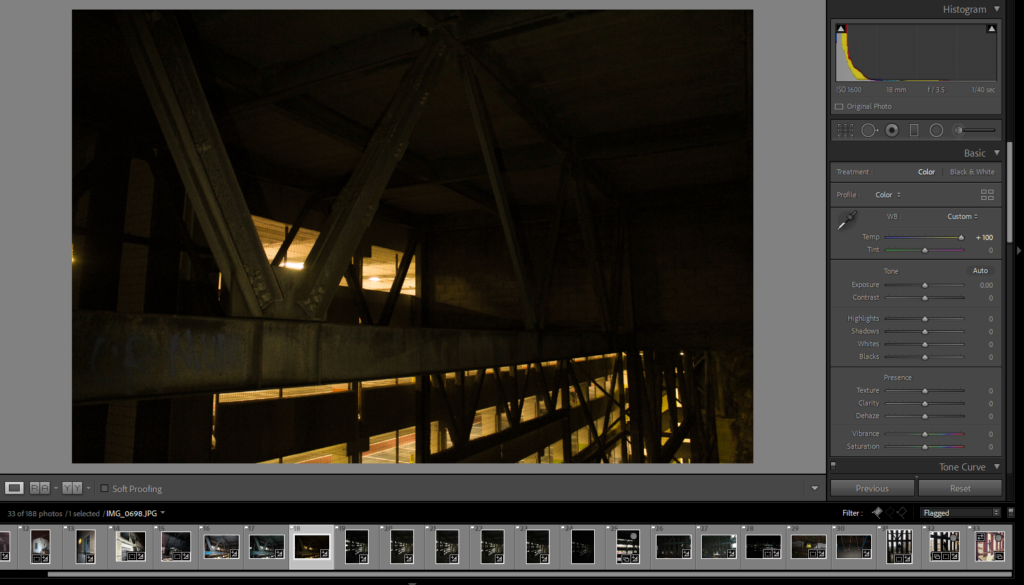
Editing process of a handful of photos in my Fort regent photos collection for my upcoming photobook.
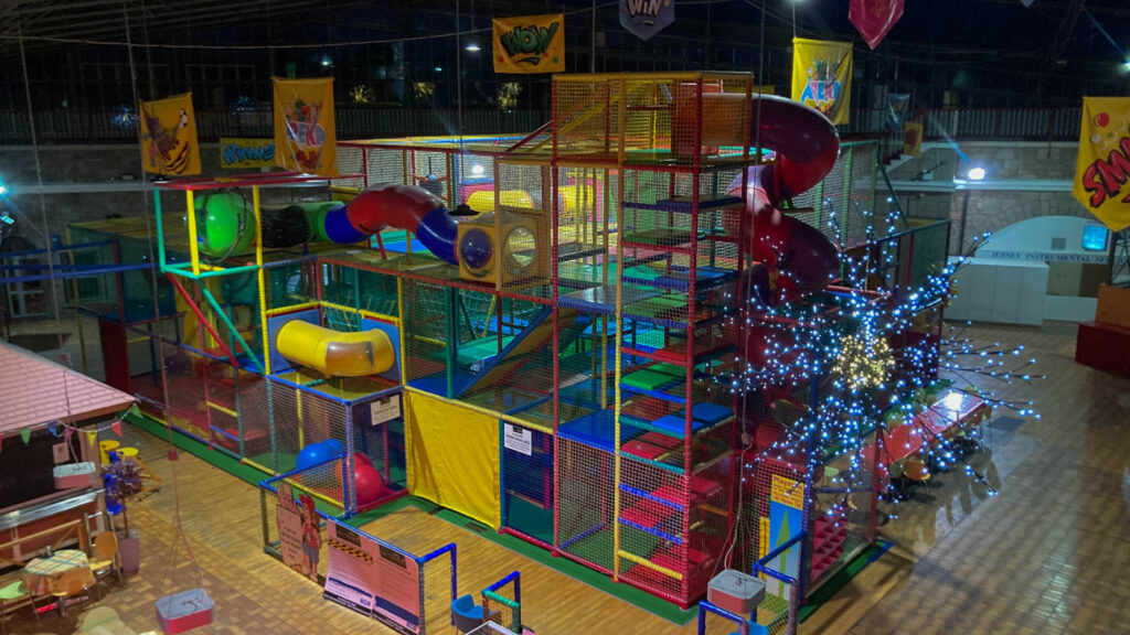
Fort Regent, what was once an iconic leisure centre, full of excitement and fun, is now a mere fossil of the past. While it remains open, Fort Regent hasn’t received much attention for the past few years, the hallways and corridors which used to have echoes of children laughing and cheering are now silent. The jungle gym which used to be full of children, empty. And all the cafe’s and restaurants, closed. Fort Regent, since it peaked many years ago, has only declined and will likely never reach the point it used to be at ever again. I wanted to go up and take some photos to revisit some old memories and to show the aging of the fort.


The sign above is my best example, the moss on it has been collecting for decades and started to cover some of the words too, I adjusted the colours a little to exaggerate this. In addition I made sure the trees behind it were visible too, to give off a more dead look. Of course I changed the lighting levels to bring the sign out more and darken everywhere else as it is the main subject.


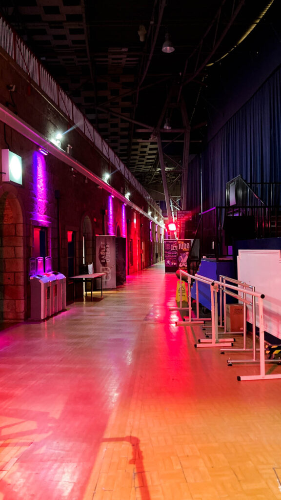
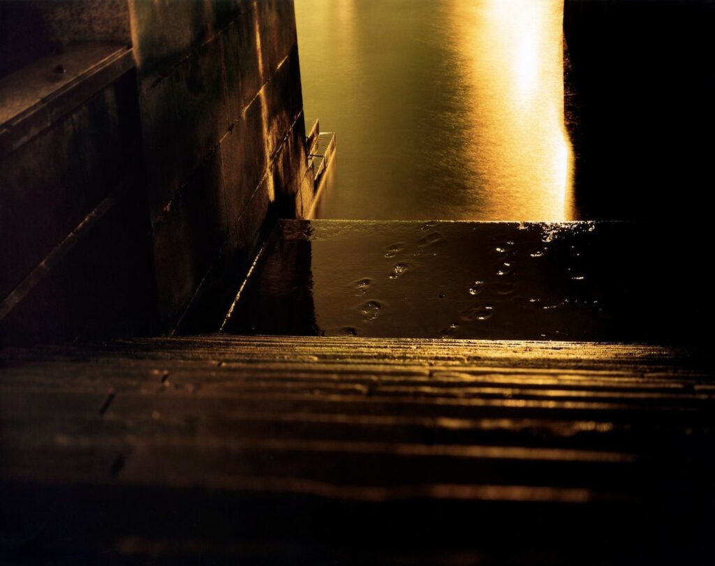
I wanted to darken this image to bring the coloured light out more, this light would constantly change colour and I always used to like it, so I wanted this photo to show that.

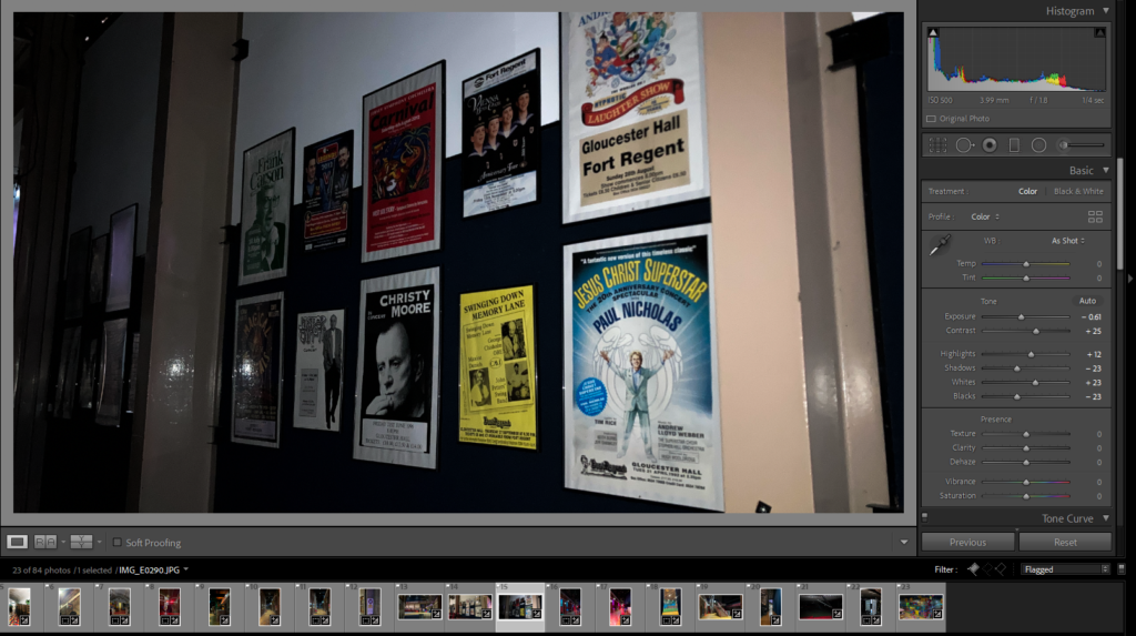
This is a collection of posters, about shows and events that would take place at the fort, since not many things have happened lately a lot of these posters are very old. I wanted to darken this image and make it look like a torch is being shined on the posters, to almost make it look as if the viewer is looking into an old dusty cupboard full of old pictures.


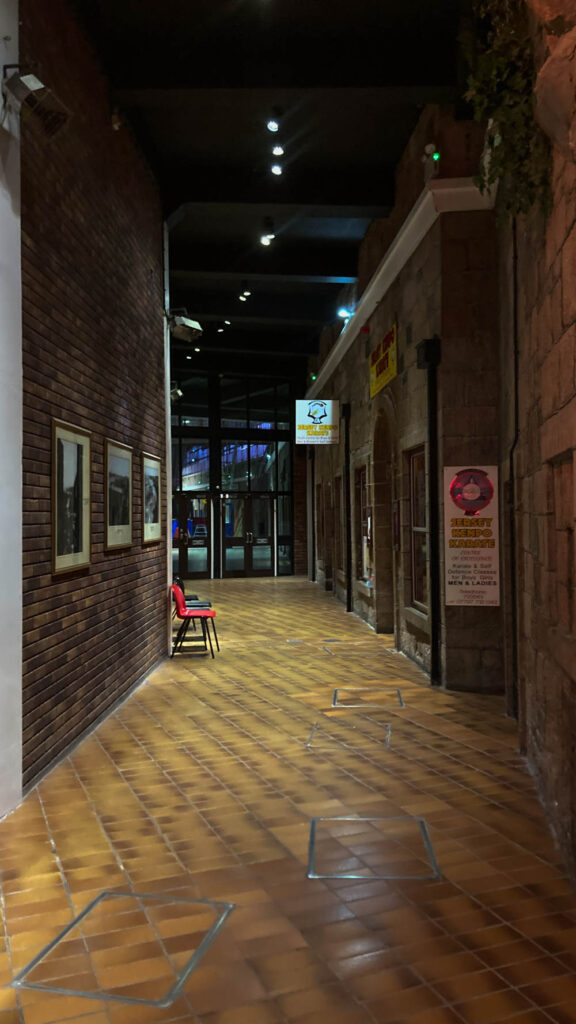
I wanted to make the lights in the hallway brighter and more vibrant, to reflect that of how I remember them when I was younger. I also remember the very dark ceiling and a bunch of random tools and gear left out in the hallways.

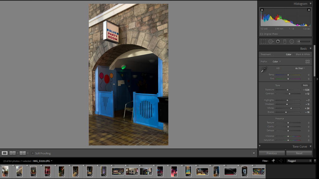
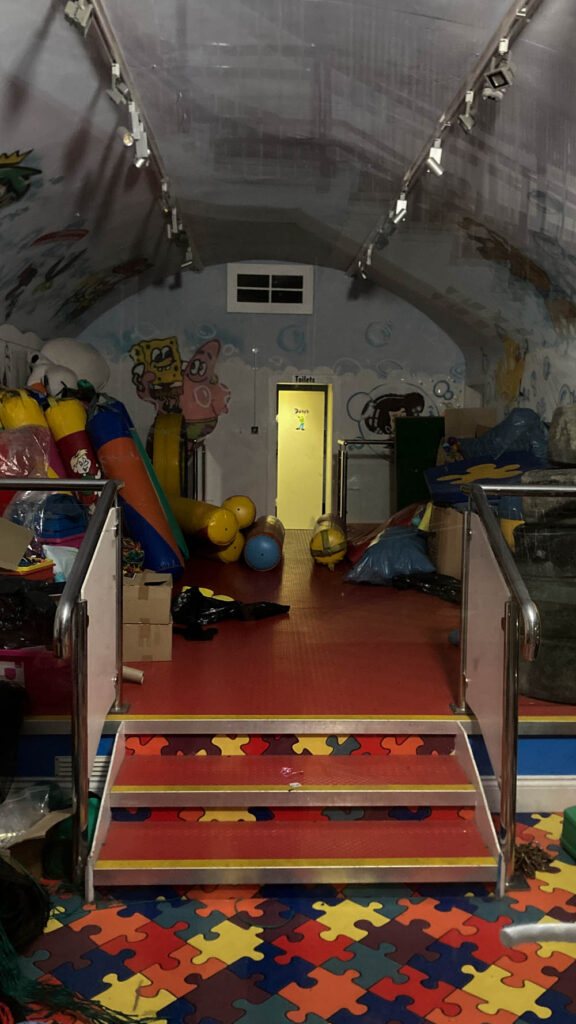
I made sure to zoom in on the party room, and to make the entrance slightly darker. This was in attempt to convey the idea that the room has not been lit for a very long time because the party rooms are, as far as I know, not used very much these days.

Editing process of a handful of my photos taken so far under my ABANDONED chapter in my upcoming photobook.
During my earlier days, I would sneak into a collection of abandoned places throughout Jersey with my friends. I remember key elements that most of the places I visited would share. Such as danger warning signs, dark rooms being dimly lit by your friends torches, cold temperatures and the constant feeling of general unwelcomeness each building gave off, combined with the thought that we were going to be spotted or badly hurt at any moment. I wanted to reflect all of these in my images by adjusting light levels to low, having bad weather and slippery environments, making photos look grainy and damaged and overall giving the photos a sense of eeriness.


I made sure to change the lighting levels in this photo to have the sign appear brighter than the background to bring out the significance of it being the main subject of the photo. Also to imply that a torch is being shined on it. I’ve encountered many signs like this whenever I have snuck into somewhere, always saying something along the lines of “Danger” or “Keep out”. Attempting to deter people and make the site dangerous and less likely to enter, but accidentally making it more intriguing.


I wanted to make this image appear darker, I felt it had a more ominous look paired with the warning sign, to arise a sort of fear for the viewer. I also made sure to make it just bright enough to appear there was a flashlight being shone onto the sign too.
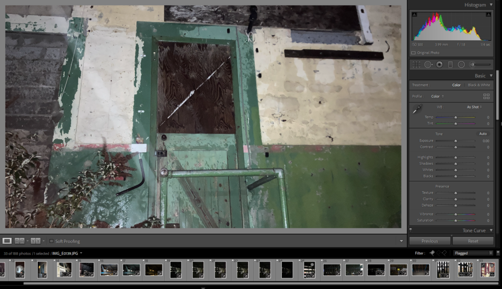

I liked the idea to just cut off the rest of the photo, because the rest was just wall, and make a box aspect ratio. I feel that the less the image shows, the little more mystery it brings about this door. Why has it been boarded up, and when? Where does it go? What caused the giant scratch on it?
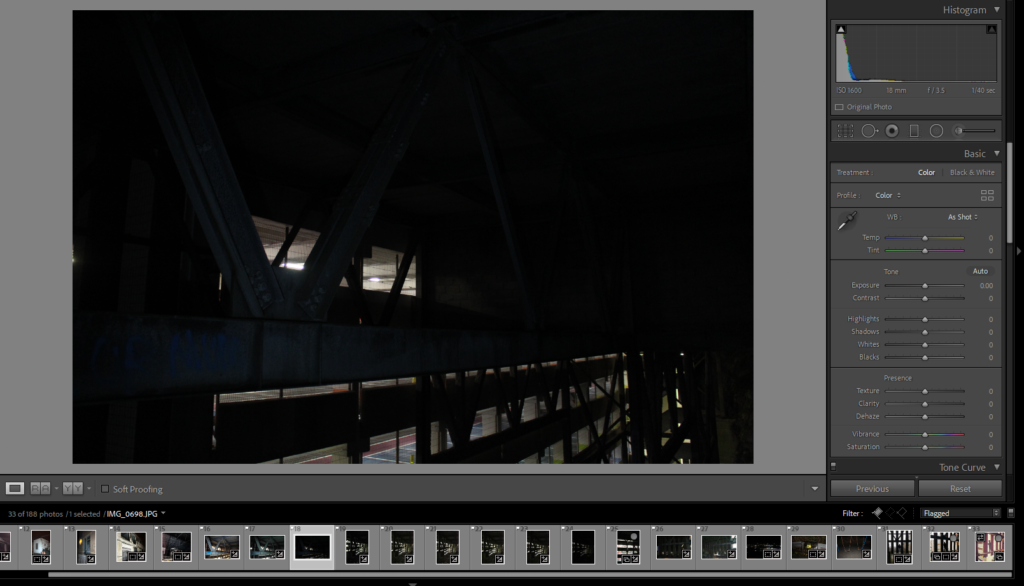
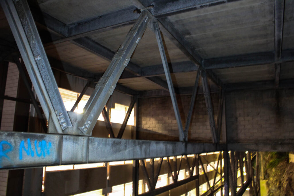
I wanted to bring out the lights in the car park more, and make the steel beams more visible. I felt that by making the lighting more yellow it made the image look more appealing instead of just plain white, I felt it made it more cinematic looking too.


I wanted to also make this have a smaller aspect ratio because it focuses more on the doorway. I made the photo darker because I wanted the photo to look scarier and more serious, it makes the doorway darker and less inviting because you don’t know what is through it. I made sure the photo was straighter as it makes the fence look better and more satisfying to look at.
Who is Peter Bialobrzeski?
Peter Bialobrzeski is a German photographer, who’s work has dipped into street and urban photography. A topic I am intending on featuring in my mock exam and essay. His city photos are what mainly peak my interest.

Career
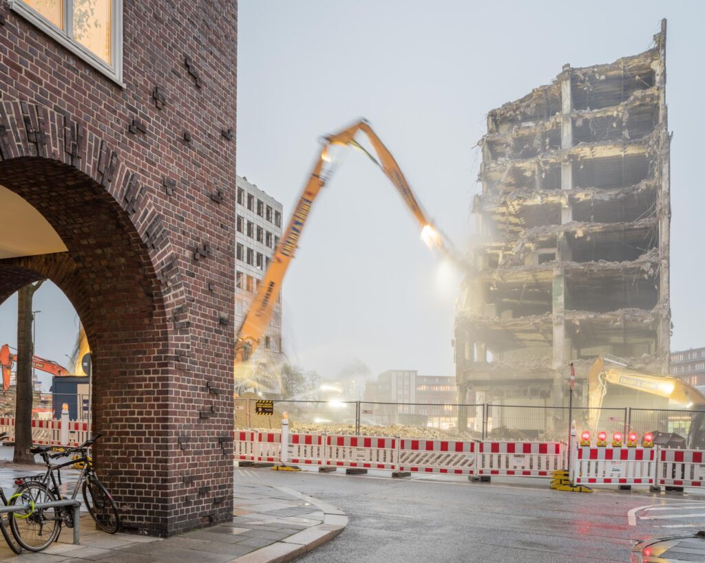
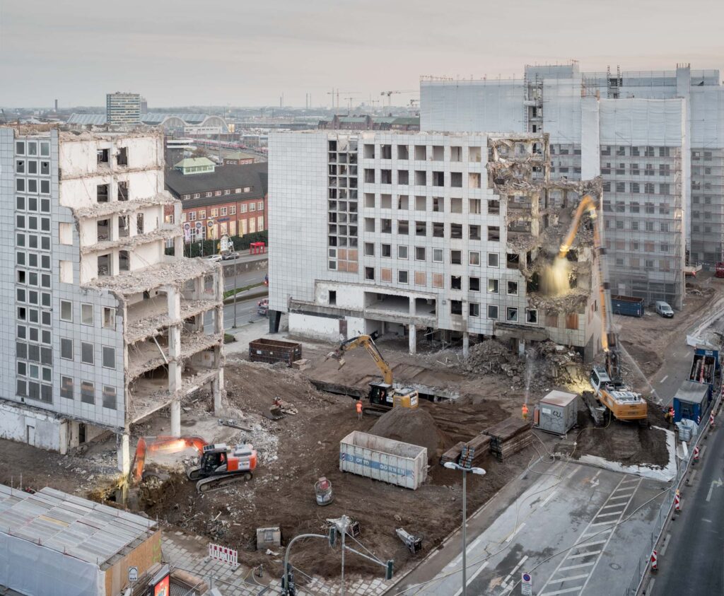
His city photos, in contrast to Luxemburg, are mostly captured during daylight hours instead of night time. His photos feature lots of run down, demolished and abandoned buildings.


Visual
Each of these photos have buildings which have been abandoned and left to decay over time, which looks to be a very long time given the lack of care seen on the buildings. Also due to the fact that newer buildings in the backgrounds of some can be seen, which implies that these abandoned ones have been neglected and ignored. The destruction and crumbling to the buildings walls, ceilings and floors creates many rigid and fluctuated lines, perhaps to show they are not perfect. Being in the day, the images are of course very bright, some of the abandoned buildings however appear to be in slightly darker areas, possibly being overshadowed by the newer and taller buildings. The buildings due to lack of care are all cracked and chipped all over, creating a sort of rough texture. I like how in a handful of photos there is machinery but blurry, obviously because the low shutter speed that was likely used captured the constant movement of the machines, which contrasts with the stillness of the buildings, being inanimate. There is a certain amount of spacing between the newer buildings and the ruined ones, almost to imply that the newer buildings are better and higher up so shouldn’t be anywhere near the old ones.
Conceptual
The idea and meaning behind these images doesn’t seem very clear, if there even is one. The first thing I’d think of is to show the difference between the old and the past and the new and the future, and that the past will always be overrun and sometimes forgotten. The images could have something to do with “Topographical” imagery given the almost deadpan look and the fact the main subjects are dissociated and abandoned things.
Response
Jersey is home to many abandoned buildings, which are often very close to still occupied buildings. I could take advantage of this by going out and positioning my camera to have the abandoned one and still used ones in the framing. In town, it can also provide good landscape backgrounds. I do want to try having the shutter speed set to low and have things within the frame moving while the buildings stay perectly still.
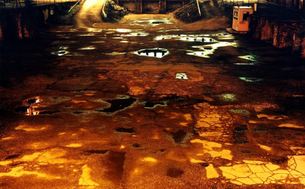
Who is Rut Blees Luxemburg?
Luxemburg is a German photographer, known for her night photography of urban/city environments. An artist I wish to feature in my essay about my upcoming photobook. Her photos that we will be talking about and showing appear to have a sort of run down, dark and ruined aesthetic of the industrialized world.

Career
As said already, her photos are of the streets of cities at night and urban areas. Most of them have a wet rainy look, combined with light being reflected off the puddles walls etc..


Visual
Each photo above is set in a dark alleyway/street etc. and has light either reflected or casted across walls, perhaps from the street lights or car lights. I think this because most of the lighting being casted has a hint of orange, which would be the colour of most streetlights in cities like these, combined with more warm orange-red lights likely from the break lights on cars. The areas are dirty and not maintained very well given the scratched and cracked walls and grounds and they all appear to have a sort of grainy and rough texture. The edges and corners on the buildings shown create lines, which result in shaping and creating sections of the image, even more so when colors are shown to be different on each side of corners/edges, it creates more variety in the image.
Conceptual
Some elements of “New Topographics” (Robert Adams) can be seen in these images too. When it shows edges and corners on buildings being perfectly straight, in contrast to natural structures such as hills and cliffs, which would have irregular shapes and forms. Perhaps Luxemburg is trying to convey a similar message that Adams tried to do.
Response
In my mock exam, I hope to respond to this work by creating my own images in reference to the work from Blees. I can take some night photography photos around town in the various alleyways, streets, roads etc.. I can take advantage of the cameras features by perhaps changing the ISO around and the Shutter speed to low, that way I can have lights from cars going past remain on the image as strips of light. Another thing I can do is in editing, bring out more of the colored lighting by adjusting the levels and the colour balancing in Lightroom.
In what way have Rut Blees Luxemburg and Peter Bialobrzeski explored suburban and urban environments in their work?
“If I could tell the story with words, I wouldn’t need to lug around a camera!” – Lewis Hine
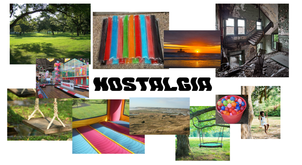
The theme of my personal study is Nostalgia, mainly in relation to childhood, and two artists I am wanting to respond to are Rut Blees Luxemburg and Peter Bialobrzeski who make photographs of city and urban environments. I want to explore the places from my childhood, such as the Watersplash, sand dunes at St. Ouens, the campsite at Greve De Lecq, Beuvelande, Fort Regent, Millbrook Park, and even abandoned places that I have not visited in a very long time. These places mean a lot to me because I spent a lot of my childhood in these areas. I used to go to Millbrook every day after school and every summer I would spend a lot of time at St. Ouens Bay and Greve De Lecq. On a rainy day when there’s nothing to do I would go to the jungle gym at Fort Regent and I’ll always remember the times when me and my friends would sneak into abandoned places. Places like the unfinished car park at the Fort, the abandoned brewery and even the abandoned cable cars when they were still up. Developing my project, I want to make a mix of observational photos and tableaux photos. I want to explore a general aesthetic for all of my images by trying various editing techniques to make the photographs look distorted and more interesting. I can do this by adding blur, changing the colour levels and using things like AI to enhance the images. In addition, I want to try putting the photographs on a polaroid printout too, to really convey a nostalgic feel.
My photos will be taking some inspiration from several artists such as Will Lakeman, Bernd and Hilla Becher, Gustave Le Gray, Stephanie Jung and Robert Clayton. I want to take inspiration from these artist’s in particular because of the things each one specialises in. Will Lakeman with his AI work, the Bechers and their deadpan approach to photography, Le Gray’s sea photographs, Stephanie Jung’s city images and shaken editing and Robert Clayton and his estate/urban photographs.
Historically speaking, Art, and later Photography since it’s inception in 1839, has been used as a platform to express and represent the artist/photographer’s views and thoughts on the world and life in general. The framing of an image, its composition and colours have all been carefully decided to make the most accurate depiction that reflects their views and thoughts. Whether that be on memories they have, certain events they have been through or people and friends they have made on their journey. Before the tech we have today, to experiment and edit their image to what they see fit, photographers would put coloured gels as makeshift filters on their lenses to get a certain shade or colour and would also colour over an already printed photo with ink. Photography has changed along with the world too, with the industrial revolution probably being one of the most dramatic shifts in human history. New technology was improving, cities were being built, the world was becoming the world we live in today. Many photographers throughout history have reacted to this change in the world, mostly known photographers like Robert Adams, Bernd and Hilla Becher and Henry Wessel Jr. who all of which took photos involving buildings in natural environments that were also in black and white – possibly to bring back a sense of “old times” as colour photography would have been invented around those times too. Many photographers around this time didn’t support colour photography as they believed it was a “distraction” and that black and white photos were a “truer form of documentation”. Two photographers I want to talk about in more detail are Rut Blees Luxemburg and Peter Bialobrzeski.
Luxemburg’s images, being taken at night, rely particularly on nearby lighting to brighten and bring life to the image. The colours are very familiar to most people, the orange colours from the street lights combined with the red lights from cars. All casted across the scratched and cracked concrete walls and grounds. The multiple puddles in the streets filling up every nook and cranny in the tarmac that reflect more lighting. The photos feature no people, yet the presence of people still remains because of the lighting and the man made areas. It makes the photos feel empty of human life yet at the same time retaining all the things humans have made. Perhaps to reflect that of the world, we humans have changed every aspect of the planet to our satisfaction and to the way we see fit, but perhaps Luxemburg’s images are asking; Was it really for the better? Did all of our advancements through history really lead us here, to this cruel and dark world? In fact, when an interviewer asked Luxemburg about whether she intentionally removes people from her photos and if they cause a disturbance in her work, she replied with ‘Yes, because I’m not thinking about individual stories, but around the space as a site of ideas and immersion. The human presence is absent. The city in my photographs is a structure in which the individual narrative does not dominate, but becomes a template to try and locate something that can be described as common. One can also think about the city as one that’s alluring, open, glowing even… yet also ambiguously wet, slippery and dark.’. I believe this quote very well speaks for all of her photos, she isn’t targeting people in these photos because they are simply not the targets, it’s the city. Almost as if the city is it’s own entity, has a soul and is sentient. The photos themselves show mostly buildings and streets. The building images are usually showing only a fragment of the building, like and edge or corner. There is an image of a corner of a building which takes good advantage of the lighting. It shows two different colour lights being casted on each side of the corner. One side is green and the other is yellow, the two lights each meet at the edge and they cut off. This defines and highlights the lined edge. Almost as if the lighting helps define the shape.
Bialobrzeski’s work covers places in cities too, but his photos are taken in the day rather than the night. His photographs cover abandoned buildings that have gone to ruin. In the photos framing, he tends to show in the background or nearby, buildings that are still in use and are newer. Almost to show some contrast between them. A difference too is that the newer buildings tend to be higher up than the old ones, this conveys the idea they are a higher class and simply better than the older ones as they are literally “higher ups”. The better buildings are tidier and have a more refined look due to their straight edges as apposed to the old buildings were time has caused them to decay and crumble, they have impurities all over. The more single photos, without any comparison between buildings, have a different comparison instead. For example, some photos take advantage of slow shutter speeds. They do this by involving in their frames, a collection of buildings and a busy road. The final image will show an abundance of red and white streaks trailing through the entire road while the buildings will come out completely still. This is because as the cameras shutter is open it catches all light, including motion. The road will of course have heavy use from cars using it constantly which leads to the streaks which choreograph the movement of the vehicles. While as the buildings, being inanimate objects, of course wouldn’t move at all during the opening of the shutter and will appear completely still on the photograph. This shows a contrast between the lively and the non-lively. His work has motivated him to travel the world and document multiple cities. He’s been to big and rich cities, poor and small cities and cities which have rich parts and poor parts. One of his images show an abundance of poor homes in a city, they are dirty and run down, in the background there are taller buildings that are more presentable and are newer. The name of this photo is called “Nail Houses”, which is a term used to describe a house which the owners refuse to move out from in order for development to be made. This implies that the higher class buildings are wanting to expand and are being prevented by the lower class ones, so when they are asked to move away they refuse, likely because they have no where else to go. When Bialobrzeski was asked why he likes to take photos of certain environments like this one, he said ‘For me, the urban environment is what is interesting. In a way, I’m like a 19th century photographer. When I was invited to a festival in Dhaka, I did a Google Image search of Dhaka and the only images that you find are colour pictures of the sites and poor people in black and white. But you don’t actually find what the city looks like, and that happens to a lot of cities. I can show people what they can’t see, and at the same time make an archive of the city.’. I think he very well explained why he takes these photos. To simply educate the world about the cities and places that have ugly parts that have certain issues and are often overlooked. He likes to show people the parts of cities that you don’t normally see, the abandoned and left behind.
In conclusion, I believe both artists have efficiently explored and documented city and urban areas. They have interesting stories and messages behind their photos and the photos themselves are very good and high quality, they look appealing and were very interesting to talk about. I like both of the photographers and their work. Both artists are similar in category and image subjects, yet have very different messages and meanings. The most notable difference of course would be the use of lighting. Luxemburg’s images are darker and appear more gloomy, Bialobrzeski’s images are more brighter and serious. Both artists cover cities and urban areas, both show a somewhat gritty and dirty environment, similarities like cracked crumbled walls and streets, gloomy street lights and places which are reasonably old are shared between each artist’s work. However, Bialobrzeski’s photographs involve people, which can make some appear more crowded and fuller, as opposed to Luxemburg’s empty and spacious environments she has created. While Luxemburg has made some use of slow shutter speeds on roads, Bialobrzeski has made much more of an effort with this method, for what seems to be for longer times too on busier roads. The time periods are different too, Peter Bialobrzeski started photographing cities sometime around 2013 and Rut Blees Luxemburg started around 1995. Which makes it interesting to see how time has changed the world, in the 90s the cities/urban areas were likely not as big as they are today, which can be seen when compared to Bialobrzeski’s work, where the cities are bigger and more full of people. All of these differences and similarities helps outline the importance of the photographers work. To be able to see that they are trying to convey different messages about the world, and the places we live in.
Roberts. P (2007). The genius of Colour Photography. London: Carlton Books Ltd.
Bergmann. S (2018). City Diaries: An Interview with Peter Bialobrzeski. Berlin art Link.
Unknown Interviewer (2017). Interview: Rut Blees Luxemburg. Photoworks.
Links:
https://photoworks.org.uk/interview-rut/
In-text referencing:
This is the point that Roberts makes when she writes, ‘by far the most popular solution to remedy photography’s colour deficiency was to add colour by means of a brush, using oil and watercolour paints or ground powdered pigments.’ (Roberts, 2007: 13) It is telling us about how photographs used to be coloured, by going over the original photo with these different methods. Compared to now where you can simply edit the original photo on your computer, or even in some cases on the device used to take the photo.
My Intentions
I want to explore the places from my childhood. Places like the Watersplash and the sand dunes at St. Ouens, The campsite at Greve De Lecq, Beuvelande, Fort Regent, Millbrook Park and even abandoned places that I have not visited in a very long time. These places mean a lot to me because I spent a lot of my childhood in these areas. I used to go to Millbrook every day after school, Every summer I would spend a lot of time at St. Ouens Bay and Greve De Lecq, On a rainy day when there’s nothing to do I would go to the jungle gym at Fort Regent. And I’ll always remember the times when me and my friends would sneak into abandoned places, places like the unfinished car park at the fort, the abandoned brewery and even the abandoned cable cars when they were still up. During development, I want to take a mix of observational photos and tableaux photos. I want to set a general aesthetic for all of my photos by trying various editing techniques to make the photos look distorted and more interesting. I can do this by adding blur, changing the colour levels and using things like AI to enhance the photos, I want to try putting the photos on a polaroid printout too, to really convey a nostalgic feel. An edit I really want to do is the “Clone” edit, where I take multiple photos with the camera in the same fixed position but with me in different locations, then putting all of them together. I have done this in GCSE and I intend on improving and doing it again. I also want to add some actually old photos that were taken in some areas and have a new one for comparison. Another thing I want to try is having any text be placed behind objects, mainly for the cover and the title. I want to try and have this entire project be presented in a photobook but may try and make a short film too. The photobook has been decided because most photos traditionally are kept in these books and since I am producing nostalgic photos I feel it would be very fitting to have the project be displayed in one. My photos will be taking some inspiration from several artists such as Will Lakeman, Bernd and Hilla Becher, Gustave Le Gray, Stephanie Jung and Robert Clayton.