All posts by Alice Jakubowska

Filters

Author:
Category:

PLAN FOR FINAL OUTCOME

IMAGES USED IN FINAL OUTCOME:
WHAT IS A TRIPTYCH?

A picture or relief carving on three panels, typically hinged together vertically and used as an altarpiece.
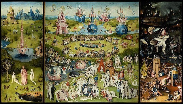
The Garden of Earthly Delights, 1490-1510, by Hieronymus Bosch

ORIGIN OF TRIPTYCHS:

The first triptychs go back to the Middle Ages when Byzantine churches were decorated with biblical altar paintings. One of the most famous of all triptychs is the altarpiece in the Antwerp Cathedral by Peter Paul Rubens, completed in 1612

Llandaff Church is one such cathedral with a triptych altarpiece. Rubens’ two versions may be seen at the Cathedral of Our Lady in Antwerp, Belgium, and Notre Dame de Paris is another instance of triptych in construction. The construction of many church stained-glass windows echoes the shape.

ARE TRIPTUCHS RELIGIOUS?

The triptych became a popular art form in early Christianity. Beginning in the Middle Ages, altarpieces with elaborate painted or carved panels that were hinged together became popular in churches and cathedrals.

PLAN FOR HANDMADE FINAL OUTCOME:
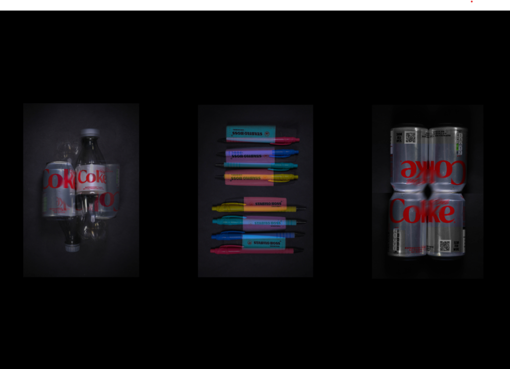
Photoshop plan of final outcome

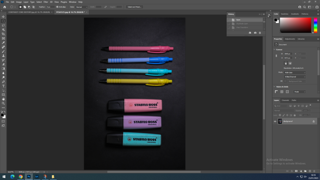
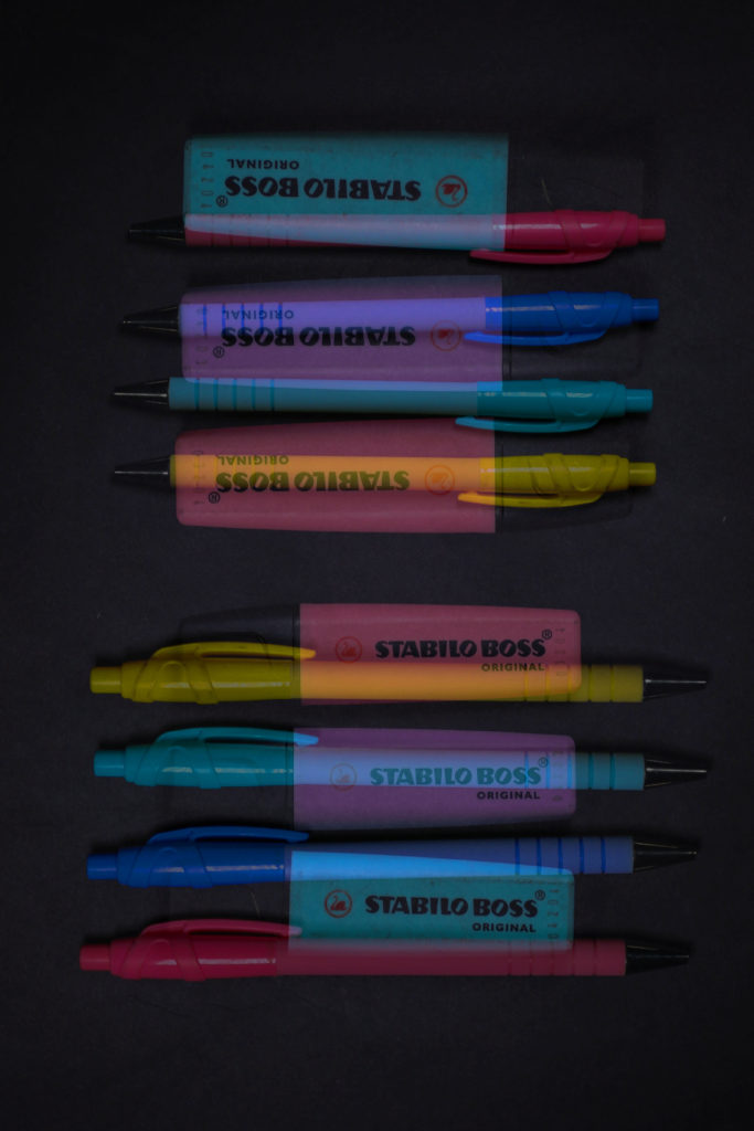
For my final outcome I will print out my images in A4, and mount them onto foam board. Then I will place them or card next to each other. My main idea is to form a triptych with my images. These are the images I made during my further editing this is due so that they are more eye catching rather than just simple basic images. I chose the highlighter-pen picture in the middle as it is the most colourful and my most successful image during my photoshoot, then I decided to pick both diet cokes on the side so that they have a similar concept.

EDITING MY IMAGES; PHOTOSHOP

EDIT ONE:

PART ONE

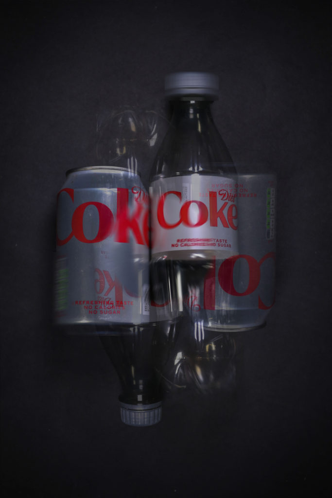
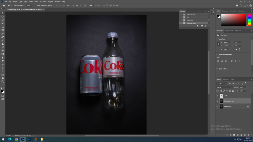
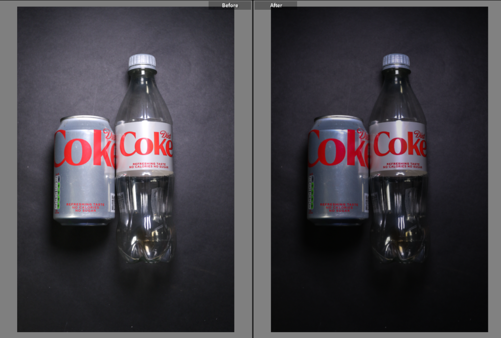
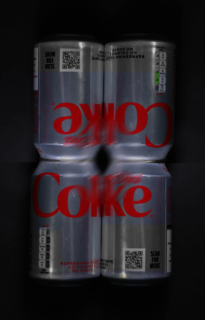
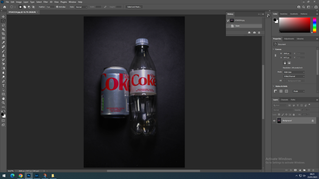
I imported this picture into photoshop of a plastic diet coke next to a can of diet coke, in Lightroom classic I did basic editing of lighting and colour changes.

PART TWO

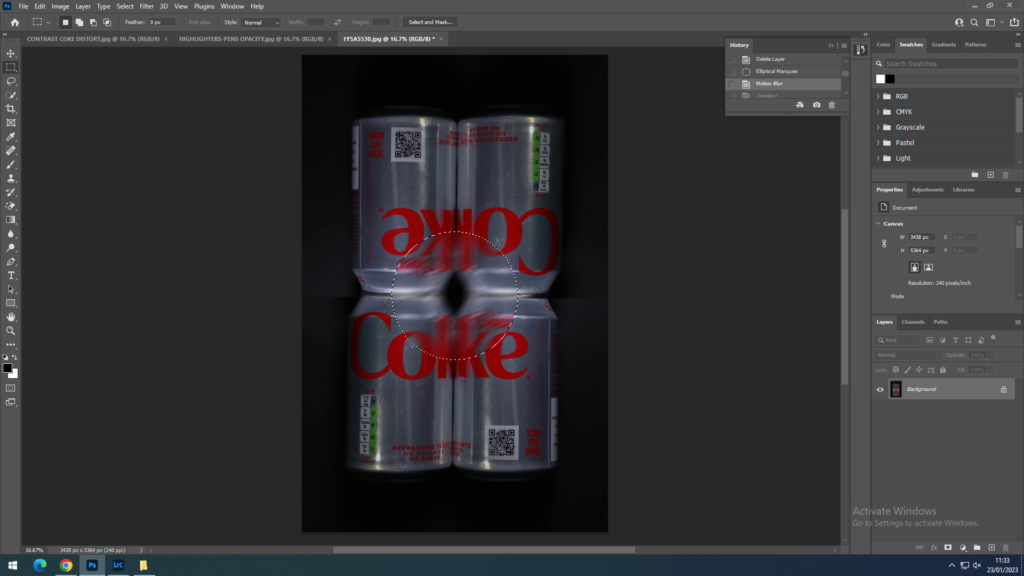
I created a background copy so I would have an extra layer if something went wrong. I used the ‘Elliptical Marquee Tool’ and drew a circle in the middle of the image. In that circle I blurred the image with the radical blur tool.

PART THREE

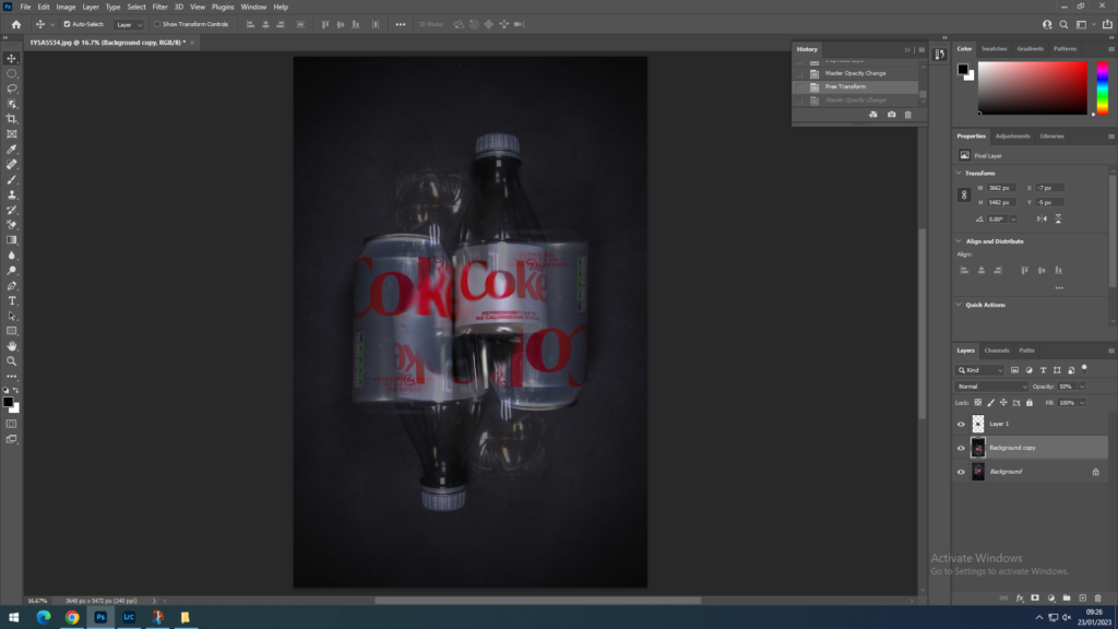
I now used the background layer and transformed it, I turned it the opposite way of the original image. While doing so I decreased the opacity to 35% which therefore created this shadow effect to the image. Furthermore it enhanced the blur in the middle within the circle.

PART FOUR

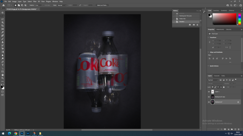
Using the background layer I began to use the ‘Rectangular Marquee Tool’ and selected the top of the plastic bottle, the bottom of the plastic bottle and the side of the can and blurred it. For this I used the ‘motion blur’ to create a more distorted look to the picture.

EDIT TWO:

PART ONE
PART TWO

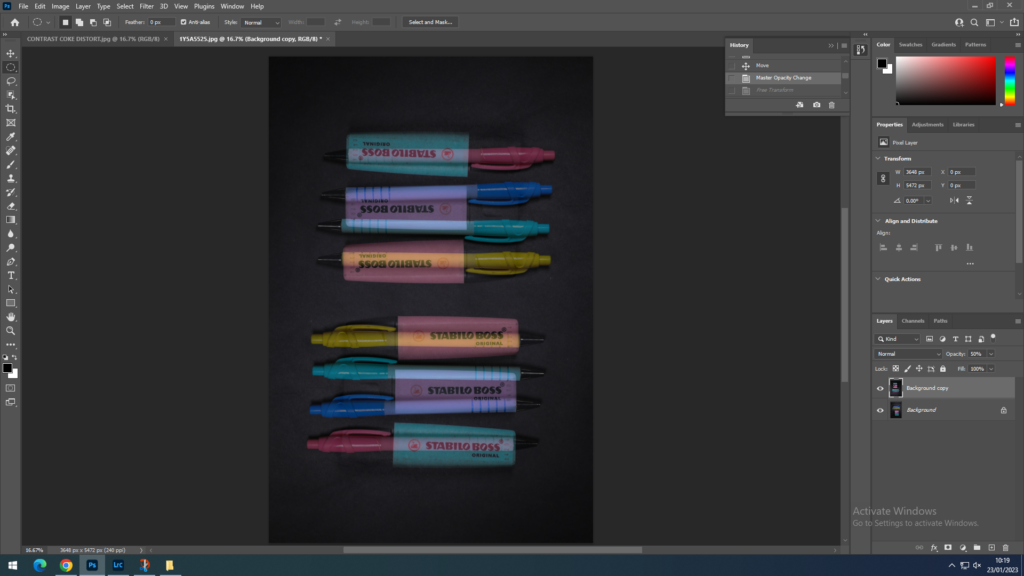
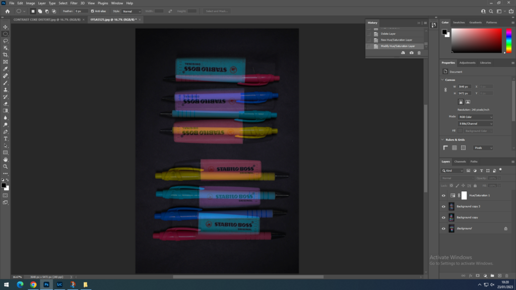
I imported this image from Lightroom. When I imported the image I created a background copy. When I created the background copy I flipped the image and reduced the opacity. I did very minimal further editing due to this image already being full with object and I didn’t want to create this image to be over chaotic.

PART THREE

When putting another layer with low opacity over the original image the colours of the objects started to fade and become muted. Therefore I increased the hue and the saturation to redefine the colours and created them for visible to the eye, especially these colours since they are already bright and vivid.

EDIT THREE:

PART ONE
PART TWO

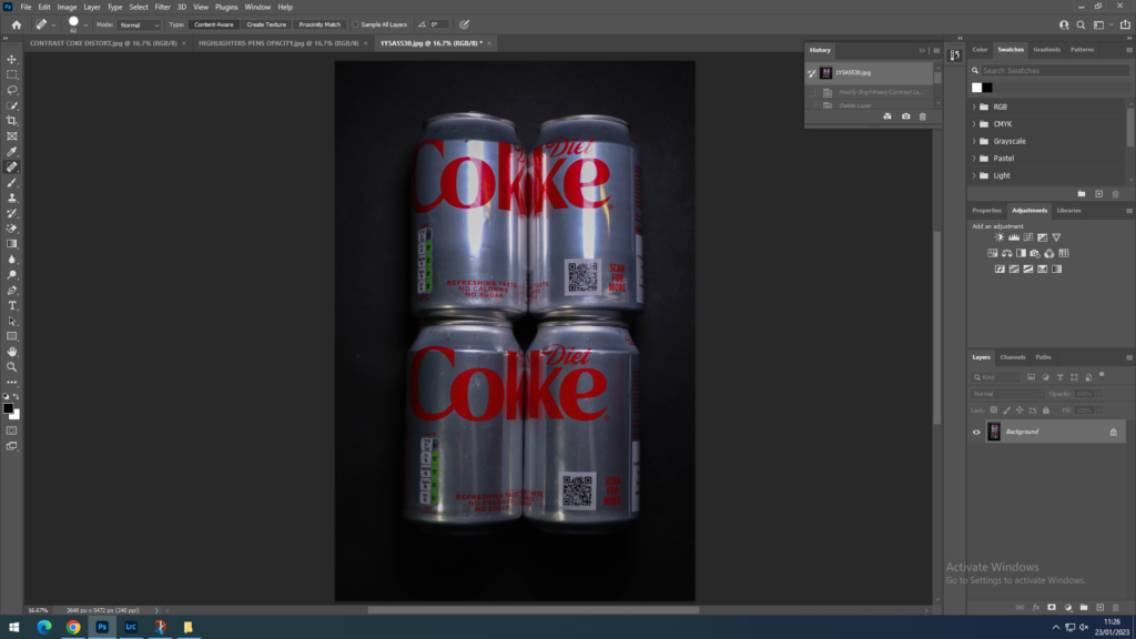
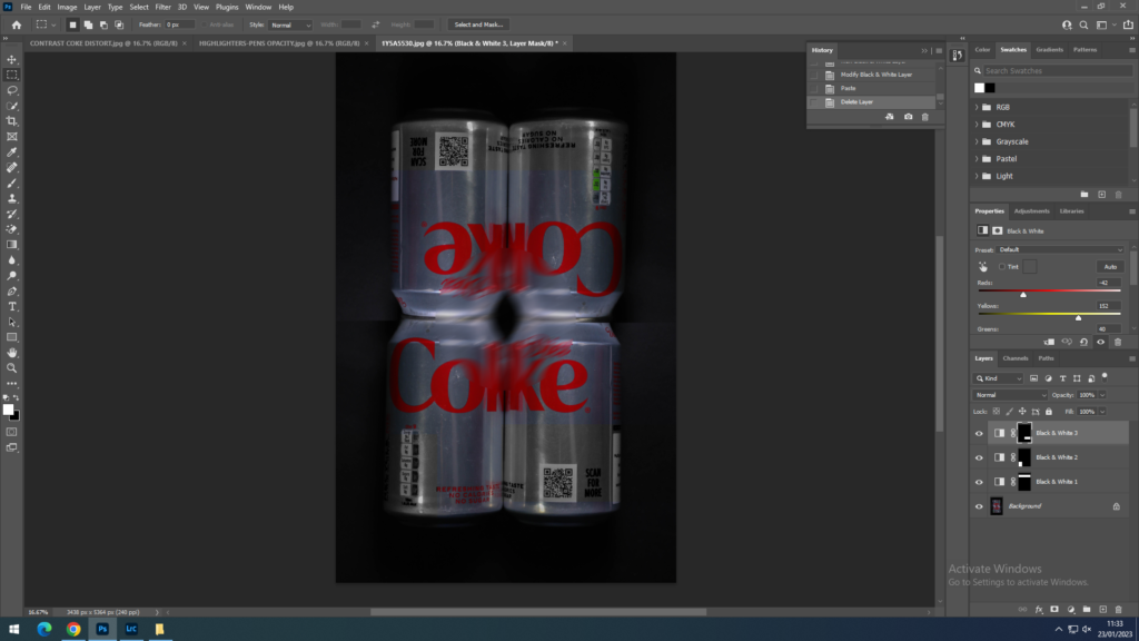
I had used the ‘Rectangular Marquee tool’ to select the bottom half of my image and then transformed it for the cans to face the opposite direction. Then I used the ‘Elliptical Marquee tool’ in the middle and blurred it with the ‘Motion blur’. This is so when the diet coke images are on either side of the highlighter image there is a connection between the two.

PART THREE

I started to used the ‘Rectangular Marquee tool’ to pick random parts outside the image and change them to black and white. This is so it could have more depth to the image.

EDITING MY IMAGES

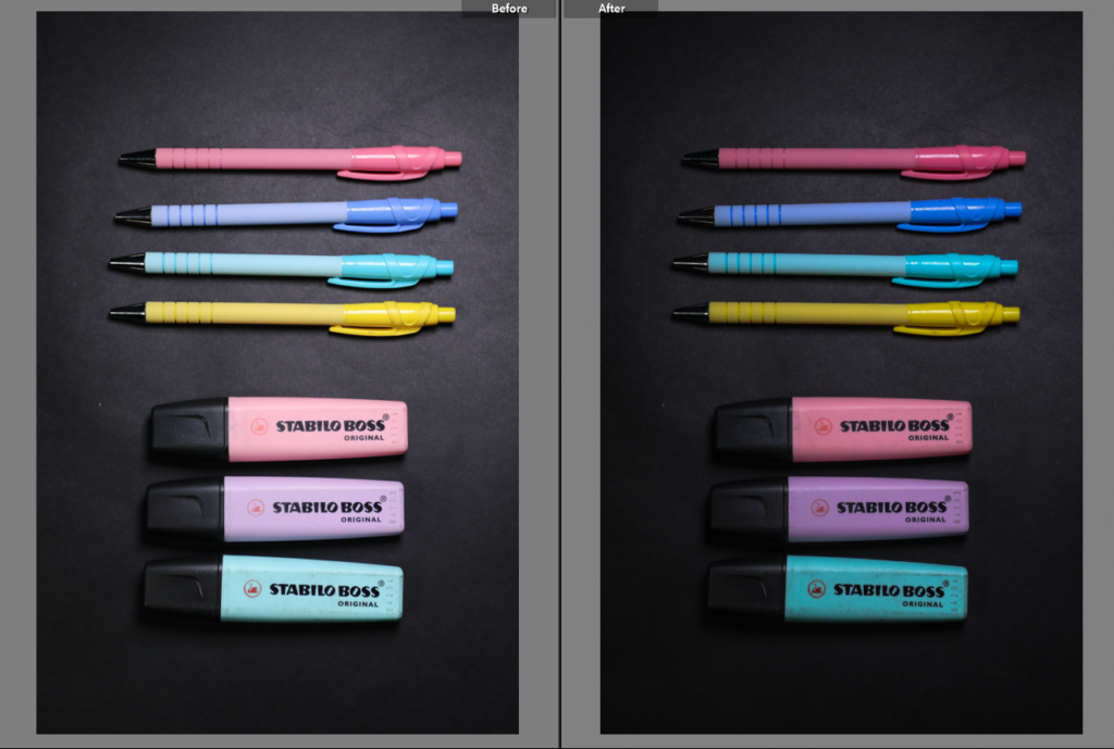
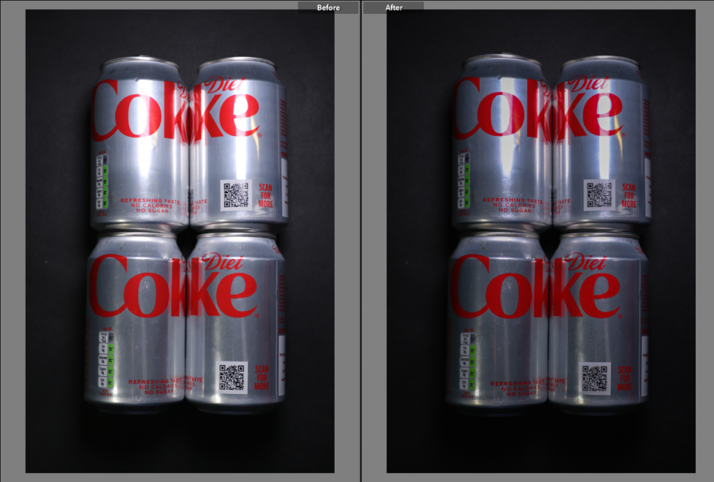
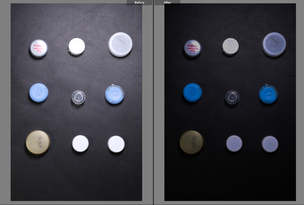
The following images I edited in Adobe Lightroom Classic. I edited to try and replicate Rosenthal’s work. To make the background more of a black colour than charcoal I reduced the exposure, however to keep the vibrant colours from the objects I increased the contrast. I slightly minimalised the highlight due to the lighting being so strong however you can see in the third edit there is still a glare from the lighting.

Edit three I may not use for my project, due to the harsh lighting lines however I can still try to minimalize it in photoshop. Currently for my Anthropocene project I will to a triptych. I will choose my best three images and print them out. Furthermore to have more of a visual effect the photo placed in the middle will be printed A3 and the other A4.

photo edit one [pencil case]
photo edit two [diet coke contrast]
photo edit three [diet coke cans]
photo edit four [plastic bottle caps]

PHOTOMONTAGE:

PHOTOMONTAGE:

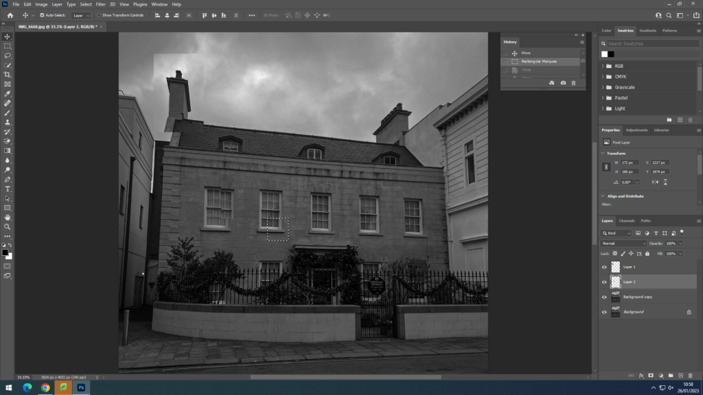
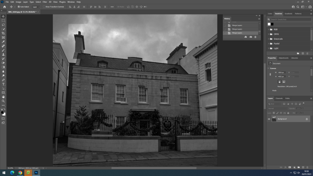
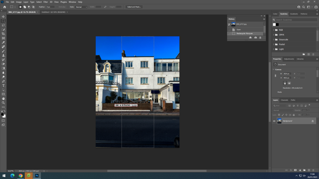
Using this image and editing it in photoshop, I used inspiration from David Hockney’s images by selecting parts of the image and then moving it slightly around to create more of a distorted image. In this image I did minimal selecting as I didn’t want to take away the simplicity and effect of the blank and white of the house.

PANORAMIC:

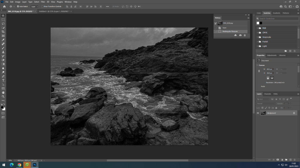
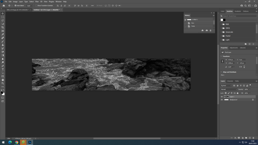
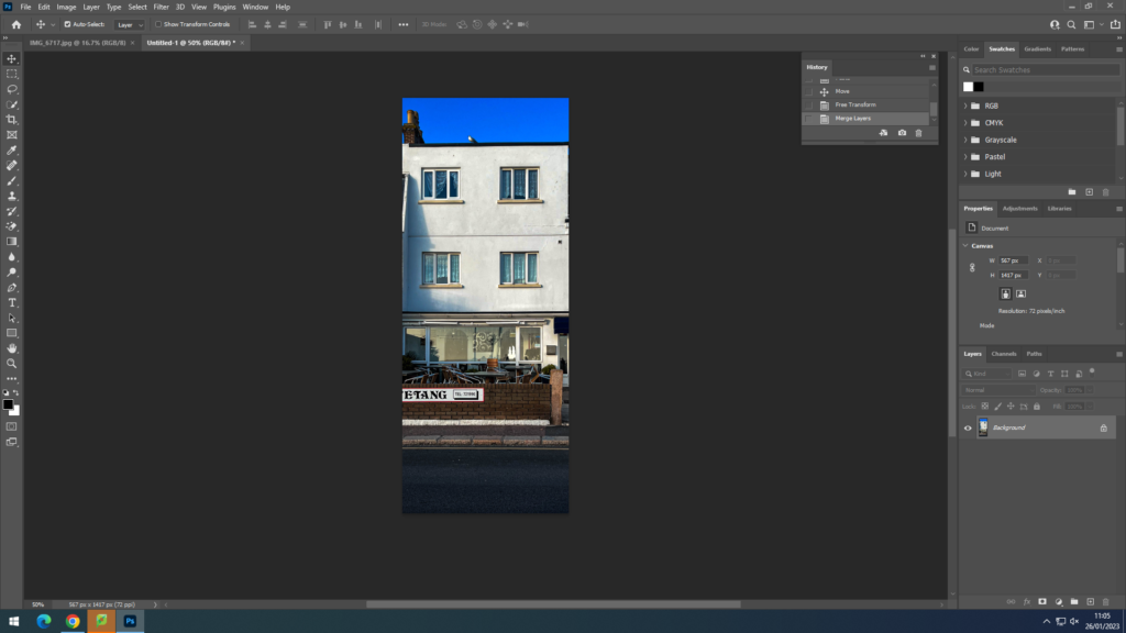
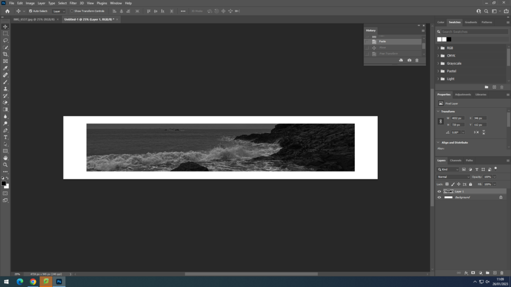
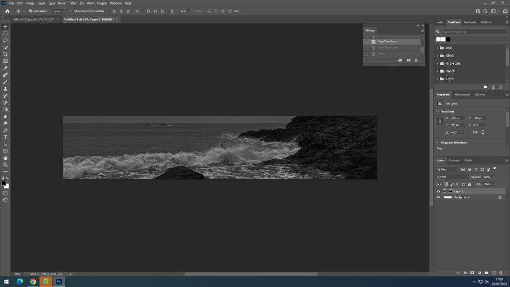
I tried doing a landscape and portrait panoramic to highlight the key parts of the image. In the landscape photo of the waves the white foam crashing into the rocks had an impact of the grainy editing. For the portrait image I highlighted the the building to emphasize the shape and how the windows create a frame in frame image.

TEXT:

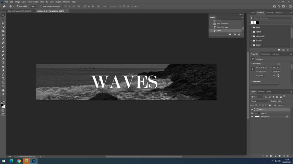
In this image I decided to do a panoramic edit of the waves crashing with a neutral text font.

PHOTOSHOOT ONE

Plastics – Photoshoot One

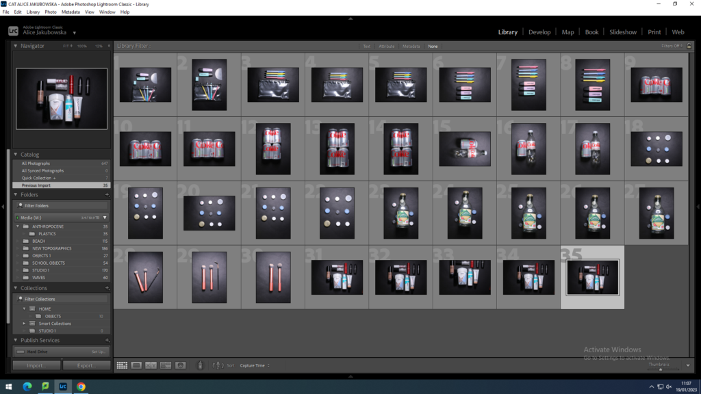
In this photoshoot I took pictures in the style of Rosenthal. I used the black cardboard to place my objects on, this was to illuminate the colours of the plastics. I took pictures of empty plastics around my house, but also plastics that I personally use of a daily basis.

In this photoshoot I took images of plastics I collected over the weekend. In addition I toom images of plastic objects I use on a daily basis to show how much we rely on plastics.

I will also take another photoshoot to show more plastic objects so I can have more of a variety of images. I will pick out some plastic objects around my house.

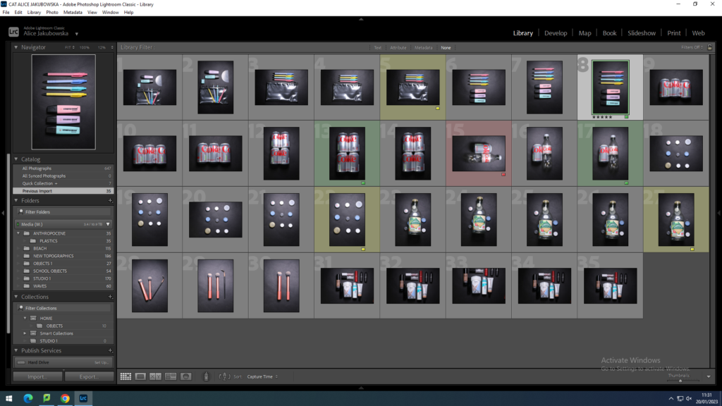
FLAGGING MY IMAGES:

The images colour-coded in green I believe are my strongest images in my photoshoot. I think these will be the ones I use for my final outcome. This is because they are focused and have a high resolution. The image colour-coded in red I will not be using as it isn’t focused and it not the best it could be.

PHOTOSHOOT PLAN PLASTIC

PHOTOSHOOT PLAN:

WHAT?

I will be taking pictures of plastic that I have collected from my house after a week. I have also got some friends to collect some plastic they would usually throw out in the bin. However I will also be photographing one time use cans and items.

WHERE?

I will be bringing the plastic into school and taking the images in the photography studio to get the full professional effect seen in both Barkers and Rosenthal’s photography.

WHEN?

I will be taking these images in the week of Monday 16th ready for the following week for the mock. This will give me time to edit and take multiples pictures of different objects.

HOW?

I will be using the school cameras. When I get to the studio I will try out multiple lighting techniques to see which ones fit with my objects. I will use black cardboard to make the objects more visible.

WHY?

I have decided to make my project based on plastic to spread awareness on how much plastic is wasted, furthermore I will be highlighting how much plastic and cans are used in a week and then incinerated which further damages the environment.

ARTIST REFERENCE: BARRY ROSENTHAL

WHO IS BARRY ROSENTHAL?

Barry Rosenthal a fine art photographer, is also an urban archaeologist and sculptor.

He studied photography at the Dayton Art Institute in Dayton, Ohio and at the Apeiron Workshops in Millerton, New York with notable photographers Emmet Gowin and George Tice.

– INFOMATION FROM THIS WEBSITE

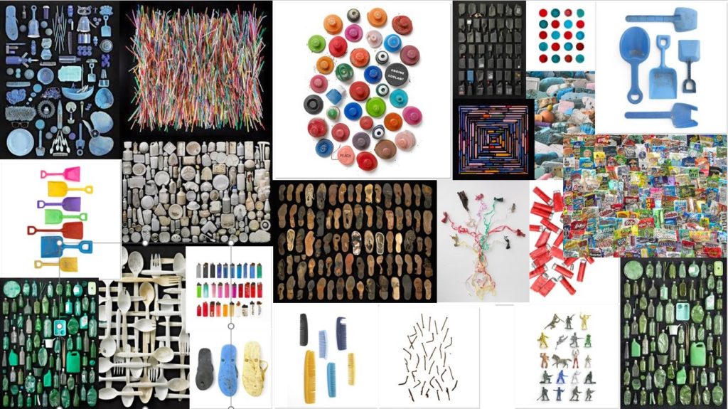
MOODBOARD:

Barry Rosenthal

WHAT IS ROSENTHAL TRYING TO HIGHLIGHT IN HIS PHOTOGRAPHY?

The artist, Barry Rosenthal, uses sculpture and photography to express his distress about plastic pollution in the oceans. His project, “Found in Nature” graphically displays collections of found objects pulled from the shores.

HOW DID ROSENTHAL START THIS PROJECT?

While scouting for plants at the shore, Rosenthal came across ocean borne trash which rode in on the waves. He cleaned the beach of trash and liked what he had picked up. The objects were changed by the elements of sun, sand and sea. He was compelled to bring the issue of plastic pollution in our oceans to the forefront of climate issues. Titled, “Found in Nature” his seminal series of photographs highlights how plastic is with us forever.

IMAGE ANALYSIS:

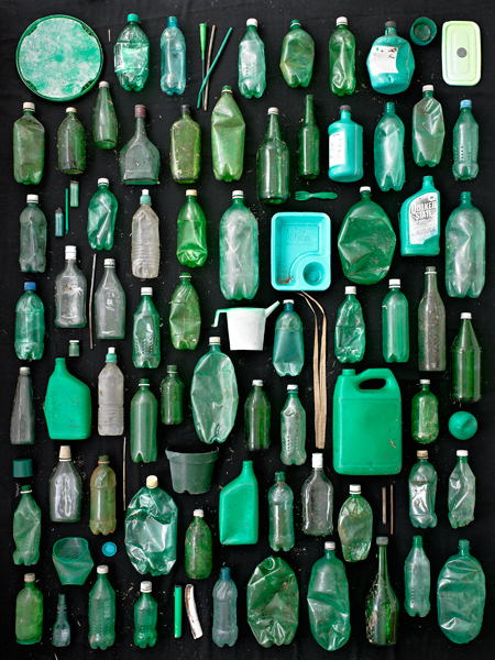
Green Containers

This image by Rosenthal is stationary with the repeating pattern of the empty green containers. The lighting is hard and equal through the images which suggests it was taken by studio lighting. The black background emphasizes the colour green of the empty containers. The colour green has connation’s of greed, rebirth, and money, however recently it can also have connotations of recycling. However even though out plastic consumption is still rising and further destroying Earth people still throw rubbish on the streets disregarding the space around them. This image that Rosenthal has taken shows the affect and how much plastic is being wasted.

CONSTRUCTIVE SEASCAPES

WHO WAS GUSTAVE LE GRAY?

Gustave Le Gray was the central figure in French photography of the 1850s. Around 1847 he took up photography. Even before making the marine images, he became one of the most renowned pioneers of the new art.

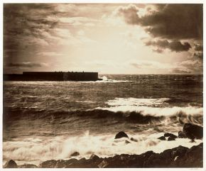
THE GREAT WAVE:

The Great Wave, the most dramatic of his seascapes, combines Le Gray’s technical mastery with expressive grandeur. He took the view on the Mediterranean coast near Montpellier. At the horizon, the clouds are cut off where they meet the sea. This indicates the join between two separate negatives.

‘The Great Wave’, Gustave Le Gray

WHO IS DAFNA TALMOR?

Dafna Talmor is a visual artist that took abstract photographs. She is an artist that lecturers based in London whose practice encompasses photography, spatial interventions, curation and collaborations. Her photographs are included in public collections of Victoria and Albert Museum, Deutsche Bank, Hiscox and in private collections internationally. 

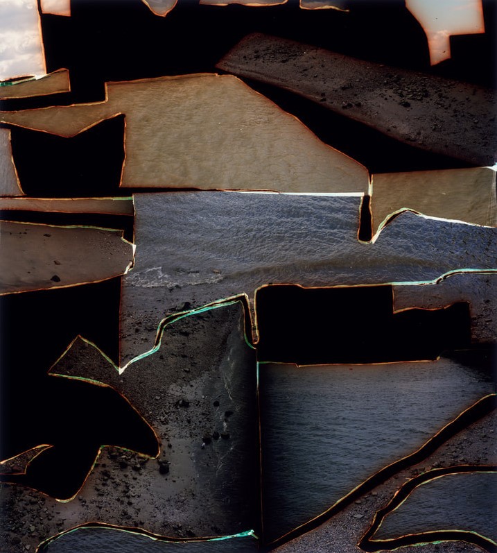
CONSTRUCTED LANDSCAPE II:

This ongoing body of work consists of staged landscapes made of collaged and montaged colour negatives shot across different locations, merged and transformed through the act of slicing and splicing. Her work also engages with contemporary discourses on manipulation, the analogue/digital divide and the effects these have on photography’s status. 

From Constructed Landscapes II, Dafna Talmor

WHAT ARE LANDSCAPE PICTURES?

Landscape photography shows the spaces within the world, sometimes vast and unending, but other times microscopic. Landscape photographs typically capture the presence of nature but can also focus on man-made features or disturbances of landscapes.

SIMILARIES AND DIFFERENCES BETWEEN BOTH IMAGES:

Both images show the landscape of the beach and waves. In Le Grays image it is more visually obvious as it is a stereotypical landscape image, whereas Talmors image is more abstract as it picks apart different landscapes. She creates different shapes so it gives a different composition than it does with a common landscape image.

WHAT WORDS DESCRIBE EACH LANDSCAPE:

THE GREAT WAVE: DRAMATIC, DELINEATED, CLASSIC

FROM CONSTRUCTED LANDSCAPES II: EVOCATIVE, MYSERIOUS, CREATIVE

IN WHICH LANDSCAPE WOULD YOU LIKE TO LIVE?

Dafna Talmors image gives a sense of mystery. As you look at the image it looks like a maze that you are trying to escape and figure out the missing pieces. Due to the abstract and the cut out parts of her image it can give connotations of missing pieces in a puzzle or perhaps a deeper meaning that slowly the beach and the earth a dying away and it is coming apart piece by piece.

ARTIST REFERENCE; MANDY BARKER

WHO IS MANDY BARKER?

Mandy Barker is an award winning British photographic artist whose work involving marine plastic debris has received global recognition. Her work has been exhibited, published and collected worldwide.

WHAT IS HER PHOTOGRAPHY TRYING TO EMPHASIZE?

Her work is trying to emphasize how humanity is negatively impacting the Earth. She creates artistic work that shows real life tragedies of what is happening around us.

WHAT IS BARKERS PROJECTS TRYING TO DO WITH THE AUDIENCE?

While her photographs are aesthetically pleasing to look at they hold a deeper meaning she is hoping to reach with the audience. She realised in her previous project when she took a picture on sight on the beach the audience didn’t engage enough she hoped, due to this she created a more colourful and bright image using vibrant plastics on a black velvet sheet. This seemed to engage with the audience more since it look more appealing. Due to Barkers project being so big she asked her viewers to help her collect plastics they find, she received many messages with people complying with her task.

MOODBOARD:

Mandy Barker INDEFINITE project

‘The objects shown are unwashed and unaltered, as found on the shore. Forms and shapes are reminiscent of sea creatures, but these are man-made from plastic, the very material that proves fatal to the animals and organisms themselves. As they gradually begin to break down, they are likely, ultimately, to be ingested as microplastic particles.’

– INDEFINITE: Mandy Barker website

ANTHROPOCENE

WHAT IS ANTHROPOCENE?

Anthropocene is relating to or denoting the current geological age, viewed as the period during which human activity has been the dominant influence on climate and the environment.

WHAT IS THE PURPOSE OF ANTHROPOCENE?

The Anthropocene is an informal geologic chronological term that serves to mark the evidence and extent of human activities that have had a significant global impact on the Earth’s ecosystems.

MOODBOARD:

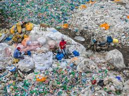
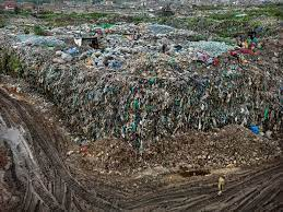
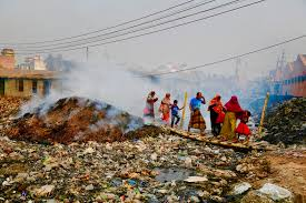
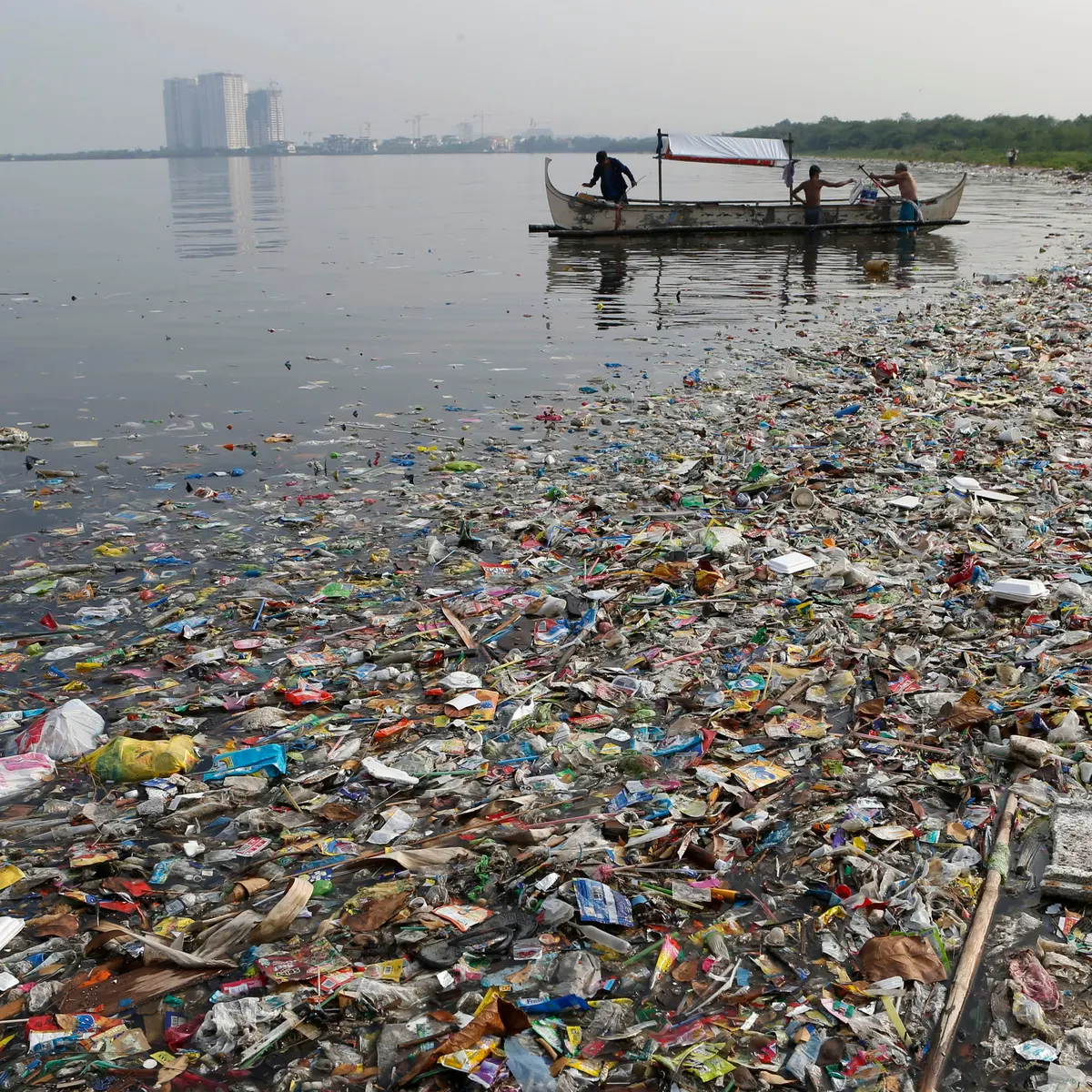
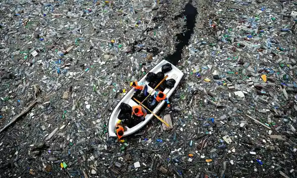
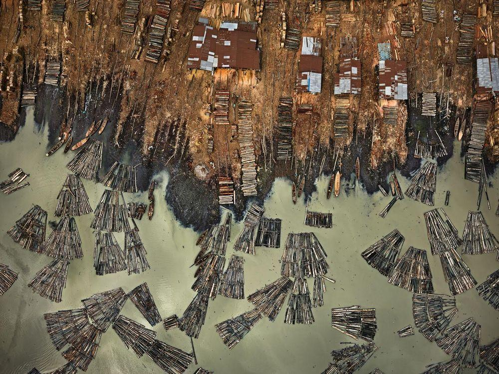
THE ANTHROPOCENE PROJECT:

The Anthropocene Project is a multidisciplinary body of work combining fine art photography, film, virtual reality, augmented reality, and scientific research to investigate human influence on the state, dynamic, and future of the Earth.

Another collaboration from Nicholas de Pencier, Edward Burtynsky, and Jennifer Baichwal, The Anthropocene Project is a multimedia exploration of the complex and indelible human signature on the Earth.

This project is a way for photographers to emphasize the damage man-kind is doing and how it is negatively affecting the Earth.