All posts by Alice Jakubowska

Filters

Author:
Category:

FILM PHOTO EDITING

THE APP USED TO EDIT OUR ELIZABETH CASTLE PICTURES; LIGHTROOM CLASSIC.

In this film we decided to create it black and white. This is so that the film could look more nostalgic and vintage. By creating this vintage look in the images we took at Elizabeth Castle they were able to fit with the aesthetic from the Jersey Archive images we received from Jersey Heritage. Our film was supposed to aim for Tourism attractions which therefore linked to the history of the grounds.
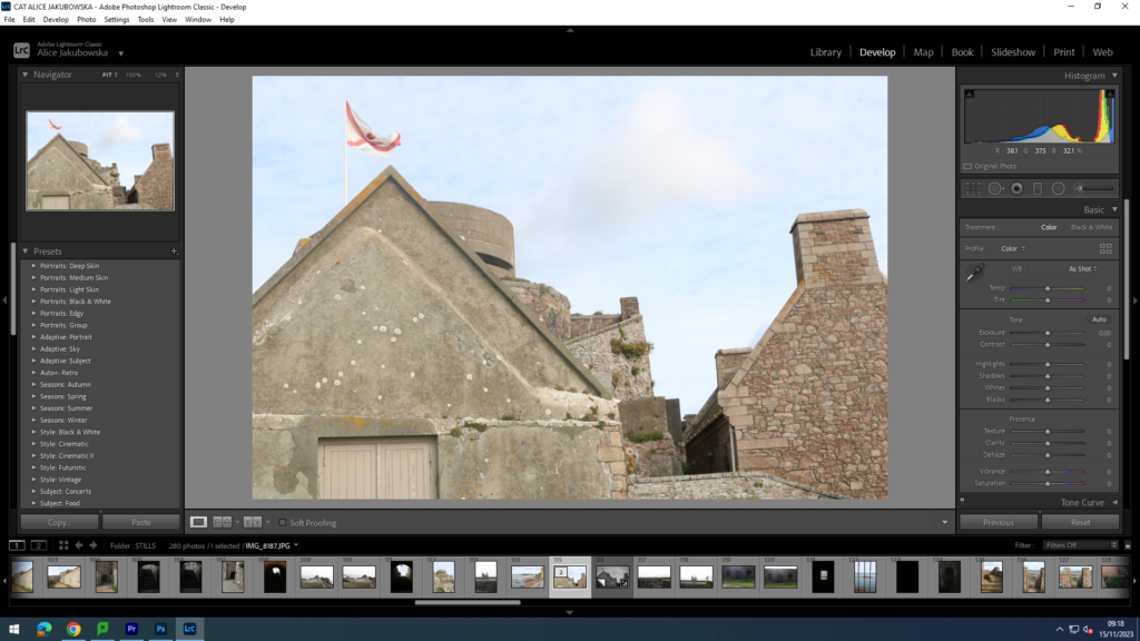
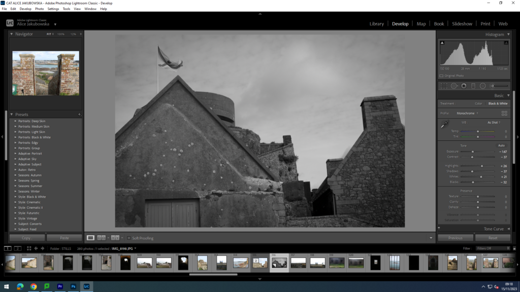
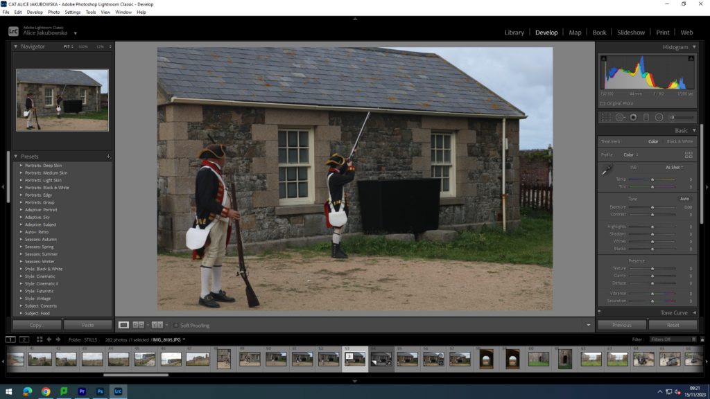
In the images we decided to created a dark atmosphere and vibe to the images, we achieved this decreasing the exposure and decreasing the blacks so we could have a darker mood. However we decided to give the image some dramatic look by contrasting the black and white tones, we further did this by increasing the white and decreasing the darks. Due to this there is a sharper contrast between the tones. To add a more dramatic effect to the images I added a slightly dark vignette around the image, however in order to create a natural aura to the image it was very minimal just enough to create some dimension to the image.
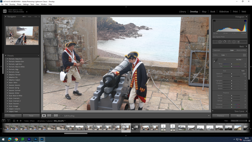
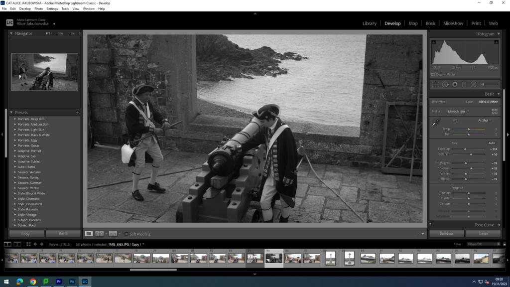
By developing this image in black and white it created a completely different visual look and emotion to the image. Black usually connotes darkness, death, and evil deeds this fits with the image as you are able to see soldiers about to fire from a canon. Which during that era was a deadly weapon that caused many soldiers from the oppositional group a painful death. Furthermore to darken the mood in the image I turned down the exposure to create a more depressed and deepen the mood already in the image. Furthermore I increase the white in order to increased the contrast in the soldiers outfits from the darkened background.
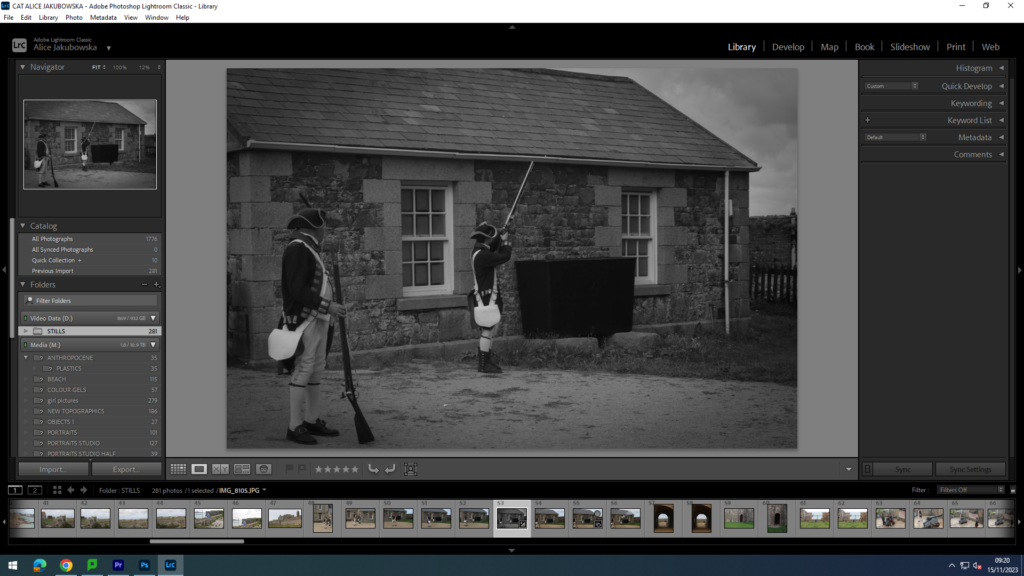
Continuing with the black and white filter I used a similar editing technique and in the image above in order to create a dark serious mood. This is to further support the sincere topic of gun firing, and some of the audience may be affected by this sort action eg post war, or family members in the army. In order to do this I decreased the saturation in order to create a dark mood and a sense of sad and ominous emotion for the viewers.
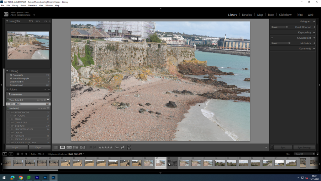
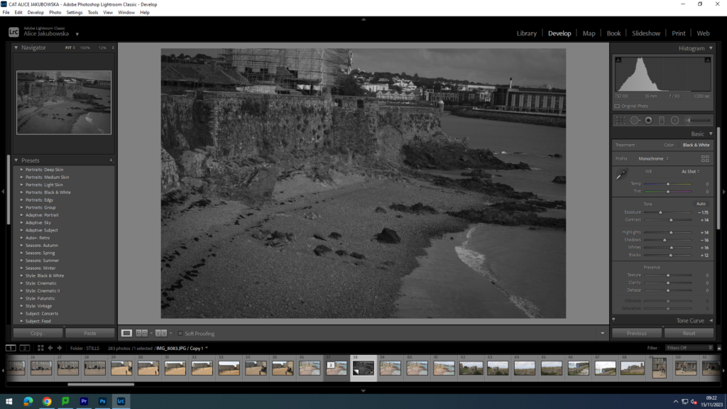
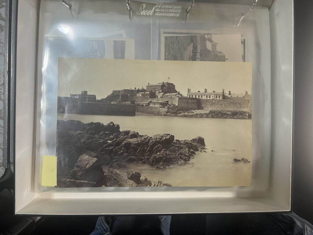
In this image you can see an establishing shot of the landscape in a hidden bit of the castle. This image was important to keep similar to the remaining images in order to keep the same mood through the film. The only different images that would stand out In the film would be the archival material provided by Jersey Heritage. This shot is one of the most important shots in the film as its shows the landscape and the area in which the movie is taking place, this shot therefore set the scene for the audience and creates an understanding of the environment.

ARCHIVE JERSEY ESSAY

The Société Jersiaise Photographic Archive holds Jersey’s collection of archives, containing over 125,000 items dating from the mid-1840s to the present day. A photographic archive is a collection of photographs, often with accompanying materials in other formats, in the course of daily life, individuals and organizations create and keep information about their personal and business activities. These records, and the places they are kept, are called “archives.” Archival records take many forms, including correspondence, diaries, financial and legal documents, photographs, and moving image and sound recordings. Archivists identify and preserve these documents of lasting value. Established in 1873 the Société is a registered Jersey Charity, in which they research collections, community outreach and collaboration with local and international heritage partners. They produce and facilitate research on the Island’s history, culture, language and environment; and to share that knowledge with the widest possible audience for the benefit of our island community. The Société holds extensive bibliographic, cartographic, photographic and research collections which act as our long-term memory. These collections provide a vital resource informing contemporary study and value for the community through a greater understanding of our shared heritage, identity and environment.

Historical archives can be stored in different ways; manuscripts, documents, records (including electronic records), objects, sound and audio visual materials, or other materials. They are living documents, records of the trends and habits of the cultural sector, notations of the changing hands of objects, and the shifting identities of the people and organisations who create and manage them. Different archives function in different ways, however the Société Jersiaise Photographic Archive stores archives digitally on their website. They hold many archives such as photographic, architecture, bibliography’s, and publications (in a library). Photographic archives can provide glimpses into past lives, long-ago events, and forgotten places. They can help shape our understanding of culture, history, and the identity of the people who appear in them. The photographic archive captures a range of subjects such as documentation such as the islands wildlife, the geography of the island, images of the local population and also significant historical island events.

The Societe Jersiaise aims are to (“produce and facilitate research on the Island’s history, culture, language, and environment; and to share that knowledge with the widest possible audience for the benefit of our island community”). Photographic archives have become way in which we can see the revolution and changes in the world, the Society Jersiaise is to share this information and historical knowledge to the public. They achieve this through their active Sections, research collections, community outreach and collaboration with local and international heritage partners, The Société’s Sections specialise in various fields of study, from archaeology to zoology.

Ernest Baudoux, one of the photographers on the Societe Archive produced a panorama of St Helier, soon after his arrival to Jersey. He was born in 1828, and conducted his photographic work in jersey in 1829. Ernest had a total of 1350 of his images primarily focusing on portraits, these are accessible to view on the jersey heritage website. The process he used to create the image is particularly interesting, the process he used required considerable skill. Producing “wet collodion” images on location required a mobile (often horse drawn) darkroom in which plates could be coated and sensitised, exposed while still wet, and developed immediately. The panorama shows the architecture of St Helier in tremendous detail. Numerous of Baudoux studio portraits were produced with a sliding plate mechanism designed to give two exposures on one glass negative. Later following by choosing the best images he often removed the ‘reject’ by marking it with a cross. Having selected his preferred image, Baudoux retouched the negative to enhance the complexion of the subject and conceal facial blemishes. This effect shows that the practice of photographic manipulation originated long before the digital age.

BIBLIOGRAPHY:

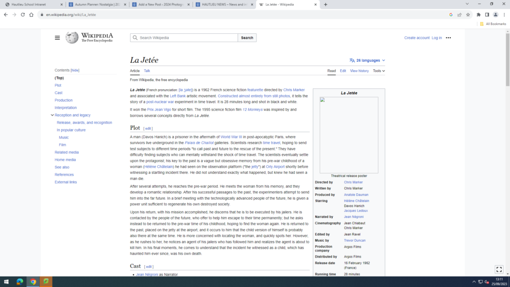
LA JETEE

La Jetée ) is a 1962 French science fiction featurette directed by Chris Marker and associated with the Left Bank artistic movement. Chris Marker, (1921-2012) was a French filmmaker, poet, novelist, photographer, editor and multi-media artist who has been challenging moviegoers, philosophers, and himself for years with his complex queries about time, memory, and the rapid advancement of life on this planet. Marker’s La Jetée is one of the most influential, radical science-fiction films ever made, a tale of time travel. Furthermore what makes the film interesting for the purposes of discussion, is that while in editing terms it uses the language of cinema to construct its narrative effect, it is composed entirely of still images showing images from the featureless dark of the underground caverns of future Paris, to the intensely detailed views across the ruined city, and the juxtaposition of destroyed buildings with the spire of the Eiffel Tower. 
LA JETEE

La Jetee was composed of static images with a VoiceOver which provided the necessary information for the audience to understand the short film. The phrase ‘La Jetee’ translates to English as ‘The Pier’ more specifically ‘a small pier for use as a landing-place’ which relates to the meaning of the film. ‘The story of a man forced to explore his memories in the wake of World War III’s devastation, told through still images‘ which suggests ‘The Pier’ connotes this idea that its his path to freedom once he is able to relive his memories he has forced to hide. Furthermore the main theme that La Jette is trying to explore is morality. As how the man lives to only find out the moment that has marked his entire life is the memory of his own death, from a philosophical point of view, La Jetee is an existentialist tale of doomed existence, inevitability, and predetermined death.

BIBLIOGRAPHY:

https://filmslie.com/chris-marker-la-jetee-analysis-temporality/#:~:text=La%20Jetee%3A%20mortality%20through%20photography&text=He%20lives%20his%20life%20(presumably,%2C%20inevitability%2C%20and%20predetermined%20death.

JERSEY HERITAGE ARCHIVES + EXHIBITION (NO PLACE LIKE HOME)

WHAT ARE PHOTOGRAPHIC ARCHIVES?

The archive or archives are a collection of documents and records that contain historical information. You can also use archives to refer to the place where archives are stored. – Collins Dictionary

JERSEY HERITAGE JERSEY ARCHIVE:

The Société Jersiaise Photographic Archive (SJPA) contains over 125,000 items dating from the mid-1840s to the present day. It is the Island’s principal collection of nineteenth and early twentieth-century photography and reflects a rich history generated from our geographical and cultural position between Britain and France, two nations that were prominent in developing the medium. 35,000 historical images in the Photographic Archive can we found on their website here.

27/09/2023 AT JERSEY ARCHIEVE:

WHAT HAPPENED ON THE TRIP:

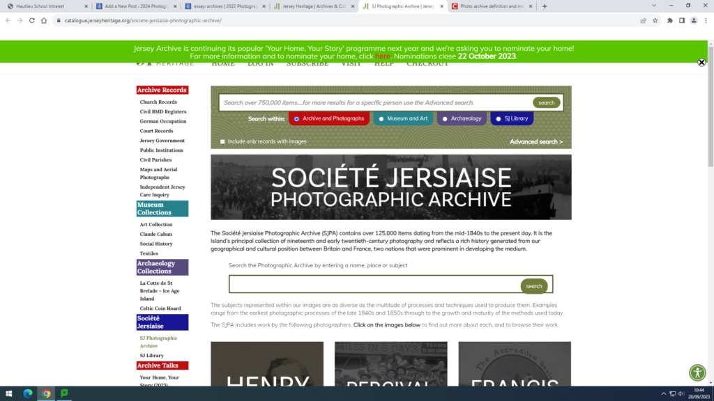
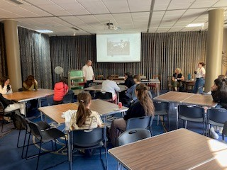
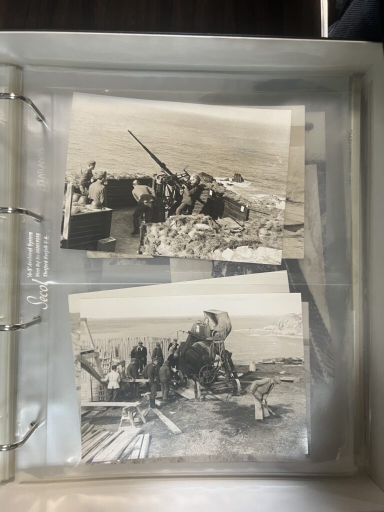
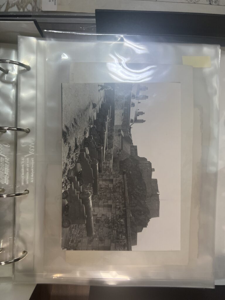
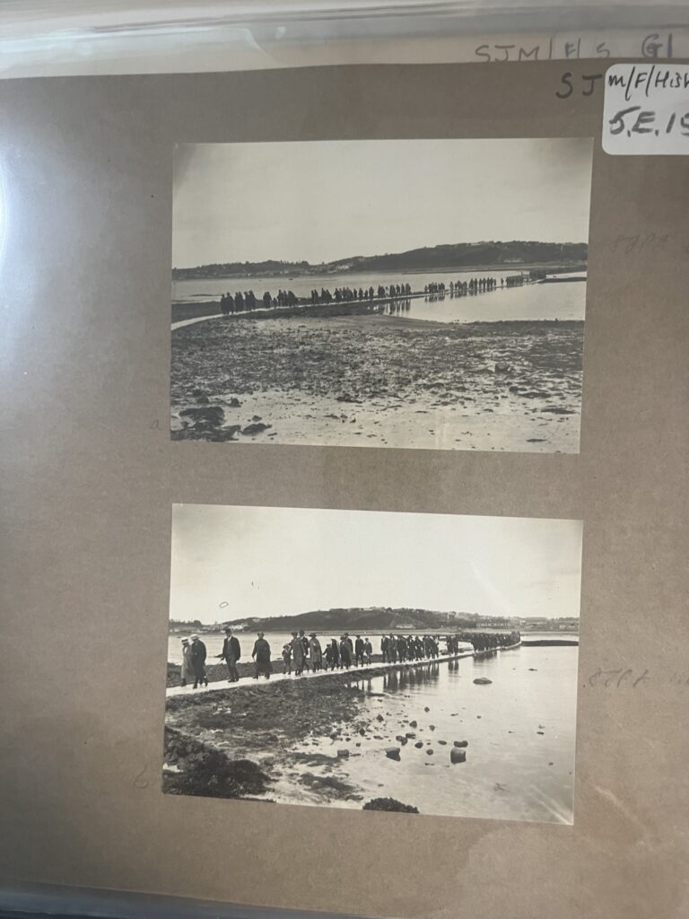
We arrived at Jersey Museum for 8:45am, there we made our way up to the room where we received the talk by ‘The Gatekeepers.’ They gave us information on how to use the Jersey Archive website in order to help us for our short film project. He proceeded to digitally show us how to filter specific instruction in order to receive the best possible results. He was able to give us some information about Elizabeth Castle, where we were supposed to extend our trip, and showed us their archival prints of historical factors around the building.

IMAGES TAKEN:

OVERVIEW OF THE TRIP:

  • They told the group of students useful historic facts about the origins on the Jersey Heritage and how it became an archive and a photographic archive known as ‘SJ Photographic Archive
  • Showed and taught us how to use the Jersey Heritage website and how to filter and modify the filter in order to get to the SJ Photographic archive, furthermore able to find images you need.
  • Told us the necessary needs your photographs need to fit in order from them to be publish to the archive eg what historic value do they have to society?
  • Showed us printed images from their archive in the building (printed copies of photos that also found digitally online, some are original and not found online)

EXHIBITION – NO PLACE LIKE HOME

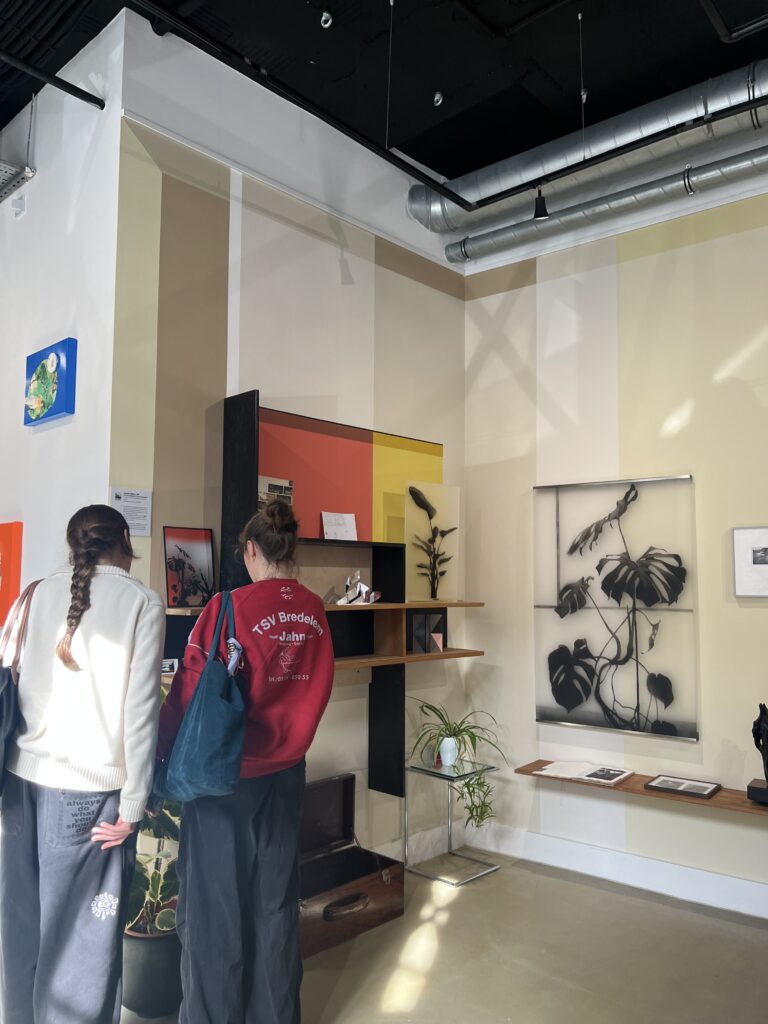
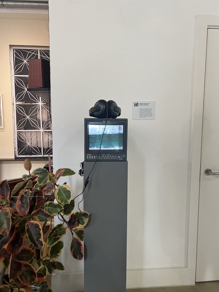
The exhibition took place in the Capital House where many project were displayed for, No Place Like Home.

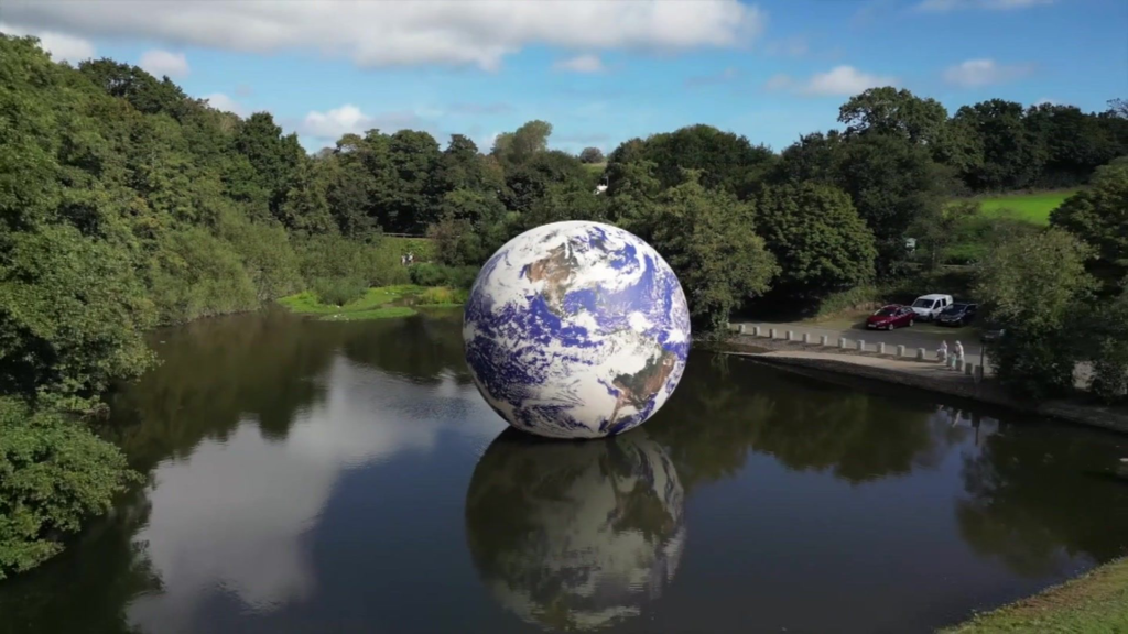
floating sculpture of the Earth was situated in the Queen’s Valley Reservoir by artist Luke Jerram between 14th and 24th of September and this was a part of the exhibition. This was to spread awareness about climate change and how it is affected the Earth.

QUOTES FROM Mr Jerram:

“I created the artwork to keep this subject on the agenda and also show people what we could lose.”

“Our floating blue planet is just incredibly beautiful and fragile.

“It will also make people realise what public art can do and it can reach out to people in lots of different ways

“It was really nice to see the Floating Earth in Jersey with ducks and swans swimming around, which means they weren’t scared of it; which is nice.”

SOURCE: BBC NEWS

RESEARCH ELIZABETH CASTLE

RESEARCH ON: post-war tourist attraction, current site of Jersey Heritage and living history.

ELIZABETH CASTLE INFOMATION

https://www.jerseyheritage.org/visit/places-to-visit/elizabeth-castle/

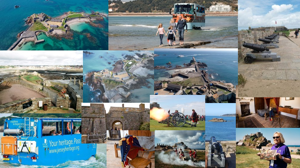
The castle is located on a tidal island within the parish of Saint Helier, Jersey. You are able to reach the castle by walking along the causeway or by taking the amphibious Castle Ferry. The castle is a 15-acre fortress that gave refuge to King Charles II during the English Civil War. It also has many historical aspects dating from; including the English Civil War, the German Occupation in World War 11. The other past of the site is, The Hermitage, where Saint Helier is thought to have lived around 550 A.D.

The spot where Elizabeth Castle is located, the Upper Ward or Mount, was a religious priory from 1155 until the late 16th century. The Islet, as it is known, is half a mile out to sea and is connected to mainland Jersey at low tide by a causeway. So, for seven out of every 12 hours it can only be reached by boat.

TOURIST ATTRACTION ELIZABETH CASTLE:

Elizabeth Castle is now managed by Jersey Heritage as an act to the public service, including as a tourist attraction. At Elizabeth Castle, as well as exploring the site and its history, you can see regular musketry demonstrations and on some weekends there are live recreations of the garrison of 1781 – the time of the battle of Jersey – when historical Interpreters give displays of musket and cannon firing and civilian life.

SYNOPSIS:

The short film we will be producing at Elizabeth Castle will be about the post historic events and the tourist attractions. The short film will include pictures of the main historic parts such as the; canons, the structure of the castle, and the main outside area (the layout). This short film is to show the evolution of the castle and how it once gave refuge to King Charles II and has now become open to the public and marked as one of the most historic elements on the island.

PRICING:

MOODBOARD:

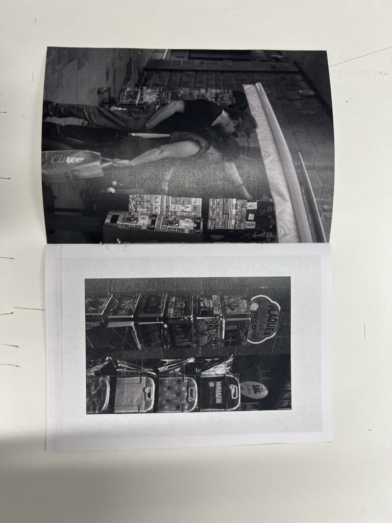
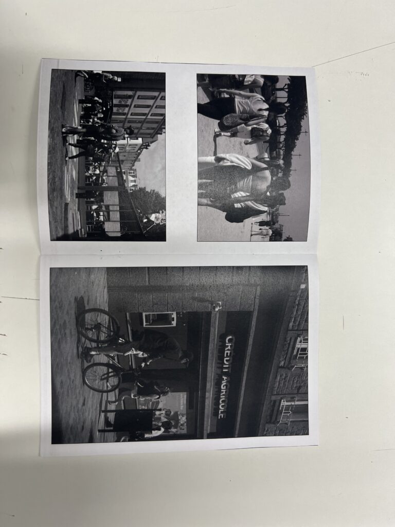
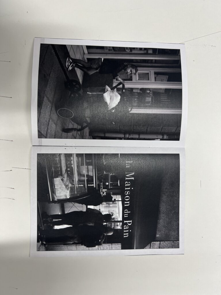
ZINE PRINTED AND BOUND

CRITIQUE:

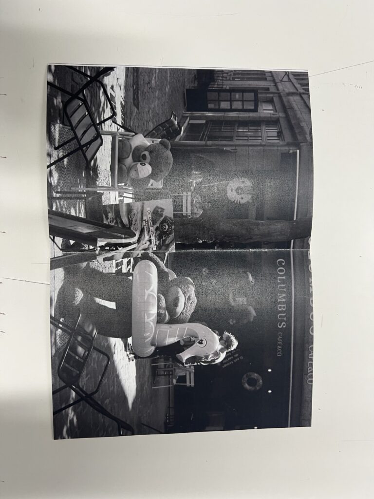
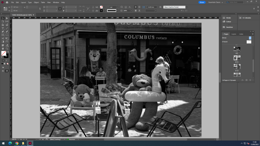
This project overall has been the best I’ve created. The whole process of taking the images, editing, and then creating a zine showed me all the work that goes into creating something like this. By going to St.Malo it created a new area for new images and a different lifestyle and culture than Jersey which meant I was able to take images I would usually be able to take. I am delighted by the way the zine looked in its finally copy, and impressed with how the layout turned out. Overall I conclude that the images worked really well together and how well the quality of these images displayed on print. Regarding the layout I am satisfied that I separated the two locations by adding the landscape image between, it created this sense of a storyline in my zine with the travel between two locations. However to make this zine better in the future I will perhaps add text next to my images to describe what is going on and what they represent, in this nostalgia project.
PHOTOGRAPHY NEWSPAPER SPREAD; INDESIGN

VERSION ONE:

VERSION TWO:

DESCRIPTION:

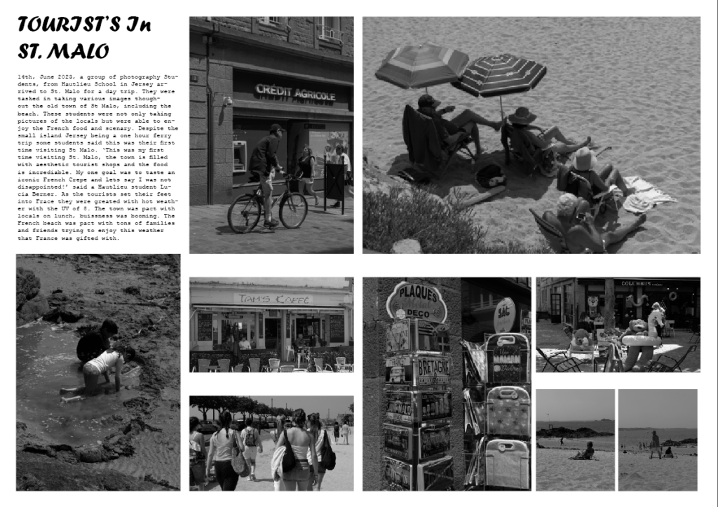
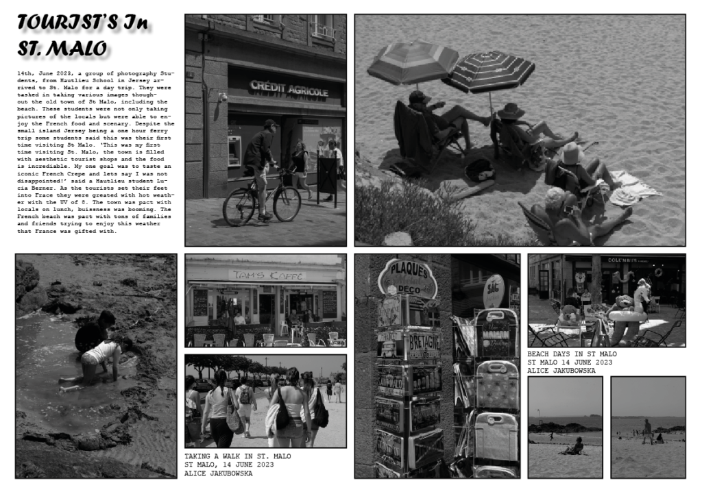
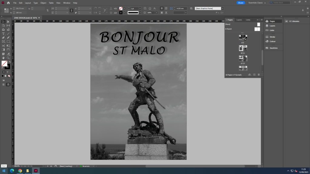
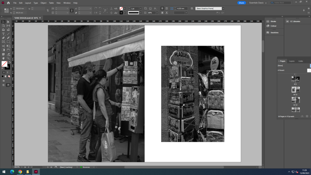
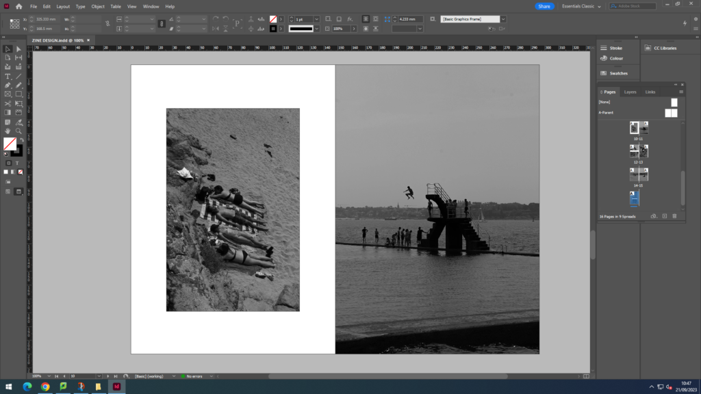
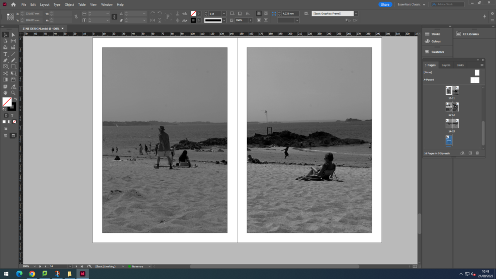
Here was my indesign project, in which I created a photographic zine. In these screenshots you are able to see the process and how the zine evolved into the final outcome. In ‘Indesign’ I was able to experiment with the placement of images, text eg fonts, borders and the background.
As you can see in the both zines I used a range of photos from the shoot including landscapes and portraits. With the layout of the images I tried to incorporate various size images, large and small. While creating this zine I tried create a minimalistic look as most audiences prefer something more subtle, this is why I used minimal text and range of different size images.

In version one of my zine, it looks basic. This is because it was my first time using the software InDesign and I was experimenting with the features. It had a plain white background, and perhaps too many images. I also decided to experiment with the border around the images giving it a slightly black border in order to emphasise the images. Furthermore, as I began to familiarise myself with the software I began working on the background, adding another image in the back and decreasing the opacity, to create some depth in the image I also included black rectangles to give more dimension.

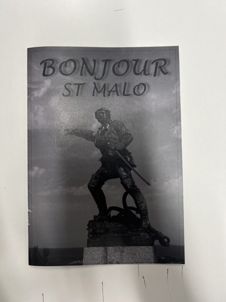
In version two of my zine I decided to add less images. This was so I could achieve this minimalistic look. I also decided to play around and incorporate some French words into my title, in which resulted in ‘Bonjour St Malo’. By creating this title by incorporating French it gives a more clear understanding that this was a French shoot. Due to adding less images I was able to spread the title across the page and add slightly more text, by creating the text box large it felt more spacious then crowded. I also incorporated a bleed, an image which runs across the border, on the bottom left third. This is so we could have a variety of looks. Furthermore I decided to incorporate the French flag into my zine, I incorporated this in the border of the images, using the colours of the French flag, blue, white, red.

DESIGN AND LAYOUT

DESIGN AND LAYOUT OF MY ZINE:

DESCRIPTION:

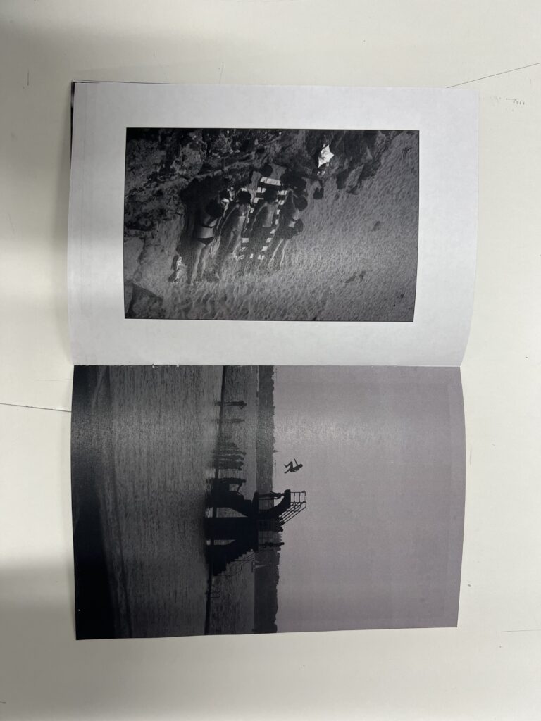
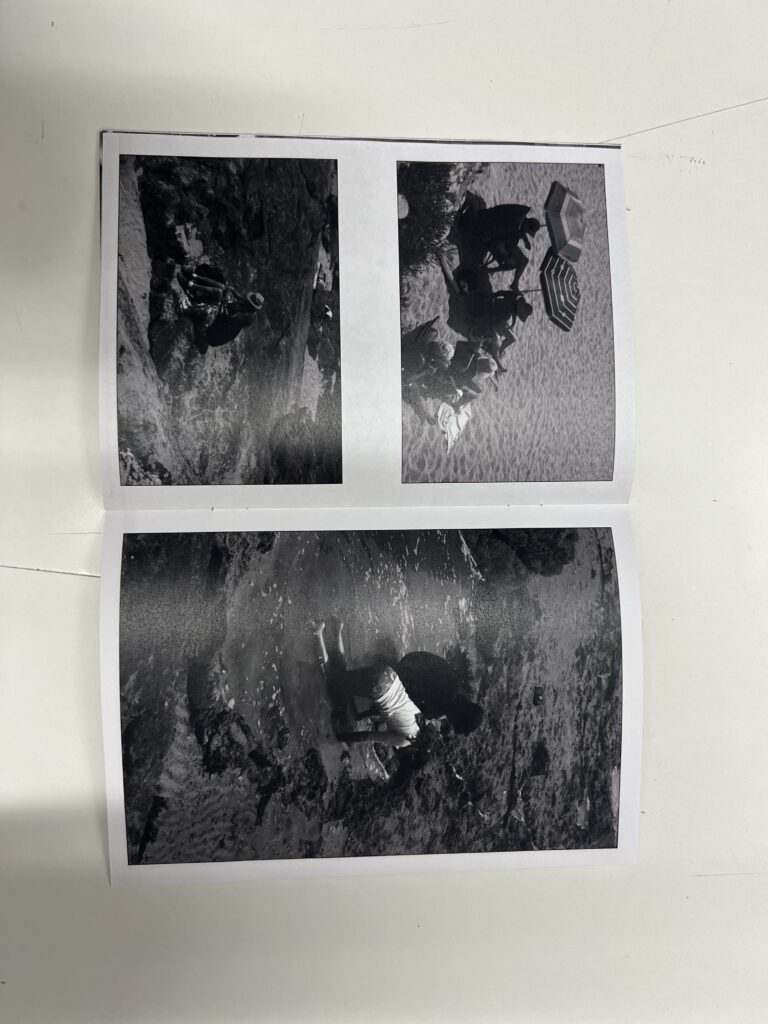
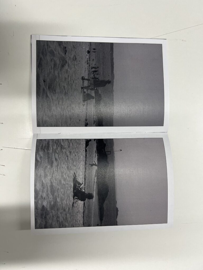
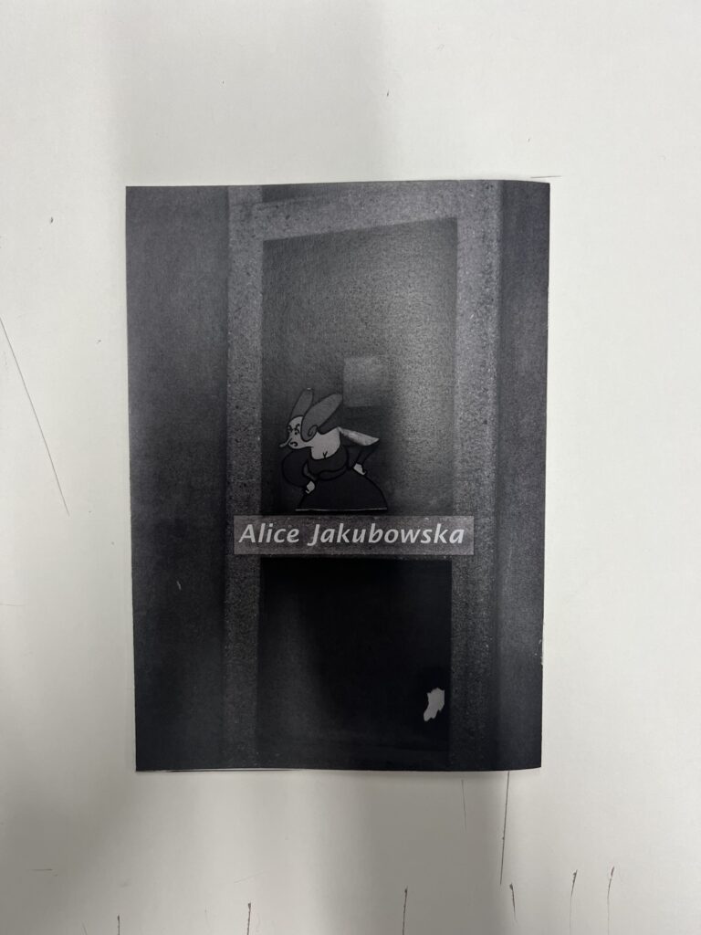
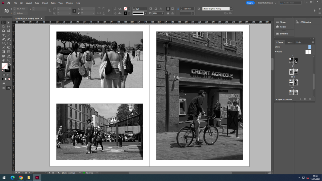
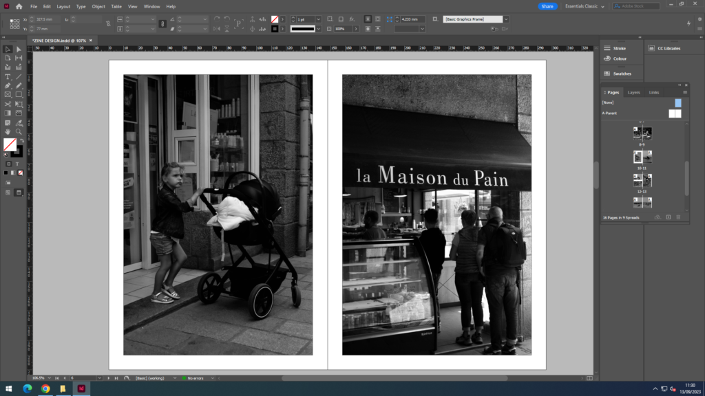
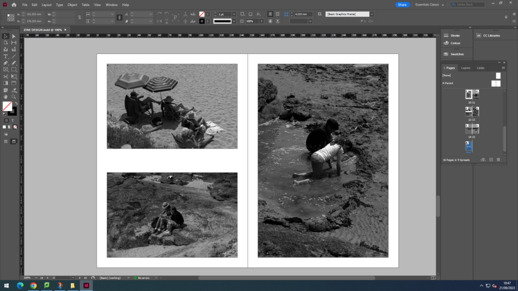
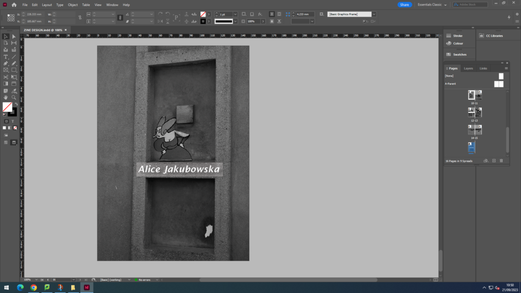
For my front and back page I wanted a simple image, to keep it a minimalistic aesthetic. The statue worked as my front image because the angle of the image made it seem like he was looking at the audience and pointing at the views in St. Malo perhaps making them more excited to open the zine. Furthermore I think my title ‘Bonjour St. Malo’ worked with my image of the statue as it suggested that he was greeting them into further reading the magazine and welcoming them on looking at the attractions in St. Malo. The back page was an image of a cartoon character that was stuck on a wall is a random street, however I think it worked well as my back page as it was simple yet added a little comedy with the yelling female cartoon character. The start of the zine are the street and attractions in the little town of St. Malo. Images included restaurants, tourist stands, and people walking along the street. This was broken by a landscape image of a set up that a restaurant created with some teddy bears. This is so the middle broke up the two halves of the zine. On the second half of my zine I included images from the coast (little beach found in St. Malo). As the weather was nice many people were at the beach with resulted many successful images. Images that I included in the blog included, people jumping from the driving board, groups of people tanning, and kids making sand castle and playing in the water. Overall with my zine design I tried to create a minimalistic and clean zine which didn’t look to overcrowded with image, and looking at the final product I believe I achieved this

ZINE RESEACH AND ANALYSIS

MOODBOARD:

SIZE OF ZINE:

InDesign
Create new document
width: 148mm
height: 210
pages: 16
orientation: portrait
columns:2
column gutter: 5mm
margins: top, bottom, inside, outside: 10mm
bleed: top, bottom, inside, outside: 3mm

RESEARCH:

FURTHER READING: Something Tactile: Why Photographers Should Create Zines

WHAT MADE YOU WANT TO MAKE A ZINE?

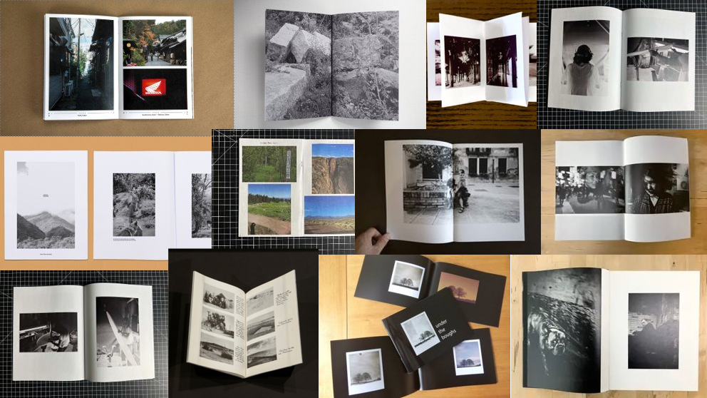
Creating a zine allows you to express your photography in a different way. The ability to create something so impactful by the composition, juxtaposition, and sorting of images to allow the flow of the story creates a different emotion and understanding in the photographer and the audience. A zine also allows something that is hand-held and physically in your hand that you are able to see; and not through a computer or electronic device. A zine allows people to engage socially and express feelings about their opinions with each other.

WHAT’S THE CREATION PROCESS LIKE? WHAT BIG QUESTIONS GO THROUGH YOUR HEAD AS YOU’RE EDITING AND PUTTING STUFF TOGETHER?

The creation process, personally is the most stressful. While you are placing your images you are trying to create a zine that looks aesthetic and the pairing of images and the flow images in a sequence is crucial. This is because if two images do not work together then the message and the flow is broken; however if you put two good images together is can make a powerful combination and transform the whole page. During the creation process I tried to create a well place, clean zine as far as I created a sequence in pages for it to flow smoothly.

DO YOU FEEL THE EFFORT IS WORTH IT? HOW DO YOU MAKE IT WORTH IT?

You make it worth it by creating a zine you are 100% happy with and proud of. By putting in the effort you are able to create something that is worth it; you need to put both aspects in otherwise then it will be pointless and you wont be happy with the result.

Editions Bessard is a paris-based independent publishing house created by pierre bessard in 2011. Focusing on working with artists, writers and curators to realise intellectually challenging projects in book form:

ANALYSIS:

  • How you want your design to look and feel
  • Format, size and orientation
  • Narrative and visual concept
  • Design and layout
  • Rhythm and sequencing
  • Images and text
  • Title and captions

WHEN YOU THOUGHT ABOUT MAKING ONE, WHAT WAS MOSTLY IN YOUR HEAD FOR HOW YOU ENVISIONED IT AND WANTED IT TO LOOK, FEEL, ETC? WHAT DID YOU WANT IT TO BE ABOUT? – Question taken from ‘Why photographers should create zines’

When created the zine I already had an idea of the title which was ‘Bonjour St Malo.’ This title was inspired when I was making my double page spread for a different magazine; however I believe it fits with the requirements for this current zine as using the French language gives further connotations of the St Malo trip. By using the French exclamation ‘Bonjour’ it gives a sense of nostalgia to my zine bringing back the native language. My main idea for this zine was to use images which best describe the tourism of St. Malo; therefore instead of adding text I used images that showed in a visual format what I would be expressing in words. The sizing of images are all the same as I kept the style of the layout sequenced through my zine as I was trying to created a clean polished look. By using a clean design and layout is keeps the magazine more composed and organised. In the design of my zine I used a range of different orientations of my images (portrait and landscape) this so my zine would have more of a diverse image range and create different formats in the zine. I decided not to add any text or captions, this is so the images can speak for themselves.