



When first looking at this photo there is a clear power dynamic the man in the centre at the forefront of the image staring straight into the camera with a blank expression and clasped hands it gives him a sense of confidence and almost makes him intimidating to look at.
The two pillars either side create symmetry framing him and the industrial looking workshop behind him implying that he owns it. His body creates a triangle in the centre mimicking how his hands are clasped also in a pyramid shape this furthers his sense of power. The ceiling has beams that lead backward creating depth but also drawing the eye back to looking at him. There are skylights on the ceiling that whilst letting light in also create a pattern leading to the back of the workshop helping create depth this is used to create a visually interesting image with harsher lines but also creates a sense of scale within the environment. with The use of backlighting in the image casts the mans face is in shadow obscuring his face whilst also giving him highlighting his silhouette giving him more shape and sharpening his features makes his gaze more severe. A shallow aperture is used to have the foreground focused whilst unfocusing the background keeping the eyes on the man as the focal point of the image.
The man in the photo was Alfried Krupp a German industrialist in charge of making trains in world war 2 many of which were used to transport Jews to concentration camps. The photographer Arnold Newman initially refused the commission the photograph Alfried Kruppbut later accepted seeing it as an opportunity to ‘expose’.
Anthropocene refers to the earths latest geological time period which is that of the affect of humans on the environment and earths ecosystem. Humanity has had drastic effects on the earths climate such as animal extinctions – The Anthropocene was a project started where artists- photographers, filmmakers ect could make responses to climate change and Anthropocene. For my project I decided to focus on plastics and how we are so reliant and so used to using and seeing plastic everywhere.
initial ideas
-post covid
-population density buildings-apartments offices- night photography
– plastic waste – plastic bottle colidescope??
My initial plan for the Anthropocene project was to look at the after math of Covid – masks and signs left over. I found a lot of that in Edinburgh and other cities ( old vaccination centre signs left in shopping enters) but jersey didn’t have anything as extreme because of the smaller population. I decided to focus on plastics and how used we are the seeing them in our daily lives.
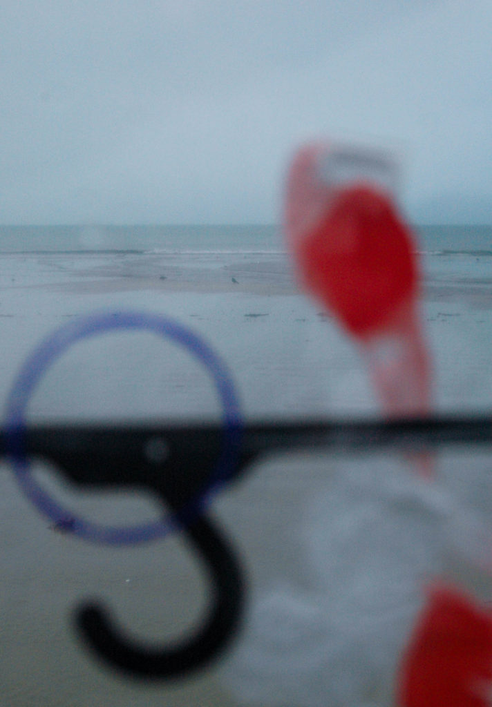
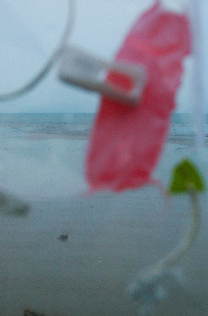
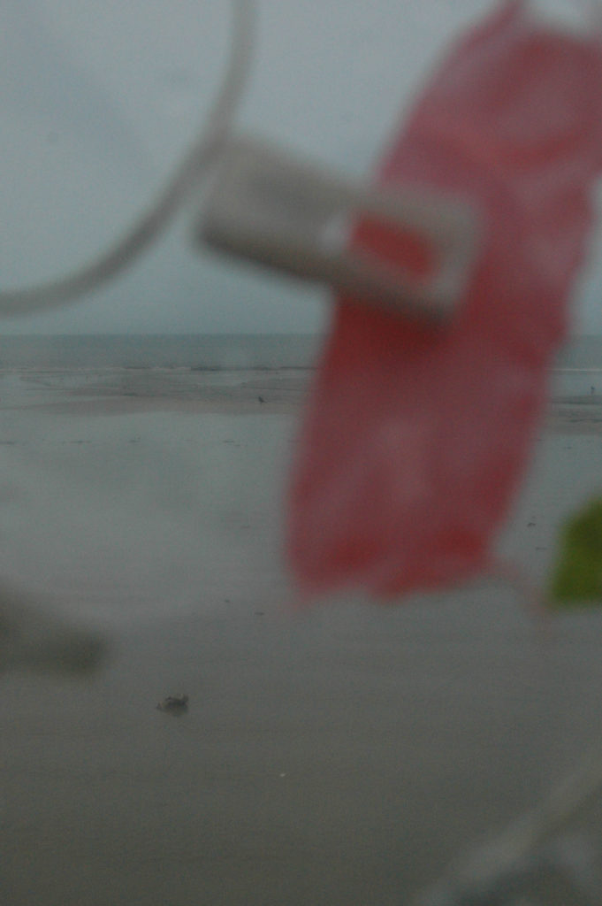
My initial plan for the Anthropocene project was to look at the after math of Covid – masks and signs left over. I found a lot of that in Edinburgh and other cities (old vaccination centre signs left in shopping enters) but jersey didn’t have anything as extreme because of the smaller population. At this point I was also very inspired by Stephen Gills work and felt that it wouldn’t hand itself as well to that so I decided to focus on plastics and how used we are the seeing them in our daily lives – hence inspired by Stephen Gill I put plastics over the lens so you were literally seeing through it. The final photos inspired by Stephen Gill in themselves were interesting but didn’t end up being my favourite.


I had struggles getting to camera to focus how I wanted through the clear plastic screen and a lot of photos ended up being blurry if I were to do it again I think I would find another way to suspend the plastics in front of the lens but I think it was an interesting experimentation and something I would try again in the future.
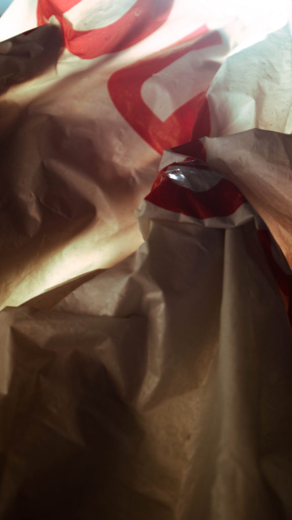
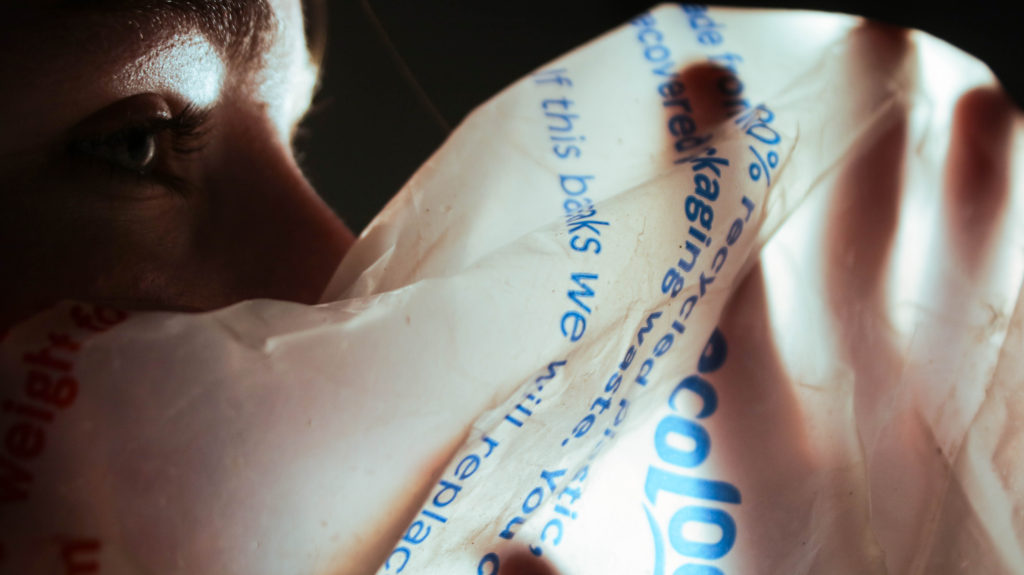
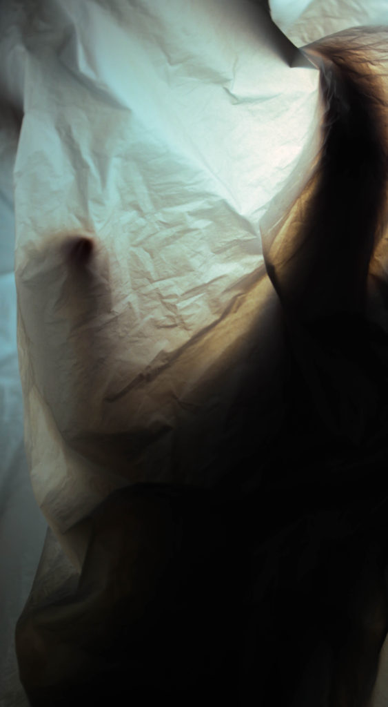
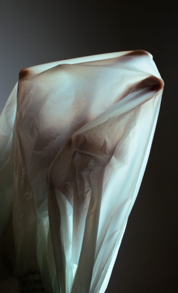
For the second photoshoot I collected plastic bags inspired by Vilde Rolfsen but instead I wanted to focus on human form mixed in with the plastic, the idea being ‘drowning in plastic’. I also took inspiration from René Magritte’s The Lovers painting as I wanted to create something ‘haunting’, so I focused on trying to make shapes and silhouettes inside the plastic bags using backlighting.
—


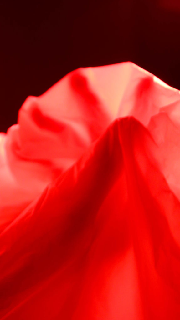
For these two images I used filters over the studio lights – Alone they aren’t successful images however together they compliment each other well.

The initial attempts looked a bit horror movie poster esc so I leaned more towards scrunching the bags to make interesting shapes.


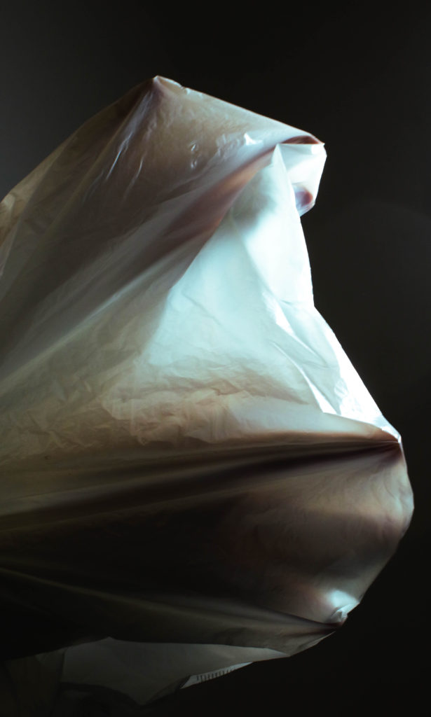
The middle image of the three was kind of and afterthought as it was suggested to me that there should be a third to create balance finding an image was quite difficult and it is not my favourite however i think it works well to break up the other two.


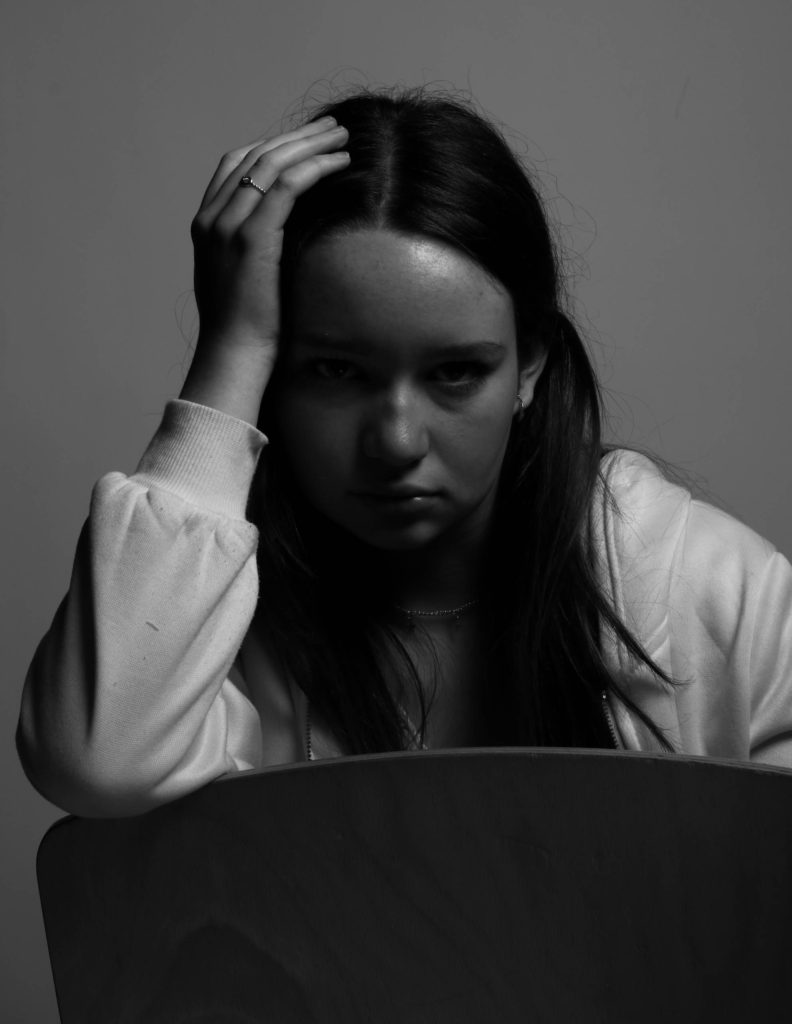
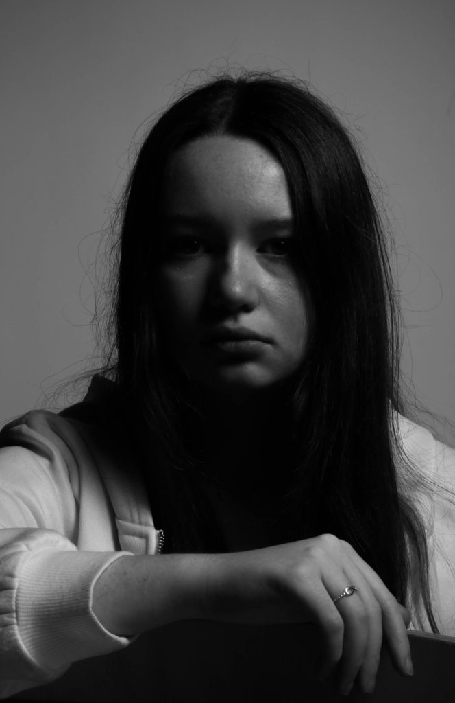
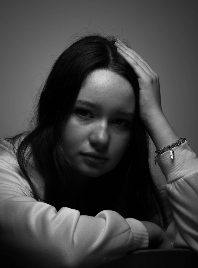
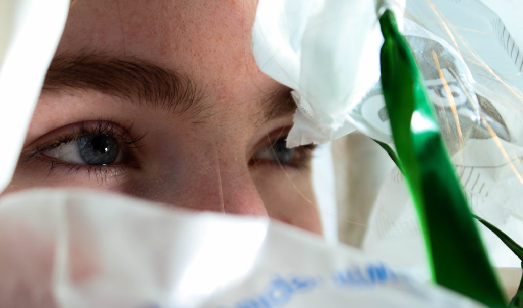
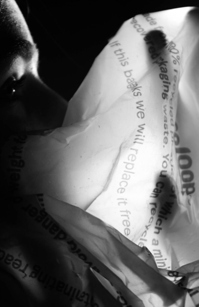
I then tried using portraiture along with the plastic bag and whilst I liked these two but I found the portraiture was overbearing with others and took away from what I was trying to achieve.

The black and white whilst giving it a more dramatic look took away from the unnatural colours I was trying to achieve.
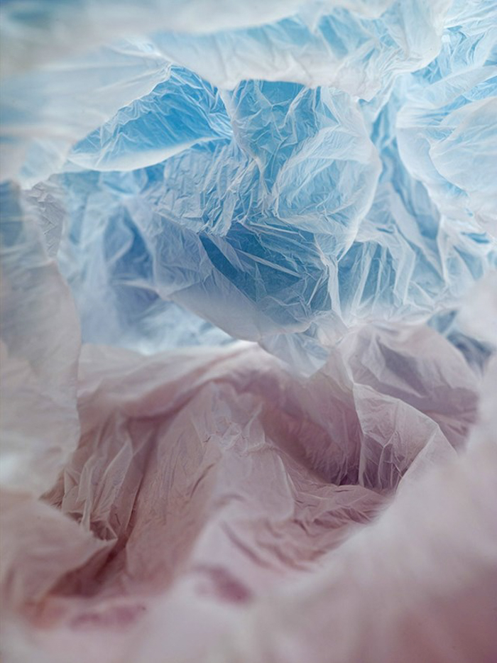
With this image I was attempting to imitate the pastel colour gradients that Vilde Rolfsen uses in her work – whilst being whilst achieving what I wanted I felt that for this product it wasn’t what I was looking
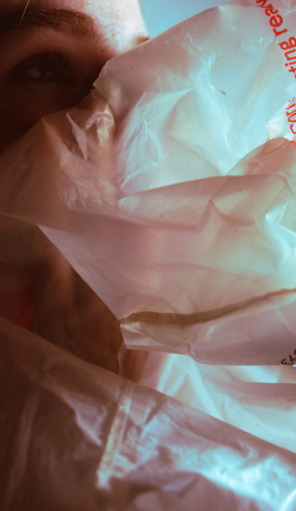
Over all I am pleased with the project and the final images I think they articulate what I was going for well. however there’s a lot if given the chance I would change and improve.

Vilde Rolfsen is a fine art photographer based in Oslo Norway. In her work ‘plastic bag landscapes’ Rolfsen scrunches plastic bags and photographs the inside to create abstract landscapes whilst addressing the effects of plastic on the land and oceans.


Vilde Rolfsen first started noticing the impact of plastic on the environment when living in London and the abundance of plastic bags and litter in the parks and city. The whimsical Plastic bag landscapes were a response to this. “I didn’t want to do something that was too in-your-face, because I think that puts people off.” – the compositions are inspired by her home country of Norway and its mountains, recreating the natural with the man made.

Rolfsen uses unatural pastel colours in her work attributing to the artificial feel whilst still be pleasing to look at. The shapes and texture created by the bags are natural looking almost like glaciers or mountains which contradicts the material they are mad with – Rolfsen modeled the bags after the Norwegian mountains. She uses vignette depth of field to focus the centre and have the edges unfocused and uses low iso to have sharp images.



Stephen Gill inspired work-


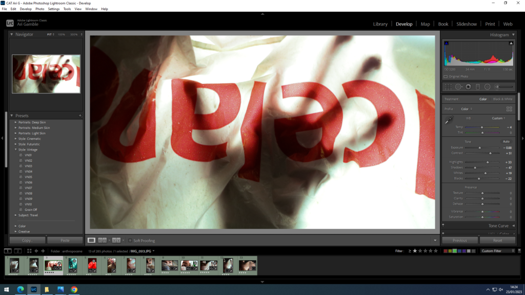
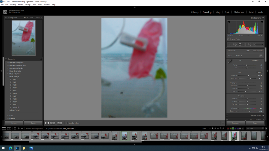
For this photoshoot I wanted to create harsher lines against the background so I achieved this by adjusting the contrast, shadows and saturation.-
First attempt
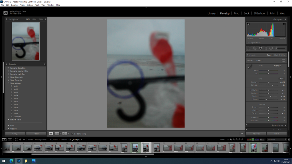

I lowered the temperature towards blue to create a cooler more bleak looking landscape. I also experimented with the contrast and saturation to make the plastics stand out from the background mimicking the contrast seen in Stephen Gills work.
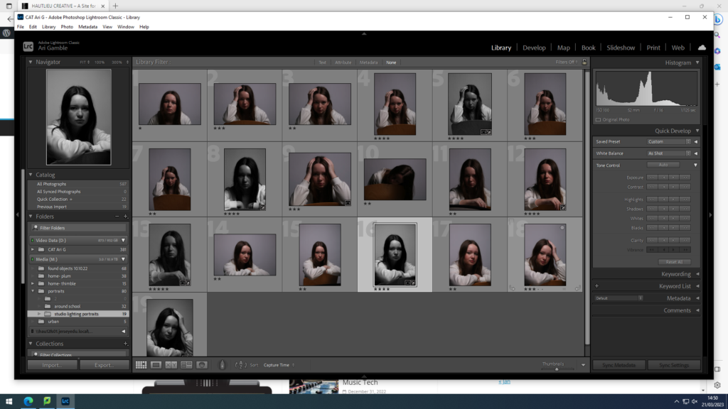
images and selection-
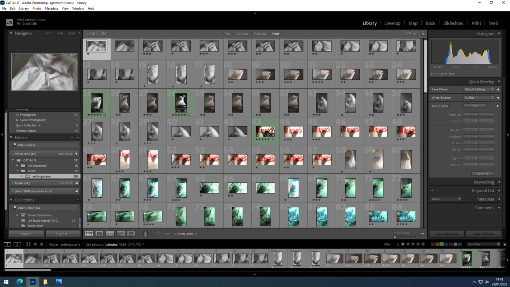
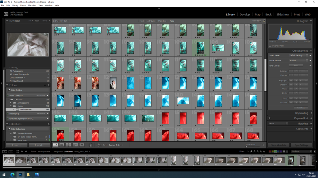
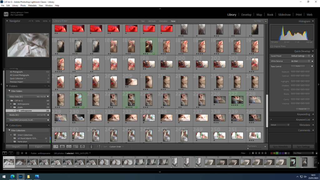
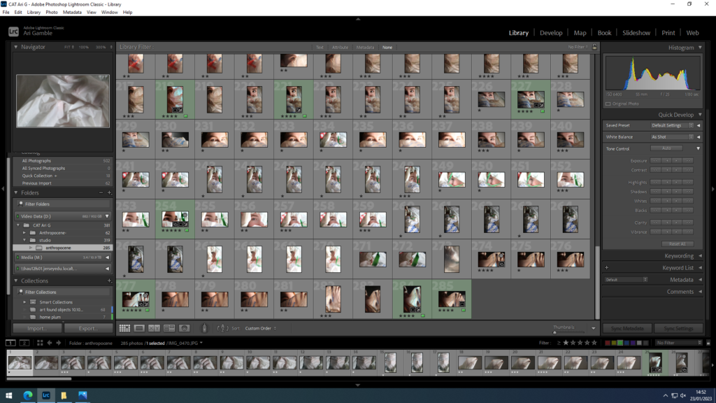
I decided a lot of the images taken with coloured filters over the lights were unsuccessful in showing what I wanted as they were too exposed and skipped out on the effect of the transparency that I was going for.
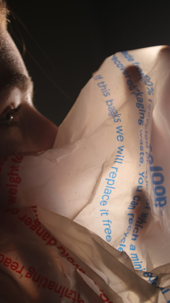
This image combines both the portraiture that I was going for and the more abstract shapes from the plastic bag.

focus is one just the hands and the shapes created.
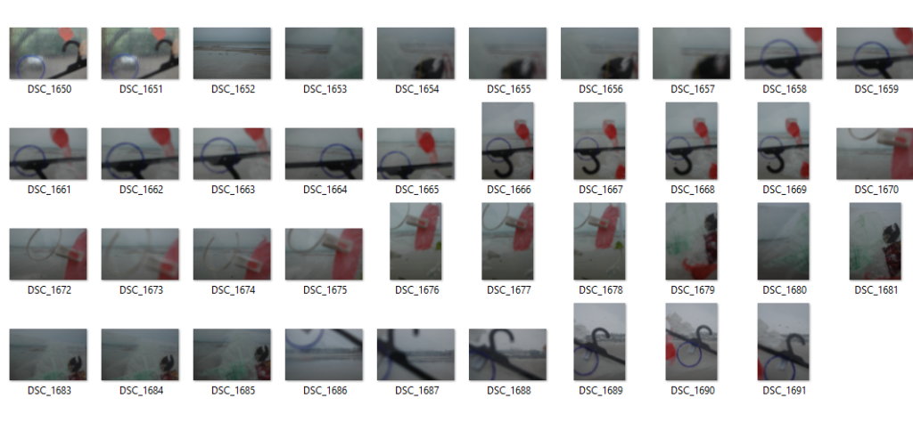
selecting-

I think these images and the clearest backgrounds and defined shapes.


experimentation

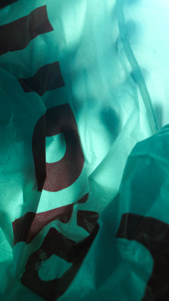
I used coloured filters over the lights to create bright colour with little to no editing- whilst I don’t think these images are effective on their own together they compliment each other.
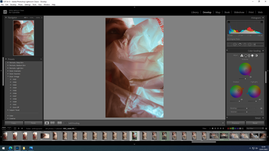
Editing
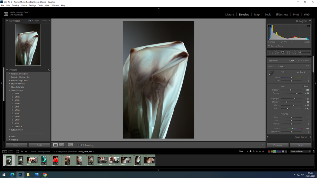
I adjusted the contrast and tones to create more dramatic lighting to highlight the transparency of the plastic. I also used colour grading to switch to blue highlights as it gave a cooler less yellow light.


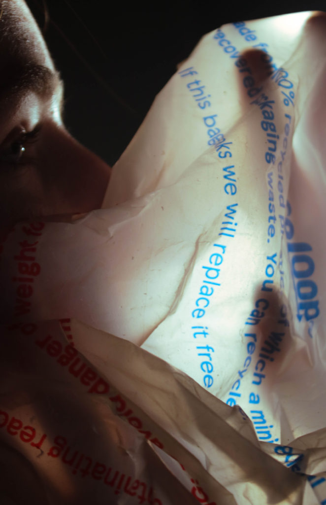
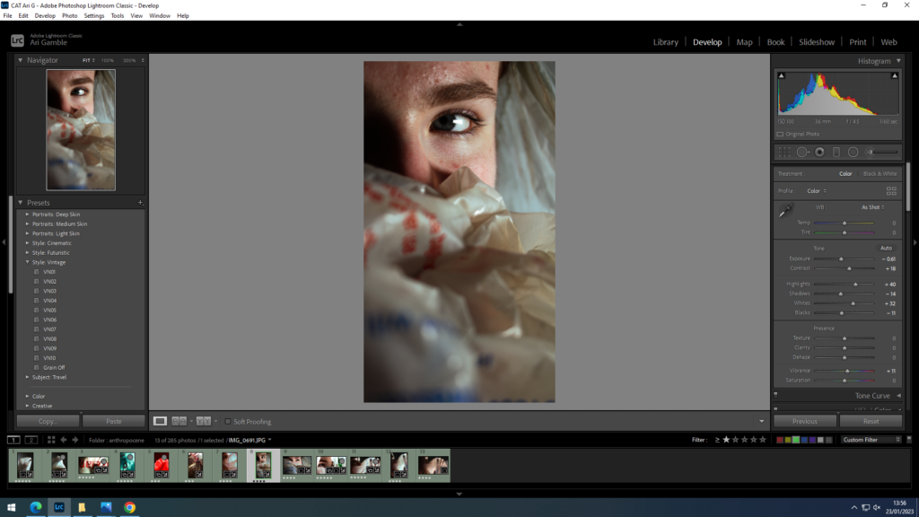
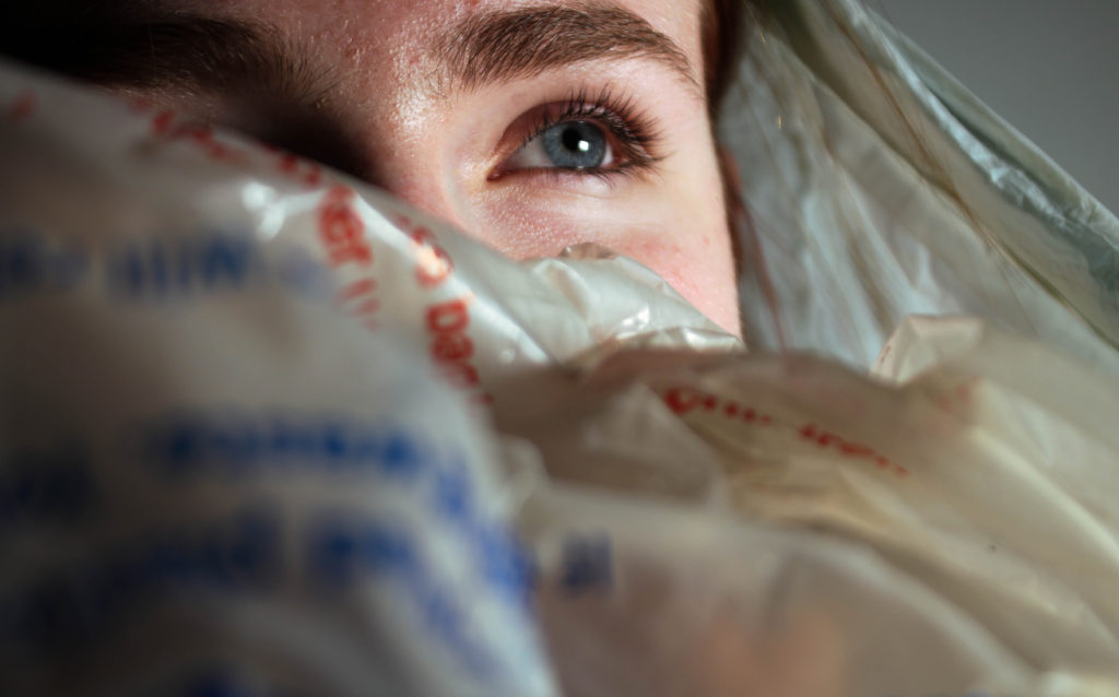
Again switched colour grading highlights to blue to keep cohesive- I think the portraiture dominates the images making them less effective for the focus being plastic.

