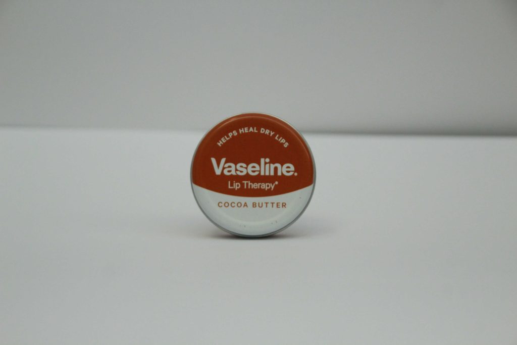
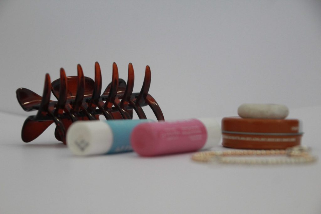
FIRST PHOTOSHOOT
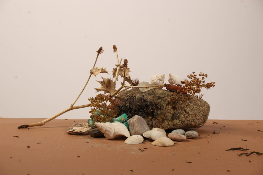
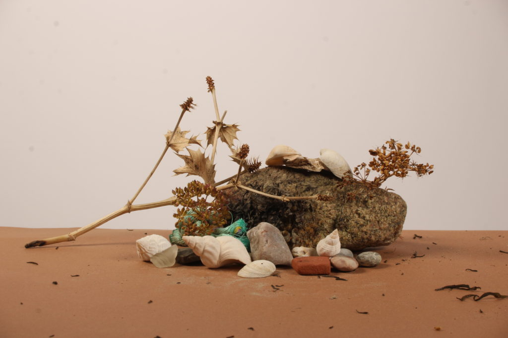
BEST SHOTS
EDITING:
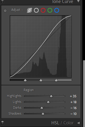
Edits I made (using Lightroom):
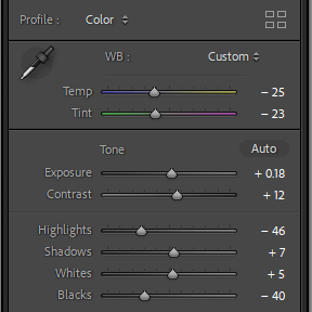
Result –
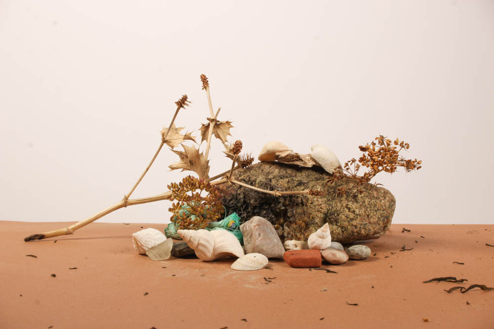
Evaluation:
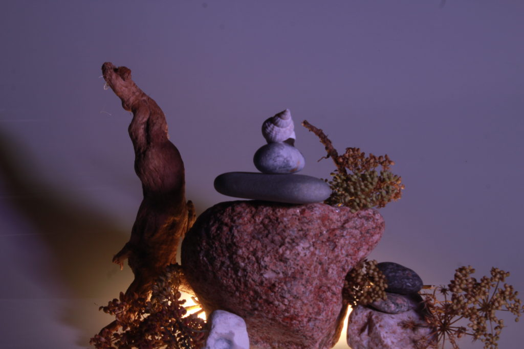
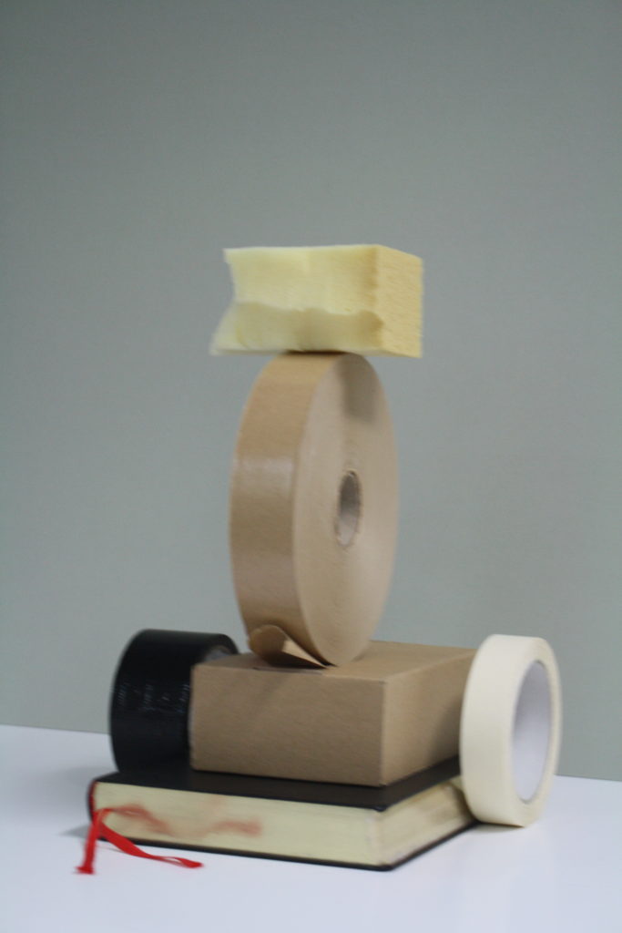
In conclusion, I really liked how it turned out; I think the contrast between the lights and darks work very well together and adds a sense of depth and shape to the image. There are also lots of different textures and shapes which is what makes the picture different from just a simple image. The colours all work well together without them blending into each other too much.
SECOND PHOTOSHOOT
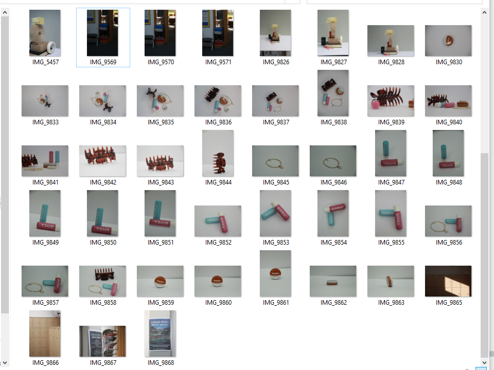
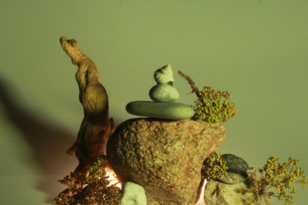
BEST SHOTS
EDITING
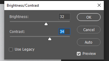
The edits I made (using photoshop):
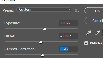
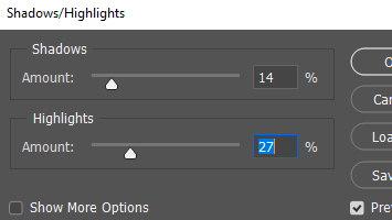
Result:
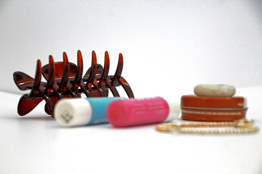
Comparison (left edited, right original):
Evaluation:
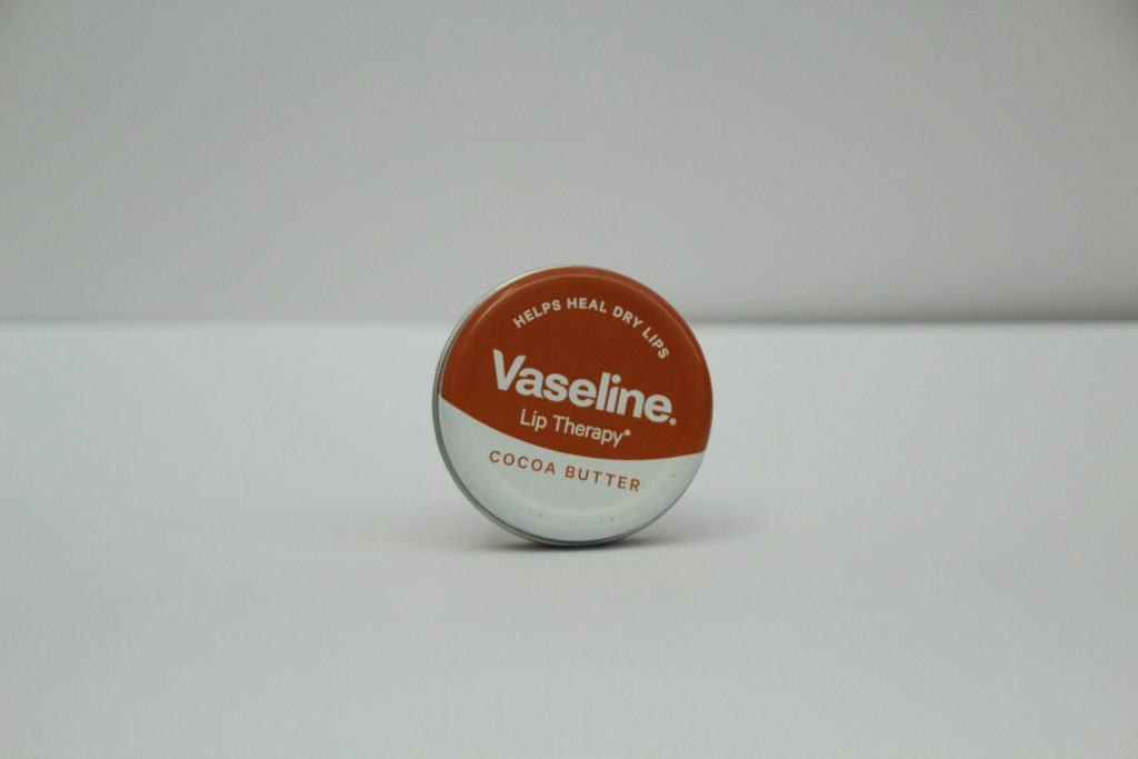
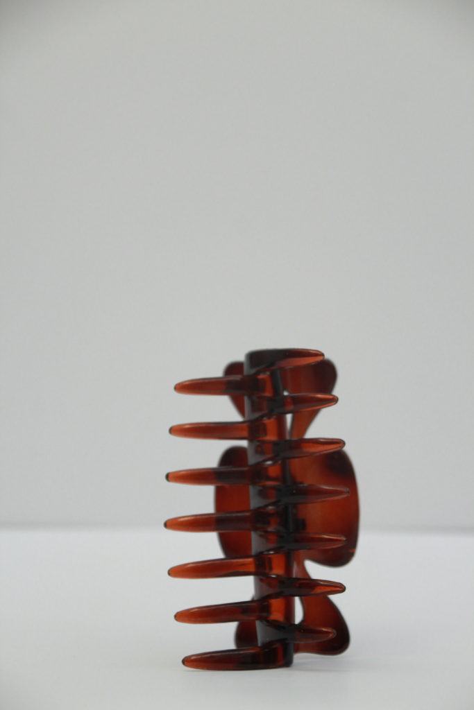
Overall, I really like how it turned out, I think that making the background lighter and making the objects in the image really took it to the next level. What I really liked about the original picture was the depth of field and the focus only being on the clip in the background, causing the objects in the foreground to be blurred out, which was what I wanted to enhance I the edit and really show off. I think I did that successfully and it added more depth and life to the picture.

