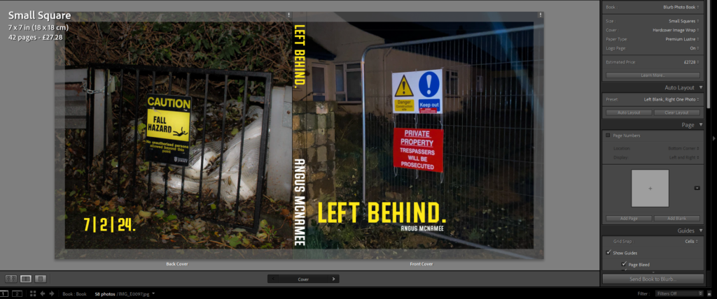
The photobook overall is set to the small square size (7×7 inches) and has a total of 42 pages, a lot more pages I was expecting. The front cover, I wanted the title to be simplistic and nominal, of course I also chose a text colour to stand out from the dark image. I also put the date of publication on the back. I liked the font because it looks bold and serious, similar to the text you’d see on a sign telling you to stay out.

For the photobook, I wanted to feature mostly square photos placed in the middle of the page. I feel this makes the pages feel more professional and nicer to look at, it also makes the images print out at a higher quality. I selected these two images because they both feature a fence and some form of un-welcomeness, with the signs and the dark doorway.

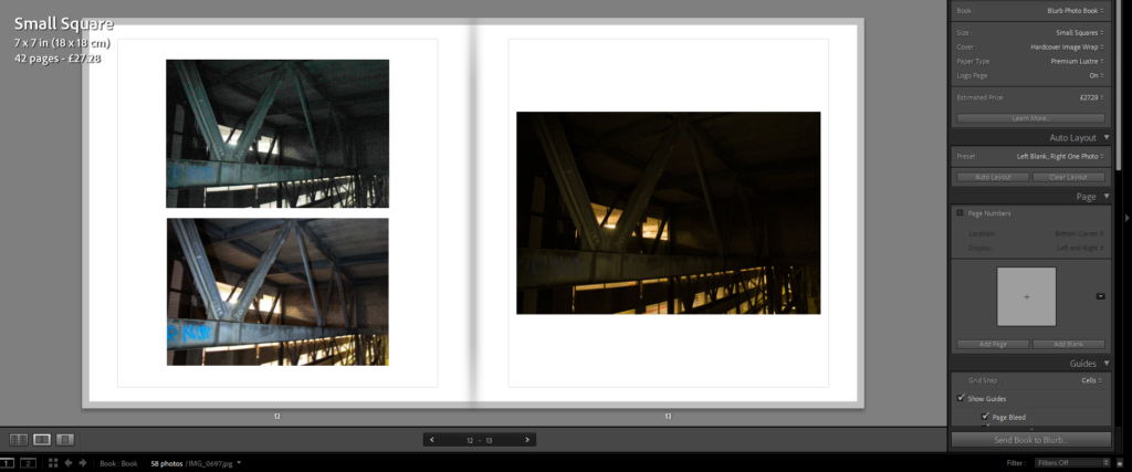
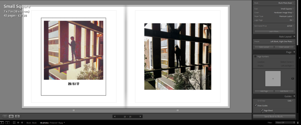
For this page, I wanted to put the images of the same thing but with different colours, I felt it made sense and made the order of the images tidier. I also did this for the page with the polaroid too.


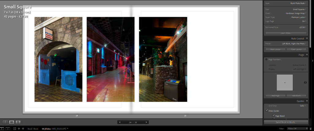
For these pages, I wanted to mix the layout a bit to cause less repetition. They also matched the same sizes too so It made them fit better together. The image that goes through the gutter makes the photo more interesting to look at while not differentiating too far from the general style of the book.


These pages, because they feature landscape photos, have the photo stretch over the middle too. To emphasise that of the long subject in the photo.


