I think that my final outcome (photobook) was successful. There is a strong and clear message that travels through the book, and I think the images, layout, text complement each other well. I think there are areas where I could have improved however. This would include the use of a slightly larger range of subject matter within my images, as well as perhaps a more conscientious use of typefaces. I chose the font because I felt it was simple and clear, but there were probably more fonts that could have been more effective. I feel that my double-page spreads are the strongest parts of the book, but I also feel that my choice to include a continuous interview throughout was very effective. It makes the subject more human and it creates a more direct experience for the viewer to make it feel as if they are speaking to him personally.
I believe I did realise my intentions with this book. I have created a series of images linked by one clear thread. The brief of nostalgia is clearly met through the use of referential archive images, and I think the mirroring between new and old imagery is important to the narrative. I also managed to convey clearly the fact that surfing is essentially my dad’s whole life and something that he is constantly chasing.
I think that I have effectively made reference to my chosen artists, but not all of them. A lot of my images could be compared to those of Arnold Newman. Note the image found on the inside cover.


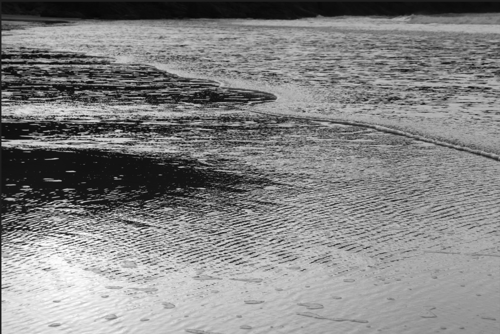
Also, I was able to replicate some of Roni Horn’s style in the final outcome. Her abstract use of water texture can be seen in some of my images.


Furthermore, I think it is fairly clear that W. Eugene Smith’s work has influenced my final outcome. This is because of the use of close up and establishing shots, as well as more formal portraits. Additionally, the use of an interview is reminiscent of his essay techniques.


My conceptual approach links to Smith because I went in with the intentions of creating a study of my dad and his lifestyle, although perhaps I did not manage to produce enough images from other areas of his life, which creates a slight lack of range and complexity.
I used a documentary style when composing my images, but I also added some more landscape and abstract based photographs to ensure it was versatile and varied. If I could do it again, to create more of a documentary approach, I would have taken more environmental portraits to frame my dad in every area of his life which would have created a more rounded and interactive character.
In editing my images, I generally used a few techniques, including Black and White, increased warmth, and decreased warmth. I did this to create a series of images that were linked by their colour schemes. The monochrome ones were dramatic and simple, and the others varied in their elements of drama and nostalgia.
Overall, this project has taught me more about expanding my methods of conveying a narrative. I have enjoyed exploring different types of shots, layouts, and typefaces and I think this has been a valuable creative experience and it will certainly influence my later work.
