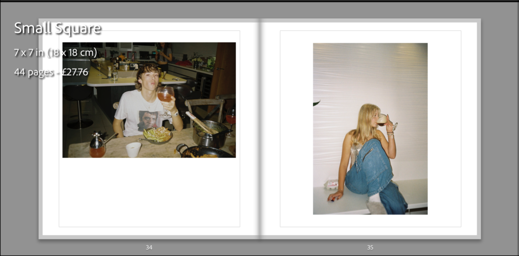
This is the final outcome of my photo book and how I have laid it out, I have done it in a simplistic way which I think is more affective, I have placed some images higher and lower than the others to break it apart from it being a consecutive symmetrical line as I think it keeps the audience attention more. All the photographs have a white boarder around them as it doesn’t cut any of the image out and gives it a simplistic look which works well as the photos aren’t overwhelming and doesn’t over power the accompanying image if they were to be full bleed. I have placed the photographs on matte paper to reflect well on the graininess from the film and have chosen to make the book as a hardback as I believe is gives more structure and a better look to it as in my opinion the soft copy books have a cheaper look and feel to them which I believe wouldn’t reflect well on the type of images I have in my book. The name of my book is called Salad Days which connotes youth in our prime days.
Here is a link to my photo book: Salad Days


