CHOSEN IMAGES FROM THIS SHOOT:


Image Analysis

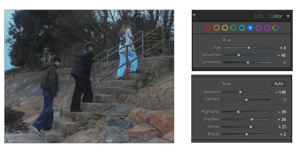
I decreased the exposure and highlights in this image as it was originally very overexposed and the highlights were bright. I also noticed that the blue tones in the image were very overpowering, the blue trousers and sky in the corner were strongly saturated and did not match the rest of my images so I tempered with that.


These three images are very similar, I edited them all but I am going to compare them to find the final image I want to use. I would put them next to each other in my photobook, however they are a bit too similar, if they had slightly obvious differences I’d pair them up. I also like how there is an obvious foreground and background. This is exaggerated by the luminance of the sky in the background but it also correlates with the blue trousers and brings the image together.

This is one of my favourite Images from this shoot. I feel it is one of the strongest as well. I started with straightening the horizon. I then decreased all the shadows and dark tones and increased the grain in the image

These two images I compared as they are also very similar but I feel they will look good next to each other, they display the theme of girlhood in my work well.
