formalism is marked attention to arrangement, style, or artistic means usually with corresponding de-emphasis of content, meaning it is excessive adherence and analysis of a specific photograph.
there are key aspects when analysing a photograph Technical, Contextual, Conceptual and Visual. , within those aspects there are a few key ones, with visual elements there a groups which make analysing easier e.g. colour, tone, texture, shape, pattern, line, space, with technical there is lighting, aperture, shutter speed, ISO, white balance. for contextual the aspects are going to be additional information that brings a deeper meaning adding more value to the photo, like historical context and personal context. conceptual aspects are ideas, meaning, reasoning, thought , theoretical construct, its art in which the concepts involved in the work take precedence over traditional aesthetic and material concerns.
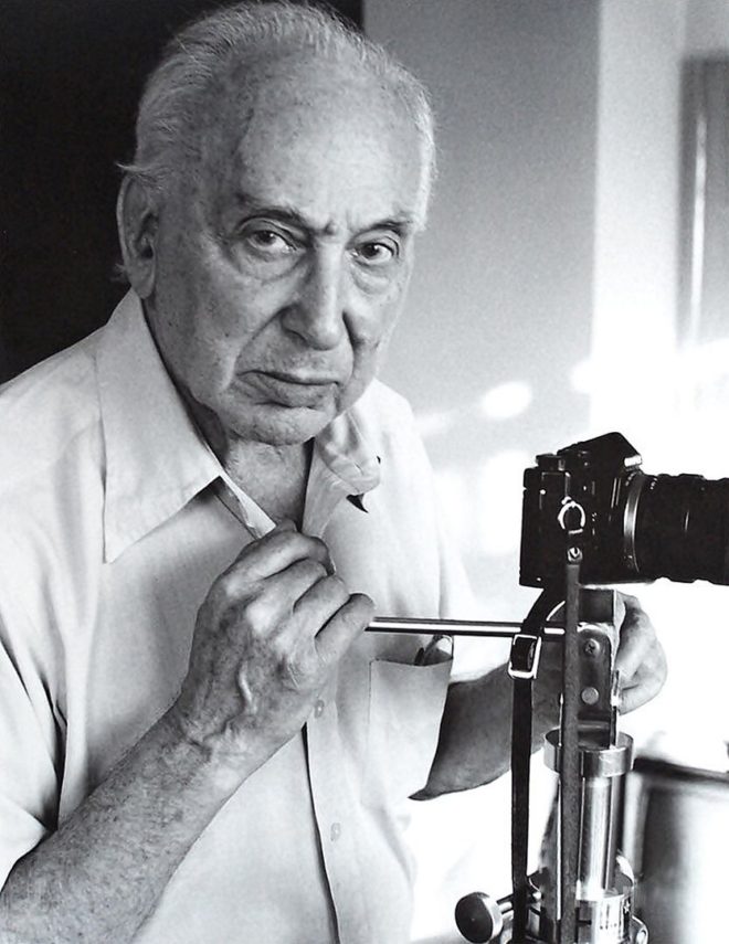
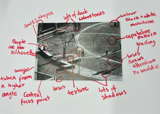
to explore and practice all the above aspects of evaluating an image, in a group we have looked at the visual aspects of the photo created by Andre Kertesz. The main aspects we looked at are the visual aspects of the photograph, which are :
Light: Which areas of the photograph are brightest? Are there any shadows? Does the photograph allow you to guess the time of day? Is the light natural or artificial? Harsh or soft? Reflected or direct? How does light fall across the objects in the photograph?
Repetition/Shape: Are there any objects, shapes or lines which repeat and create a rhythm or pattern? Do you see echoes or reflections within the image?
Space: Is there depth to the photograph or does it seem shallow? What creates this appearance? What is placed in the foreground, middle ground and background? Are there important negative (empty) spaces in addition to positive (solid) spaces?
Texture/ value tones: If you could touch the surface of the photograph how would it feel? How do the objects in the picture look like they would feel?
Colour: What kind of colours can you see e.g. saturated, muted, complementary, primary? Is there a dominant colour? How would this image be different if it was in black and white? Does the use of colour help us understand the subject or does it work independently?


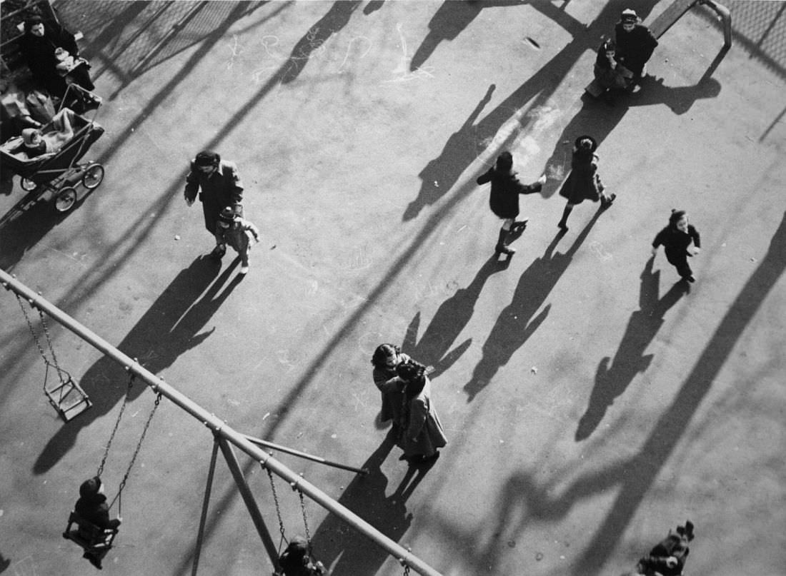
I have found a similar image to the previous one we were analyzing in class also by Andre Kertesz. Taken from a birds eye view/ from a higher point, showing people walking on the street. His work is in black and white as he worked in early 1900. This is his signature style of work and many photographs include variety of ordinary camera angles , especially at significant times of day , golden hour when the sunlight is very sharp and creates longer and more shadows then at any other time of the day.
When it comes to analyzing this picture by using the key main features and a help sheet which help focus on different aspect of the photograph, focusing for now on the visual aspects, the photograph is in black and white and because of this this can relate to contextual part of the photograph as during the times it was taken, a coloured photograph wasn’t available or produced yet , the tone , lighting , texture is what may fall int o the technical categories as well as visual because depending on the camera or its setting how much lighting is in the photo is effected by aperture, shutter speed , white balance etc. regarding this photograph it seems bright as the highlights are very defined but the spaces between people are also filled in with lots of light, the darks are also very visible on people which contrasts which the background. the shadows of people on the floor is very smooth resulting is a blended in texture of the image. when looking at line, pattern, space within the image i can say there isn’t a regular pattern of most things except little accents of grid like fence on the right corner or children’s playground equipment,e.g swing on the bottom left. the lines and shapes in the image is what shows the viewer more of what the image is off , allowing them to make sense in their mind of what is photographed this as a whole analysis correlates to conceptual aspects of the image, to why the image is how it is , what the photographer meant and what he planed to teach, show, mean about the image. this is to everyone to interpret in their own way. but looking and analyzing this image to me the light and the fact it is of children being in the playground links together a lot . because you can see more children leaving or leading towards the exit of the playground when it is a later time of day may mean that everything good has to end however it may also mean control and restriction that children have the lack of freedom , as everyday at certain times their parent may tell them to do a certain task or not to do it, like here they may tell them to leave the park, restricting children freedom. this may also be a metaphor for life in general as through children we are thought exactly that, restrictions like having to end your fun at the end of the day.

