Narrative: What is your story?
Describe in:
- 3 words: my grandparents relationship
- A sentence: an exploration of how my grandma’s passing effected my grandad’s life
- A paragraph: I want to explore my grandad’s life after my grandma died, capturing pictures of him that show a clear lack of her. I want to show a then and now comparison of the two time periods. I want to show it as a story with flashbacks, interchanging with archives and new pictures.
Designing Photobook in Lightroom Classic
- How you want your book to look– I want it to tell the story of my grandparents life together, contrasting with how my grandad’s life is now.
- Paper and ink– Premium lustre paper- it is semi glossy and photos will look good.
- Format, size and orientation– Standard landscape format (10 x 8 inches)
- Binding and cover– Hard cover image wrap
- Title– Upływ Czasu (The Passing of Time)- links in with the concept of the book and how time alters memories and life. Upływ can also mean flow- relating to the pattern of ocean/ water within the photobook.
- Images and text– I will be using a mix of new images and archives, as well as text in the form of quotes within the book.
Image Layout


First thing I decided was that I want my layout to be standard landscape and first page to begin with an archive. I also have decided to add border around each archive- making the colour a light beige and having a width of 12pt.

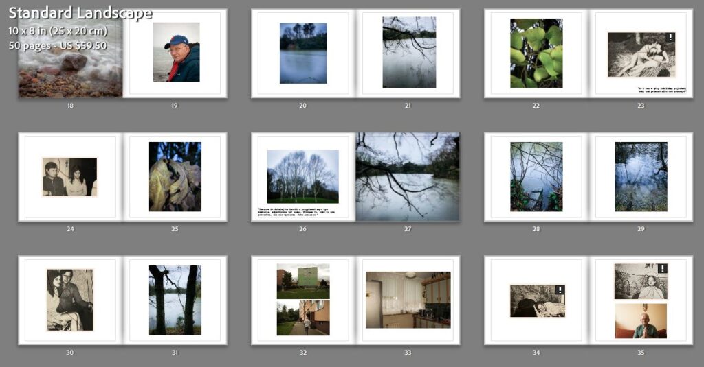
This is the layout I decided on for my first pages, they cover a mix of my first photoshoot and archives. I want to cause the book to appear as though it has three chapters, each chapter showcasing my 3 photoshoots mixed with archives.

I put these two photos next to each other since the new image is a re-enactment of the old one. I will do this multiple times throughout the photobook.

I paired this image with an archives since the new photo causes my grandad to look as though he is staring at the other photo, creating the sense of longing to be present between the pages.


This is my final layout of the pictures in the photobook.
Essay Layout

I included my essay at the end of my photobook, using size 15 font for my title, size 11 for my main quotes and size 10 for the main bodies of writing. I used the Courier New font as I think it is very clear and easy to read.

I made the quote slightly lighter, to have contrast between my writing and another person’s views.


Final essay layout.
Text Layout
I firstly added writing on the first page- my name in the top right corner and the title of my photobook in the bottom left corner. I called my book Upływ Czasu, which in Polish means The Passing of Time. I put both the title and it’s English translation- the translation in a slightly smaller font and in a lighter colour.

I also added text (key quotes) from the interview I did with my grandad. I think it is effective since it acts as a more direct indication of the story. I decided to add the quotes in polish, making the photobook more personal.

I decided to not make the text too large, making it a size 15. I again went with the ‘courier new’ font, as I did for my essay.


Final layout of the text.
Cover layout

For this cover, I used an archive that I photographed with a thread arranged on it. I made it a two page spread so that it would be wrapped round the front and back cover. The title is in the top right corner.

For this cover, I used the same archive but only put in on the front cover and the spine. I added another image for the back cover, which gives the effect of the back of the picture. I placed the writing in the top right, a thread running between the two words.

For my title, I made a 55 sized font (courier std) and made it red, matching the deep red thread used on the cover and throughout the photobook.

I kept the spine simple, adding my name and the title of the book, making it size 16 and the same shade of red as the title.

Final photobook cover.
