Formalism within photography is mainly the focus of how the picture was created or design of it, for example the photographers choice in lighting, where the camera is placed, what setting, colours, which creates this amazing image. Its focusing on the looks of an image rather the context behind the image.

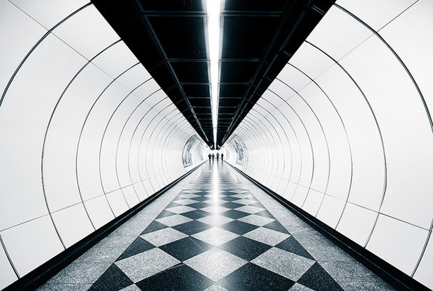
Things people look for in photography when they are aiming towards formalism is how unique the picture may be. For example:

it seems simple but has used a lot of visual elements, which are useful in attracting peoples attention. The repetition of lines within the side view of the image, and how the whole image is like looking down a circular tube, with a smooth look of material on the ground with patterns. and even lighting within the middle. And casual people at the end it sets a scene visually. And how it has used simple but bright colours which works well.
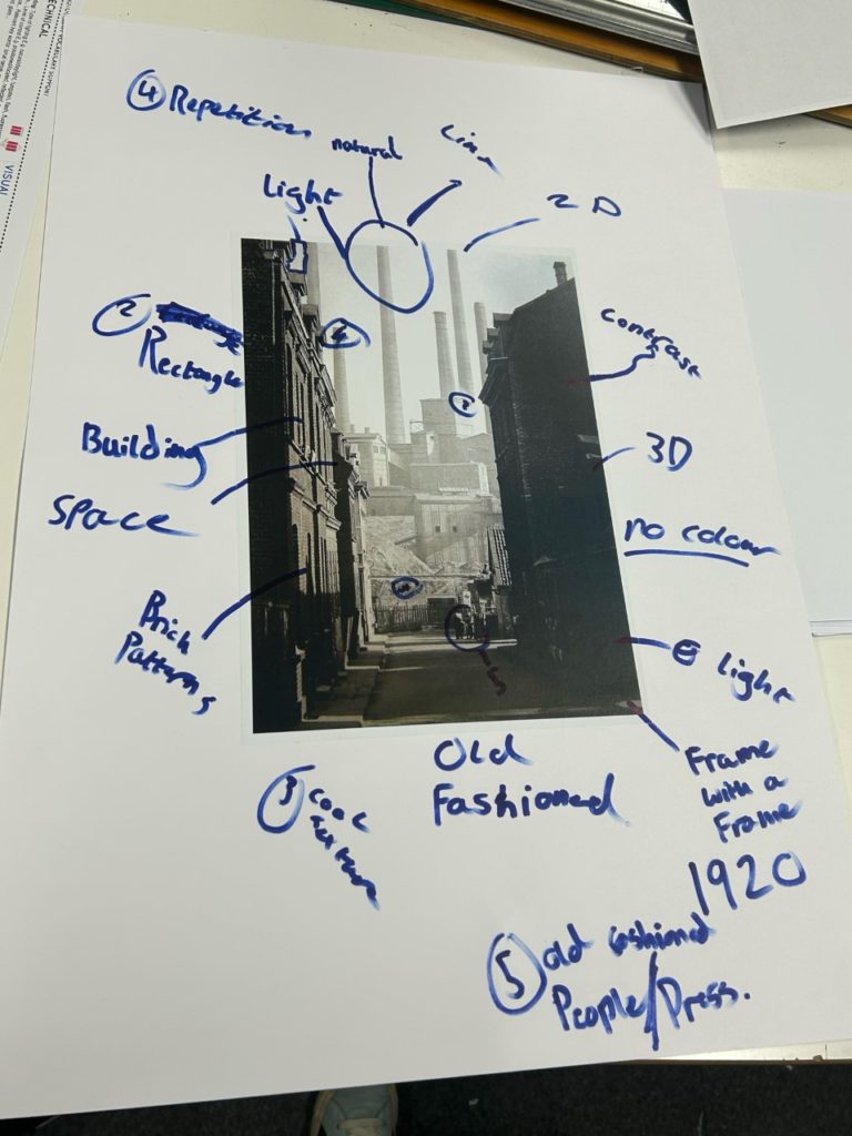
Key things formalism aims for:
Light: is there a good even use of light? Where is the light? How is the light used.
Line: Is there a use of lines within the photograph?
Repetition: Is there any repetition of shapes? For example buildings, lines?
shape: What shapes where used, and by what?
Texture: What materials where captured in the image, how smooth, rough it looks?
colour: What colours where used? Bright or dark? and what contrast was used for the image?
Composition: Did the photographer use all these elements to create a good picture?
Flatness: If it is 2D or 3D, which is observed by the viewer.
Frame: Does the image use edges?
Focus: What part of the picture would the photographer want you to focus on? Where?

An interesting feature this photographer used for his picture was a “frame within a frame”, What I mean by this is the photographer used the dark buildings on the side of the image as almost like a frame for the image.
Imagine looking at an image a photographer has taken. The first instinctual thing to do is to look at it and see what it is, where is it, how was it done, all the visual elements of the image. The next thing you would do is to figure out what it is, when it was taken. the reason behind the image ect. Its interesting to see how there is a natural order in which we view images, instead of looking straight for the context of an image and its background for example.
With an image in photography there are “rules”, (like the visual elements) which are all used to create a unique image in that specific moment. These rules are said to be broken in photography but that’s what they where made for, except for breaking the rules without knowing it. Almost as if you took a picture with a big light and dark contrast, except if you swapped the light and dark areas round the image would look horrible.
Walker Evans & Darren Harvey Regan
Walker Evans
He was an American Photographer and photojournalist, who was known for his best work on documenting the great depression. With a goal in mind to create pictures that are “literate, authoritative, and transcendent”. He was born in St. Louis, missouri, and a father who was an advertising director.
Evans took up photography in 1928, with an assignment in 1933 in cuba names the “crime of cuba”. This captured street life, the presence of police, beggars and dockworkers in rags.
Already you could understand the skills of Walker Evans through his use in his angles to show shadows, and how he still keeps the background of the beggars environment, showing the rich environment with a poor beggar asleep (during this period the great depression was around).
Darren Harvey Regan
Graduating at the Royal Collage of Art Darren Harvey’s work has inspired and confused people, appearing in exhibitions and has work as part of the permanent photography collection museum in London.

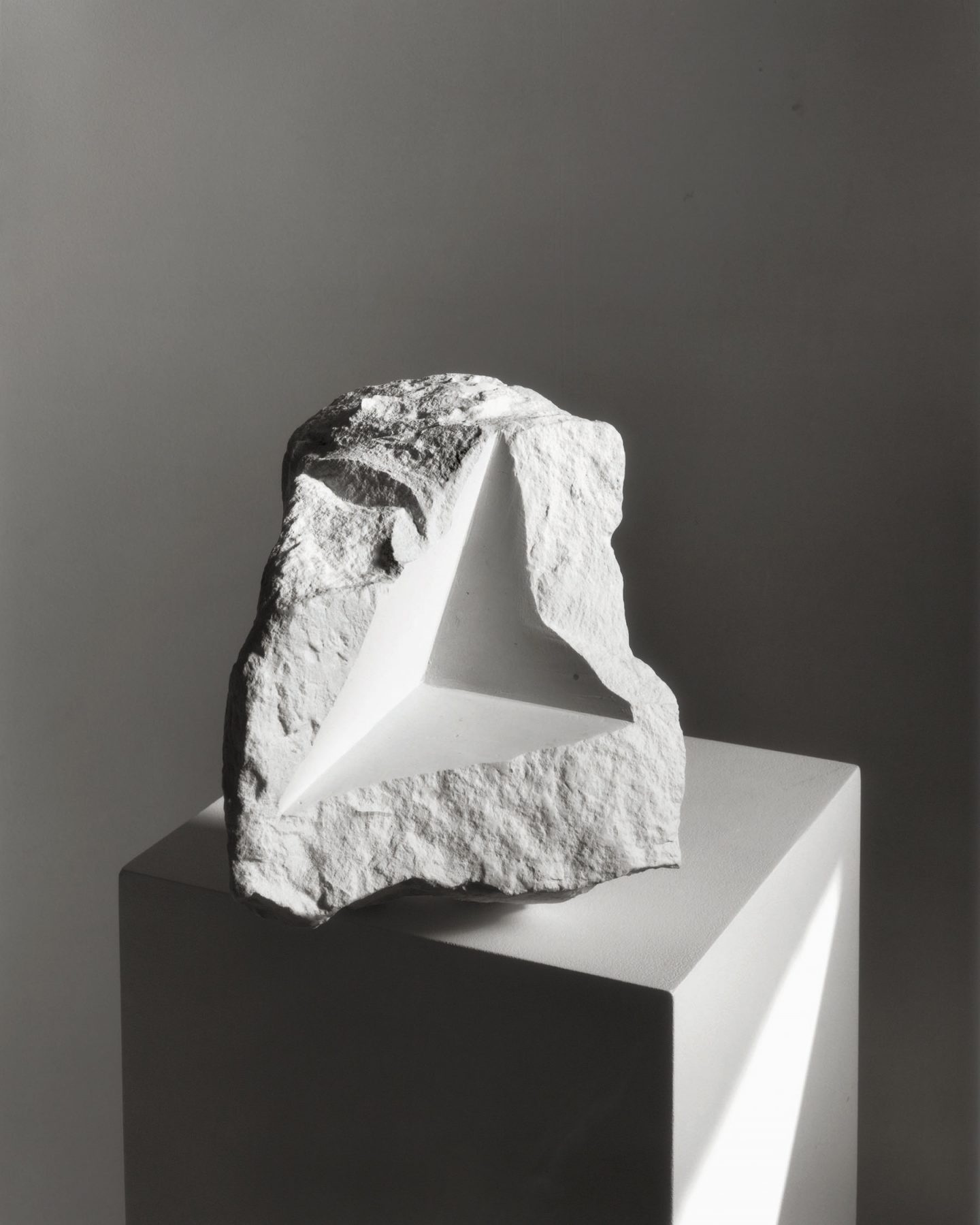
Darren Harvey’s work is mainly abstract which includes inanimate objects, or “things”. You can see the odd shapes he uses within a rock, which is normally seen with bumpy round features. The photographer uses good lighting and normally has his photographs included on top of something, bringing all the attention to the object.
The concept of a rock is very blunt at first sight. But the features Darren adds to his photographs (mainly of rocks), giving a newer look and nicer eye catching view, almost hypnotic, especially with his editing features it looks modern, as if it where a one in a life time amazing rock.

This is a picture I took with simple, common objects that anyone can find, and placed them where I wanted. It seems simple but thats the point. The use of circles, lines, and even shapes creates a weird but unique look, if you really think about it, this exact picture and form of the picture, and even lighting wont ever be recreated to this exact image ever again.
