There are seven basic elements of photographic art: line, shape, form, texture, colour, size, and depth.
Formalism is the Design, Composition and Lighting are dominant over Subject Matter. The photographer becomes a visual designer whenever a frame is captured.
Lines
Whenever people look at an image, our eyes are naturally drawn to the lines present within it. We instinctively follow these lines to see where they go—these lines are leading our gaze towards a particular subject.

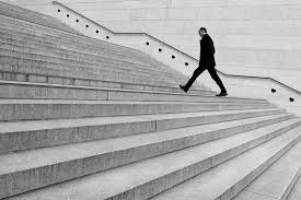

Leading lines in photography are existing lines within the frame of a photograph which the photographer has deliberately aligned/arranged (prior to taking the photo) by adjusting their composition either shifting their body or camera. It should result in lines which “lead” to the subject, increasing the focus of the viewer, allowing for a more enjoyable viewing experience.
Shape
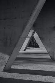
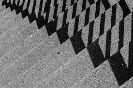
Shape is generally considered two-dimensional, while Form is three-dimensional. In photography, how we light an object can determine whether it’s perceived as a shape (if the lighting is flat or silhouetted) or a form (if the lighting has accentuated shadows & highlights to create depth).
A shape is two-dimensional. Yes, a photograph itself is two-dimensional. But a shape in a photograph doesn’t have any depth.
You can use lighting or perspective to give a two-dimensional shape depth. But once a sense of depth has been applied, a shape becomes a three-dimensional form.
For instance, if you look at an image of a ball, you’ll find its shape as a circle. Likewise, if you look at a picture of a cube-shaped suitcase, you’ll find its shape like a square.

Form
Objects with the appearance of depth are three-dimensional forms rather than shapes. So, despite being part of a two-dimensional image, the viewer can detect depth beyond the object’s front surface.
Light and shadows give forms their depth. Or a change of perspective reveals the form’s angles and edges, rather than having a head-on view.


Texture
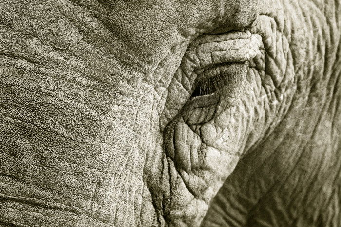
Texture creates a sense of depth in a two-dimensional image. Texture in photography can also be accentuated by light and shadow.
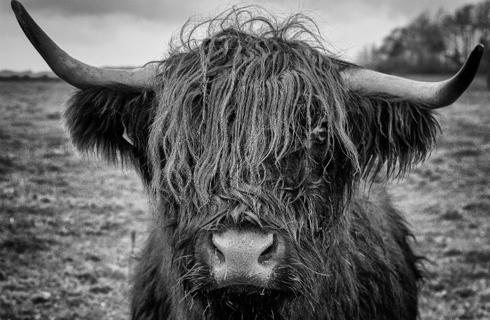
In black and white photography, texture add interest to your photos by providing tonal variance and detail densely concentrated in certain areas of the frame.
Having an emphasis on texture in your photos can help you make the overall photo stronger. Being able to see surface details enables the viewer to get a better feel for your subject and location.
It adds character and atmosphere to your composition. Texture evokes the viewer’s tactile sense.

ANALYS.

This photo is of a street in America, in black and white, with dark tones. the image also includes a ‘frame within a frame’ due to the dark buildings acting as a frame for the lighter building, this can also be seen as a tunnel looking photo too, due to the lines from windows, pavements street poles, and floor painting.
This image also gives a 3D affect as the road also looks as it it is getting more narrow the further away it is.
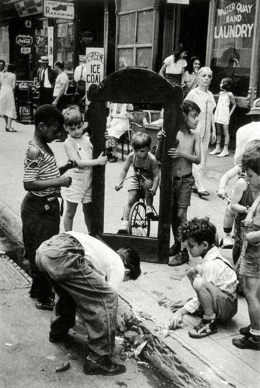
This is a urban photo of children playing in the street, there is no colour in this photo which further suggests hat they are in a urban city. there is a trashed floor that the children seem to be playing with that implies that they are in a poor area. within the photo there is two boys holding something which looks like a photo or door frame which creates a ‘frame within a frame’ image. this also draws the attention of the viewers eye straight to the boy on the bike.
