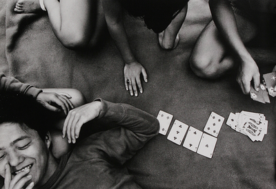
Formalism describes how the visual elements of a piece of art work is the most important aspect of that work, not the narrative content or relationship to the visual world.
The Formal Elements
The formal elements are the different aspects that are involved in a photographic image. These include:
- LIGHT – Which areas of the photograph are brightest? Are there any shadows? Does the photograph allow you to guess the time of day? Is the light natural or artificial? Harsh or soft? Reflected or direct? How does light fall across the objects in the photograph?
- LINE – Are there objects in the photograph that act as lines? Are they straight, curvy, thin, thick? Do the lines create direction in the photograph? Do they outline? Do the lines show movement or energy?
- REPETITION – Are there any objects, shapes or lines which repeat and create a rhythm or pattern? Do you see echoes or reflections within the image?
- SHAPE – Do you see geometric (straight edged) or organic (curvy) shapes? Which are they and how do they relate to each other?
- SPACE – Is there depth to the photograph or does it seem shallow? What creates this appearance? What is placed in the foreground, middle ground and background? Are there important negative (empty) spaces in addition to positive (solid) spaces?
- TEXTURE – If you could touch the surface of the photograph how would it feel? How do the objects in the picture look like they would feel?
- TONE – Is there a range of tones from dark to light? Where is the darkest part of the image? Where is the lightest? Are the tones in the photograph balanced or does the image tend towards darkness or lightness overall. How does this affect the mood or atmosphere?
- COLOUR – What kind of colours can you see e.g. saturated, muted, complementary, primary? Is there a dominant colour? How would this image be different if it was in black and white? Does the use of colour help us understand the subject or does it work independently?
- COMPOSITION – How have the various elements in the picture been arranged? Does the image seem balanced or unbalanced? Is it possible to superimpose geometrical shapes on the image to better understand the composition? Has the photographer used the Rule of Thirds?

This monochrome image taken by Shomei Tomatsu in 1964 shows three people playing cards, hence its title “The Card Game”. You can see what seems to be natural light from the sun coming in from the left side of the image and by the brightness of the monochrome imaging I can infer that the photo was taken on a sunny day. “The Card Game” shows the organic shapes of the human body coupled with the straight geometric edges of the cards. Because of these organic shapes there isn’t really any repetition as the composition of the image seems to be very natural showing how each person is different. The image is quite shallow in the regards that all we can really see is one person’s face and the cards being dealt. The framing of the image also adds to this effect as the audience can only see the bottom half of the two subjects in the top of the photograph, outlining the cards as seeming to be the main focal point of this photographic image.
