Photos have formal and visual aspects. For example, lines, shapes, colour, repetition and colour. In addition, photos have their own form of grammar. For example, frame, time, focus and flatness.
How different elements of formalism work
Light– The brightest/darkest area of the photo, shadows, natural or artificial, harsh or soft, time of day.

Time of day appears to be golden hour. Natural soft light. Brightest area at the top of the image.
Line– Objects in photo that act as lines, straight, wobbly, thin, thick, direction, can outline the image (frame within a frame).

Straight thick lines creating direction to the background. The vertical lines on the edge of the photo create a frame within a frame effect.
Repetition– Repeated objects, shapes, lines, reflections.

Repetition of triangular shapes separating all the colours of thread from all being mixed together. Repetition of the same object.
Shapes– Rectangles, circles, more.
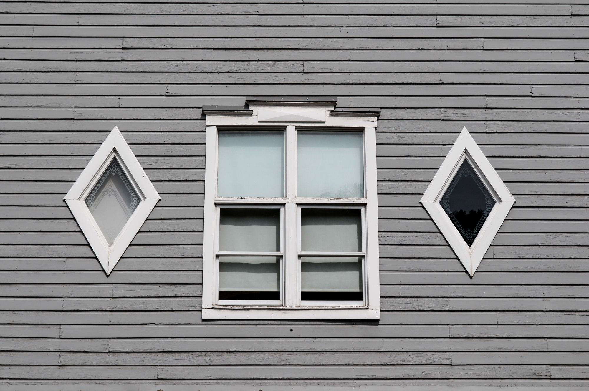
Repetition of rectangular shape, in the middle window and the wood. Either side of the rectangular window there are 2 diamond shaped window which creates contrast.
Space– The depth, empty or solid space, foreground, middle.

This photo has a lot of space in all areas. The person on the boat which breaks the space almost seems insignificant and is surrounded by the almost empty space.
Texture– texture of materials in photo, eg bricks, glass, sand
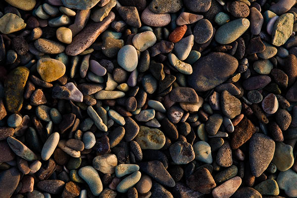
The texture of the image has deep layers. The rocks create a sharp texture and you immediately think of how it would feel to touch or stand on.
Tone– feeling, mood atmosphere of photo.
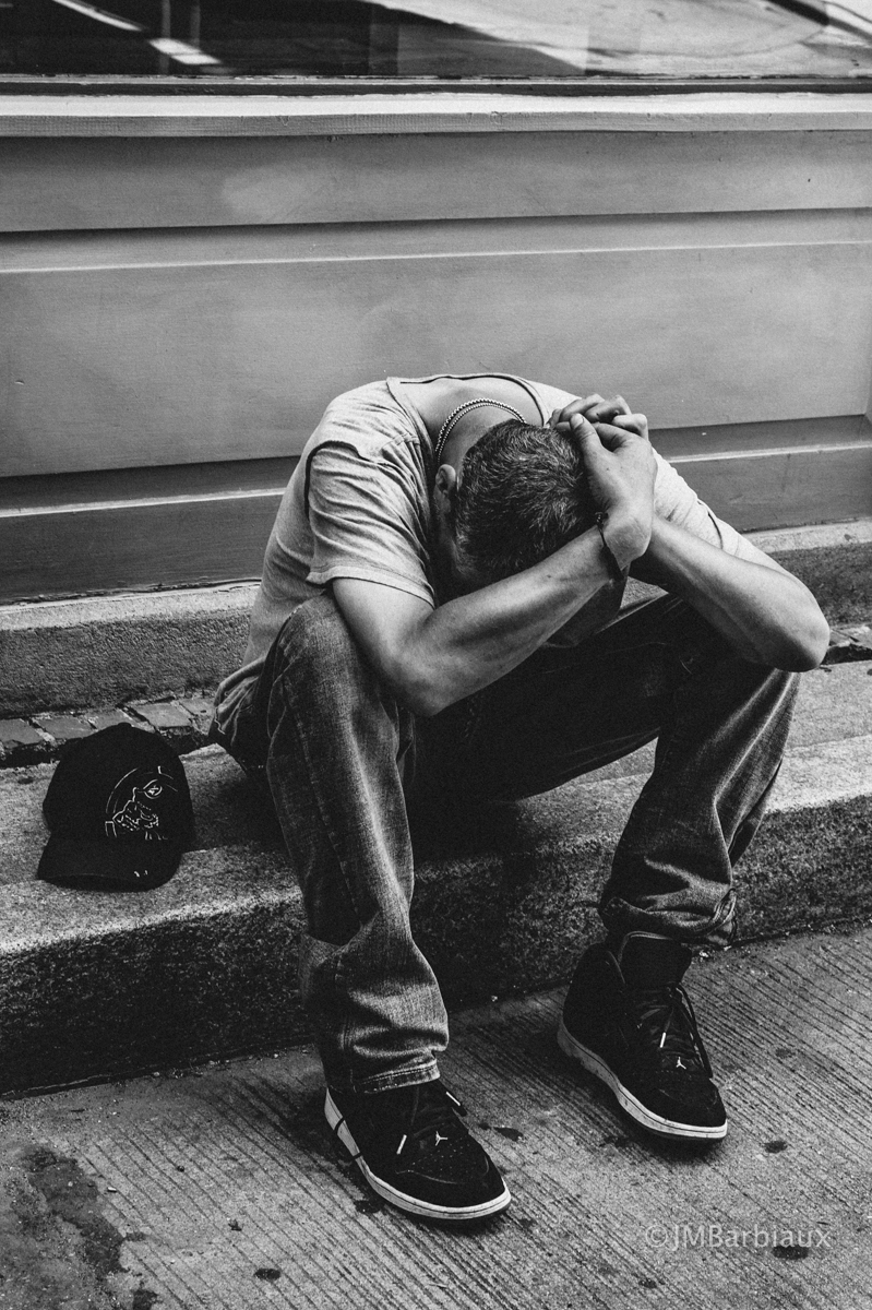
The tone in this image is sad and dark. The monochrome colours further accentuates the sadness of the image. Also the models stance reflects that he is sad.
Colour– Balanced, saturated, muted, primary and secondary, dominant colours, monochrome.
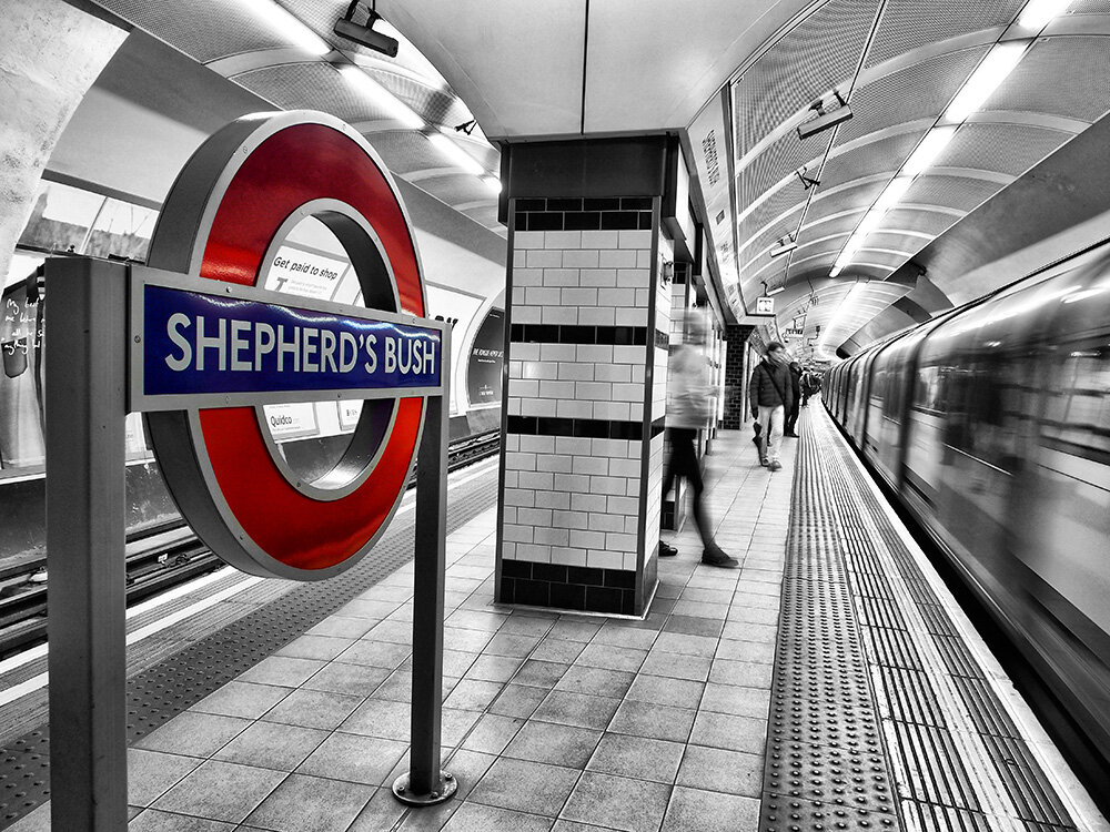
The selective colour of this image is saturated and primary. However, the background is muted and monochrome. It is unbalanced colour.
Composition– Arrangement, layering, balance, rule of thirds
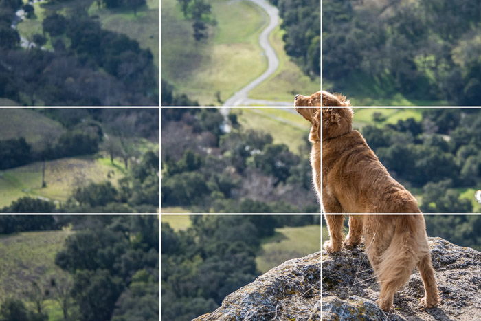
The dog is mostly in the right third. The dog is arranged at the top of the cliff to show he is important. The background is shown in the other two thirds
