WHAT IS FORMALISM?
Formalism is when “The Design, Composition and Lighting are dominant over Subject Matter.”
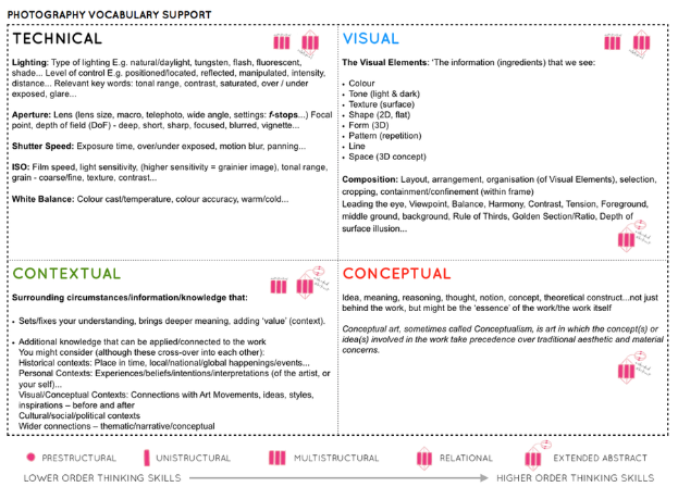
When exploring a picture in a formalist way, you would analyse the style and form of this image by examining the choice and use of lens (and the depth of field), the type of camera used, the cropping, framing, composition, tone, light, the arrangement and contrast or juxtaposition of elements within the frame, and the object/person chosen. The use of shapes, lines, repetition, texture, and colour can also play a big role in reading into the photographs. These are known as the ‘formal’ elements of the image.

ANAYSIS

How to analysis:
- colour – darks, lights, primary, secondary, opposites
- shapes – squares, circles, rectangles, triangles
- lines – long, short, loads, a few
- tone – light and dark
- texture – hard, soft, smooth, rough
- dimension – 3D, 2D
- pattern – repetition
- Composition – angle, staged, natural


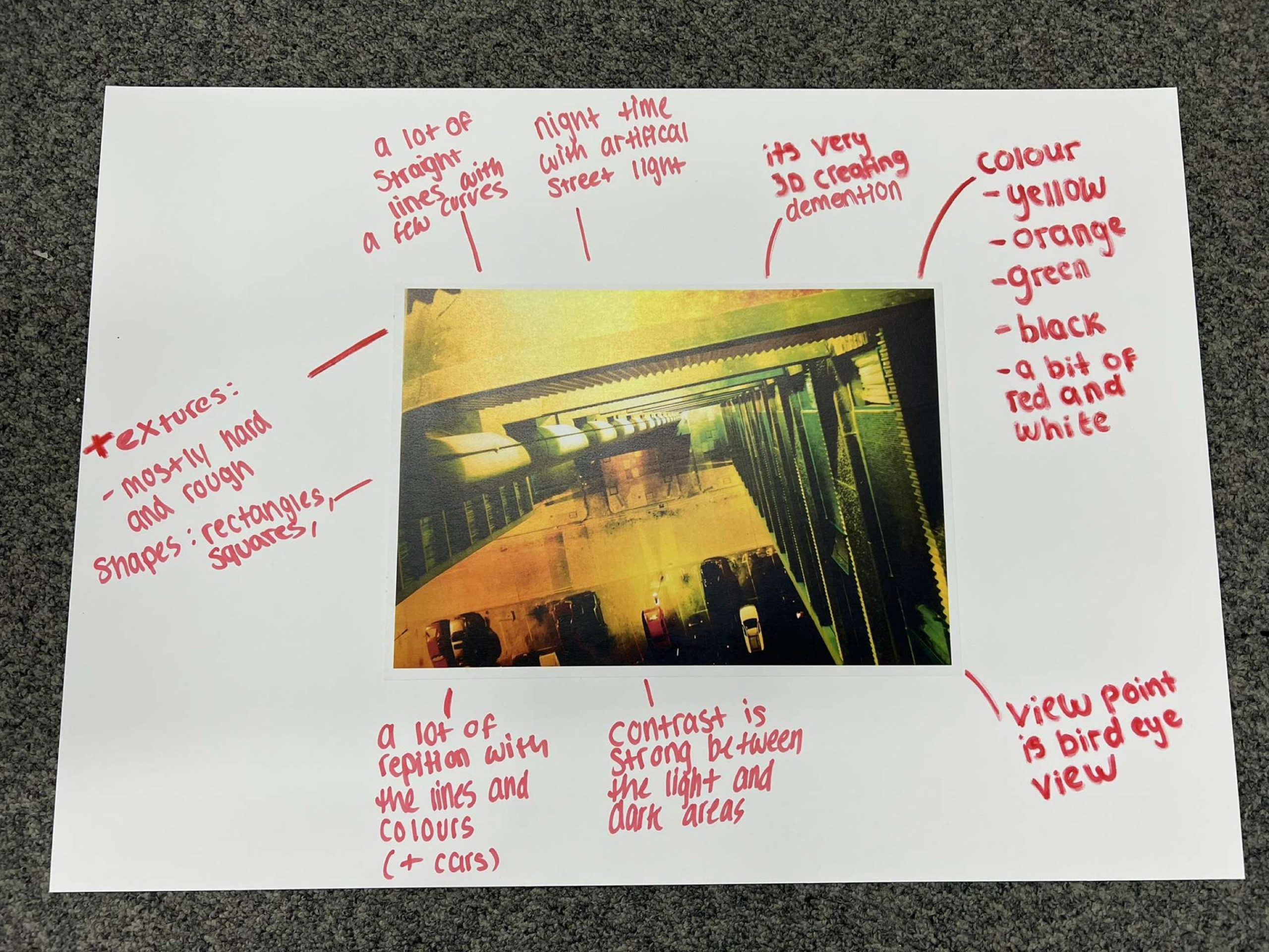
In this picture, the first things that stands out is the colour combinations along with the choice of angle. The yellows and greens work very well together while still bringing a sense of depth and dimension. It’s from a birds eye view and the strong structure is not centred in the middle, making the photography feel slightly off. There is a lot of repetition and pattern with the building and cars making it seem more organised. However, this is juxtaposed by the cars on the ground, the uneven floor and odd placement of cars makes the image look messy and thrown together. The only light source is the artificial light in the top left corner and towards the floor, this allows the darker areas to hold a lot of power as they add the shape needed while still creating a strong comparison.
