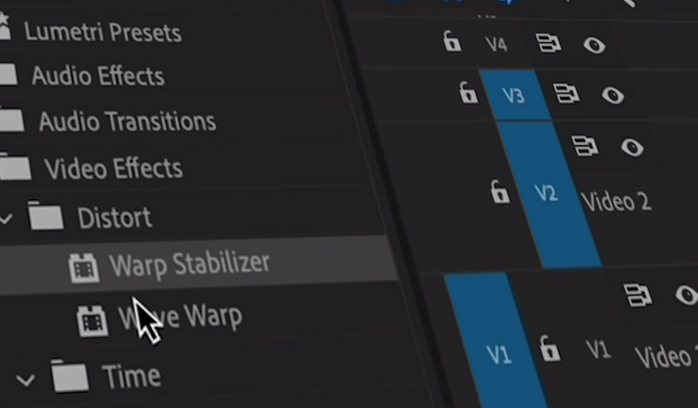
The process for editing the film and putting the clips in order so they could tell a story took quite a long time. I had never used Adobe Premier Pro before so it was a challenge to get to know the basics of editing. However, once I understood how the app worked, it became easier. I started off by selecting the best clips and images, considering the composition, mise-en-scene, lighting, focus, and stability of the image. Before I put still images into the app I had to size them in Lightroom Classic to fit the film size that Premiere requires. Once I had put all my clips and images in the order I wanted I edited the lighting and colour (shown in my previous blog post ‘EDITING STILL/ MOVING IMAGES FOR OUR FILM’). Some of the clips were shaky because they were hand held, so to fix this I used ‘warp stabiliser’ to analyse the video and make it more stable. I had to be careful with how much was on the cli, because too much would cause an unrealistic movement.

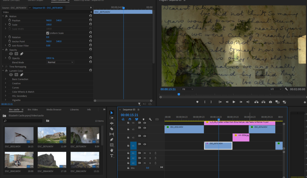
I then moved onto achieving putting the letter we chose from the Jersey Archives over the film.

Putting the letter over the film was challenging, but I figured out how to achieve it so it would scroll down the film.

I chose the starting point and marked it, then the finishing point on the ‘positioning’ section. I selected this for the amount of time I wanted the image on the screen, the shorter it was on the faster it would scroll so I lengthened the clip to make the scroll slower. I also had to keep in mind that the letter will be read out, so it had to scroll at reading pace.
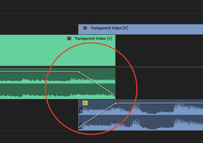
After I got the speed right, and the first two pages of the letter that we chose in, I moved onto fading each clip into each other. I chose to do this after inserting the letter because the fades could effect how the opacity is presented. I used the basic fade by enlarging the clip, marking two points, and dragging the fade down.

For the Title I went into photoshop and cropped the letter to get ‘Dearest Patricia’. In Premier I put Blend Mode as ‘Multiply’ to remove the yellow background. I then used ‘dip to white/ black’ to fade it in and out.
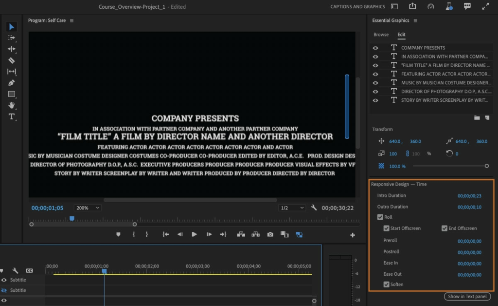
For the end credits I used one of Premier’s premade designs to credit who directed, filmed sound, edited clips, sound and who was the voice of the letter.

