The process of my page spreads and the development:

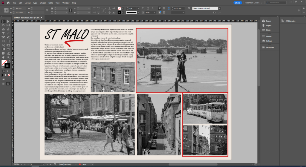
To give an old look to the article, I made sure the paper background had a little yellowing by making the color a more cream, off-white instead of a plain white. I feel it makes it look more interesting as it looks like it was made a while ago rather than it looking like it came out today. On the first page I added many photos and added a red border around a handful, this was mostly for decoration as without it the page looked a bit bland. I made the red borders by simply adding text boxes around them, changing the colour and thickness and having no text inside. For the headline, “ST MALO”, I obviously had to make it bigger as that is what the article is mainly about, the red line under the ‘MALO’ isn’t actually a red line, it is actually an L that has been put on it’s side and dyed red, I did this because I liked the swish it had and it made it look more interesting than a simple red line.

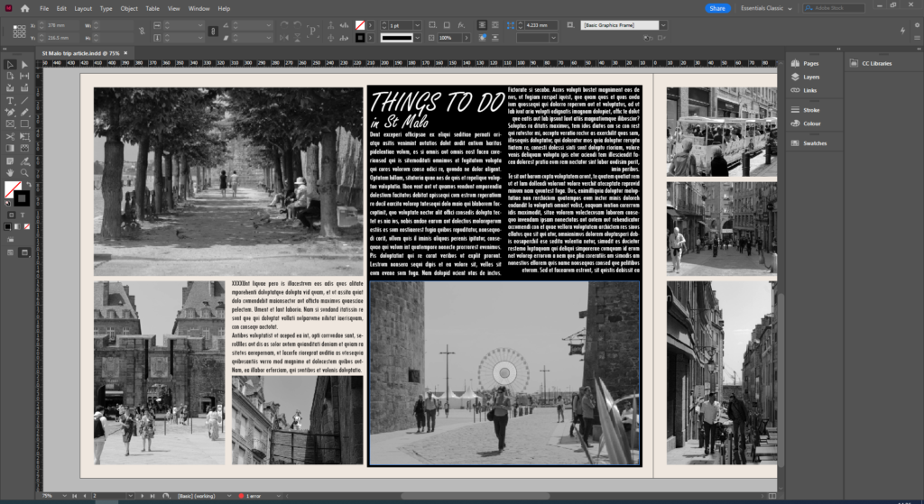
For this page I decided to change things up by using a black background for half of it, this helps highlight the text and the photo underneath and gives a more old time look. I made this by making another text box, setting it behind the photo and text and dying the body black. On the other half, I had the idea to surround a body of text with photos to make it look neat and tidy.

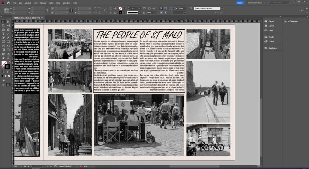
On the final page, I wanted a similar style the first one had. I wanted a black border encasing the headline and main body of text in the upper center, done using the same method, which I think makes the final page look more focused on what could be perhaps wrapping things up for the article. Underneath there is a photo which is proportional for the body of text and on the sides of the page show different photos in slightly different layouts just to make the patterns more interesting that having the same ones.
