Photoshoot
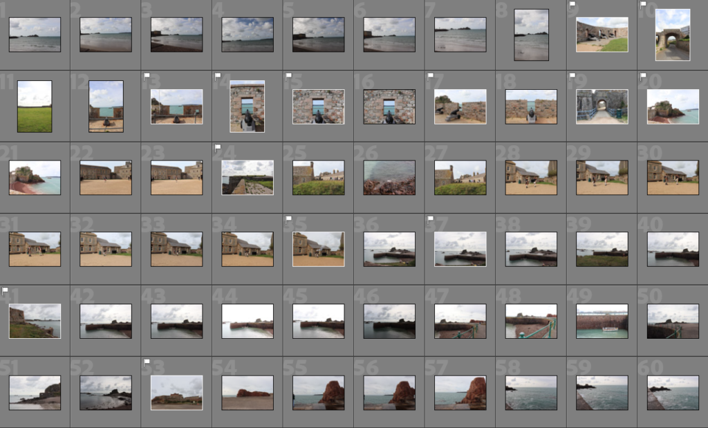
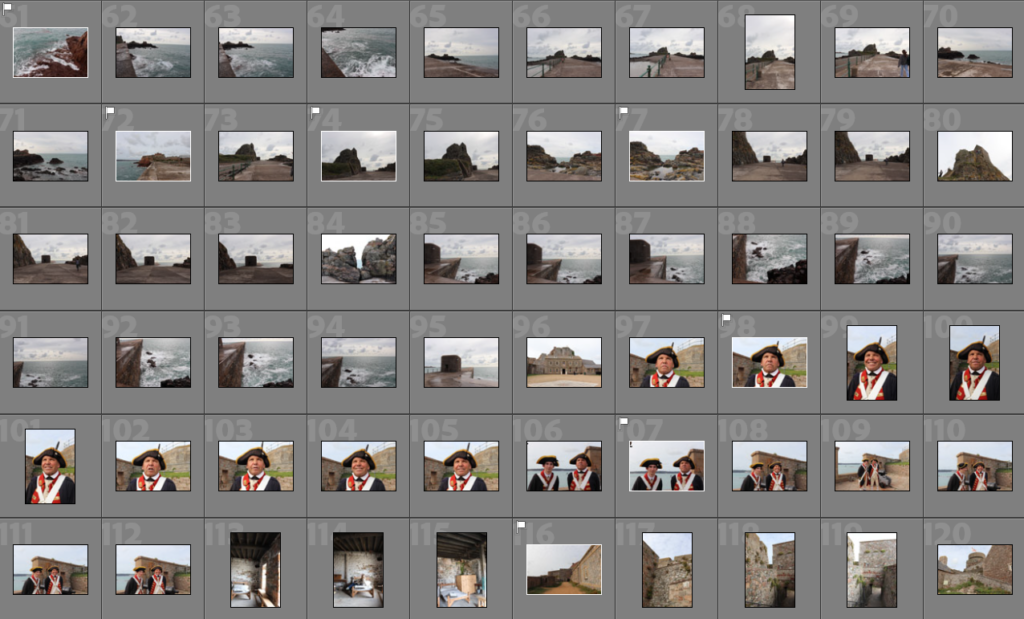
Sub Selection
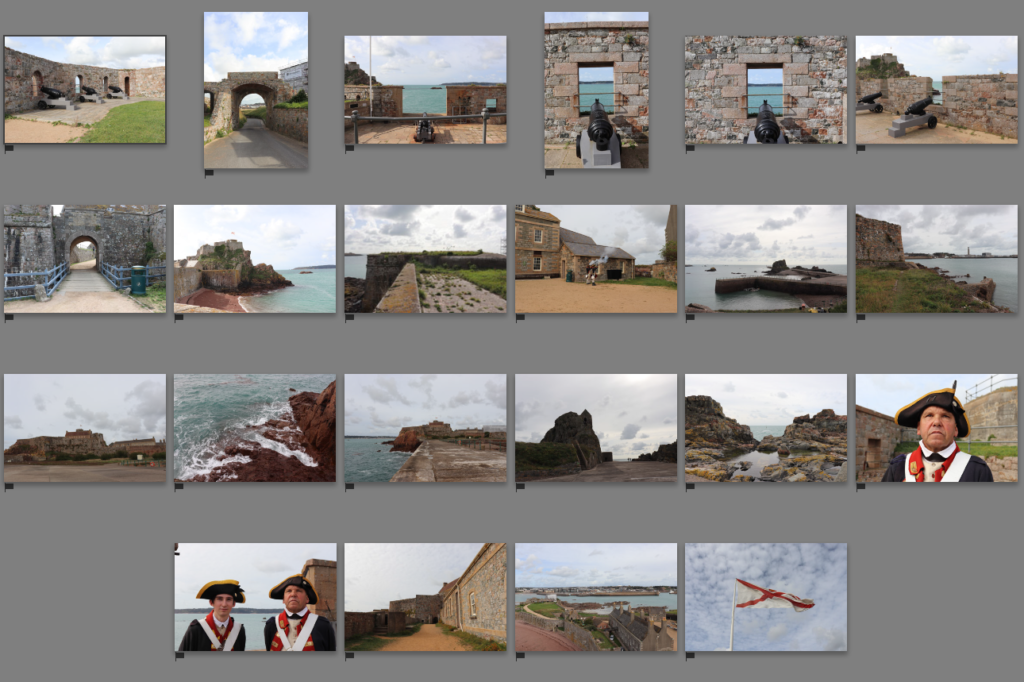
Editing
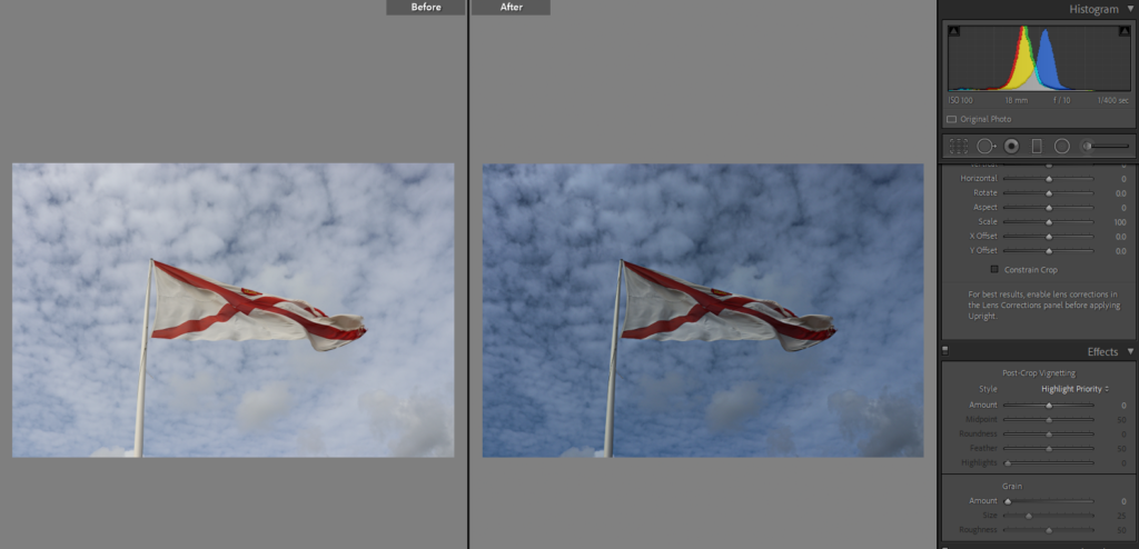
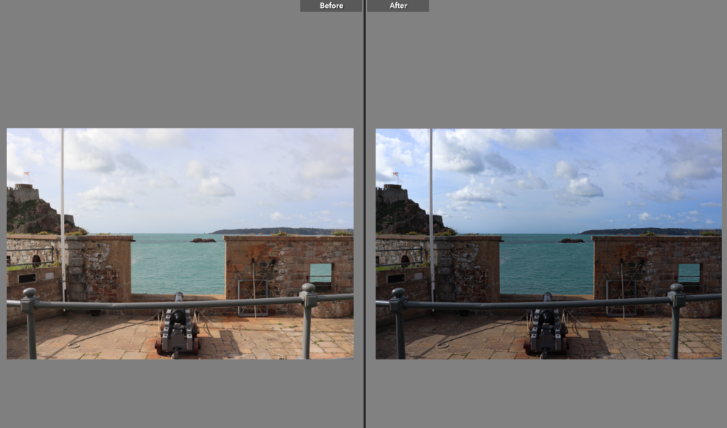
I tried not to change the original image too much and just focus on heightening the contrast and sharpness as well as with a little bit of different tone.
Overall regarding the fact that we all had different tasks, we worked together as a group to make sure we all had the same vision and plan for the film. we had to communicate a lot to make sure we were all on the same lines.
“When editing the stills (which we weren’t sure if we were going to include or not) Pip made sure to edit them with standardisation and keep them similar in appearance. This was difficult when images differed in tone because of the balance of light or were darker because of cloud, but Pip tried to ensure that they all had the same feel despite the differences in light/colour in the original images. As a more general overview of changes made, Pip increased saturation and vibrancy to make the images a little less grey, whilst also bringing the contrast and sometimes the highlights down. Pip then adjusted exposure as necessary. Pip thinks she has achieved what she wanted to an extent, but the general greyness and lack of light in the original images made it hard to create images she was truly happy with. In terms of creating images that match the style of Wes Anderson’s work – which is characterised by bold colour palettes, wide lens shots and symmetrical framing – she thinks she has only truly achieved this on a few occasions, which she shows below.”


