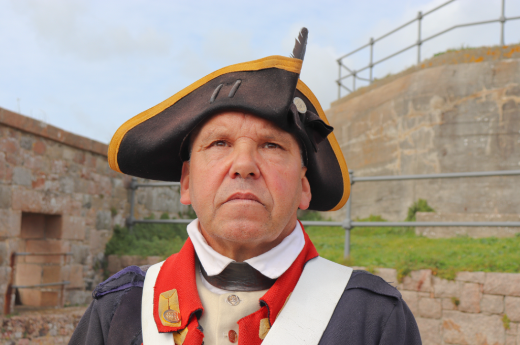
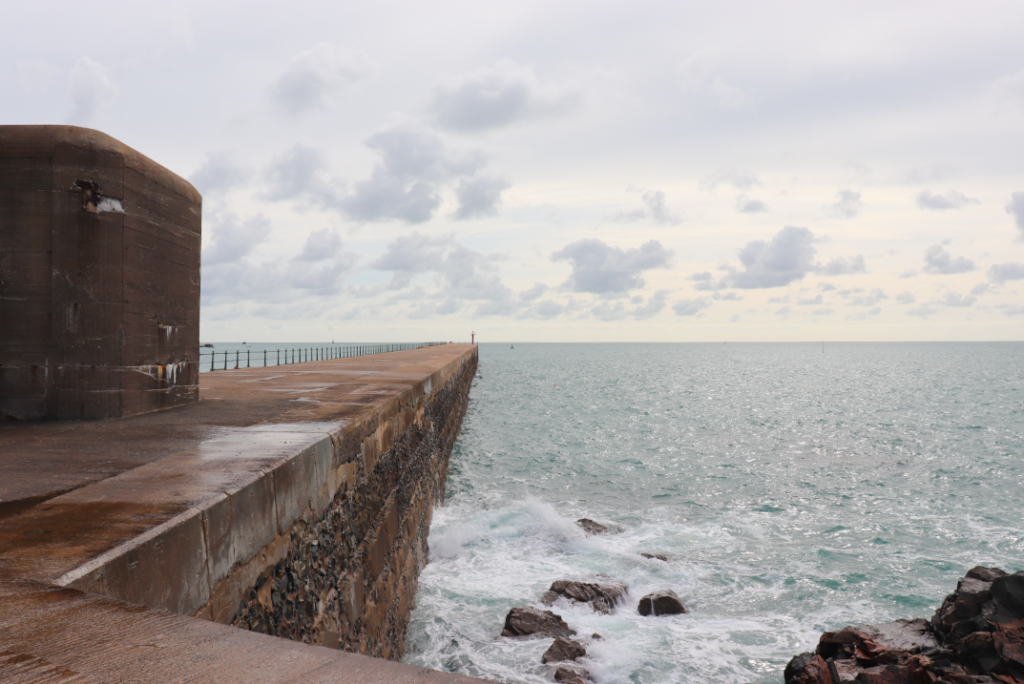
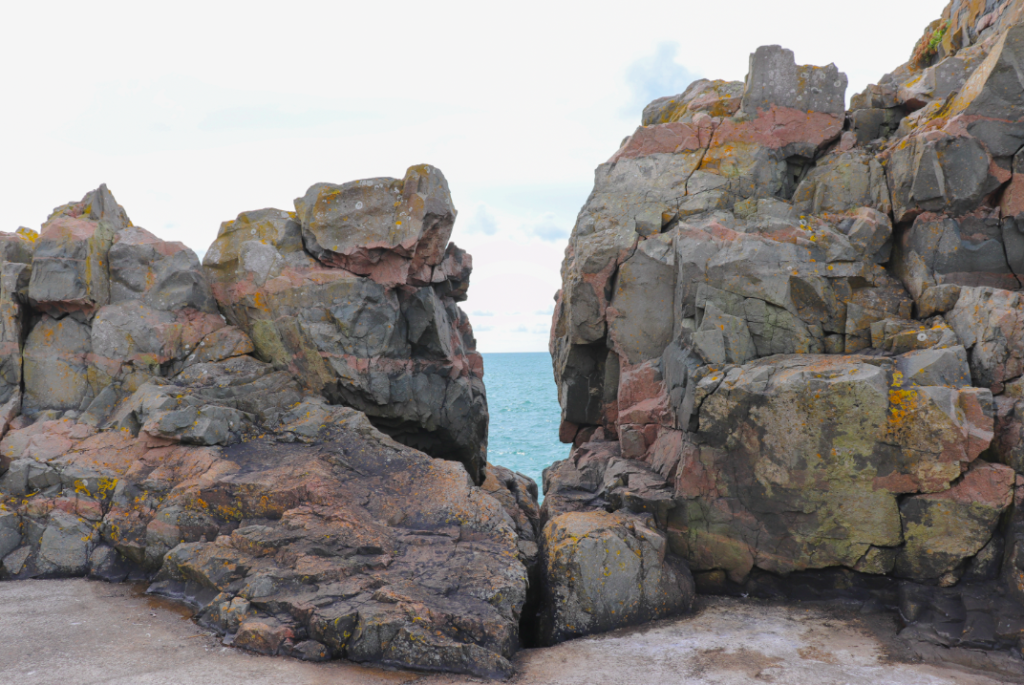
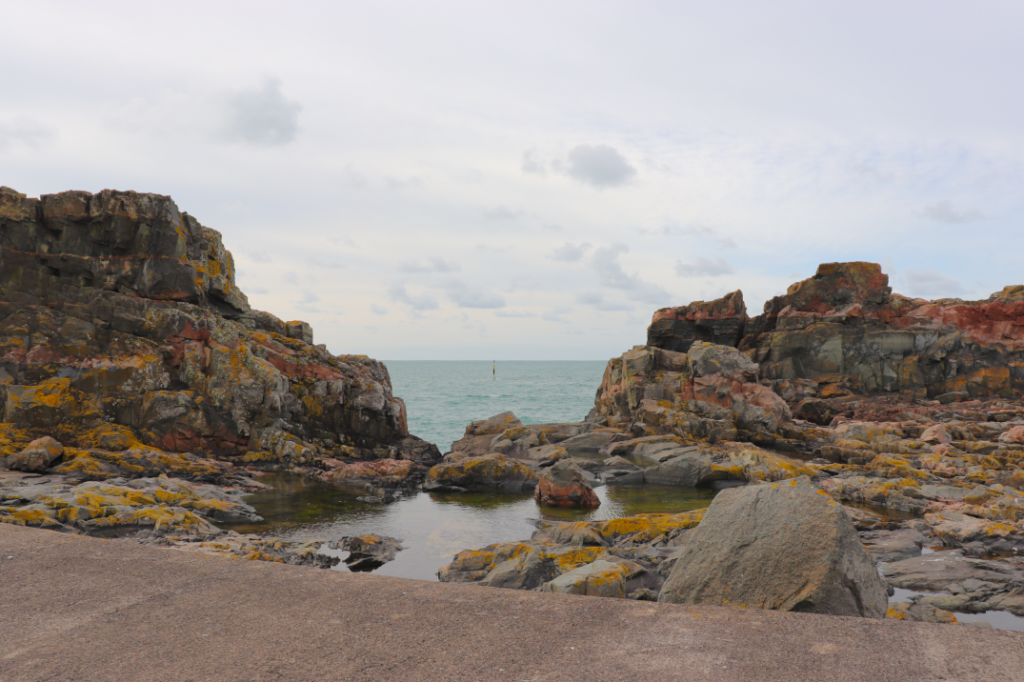
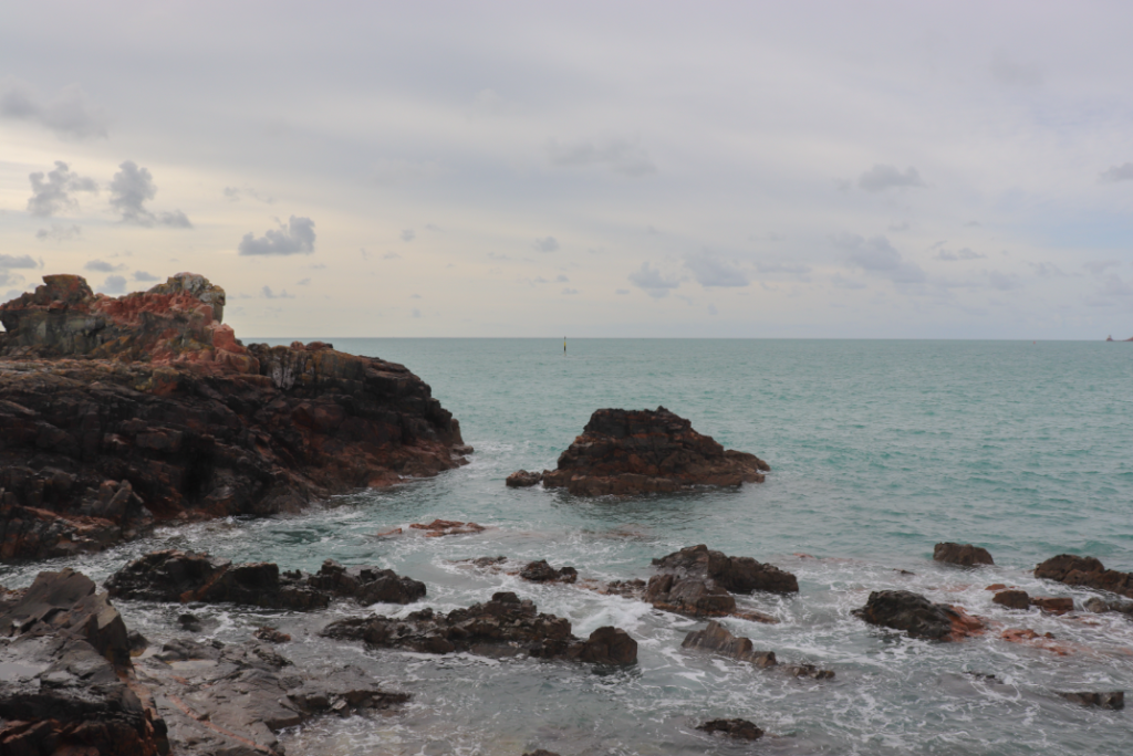
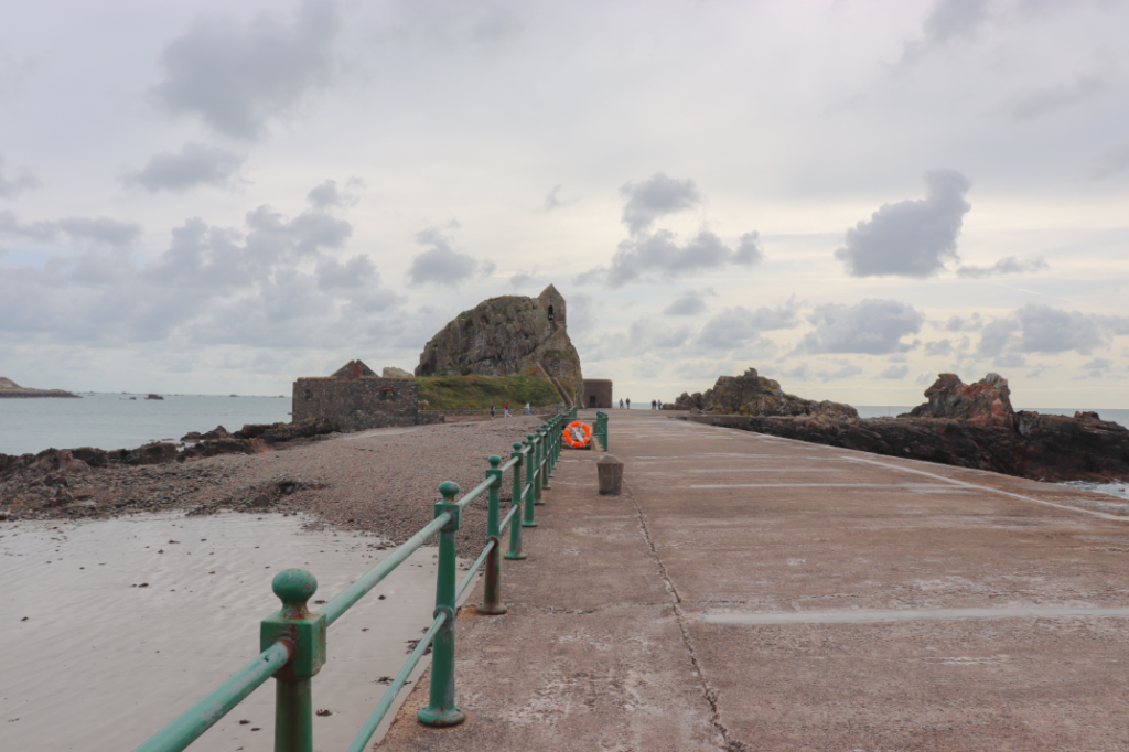
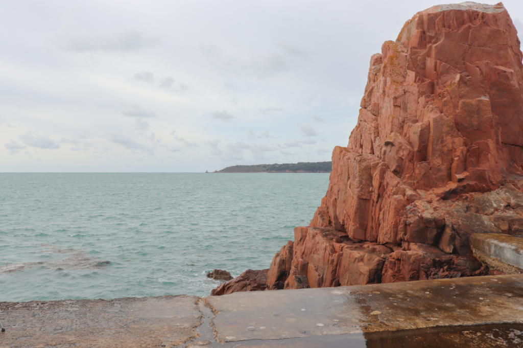
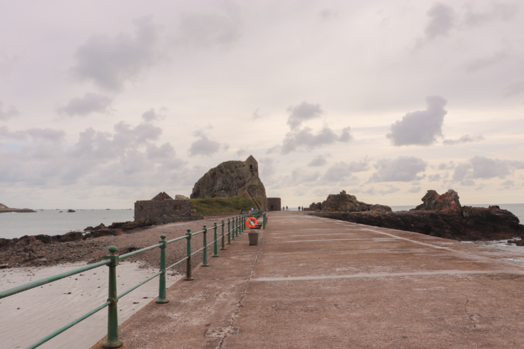
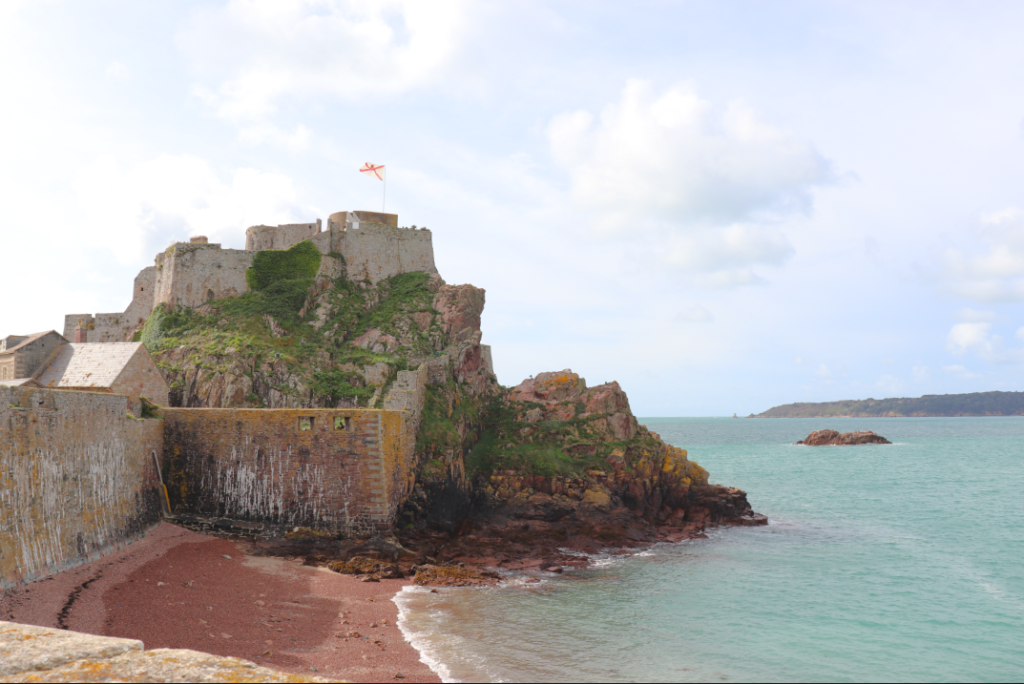
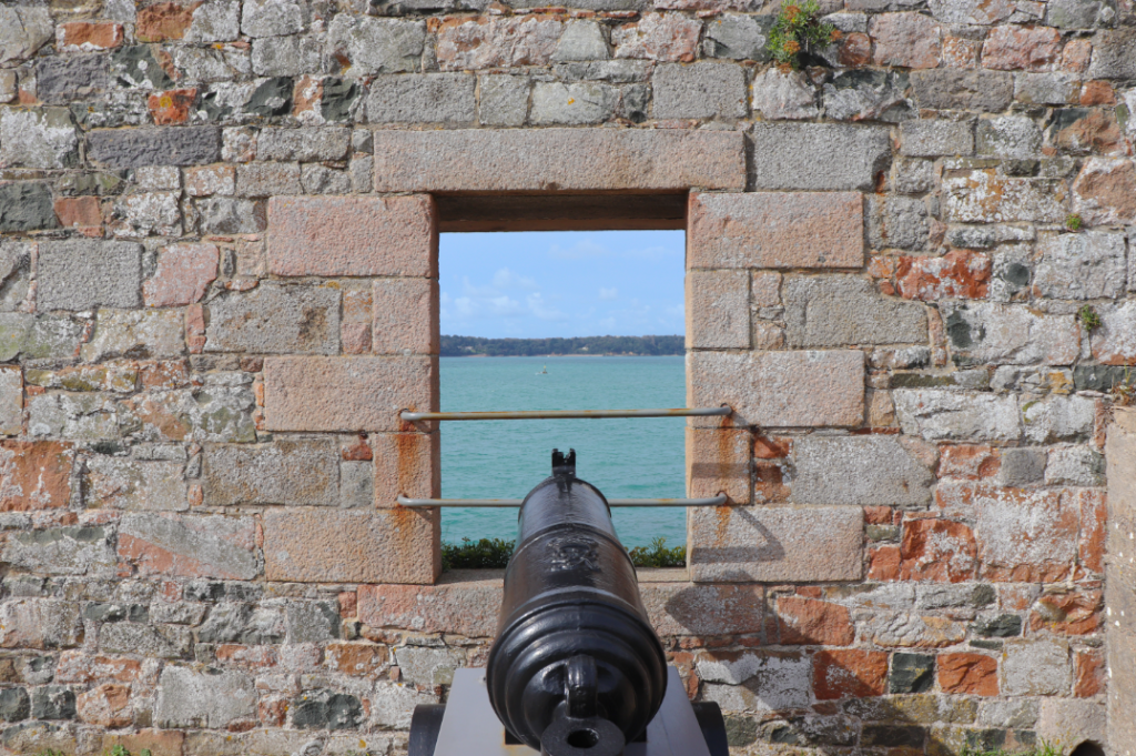
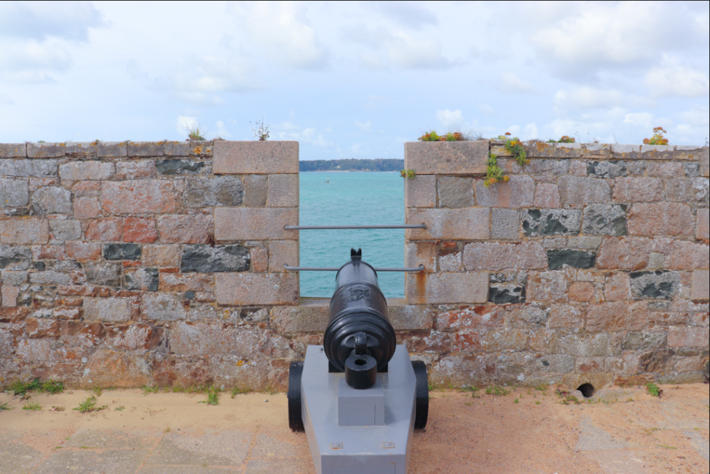
When editing the stills (which we weren’t sure if we were going to include or not) I made sure to edit them with standardisation and keep them similar in appearance. This was difficult when images differed in tone because of the balance of light or were darker because of cloud, but I tried to ensure that they all had the same feel despite the differences in light/colour in the original images. As a more general overview of changes made, I increased saturation and vibrancy to make the images a little less grey, whilst also bringing the contrast and sometimes the highlights down. I then adjusted exposure as necessary. I think I have achieved what I wanted to an extent, but the general greyness and lack of light in the original images made it hard to create images I was truly happy with. In terms of creating images that match the style of Wes Anderson’s work – which is characterised by bold colour palettes, wide lens shots and symmetrical framing – I think I have only truly achieved this on a few occasions, which I will show below.

