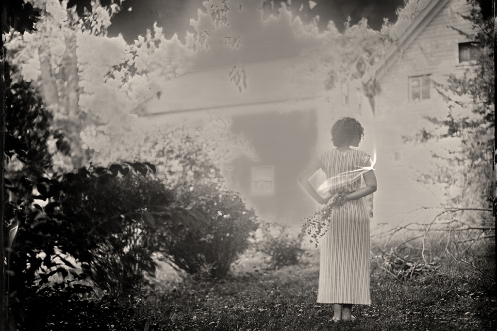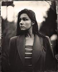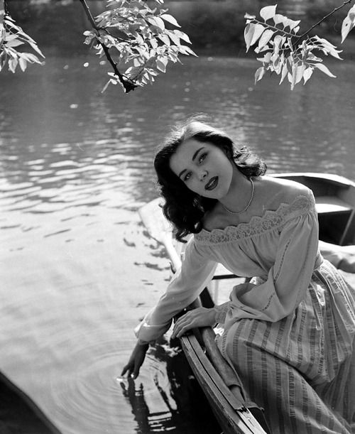


For my zine, I feel that my photographs from St Malo suit a more old fashioned style of photography, due to the timeless, old-fashioned architecture present throughout the town. I also think this style helps imitate the work of Cartier-Bresson, who was the main inspiration for this trip, which, especially with my images of the old buildings, is prevalent as in influence in my work there.

Cartier-Bresson’s work is carefully constructed using leading lines and different focal points to easily guide a viewer’s eyes across his images, such as in this photograph, one of his most iconic pieces, the darkest tones – the handrails at the top of the stairs- smoothly bring your attention to the blur of a cyclist passing through the scene. Cartier-Bresson’s use of strong geometric shapes in this image in particular build onto the composition, the sharpest, most rigid shapes dominating the foreground.

I’ve also spent time looking through various zines both online and in the classroom, each with their own unique styles and formats, and I plan on utilising the page fully for my images, completely filling each page and using other images at lower opacities as a background for some writing on a few pages. I’m interested in a minimalistic approach to my zine, which I hope to explore in this task. The title that I’ve come up with for my zine is going to be ‘malo.’, which I believe suits the minimalistic style that I want to aim for in my zine.
