DESIGN AND LAYOUT OF MY ZINE:
DESCRIPTION:
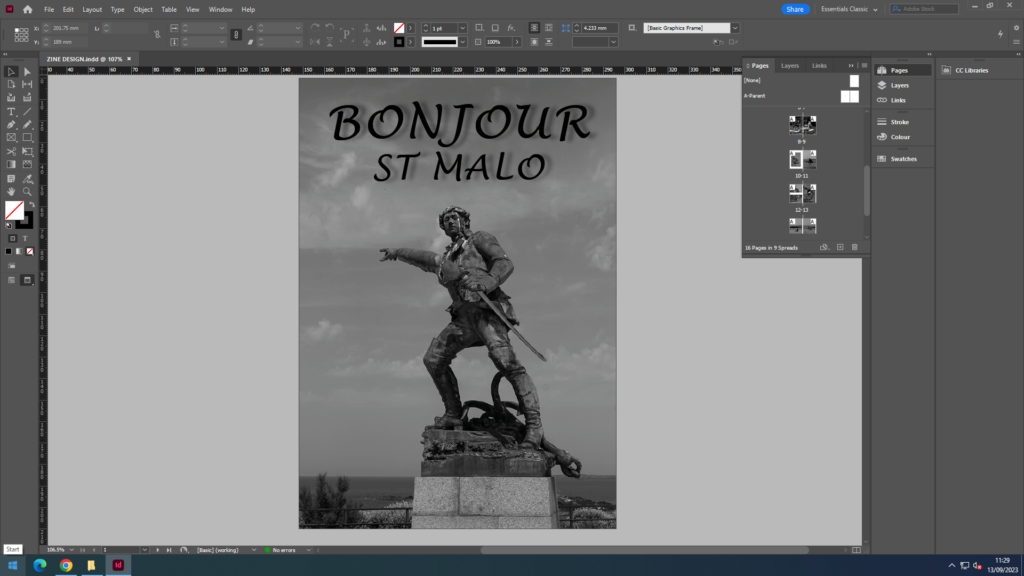
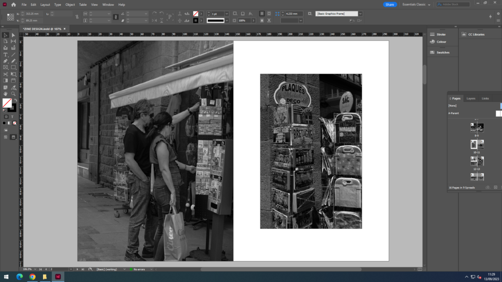
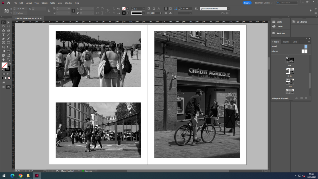
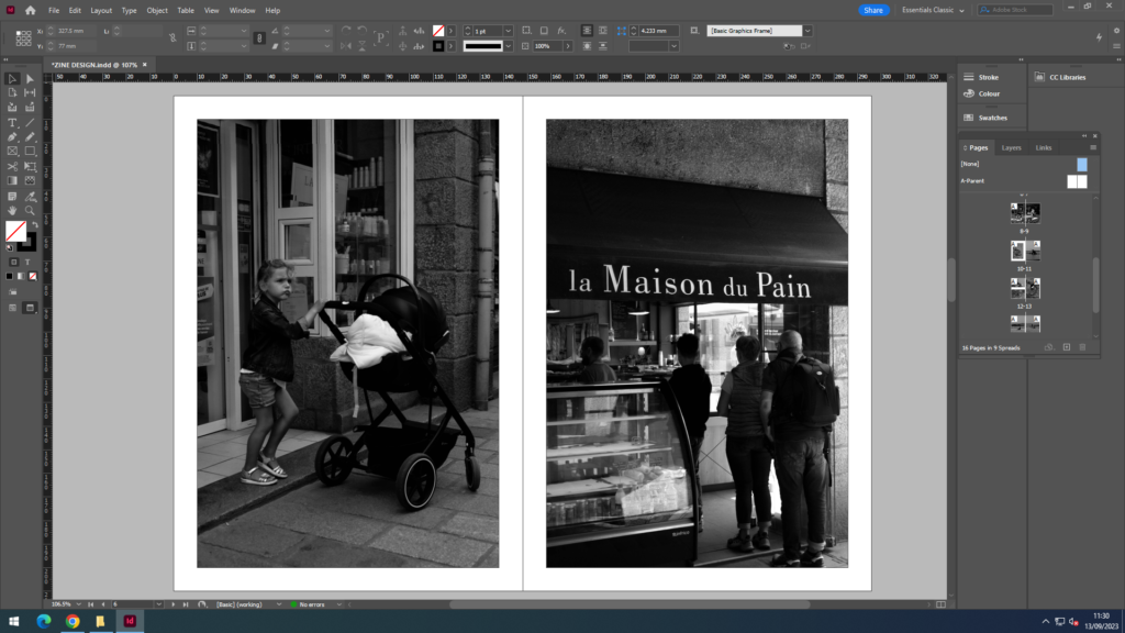
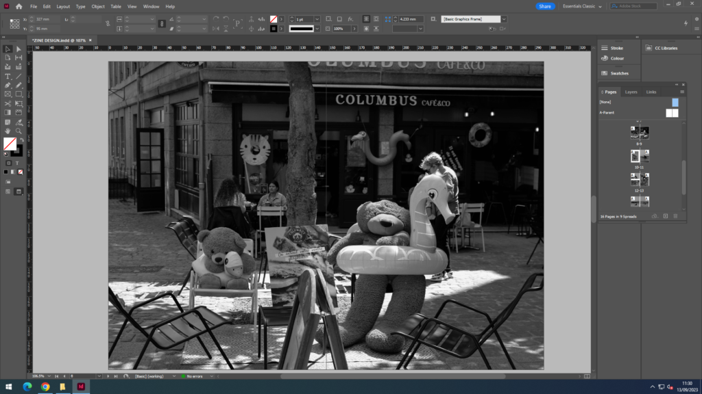
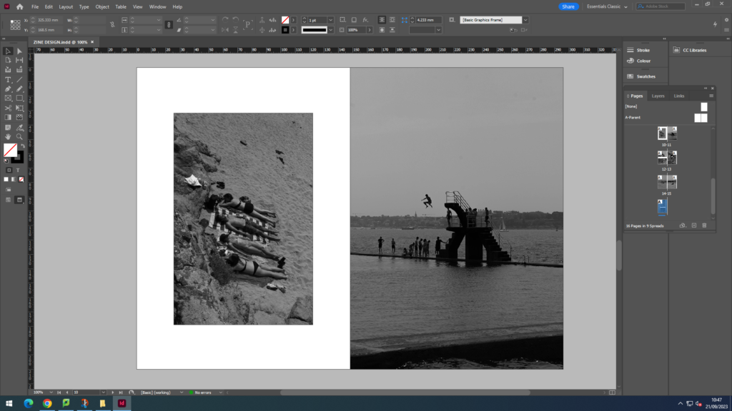
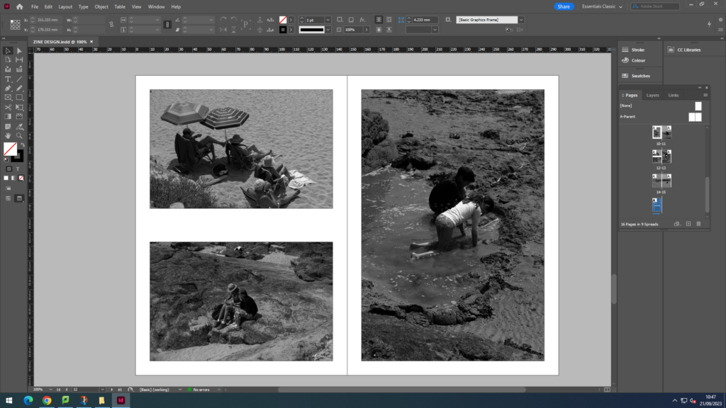
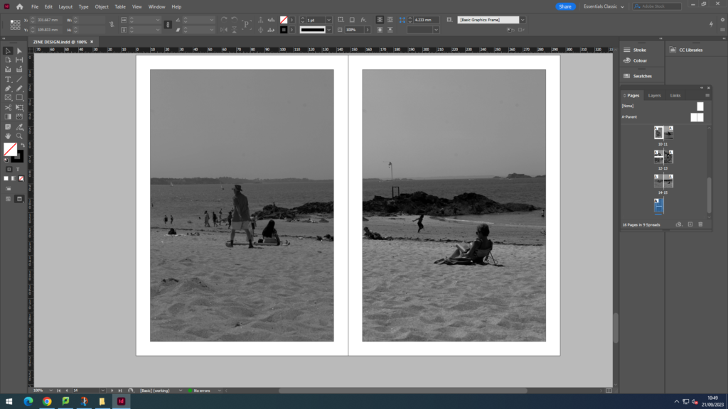
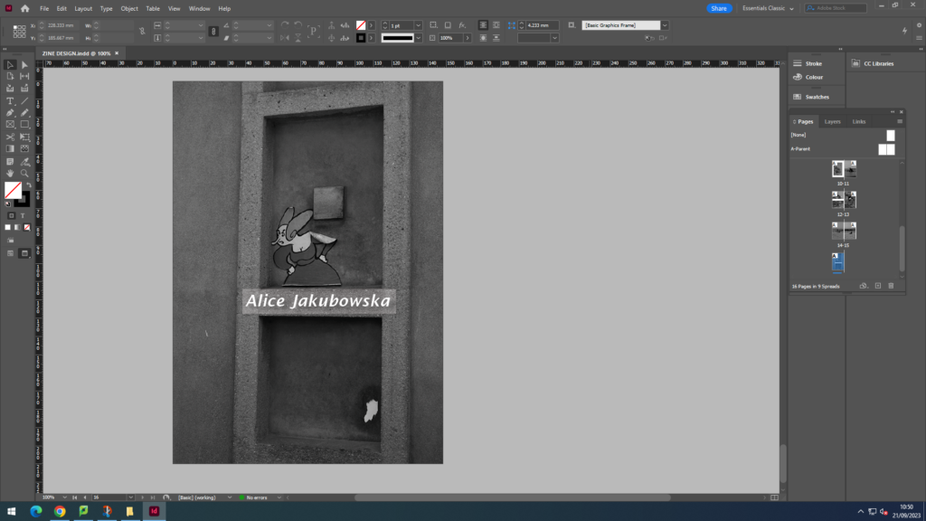
For my front and back page I wanted a simple image, to keep it a minimalistic aesthetic. The statue worked as my front image because the angle of the image made it seem like he was looking at the audience and pointing at the views in St. Malo perhaps making them more excited to open the zine. Furthermore I think my title ‘Bonjour St. Malo’ worked with my image of the statue as it suggested that he was greeting them into further reading the magazine and welcoming them on looking at the attractions in St. Malo. The back page was an image of a cartoon character that was stuck on a wall is a random street, however I think it worked well as my back page as it was simple yet added a little comedy with the yelling female cartoon character. The start of the zine are the street and attractions in the little town of St. Malo. Images included restaurants, tourist stands, and people walking along the street. This was broken by a landscape image of a set up that a restaurant created with some teddy bears. This is so the middle broke up the two halves of the zine. On the second half of my zine I included images from the coast (little beach found in St. Malo). As the weather was nice many people were at the beach with resulted many successful images. Images that I included in the blog included, people jumping from the driving board, groups of people tanning, and kids making sand castle and playing in the water. Overall with my zine design I tried to create a minimalistic and clean zine which didn’t look to overcrowded with image, and looking at the final product I believe I achieved this
