Front Cover
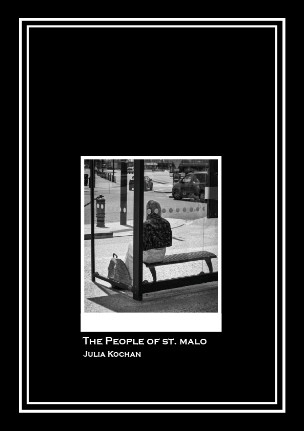
I decided to create quite a simple cover, with one of my pictures featured in the middle. I added a white border around the picture (with a thicker bit at the bottom to create a polaroid effect) and a double border around the edge. I choose quite a simple yet blocky font, adding a title and my name in a smaller size beneath it. I think it is an effective cover as it gives the viewer a taste of what is featured in the zine without revealing too much.
Inside
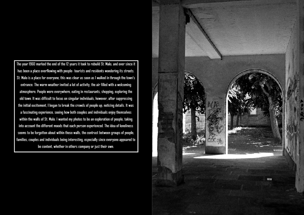
My first double page includes a blank black page with an overview of the trip written in the middle. On the right, I included a landscape image that I took.
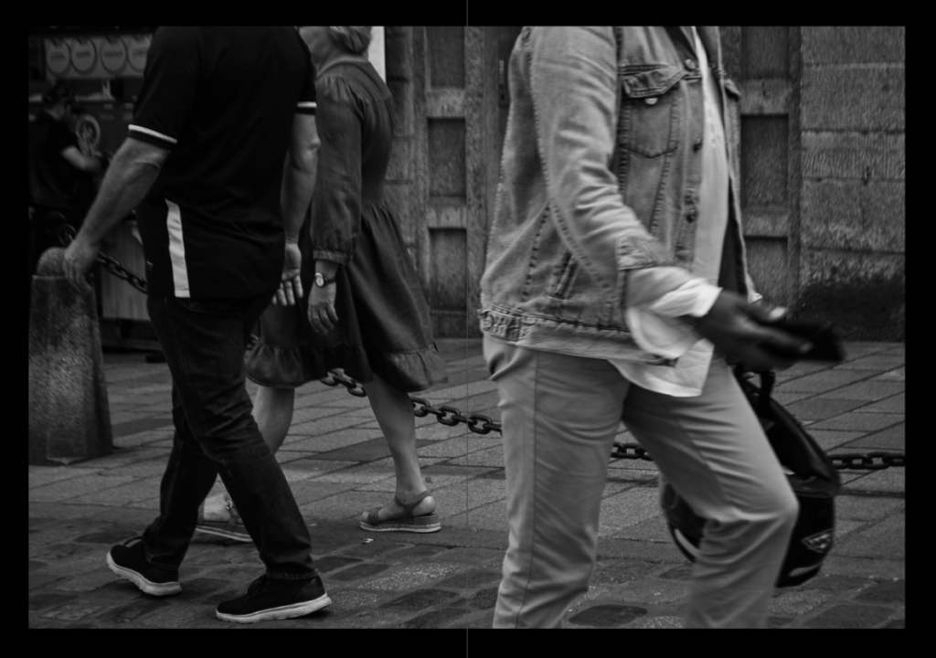
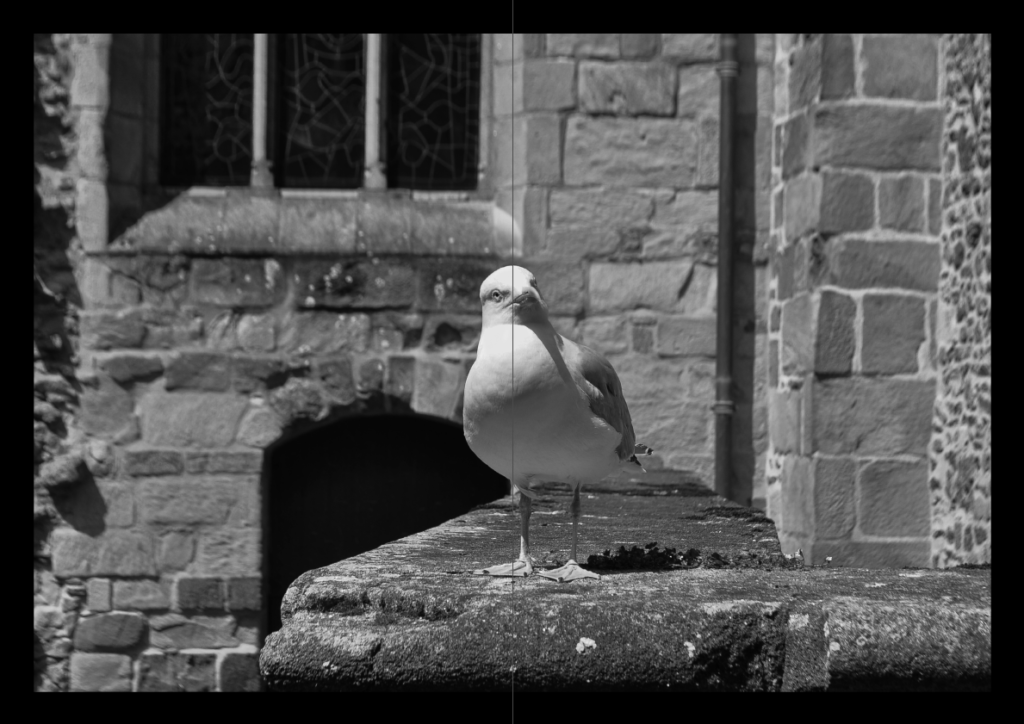
I decided to display my favourite landscape images over two pages.
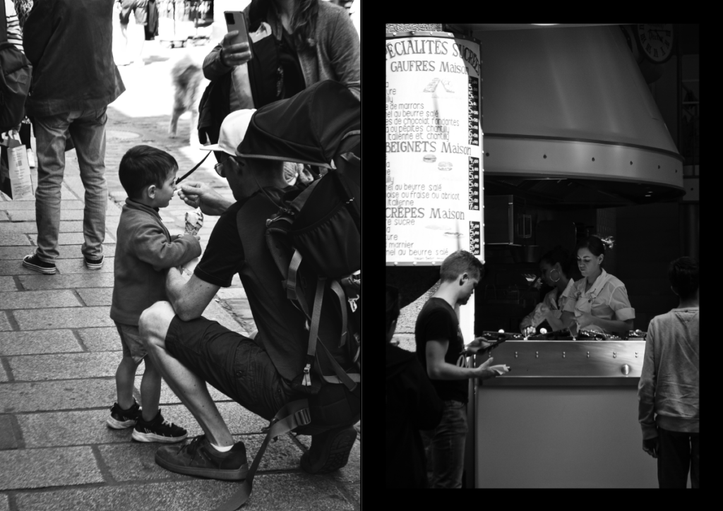
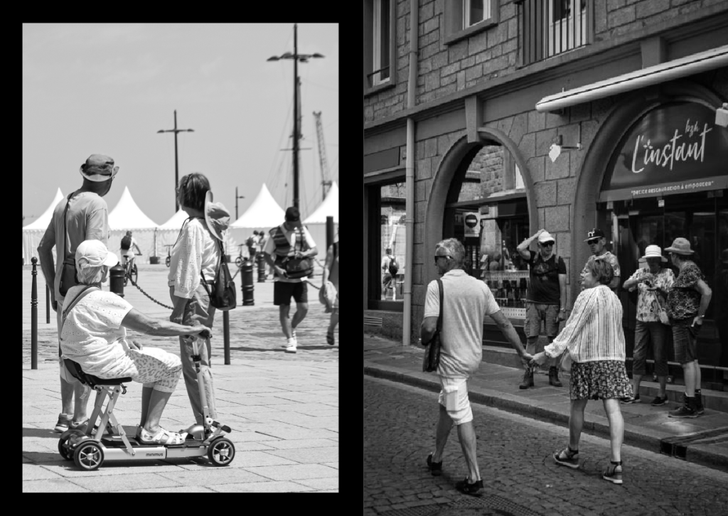
I displayed the portrait images side by side, some filling up the whole page and some having a black border.
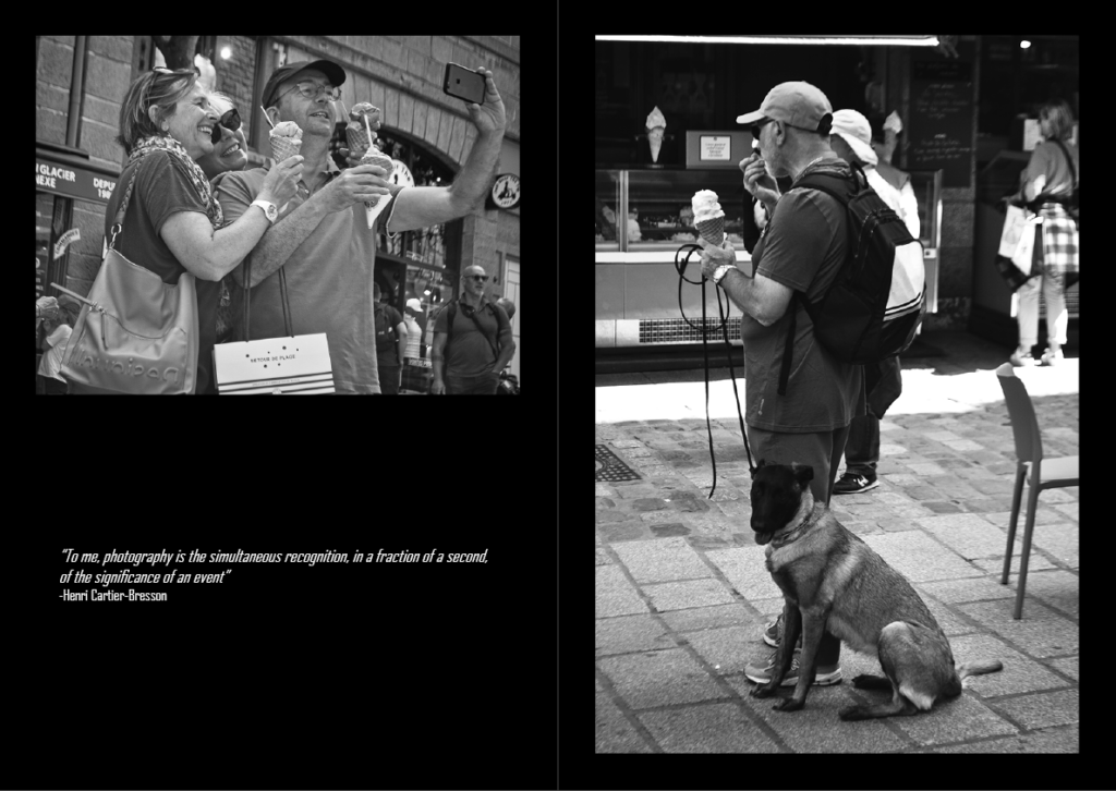
For my remaining portrait and landscape photos, I went for a different layout, including a quote from Henri Cartier- Bresson below the landscape image.
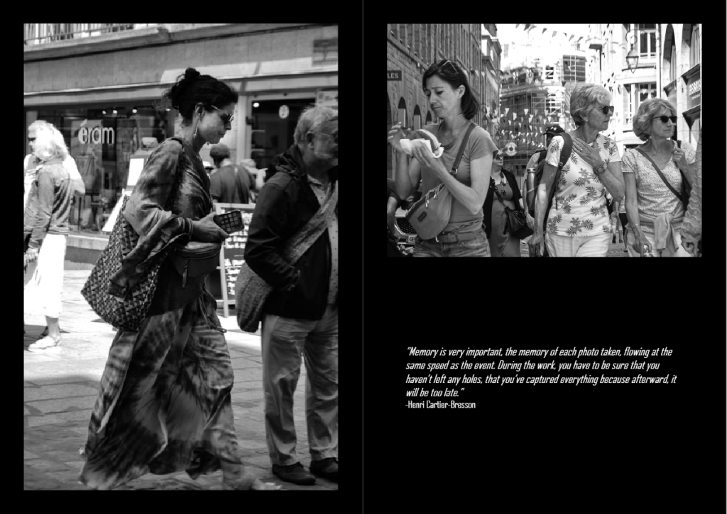
Back Cover
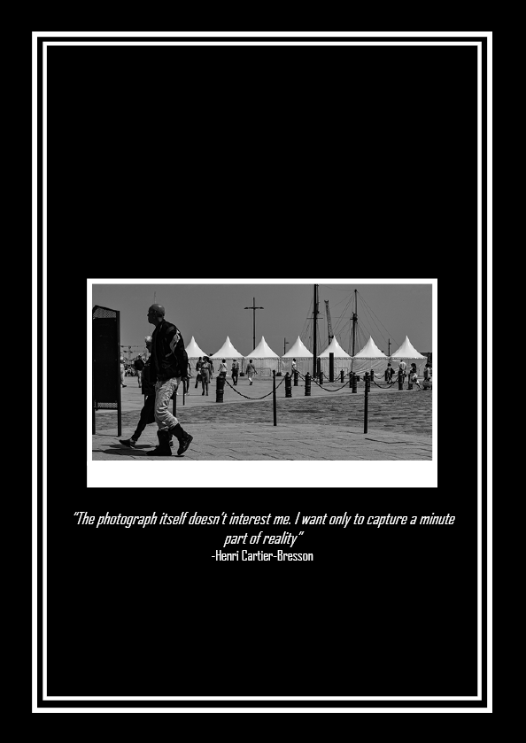
For the back cover, I used a similar layout as I did for my front cover, however this time I included another quote from Henri Cartier- Bresson.
