ZINE (n):
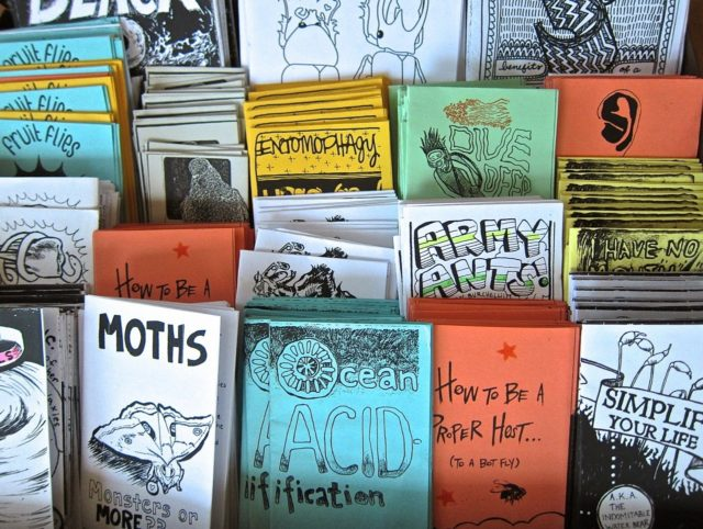
A zine is a self-published, non-commercial print-work that is typically produced in small, limited batches. Zines are created and bound in many DIY ways, but traditionally editions are easily reproduced—often by crafting an original “master flat,” and then photocopying, folding, and stapling the pages into simple pamphlets. Zines may also be sewn, taped, glued—or even exist in unbound and other non-folio formats.
“Zines provide a safe, independent platform of expression for underrepresented and marginalized voices: Black, Indigenous & People of Color, young people, people with disabilities, the LGBTQ(+) community, persecuted religious groups, and people with limited economic resources.”

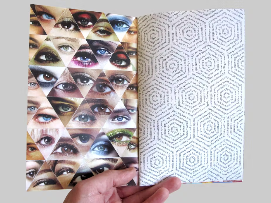
This zine (above) shows a typology of eyes compressed into one single page alongside lines from a book positioned on the adjacent page in a series of hexagons. Looking across two pages, this is an effective technique of separating typical photographic presentations with a page of text, while simultaneously showing a mix of colour and monochrome imagery. However, the overall page spread shares a motif through how each image is presented. Both typologies are arranged in intertwining triangles, the eyes creating a linear, uniform spread and the text forming hexagonal formations. The only critique that I would have for this approach is that it is unclear whether the designer wanted the text to be read as I have no idea if what is written in the text links to the ‘eye’ typology or not. However, if they didn’t want the text to be read then it is an extremely clever and creative approach that has an intriguing effect on the viewer. For me personally, the interlocking hexagonal formations remind of honeycomb and how natural patterns seem the most beautiful and most mesmerising to the human eye.

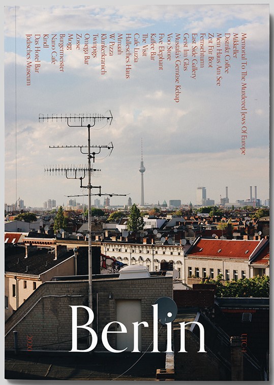
When looking through examples of zines that are focused around tourism, they all seemed to be have the same common approach – a single image of the are that they want to tell a viewer about. For instance the front cover above shows a typical landscape image of a high-rise that is very obviously of Berlin. It has a simple title so everyone knows exactly what this zine will be about. That is the typical front cover for any tourism based zine. However this differs from the status quo by having somewhat of a contents page of what there is to see in the city going across the top of the page, forcing the viewer to take a closer look in order to read it. This is a clever trick to grab someone’s interest, but for me personally I wouldn’t bother attempting to shift my head just to read a little bit of extra information. I also find the simple title of ‘Berlin’ quite boring as a viewer and therefore when designing my own zine would think of a clever way to present what is enclosed in a clever and submerged way that a viewer would have to look through the zine to get an understanding of what it is about.


The two page spreads above both show techniques that I would like to incorporate into my design. The image on the left shows on photograph spanning across a double page as an establishing shot for the section of the zine about ‘Mitte’. I believe that this is a good way to show off more important images of the St Malo that I have taken (i.e. the petit train that tours the town or a view of the walls from outside of the town as you approach from the ferry terminal). The spread on the right if you look closely shows an image of food and coffee layered on top of an establishing shot of a café. I want to use this technique as it is a stylised way to not only use more of my images but to also create an unusual background for that specific page spread.
