I have chosen to use these images in my zine;
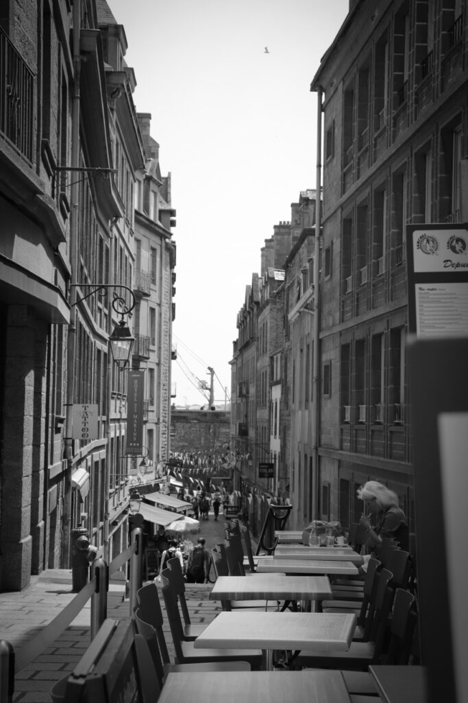
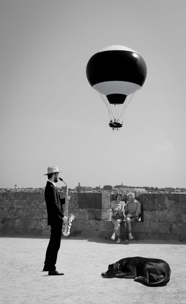
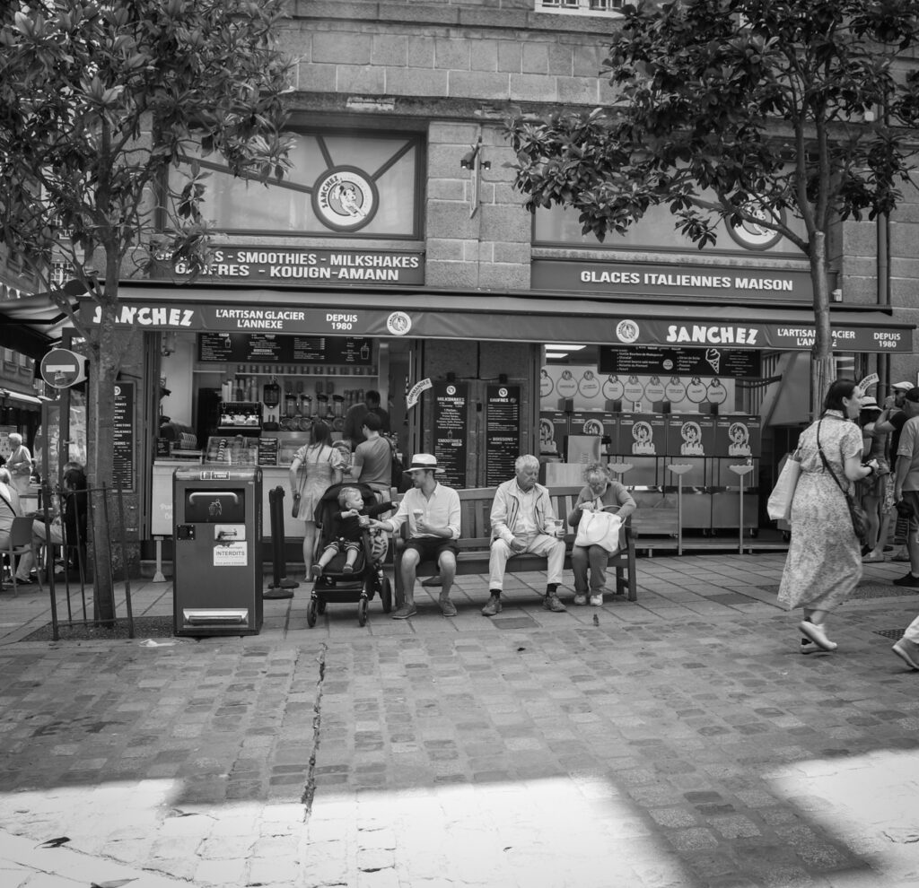
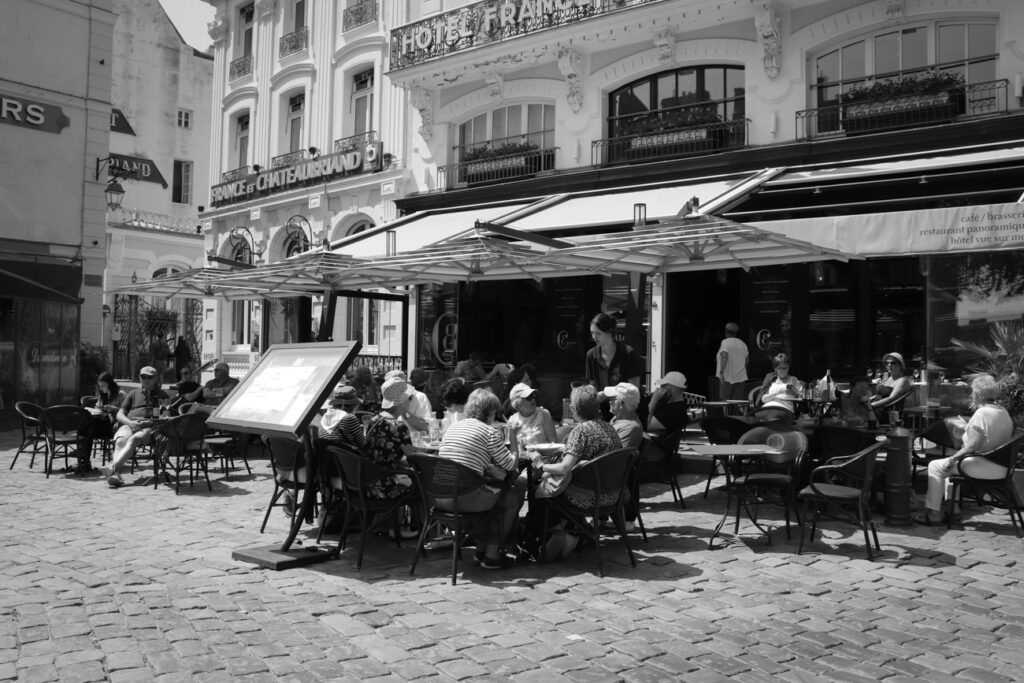
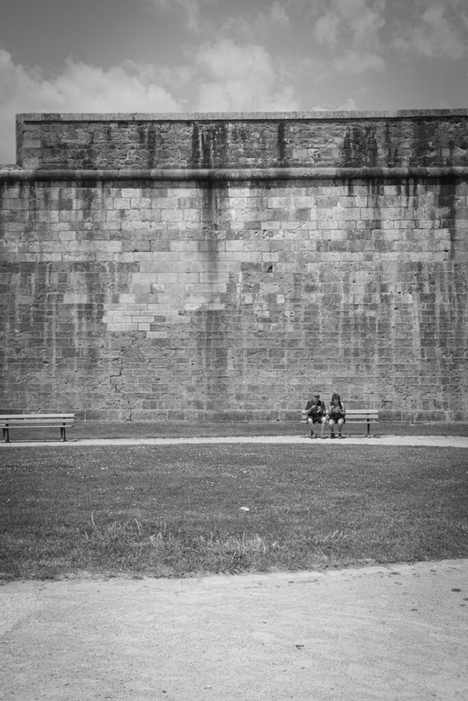
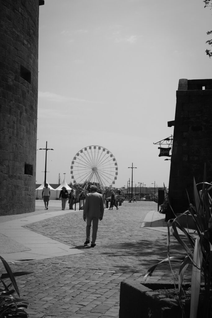
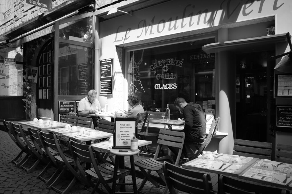
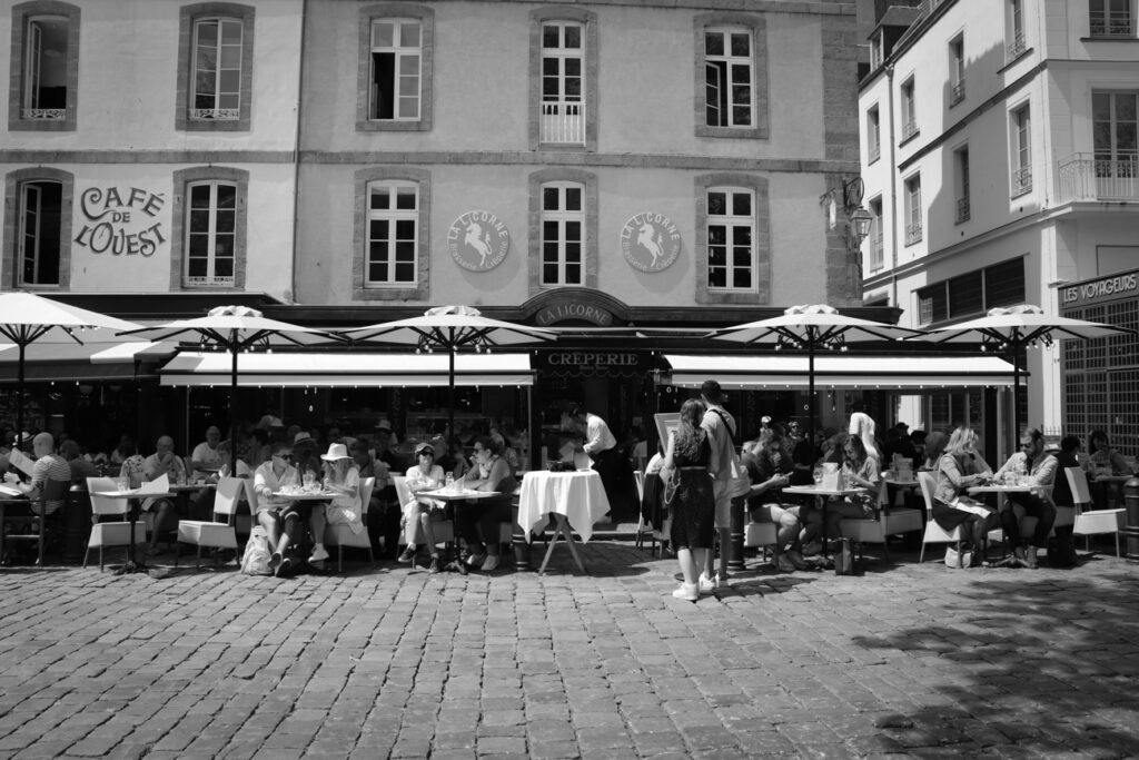
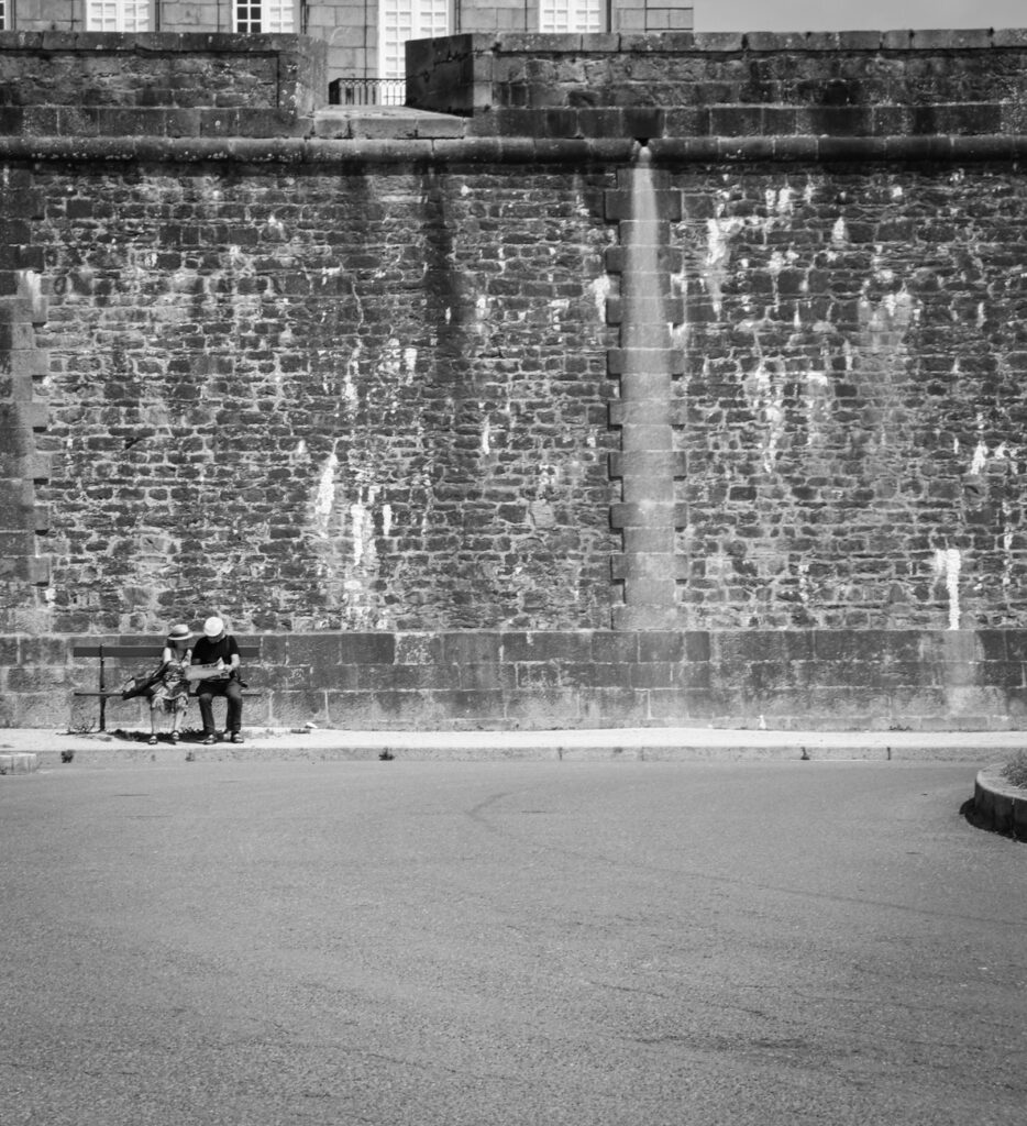
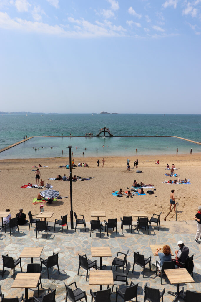
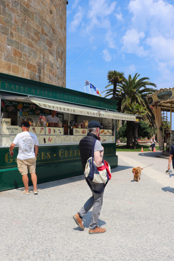
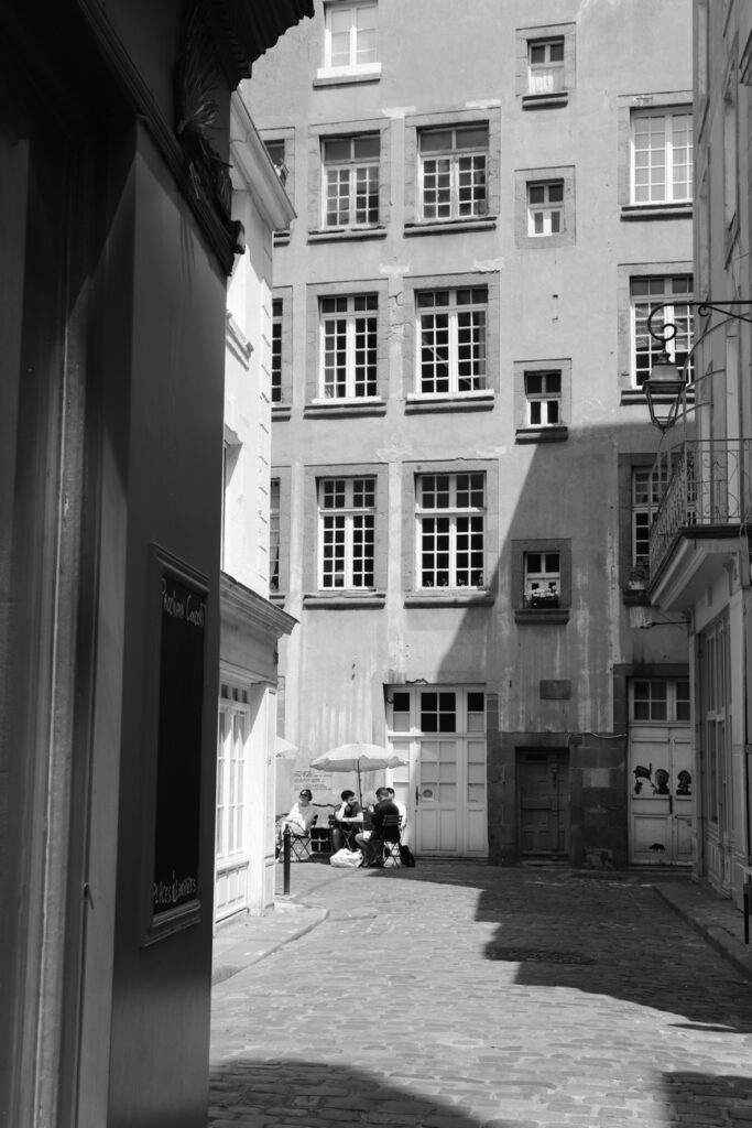
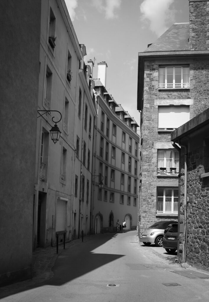
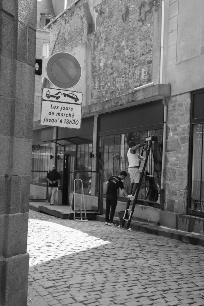
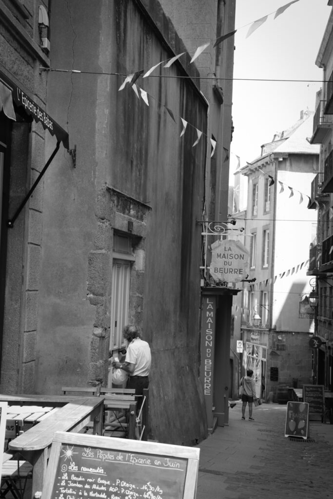
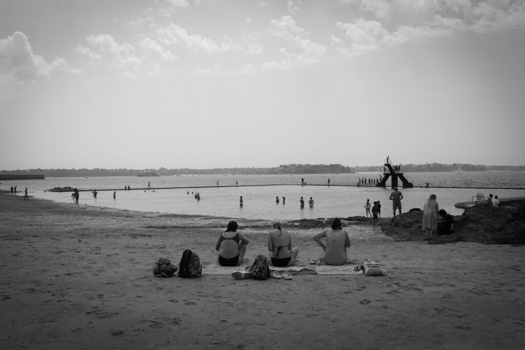

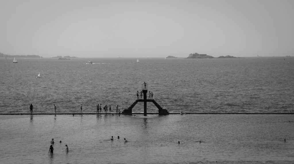
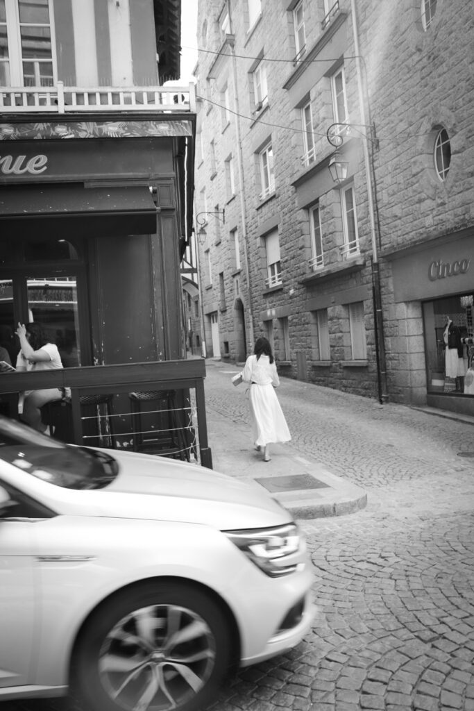

This is the layout I have chosen for the images in my 16 page zine. I have relatively split them into 5 vague groups based on content (e.g. beach, street views, colour photos). I have chosen to edit most of them in black and white and with a few adjustments to contrast and shadows as is typical with black and white imagery. I chose the cover image as I think it will frame a title well and also represents what the reader can expect from the rest of the zine. I chose the back cover image as the subject is walking away from the camera as if to close the ‘story’.
Textual elements
I have chosen to add some textual elements in the form of a few small blocks of text that describe my experiences in the moment which I took them. I also titled the zine with the French title ‘Souvenirs de Saint-Malo‘, translating to ‘memories of Saint-Malo’. I chose this because I think it reflects the main objective of the piece, which is to convey the concept of nostalgia through imagery and text. The typography settings I have chosen throughout (for everything except the cover) are shown below.

I chose these settings because I found they created the right kind of effect and that they fitted best with the nostalgic concept I wanted.
