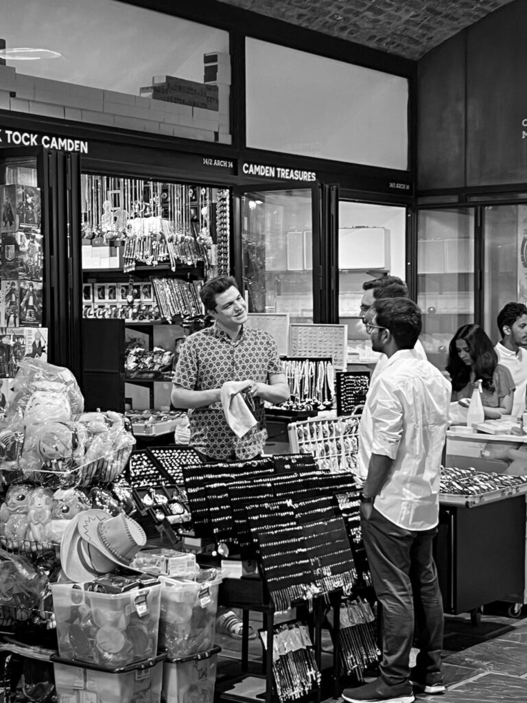
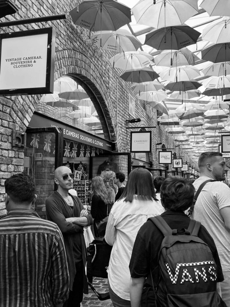
My main images that I think have the best composition and meaning:
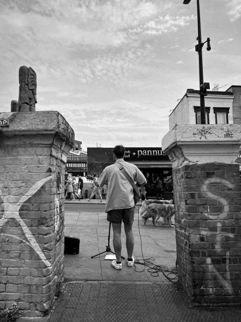
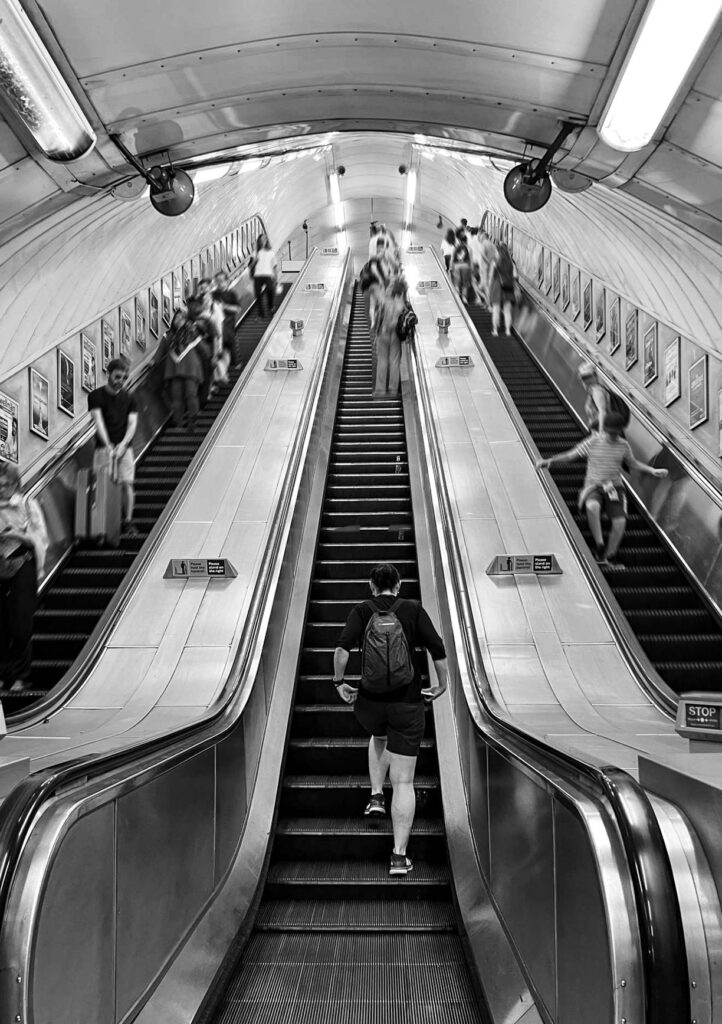
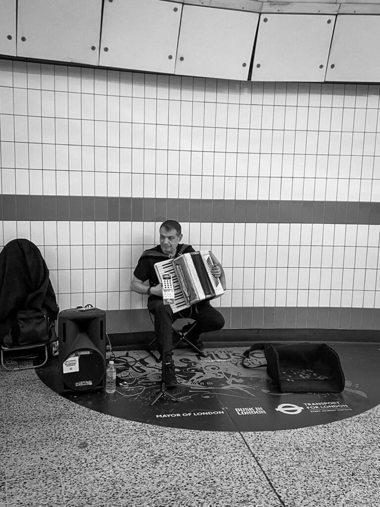
I’ve chosen these three images because they all have a main and obvious focal point for the viewer, which causes them to stand out unlike some of my other images where the focus is hidden amongst a crowd. They also give the viewer a chance to focus on the individual in the image and consider their story. I might use these images for full page images.
I’ve edited this image to have movement around the subject so that the focus is more obvious. I also like how the main subject is still, unlike everyone else.
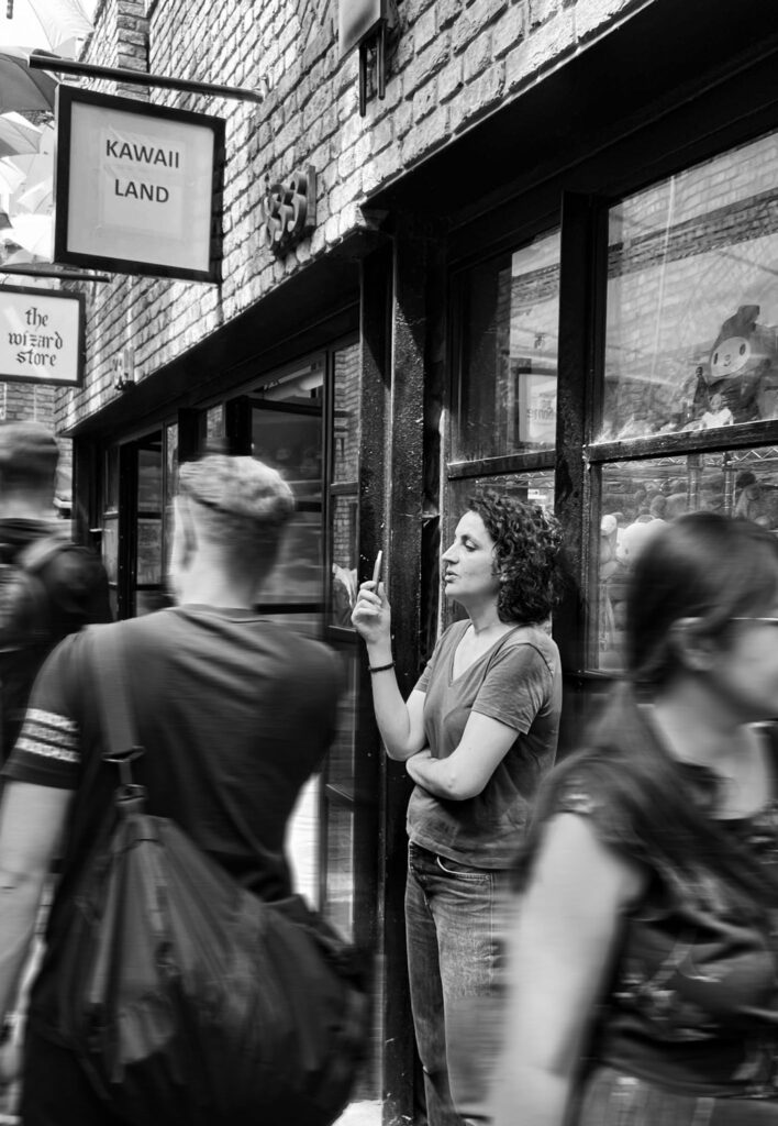
These images are my second favourites, and I may use them as full page instead because there is a lot in the composition and could cause the page to become confusing, or I will place them next to a more simple image like the ones above.
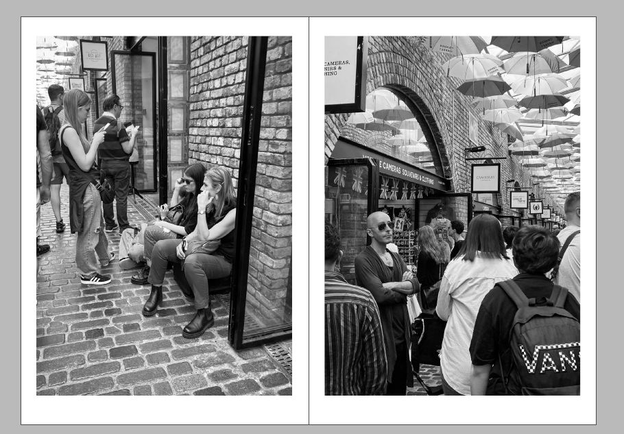
Front Page
I attempted multiple designs to see which image and design was the most effective.


I decided to choose this image and text as my front page because I felt it was the most effective/ dramatic. I like the movement I created in photoshop as it creates more of a focus point on the main subject.
For the rest of the pages I just placed them in, cropping some and leaving some original. I put them in an order so a basic story could be told of going round Camden and seeing the different types of people.

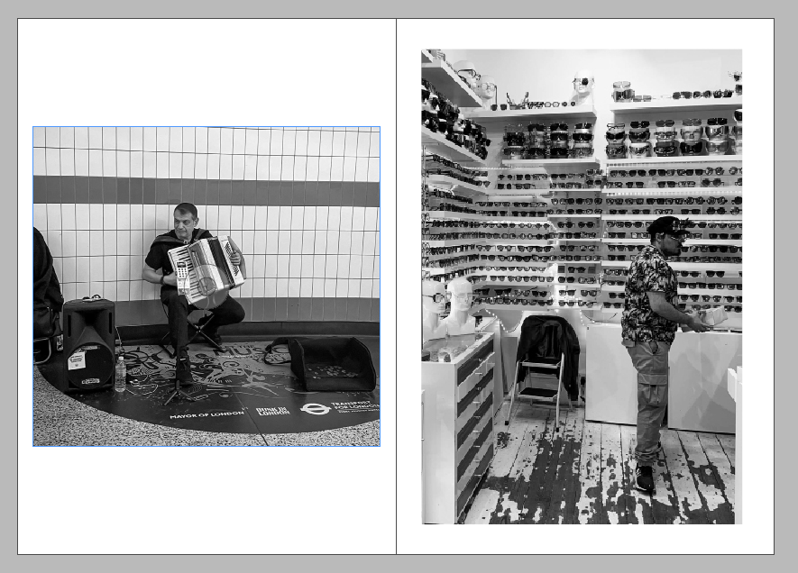

For the back cover I reused one of my other images and added a transparent rectangle over it. I felt like ending with the beginning photo was a good idea as its revisiting the start.
