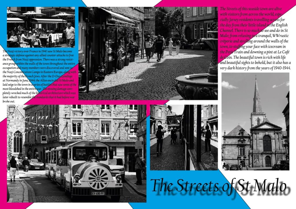

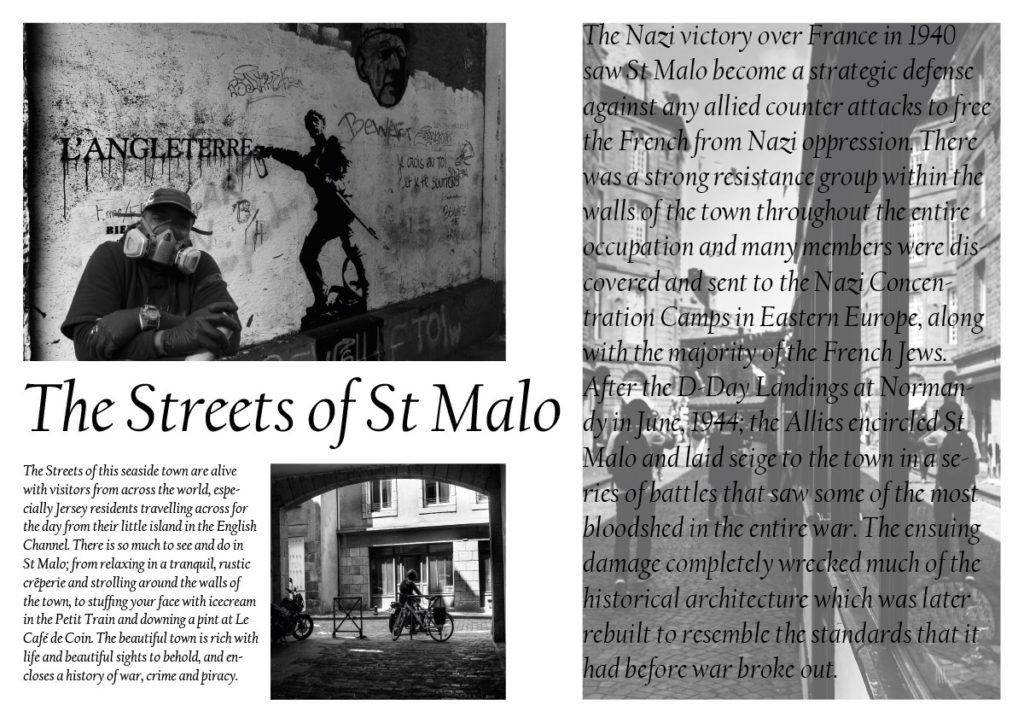
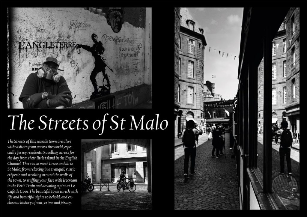

These 8 page spreads all began with a simple white background and by positioning different images in as man6y different positions as possible. From this simplicity i explored the Adobe In Design software and tried adding drop shadows, coloured backgrounds, text etc and created the outcomes above.
Double Page Spread
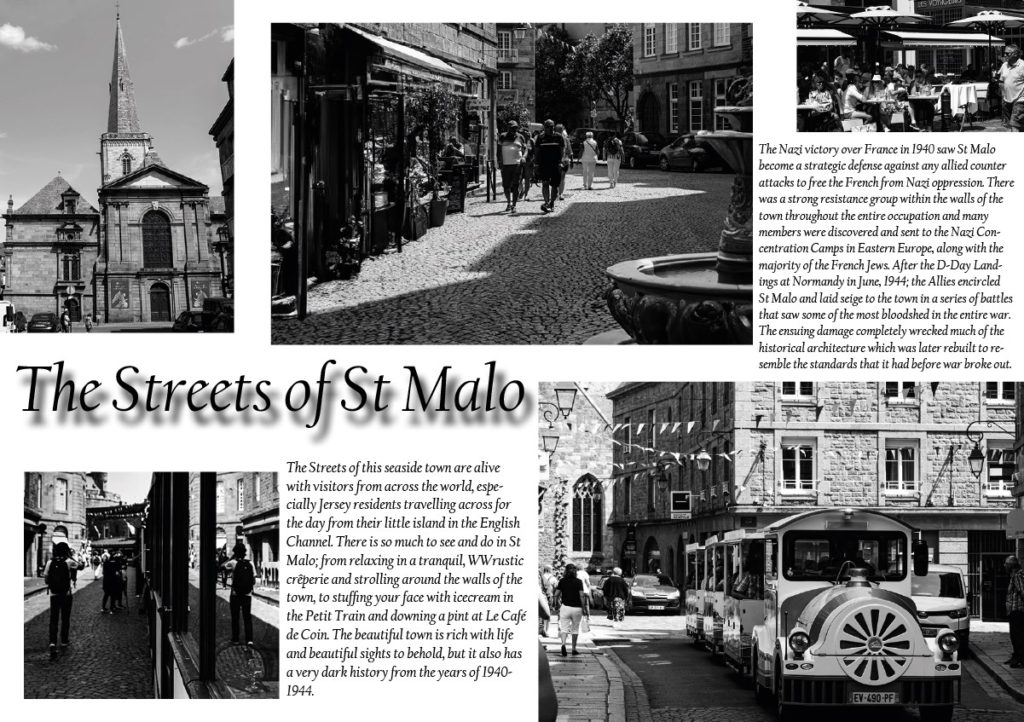
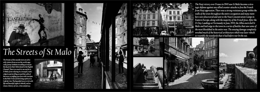
I found it difficult to squish text and a vast range of images onto a single page spread then decided to create two with the exact same background and design and share images and information across the two, finally presenting them together once printed.
Text Development

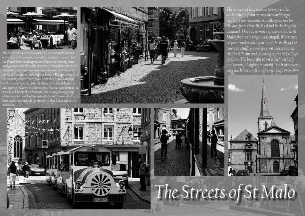
I also experimented with the backgrounds of the spreads by using my own images to create them. This created an amazing effect; however, disrupted the clarity of text making it difficult to read (example shown above). Therefore I added a simple layer of translucent grey which allowed the text to come across more distinctly and easier for people to read (shown below).

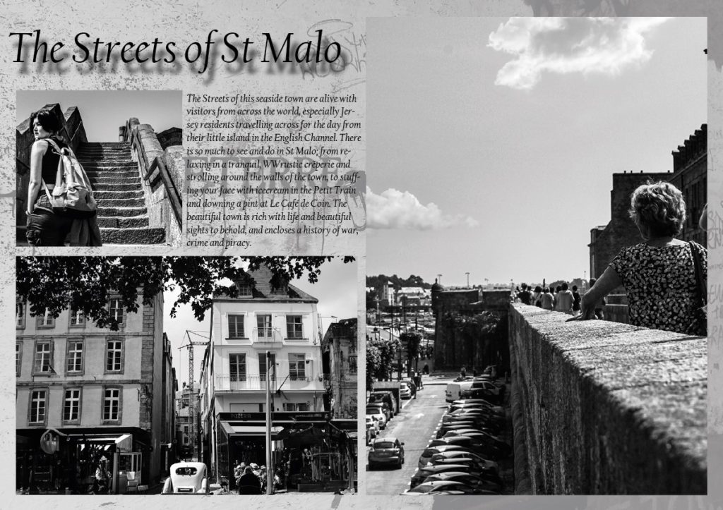
Favourite Outcomes
The outcomes below are those that I wish to print but before properly mounting them, I want to have them peer assessed to establish which layouts work the best, are the easiest to read and understand, and which are simply the most liked.


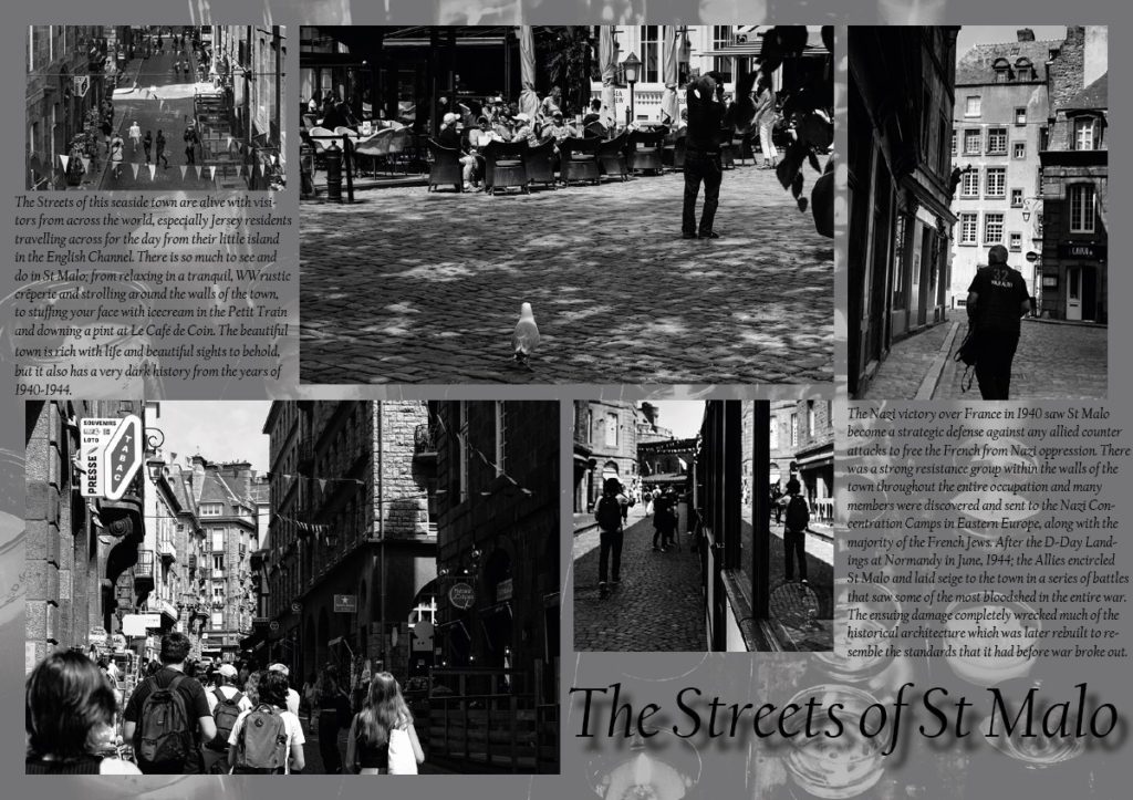

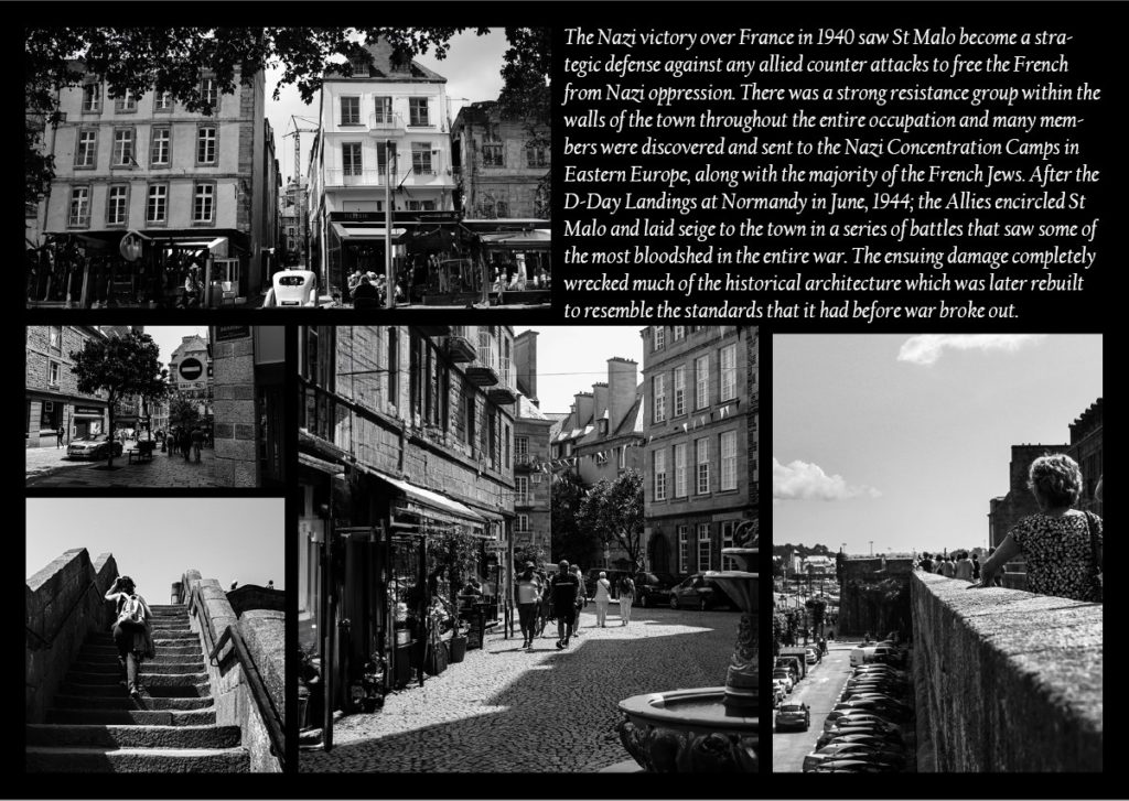
From the findings of the peer assessment, I will print and mount the favourite three or four outcomes.
