
My first attempt of making a photographic spread on InDesign:
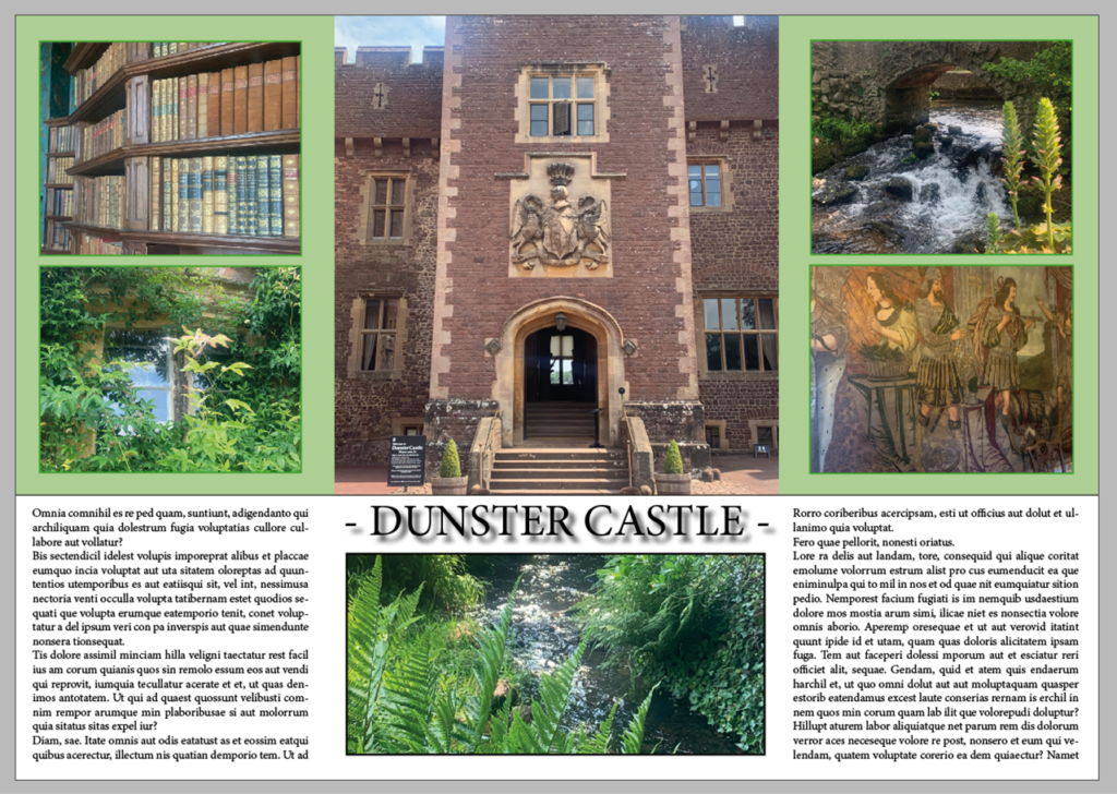
What I liked about this first spread is how the pictures have been placed. The colours and photographs create a separation between the main/dominant images and the text and smaller images.
My second attempt of making a photographic spread on InDesign:
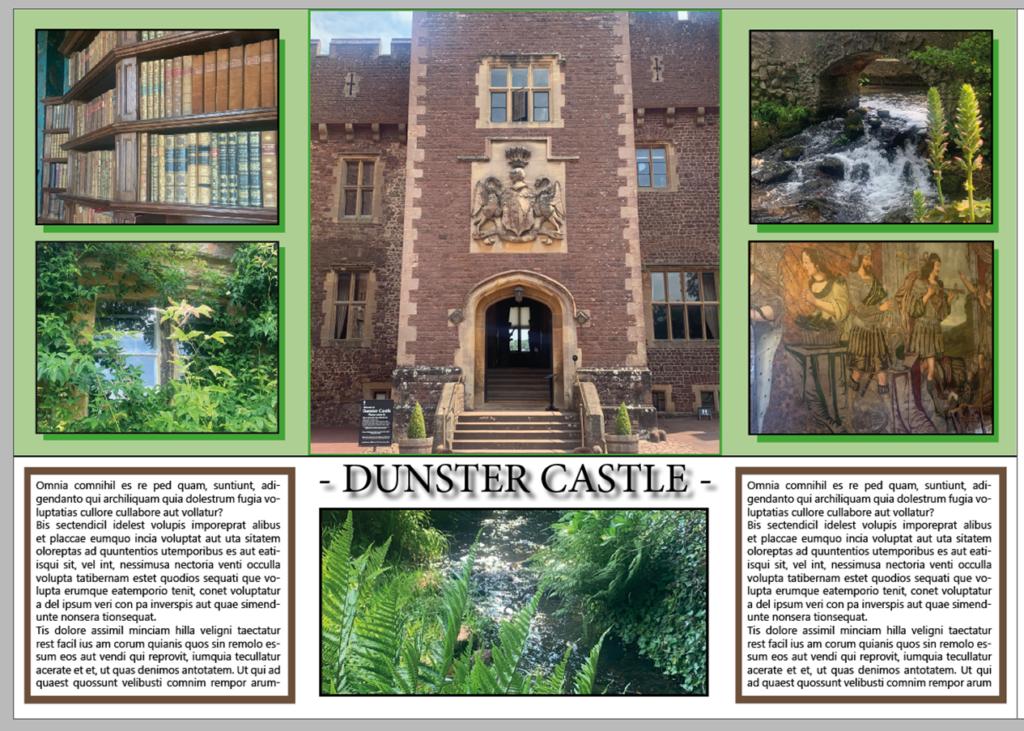
I really liked how my first one was placed so decided to copy these and just add onto it. I started off by adding a coloured shadow behind the four smaller images on the top half. I then added a brown border to the text because I wanted to incorporate all of the colours in the images onto the paper.
My last InDesign attempt:
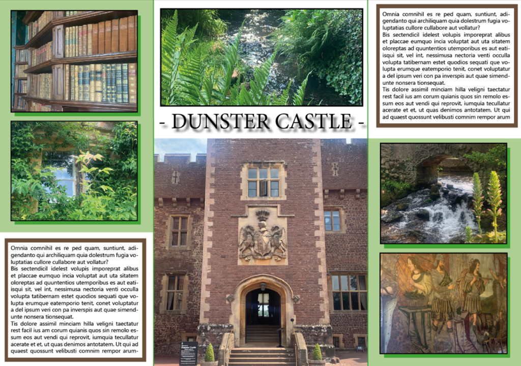
I decided to have a small play around with the layout so changed where the text and images were. By doing this I created a diagonal idea with the text and smaller images being on the opposite sides to each other.