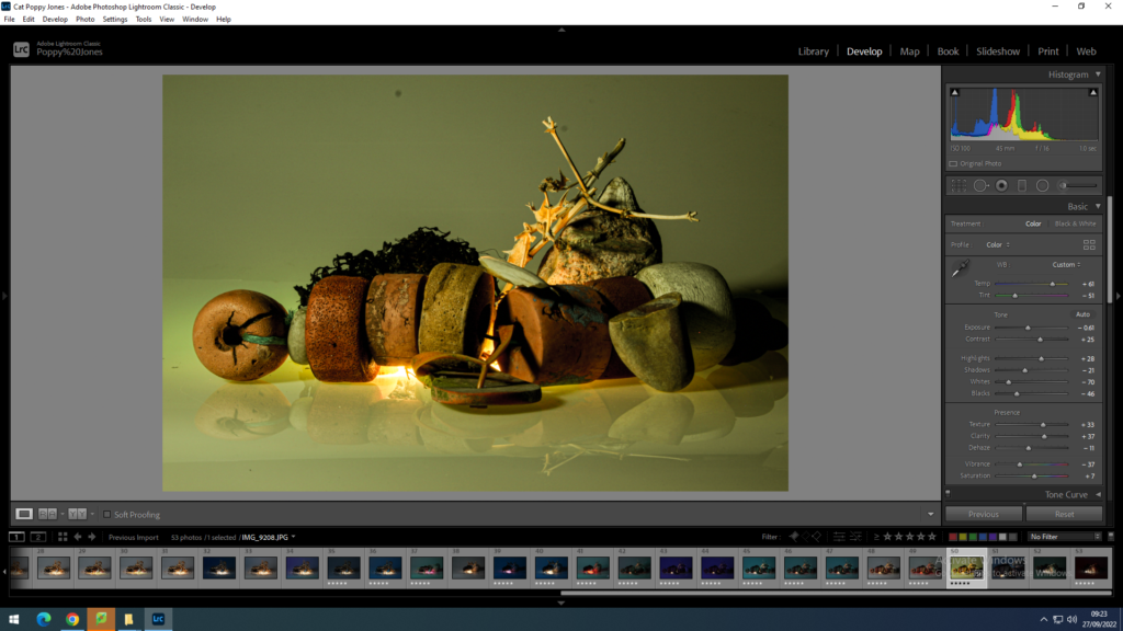
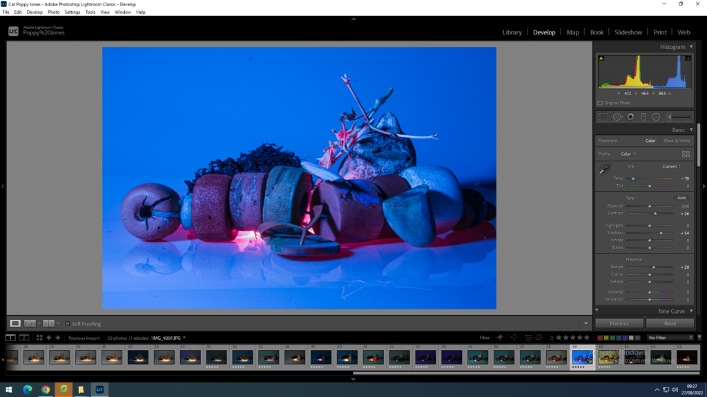
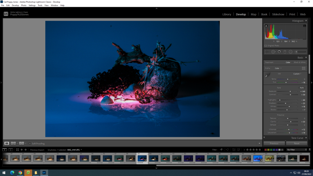
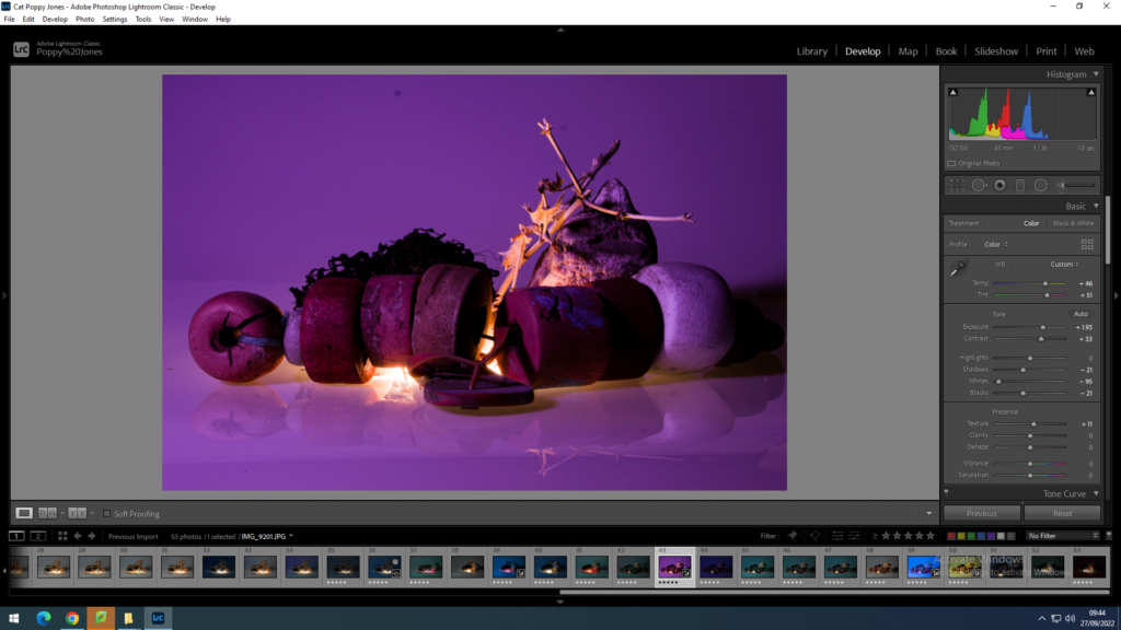
This is one of the still life photos I took in the studio. I really like how it has come out. I have used editing techniques on Lightroom to change the appearance of the photo and I really like it. The filters I used are shown in the right of the screen. This edit has subdued pale yellow colours, this really lets the objects I have used speak for themselves. The pale yellow links with the beach objects as it resembles sand.This is the same image, however, I have changed the temperature a lot. The dark blue colours give the image an ominous tone. On the other hand the luminous pink colours give the image a upbeat tone and it balances out the deep blue. I have accentuated the shadows and I am happy with how it has turned out.For this edit, I have gone for the same style as the last. But, I have turned up the vibrance and saturation which further accentuates the pink colour. I have also decreased the highlights and shadows which decreases the colours of the background which makes the pink light seem artificial and almost magical.I really how this image has turned out. The light coming through the objects looks great. The purple background gives a great contrast. It also accentuates the reflection of the objects. I have got rid of the white background by increasing the temperature and tint and almost completely decreasing the whites.