
How did I planned the project:
Majority of my final outcomes I have used are from photoshoots throughout the portraiture project. However, my more recent fruits portraiture project was done to reflect aspects of femininity and masculinity. I collated a group of my friends and then brought in some fruit that I had at home. I explored different ways of photographing the models i.e., different poses. By planning my photoshoots to be taken in the studio, I could control the lighting as well as the backdrop. The plain background allows the attention to be focussed on just the models, more specifically the fruits. Overall, I think the outcome is quite playful and vibrant.
What went well:
I am happy with my final outcomes and believe that I have displayed a range of my work from throughout the photography project i.e., multi-exposure, lighting techniques, environmental portraiture.
What could I improve on:
During my fruits portraiture photoshoot, the band was practising in the studio so I couldn’t turn off the lights. This resulted in the peach photograph appearing slightly dark or dull. If I could do it again, I would try edit all the photos better so that they were all as vibrant as the orange photo.
I could’ve tried to select more images, or been more selective and chosen better outcomes, so that I could reflect more of my work that I have created throughout the project.
Mounting images:
I like the way I have mounted the images, I think I’ve effectively presented my images in a way which makes them visually appealing.
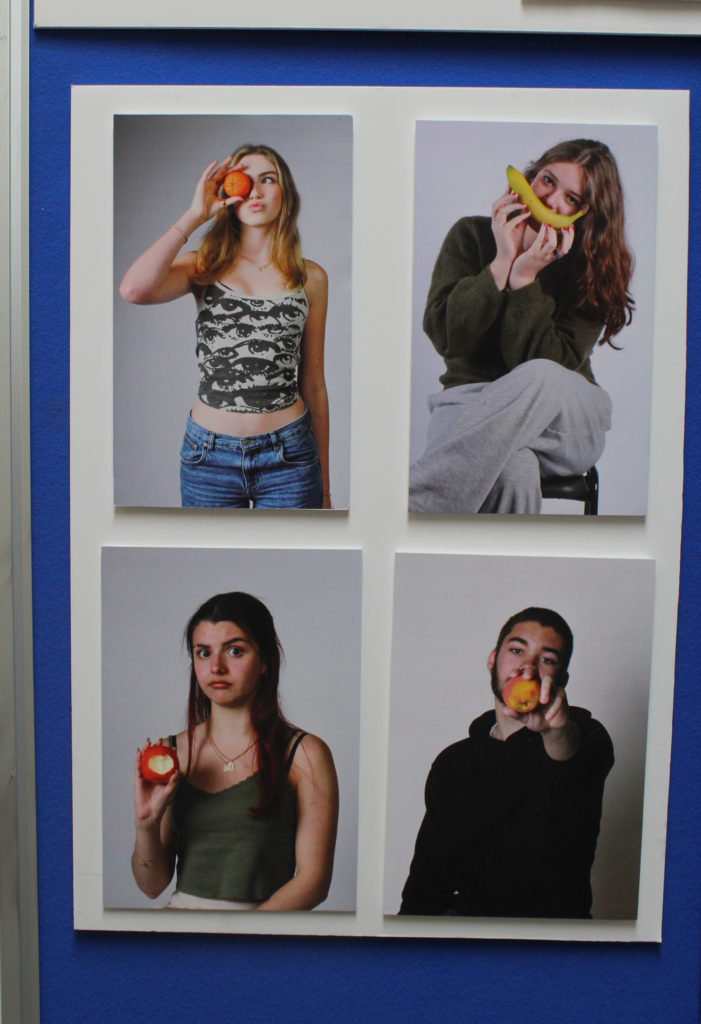
I have double-mounted these A5 images on foam board in a grid formation. These are images I created in theme of the masculinity vs femininity theme. By creating mood-boards when given this theme, it inspired me to carry out this photoshoot. I enjoyed creating these photographs as they have elements of symbolism and overall they were fun photoshoots.
The apple has been associated with mythological figures and goddesses throughout time, and therefore becoming a symbol of femininity. Another interpretation is the biblical story of the forbidden fruit. This is because the model has eaten the apple, therefore becoming a symbol of Eve.
In my self-portrait of the banana, I am posing with it as if it is my mouth smiling. Bananas have been called the ‘happy’ fruit, therefore symbolising happiness.
The orange is associated with optimism and energy, which is reflected by the colour and vibrancy of the photo as well as the playful pose. Whereas the peach just has playful connotations.
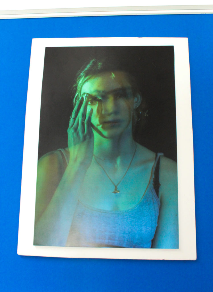
I have double-mounted this image on foam board. I printed this image as A3 as a stand-alone image as it is quite effective.
This is my favourite multi-exposure photograph I have taken from when exploring with using lighting in the studio. I like how each exposure is a different colour, and because there is multiple exposures they blend to make a really visually appealing result.
The model has her hand raised, touching her face. I think this adds a small touch to the image, making it less boring by adding an aspect of asymmetry.
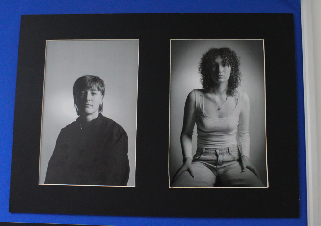
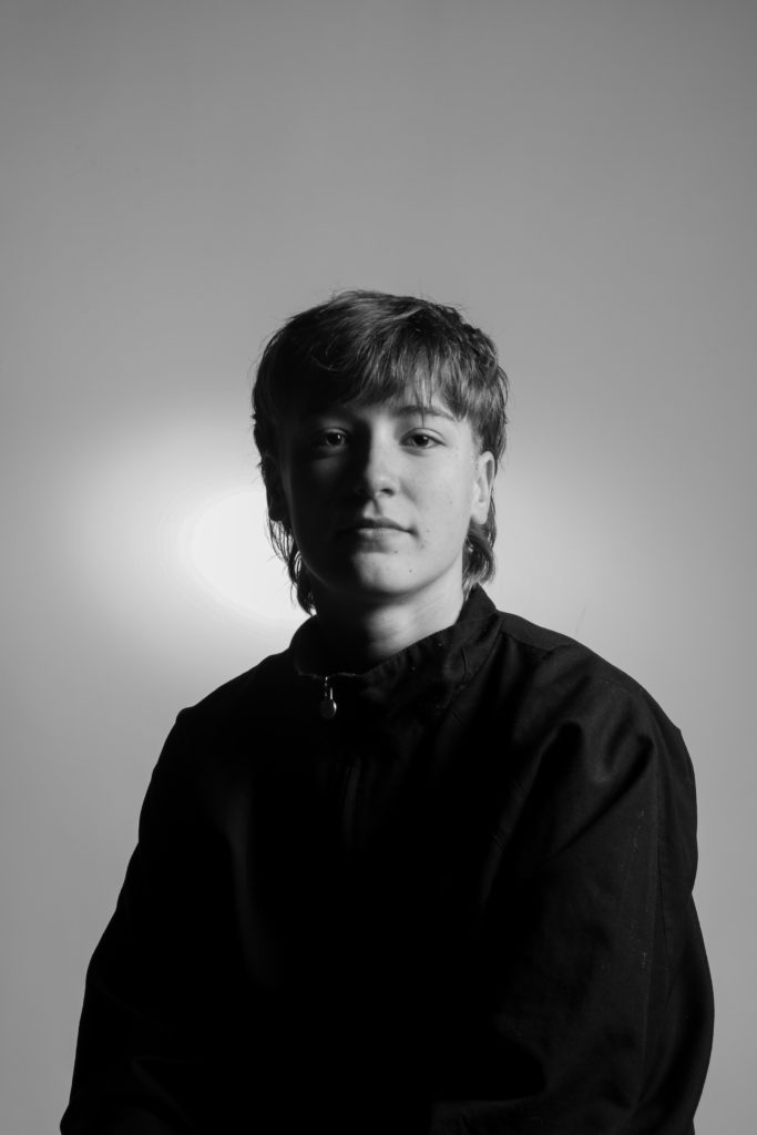
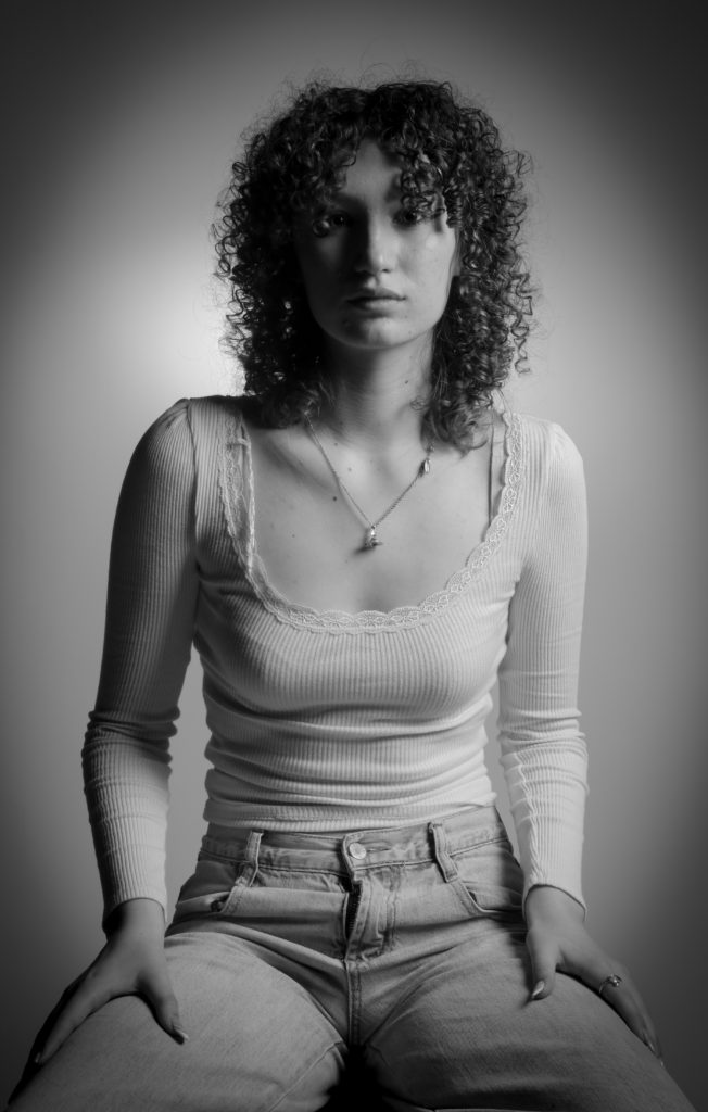
I created a window mount to display these A4 images. These are a couple of my final outcomes from a photoshoot I did when exploring lighting techniques. These are evidence of Rembrandt lighting and I think they are my strongest outcomes from the project.
I have edited these images in black and white to dramatize them, but also to reflect the lighting technique. With colour, there is more occurring in the image, and this takes focus away from the lighting technique I have employed.
I mounted these images on foam board, then taped them on some black card to give them a 3D sort of effect. The black background suited these images best due to the dull lighting during the photoshoot as well as the dark colours in the images.
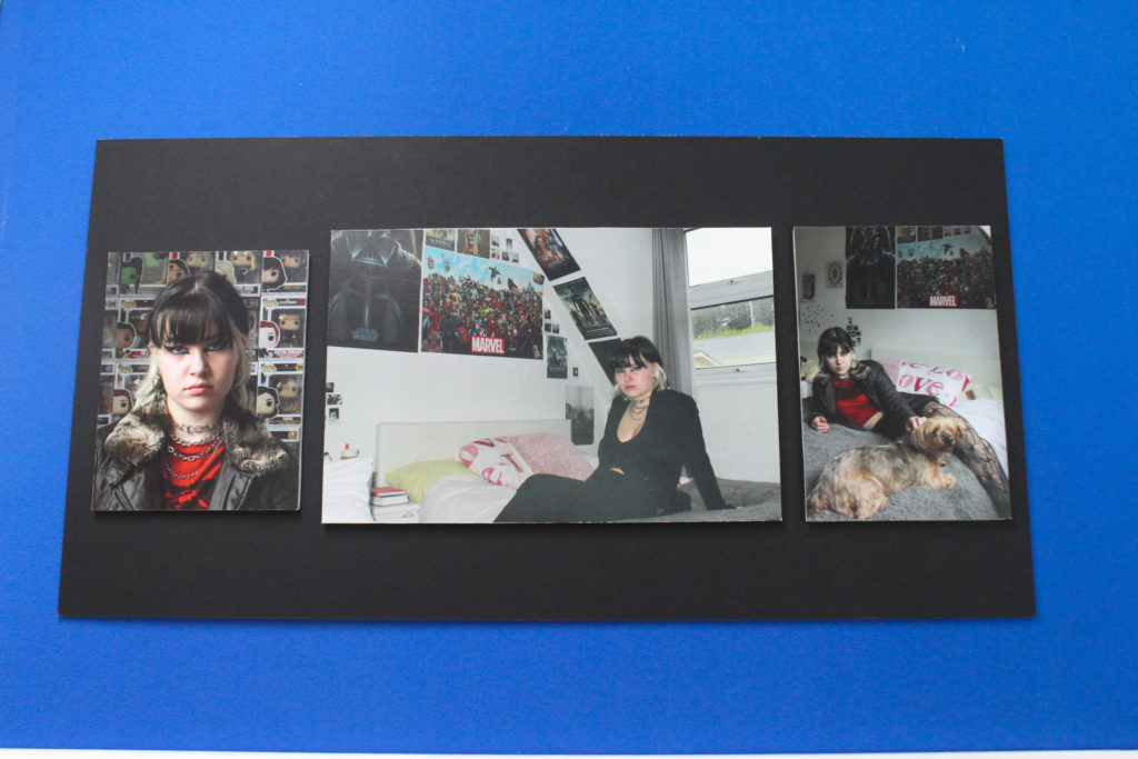
These are some of my photographs from the environmental area of the portraiture project. I photographed a friend in their room in order to reflect parts of their personality. Before the photoshoot, I asked them to dress a certain way and to make their makeup more eccentric in order to exaggerate their everyday appearance.
The image on the far left is A5. In the image, I had asked them to stand in front of a collection they have. I especially like the way this image is framed and that the background is this collection being shown. The middle image is A4, it’s inspired by elements of Lissa Rivera’s identity work and poses she uses, however I have taken my own spin on it in the environmental sense by photographing the subject in their room. The image on the far right is A5 and also included posters and other aspects of my friend’s room, as well as including their dog. I think it is clear that this photograph also reflects some of Lissa Rivera’s work through the posing.
