For the final photographs I have produced out of the portraiture topic, I have mounted some outcomes on black board , creating a window mount, and some on white foam board.
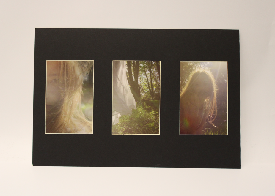
With the top 3 photographs, I had previously planed to arrange them as a grouped sequence of images. I wanted them to be right next to one another as they are all taken perpendicular, in portrait. Since they were shot one after another, the images look very similar to each other. I had also ensured this with the editing I chose for them. because I essentially chose 2 actual portraits, and one not, I wanted to desperate the portraits with the picture of the landscape and dress. by aligning the images in this sequence I noticed they sort of tell a story. this story could of been interpreted differently is the order of these photographs was different. Regarding having to physically having to do the window mount, it was definitely trickier then a single or even a double window mount. this was because I had to do much more measuring and remember to leave space for the middle, separating space. other then that this window mount was quite successful and I didn’t make any mistakes.
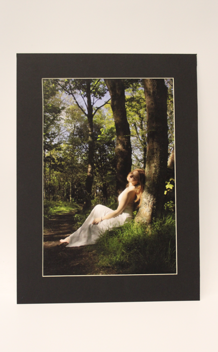
Because this picture wouldn’t fit with any other ones I decided to do a single window mound for it, this makes the photograph feel more professional and the black suits the tones in the shadows of the picture more than if I decided to do it on white foam board.
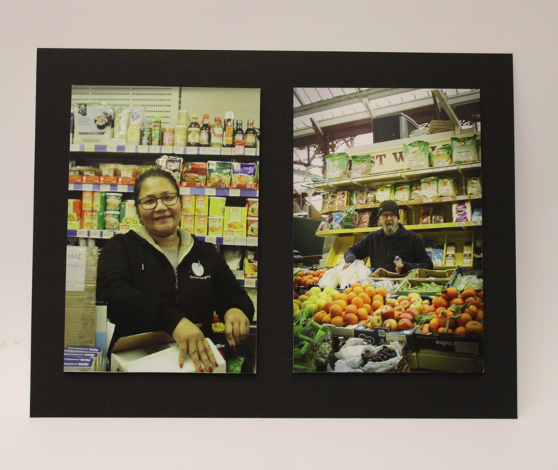
I firstly stuck the images using spray glue onto a white foam board, then cut them out and using double sided tape, I stuck them onto black board that was previously measured and cut. what I should have done is to measure where exactly I would have to place the images, as when it came to sticking them down I had a hard time figuring out where they needed to be in order for them to be straight and proportional.
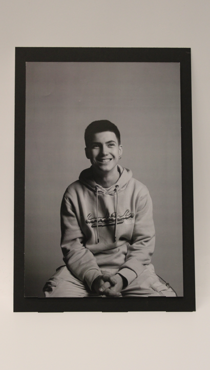
With the above image, after sticking it down onto foam board, l had a hard time deciding if l should place it onto a white foam, to create a white boarder or onto black board, for a black frame. Because the image is black and white, any of those would suit it, complimenting the colours in different ways. However the black to me looked much more mature and serious, contrasting with the image itself .
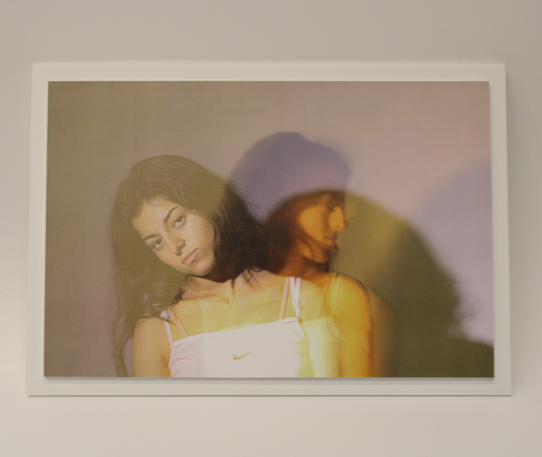
As I haven’t produce a white boarder yet l felt like for this image above it was perfect for it. The tones on the photograph are soft, therefore having a lighter shade around it would fit to the image. I simply stuck the image on foam board, cut it out, and stuck it again onto another white foam board.
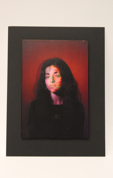
For the above image l tried to change something. l coloured in with a black permanent marker the edges around the image, as some spilt to the actual photograph, I created a black line around the image that is visible from the front, from the side, because the foam board has been coloured in black, it blend in with the black board underneath. This dark effect suited the photograph as there are many black and dark tones in the actual photograph.
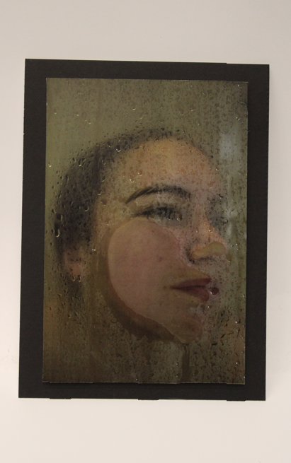
Lastly I wanted to do something simple and stuck to ordinary foam on black board, this suited the tones and complimented the photograph very well.
