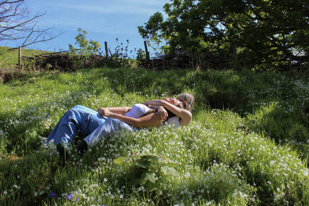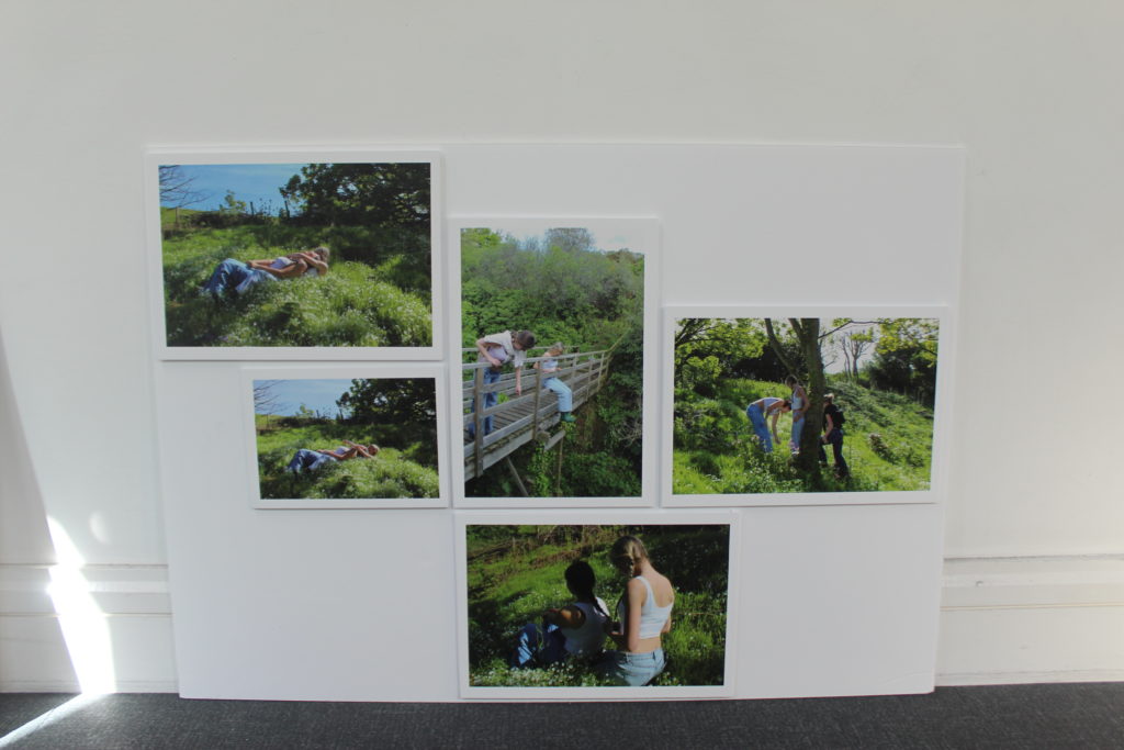


My final outcomes were successful and came out the way I wanted them to. By mounting them up onto foam board to display them in a sequence in which it tells a story. I really like the colours in the images, they create a happy joyful feeling to the images. My artist references were Justin Kurland and Sian Davey. By researching and getting more inspiration from them I started to build more ideas of what pictures I can take and where to take them.
How did I plan this project:
I planned to take inspiration from Justin Kurland and her ‘Girl Pictures’ project. I thought of areas in the island which would fit well and have a similar environment as her work. Living on the north coast of the island I have a pathway down to the cliff paths. On the sides of the paths there are grass areas which we used to create most of the images. In these areas there was trees, flower patches and lots more greenery. We walked further and found a fort which had a bridge which we thought could be a good feature to incorporate.
What could I Improve:
If I were to change or cretic anything I would have done another photoshoot or edited more of my images to be printed out for the print folder. By doing this it could have added more of a story to my group of images.
Image Mounting
I printed my images onto different sized papers to lay them out to see how I want to display them. I wanted my pictures to tell a story. So the way I lay them out is important. Using the images which I put into the print folder I used spay glue to stick my individual images onto. After doing this I put them into the order in which I think works the best to tell a story. I am happy with the way my final outcome turned out I think that it tells a story and shows an adventure. It also shows the idea of femininity and what it is to be feminine.


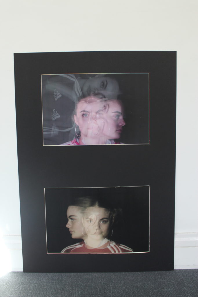
To display my multi exposure images I used a double window mount.
