My process:
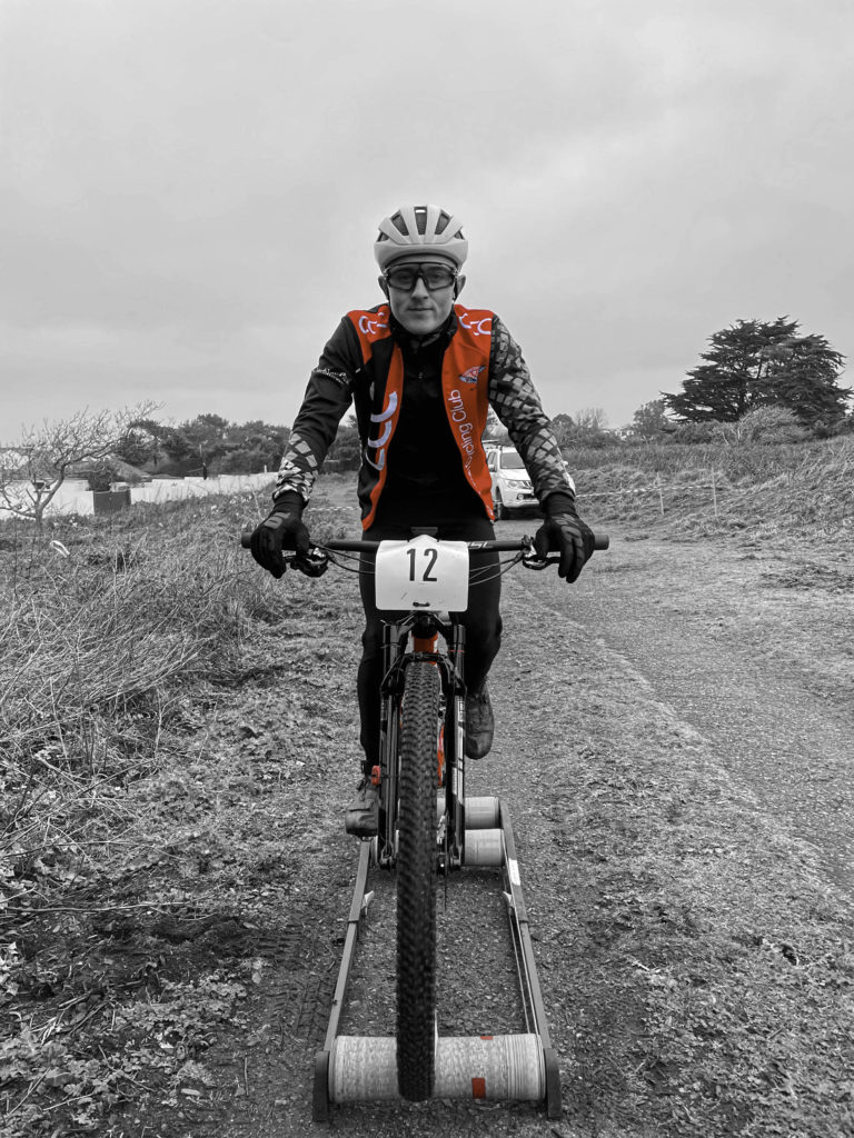
At the start of these my environmental portraiture project I decided to focus on the sport industry. I chose to do this as I know many people who par take in sports and think that that area of photography is very intriguing as it captures a section of their performance. I chose to photography dance and cycling as I think that they contrast together. For my dance images, I used some of my friends who dance and photographed them in their dance studio to add more detail to the image. For cycling, I photographed my brother who rides for a team in Jersey. I decided that photographing him warming up would be the best was to do it as I was able to get him to look straight as the camera to achieve the portrait.
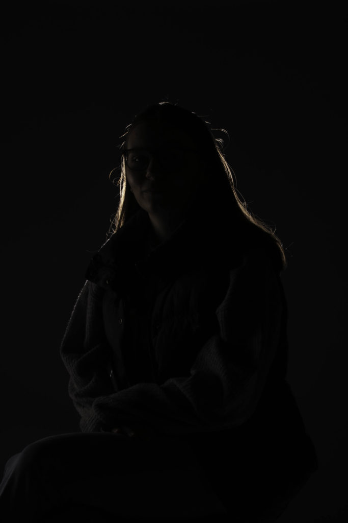
Along with my environmental portraiture projects I also focus on studio lighting. For this project I used my model facing in different directions with different type of lighting to make different images. I chose three types of lighting, chiaroscuro, butterfly and rembrandt. For rembrandt lighting I had my model sit on a stool on a 45 degree angle and I placed my light to her left side to create the triangle effect. For the butterfly lighting I asked my model to sit facing me and placed the light facing downwards almost over her to create the shadows underneath her nose. Lastly, for chiaroscuro lighting I had my model sit at a 45 degree angle again, however, this time I placed the light behind her to add the highlight around her head making her quite hidden.
What went well:
Overall, in these two projects I think that my images turned out well. I like how I tried different edits to see what worked well with my images and chose different colours and ideas with them to make them look the best that they could. I think that my final pieces were the strongest as they allow the viewers to see my images presented with the different backing and framing to make them look finished. I think that my environmental portraits were very bold and the ones that I used in my final pieces were very effective. My window mount of the cyclist in A3 ( as you can see below) was my favourite out of the two as it was very engaging with the contrast in colours which made it eye catching. With my studio lighting portraits I like how they turned out and this that how I mounted and backed them made them work well together. I liked my window mount with the three images as I like how they looked together as each image had elements that were the same and elements that were different. Overall, I think that both my projects turned out well.

Possible improvements:
With in both projects I think that there were things that I could have improved on. For my environmental portraiture images I think that I could have photographed either, some more models for example some of the other cyclists, or another industry like stalls at the market for example. If I had done this I think that it would have made my projects stronger as I would have had a wider range on images to work with rather than my limited selection. This would have also meant that I could have made more final prints with a difference rather than mine which were both sport ones. For my studio lighting portraits, I think that I could have also made some more images with different types of lighting by using coloured gels for example or made some more edits with different ideas. This would have also gave me a wider variety of image to use for my final prints so that I could have made more contrasting images. With the images that I did make. I think that they also could have been improved as they all turned out quite dark (as you can see below) which may have been to do with the studio or the lighting that I use. As a whole I think that my projects could have had improvements however I still think that they turned out well.

