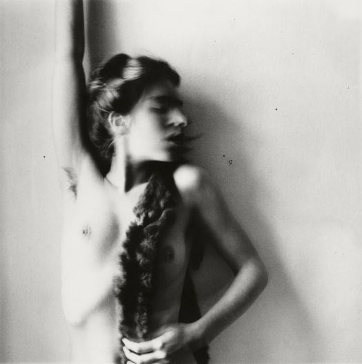

Untitled, MacDowell Colony, Peterborough, New Hampshire (1980)
This photo was inspired by Francesca Woodman, who took mostly self- portraits in black and white, using a slow shutter speed to blur specific areas of her body (especially her face). She also took many of her photos while being nude (like the one above), and I think it was a very interesting take on self- portraits. Her portrait consists of her leaning against a wall, her face blurred and she turned it to the side, completely nude. I found this a very inspiring photo as she posed in quite a vulnerable way, however it is obvious that she is in control.
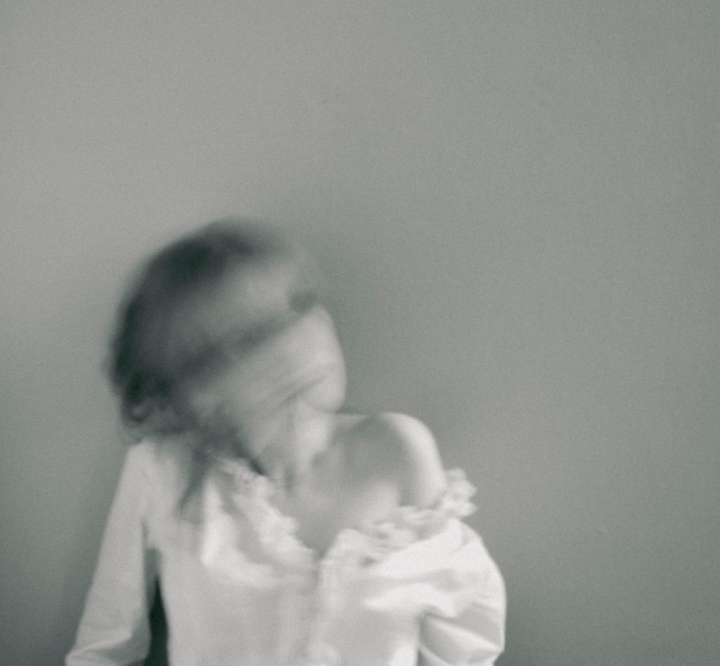
I found her very inspiring and also thought she fit perfectly into the ‘femininity’ and ‘identity’ topics we have been studying, which is why she was my main inspiration. The composition of her photo is very interesting, as she isn’t completely centred in the frame which is unlike most (self) portraits. I recreated this, framing the camera in a way that allowed there to be more space on the right of me. I think this is effective as it creates a much more unique photo due to its composition. However, she has more of her torso in the image, making her a portrait shape whereas mine is a squarish shape. Moreover, her pose was one of the main aspects of the photo, therefore I recreated this by leaning against a plain wall, and propping myself up slight, looking similarly vulnerable (in terms of the pose). I like how this links in with the ‘femininity’ topic, as it presents me in a very stereotypically feminine way, looking weak and almost helpless. I do believe she didn’t try to convey that meaning across however, as I think despite being naked and being in such a position, she is trying to show how she is the one in control of her body and what happens to it. I also think her blurred face represents how society often only focus on a woman’s body, and I think she is attempting to mock this idea by hiding her face in a very exaggerated and obvious manner, incorporating it with her unique style of using a slow shutter speed. I liked the idea of this, and tried to recreate it by setting my camera to a very slow shutter speed (1/30) and slowly moving my head side to side, to create this obscured, smudged look. Furthermore, all of her photos are in black and white, which I think is very interesting since at the time, colour photos were already a technology used by photographers. I recreated this, and edited most of my photos in black and white. I did this not only as it is her style, but because I think colour would distract the viewer from the concept of the photo, which is a reason why Woodman did this herself too. Despite both being in black and white, her photo consists of much stronger white and black tones, having a more varied tonal range as well as having a heavier contrast. My photo is much duller and grey, which I think was successful in the way it made the photo look softer, however lacked the strong appearance and the way the background looked separate from Woodman’s body. I think this is something I could’ve improved on, in terms of editing the photo.
Overall, I think being influenced by Woodman created a successful outcome, creating unique photos that linked in with the idea of stereotypical femininity.

Good progress…double check you have the following for each unit of work
Mood-board, definition and introduction (AO1)
Mind-map of ideas (AO1)
Artist References / Case Studies (must include image analysis) (AO1)
Photo-shoot Action Plan (AO3)
Multiple Photoshoots + contact sheets (AO3)
Image Selection, sub selection, review and refine ideas (AO2)
Image Editing/ manipulation / experimentation (AO2)
Presentation of final outcomes (AO4)
Compare and contrast your work to your artist reference(AO1)
Evaluation and Critique (AO1+AO4)