Photographs
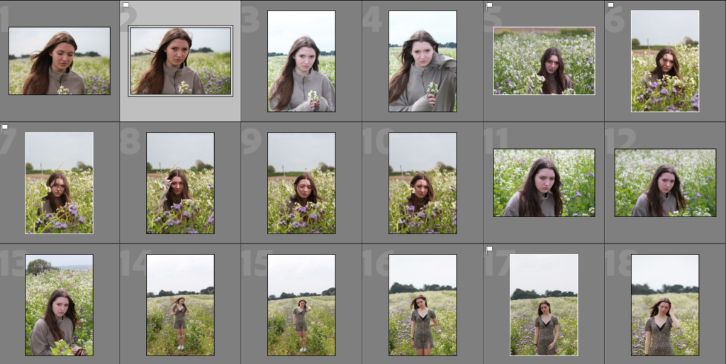
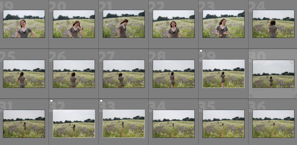
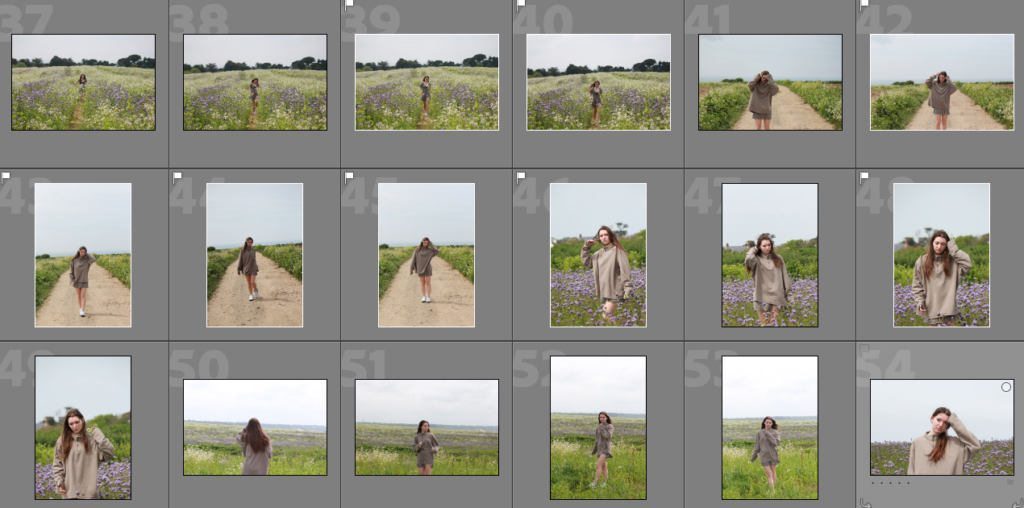

Edits
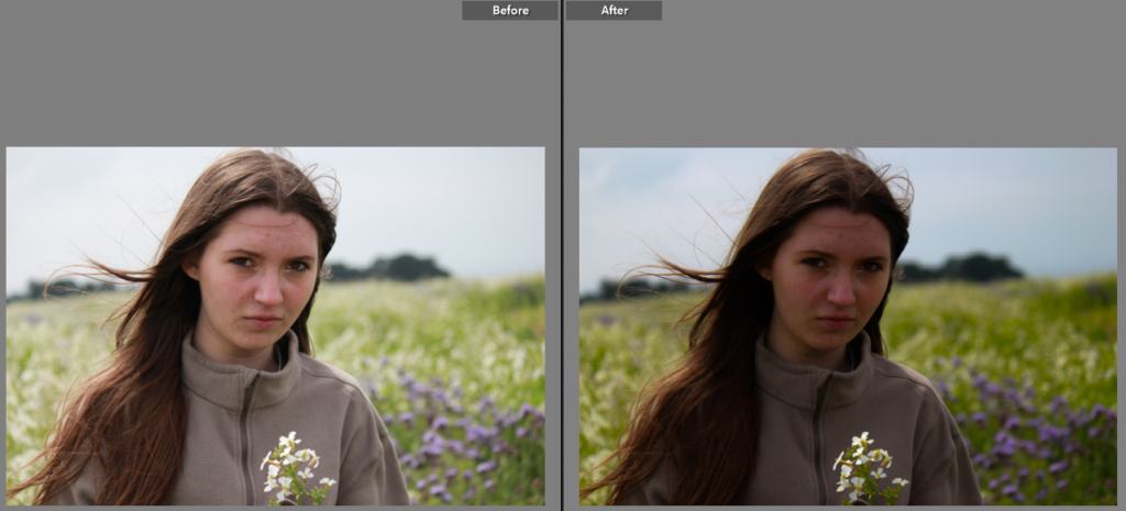
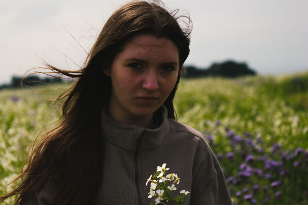
For this image, I created more of a contrast by increasing the shadows on the image. I also increased the saturation to make the greenery and flowers stand out.
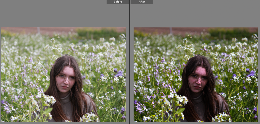
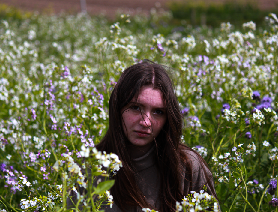
For this image, I again increased the contrast and decreased the highlights slightly. I also slightly increased the saturation and vibrancy to make the image pop more.
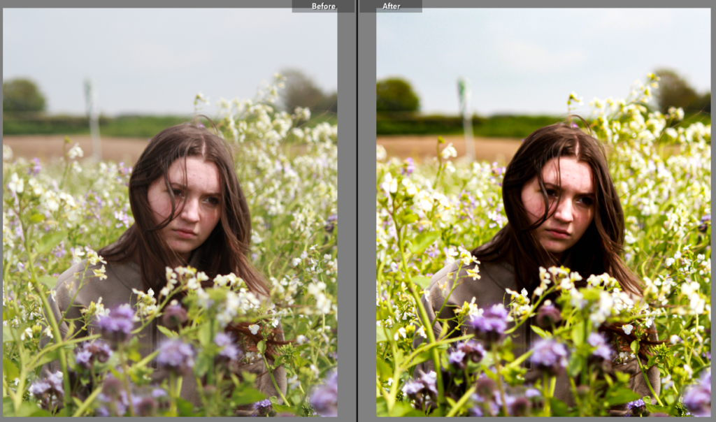
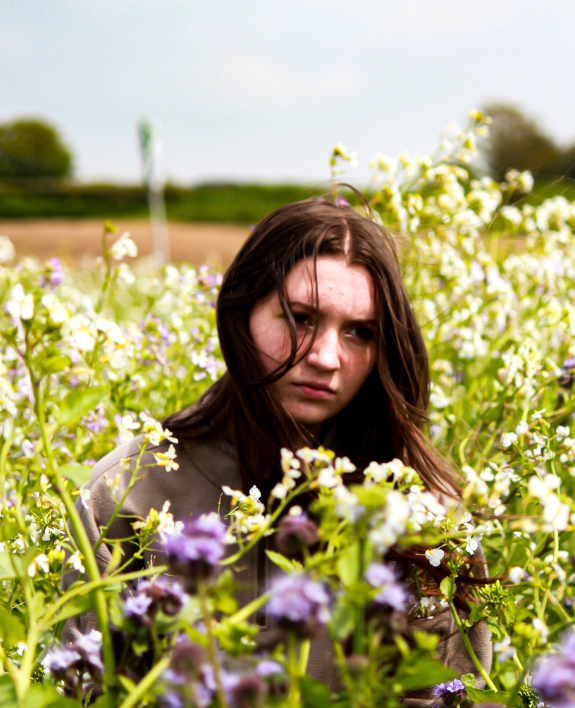
With this image I took a lighter approach, increasing the highlights and white tones while still increasing the contrast slightly to give the image more depth.
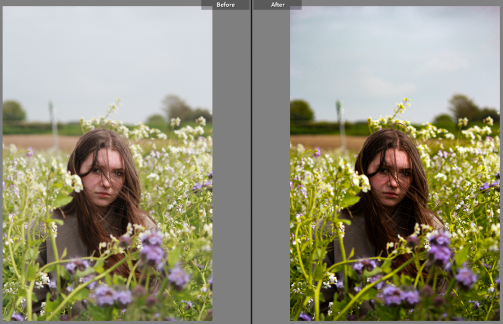
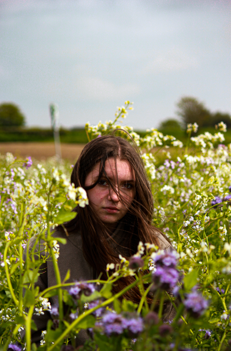
I took a similar approach with this image, making the image brighter and increasing the contrast.
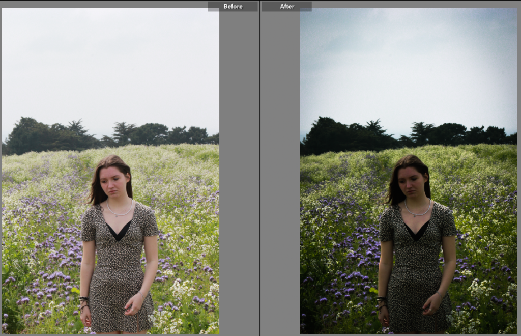
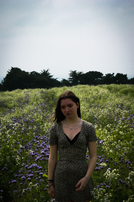
With this picture, the models features feel sad, so I tried to make the image seem more dramatic. I did this by increasing the shadows and contrast while adding some vignette around the outside to make the viewer focus in more on the model.
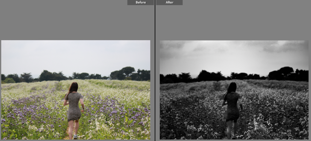
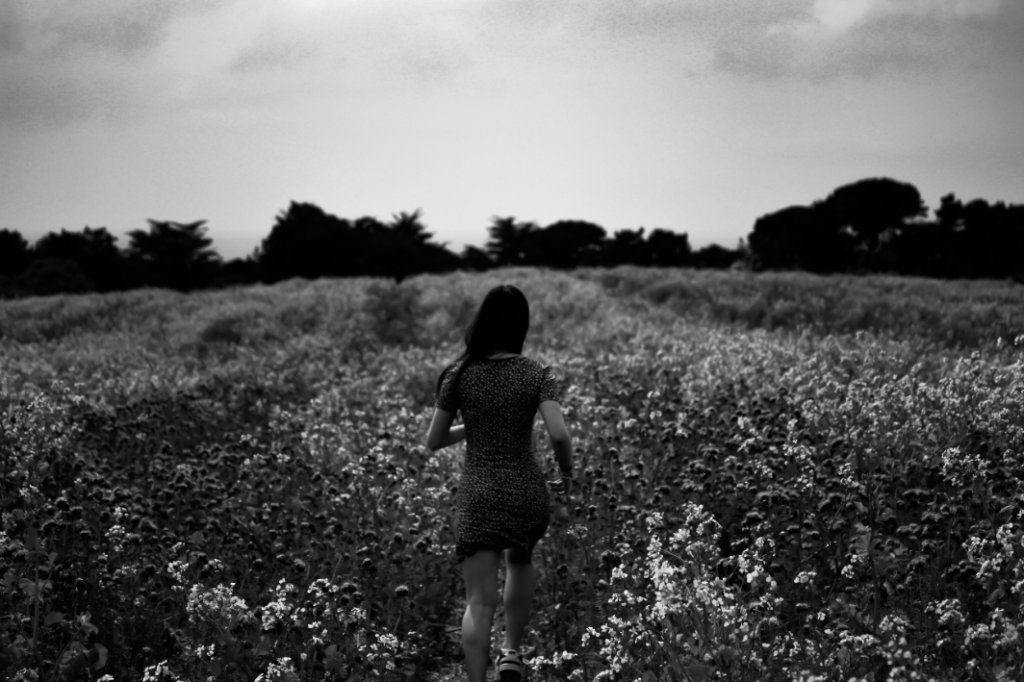
I turned the image to black and white here, creating a contrast between the bottom of the picture and the sky. I also increased the shadows and contrast to make the sky and model stand out more.
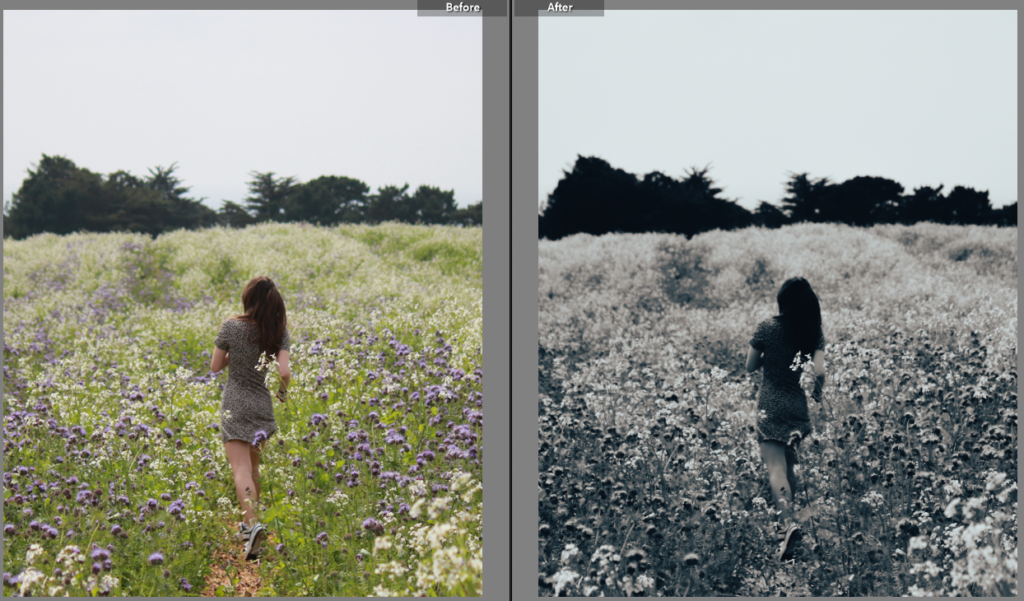
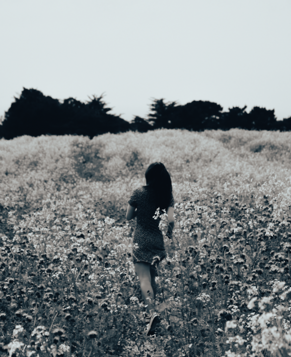
Once again, I changed the image to be in black and white however I made the image brighter by increasing the exposure and white tones which ended up highlighted the flowers more.
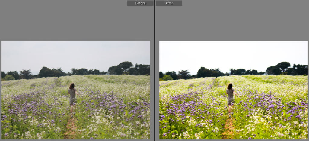
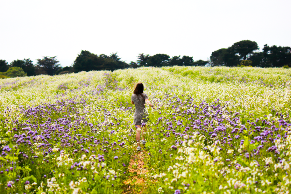
For this picture, I made the image brighter, making the flower field stand out more. This did however, take the view point away from being the model due to the brighter colours surrounding her.
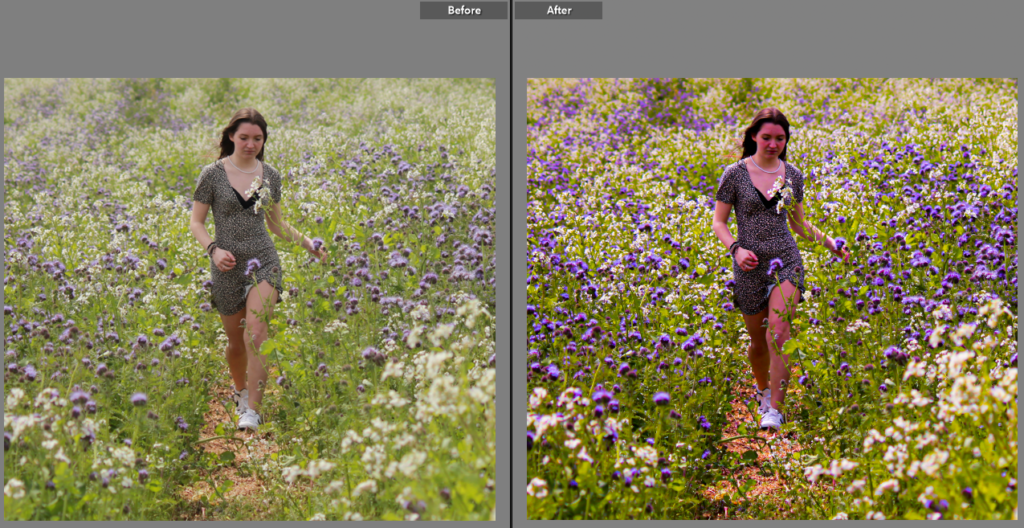
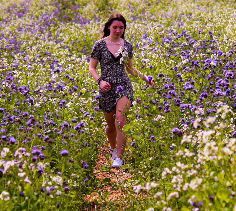
Here, I made the purple tones in the picture stand out more as well as increasing the saturation of the whole picture.
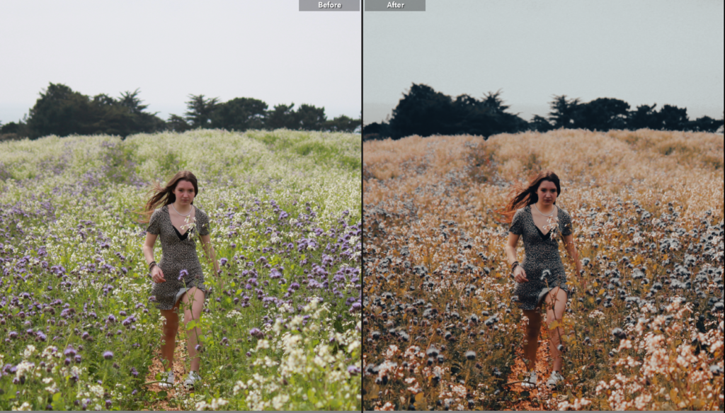
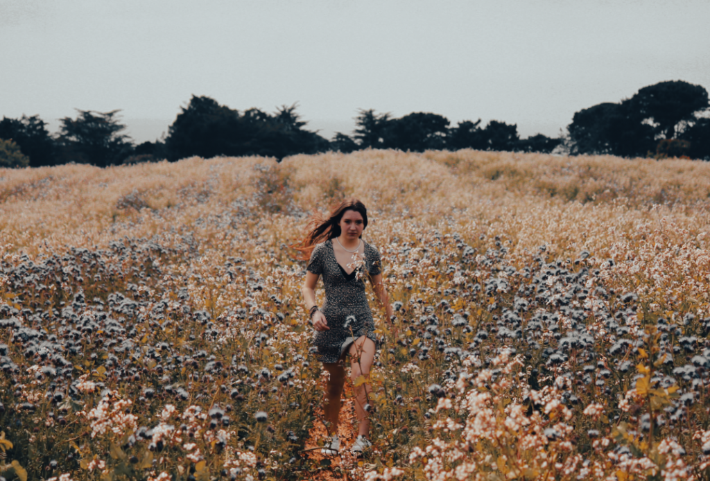
For this picture I changed the hue of the image to make the photo feel more like autumn rather than summer. I also increased the contrast and highlights.
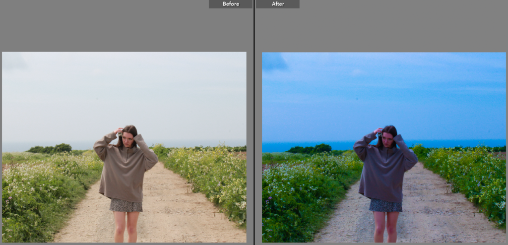
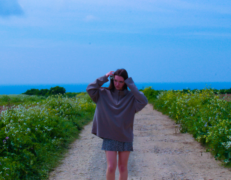
With this image, I lowered the exposure and increased the contrast of the image to make the sky stand out more and give the photo a more summery feel to it. I enhanced this by increasing the saturation.
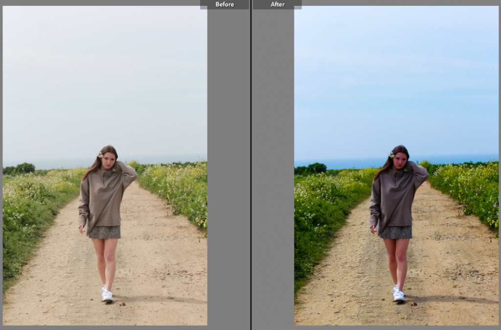
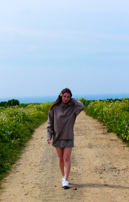
With this picture, I again decreased the exposure of the image which increasing the saturation and white tones.
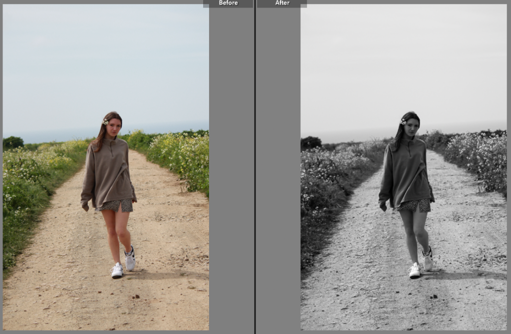
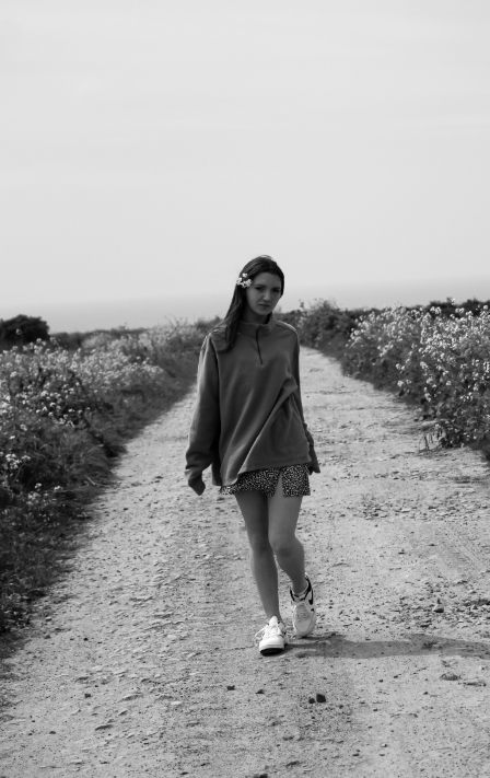
I turned this image to black and white while increasing the contrast, and shadows and lowering the exposure.
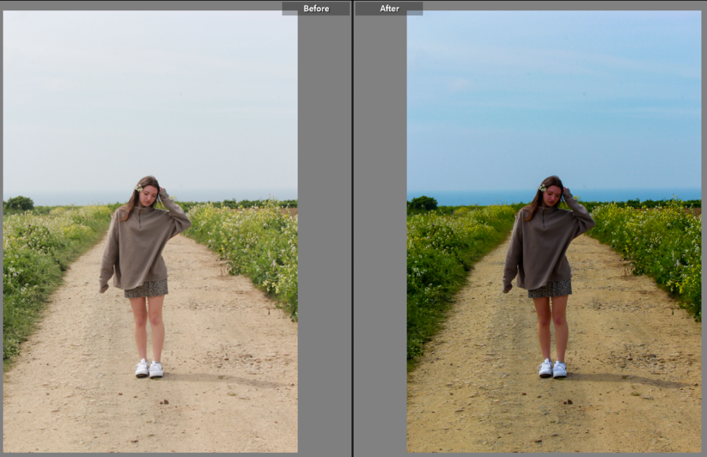
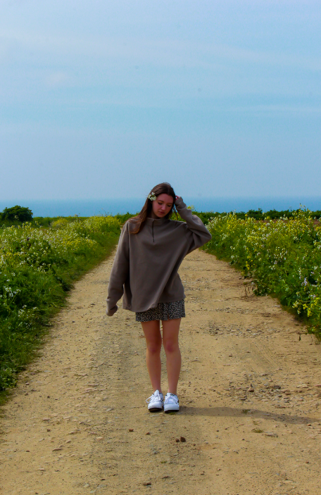
Similarly to the other images, I lowered the exposure and increased the saturation and contrast to make the sky more prominent.
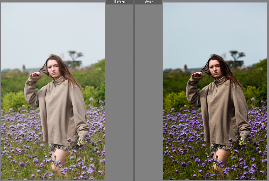
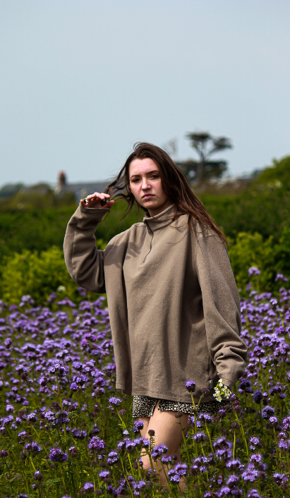
Here I increased the contrast and saturation of the image as well as the shadows to make the image appear more clean and clear.
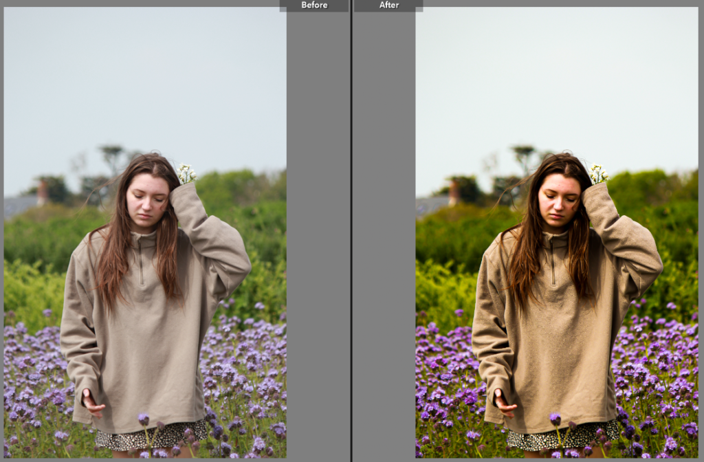
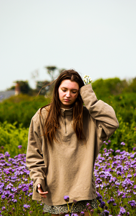
Similar to the previous photo, I increased the contrast and saturation while also increasing the shadows.
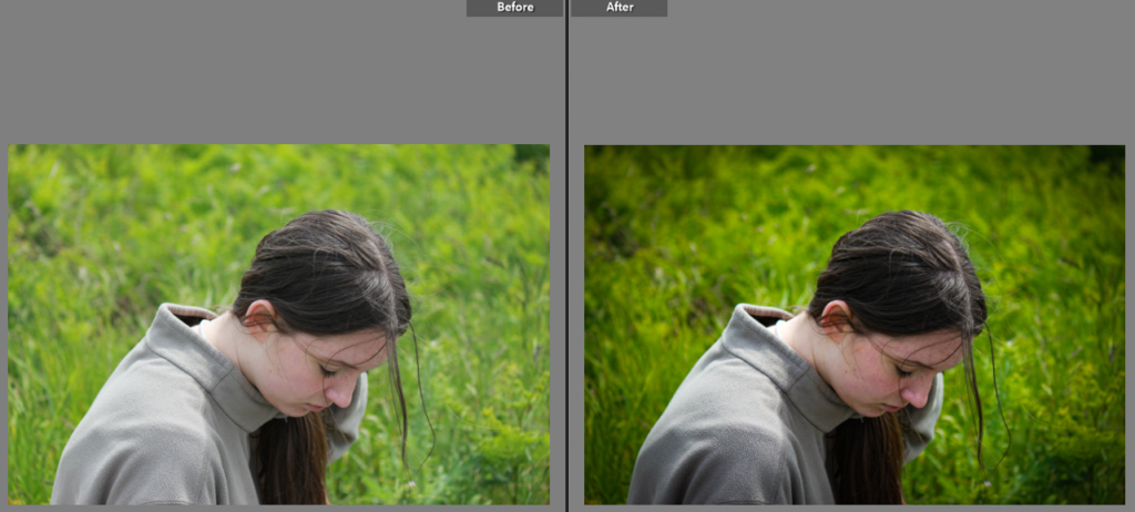
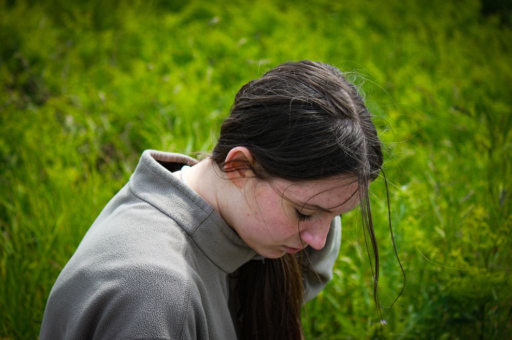
I increased the contrast and lowered the exposure slightly before adding vignette to the edges of the image to focus it on the model.
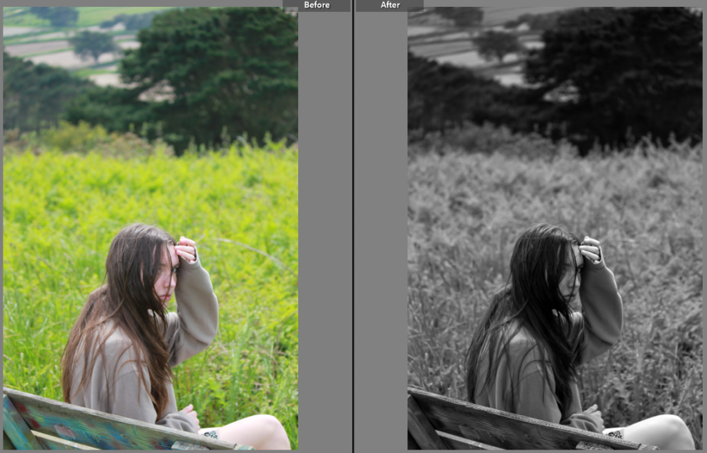
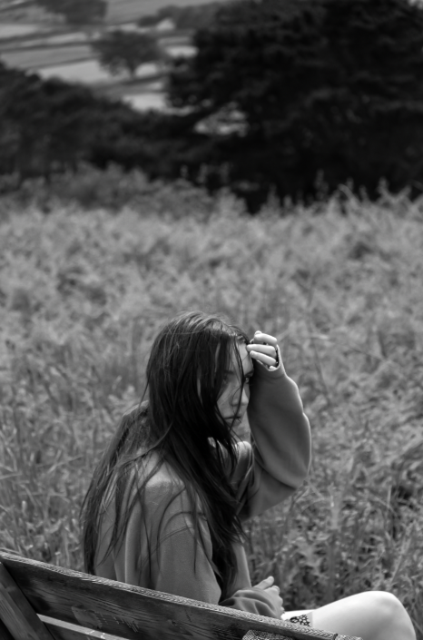
I turned the image to black and white while and increased the contrast slightly.
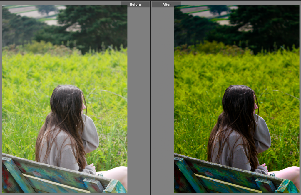
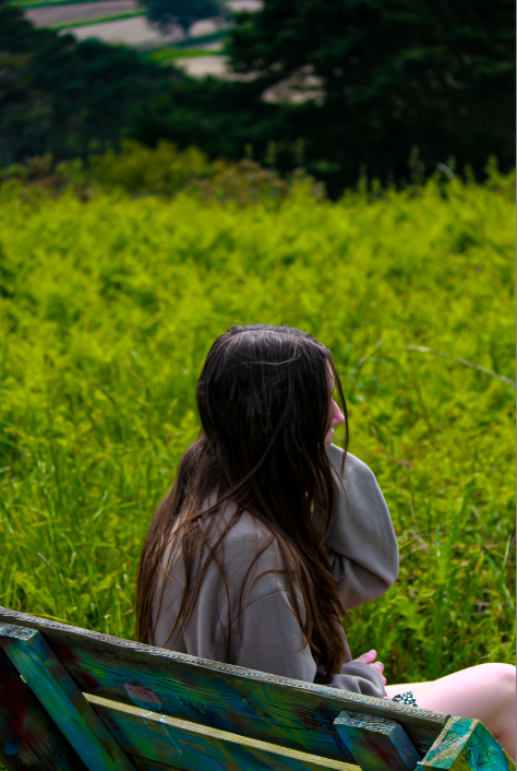
Here I lowered the exposure while increasing the saturation and contrast.
