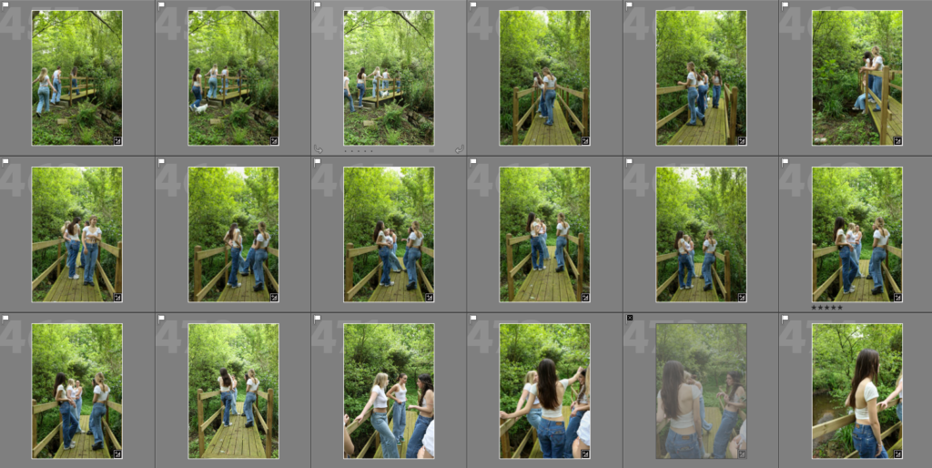
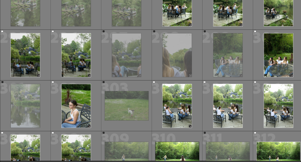
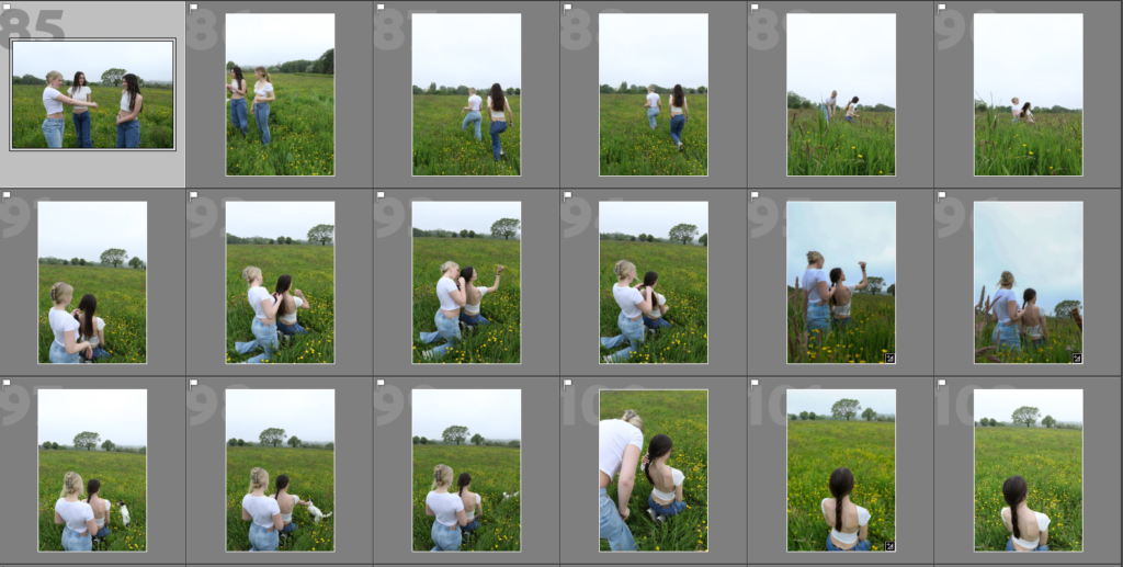
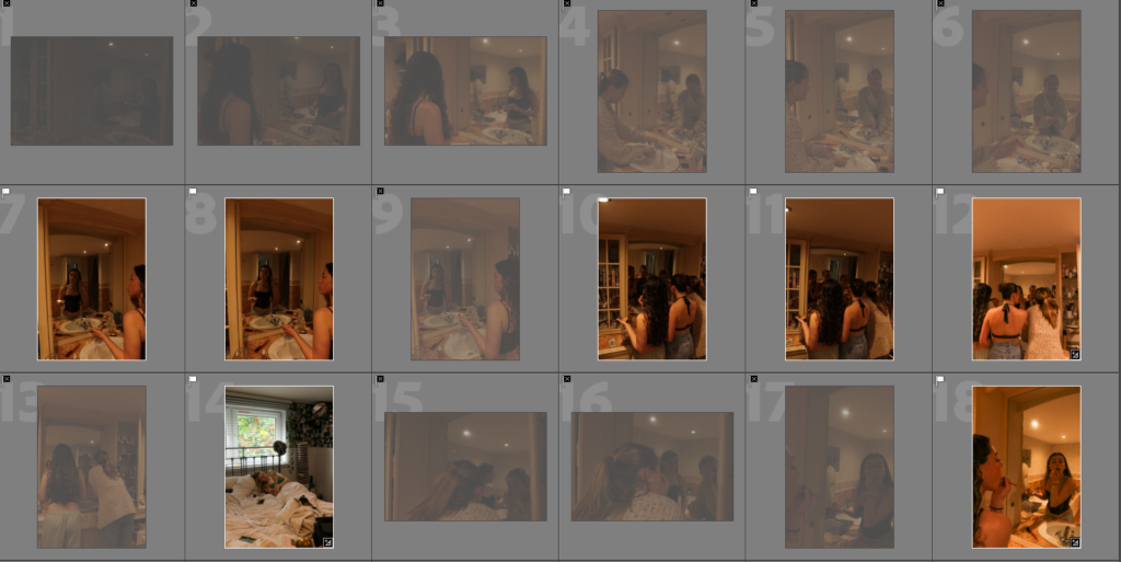
Contact Sheet:
Edits Vs Originals:
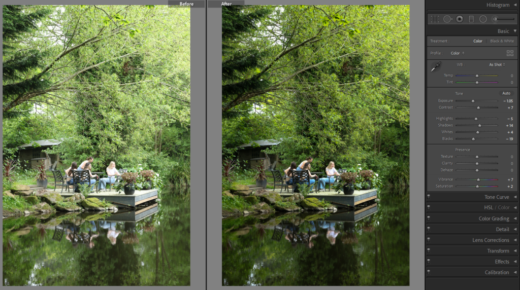
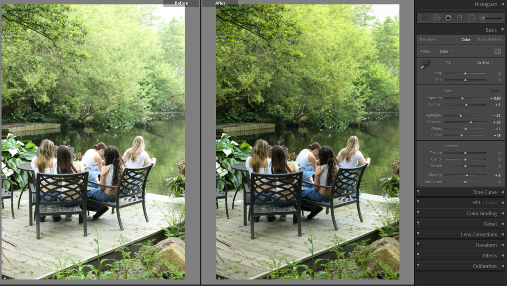
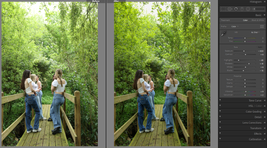
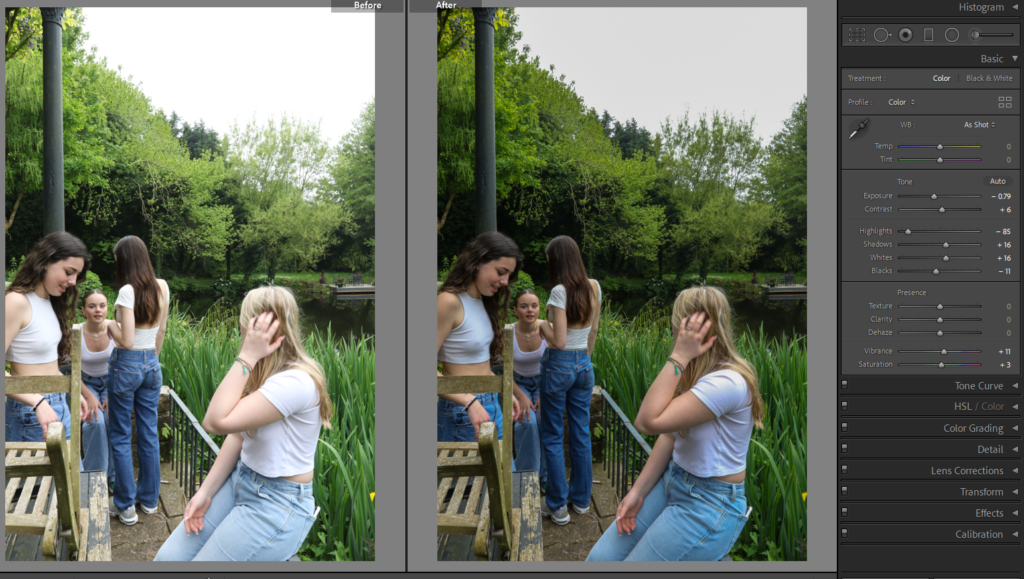
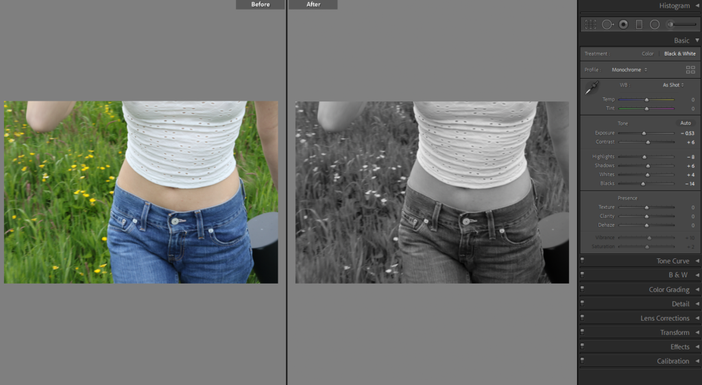
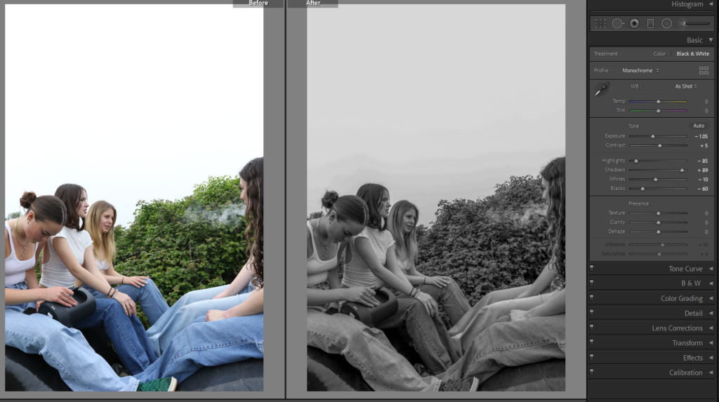
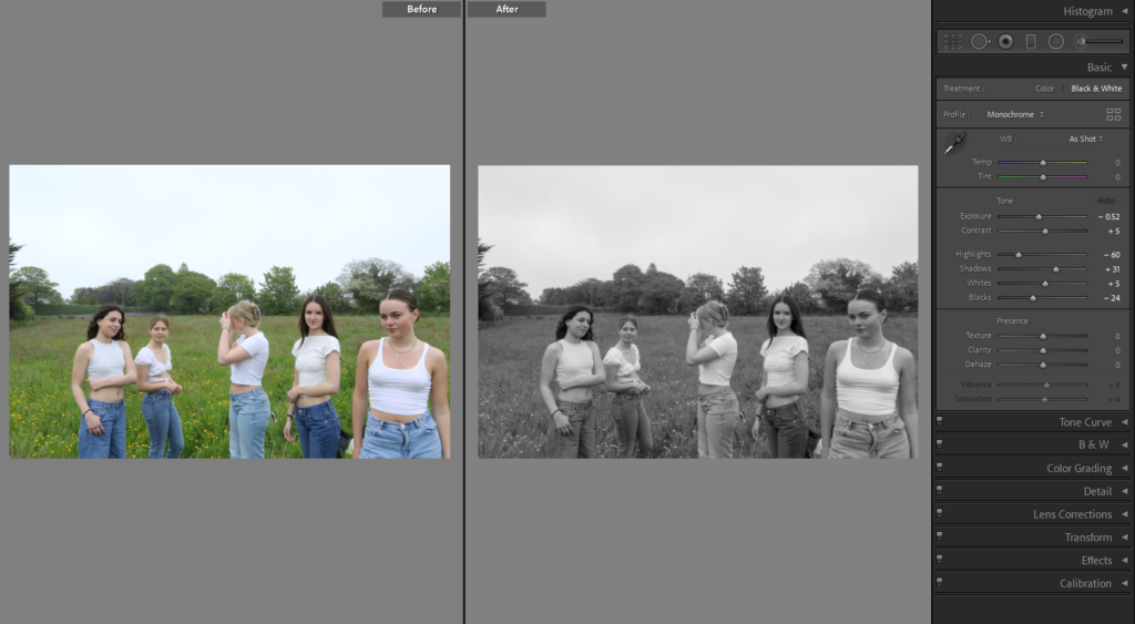
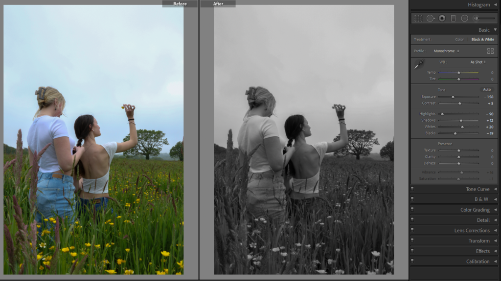
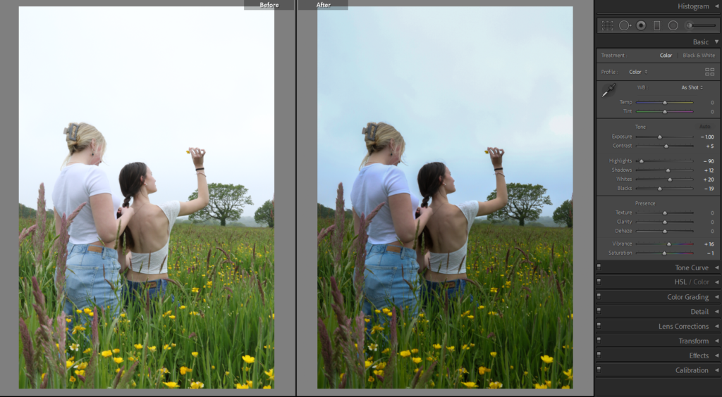
I have edited both of the images above very similar, however in one image the saturation is a lot lower in order for the image to be in black and white. I also turned the highlights all the day down to -90 in both images which again takes away from the harshness to the sky and adds more detail into it. In the black and white image, I lowered the ‘blacks’ as it creates more shadow into the image.
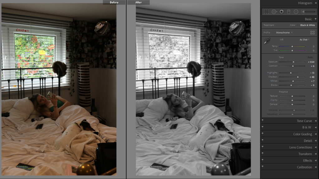
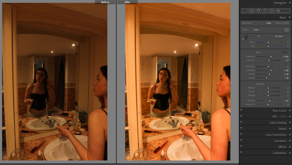
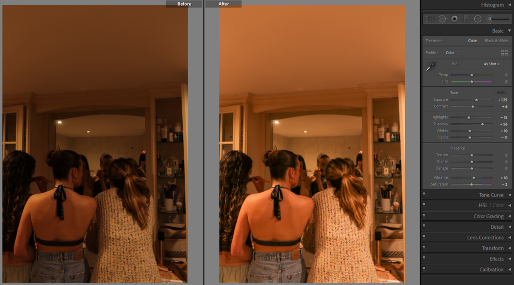
I edited the image above by increasing the exposure up +1.32, by doing this it brightens up the whole image making it more clear and less gloomy. I also increased the shadows up to +65, this helped to highlight the centre of the image doe to the cupboards around the mirror and where the lights are placed.
