EDIT ONE:
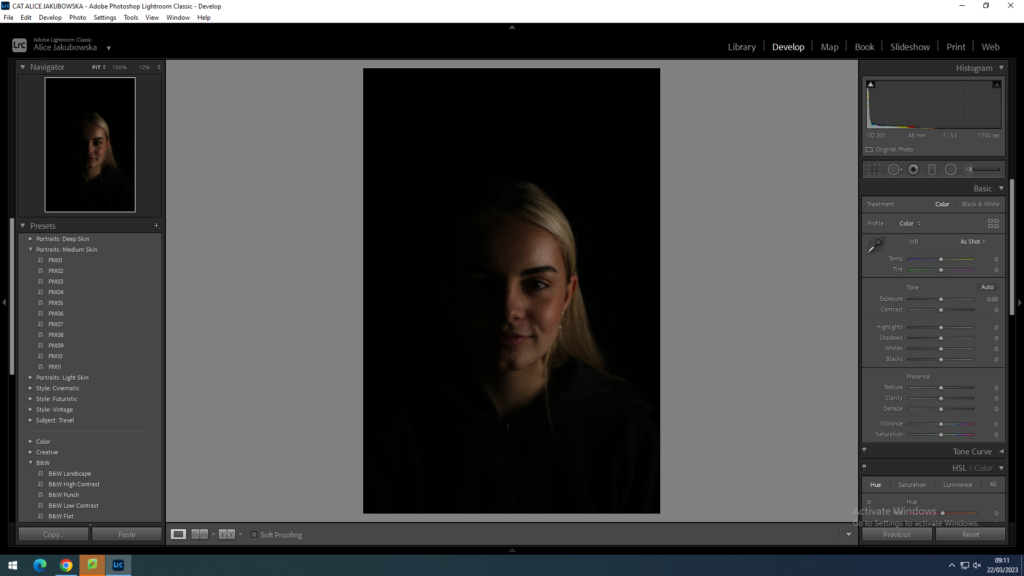
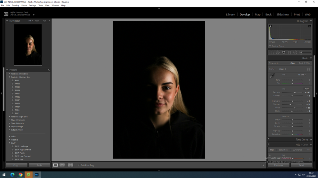
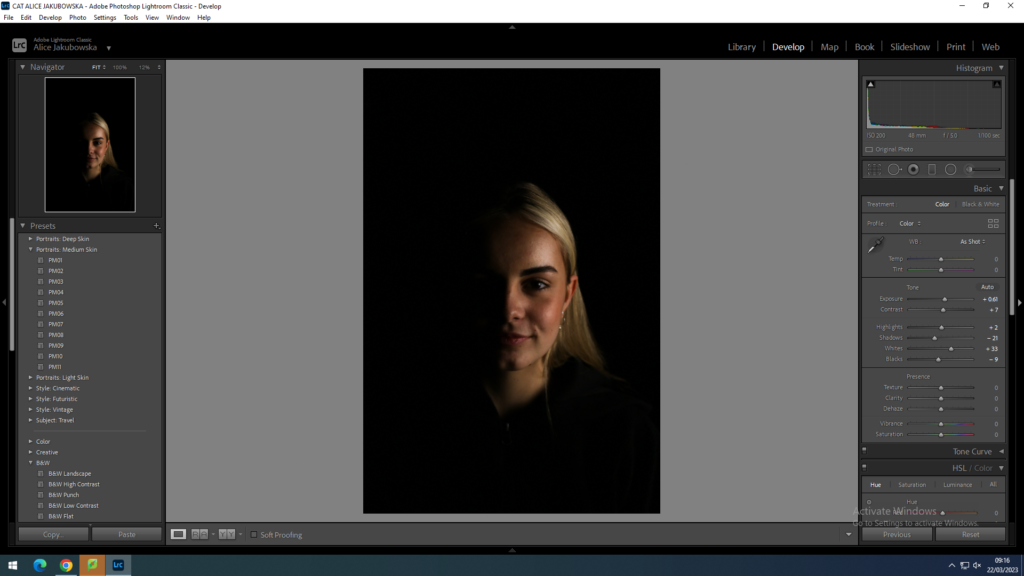
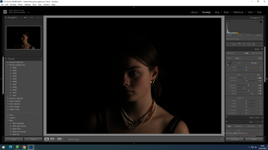
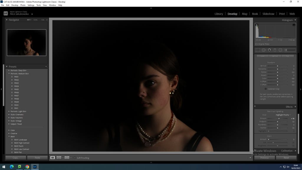
These images were used with Chiaroscuro Lighting. I photographed Phoebe on a black background to create more of a dramatic effect and a more darker sinister image, giving a sense of a horror movie poster. However in these images I want to create a sharper contrast between the two halves of her face to create more of a distinction between the bright and dark lighting on her face. In these images I will increase her exposure slightly, while also increasing the contrast to create that sharp lines on her face, yet I don’t want to overdramatise the image. Increasing the whites in her images will illuminate the natural highlight on her cheekbones which will give her a natural brighter complexion.
EDIT TWO:
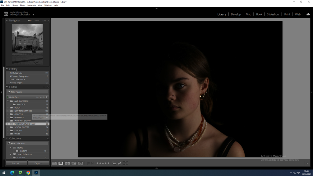
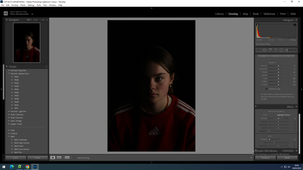
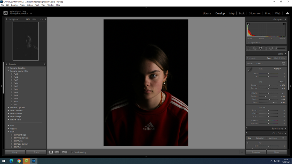
The lighting used in this image is slightly underexposed which has an affect on the whole photograph. While creating this image we had a dark background with minimal lighting which creates a flat image as there is no contrast between the two lightings. So in this image I will increase the exposure to make Phoebes right side of the face brighter which will results in a jarring distinction between the lighting. I also slightly increased the contrast so the exposure doesn’t wash out the features and colours in her face.
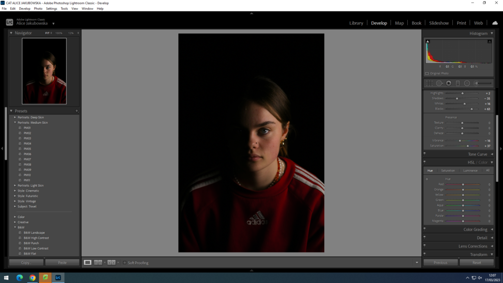
EDIT THREE:
Due to the darkness of the image, it has created an ominous and sinister aura. The Chiaroscuro Lighting can be used to create film posters including the genres: horror, and drama, this is because eerie and mysterious mood. The position of the lighting has given a symmetrical shadow of her face, however due to the low lighting their is no depth in the image, so I will slightly increased the exposure to create some light on her face. Furthermore I will increase the highlights in order to show the natural highlight already seen on her face, enhancing the brighter features on her face.
