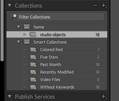
When I first opened Lightroom Classic, I created a collection to put my photos inside. I made a sub-folder for the photographs we had taken in the studio, and began the process of editing.
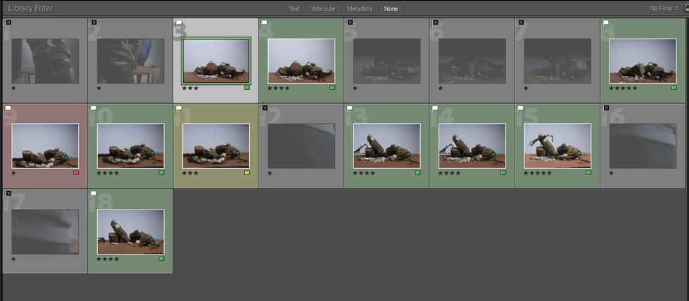
Using the picker tool, I selected my best images that would be eligible for editing, ones with the least blurring, highest resolution, and good framing. The rest would be discarded as the set was obstructed by either someone else or the shutter when the shutter speed was set too high.
this is annoying
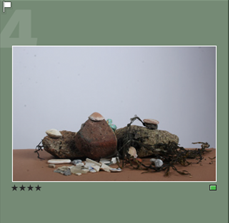
The photographs with the white flag in the top left were the ones that were kept, whilst the ones with the black flag were discarded.
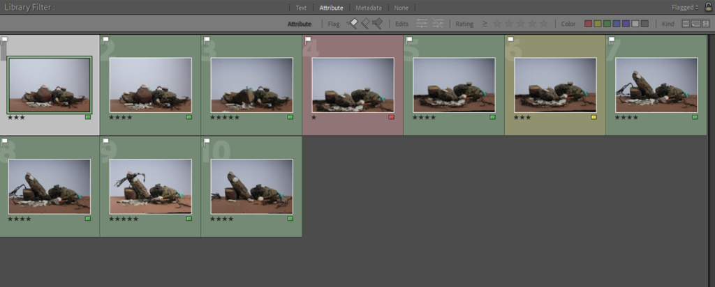
These were the photos I was left with. My plan was to then experiment with editing to give them more colour and detail.

These were the three edited images I was left with. I increased the vibrance in each one to bring out the blue hue of the background, and messed mainly with the exposures and contrasts to create three similar pieces that could work as a tryptic.
During my GCSE’s I used Lightroom for my photography, so I’m familiar with the tools and layout of Lightroom Classic.
