Stephanie Jung:
My Work:
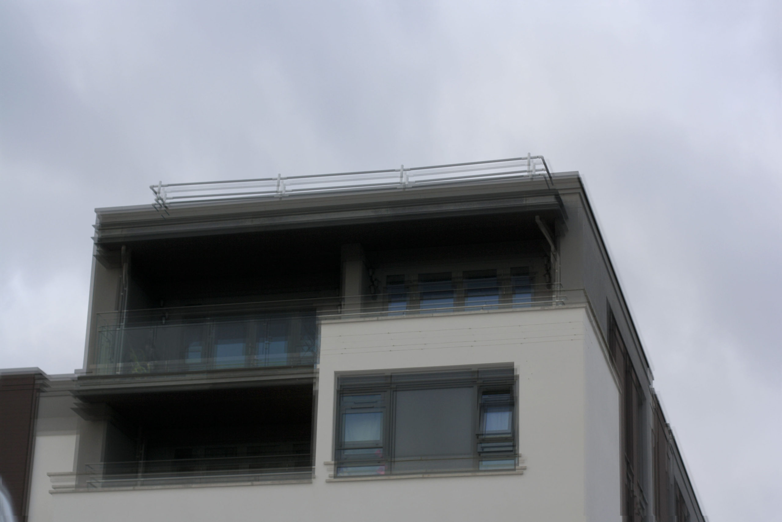
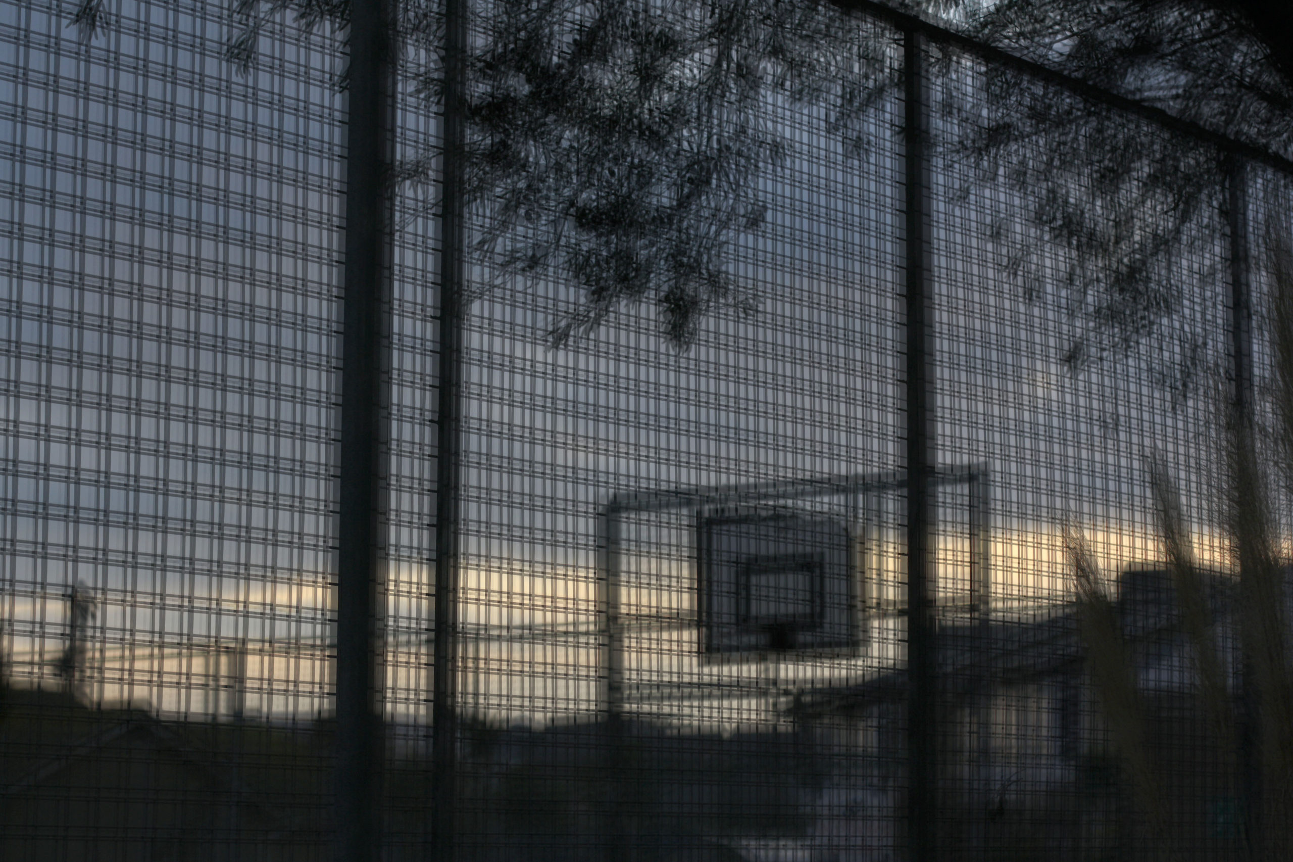
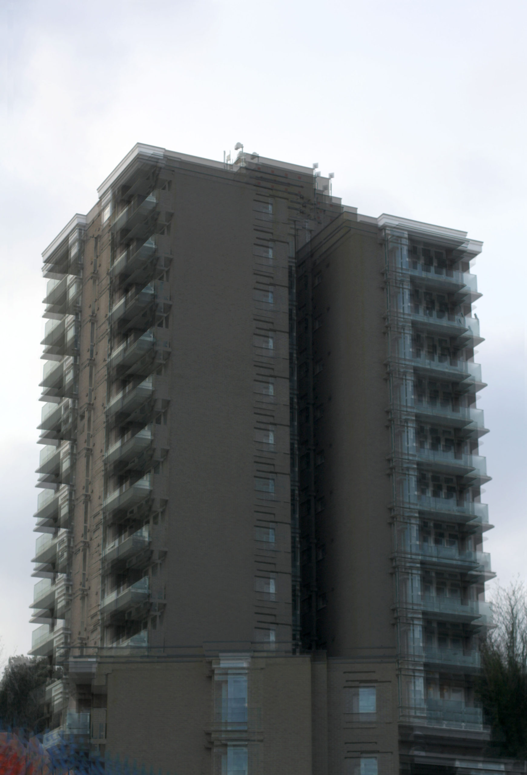
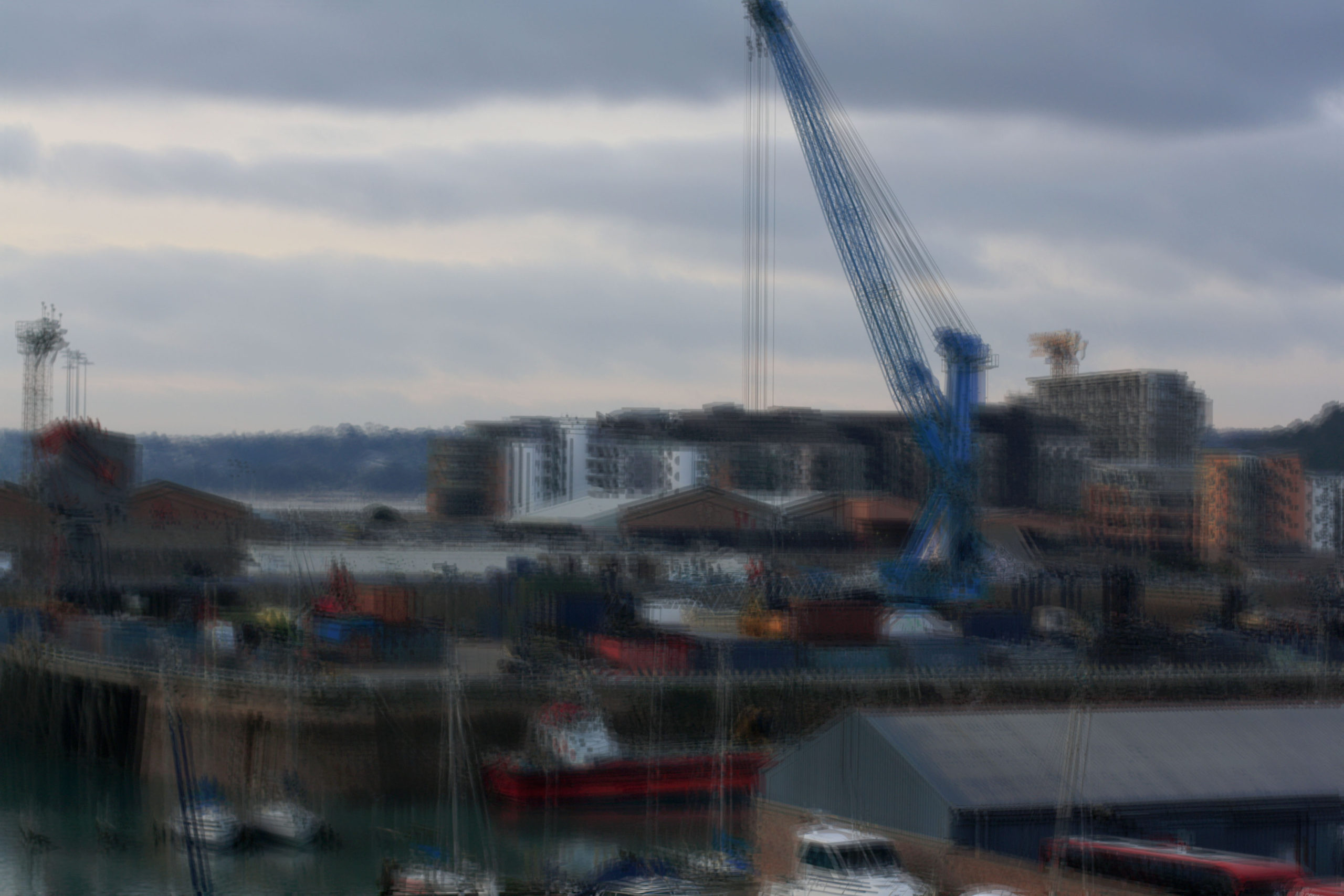
Jung’s Work:
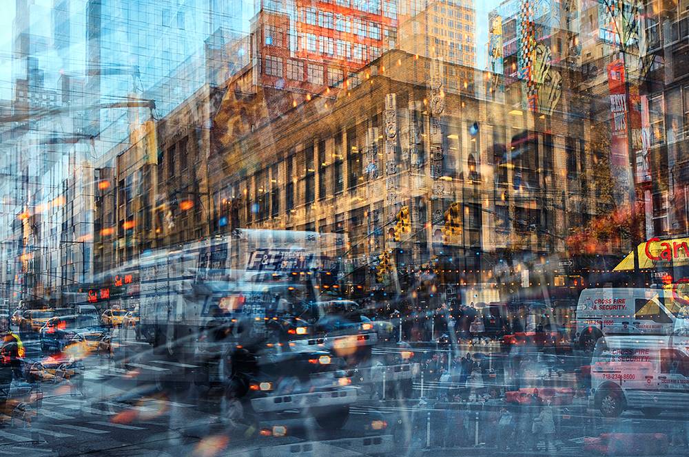
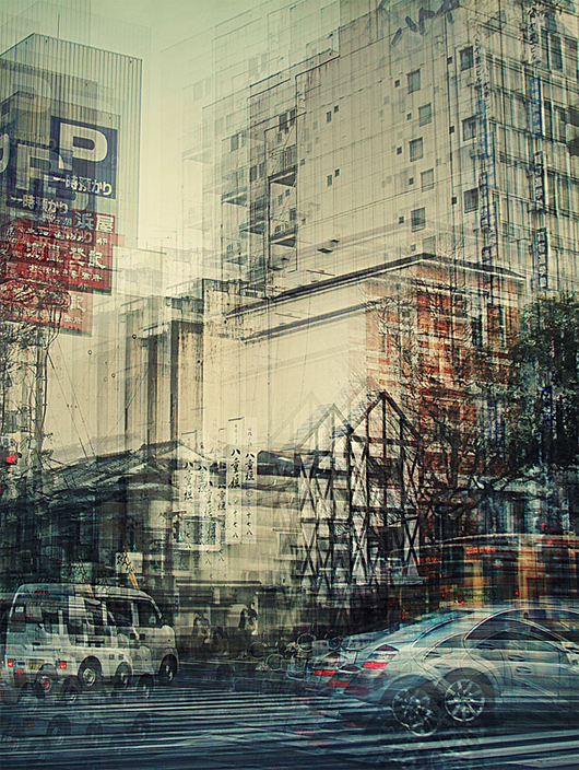
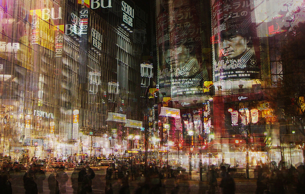
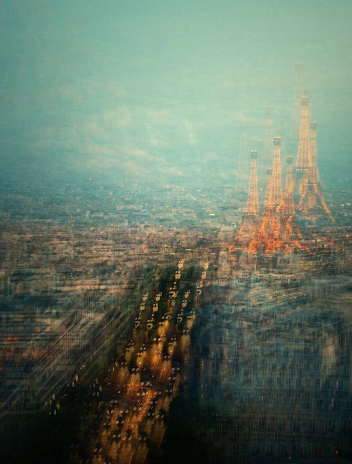
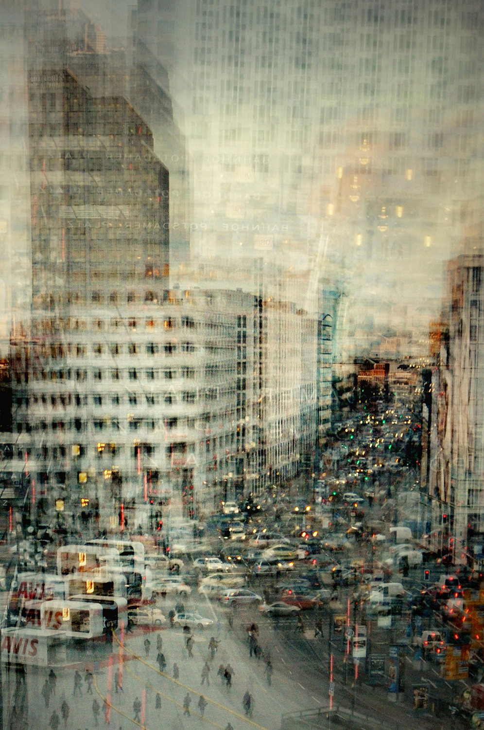
Very similar themes here and I think mine are just as good as hers, although you can definitely tell who made what as Jung’s pictures have a much stronger blur and probably involved a different camera technique. Some of mine don’t have a lot of visual blurring and I made my ones from the same single photo. Something else is that Jung’s photos have better views of cities and streets and mine are single objects where not much is going on nearby. I wish I had ventured more into town to take pictures of the streets along with the many more buildings. I also wish that when I was editing mine, I had one of Jung’s photos open so I could quickly compare them for the best accuracy. All together these photos aren’t actually that bad, but compared to Stephanie’s ones they are quite weak.
Robert Clayton:
My Work:
Clayton’s Work:
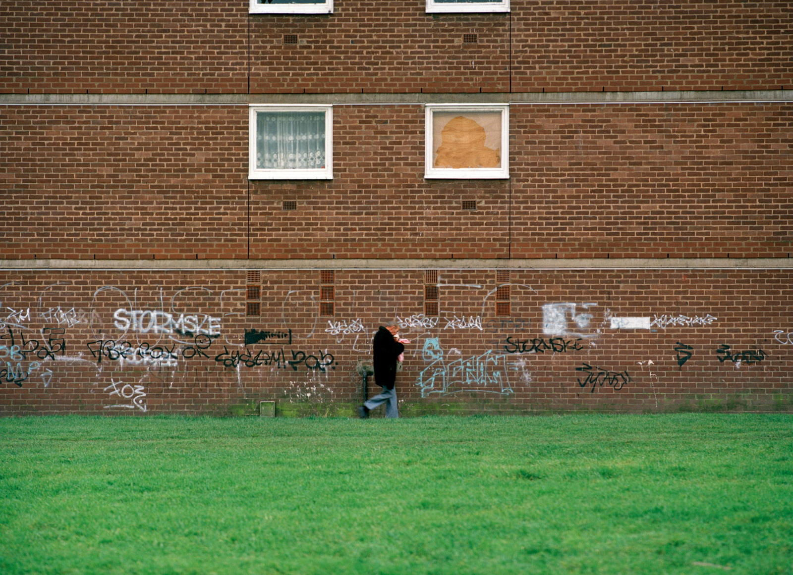
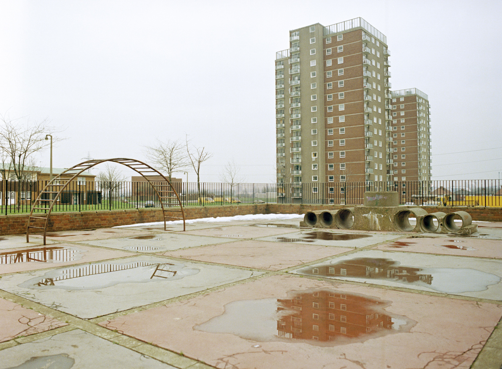
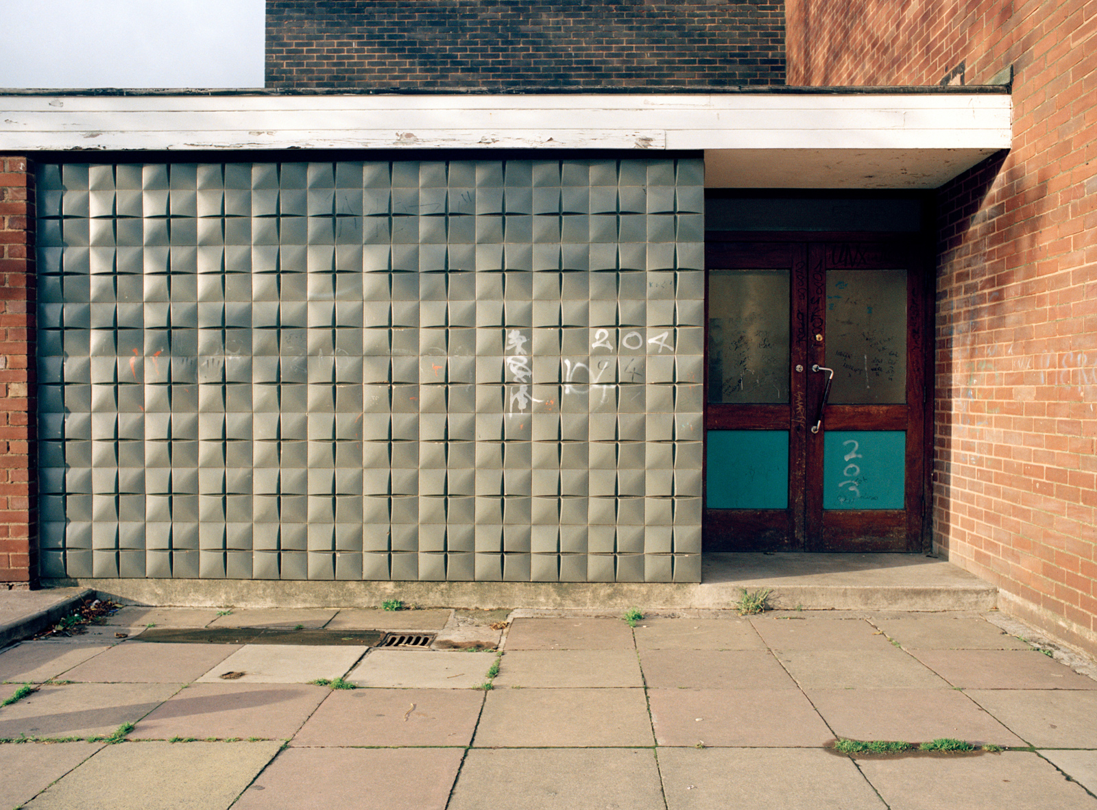
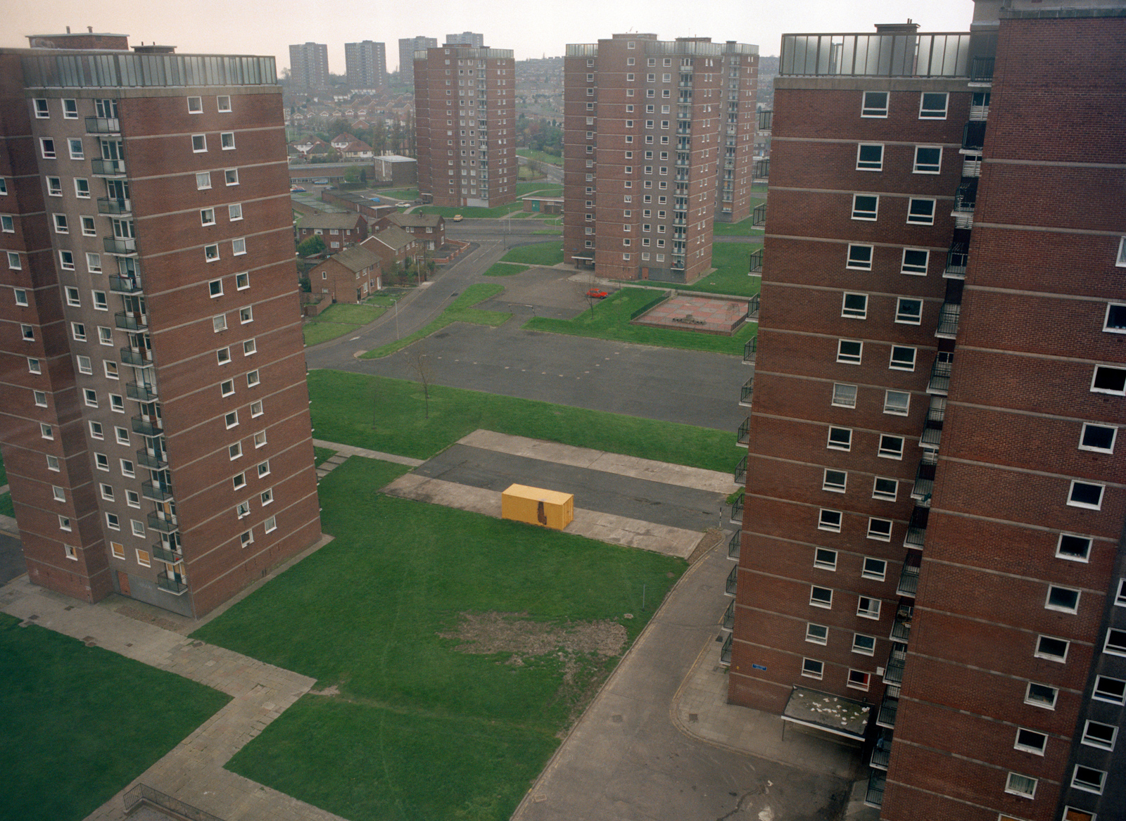
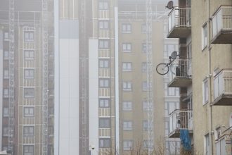
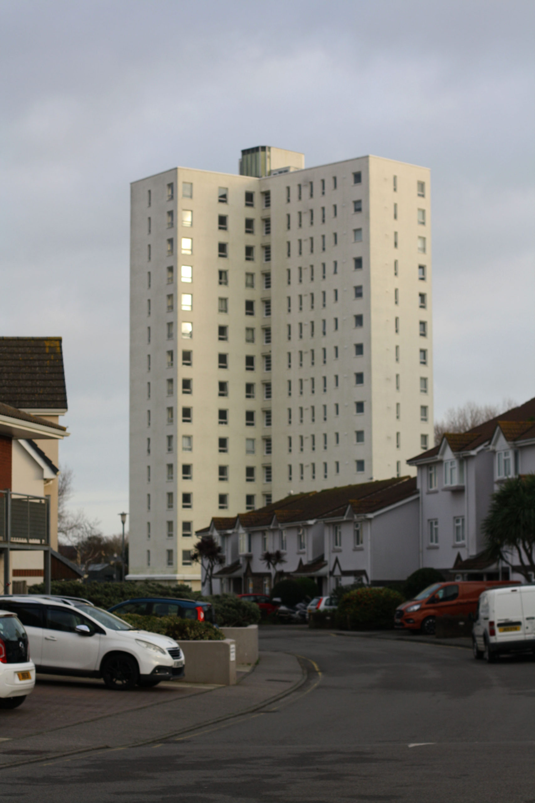
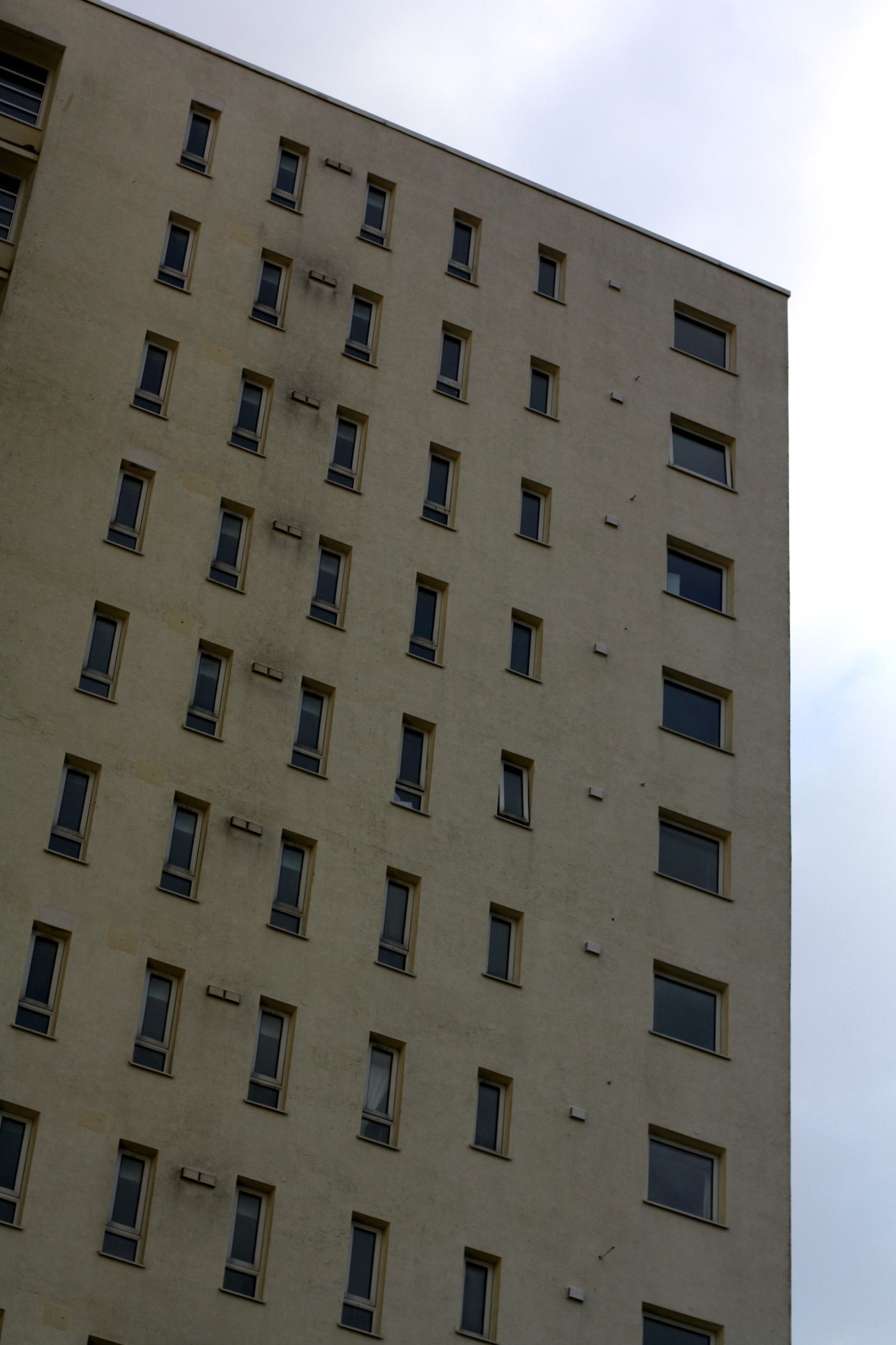
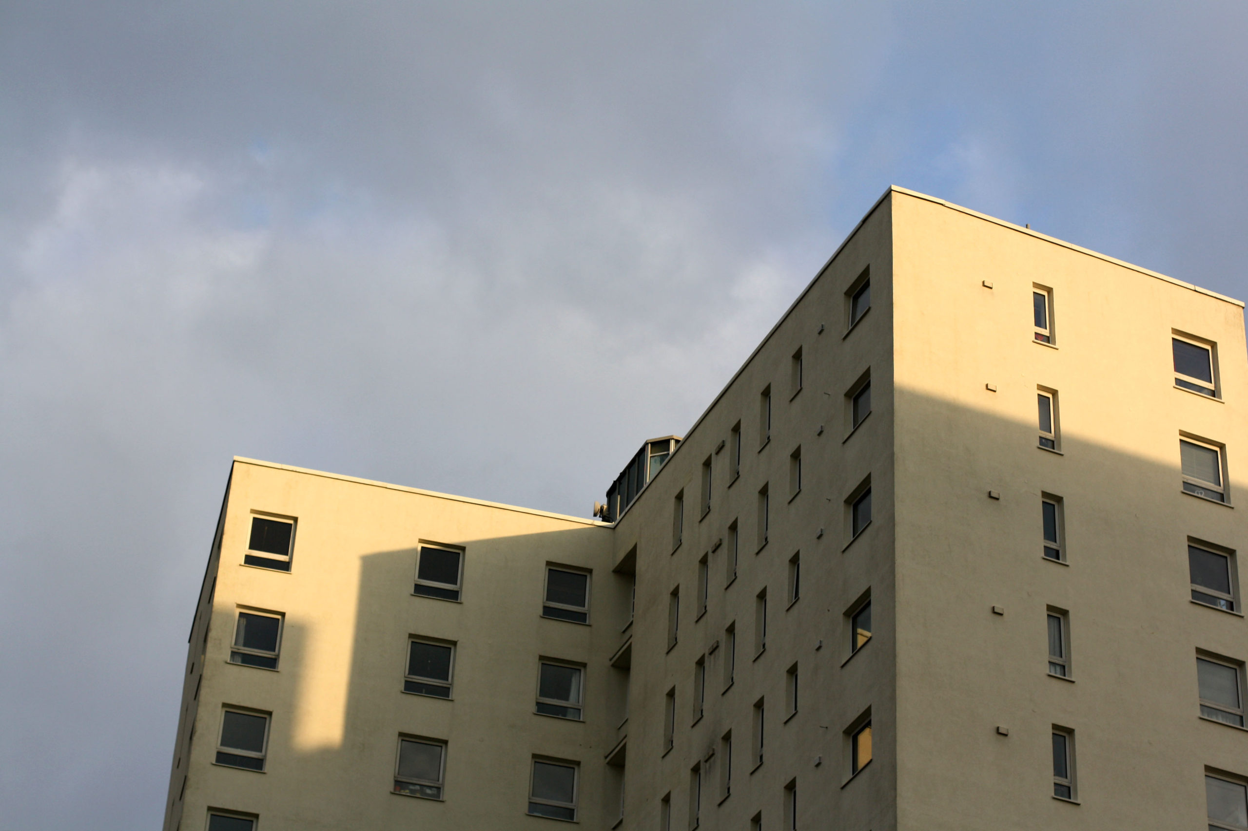
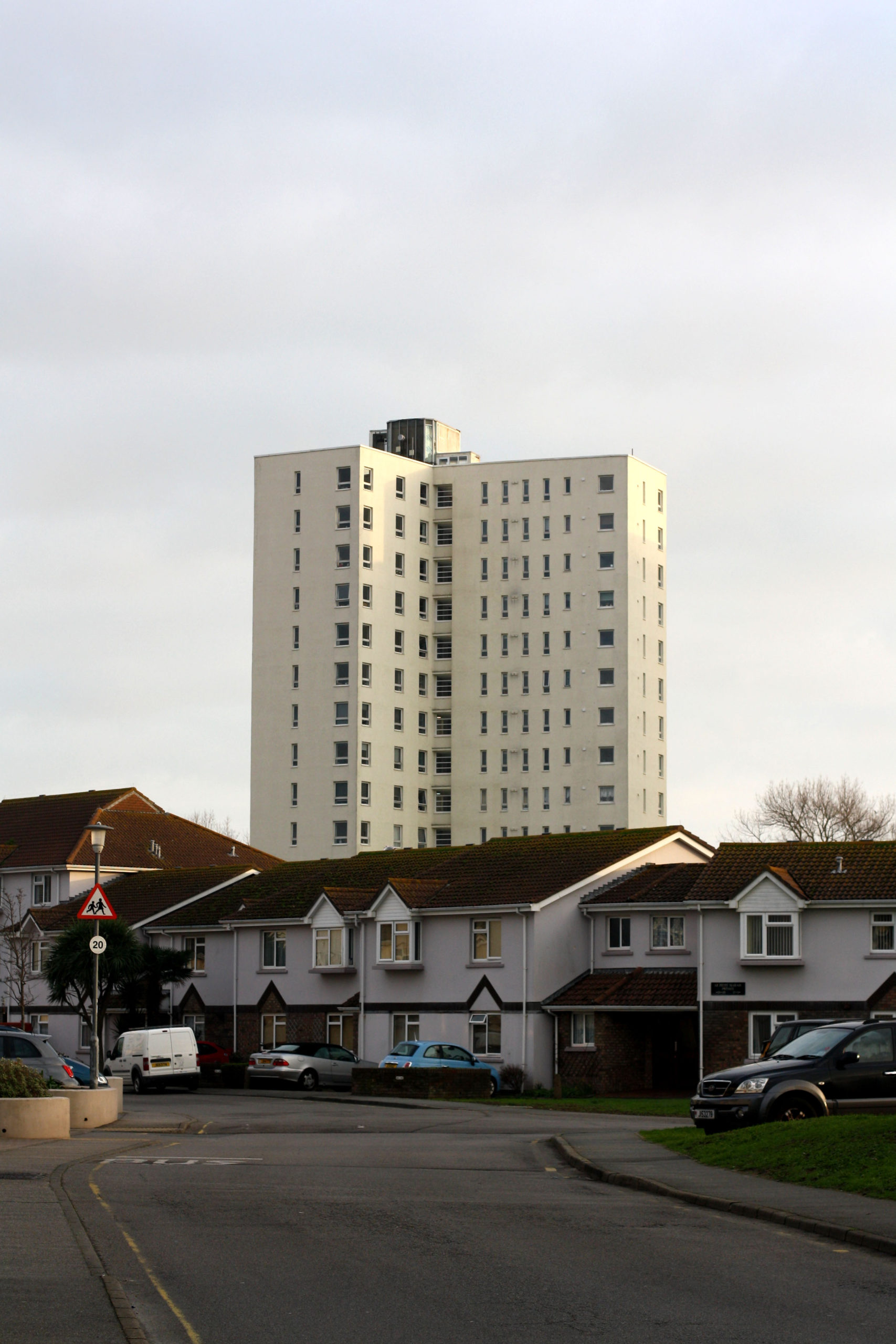
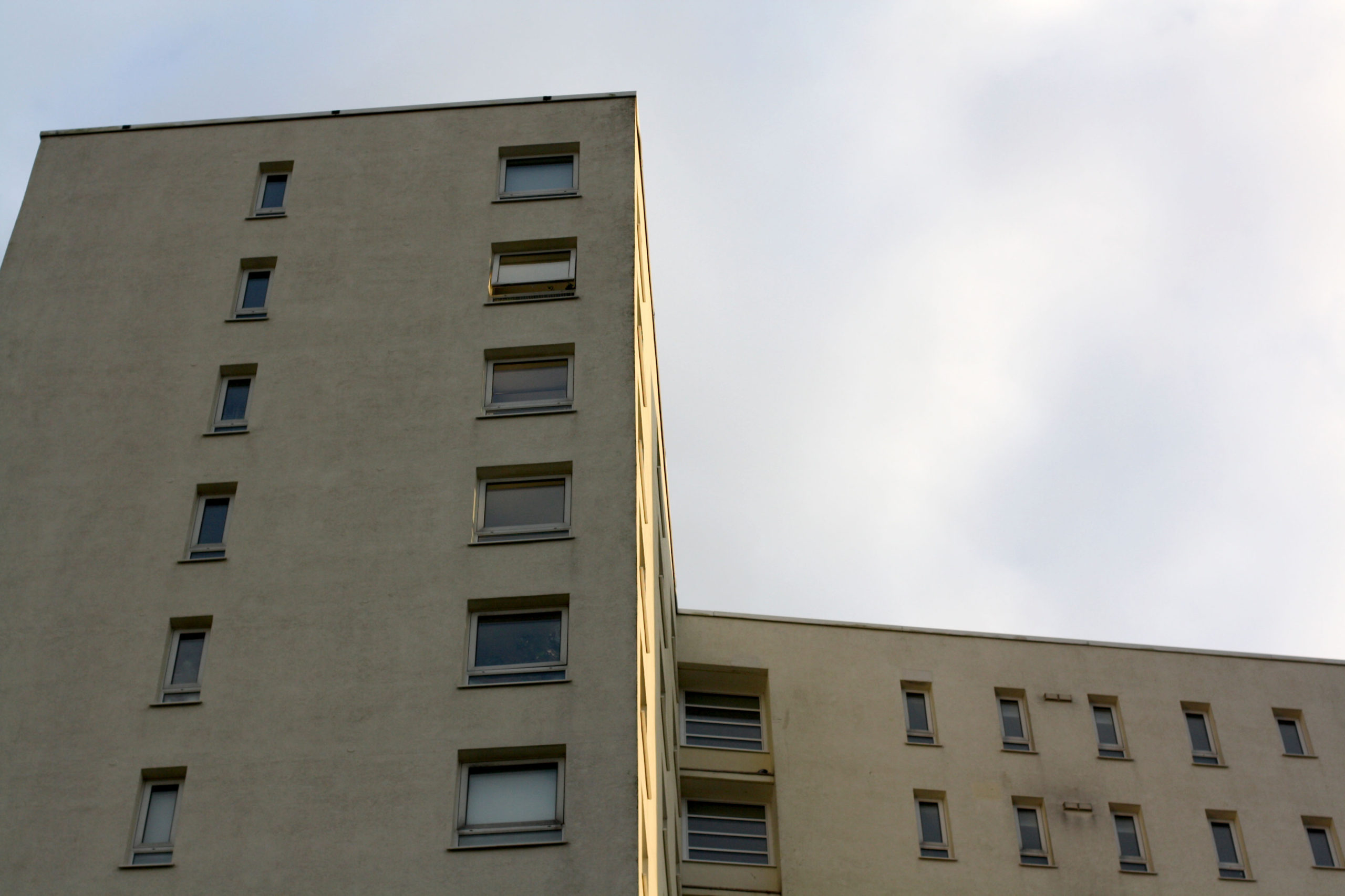
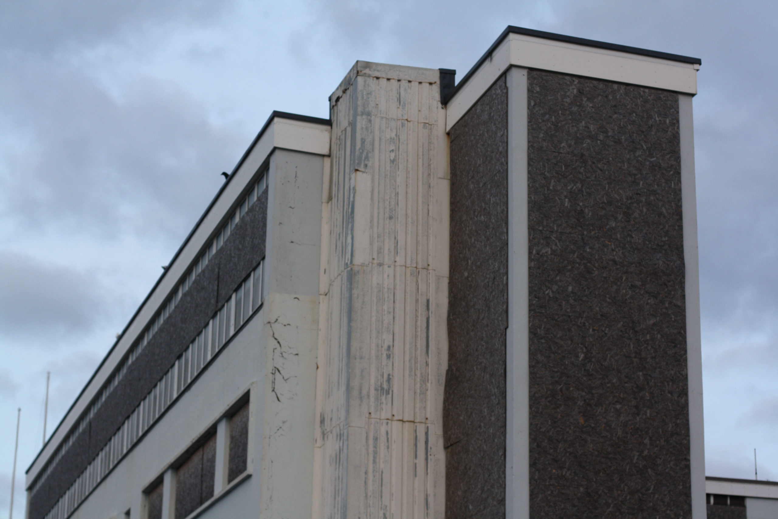
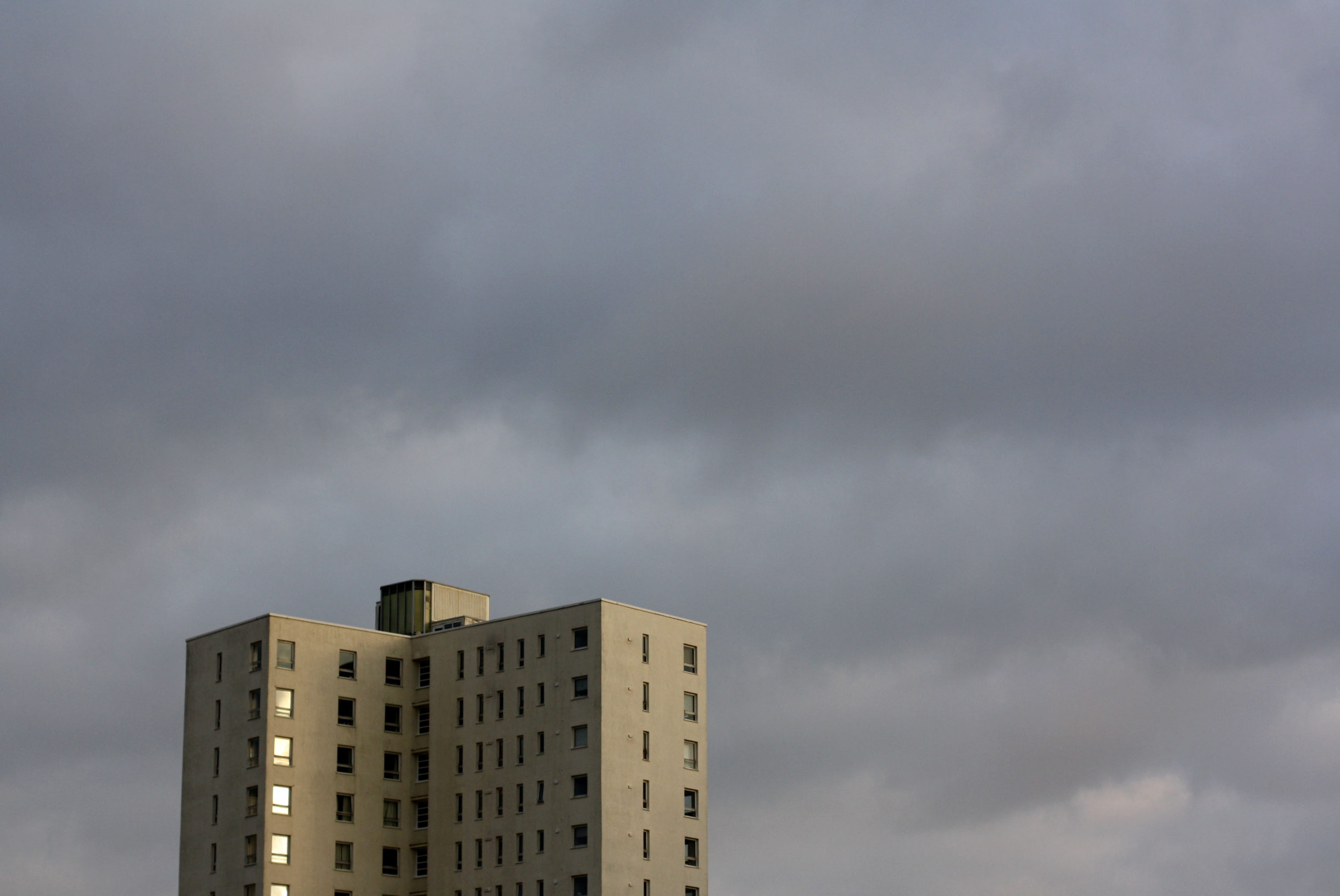
I don’t think, compared to Robert, that my pictures are that bad. I think they might even be better on a scale of colours and sharpness. When I said I was going to mimic Clayton’s work I instantly knew I was going to go down to Le Marais and take pictures of the tall buildings and they turned out just how I expected them to. Nothing I don’t think I could have improved on in these photos, but I should have gone to other areas to take pictures of different buildings. That would have most likely improved the variation and made the photos more interesting.
