original:
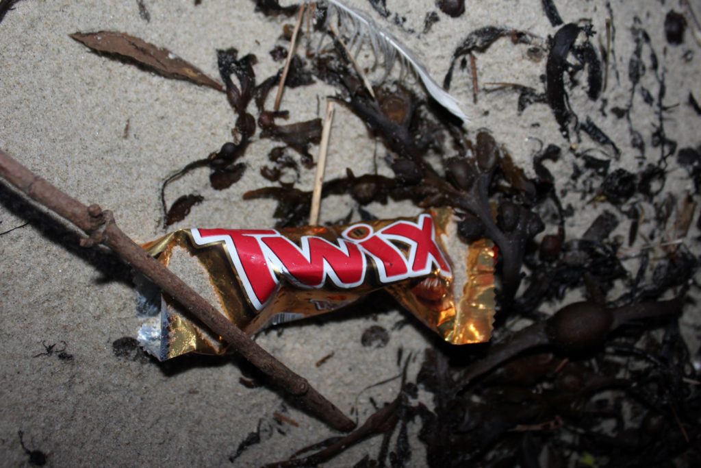
I decided to experiment with the colours in this image, adjusting the hue, saturation, luminance, highlights and shadows of every colour.
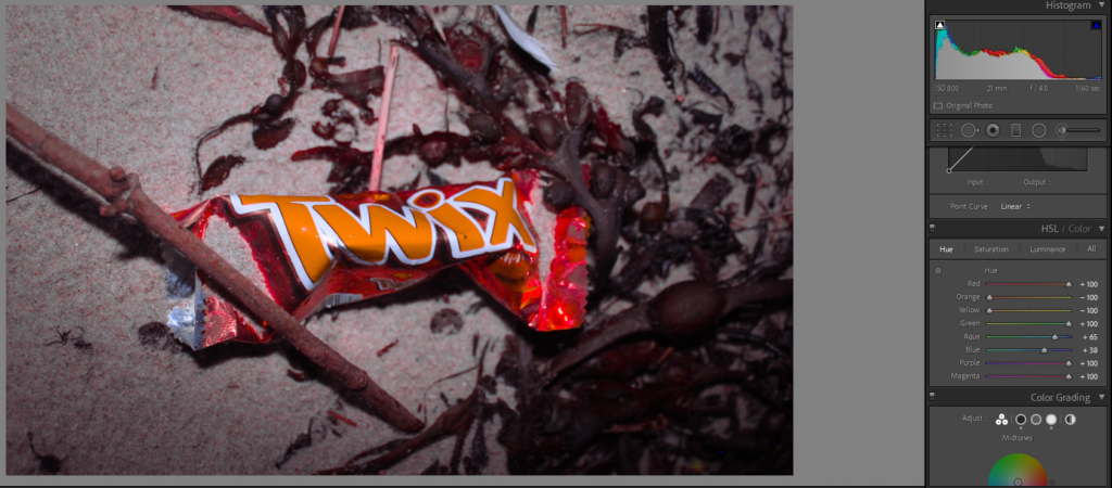
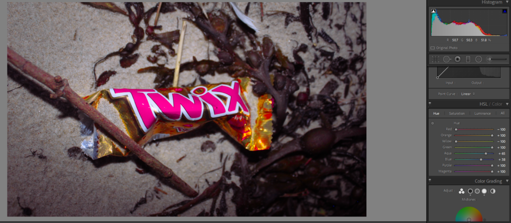
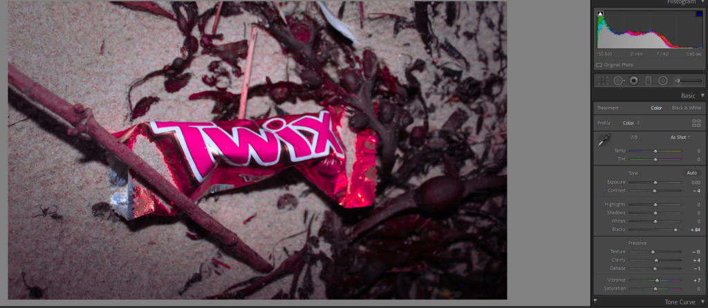
I like these as they contradict the original colours of the original image and the original colour of a ‘twix’. Although they are different to the original colour of the image, it isn’t too obvious, this is because the negative space in the image hasn’t significantly changed.
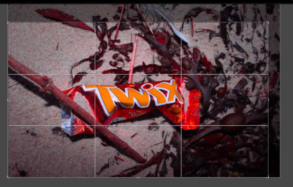
After editing the image, I decided to crop it. I did this so the rubbish wrapper was the centre of the image; creating an obvious focal point. Also, so the bottom and top part of the image were similar in size making the image even.
