Final image analysis
Urban images:
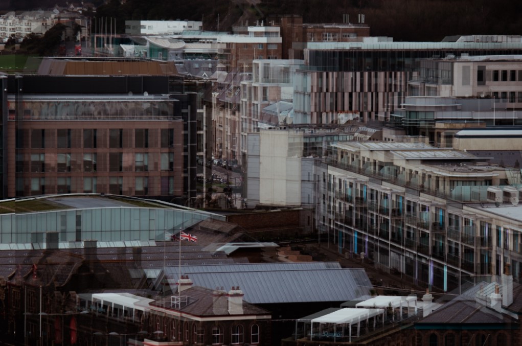
I really like this image and I think that the multiple layers paired with the busy town go really nicely together. If I could change anything about this image I would want to change the colouring. While I like the colour on the image, I don’t think it matches the style I was going for, and having certain bright areas would look a lot better in this image.

I think this image turned out very well. I like how there’s always something to look at in the image and that the focus point is in the centre. I am also fond of the colours used for this picture. If I were to change anything, I would probably add two more layers going inward towards the photo.
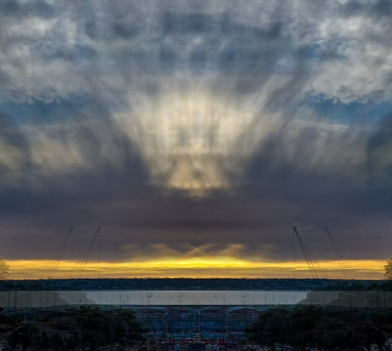
I think that this image is good as the focus point is in the centre and there’s always something to look at in it. If I were to change something it would probably be the vibrancy of the sky as I feel that it takes away the attention from the harbour which is the urban part of this image.
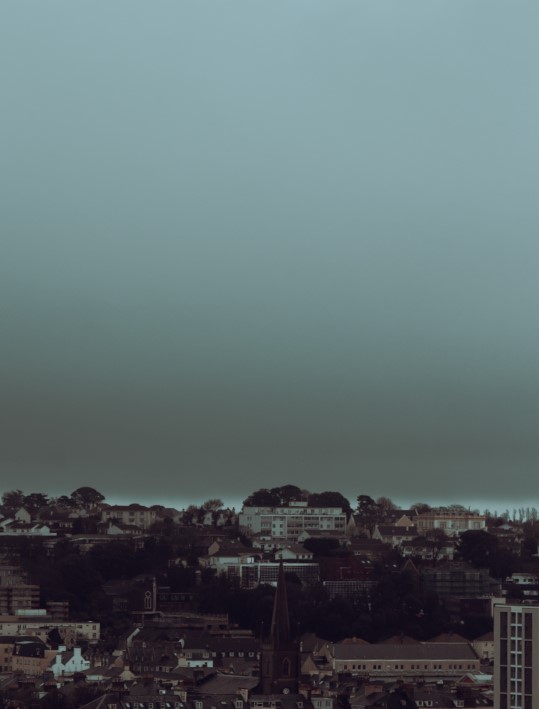
I am fond of this image, the blue shy contrasting with the busy town below creates a nice contrast. I I could change anything, I would crop the image a little bit so that there would be enough sky to have the contrast, but not too much you focus on it instead of the image.
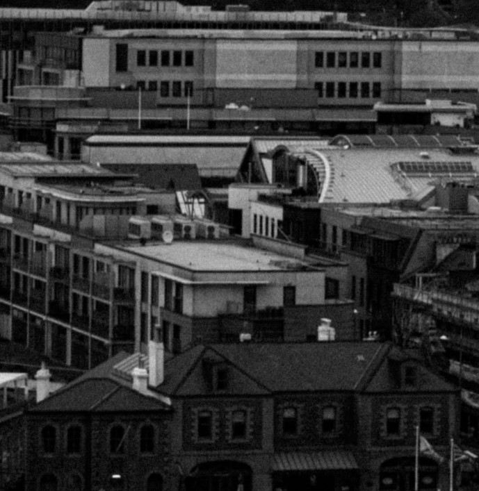
I really like the whole aesthetic this image gives off and i think that the grain on it helps to create a more old timely look. If I were to change anything I would of probably expanded the image to get more in frame.
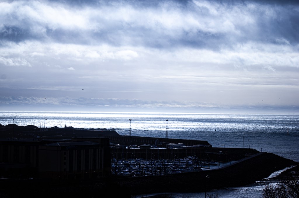
I think this image has an overall refreshing feel to it. I think the cool colours contrast nicely with the dark town. If I were to change anything I would probably decrease the highlights so that the sky isn’t as bright.

I really like how the tower is the main focus. I also like how highly contrasted the image is. I don’t think I would really want to change anything about this image. If I had to, I would probably add some more highlights.
Anthropocene images:
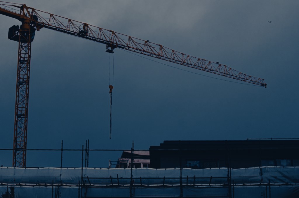
I like the industrial style this image presents as I think it shows a more modern side to Anthropocene. I also think the cool colouring of the image produce a melancholy mood, making the viewer reflect. If I were to change anything I would most likely edit out the bird in the corner of the photo as I feel it can be distracting from the main focus of the image.
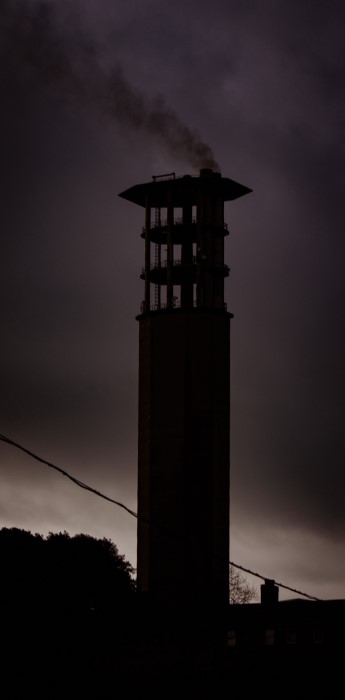
I’m very happy with how this image turned out and really like how prominent the smoke is. I would improve this image by getting rid of the powerline as I feel it obstructs the tower.

This image turned out nicely however, I would of liked to include some more colour to it. Perhaps by making the lamp post have some light on it or finding a way to incorporate the sky light more.
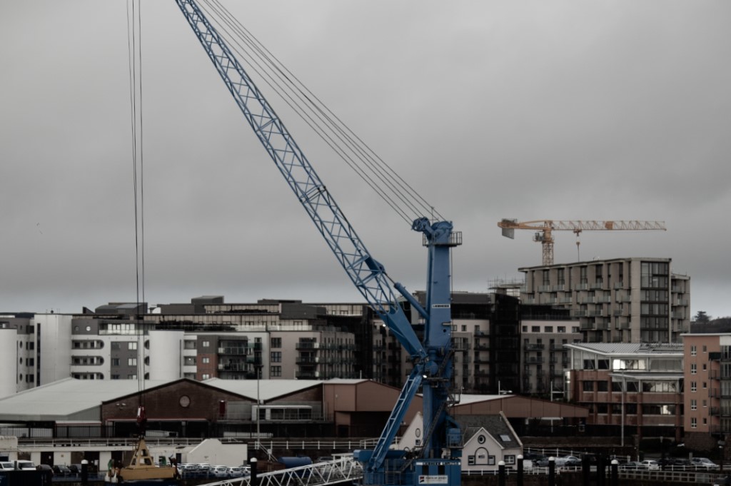
This image shows very well how modernized the world is a will continue to be. The two cranes towering over the buildings below also make for great focus points. To improve this image I would lower the exposure, I like how low saturated the image is but i still feel like it’s too bright.
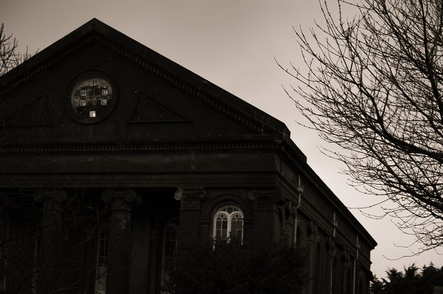
I think this image shows really well how nature can fight back. I really like the low exposure and black and white tones in this image. To improve, I would make the white in the windows and pipes on the side more noticeable.
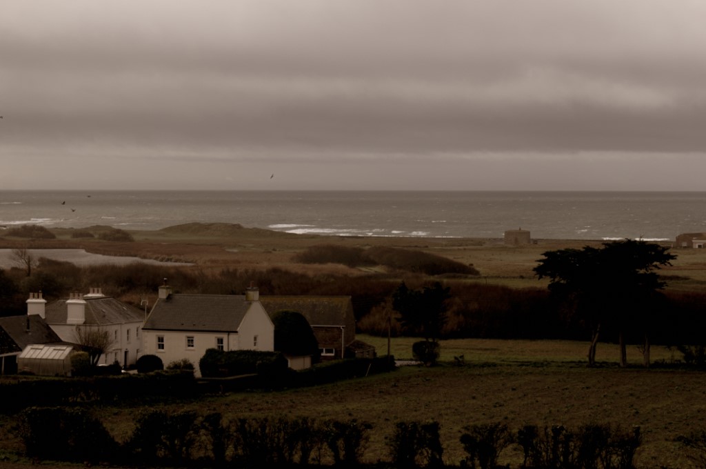
This Image turned out okay. I like the view however I don’t think the vintage colourizing really works it it. To improve I would change the tones and perhaps have it in black and white.
