Anthropocene- photoshoot 2 – editing + experimentation

experimentation

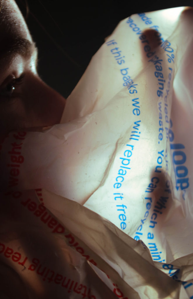
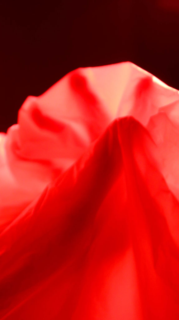
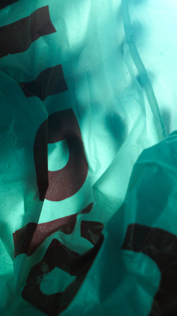
I used coloured filters over the lights to create bright colour with little to no editing- whilst I don’t think these images are effective on their own together they compliment each other.
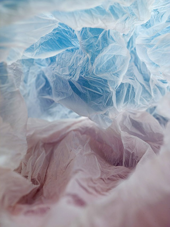
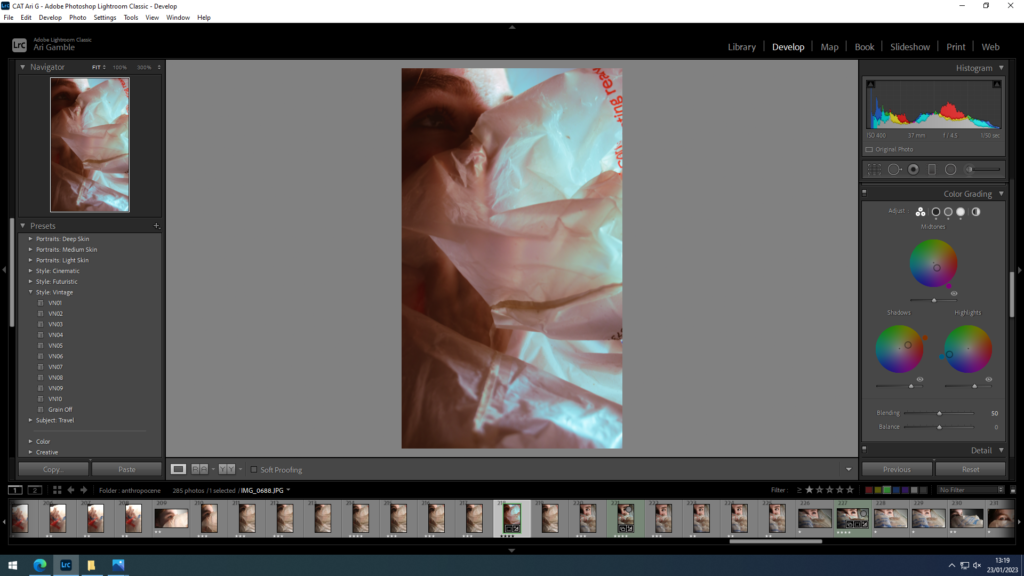
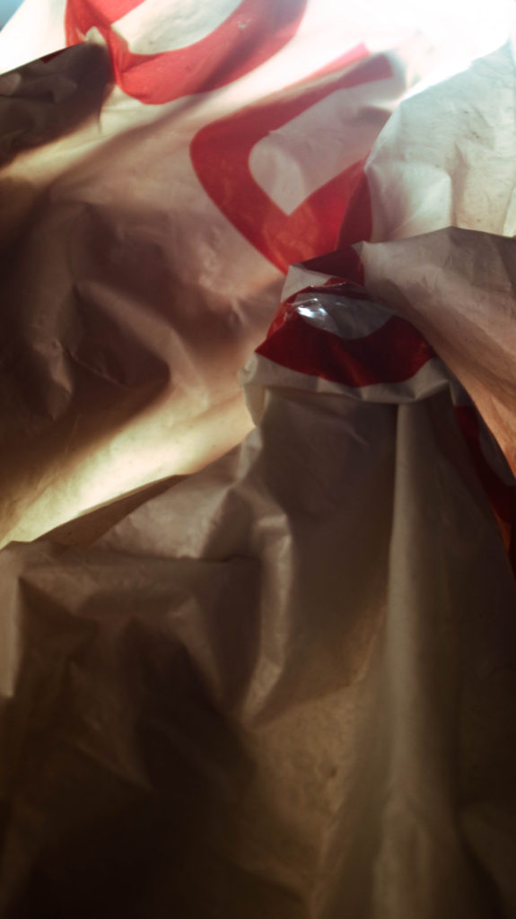
I experimented with adjusting the colour grading of an image to look like the colour gradients in Vilde Rolfsens work. I made sure to use analogous colours going in a scale to blend easily between shades but with enough of a change in hues to be visually interesting.
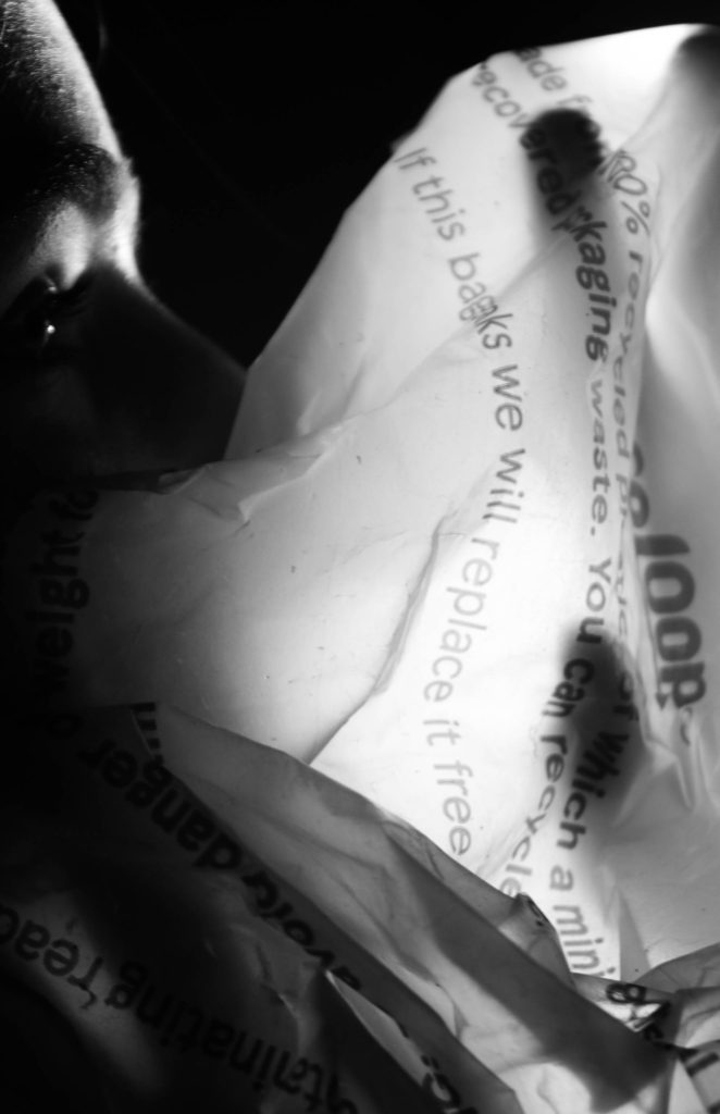
I experimented with high contrast black and white- however I preferred the colours as it emphasised the unnatural plastic.

Editing

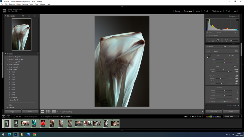
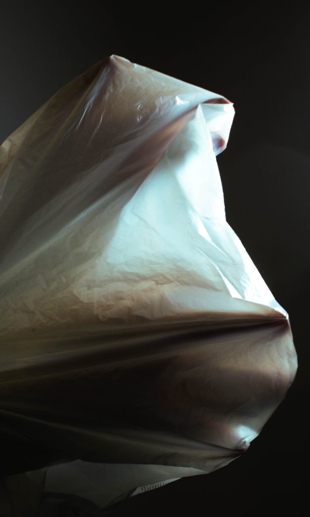
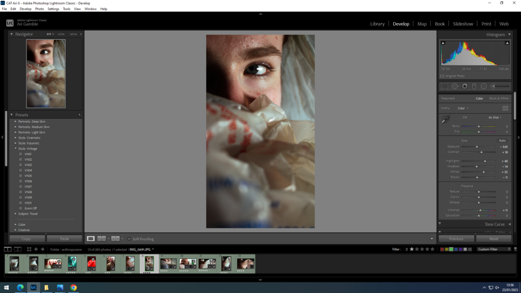
I adjusted the contrast and tones to create more dramatic lighting to highlight the transparency of the plastic. I also used colour grading to switch to blue highlights as it gave a cooler less yellow light.
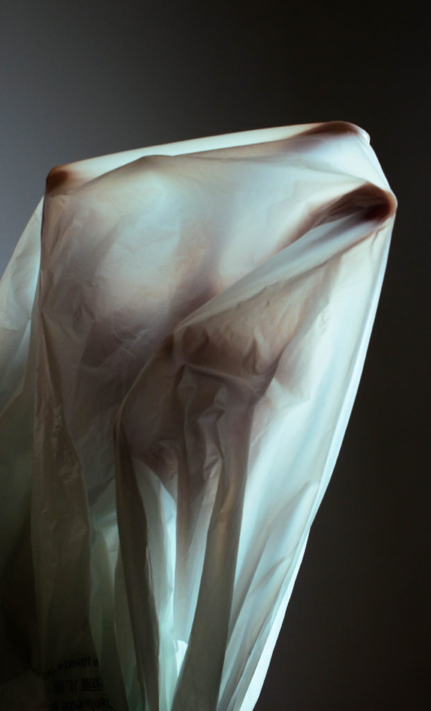
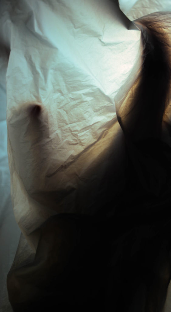
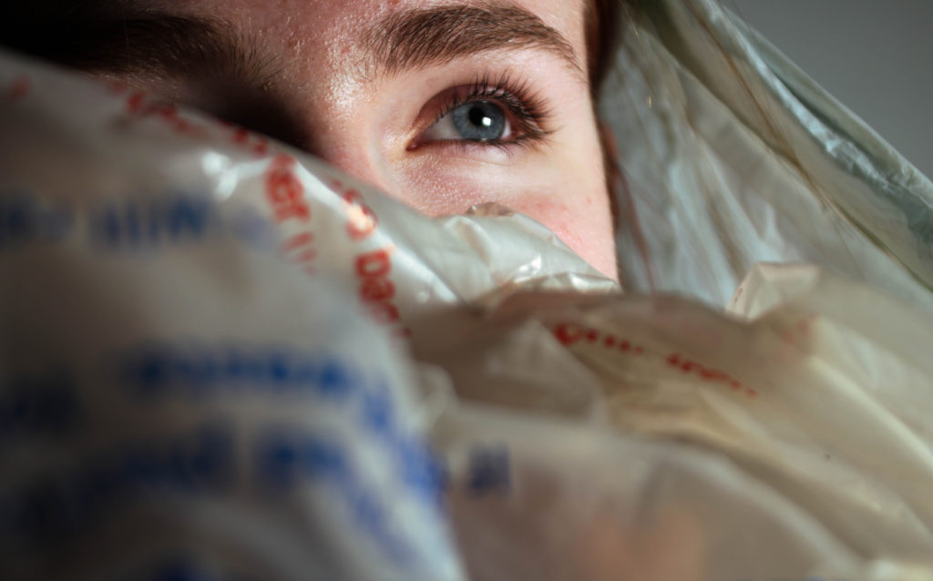
Prefer this compositionally but find the lighting less effective.

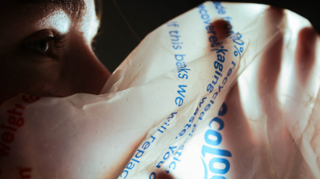
Again switched colour grading highlights to blue to keep cohesive- I think the portraiture dominates the images making them less effective for the focus being plastic.
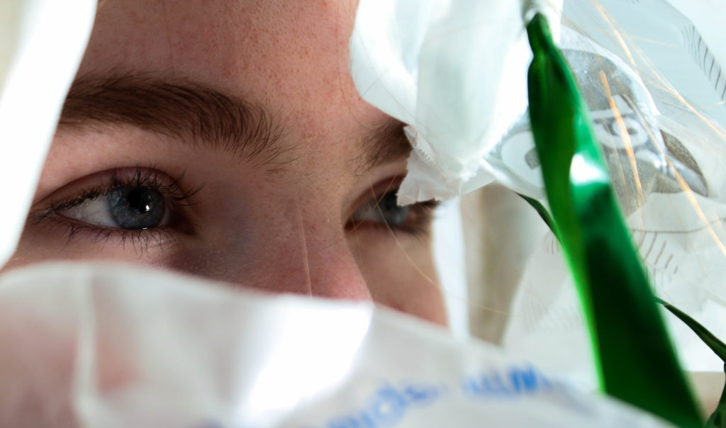
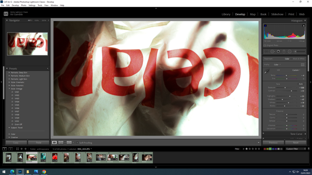
Green streak stands out against skin tone creating a division with the plastic.
Focusing more on contrast to emphasise the silhouette. – looks too horror movie esc decided it wasn’t subtle enough.

Leave a Reply

Your email address will not be published. Required fields are marked *