My Jersey
The person I chose for this task is my dad. Together with my mum we have lived on the island for just under a month. Having moved from the Scottish Borders we do not have deep roots in Jersey, so I decided to focus this task on my dads new found life on the island following his job.

My dad Alan Gamble was born in Northern Ireland on 14th January 1973. Farming has always been an interest and a job that he he has followed having worked and managed on many farms. The opportunity to move to Jersey following my dads work was one that he nor us could pass up.
Ideas
My main ideas going into this project were to capture my dads daily life in an entirely new place. Straight of the bat I knew I wanted photos of him working as people aren’t normally used to seeing cows in this setting- how milking actually works or the insides of this line of work.
I had a fair few concerns going into this project as photography isn’t something I’ve done before at the end of the day this project allowed me to pick up some new skills that can be expanded on.
Research
Laura Letinsky
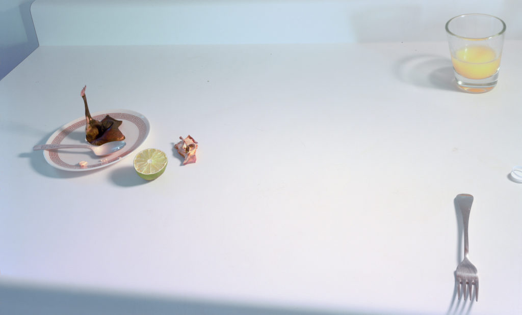
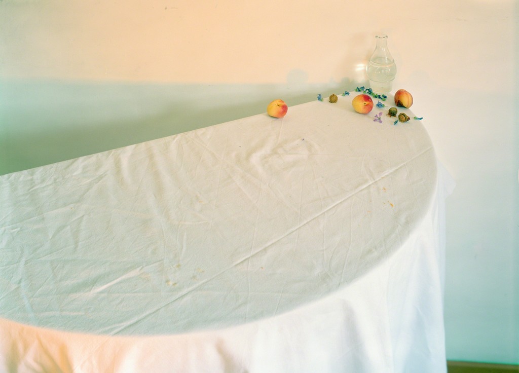
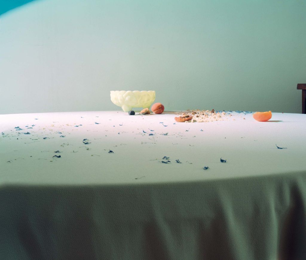
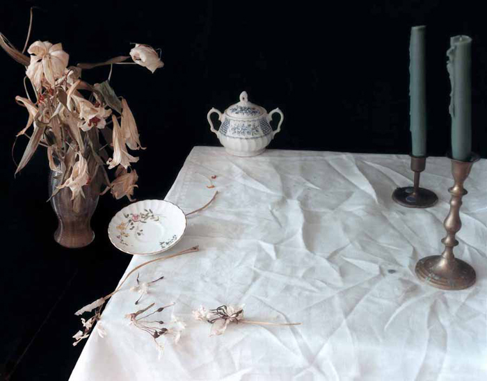
Laura Letinsky is an artist born in 1962 in Canada. Her photography work focuses on challenging the norms of domesticity, gender and unsustainable consumption.
“We live in a world where photographs demand more photographs. They generate a need for desire. My understanding of desire is from a psychoanalytical point of view. Desire involves something being just out of reach—close enough that we know it is there, but not close enough, that we can have it.” Lentinsky talks about the constant demand for photos that people can live through and the expectation from Capitalism the photographer should constantly produce “perfection” that they can consume and then get bored of and demand more. Many of her 2010 Photography projects such as ” albeit” and ” ill form and void full” are an attempt to find a new way to view photography without the burden of capitalism and desire and to illustrate how it is often seen by consumers. Laura Letinskys photography focuses on breaking the social norms of photography and much outside of it.

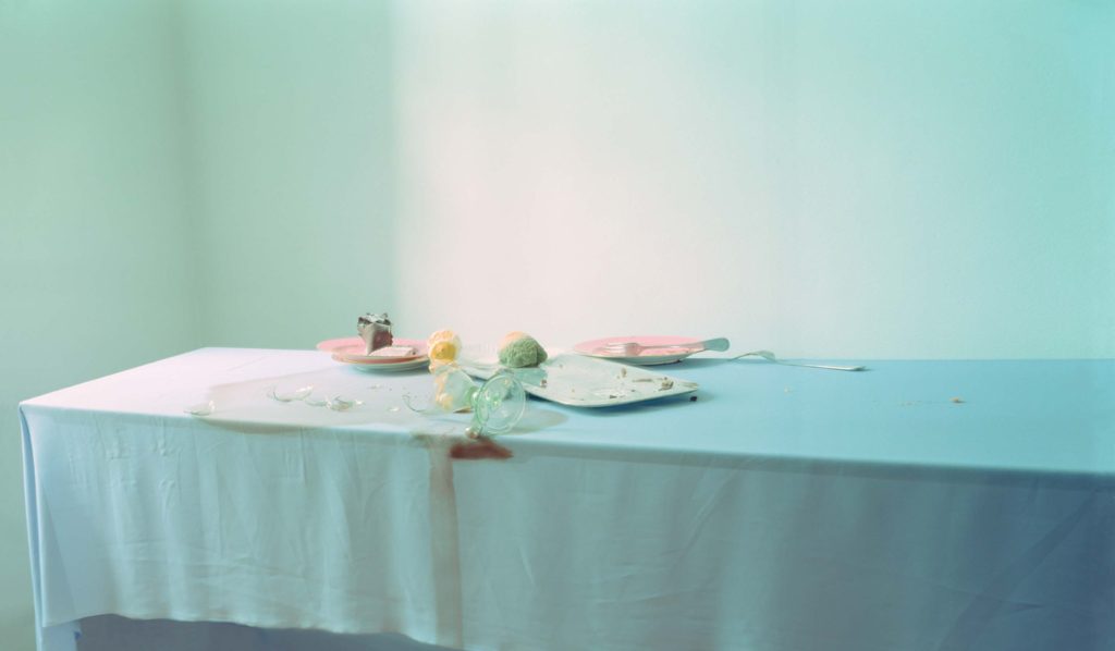
She uses Light backgrounds and overexposure adding a whimsical and calm feeling to her work. She uses soft pastel palettes in backgrounds and subject. She tends to avoid harsh light. Though when severer lights and colours are used in her photography she uses them to create a striking contrast between them and her usual pastel subjects.
What I find interesting in her work is her use of subject matter. I have decided to focus on her 2006 series “Hardly More than Ever” which depicts half eaten and mashed fruits with cutlery and other dinning items seemingly abandoned at tables. I think the photos make you think as you question what has happened to leave the items in this state.
Stephen Shore
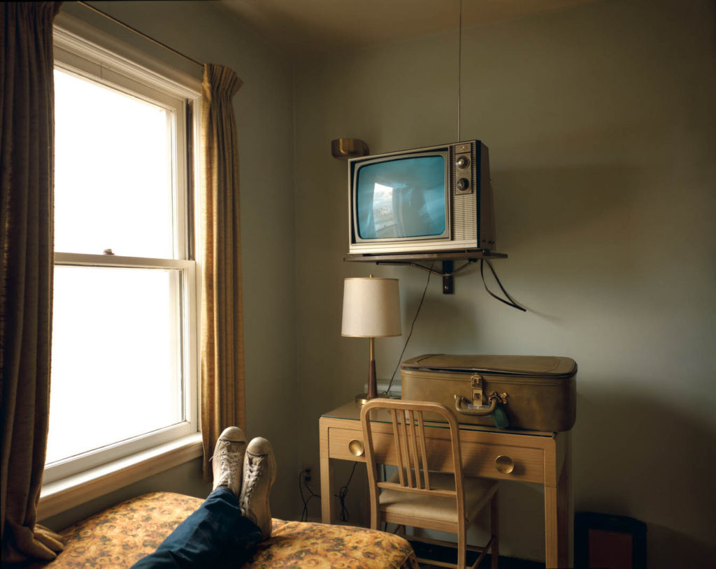
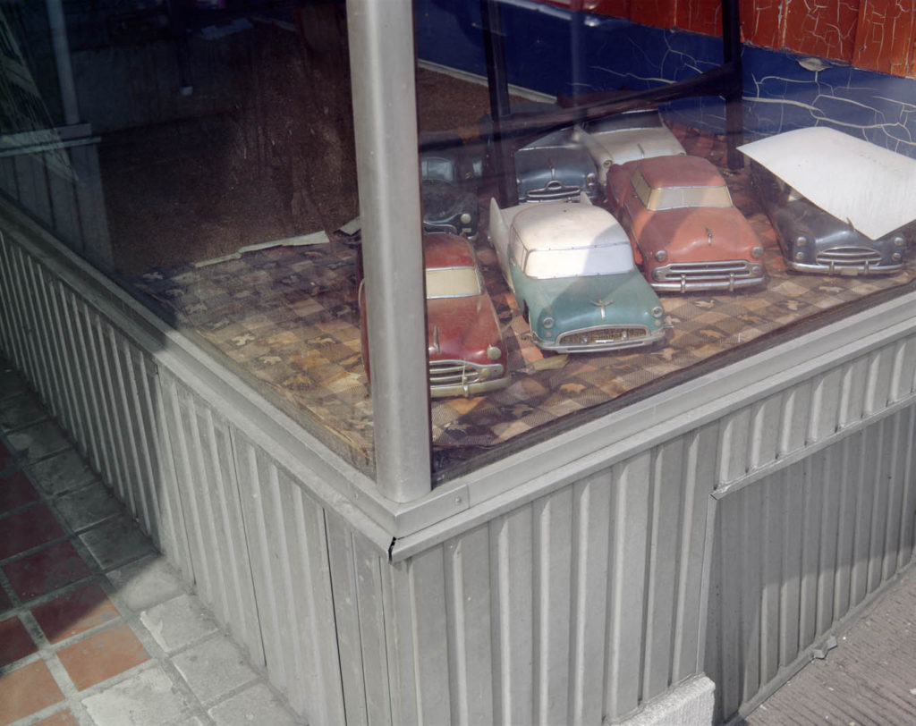
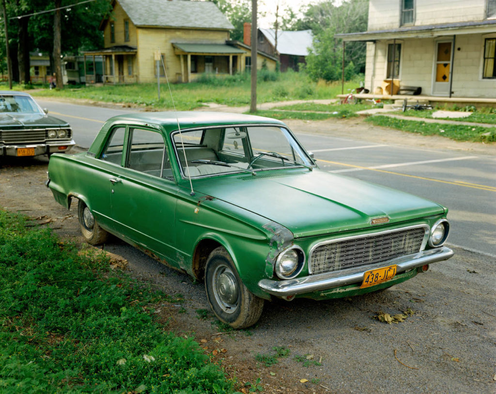
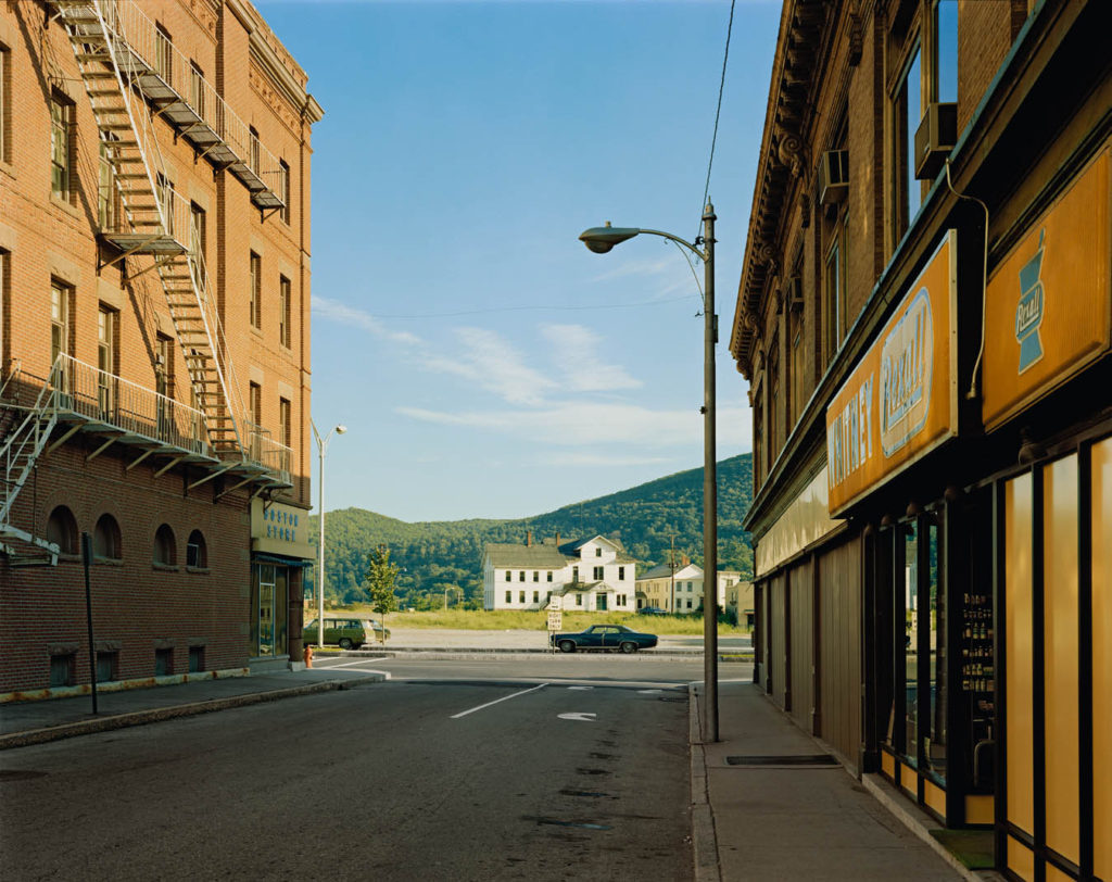
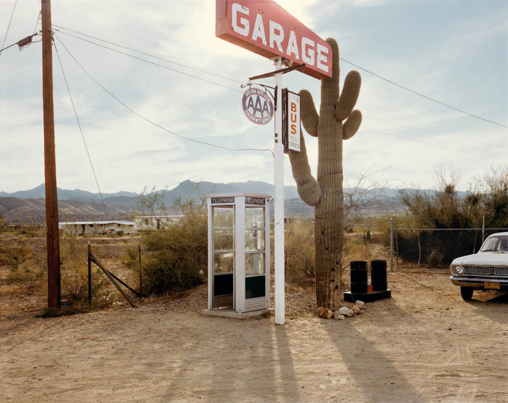
Stephen Shore is an American photographer born in 1947. He is known for his use of colour in art photography. During the 1970s Shore set of on a trip round America capturing the mundane in a colourful new way and forcing people to look at what they walk past everyday closer and see the beauty in it “discovering America”.
His work uses saturated colours and everyday subjects expressing parts of boring life in great colour. I particularly like his work “uncommon places” as it captures small snippets of landscape and life in a happy colourful way which is what I am hoping to achieve with my photographs for place.
Luke Fowler
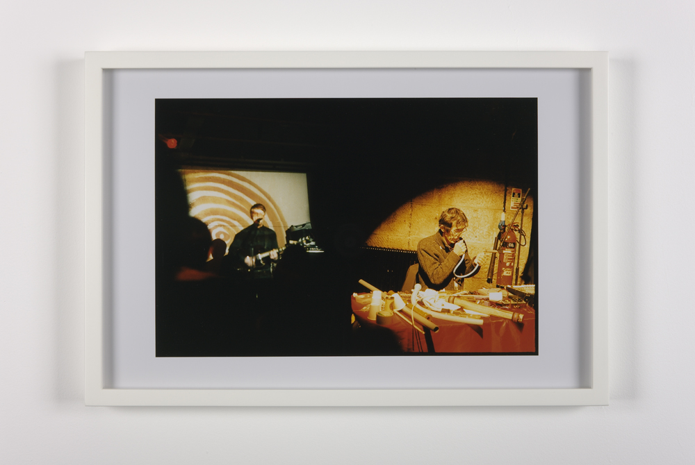
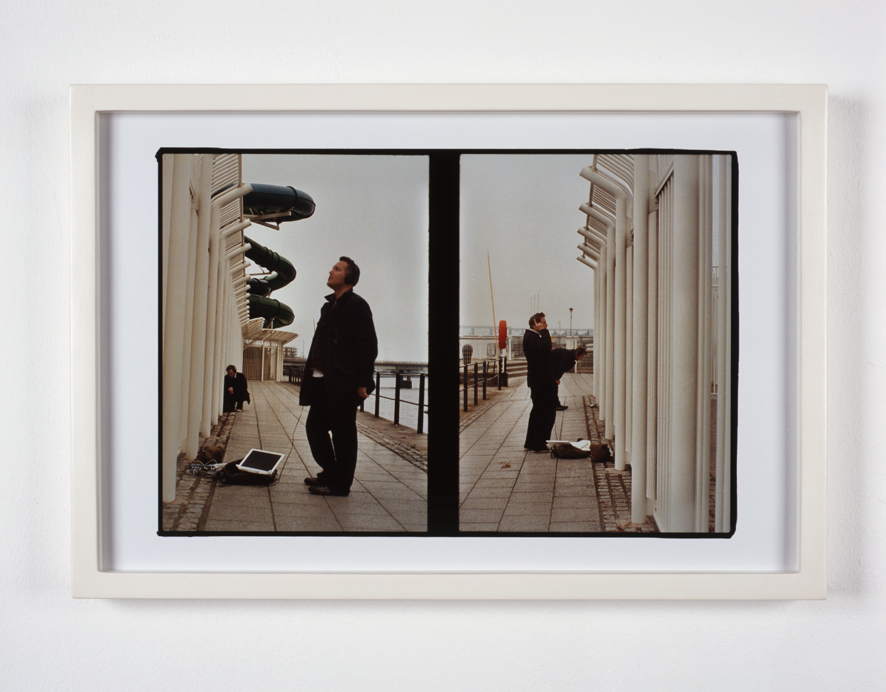
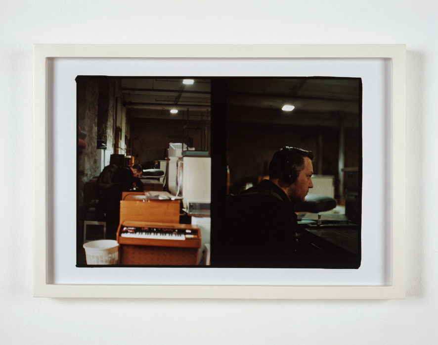
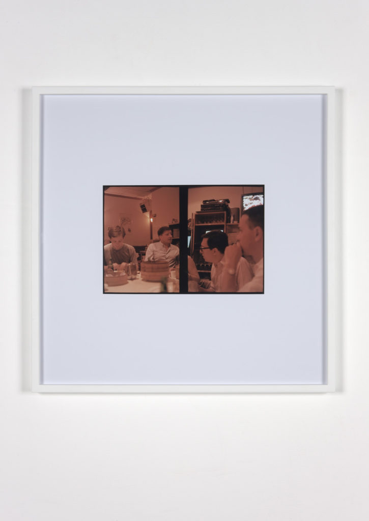
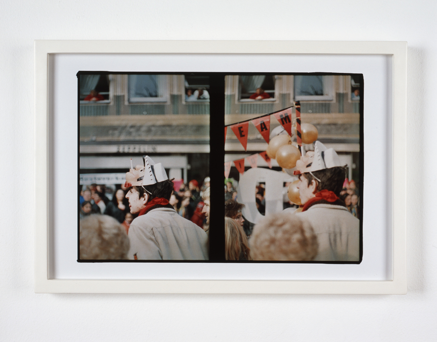
Luke fowler born in 1978 is Artist and film maker based in Glasgow. His photography is know for his use of juxtaposition having used old film cameras for his work.
However I am interested in his portrait work as it captures people being people which is my goal for the portrait shoot. I think Luke fowler work is interesting as it expresses many of his subjects just doing their job, or at a party or even just walking and creates an insight into their everyday life.
I am also fond of Fowler’s heavier use of exposure creating a darker more under exposed photo.
The Object
Planning
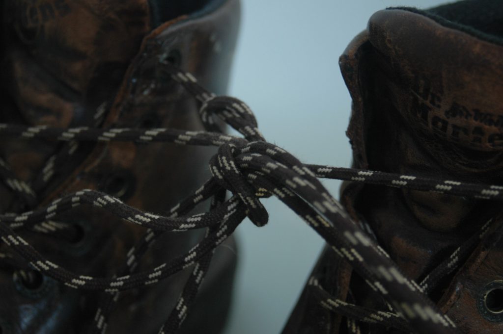
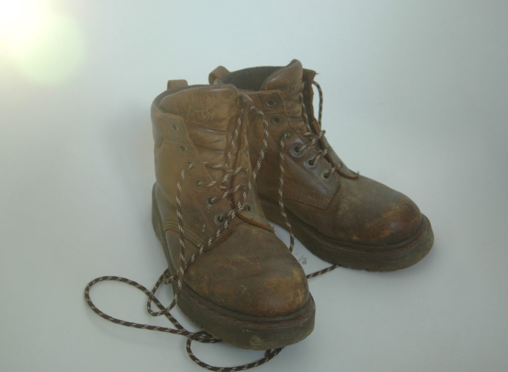
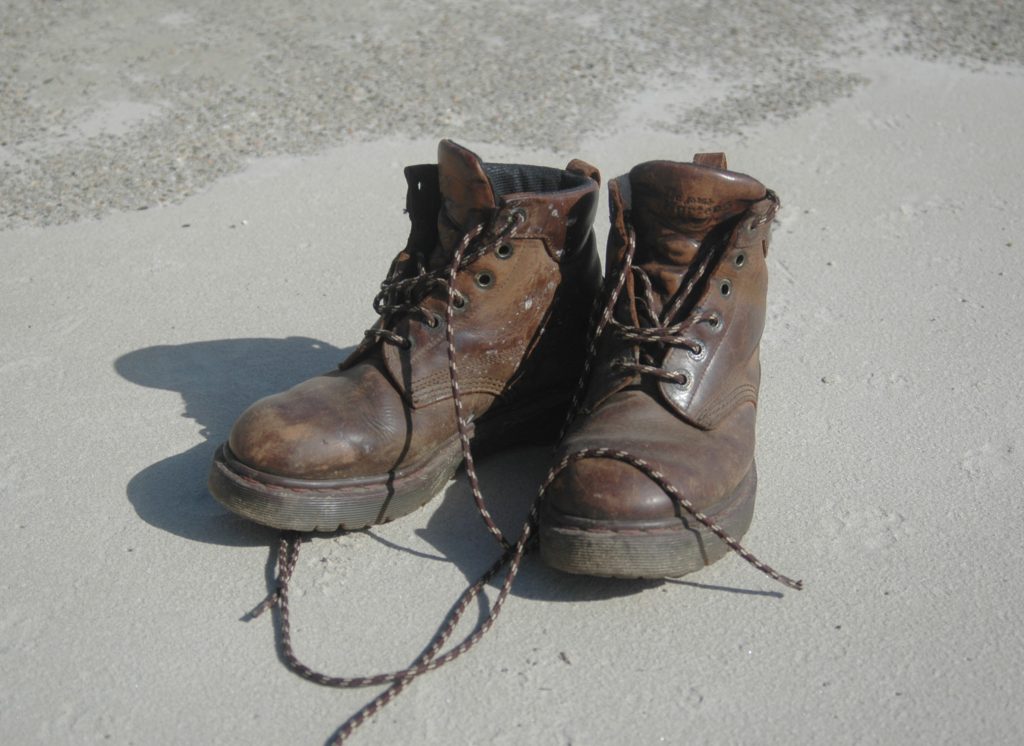
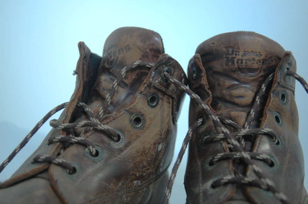
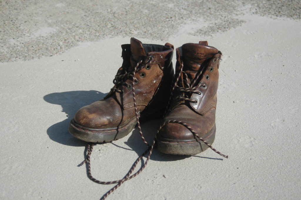
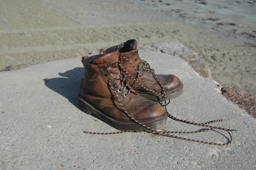
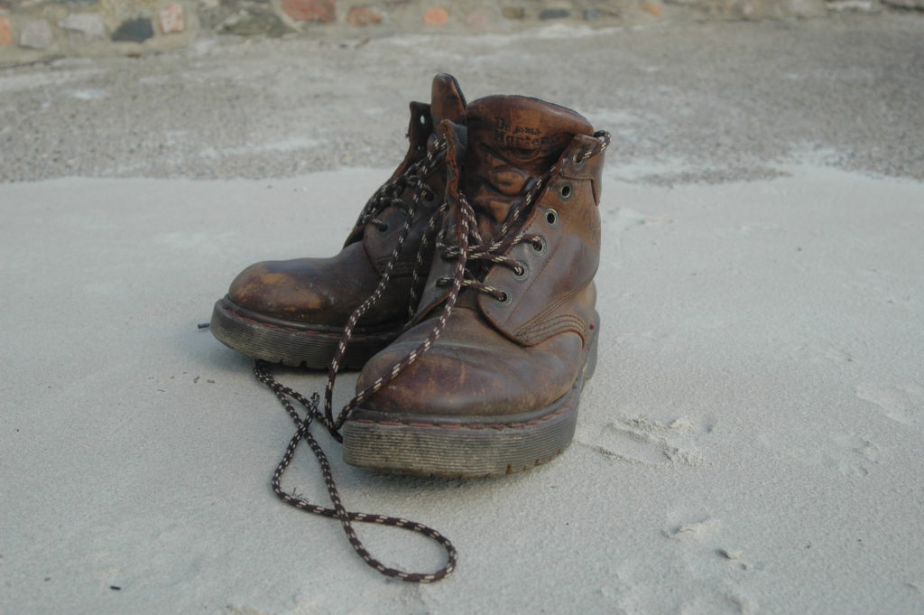
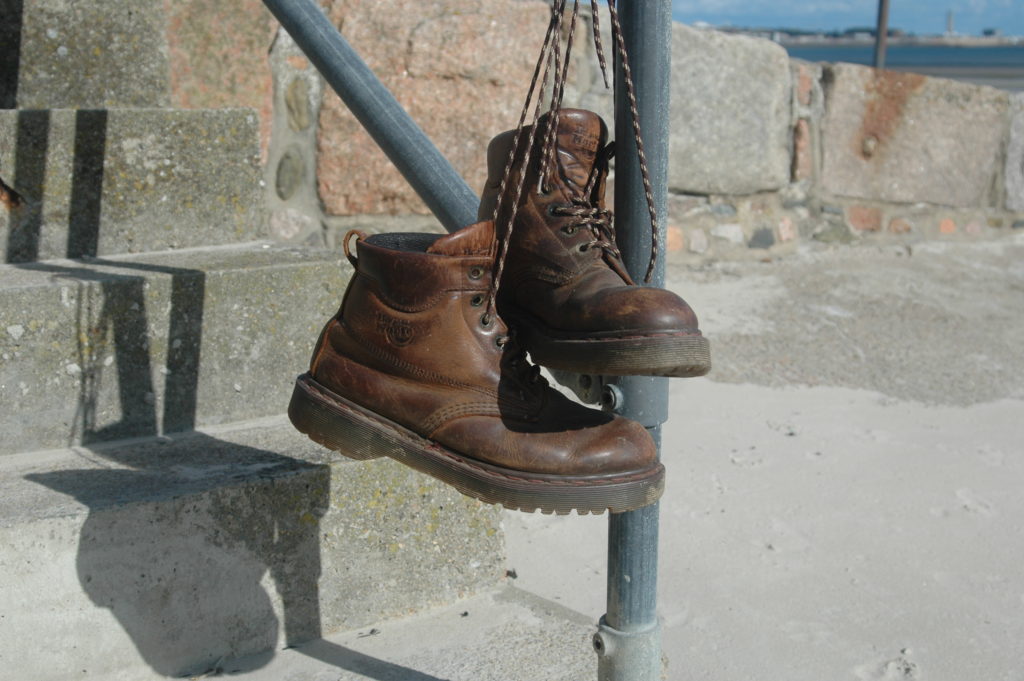
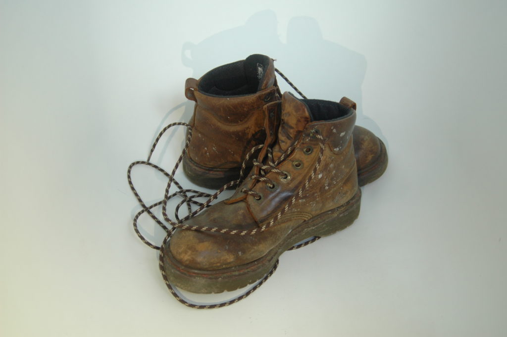
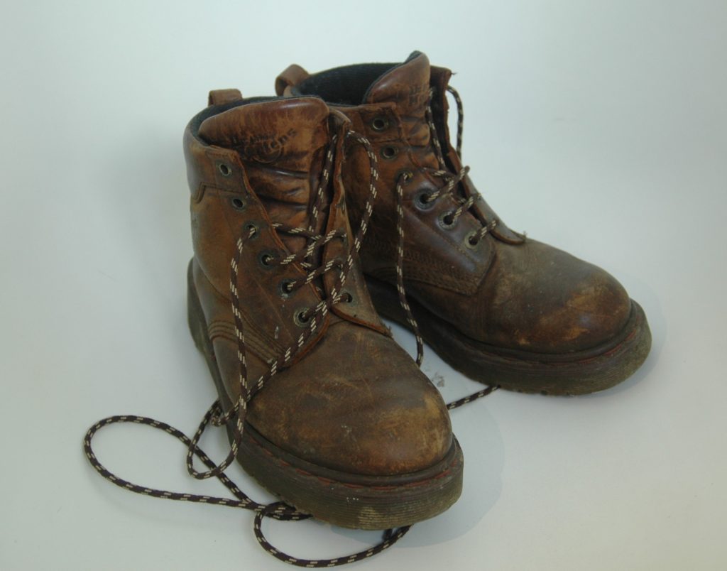
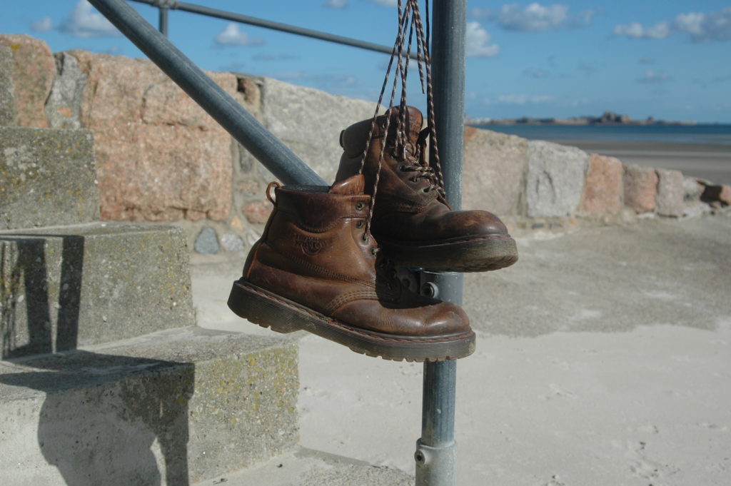
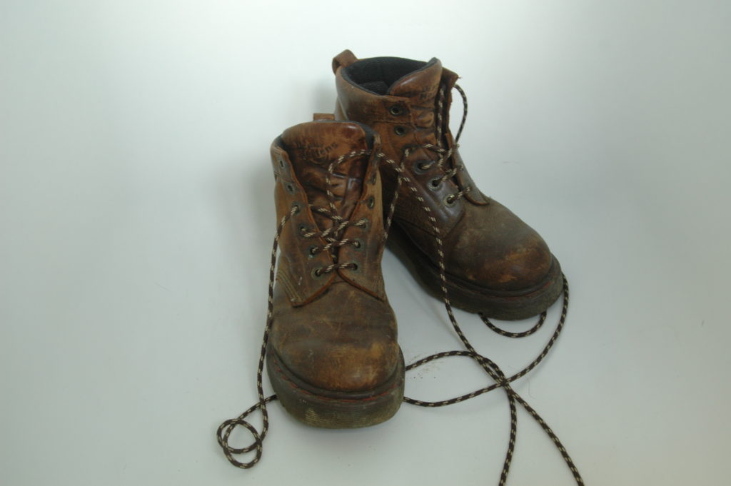
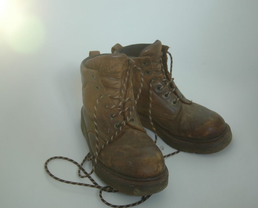
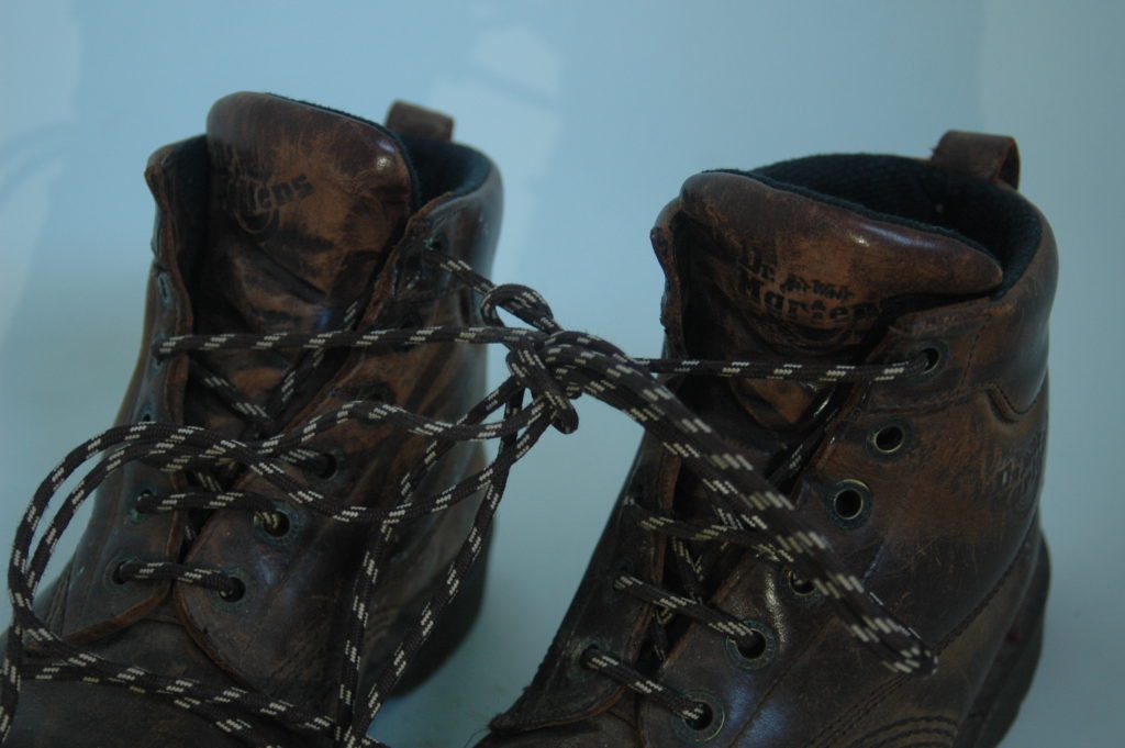
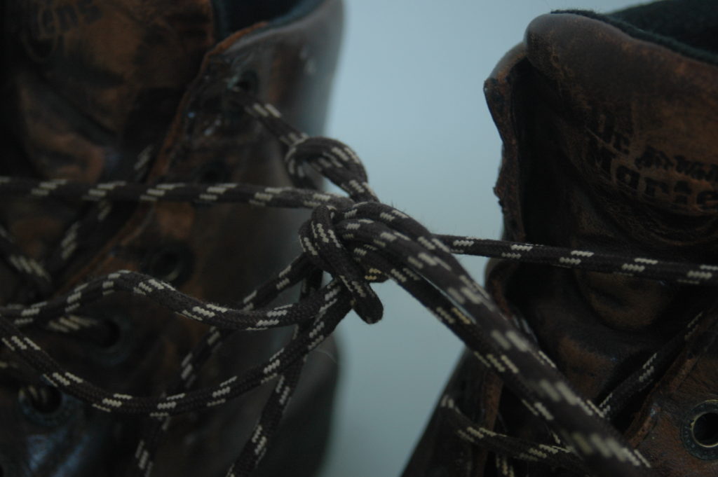
inspired by Letinskys “Hardly more than ever” my idea for the object photo shoot I chose a pair of my dads boots as our time in jersey has been about travel and discovery and shoes although not often brought to mind come with us everywhere. They are what we take our steps in through change and the mundane of everyday life.
I wanted to emulate the plain and light backgrounds of laura Letinskys work to focus purely on the boots and their story of travel. The first photos I wanted to use an infinity curve to get the completely plain back ground so I figured my bath tub would work well. The second shoot I took them to the beach to get a plain light background but not completely bare to try and replicate Letinskys simple but effective backgrounds and the beach has been a frequented spot by me and my dad recently as it was a rarity to visit in Scotland.
Raw Photos
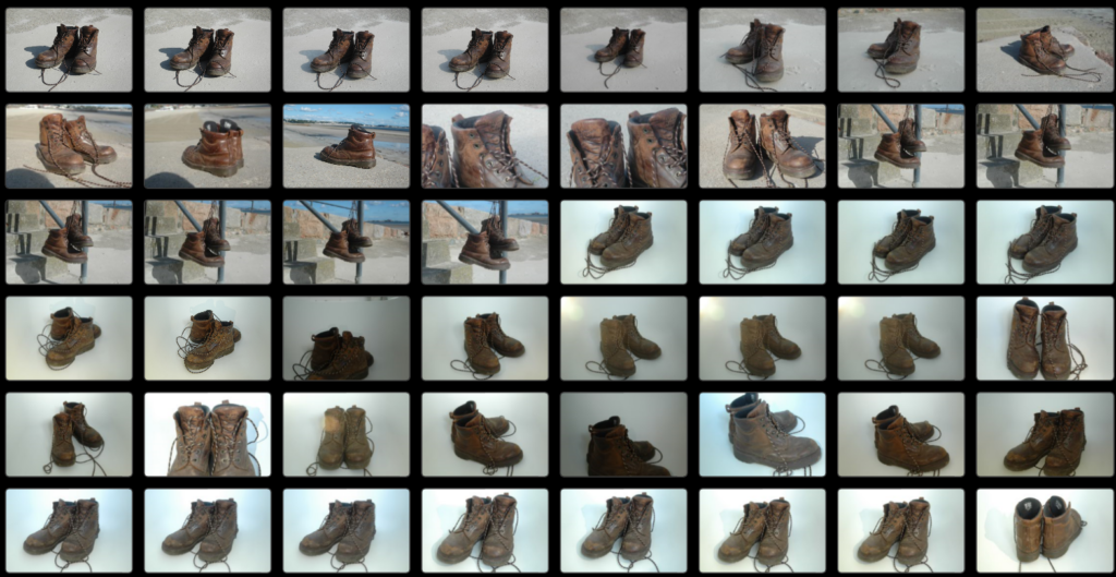
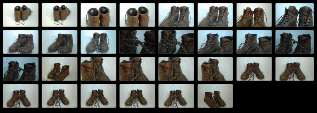
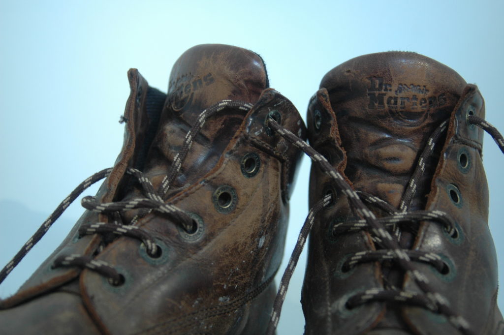
I took a total of 80 photos of the boots. I started by taking pictures of them first in my bath tub in an attempted to create an infinity curve so all focus would be on the boots. I used the natural light of the bathroom window and my phone torch to try and light it. A few photos I attempted to emulate having a gel by wrapping my phone torch in a blue plastic bag and waiting for a less harsh natural light from the window to get the effect of the under statured blue light often used by Letinsky. The effects of this I was rather pleased with this and can be seen in the last 3 of the first cut.
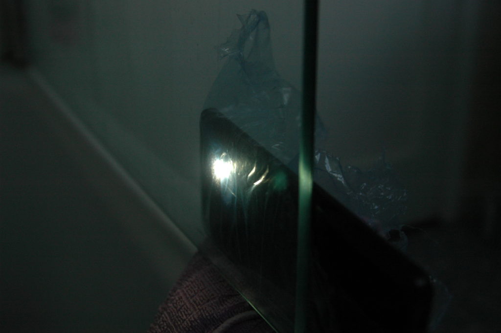
First cut- Unedited
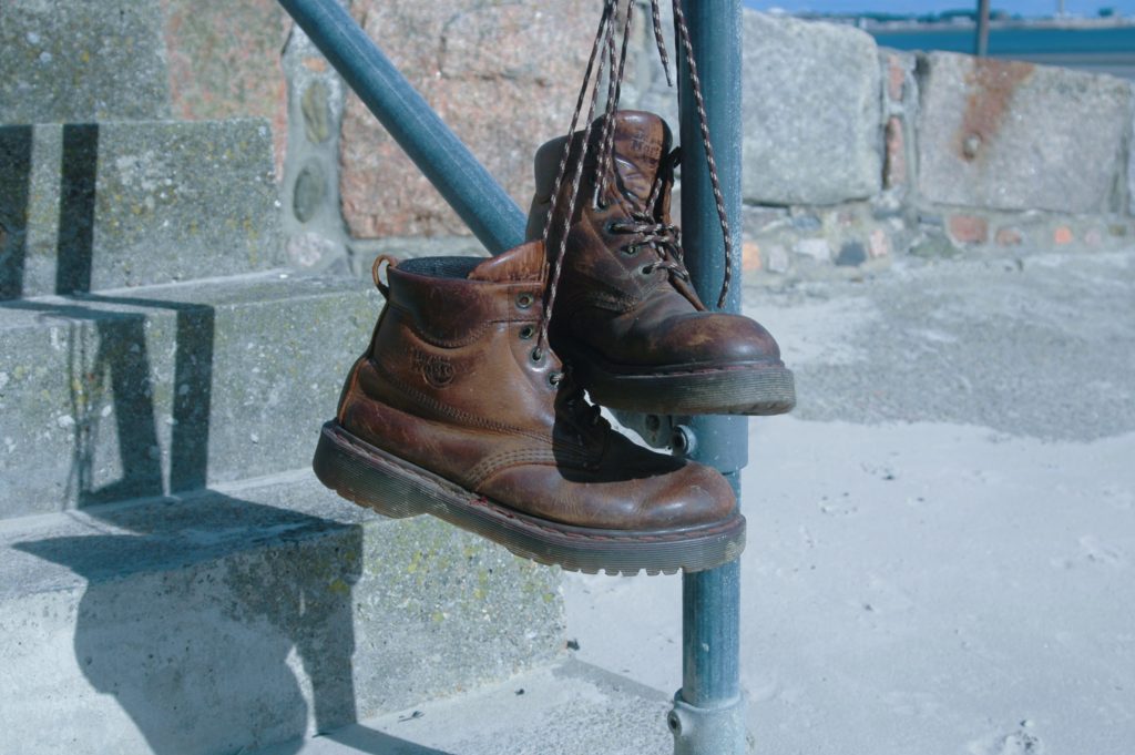
Object – Final Photos
I started by cropping the images to center and align the composition better. I then went on to adjust the exposure to wash out and achieve the more over exposed look of my inspiration that was Letinskys work.
The Place
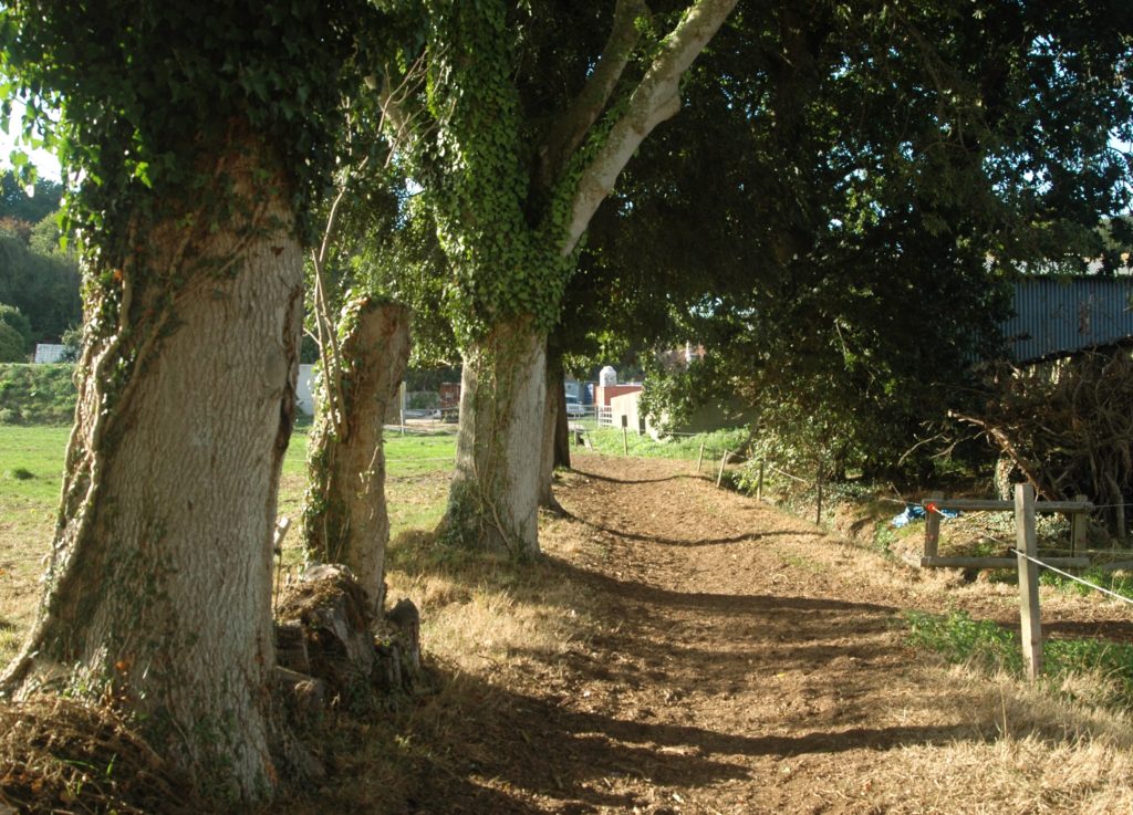
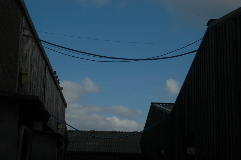
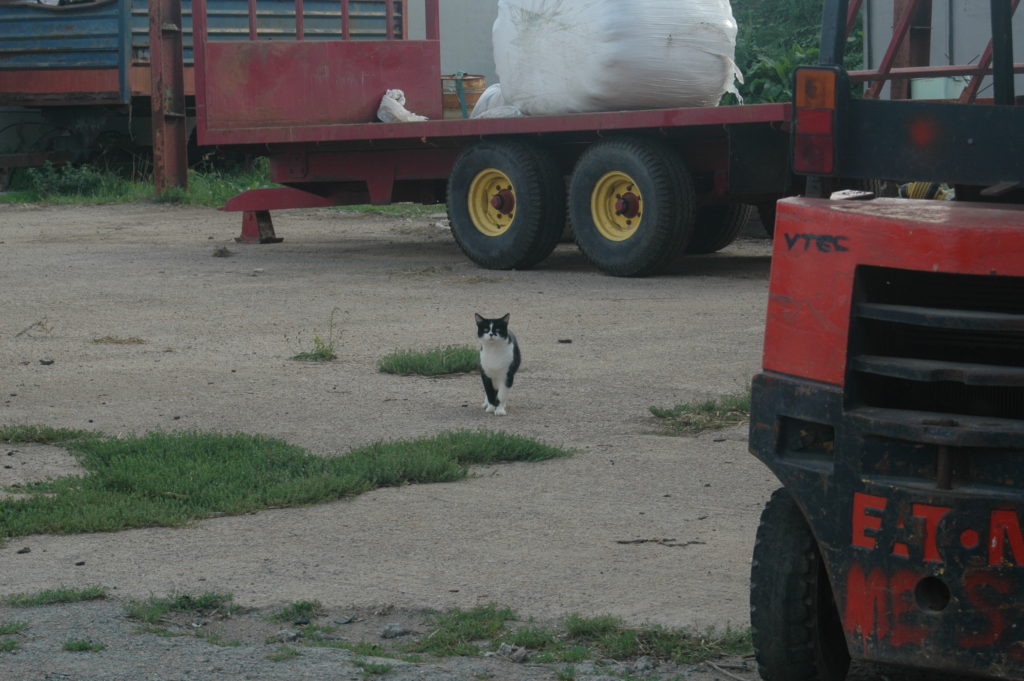
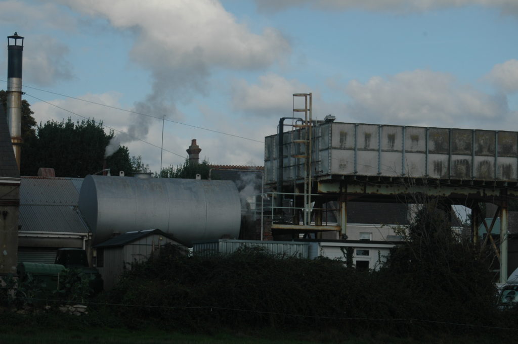
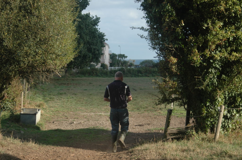
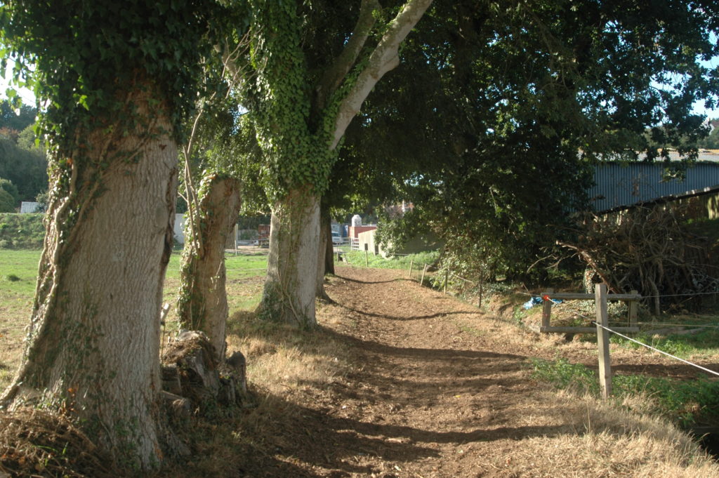
I could not chose one place when Jersey to my dad is still being discovered so instead I took photos of things he would walk past and see every day that have a sense of familiarity in this new place. My goal was to document things as my dad would see then as he went to and from work.
Planning
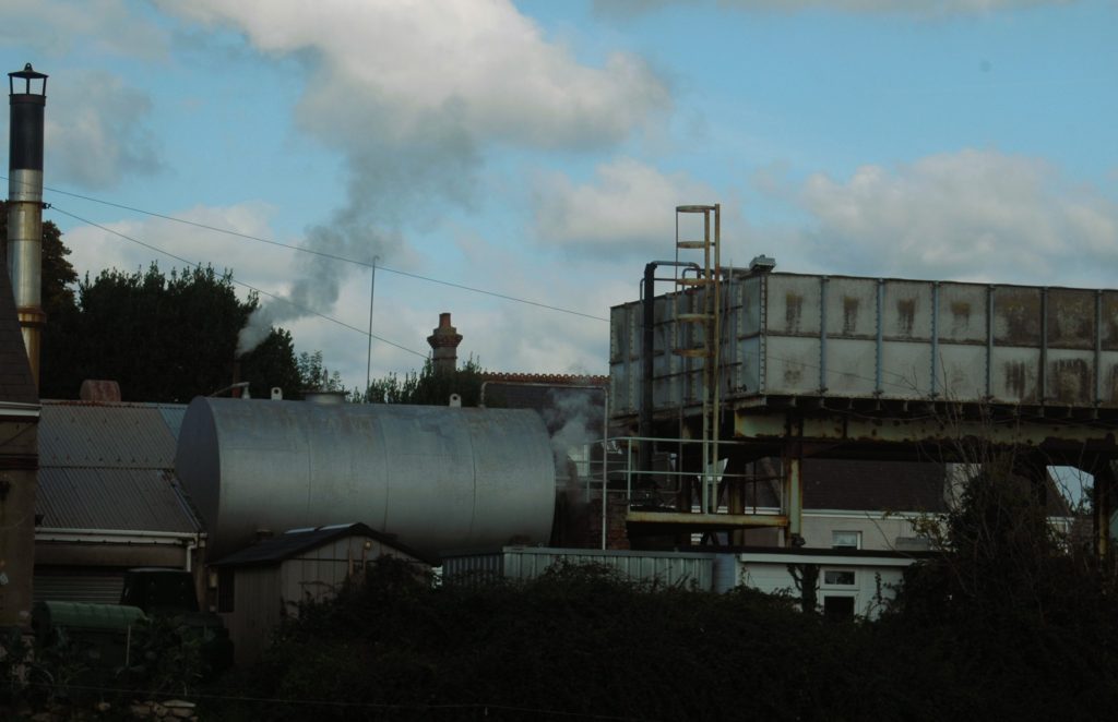
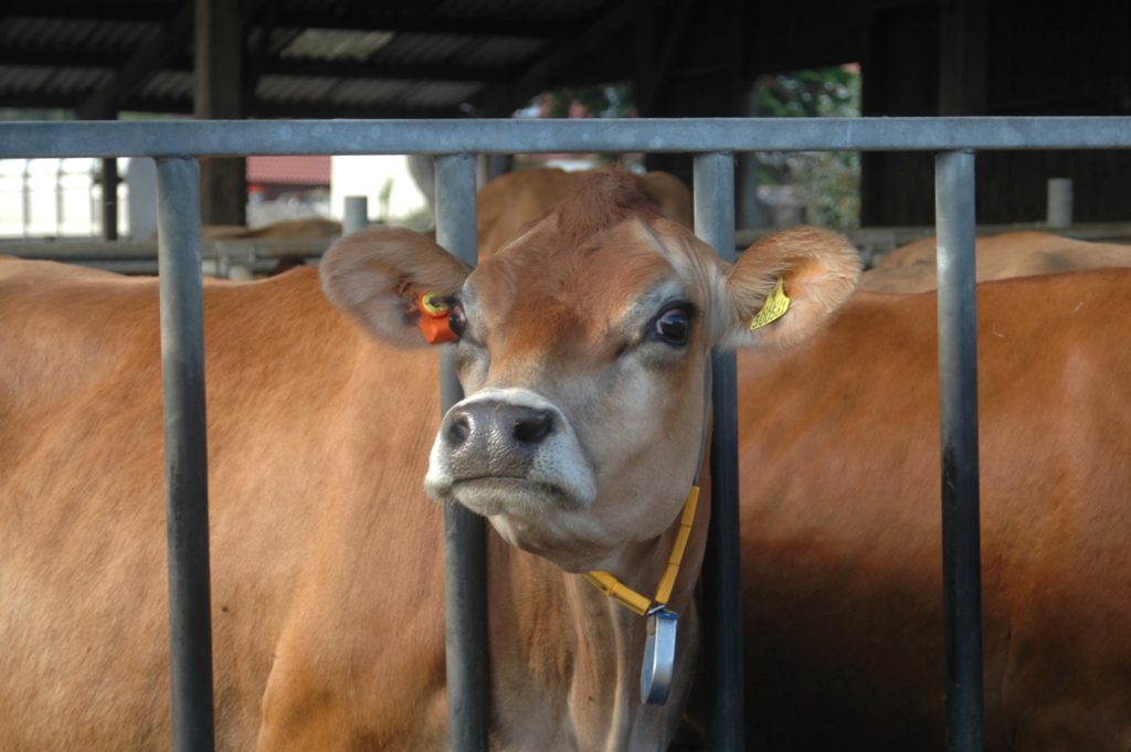
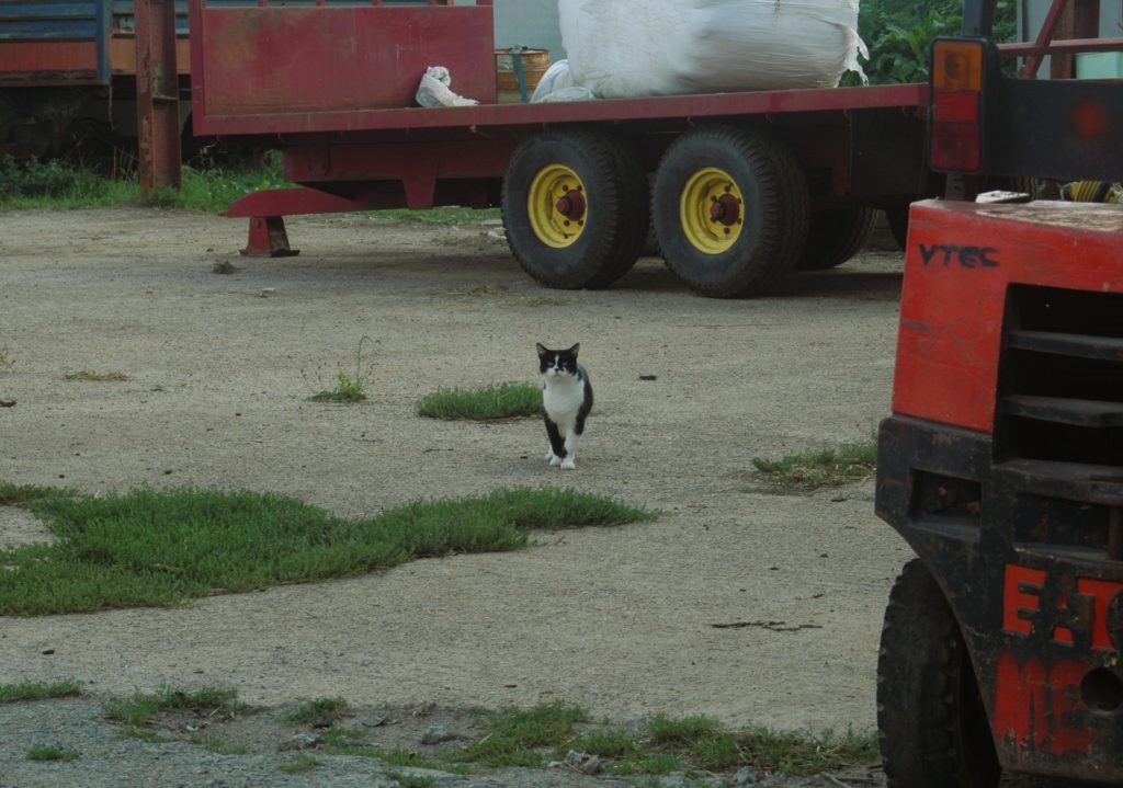
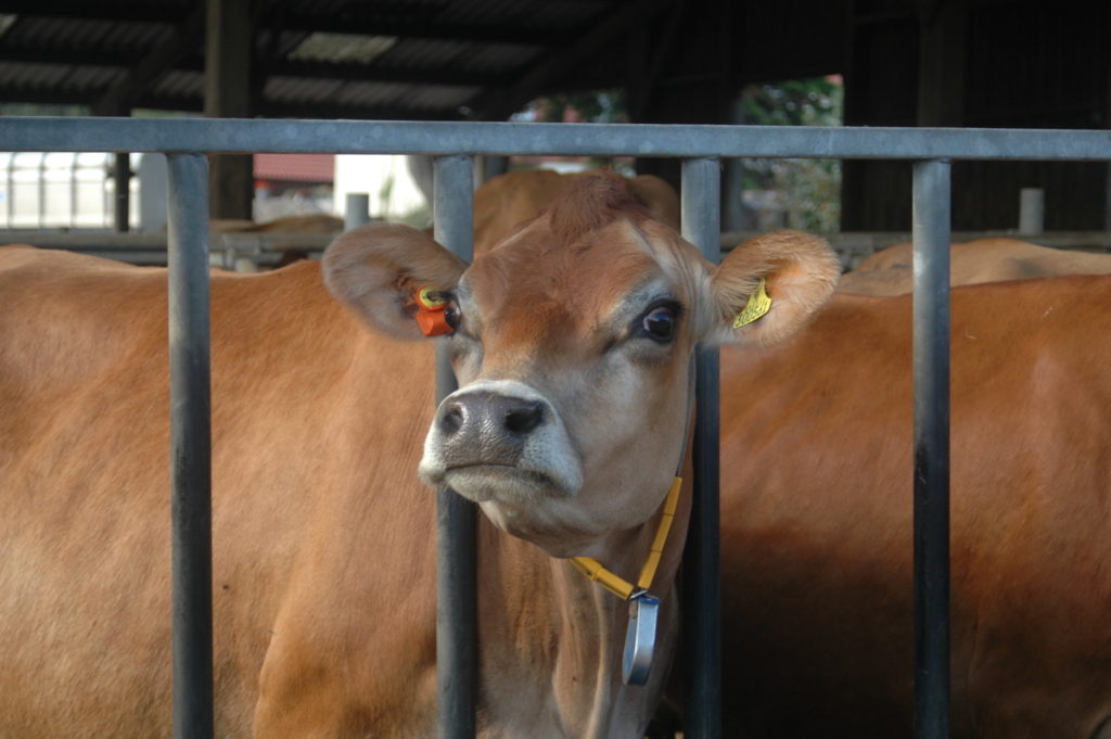
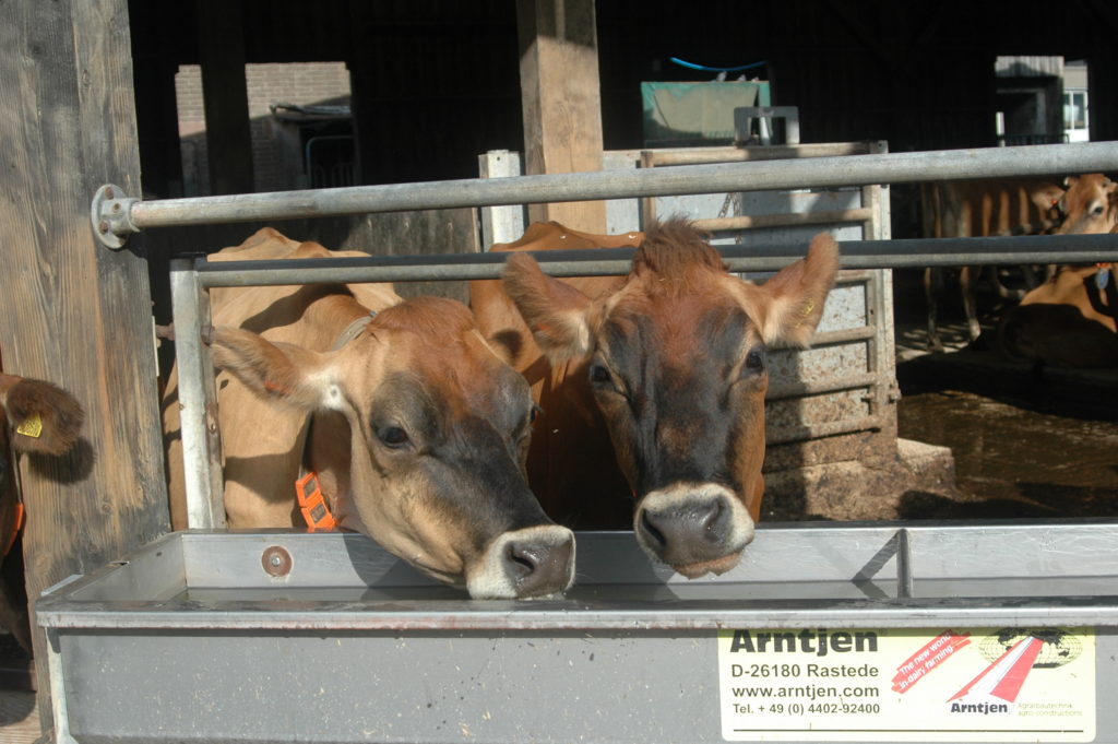
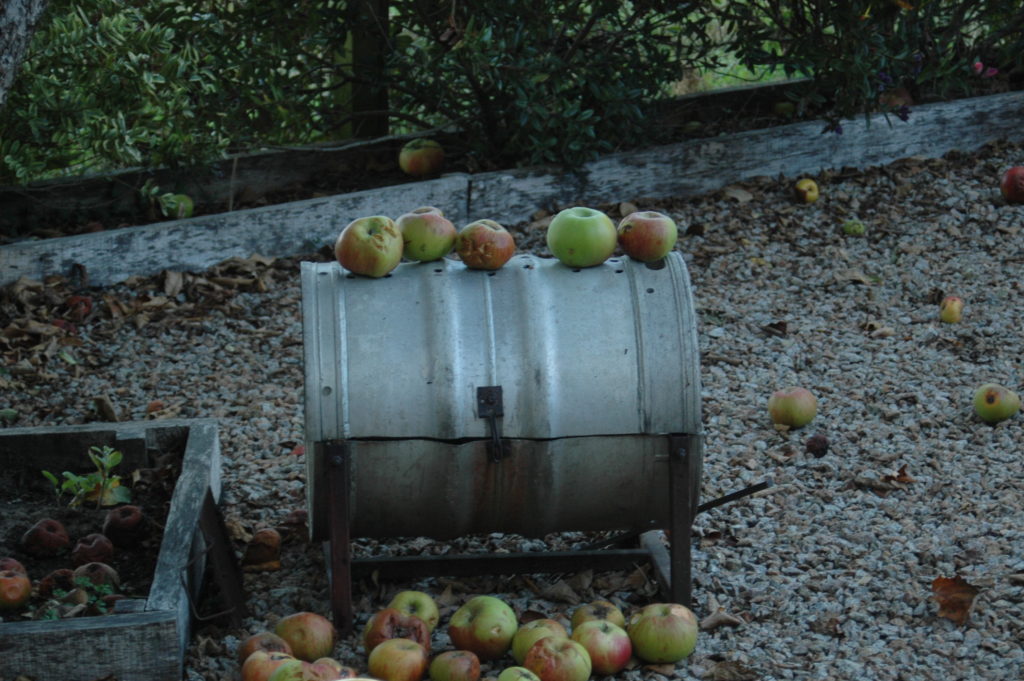
Inspired by shore’s trip around America I decided to do a much less epic trip and walk to the farm on the route my dad takes every morning and capture things on my way and at the farm. I tired to take bright saturated pictures to emulate Stephen Shores work. Of course a big part of the place was cows and in my dads line of work it would be criminal for me not to include them.
Raw Photos
Blanc Pignon Farm
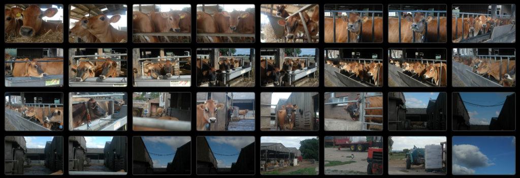

First Cut
Place – Final Photos
I cropped the photos to cut unwanted parts then focused on the contrast and exposure to make the photos brighter and more colourful.

The Portrait
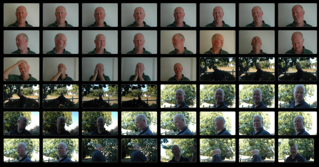
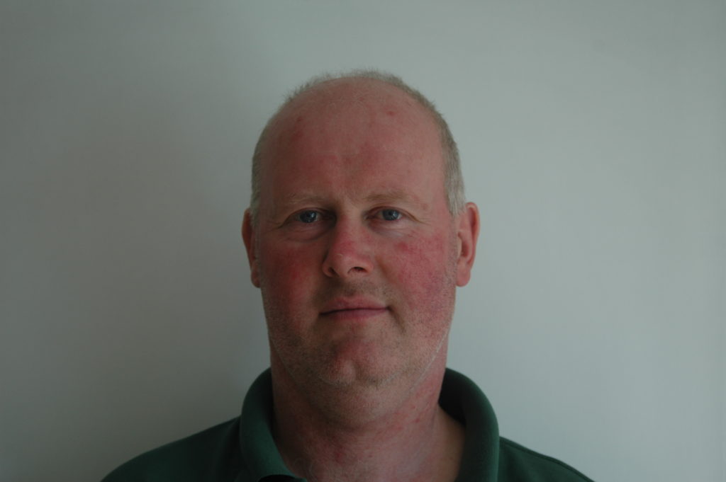
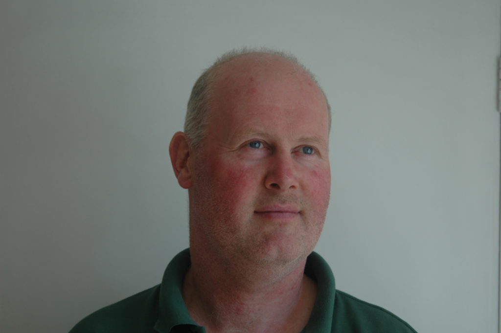
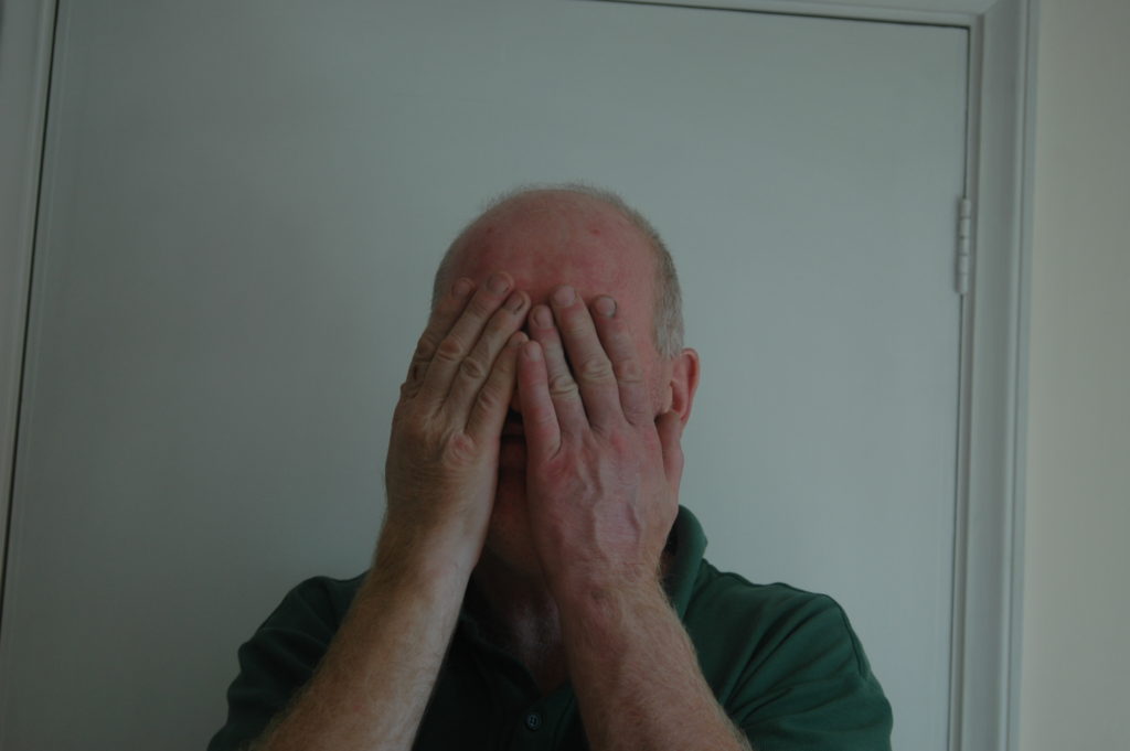
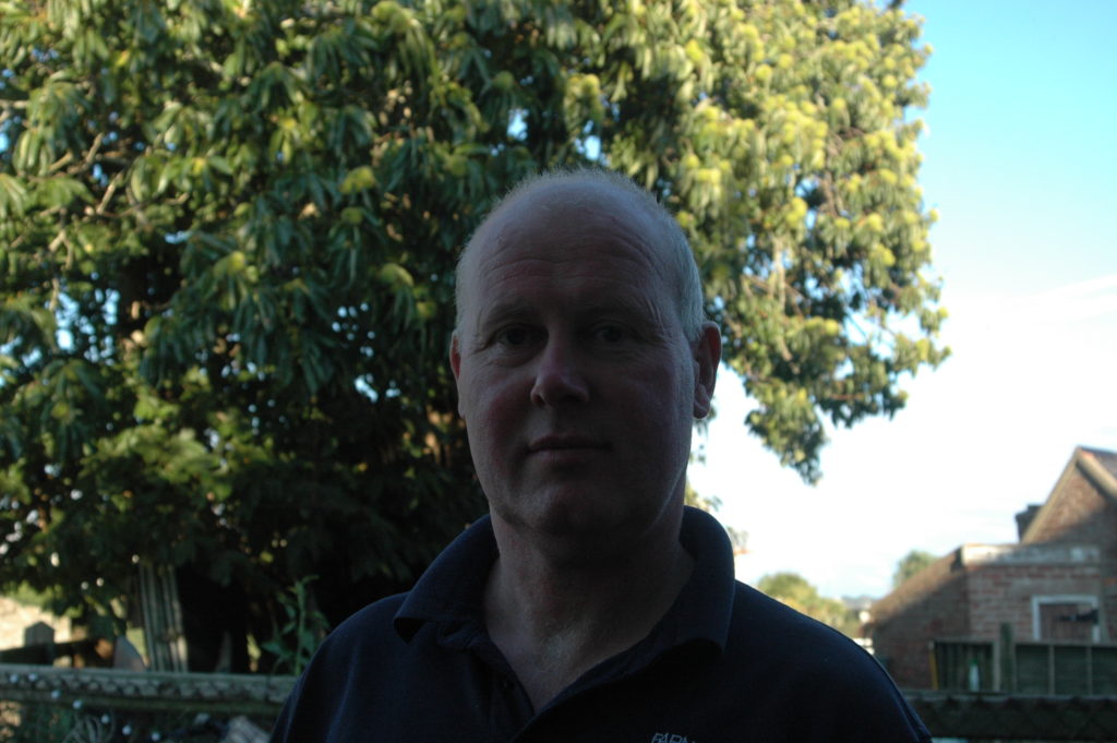
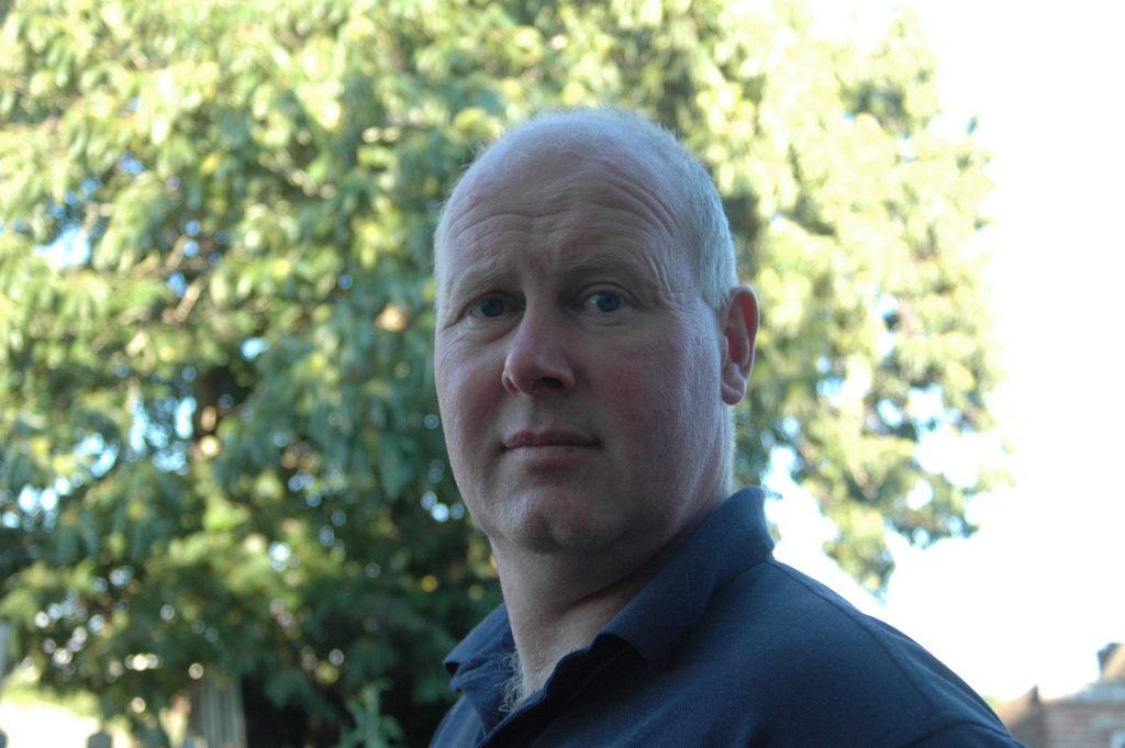
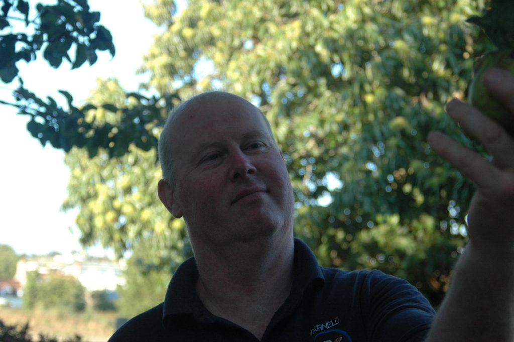
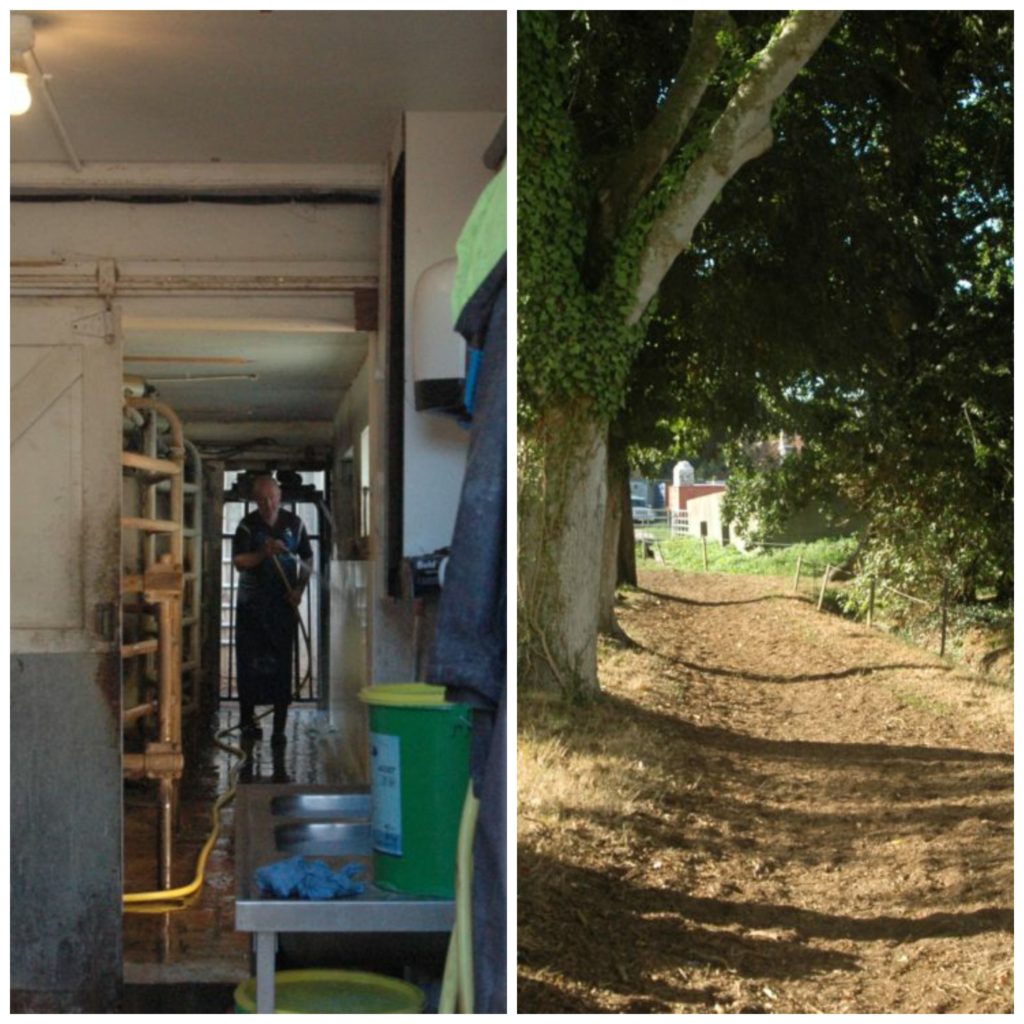
For my dads portrait I did multiple shoots, one like passport photos and focusing on his face and another focusing on him working.
Planning-first shoot
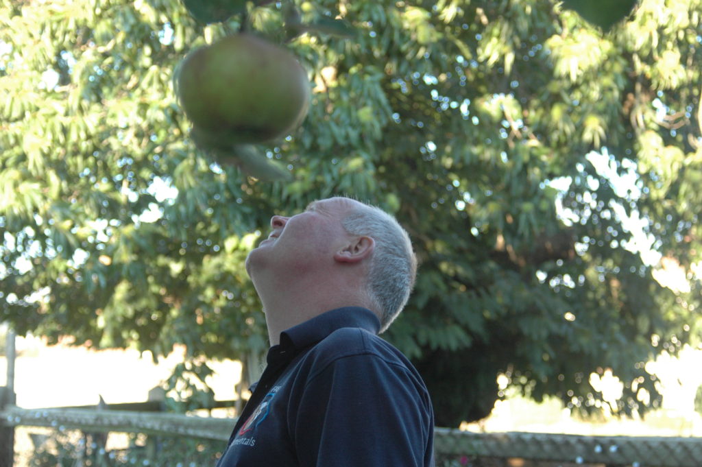
The first shoot I focused less on candid photos and more on my dads face and getting a “passport photo” I then went on to experiment with using a shallow depth of field outside in the garden to attempted to get only his face in focus to frame it.
Raw Photos
Shoot 1 – First cut
Portrait shoot 2
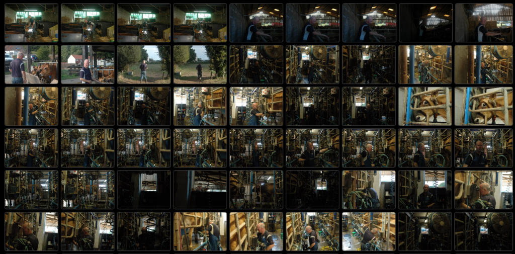
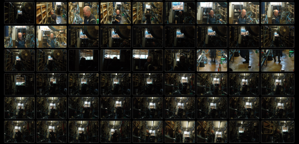
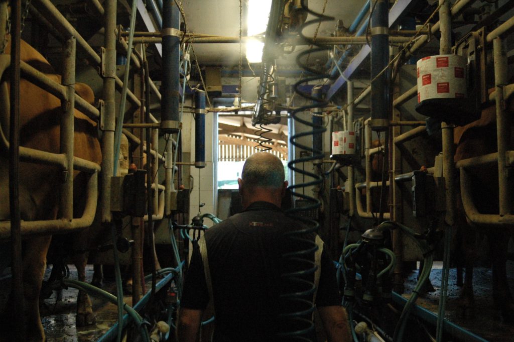
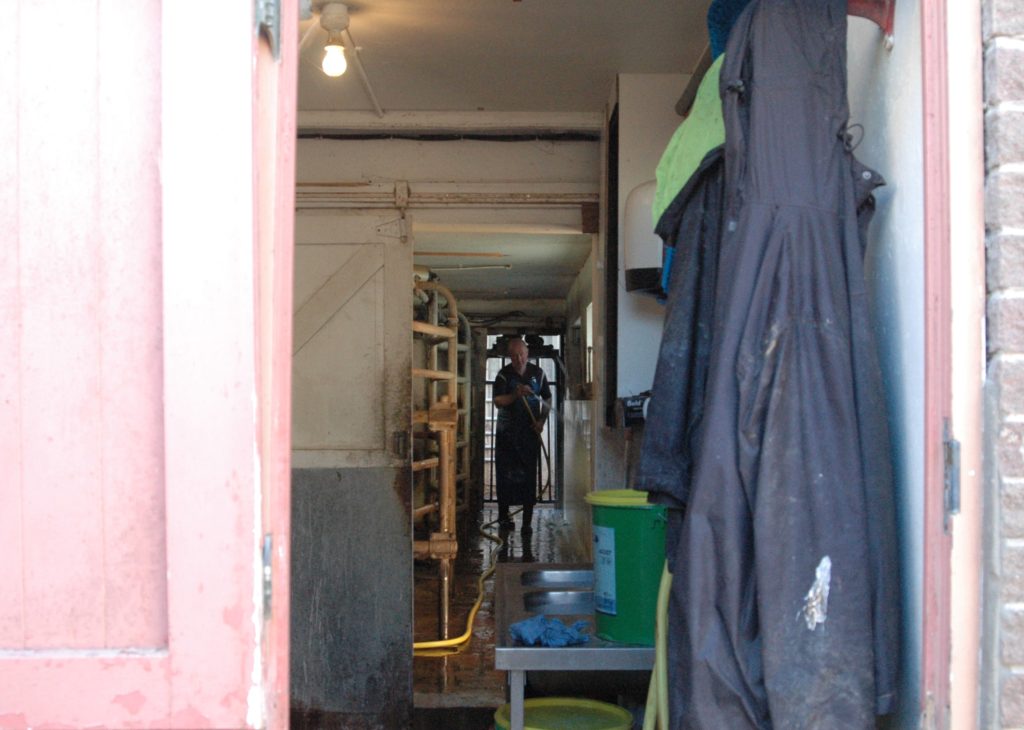
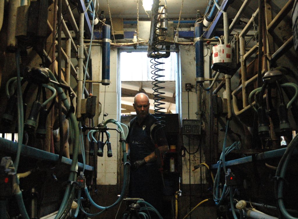
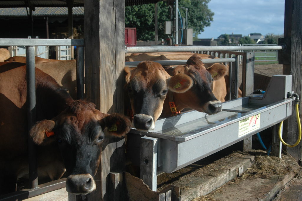
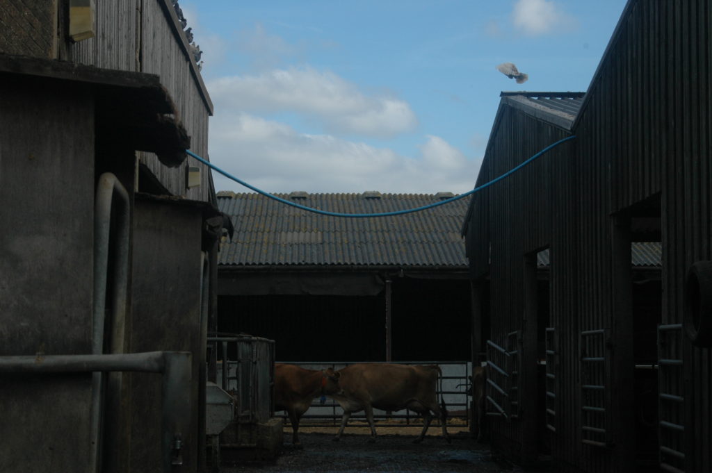
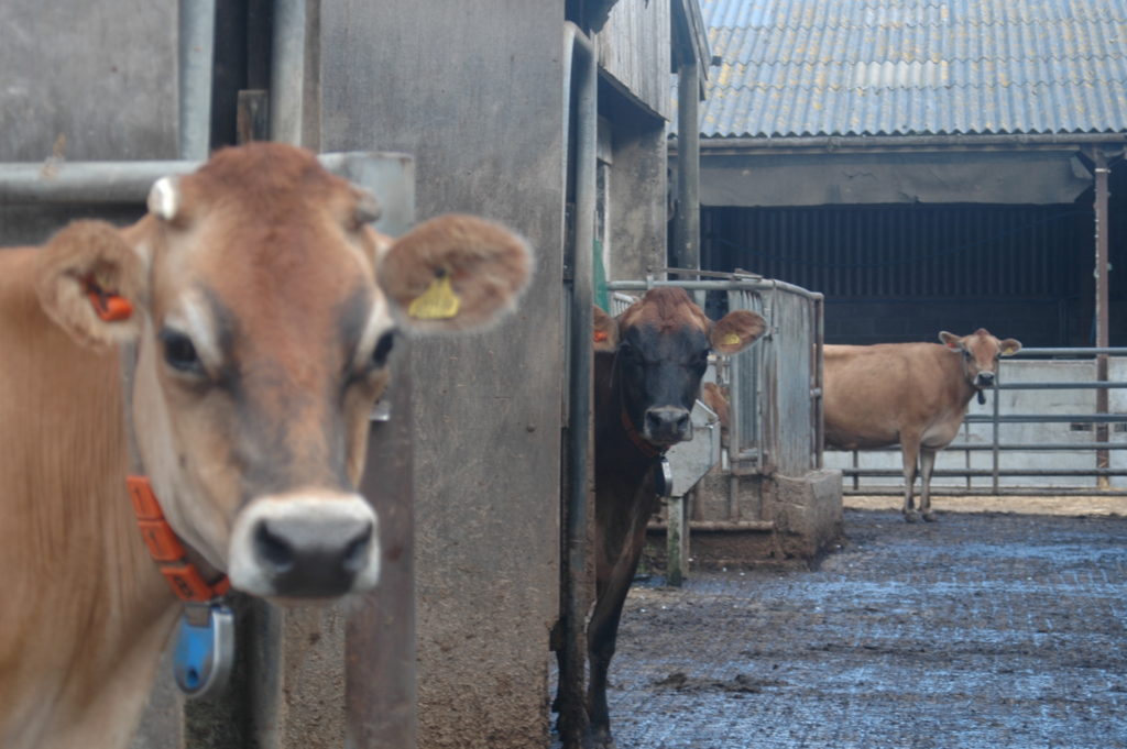
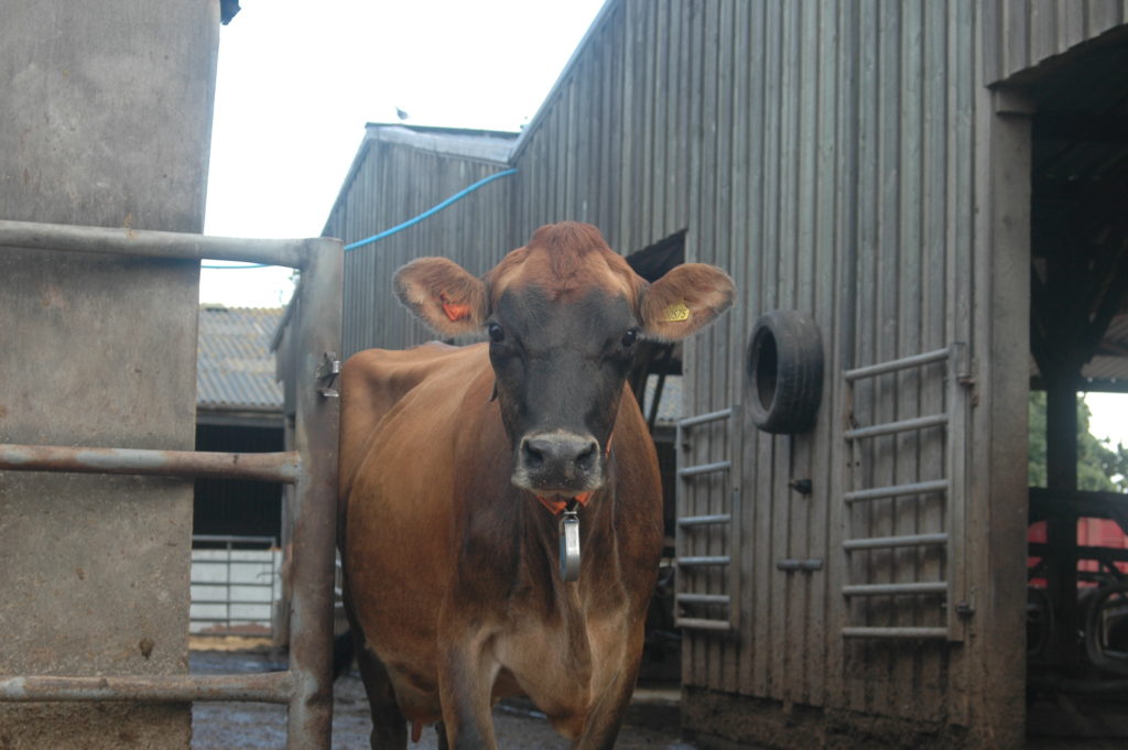
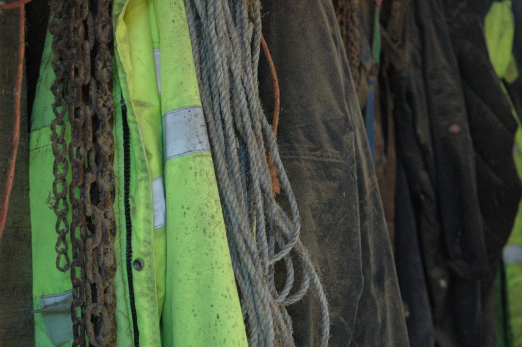
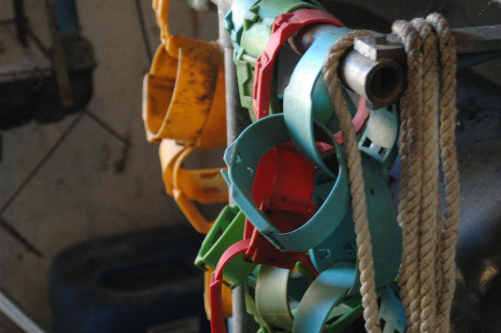
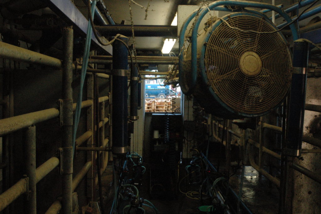
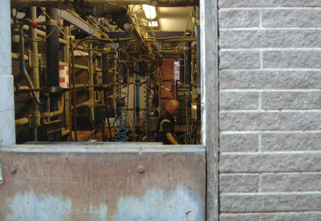
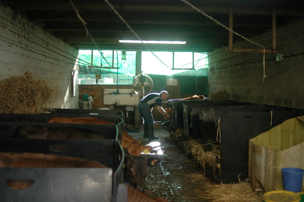
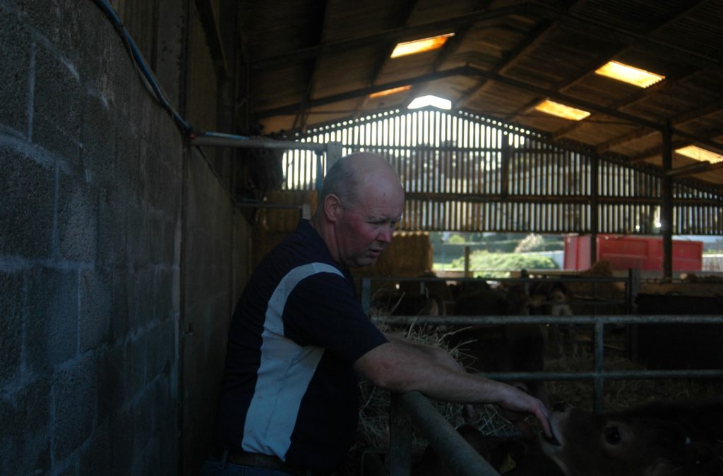
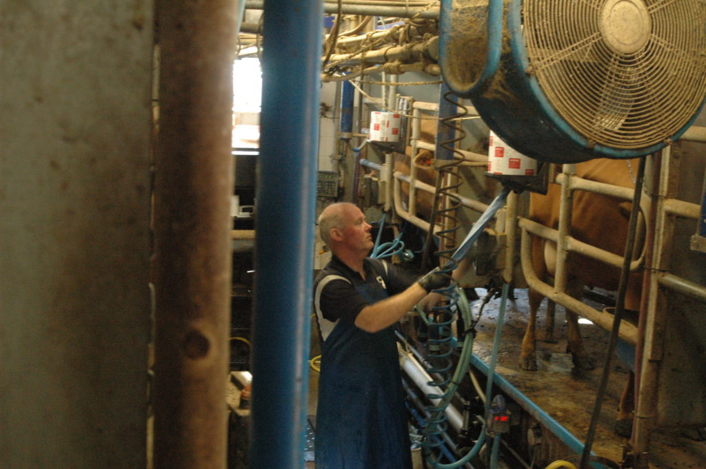
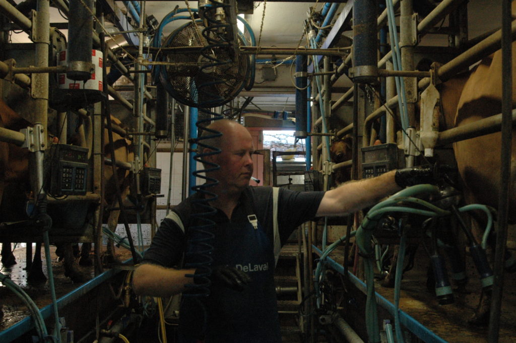
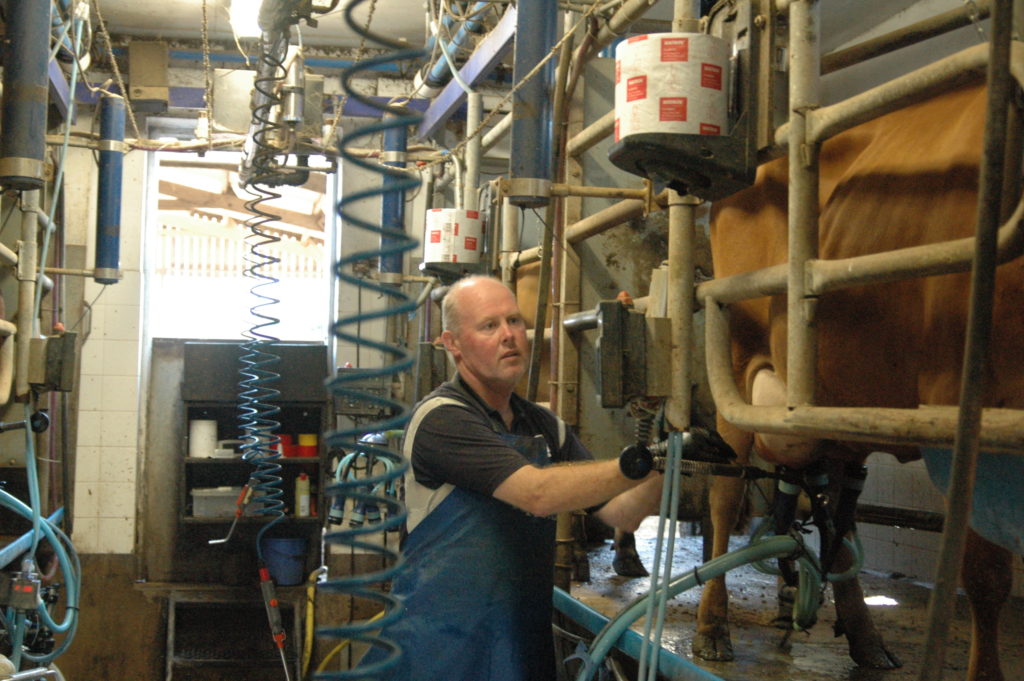
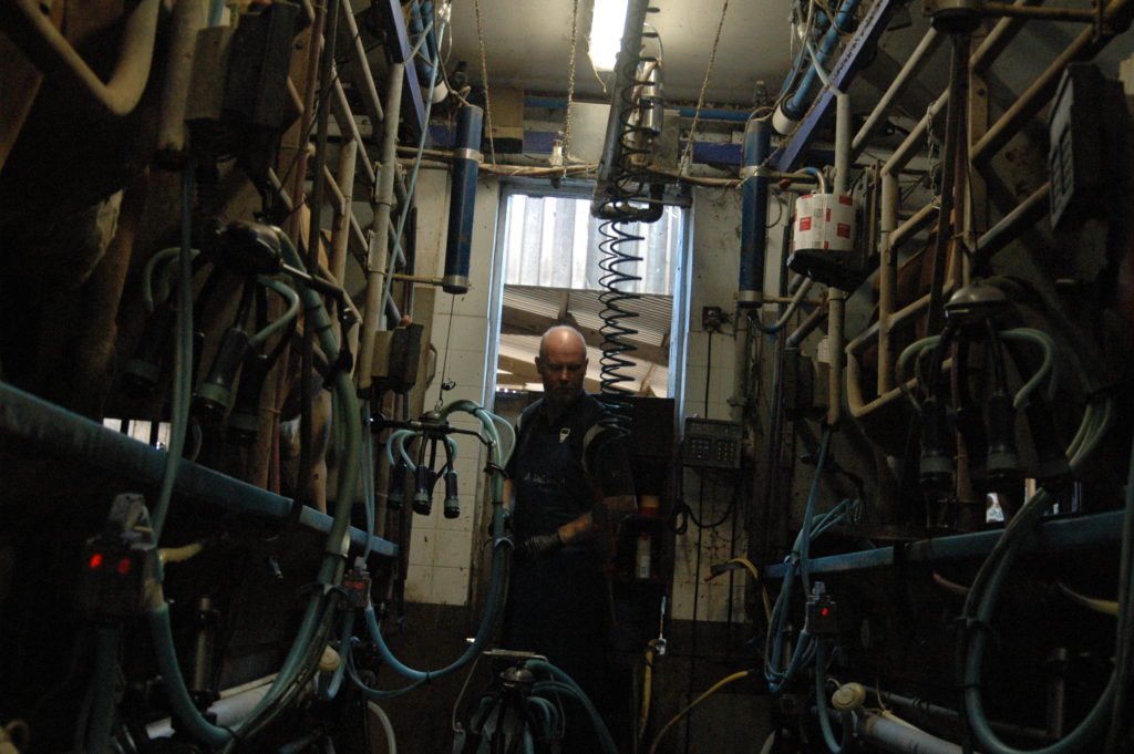
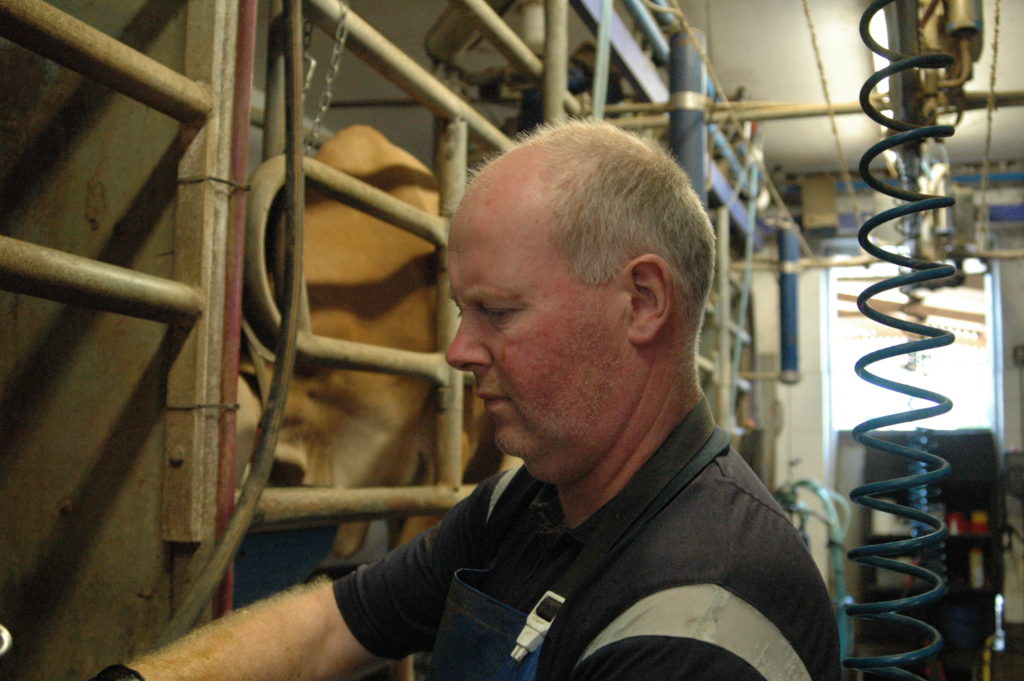
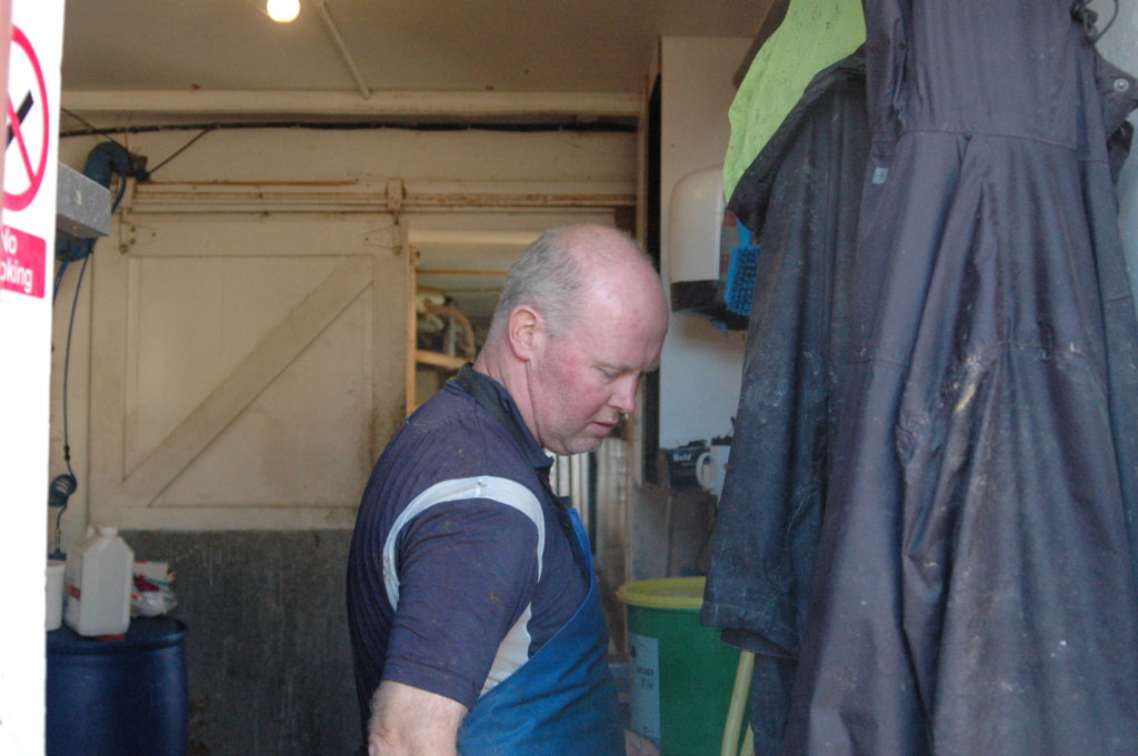
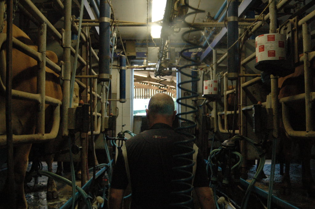
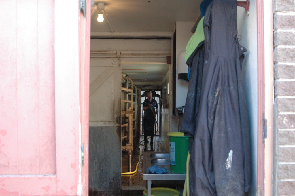
I went with my dad to work on two different occasions to take photos of him working. getting him to focus on what he was doing and not paying attention to the camera. This is what I was hoping this project would lead up to- taking pictures of my dad in his new job the thing that brought us to jersey in the first place.
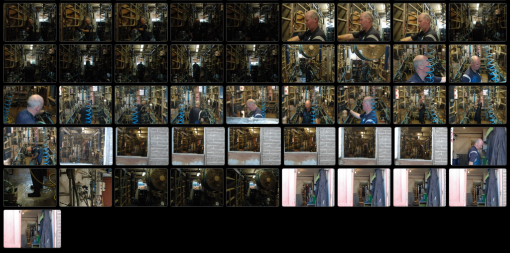
First cut
Many of the photographs taken in the shed and parlor are grainy as a result of the light I made the decision to not use flash as to keep the depth and to not spook the cows.
Portrait-Final photos
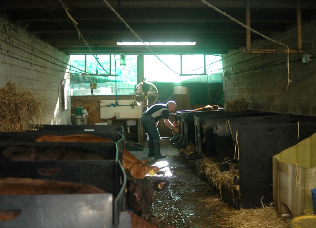
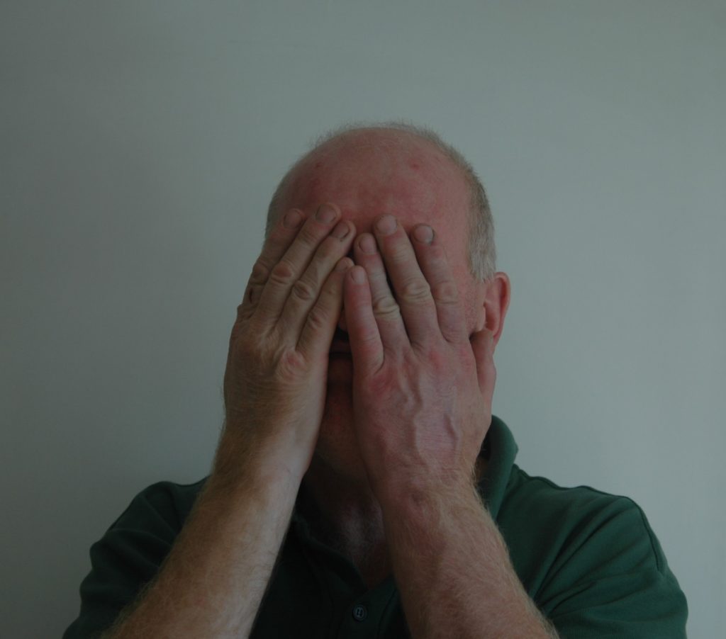
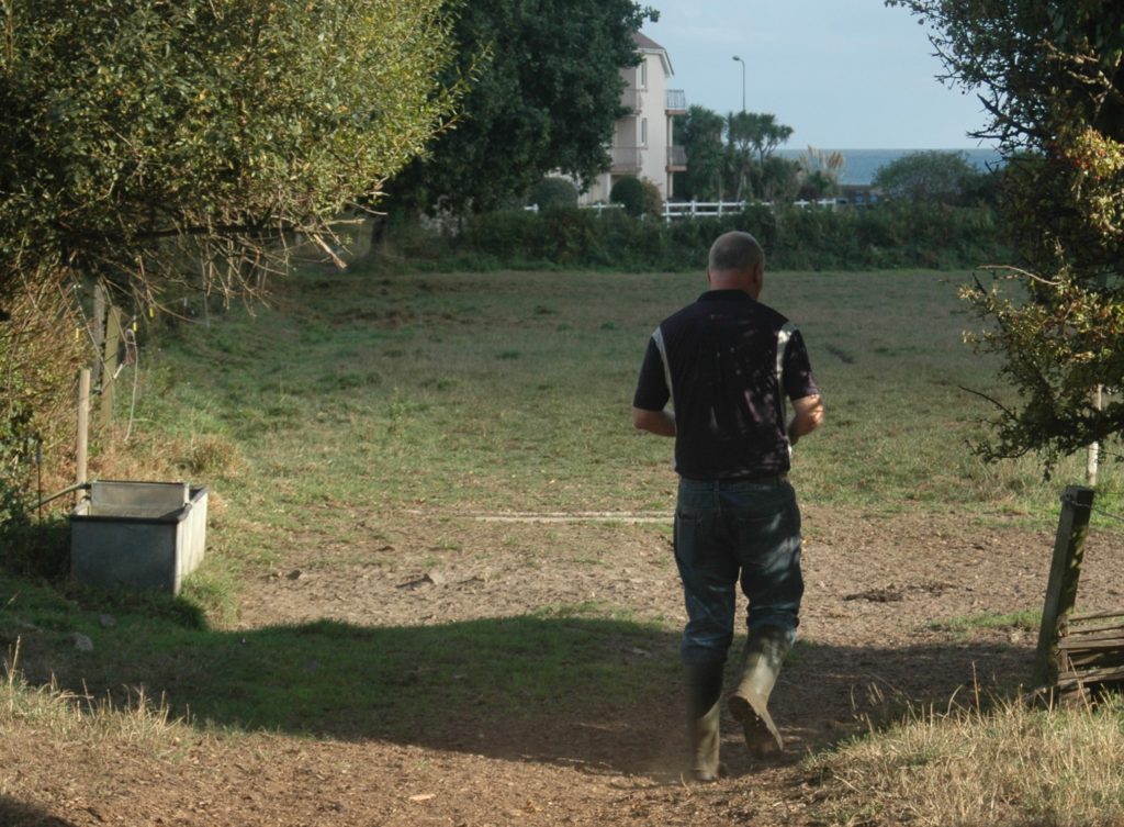
Experimentation
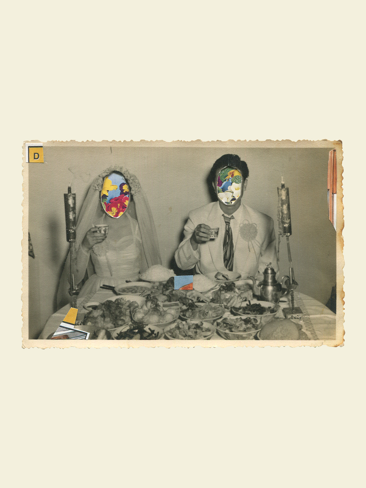
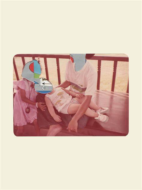
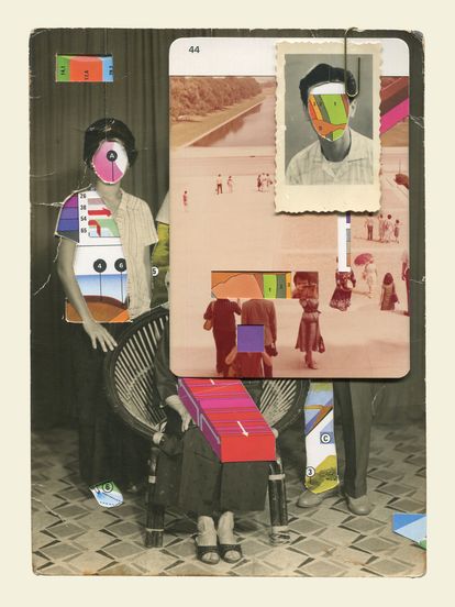
I started looking at photo stacking to see if it would suit my photos. I specifically looked at the work of John Stazaker and tried to emulate the way he would stack objects over the face of his portraits obscuring their face.
Photo Stacking
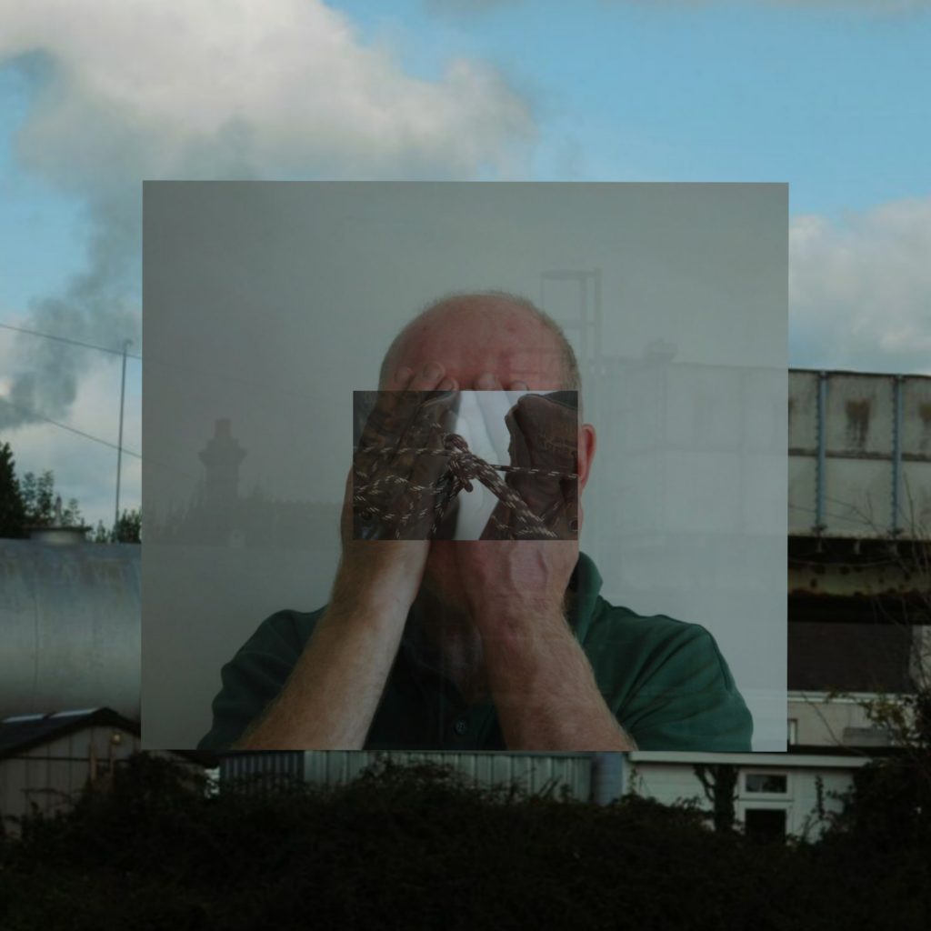
I thought this one was effective as it uses darker tones and the unequally size of the squares is pleasing to look at.
Merging
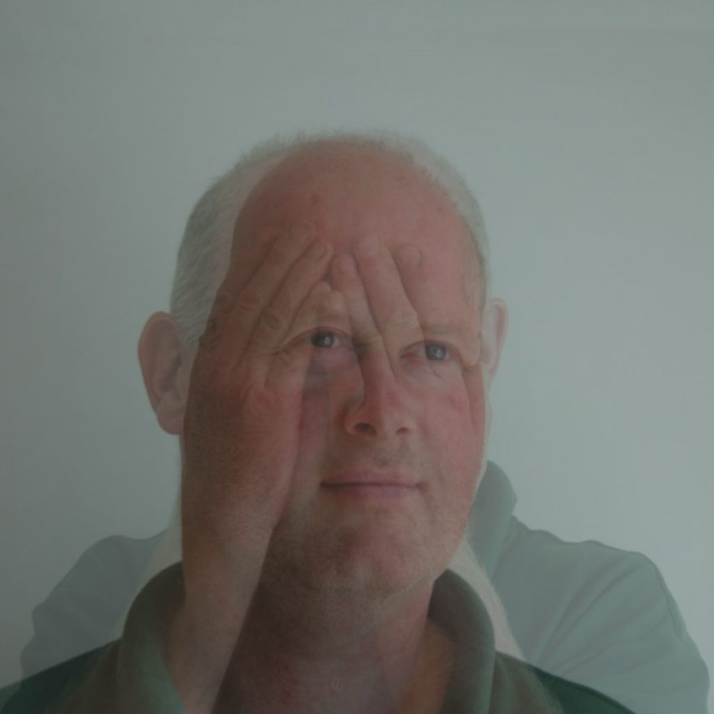
Juxtapositions
Looking again at the work of Luke Fowler and his use of juxtaposition the create contrast between images i attemped to create my own.
Collage
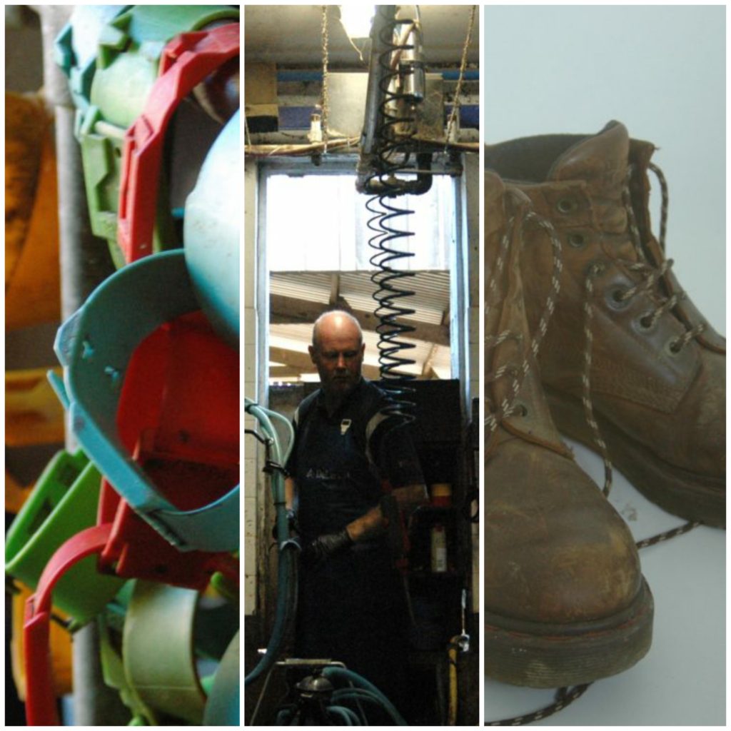
I started looking at the work of Pariwat Anantachina and his used of photo mashing and merging to create collage like photos which I really liked however I decided to use lower opacity images to achieve less jarring lines between images.
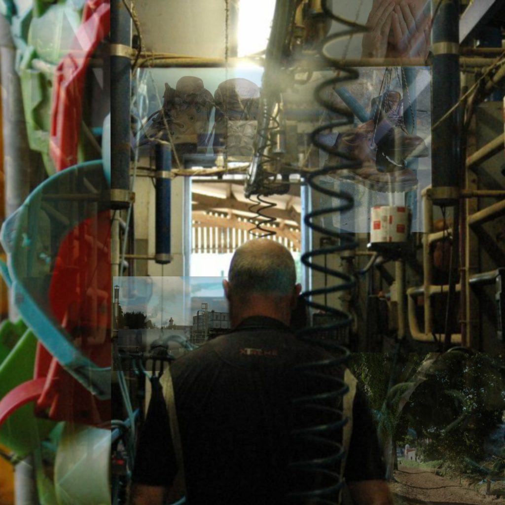
I liked this photo so far but I decided that it lacked colour and contrast so I took more yellow from the photo of the bracelets and added them in.
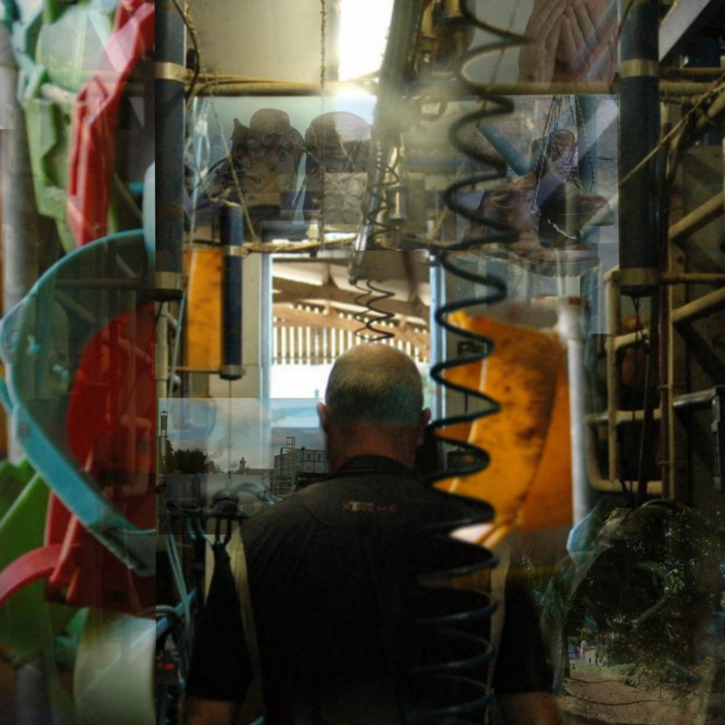
I really liked the more crowded look of this photo and I think the primary colours scattered throughout due to the other images lead your eye round the photo well.
Final Images


Thoughts
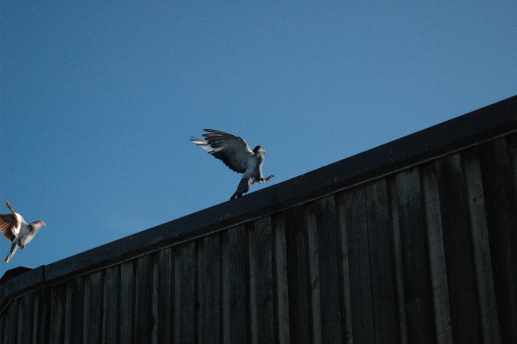
I am over all pleased with what I’ve produced as photography is entirely new to me, however there are many things I would now do different and have learned from. I think for the future I will try and take more interestingly angled photos as I feel many of mine were very linear and lacked compositional interest. I have also learned a lot about camera handling and how to achieve what I want especially when balancing aperture and shutter speed. I ran into a lot of issues with photoshop on my laptop when editing the photos so I had to use other ways to edit them how I wanted which I wasn’t pleased with as I was hoping this project would allow me to explore photoshop more. I have spent a lot of time on this and whilst there is much room for improvement I’m am proud of what I’ve done.


Excellent effort…logical approach, clear decision making and confident image selection too.
Well done!